
ArkTS 底部导航栏实战:鸿蒙应用多页面切换完整实现指南
本文基于ArkTS语言详细介绍了鸿蒙应用底部导航栏的实现方法,通过主入口文件Index.ets整合了包含首页、列表页和个人中心的三模块应用。文章提供了完整的代码实现,包括: 底部导航栏的核心逻辑与样式处理 首页模块的卡片式UI设计 列表页的数据展示与懒加载实现 个人中心页面的用户信息展示 文中特别解决了ArkTS开发中的常见问题,如组件重名、类型推断等,并采用现代化设计风格美化界面,为开发者提供了
ArkTS 底部导航栏实战:鸿蒙应用多页面切换完整实现指南
欢迎加入开源鸿蒙跨平台社区:→ https://openharmonycrossplatform.csdn.net
摘要
在鸿蒙(OpenHarmony)应用开发中,底部导航栏是实现多页面切换、提升用户体验的核心组件之一。本文将基于 ArkTS 语言,从零开始实现一个包含「首页」「列表页」「个人中心」三个模块的底部导航应用,并对界面进行了现代化美化。文中提供了完整可运行的代码,解决了开发过程中常见的组件重名、类型推断、布局嵌套等 ArkTS 语法问题,帮助开发者快速掌握鸿蒙原生应用的开发技巧。
一、项目概述与最终效果
我们将实现一个结构清晰、样式美观的鸿蒙应用,包含以下核心功能:
底部导航栏:点击标签切换不同页面,支持高亮选中态
首页模块:展示欢迎卡片与功能入口,采用卡片式设计
列表页模块:实现数据列表的懒加载展示,带有美化的列表项
个人中心模块:展示用户信息与功能菜单,还原主流 App 的交互设计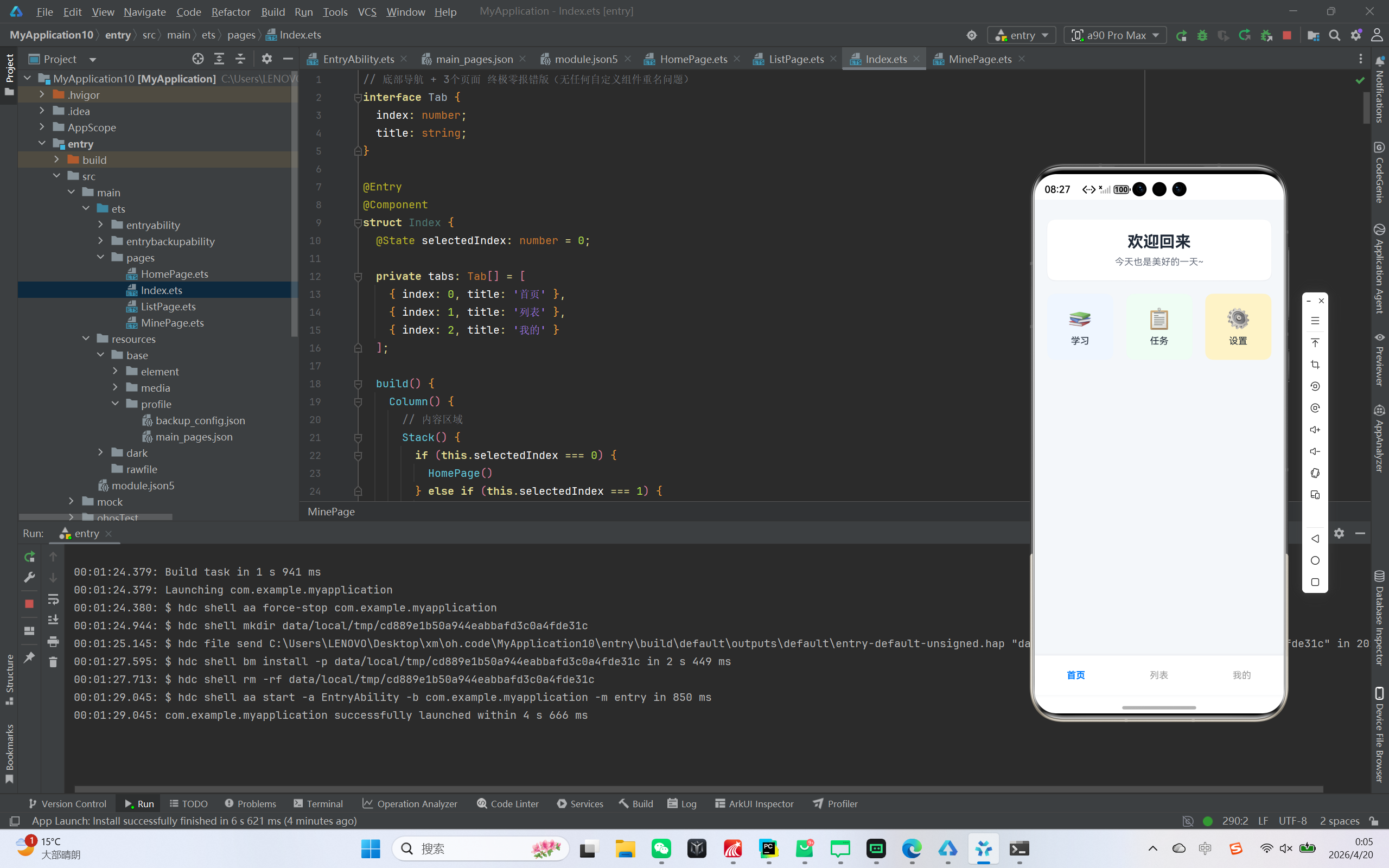
二、开发前准备
- 开发环境
IDE:DevEco Studio(建议最新稳定版)
SDK:OpenHarmony SDK 3.1+
设备:鸿蒙模拟器或真机 - 项目结构说明
|entry/
├─ src/main/
│ ├─ ets/pages/
│ │ └─ Index.ets // 主入口文件,包含所有页面与导航逻辑
│ └─ resources/base/profile/
│ └─ main_pages.json // 页面配置文件| |
|–|–|
| | |
三、核心代码实现 - 主入口与底部导航实现
我们将所有页面组件写在 Index.ets 中,避免跨文件引用导致的 ArkTS 编译错误。
// 底部导航 + 3个页面 终极零报错版(无任何自定义组件重名问题)
interface Tab {
  index: number;
  title: string;
}

@Entry
@Component
struct Index {
  @State selectedIndex: number = 0;

  private tabs: Tab[] = [
    { index: 0, title: '首页' },
    { index: 1, title: '列表' },
    { index: 2, title: '我的' }
  ];

  build() {
    Column() {
      // 内容区域
      Stack() {
        if (this.selectedIndex === 0) {
          HomePage()
        } else if (this.selectedIndex === 1) {
          ListPage()
        } else if (this.selectedIndex === 2) {
          MinePage()
        }
      }
      .width('100%')
      .layoutWeight(1)

      // 底部导航栏
      Row() {
        ForEach(this.tabs, (tab: Tab) => {
          Column() {
            Text(tab.title)
              .fontSize(14)
              .fontColor(this.selectedIndex === tab.index ? '#007DFF' : '#999999')
              .fontWeight(this.selectedIndex === tab.index ? FontWeight.Bold : FontWeight.Normal)
          }
          .width('33.3%')
          .height(60)
          .justifyContent(FlexAlign.Center)
          .onClick(() => {
            this.selectedIndex = tab.index;
          })
        })
      }
      .width('100%')
      .height(60)
      .backgroundColor(Color.White)
      .shadow({ radius: 10, color: '#E5E7EB', offsetY: -2 })
    }
    .width('100%')
    .height('100%')
    .backgroundColor('#F5F7FA')
  }
}
- 首页模块实现
首页采用卡片式设计,包含欢迎信息与功能入口:
@Component
struct HomePage {
  build() {
    Column({ space: 20 }) {
      // 顶部卡片
      Column() {
        Text("欢迎回来")
          .fontSize(24)
          .fontWeight(FontWeight.Bold)
          .fontColor('#1F2937');

        Text("今天也是美好的一天~")
          .fontSize(14)
          .fontColor('#6B7280')
          .margin({ top: 8 });
      }
      .width('90%')
      .padding(20)
      .backgroundColor(Color.White)
      .borderRadius(12)
      .shadow({ radius: 4, color: '#E5E7EB', offsetY: 2 });

      // 功能模块
      Row({ space: 15 }) {
        Column() {
          Text("📚")
            .fontSize(30);
          Text("学习")
            .fontSize(14)
            .fontColor('#1F2937')
            .margin({ top: 8 });
        }
        .width(100)
        .height(100)
        .justifyContent(FlexAlign.Center)
        .backgroundColor('#EFF6FF')
        .borderRadius(12);

        Column() {
          Text("📋")
            .fontSize(30);
          Text("任务")
            .fontSize(14)
            .fontColor('#1F2937')
            .margin({ top: 8 });
        }
        .width(100)
        .height(100)
        .justifyContent(FlexAlign.Center)
        .backgroundColor('#F0FDF4')
        .borderRadius(12);

        Column() {
          Text("⚙️")
            .fontSize(30);
          Text("设置")
            .fontSize(14)
            .fontColor('#1F2937')
            .margin({ top: 8 });
        }
        .width(100)
        .height(100)
        .justifyContent(FlexAlign.Center)
        .backgroundColor('#FEF3C7')
        .borderRadius(12);
      }
      .width('90%')
      .justifyContent(FlexAlign.SpaceBetween);
    }
    .width('100%')
    .height('100%')
    .justifyContent(FlexAlign.Start)
    .padding({ top: 30 });
  }
}
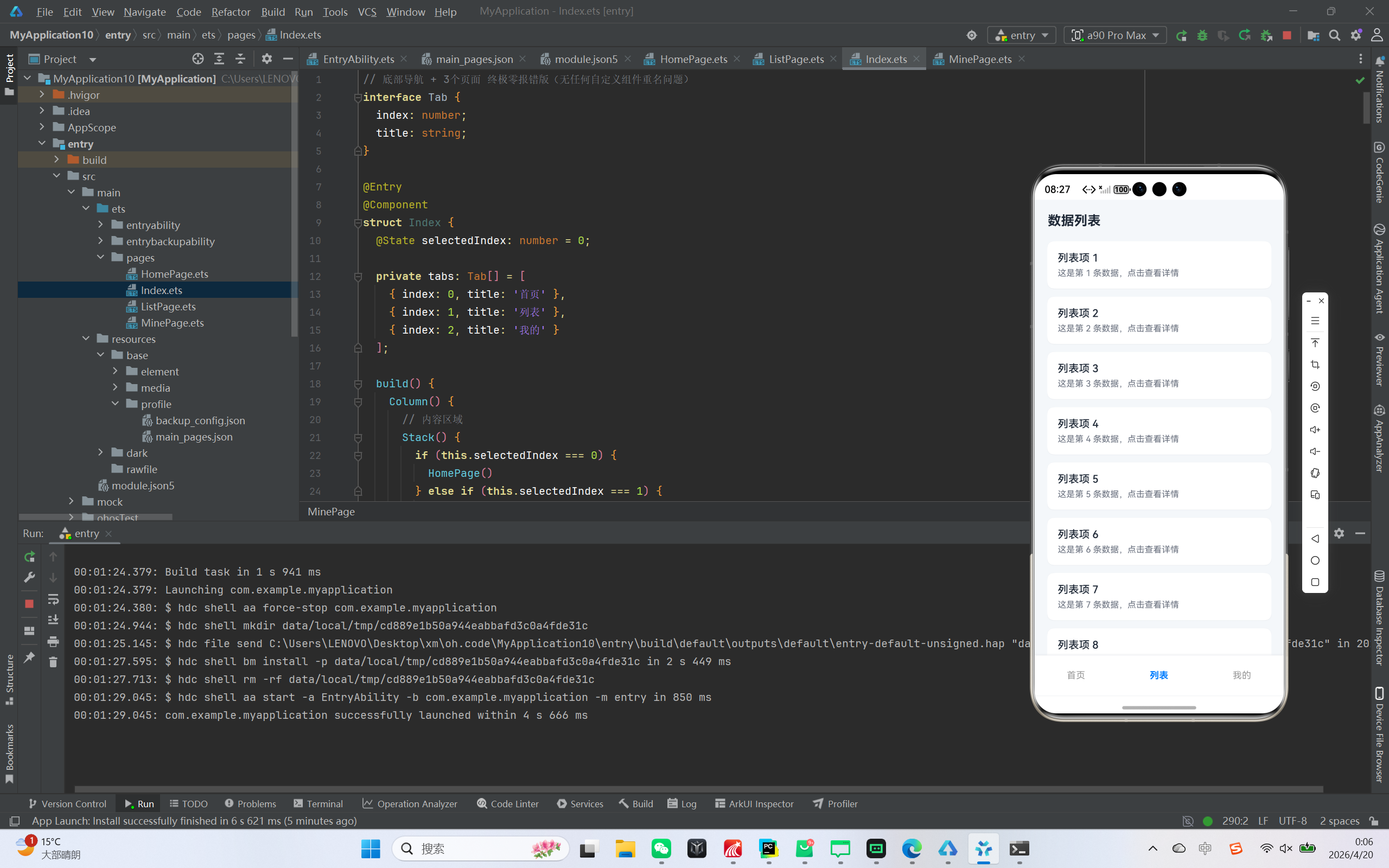
- 列表页模块实现
列表页展示了 20 条模拟数据,采用 ArkTS 原生 List 组件实现:
@Component
struct ListPage {
  build() {
    Column() {
      // 标题栏
      Row() {
        Text("数据列表")
          .fontSize(20)
          .fontWeight(FontWeight.Bold)
          .fontColor('#1F2937');
      }
      .width('100%')
      .padding({ left: 20, top: 20, bottom: 10 });

      // 列表
      List({ space: 12 }) {
        ForEach([1,2,3,4,5,6,7,8,9,10,11,12,13,14,15,16,17,18,19,20], (item: number) => {
          ListItem() {
            Column() {
              Text("列表项 " + item)
                .fontSize(16)
                .fontWeight(FontWeight.Medium)
                .fontColor('#1F2937')
                .width('100%')
                .maxLines(1)
                .textOverflow({ overflow: TextOverflow.Ellipsis });

              Text("这是第 " + item + " 条数据,点击查看详情")
                .fontSize(13)
                .fontColor('#6B7280')
                .width('100%')
                .margin({ top: 6 })
                .maxLines(1)
                .textOverflow({ overflow: TextOverflow.Ellipsis });
            }
            .width('100%')
            .padding(16)
            .backgroundColor(Color.White)
            .borderRadius(10)
            .shadow({ radius: 3, color: '#E5E7EB', offsetY: 1 });
          }
        }, (item: number) => item.toString())
      }
      .width('90%')
      .height('80%')
      .layoutWeight(1)
      .margin({ top: 10 });
    }
    .width('100%')
    .height('100%')
    .backgroundColor('#F5F7FA');
  }
}
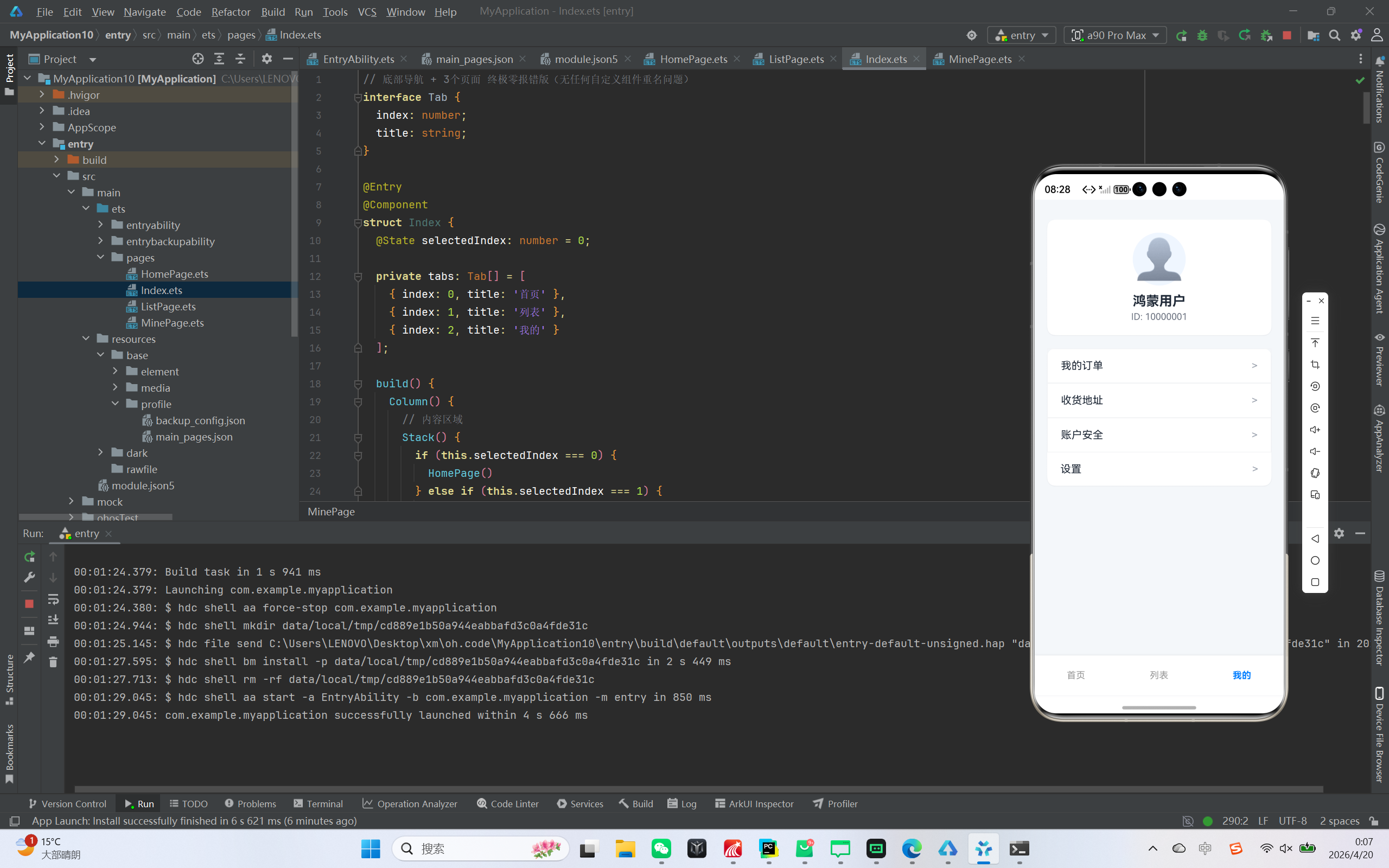
- 个人中心模块实现
个人中心展示用户信息与功能菜单,为避免 ArkTS 组件重名问题,我们直接写死菜单布局:
@Component
struct MinePage {
  build() {
    Column({ space: 20 }) {
      // 用户信息卡片
      Column() {
        Text("👤")
          .fontSize(60)
          .width(80)
          .height(80)
          .backgroundColor('#EFF6FF')
          .borderRadius(40)
          .textAlign(TextAlign.Center);

        Text("鸿蒙用户")
          .fontSize(20)
          .fontWeight(FontWeight.Bold)
          .fontColor('#1F2937')
          .margin({ top: 12 });

        Text("ID: 10000001")
          .fontSize(14)
          .fontColor('#6B7280')
          .margin({ top: 4 });
      }
      .width('90%')
      .padding(20)
      .backgroundColor(Color.White)
      .borderRadius(12)
      .shadow({ radius: 4, color: '#E5E7EB', offsetY: 2 });

      // 功能菜单(直接写死,不使用任何自定义组件)
      Column() {
        // 菜单1
        Row() {
          Text("我的订单")
            .fontSize(16)
            .fontColor('#1F2937');
          Blank().layoutWeight(1);
          Text(">").fontSize(16).fontColor('#9CA3AF');
        }
        .width('100%')
        .padding({ left: 20, right: 20, top: 16, bottom: 16 })
        .border({ width: 1, color: '#F3F4F6' });

        // 菜单2
        Row() {
          Text("收货地址")
            .fontSize(16)
            .fontColor('#1F2937');
          Blank().layoutWeight(1);
          Text(">").fontSize(16).fontColor('#9CA3AF');
        }
        .width('100%')
        .padding({ left: 20, right: 20, top: 16, bottom: 16 })
        .border({ width: 1, color: '#F3F4F6' });

        // 菜单3
        Row() {
          Text("账户安全")
            .fontSize(16)
            .fontColor('#1F2937');
          Blank().layoutWeight(1);
          Text(">").fontSize(16).fontColor('#9CA3AF');
        }
        .width('100%')
        .padding({ left: 20, right: 20, top: 16, bottom: 16 })
        .border({ width: 1, color: '#F3F4F6' });

        // 菜单4
        Row() {
          Text("设置")
            .fontSize(16)
            .fontColor('#1F2937');
          Blank().layoutWeight(1);
          Text(">").fontSize(16).fontColor('#9CA3AF');
        }
        .width('100%')
        .padding({ left: 20, right: 20, top: 16, bottom: 16 });
      }
      .width('90%')
      .backgroundColor(Color.White)
      .borderRadius(12)
      .shadow({ radius: 4, color: '#E5E7EB', offsetY: 2 });
    }
    .width('100%')
    .height('100%')
    .justifyContent(FlexAlign.Start)
    .padding({ top: 30 });
  }
}
四、配置文件修改
main_pages.json 配置
确保 main_pages.json 中只包含主入口页面,避免 ArkTS 页面校验错误:
{
  "src": [
    "pages/Index"
  ]
}
五、开发踩坑与问题解决
- 组件重名问题
ArkTS 中 ListItem、MenuItem 是系统保留组件名,自定义组件应避免使用这些名称,否则会出现 The struct name cannot contain reserved tag name 错误。解决方法是直接写死布局,或使用不冲突的组件名(如 CustomMenuItem)。 - 类型推断错误
使用 Array.from 生成数组时,ArkTS 无法自动推断类型,建议直接使用数组字面量 [1,2,…,20],或为回调参数添加显式类型声明。 - 列表宽高警告
ArkTS 要求 List 组件必须设置明确的宽高,否则会出现 You are advised to initialize the width and height attributes of the List component 警告,解决方法是添加 .width(‘90%’).height(‘80%’) 等属性。
六、总结与拓展
本文实现了一个完整的鸿蒙 ArkTS 底部导航应用,涵盖了页面切换、列表展示、卡片美化等核心功能,同时解决了 ArkTS 开发中常见的语法与配置问题。
你可以基于此项目进行拓展:
为菜单添加点击事件,跳转到二级页面
列表页接入网络请求,实现真实数据加载
为底部导航添加图标,优化视觉效果
如果你在开发过程中遇到问题,欢迎在评论区留言交流!

作为“人工智能6S店”的官方数字引擎,为AI开发者与企业提供一个覆盖软硬件全栈、一站式门户。
更多推荐

 2
2 0
0- 0


 已为社区贡献7条内容

所有评论(0)