
ReactNative for OpenHarmony项目鸿蒙化三方库:react-native-vector-icons — 矢量图标组件
应用于图标的外部样式。<Iconstyle={{}}/>createIconSet 允许创建自定义图标集,支持使用自定义字体文件。参数类型说明glyphMapobject图标名称与 Unicode 的映射fontFamilystring字体名称fontFilestring字体文件名(Android)使用react-native-vector-icons 为 HarmonyOS 平台提供了丰富的矢量
欢迎加入开源鸿蒙跨平台社区:https://openharmonycrossplatform.csdn.net
📌 开发环境声明:本文基于 React Native 0.72.90 版本进行开发适配
🚀 一、开篇引言
react-native-vector-icons 是 React Native 生态中最流行、最成熟的矢量图标解决方案,提供了 3000+ 图标,支持 AntDesign、FontAwesome、Ionicons、MaterialIcons、Entypo 等十多种图标集。它通过将 SVG 图标编译为自定义字体文件,实现高性能、可缩放的图标渲染。本文将带你深入了解如何在 HarmonyOS 平台上集成和使用这个强大的图标组件库。
📦 二、库概览
2.1 基本信息
| 项目 | 内容 |
|---|---|
| 库名称 | react-native-vector-icons |
| 版本信息 | 10.0.3 |
| 官方仓库 | https://github.com/oblador/react-native-vector-icons |
| 开源协议 | MIT |
2.2 版本兼容性
| 三方库版本 | 支持RN版本 | 说明 |
|---|---|---|
| 10.0.3 | 0.72/0.77 | 已弃用 |
| 10.2.0+ | 0.72/0.77 | 推荐使用(新架构) |
⚠️ 注意:
react-native-vector-icons@10.0.3已被弃用,建议使用新的 per-icon-family 包结构。新版将每个图标集拆分为独立包,
2.3 支持的图标集
| 图标集 | 图标数量 | 说明 |
|---|---|---|
| AntDesign | 800+ | 蚂蚁金服设计规范图标 |
| Entypo | 411 | 精美线条图标 |
| EvilIcons | 70 | 简洁图标 |
| Feather | 285 | 简约风格图标 |
| FontAwesome | 1600+ | 经典图标库 |
| FontAwesome5 | 1600+ | FontAwesome 5 版本 |
| Foundation | 283 | Foundation 框架图标 |
| Ionicons | 1300+ | Ionic 框架图标 |
| MaterialIcons | 1000+ | Material Design 图标 |
| MaterialCommunityIcons | 6000+ | Material 社区扩展图标 |
| Octicons | 200+ | GitHub 图标 |
| Zocial | 100+ | 社交媒体图标 |
| SimpleLineIcons | 200+ | 简约线条图标 |
2.4 核心能力矩阵
| 能力项 | 描述 | HarmonyOS 支持 |
|---|---|---|
| 基础图标渲染 | Icon 组件 | ✅ 完全支持 |
| 自定义颜色 | color 属性 | ✅ 完全支持 |
| 自定义大小 | size 属性 | ✅ 完全支持 |
| 多图标集支持 | 多种图标库 | ✅ 完全支持 |
| 自定义图标集 | createIconSet | ✅ 完全支持 |
| Button 组件 | 图标按钮 | ✅ 完全支持 |
| TabBar 图标 | 底部导航图标 | ✅ 完全支持 |
2.5 技术架构图
📖 三、安装与配置
3.2 安装依赖
在项目根目录执行以下命令:
npm install react-native-vector-icons@10.0.3 --legacy-peer-deps
3.3 安装类型声明(TypeScript 项目)
如果使用 TypeScript,需要安装类型声明文件:
npm install --save-dev @types/react-native-vector-icons --legacy-peer-deps
⚠️ 注意:如果遇到 npm 缓存错误,请先执行
npm cache clean --force清理缓存。
3.4 验证安装
安装完成后,检查 package.json 文件中是否包含以下依赖:
{
  "dependencies": {
    "react-native-vector-icons": "^10.0.3"
  },
  "devDependencies": {
    "@types/react-native-vector-icons": "^6.4.18"
  }
}
3.5 基本导入
import Icon from 'react-native-vector-icons/AntDesign';
import FontAwesome from 'react-native-vector-icons/FontAwesome';
import Ionicons from 'react-native-vector-icons/Ionicons';
import MaterialIcons from 'react-native-vector-icons/MaterialIcons';
import MaterialCommunityIcons from 'react-native-vector-icons/MaterialCommunityIcons';
🔧 四、原生配置
⚠️ 重要提示:react-native-vector-icons 需要配置字体文件才能在 HarmonyOS 平台上正常显示图标。
4.1 复制字体文件
将所需的字体文件复制到 HarmonyOS 项目的资源目录:
步骤一: 创建字体目录
mkdir -p harmony/entry/src/main/resources/rawfile/assets/fonts
步骤二: 复制字体文件
从 node_modules/react-native-vector-icons/Fonts 目录复制需要的字体文件
4.2 注册字体文件
打开 harmony/entry/src/main/ets/pages/Index.ets,注册字体:
import { RNApp } from "@rnoh/react-native-openharmony";

const fonts: Record<string, Resource> = {
    "anticon": $rawfile("assets/fonts/AntDesign.ttf"),
    "AntDesign": $rawfile("assets/fonts/AntDesign.ttf"),
    "FontAwesome": $rawfile("assets/fonts/FontAwesome.ttf"),
    "FontAwesome5-Brand": $rawfile("assets/fonts/FontAwesome5_Brands.ttf"),
    "Ionicons": $rawfile("assets/fonts/Ionicons.ttf"),
    "Material Icons": $rawfile("assets/fonts/MaterialIcons.ttf"),
    "MaterialIcons": $rawfile("assets/fonts/MaterialIcons.ttf"),
    "MaterialCommunityIcons": $rawfile("assets/fonts/MaterialCommunityIcons.ttf"),
    "Entypo": $rawfile("assets/fonts/Entypo.ttf"),
    "Feather": $rawfile("assets/fonts/Feather.ttf"),
    "Foundation": $rawfile("assets/fonts/Foundation.ttf"),
    "Octicons": $rawfile("assets/fonts/Octicons.ttf"),
    "Zocial": $rawfile("assets/fonts/Zocial.ttf"),
    "SimpleLineIcons": $rawfile("assets/fonts/SimpleLineIcons.ttf"),
    "EvilIcons": $rawfile("assets/fonts/EvilIcons.ttf"),
}

@Entry
@Component
struct Index {
    build() {
        Column() {
            RNApp({
                rnInstanceConfig: {
                    fontResourceByFontFamily: fonts
                },
            })
        }
    }
}
⚠️ 注意:字体家族名称需要与字体文件内部定义一致:
AntDesign字体的实际名称是"anticon"MaterialIcons字体的实际名称是"Material Icons"(带空格)- 建议同时注册两种名称以确保兼容性
📖 五、API 详解
5.1 Icon 组件
Icon 是最基础的图标组件,用于渲染单个矢量图标。
基本用法:
import Icon from 'react-native-vector-icons/AntDesign';

<Icon name="home" size={24} color="#000" />
5.2 属性详解
name - 图标名称
图标的名称,不同图标集有不同的图标名称。
类型: string
必填: 是
<Icon name="home" size={24} />
<Icon name="user" size={24} />
<Icon name="setting" size={24} />
size - 图标大小
图标的尺寸,单位为像素。
类型: number
默认值: 12
<Icon name="home" size={16} />
<Icon name="home" size={24} />
<Icon name="home" size={32} />
<Icon name="home" size={48} />
color - 图标颜色
图标的颜色,支持十六进制、RGB、颜色名称等格式。
类型: string
默认值: 'black'
<Icon name="home" color="#007AFF" />
<Icon name="home" color="rgb(255, 0, 0)" />
<Icon name="home" color="red" />
style - 自定义样式
应用于图标的外部样式。
类型: StyleProp<TextStyle>
<Icon
  name="home"
  style={{
    backgroundColor: '#f0f0f0',
    padding: 10,
    borderRadius: 8
  }}
/>
allowFontScaling - 字体缩放
是否允许图标跟随系统字体大小缩放。
类型: boolean
默认值: true
<Icon name="home" allowFontScaling={false} />
5.3 Icon.Button 组件
Icon.Button 是带有图标的按钮组件,常用于工具栏、列表项等场景。
基本用法:
import Icon from 'react-native-vector-icons/Ionicons';

<Icon.Button
  name="facebook"
  backgroundColor="#3b5998"
  onPress={() => console.log('Facebook')}
>
  Login with Facebook
</Icon.Button>
Button 特有属性
| 属性 | 类型 | 说明 |
|---|---|---|
| backgroundColor | string | 按钮背景颜色 |
| borderRadius | number | 圆角大小 |
| onPress | function | 点击回调 |
| disabled | boolean | 是否禁用 |
| underlayColor | string | 点击时的背景颜色 |
| iconStyle | object | 图标样式 |
| buttonStyle | object | 按钮样式 |
| textStyle | object | 文本样式 |
<Icon.Button
  name="logo-google"
  backgroundColor="#DB4437"
  borderRadius={8}
  iconStyle={{ marginRight: 10 }}
  onPress={handleGoogleLogin}
>
  Sign in with Google
</Icon.Button>
5.4 createIconSet 自定义图标集
createIconSet 允许创建自定义图标集,支持使用自定义字体文件。
基本用法:
import { createIconSet } from 'react-native-vector-icons';

const glyphMap = {
  'custom-icon-1': 0xe800,
  'custom-icon-2': 0xe801,
  'custom-icon-3': 0xe802,
};

const CustomIcon = createIconSet(glyphMap, 'CustomFont', 'CustomFont.ttf');

<CustomIcon name="custom-icon-1" size={24} color="#000" />
参数说明:
| 参数 | 类型 | 说明 |
|---|---|---|
| glyphMap | object | 图标名称与 Unicode 的映射 |
| fontFamily | string | 字体名称 |
| fontFile | string | 字体文件名(Android) |
5.5 getImageSource 获取图片源
将图标转换为图片源,可用于 Image 组件或导航栏图标。
基本用法:
import Icon from 'react-native-vector-icons/Ionicons';

const source = Icon.getImageSource('home', 24, '#000');

<Image source={source} />
用于导航栏:
import Icon from 'react-native-vector-icons/Ionicons';

const homeIcon = await Icon.getImageSource('home', 24, '#007AFF');

navigation.setOptions({
  headerRight: () => (
    <Image source={homeIcon} />
  ),
});
💡 六、使用示例
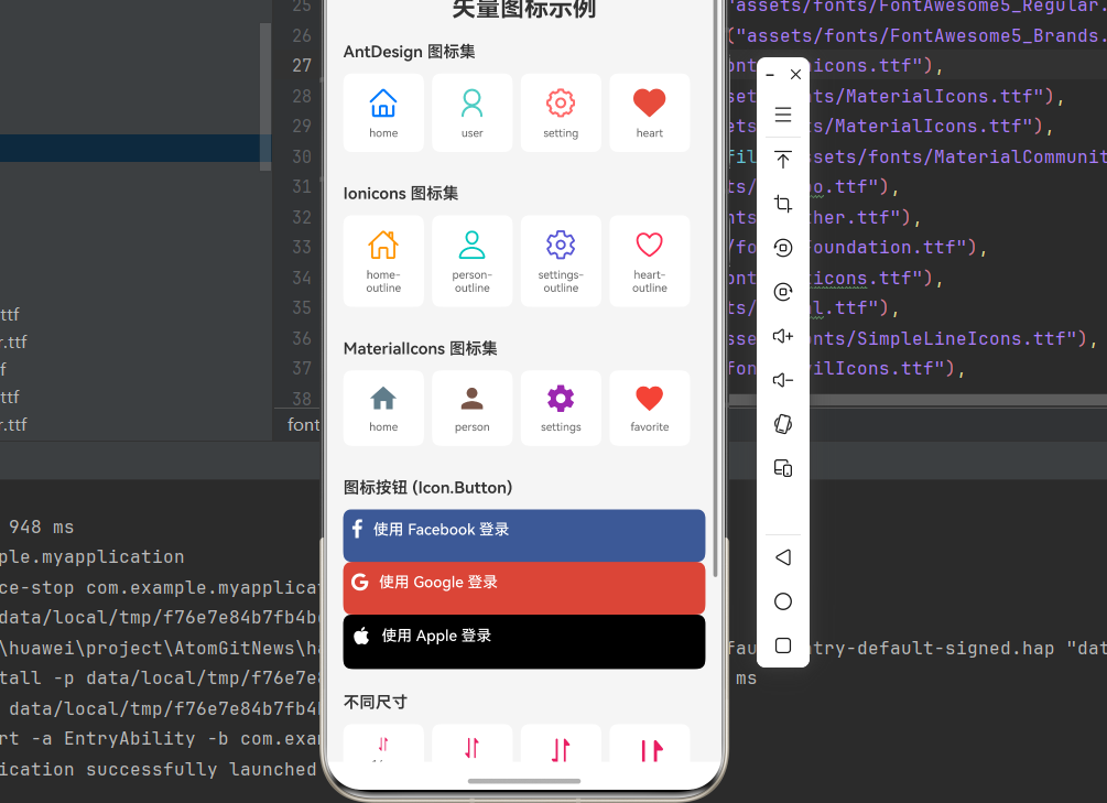
import React from 'react';
import { View, Text, StyleSheet, SafeAreaView, ScrollView, Alert, TouchableOpacity } from 'react-native';
import AntDesign from 'react-native-vector-icons/AntDesign';
import FontAwesome from 'react-native-vector-icons/FontAwesome';
import Ionicons from 'react-native-vector-icons/Ionicons';
import MaterialIcons from 'react-native-vector-icons/MaterialIcons';
import MaterialCommunityIcons from 'react-native-vector-icons/MaterialCommunityIcons';

interface IconItemProps {
  icon: React.ReactNode;
  name: string;
}

const IconItem: React.FC<IconItemProps> = ({ icon, name }) => (
  <View style={styles.iconItem}>
    {icon}
    <Text style={styles.iconName}>{name}</Text>
  </View>
);

const VectorIconsDemo: React.FC = () => {
  const handlePress = (name: string) => {
    Alert.alert('图标点击', `你点击了 ${name} 图标`);
  };

  return (
    <SafeAreaView style={styles.container}>
      <ScrollView contentContainerStyle={styles.content}>
        <Text style={styles.title}>矢量图标示例</Text>

        <View style={styles.section}>
          <Text style={styles.sectionTitle}>AntDesign 图标集</Text>
          <View style={styles.row}>
            <TouchableOpacity onPress={() => handlePress('home')}>
              <IconItem icon={<AntDesign name="home" size={32} color="#007AFF" />} name="home" />
            </TouchableOpacity>
            <TouchableOpacity onPress={() => handlePress('user')}>
              <IconItem icon={<AntDesign name="user" size={32} color="#4ECDC4" />} name="user" />
            </TouchableOpacity>
            <TouchableOpacity onPress={() => handlePress('setting')}>
              <IconItem icon={<AntDesign name="setting" size={32} color="#FF6B6B" />} name="setting" />
            </TouchableOpacity>
            <TouchableOpacity onPress={() => handlePress('heart')}>
              <IconItem icon={<AntDesign name="heart" size={32} color="#E74C3C" />} name="heart" />
            </TouchableOpacity>
          </View>
        </View>

        <View style={styles.section}>
          <Text style={styles.sectionTitle}>Ionicons 图标集</Text>
          <View style={styles.row}>
            <IconItem icon={<Ionicons name="home-outline" size={32} color="#FF9500" />} name="home-outline" />
            <IconItem icon={<Ionicons name="person-outline" size={32} color="#00C7BE" />} name="person-outline" />
            <IconItem icon={<Ionicons name="settings-outline" size={32} color="#5856D6" />} name="settings-outline" />
            <IconItem icon={<Ionicons name="heart-outline" size={32} color="#FF2D55" />} name="heart-outline" />
          </View>
        </View>

        <View style={styles.section}>
          <Text style={styles.sectionTitle}>MaterialIcons 图标集</Text>
          <View style={styles.row}>
            <IconItem icon={<MaterialIcons name="home" size={32} color="#607D8B" />} name="home" />
            <IconItem icon={<MaterialIcons name="person" size={32} color="#795548" />} name="person" />
            <IconItem icon={<MaterialIcons name="settings" size={32} color="#9C27B0" />} name="settings" />
            <IconItem icon={<MaterialIcons name="favorite" size={32} color="#F44336" />} name="favorite" />
          </View>
        </View>

        <View style={styles.section}>
          <Text style={styles.sectionTitle}>图标按钮 (Icon.Button)</Text>
          <FontAwesome.Button
            name="facebook"
            backgroundColor="#3b5998"
            borderRadius={8}
            style={styles.socialButton}
            onPress={() => Alert.alert('Facebook', 'Facebook 登录')}
          >
            <Text style={styles.buttonText}>使用 Facebook 登录</Text>
          </FontAwesome.Button>
          <FontAwesome.Button
            name="google"
            backgroundColor="#DB4437"
            borderRadius={8}
            style={styles.socialButton}
            onPress={() => Alert.alert('Google', 'Google 登录')}
          >
            <Text style={styles.buttonText}>使用 Google 登录</Text>
          </FontAwesome.Button>
          <Ionicons.Button
            name="logo-apple"
            backgroundColor="#000000"
            borderRadius={8}
            style={styles.socialButton}
            onPress={() => Alert.alert('Apple', 'Apple 登录')}
          >
            <Text style={styles.buttonText}>使用 Apple 登录</Text>
          </Ionicons.Button>
        </View>

        <View style={styles.section}>
          <Text style={styles.sectionTitle}>不同尺寸</Text>
          <View style={styles.row}>
            <IconItem icon={<MaterialCommunityIcons name="heart" size={16} color="#E91E63" />} name="16px" />
            <IconItem icon={<MaterialCommunityIcons name="heart" size={24} color="#E91E63" />} name="24px" />
            <IconItem icon={<MaterialCommunityIcons name="heart" size={32} color="#E91E63" />} name="32px" />
            <IconItem icon={<MaterialCommunityIcons name="heart" size={48} color="#E91E63" />} name="48px" />
          </View>
        </View>

        <View style={styles.section}>
          <Text style={styles.sectionTitle}>不同颜色</Text>
          <View style={styles.row}>
            <IconItem icon={<MaterialCommunityIcons name="star" size={32} color="#007AFF" />} name="蓝色" />
            <IconItem icon={<MaterialCommunityIcons name="star" size={32} color="#34C759" />} name="绿色" />
            <IconItem icon={<MaterialCommunityIcons name="star" size={32} color="#FF9500" />} name="橙色" />
            <IconItem icon={<MaterialCommunityIcons name="star" size={32} color="#FF3B30" />} name="红色" />
          </View>
        </View>
      </ScrollView>
    </SafeAreaView>
  );
};

const styles = StyleSheet.create({
  container: {
    flex: 1,
    backgroundColor: '#f5f5f5',
  },
  content: {
    padding: 16,
  },
  title: {
    fontSize: 24,
    fontWeight: 'bold',
    marginBottom: 20,
    textAlign: 'center',
    color: '#333',
  },
  section: {
    marginBottom: 24,
  },
  sectionTitle: {
    fontSize: 16,
    fontWeight: '600',
    marginBottom: 12,
    color: '#333',
  },
  row: {
    flexDirection: 'row',
    flexWrap: 'wrap',
    justifyContent: 'flex-start',
  },
  iconItem: {
    width: 80,
    alignItems: 'center',
    backgroundColor: '#fff',
    padding: 12,
    borderRadius: 8,
    marginRight: 8,
    marginBottom: 8,
  },
  iconName: {
    fontSize: 11,
    color: '#666',
    marginTop: 6,
    textAlign: 'center',
  },
  socialButton: {
    marginBottom: 12,
    paddingVertical: 10,
  },
  buttonText: {
    color: '#fff',
    fontSize: 15,
    fontWeight: '500',
  },
});

export default VectorIconsDemo;
❓ 七、常见问题
7.1 图标显示为方框或乱码
问题描述: 图标显示为方框 □ 或乱码。
解决方案:
- 确认字体文件已正确复制到
rawfile/assets/fonts目录 - 确认字体已在
Index.ets中正确注册 - 确认字体名称与图标集匹配
const fonts: Record<string, Resource> = {
    "AntDesign": $rawfile("assets/fonts/AntDesign.ttf"),
};
7.2 如何查找图标名称?
解决方案:
- 访问 React Native Vector Icons 目录
- 在页面中选择图标集,搜索图标
- 复制图标名称使用
7.3 如何使用自定义图标?
解决方案:
使用 createIconSet 创建自定义图标集:
import { createIconSet } from 'react-native-vector-icons';

const glyphMap = {
  'my-icon': 0xe001,
};

const MyIcon = createIconSet(glyphMap, 'MyIconFont', 'MyIconFont.ttf');
7.4 HarmonyOS 特殊配置
注意事项:
在 HarmonyOS 平台上使用图标时,建议添加以下样式以获得更好的显示效果:
<Icon
  name="home"
  size={24}
  color="#007AFF"
  style={{
    includeFontPadding: false,
    textAlignVertical: 'center'
  }}
/>
📋 八、属性参考
Icon 组件属性
| 属性 | 类型 | 必填 | 默认值 | 说明 |
|---|---|---|---|---|
| name | string | 是 | - | 图标名称 |
| size | number | 否 | 12 | 图标大小 |
| color | string | 否 | ‘black’ | 图标颜色 |
| style | StyleProp <TextStyle> |
否 | - | 自定义样式 |
| allowFontScaling | boolean | 否 | true | 是否跟随系统缩放 |
Icon.Button 组件属性
| 属性 | 类型 | 必填 | 默认值 | 说明 |
|---|---|---|---|---|
| name | string | 是 | - | 图标名称 |
| size | number | 否 | 12 | 图标大小 |
| color | string | 否 | ‘white’ | 图标颜色 |
| backgroundColor | string | 否 | ‘#007AFF’ | 按钮背景颜色 |
| borderRadius | number | 否 | 0 | 圆角大小 |
| onPress | function | 否 | - | 点击回调 |
| disabled | boolean | 否 | false | 是否禁用 |
| iconStyle | object | 否 | - | 图标样式 |
| buttonStyle | object | 否 | - | 按钮样式 |
| textStyle | object | 否 | - | 文本样式 |
📝 九、总结
react-native-vector-icons 为 HarmonyOS 平台提供了丰富的矢量图标解决方案,通过配置字体文件即可使用 3000+ 图标。通过本篇文章,你已经掌握了:
- 字体文件的配置方法
- 多种图标集的使用
- Icon 和 Icon.Button 组件的 API
- TabBar 图标的实现
- 自定义图标集的创建
开源协议
本项目基于 The MIT License (MIT) ,请自由地享受和参与开源。

作为“人工智能6S店”的官方数字引擎,为AI开发者与企业提供一个覆盖软硬件全栈、一站式门户。
更多推荐
 6
6 0
0- 0


 已为社区贡献8条内容

所有评论(0)