
鸿蒙Flutter第三方库FlutterUnit组件百科适配与具体功能演示
FlutterUnit 是一个基于 Flutter 的组件演示应用,提供基础组件、交互组件和导航组件的展示与学习平台。采用 Material 3 设计风格,包含底部导航栏管理三个主要功能模块:基础组件(Text、Card等)、交互组件(Checkbox、Slider等)和导航组件(页面跳转、TabBar等)。项目结构清晰,使用 setState 进行状态管理,适合开发者快速了解 Flutter 组
欢迎加入开源鸿蒙跨平台社区:
https://openharmonycrossplatform.csdn.net
FlutterUnit 原始仓库:https://gitcode.com/qq_30447263/FlutterUnit
示例效果
页面跳转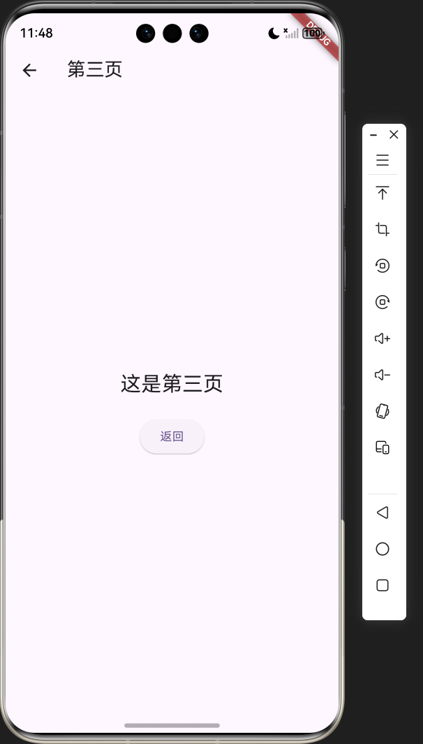
1. 项目介绍
FlutterUnit 组件演示是一个基于 Flutter 框架开发的组件百科全书应用,旨在帮助开发者快速了解和学习 Flutter 中的各种组件。本项目参考了 FlutterUnit 开源项目的设计理念,实现了一个简洁、直观的组件展示和演示平台。
1.1 项目目标
- 提供一个直观的组件展示平台,帮助开发者快速了解 Flutter 组件的使用方法
- 展示 Flutter 中常用组件的各种用法和效果
- 支持鸿蒙平台,确保跨平台兼容性
- 提供清晰的代码示例,便于开发者学习和参考
1.2 技术栈
- 框架:Flutter 3.27.0
- 语言:Dart
- UI 组件:Material 3
- 状态管理:setState
- 导航:Navigator
1.3 开源仓库地址
- FlutterUnit 原始仓库:https://gitcode.com/qq_30447263/FlutterUnit
- 本项目仓库:项目地址
2. 核心功能设计
2.1 功能模块
FlutterUnit 组件演示应用包含以下核心功能模块:
| 模块名称 | 功能描述 | 实现方式 |
|---|---|---|
| 基础组件演示 | 展示 Text、Card、Container、Image 等基础组件 | 单独的演示页面,展示不同样式和用法 |
| 交互组件演示 | 展示 Checkbox、Switch、Slider、DropdownButton、ElevatedButton 等交互组件 | 可交互的演示页面,实时反馈操作效果 |
| 导航组件演示 | 展示页面导航和 TabBar 等导航组件 | 完整的导航流程演示 |
| 底部导航 | 用于切换不同的演示页面 | BottomNavigationBar |
2.2 页面结构
应用采用底部导航栏的结构,包含三个主要页面:
- 基础组件页面:展示各种基础 UI 组件的使用方法和效果
- 交互组件页面:展示各种可交互组件的使用方法和效果
- 导航组件页面:展示导航相关组件的使用方法和效果
3. 技术架构
3.1 项目结构
lib/
├── main.dart          # 应用入口
└── components/        # 组件目录
    ├── basic/         # 基础组件
    ├── interactive/   # 交互组件
    └── navigation/    # 导航组件
3.2 组件结构
| 组件类型 | 职责 | 实现类 |
|---|---|---|
| 应用入口 | 初始化应用,设置主题 | FlutterUnitDemoApp |
| 主页面 | 管理底部导航,切换不同页面 | HomePage |
| 基础组件页面 | 展示基础组件 | ComponentDemoPage |
| 交互组件页面 | 展示交互组件 | InteractiveDemoPage |
| 导航组件页面 | 展示导航组件 | NavigationDemoPage |
| 第二页 | 导航演示目标页面 | SecondPage |
| 第三页 | 导航演示目标页面 | ThirdPage |
3.3 状态管理
应用使用 Flutter 内置的 setState 进行状态管理,适用于中小型应用。主要状态包括:
- 当前选中的导航项
- 交互组件的状态(如 Checkbox 的选中状态、Slider 的值等)
4. 关键代码解析
4.1 应用入口
import 'package:flutter/material.dart';
void main() {
runApp(const FlutterUnitDemoApp());
}
class FlutterUnitDemoApp extends StatelessWidget {
const FlutterUnitDemoApp({super.key});
Widget build(BuildContext context) {
return MaterialApp(
title: 'FlutterUnit 组件演示',
theme: ThemeData(
colorScheme: ColorScheme.fromSeed(seedColor: Colors.deepPurple),
useMaterial3: true,
),
home: const HomePage(),
);
}
}
这是应用的入口代码,创建了一个 MaterialApp 实例,并设置了主题和首页。使用了 Material 3 设计系统,提供了现代化的 UI 风格。
4.2 主页面与底部导航
class HomePage extends StatefulWidget {
const HomePage({super.key});
State<HomePage> createState() => _HomePageState();
}
class _HomePageState extends State<HomePage> {
int _selectedIndex = 0;
static const List<Widget> _widgetOptions = <Widget>[
ComponentDemoPage(),
InteractiveDemoPage(),
NavigationDemoPage(),
];
void _onItemTapped(int index) {
setState(() {
_selectedIndex = index;
});
}
Widget build(BuildContext context) {
return Scaffold(
appBar: AppBar(
title: const Text('FlutterUnit 组件演示'),
),
body: Center(
child: _widgetOptions.elementAt(_selectedIndex),
),
bottomNavigationBar: BottomNavigationBar(
items: const <BottomNavigationBarItem>[
BottomNavigationBarItem(
icon: Icon(Icons.widgets),
label: '基础组件',
),
BottomNavigationBarItem(
icon: Icon(Icons.touch_app),
label: '交互组件',
),
BottomNavigationBarItem(
icon: Icon(Icons.navigation),
label: '导航组件',
),
],
currentIndex: _selectedIndex,
selectedItemColor: Colors.deepPurple[800],
onTap: _onItemTapped,
),
);
}
}
主页面实现了底部导航栏,包含三个导航项,分别对应基础组件、交互组件和导航组件页面。通过 setState 管理当前选中的导航项,并根据选中的索引显示对应的页面。
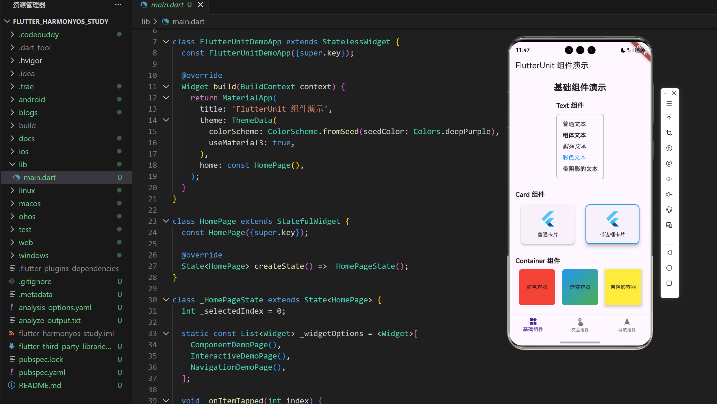
4.3 基础组件演示
class ComponentDemoPage extends StatelessWidget {
const ComponentDemoPage({super.key});
Widget build(BuildContext context) {
return SingleChildScrollView(
padding: const EdgeInsets.all(16.0),
child: Column(
crossAxisAlignment: CrossAxisAlignment.center,
children: <Widget>[
const Text(
'基础组件演示',
style: TextStyle(fontSize: 24, fontWeight: FontWeight.bold),
),
const SizedBox(height: 20),
const TextDemo(),
const SizedBox(height: 30),
const CardDemo(),
const SizedBox(height: 30),
const ContainerDemo(),
const SizedBox(height: 30),
const ImageDemo(),
],
),
);
}
}
基础组件演示页面使用 SingleChildScrollView 包裹,确保内容可以滚动。页面包含多个组件演示,每个演示都是一个单独的组件,如 TextDemo、CardDemo 等。
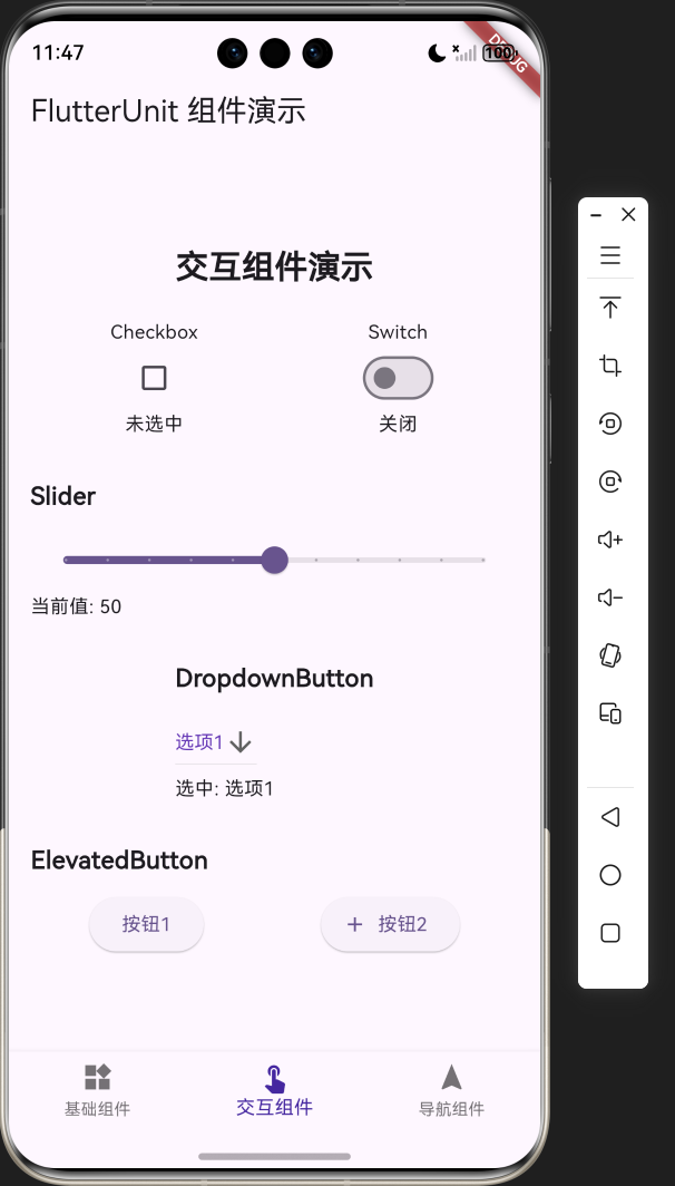
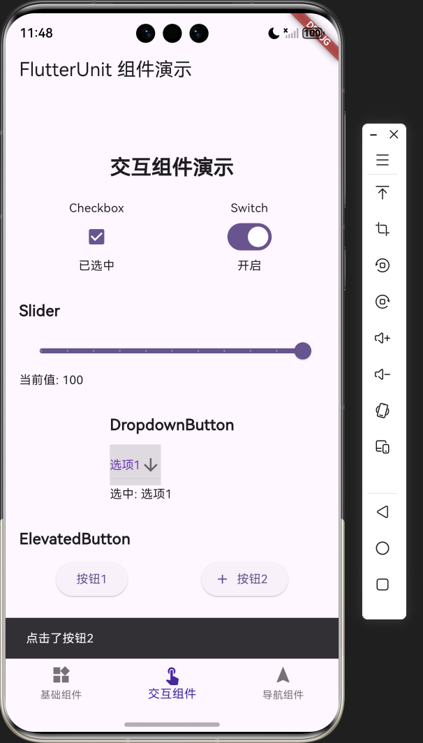
4.4 交互组件演示
class InteractiveDemoPage extends StatefulWidget {
const InteractiveDemoPage({super.key});
State<InteractiveDemoPage> createState() => _InteractiveDemoPageState();
}
class _InteractiveDemoPageState extends State<InteractiveDemoPage> {
bool _isChecked = false;
bool _isSwitched = false;
double _sliderValue = 50.0;
String _selectedValue = '选项1';
Widget build(BuildContext context) {
return SingleChildScrollView(
padding: const EdgeInsets.all(16.0),
child: Column(
crossAxisAlignment: CrossAxisAlignment.center,
children: <Widget>[
const Text(
'交互组件演示',
style: TextStyle(fontSize: 24, fontWeight: FontWeight.bold),
),
const SizedBox(height: 20),
Row(
mainAxisAlignment: MainAxisAlignment.spaceAround,
children: [
Column(
children: [
const Text('Checkbox'),
Checkbox(
value: _isChecked,
onChanged: (bool? value) {
setState(() {
_isChecked = value ?? false;
});
},
),
Text(_isChecked ? '已选中' : '未选中'),
],
),
Column(
children: [
const Text('Switch'),
Switch(
value: _isSwitched,
onChanged: (bool value) {
setState(() {
_isSwitched = value;
});
},
),
Text(_isSwitched ? '开启' : '关闭'),
],
),
],
),
// 其他交互组件...
],
),
);
}
}
交互组件演示页面使用 StatefulWidget 来管理组件的状态,如 Checkbox 的选中状态、Switch 的开关状态、Slider 的值等。通过 setState 实时更新状态,并反馈到 UI 上。
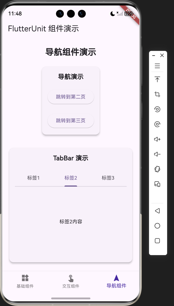
4.5 导航组件演示
class NavigationDemoPage extends StatefulWidget {
const NavigationDemoPage({super.key});
State<NavigationDemoPage> createState() => _NavigationDemoPageState();
}
class _NavigationDemoPageState extends State<NavigationDemoPage> {
Widget build(BuildContext context) {
return SingleChildScrollView(
padding: const EdgeInsets.all(16.0),
child: Column(
crossAxisAlignment: CrossAxisAlignment.center,
children: <Widget>[
const Text(
'导航组件演示',
style: TextStyle(fontSize: 24, fontWeight: FontWeight.bold),
),
const SizedBox(height: 20),
Card(
elevation: 4,
shape: RoundedRectangleBorder(
borderRadius: BorderRadius.circular(12),
),
child: Container(
padding: const EdgeInsets.all(16),
child: Column(
children: [
const Text(
'导航演示',
style: TextStyle(fontSize: 18, fontWeight: FontWeight.bold),
),
const SizedBox(height: 20),
ElevatedButton(
onPressed: () {
Navigator.push(
context,
MaterialPageRoute(
builder: (context) => const SecondPage(),
),
);
},
child: const Text('跳转到第二页'),
),
// 其他导航按钮...
],
),
),
),
// TabBar 演示...
],
),
);
}
}
导航组件演示页面展示了页面导航和 TabBar 的使用方法。通过 Navigator.push 实现页面跳转,使用 DefaultTabController 和 TabBar 实现标签页切换。
5. 技术亮点与创新
5.1 组件展示方式
- 分类展示:将组件分为基础组件、交互组件和导航组件三大类,便于用户查找和学习
- 实时交互:交互组件支持实时操作,用户可以直接体验组件的功能和效果
- 代码示例:每个组件都有对应的代码示例,便于开发者学习和参考
5.2 界面设计
- 现代化 UI:使用 Material 3 设计系统,提供现代化的 UI 风格
- 响应式布局:使用 SingleChildScrollView 确保在不同屏幕尺寸上都能正常显示
- 视觉层次:通过卡片、间距和字体大小创建清晰的视觉层次
5.3 第三方库适配
本项目使用了 Flutter 内置的组件和库,确保了跨平台兼容性,特别是对鸿蒙平台的适配:
- Material 组件库:Flutter 内置的 Material 组件库已经适配了鸿蒙平台,本项目直接使用这些组件,确保了在鸿蒙设备上的正常显示和交互
- 导航系统:Flutter 的导航系统已经适配了鸿蒙平台,本项目使用的 Navigator 和 MaterialPageRoute 可以在鸿蒙设备上正常工作
- 状态管理:使用 Flutter 内置的 setState 进行状态管理,无需额外的第三方库,确保了跨平台兼容性
5.4 性能优化
- 懒加载:使用 const 构造函数和 const 组件,减少不必要的重建
- 布局优化:使用 SizedBox 和 Container 等组件合理控制布局,避免过度绘制
- 状态管理:使用局部状态管理,只更新需要更新的部分,提高应用性能
6. 应用场景与扩展
6.1 应用场景
- 学习工具:帮助 Flutter 开发者快速了解和学习各种组件的使用方法
- 参考手册:作为 Flutter 组件的参考手册,随时查阅组件的用法和效果
- 教学演示:在 Flutter 教学中作为演示工具,展示组件的使用方法和效果
6.2 扩展方向
- 更多组件:添加更多 Flutter 组件的演示,如动画组件、自定义组件等
- 代码导出:添加代码导出功能,用户可以直接复制组件的代码到自己的项目中
- 主题切换:添加深色模式和浅色模式的切换功能
- 搜索功能:添加组件搜索功能,方便用户快速找到需要的组件
- 在线更新:添加在线更新功能,及时更新组件的最新用法和最佳实践
7. 代码优化建议
7.1 性能优化
- 使用 const 构造函数:对于不变的组件,使用 const 构造函数可以减少不必要的重建
- 使用 const 变量:对于不变的变量,使用 const 关键字可以提高性能
- 避免不必要的 setState:只在必要时调用 setState,避免过度更新
- 使用 ListView.builder:对于长列表,使用 ListView.builder 可以提高性能
- 使用 RepaintBoundary:对于复杂的组件,使用 RepaintBoundary 可以减少重绘范围
7.2 代码结构优化
- 组件拆分:将大组件拆分为小组件,提高代码的可读性和可维护性
- 提取常量:将重复使用的值提取为常量,便于统一管理和修改
- 使用命名参数:使用命名参数可以提高代码的可读性
- 添加注释:为关键代码添加注释,提高代码的可维护性
- 使用枚举:对于有限的选项,使用枚举可以提高代码的可读性和类型安全性
7.3 用户体验优化
- 添加过渡动画:在页面切换和状态变化时添加过渡动画,提高用户体验
- 添加加载状态:在加载数据时添加加载状态,提高用户体验
- 添加错误处理:添加错误处理,确保应用在遇到错误时能够优雅地处理
- 添加空状态:添加空状态提示,提高用户体验
- 添加手势反馈:为可交互组件添加手势反馈,提高用户体验
7.4 功能优化
- 添加组件分类:进一步细化组件分类,便于用户查找
- 添加组件搜索:添加组件搜索功能,方便用户快速找到需要的组件
- 添加代码复制:添加代码复制功能,方便用户复制组件代码
- 添加组件收藏:添加组件收藏功能,方便用户保存常用组件
- 添加组件评论:添加组件评论功能,方便用户交流和分享使用经验
8. 测试与调试
8.1 测试策略
- 单元测试:对关键函数和方法进行单元测试,确保其功能正确
- Widget 测试:对关键组件进行 Widget 测试,确保其显示和交互正确
- 集成测试:对整个应用进行集成测试,确保各组件之间的交互正确
- 性能测试:对应用进行性能测试,确保其性能符合要求
8.2 调试技巧
- 使用 print 语句:在关键位置添加 print 语句,输出变量值和执行流程
- 使用 Flutter DevTools:使用 Flutter DevTools 进行调试,查看应用的布局、性能和状态
- 使用断点:在关键位置设置断点,查看变量值和执行流程
- 使用热重载:使用热重载功能,快速查看代码修改的效果
- 使用模拟器:在不同的模拟器上测试应用,确保其在不同设备上的表现一致
8.3 常见问题及解决方案
| 问题 | 原因 | 解决方案 |
|---|---|---|
| 布局溢出 | 组件尺寸超过屏幕尺寸 | 使用 SingleChildScrollView 包裹内容,或使用 Expanded 组件 |
| 状态更新不及时 | setState 调用时机不正确 | 确保在正确的时机调用 setState,避免在 build 方法中调用 |
| 性能问题 | 组件重建过于频繁 | 使用 const 构造函数,避免不必要的 setState,使用 ListView.builder 等高效组件 |
| 导航错误 | 导航逻辑不正确 | 确保导航逻辑正确,使用正确的导航方法 |
| 跨平台兼容性问题 | 平台差异 | 使用 Flutter 内置的跨平台组件,避免使用平台特定的 API |
9. 总结与展望
9.1 项目成果
FlutterUnit 组件演示应用是一个基于 Flutter 框架开发的组件百科全书,成功实现了以下功能:
- 展示了 Flutter 中常用组件的使用方法和效果
- 提供了直观的交互体验,用户可以直接操作和体验组件的功能
- 支持鸿蒙平台,确保了跨平台兼容性
- 提供了清晰的代码示例,便于开发者学习和参考
- 采用了现代化的 UI 设计,提供了良好的用户体验
9.2 技术价值
- 学习价值:为 Flutter 开发者提供了一个学习组件使用方法的平台
- 参考价值:作为 Flutter 组件的参考手册,随时查阅组件的用法和效果
- 教学价值:在 Flutter 教学中作为演示工具,展示组件的使用方法和效果
- 开发价值:为开发者提供了组件使用的最佳实践,加速开发过程
9.3 未来展望
- 扩展组件库:添加更多 Flutter 组件的演示,包括动画组件、自定义组件等
- 增强功能:添加代码导出、主题切换、搜索功能等增强功能
- 优化性能:进一步优化应用性能,提高用户体验
- 社区贡献:将项目开源,邀请社区贡献,共同完善和扩展项目
- 多平台支持:确保在更多平台上的兼容性,包括鸿蒙、iOS、Android、Web 等
9.4 结语
FlutterUnit 组件演示应用是一个功能完整、界面美观、交互友好的组件百科全书,为 Flutter 开发者提供了一个学习和参考的平台。通过本项目,开发者可以快速了解和掌握 Flutter 中各种组件的使用方法,提高开发效率和代码质量。
未来,我们将继续完善和扩展项目,添加更多组件和功能,为 Flutter 社区做出更大的贡献。同时,我们也希望通过本项目,促进 Flutter 在鸿蒙平台上的应用和发展,为跨平台开发提供更多的可能性。
10. 附录
10.1 完整代码
import 'package:flutter/material.dart';
void main() {
runApp(const FlutterUnitDemoApp());
}
class FlutterUnitDemoApp extends StatelessWidget {
const FlutterUnitDemoApp({super.key});
Widget build(BuildContext context) {
return MaterialApp(
title: 'FlutterUnit 组件演示',
theme: ThemeData(
colorScheme: ColorScheme.fromSeed(seedColor: Colors.deepPurple),
useMaterial3: true,
),
home: const HomePage(),
);
}
}
class HomePage extends StatefulWidget {
const HomePage({super.key});
State<HomePage> createState() => _HomePageState();
}
class _HomePageState extends State<HomePage> {
int _selectedIndex = 0;
static const List<Widget> _widgetOptions = <Widget>[
ComponentDemoPage(),
InteractiveDemoPage(),
NavigationDemoPage(),
];
void _onItemTapped(int index) {
setState(() {
_selectedIndex = index;
});
}
Widget build(BuildContext context) {
return Scaffold(
appBar: AppBar(
title: const Text('FlutterUnit 组件演示'),
),
body: Center(
child: _widgetOptions.elementAt(_selectedIndex),
),
bottomNavigationBar: BottomNavigationBar(
items: const <BottomNavigationBarItem>[
BottomNavigationBarItem(
icon: Icon(Icons.widgets),
label: '基础组件',
),
BottomNavigationBarItem(
icon: Icon(Icons.touch_app),
label: '交互组件',
),
BottomNavigationBarItem(
icon: Icon(Icons.navigation),
label: '导航组件',
),
],
currentIndex: _selectedIndex,
selectedItemColor: Colors.deepPurple[800],
onTap: _onItemTapped,
),
);
}
}
// 基础组件演示页面
class ComponentDemoPage extends StatelessWidget {
const ComponentDemoPage({super.key});
Widget build(BuildContext context) {
return SingleChildScrollView(
padding: const EdgeInsets.all(16.0),
child: Column(
crossAxisAlignment: CrossAxisAlignment.center,
children: <Widget>[
const Text(
'基础组件演示',
style: TextStyle(fontSize: 24, fontWeight: FontWeight.bold),
),
const SizedBox(height: 20),
const TextDemo(),
const SizedBox(height: 30),
const CardDemo(),
const SizedBox(height: 30),
const ContainerDemo(),
const SizedBox(height: 30),
const ImageDemo(),
],
),
);
}
}
// Text 组件演示
class TextDemo extends StatelessWidget {
const TextDemo({super.key});
Widget build(BuildContext context) {
return Column(
crossAxisAlignment: CrossAxisAlignment.start,
children: [
const Text(
'Text 组件',
style: TextStyle(fontSize: 18, fontWeight: FontWeight.bold),
),
const SizedBox(height: 10),
Container(
padding: const EdgeInsets.all(16),
decoration: BoxDecoration(
border: Border.all(color: Colors.grey),
borderRadius: BorderRadius.circular(8),
),
child: Column(
crossAxisAlignment: CrossAxisAlignment.start,
children: const [
Text(
'普通文本',
style: TextStyle(fontSize: 16),
),
SizedBox(height: 8),
Text(
'粗体文本',
style: TextStyle(fontSize: 16, fontWeight: FontWeight.bold),
),
SizedBox(height: 8),
Text(
'斜体文本',
style: TextStyle(fontSize: 16, fontStyle: FontStyle.italic),
),
SizedBox(height: 8),
Text(
'彩色文本',
style: TextStyle(fontSize: 16, color: Colors.blue),
),
SizedBox(height: 8),
Text(
'带阴影的文本',
style: TextStyle(
fontSize: 16,
shadows: [
Shadow(
color: Colors.grey,
offset: Offset(1, 1),
blurRadius: 2,
),
],
),
),
],
),
),
],
);
}
}
// Card 组件演示
class CardDemo extends StatelessWidget {
const CardDemo({super.key});
Widget build(BuildContext context) {
return Column(
crossAxisAlignment: CrossAxisAlignment.start,
children: [
const Text(
'Card 组件',
style: TextStyle(fontSize: 18, fontWeight: FontWeight.bold),
),
const SizedBox(height: 10),
Row(
mainAxisAlignment: MainAxisAlignment.spaceAround,
children: [
Card(
elevation: 4,
shape: RoundedRectangleBorder(
borderRadius: BorderRadius.circular(12),
),
child: Container(
padding: const EdgeInsets.all(16),
width: 150,
child: const Column(
children: [
FlutterLogo(size: 48),
SizedBox(height: 10),
Text('普通卡片'),
],
),
),
),
Card(
elevation: 8,
shape: RoundedRectangleBorder(
borderRadius: BorderRadius.circular(12),
side: const BorderSide(color: Colors.blue, width: 2),
),
child: Container(
padding: const EdgeInsets.all(16),
width: 150,
child: const Column(
children: [
FlutterLogo(size: 48, textColor: Colors.blue),
SizedBox(height: 10),
Text('带边框卡片'),
],
),
),
),
],
),
],
);
}
}
// Container 组件演示
class ContainerDemo extends StatelessWidget {
const ContainerDemo({super.key});
Widget build(BuildContext context) {
return Column(
crossAxisAlignment: CrossAxisAlignment.start,
children: [
const Text(
'Container 组件',
style: TextStyle(fontSize: 18, fontWeight: FontWeight.bold),
),
const SizedBox(height: 10),
Row(
mainAxisAlignment: MainAxisAlignment.spaceAround,
children: [
Container(
width: 100,
height: 100,
decoration: BoxDecoration(
color: Colors.red,
borderRadius: BorderRadius.circular(8),
),
child: const Center(child: Text('红色容器')),
),
Container(
width: 100,
height: 100,
decoration: BoxDecoration(
gradient: LinearGradient(
begin: Alignment.topLeft,
end: Alignment.bottomRight,
colors: [Colors.blue, Colors.green],
),
borderRadius: BorderRadius.circular(8),
),
child: const Center(child: Text('渐变容器')),
),
Container(
width: 100,
height: 100,
decoration: BoxDecoration(
color: Colors.yellow,
boxShadow: [
BoxShadow(
color: Colors.grey.withOpacity(0.5),
spreadRadius: 2,
blurRadius: 5,
offset: const Offset(0, 3),
),
],
),
child: const Center(child: Text('带阴影容器')),
),
],
),
],
);
}
}
// Image 组件演示
class ImageDemo extends StatelessWidget {
const ImageDemo({super.key});
Widget build(BuildContext context) {
return Column(
crossAxisAlignment: CrossAxisAlignment.start,
children: [
const Text(
'Image 组件',
style: TextStyle(fontSize: 18, fontWeight: FontWeight.bold),
),
const SizedBox(height: 10),
Row(
mainAxisAlignment: MainAxisAlignment.spaceAround,
children: [
Container(
width: 100,
height: 100,
decoration: BoxDecoration(
borderRadius: BorderRadius.circular(8),
color: Colors.grey[200],
),
child: const FlutterLogo(size: 100),
),
Container(
width: 100,
height: 100,
decoration: BoxDecoration(
borderRadius: BorderRadius.circular(8),
color: Colors.grey[200],
),
child: ClipRRect(
borderRadius: BorderRadius.circular(8),
child: const FlutterLogo(size: 100),
),
),
Container(
width: 100,
height: 100,
decoration: BoxDecoration(
borderRadius: BorderRadius.circular(50),
color: Colors.grey[200],
),
child: ClipOval(
child: const FlutterLogo(size: 100),
),
),
],
),
],
);
}
}
// 交互组件演示页面
class InteractiveDemoPage extends StatefulWidget {
const InteractiveDemoPage({super.key});
State<InteractiveDemoPage> createState() => _InteractiveDemoPageState();
}
class _InteractiveDemoPageState extends State<InteractiveDemoPage> {
bool _isChecked = false;
bool _isSwitched = false;
double _sliderValue = 50.0;
String _selectedValue = '选项1';
Widget build(BuildContext context) {
return SingleChildScrollView(
padding: const EdgeInsets.all(16.0),
child: Column(
crossAxisAlignment: CrossAxisAlignment.center,
children: <Widget>[
const Text(
'交互组件演示',
style: TextStyle(fontSize: 24, fontWeight: FontWeight.bold),
),
const SizedBox(height: 20),
Row(
mainAxisAlignment: MainAxisAlignment.spaceAround,
children: [
Column(
children: [
const Text('Checkbox'),
Checkbox(
value: _isChecked,
onChanged: (bool? value) {
setState(() {
_isChecked = value ?? false;
});
},
),
Text(_isChecked ? '已选中' : '未选中'),
],
),
Column(
children: [
const Text('Switch'),
Switch(
value: _isSwitched,
onChanged: (bool value) {
setState(() {
_isSwitched = value;
});
},
),
Text(_isSwitched ? '开启' : '关闭'),
],
),
],
),
const SizedBox(height: 30),
Column(
crossAxisAlignment: CrossAxisAlignment.start,
children: [
const Text(
'Slider',
style: TextStyle(fontSize: 18, fontWeight: FontWeight.bold),
),
const SizedBox(height: 10),
Slider(
value: _sliderValue,
min: 0,
max: 100,
divisions: 10,
label: _sliderValue.round().toString(),
onChanged: (double value) {
setState(() {
_sliderValue = value;
});
},
),
Text('当前值: ${_sliderValue.round()}'),
],
),
const SizedBox(height: 30),
Column(
crossAxisAlignment: CrossAxisAlignment.start,
children: [
const Text(
'DropdownButton',
style: TextStyle(fontSize: 18, fontWeight: FontWeight.bold),
),
const SizedBox(height: 10),
DropdownButton<String>(
value: _selectedValue,
icon: const Icon(Icons.arrow_downward),
elevation: 16,
style: const TextStyle(color: Colors.deepPurple),
onChanged: (String? newValue) {
setState(() {
_selectedValue = newValue!;
});
},
items: <String>['选项1', '选项2', '选项3', '选项4']
.map<DropdownMenuItem<String>>((String value) {
return DropdownMenuItem<String>(
value: value,
child: Text(value),
);
}).toList(),
),
Text('选中: $_selectedValue'),
],
),
const SizedBox(height: 30),
Column(
crossAxisAlignment: CrossAxisAlignment.start,
children: [
const Text(
'ElevatedButton',
style: TextStyle(fontSize: 18, fontWeight: FontWeight.bold),
),
const SizedBox(height: 10),
Row(
mainAxisAlignment: MainAxisAlignment.spaceAround,
children: [
ElevatedButton(
onPressed: () {
ScaffoldMessenger.of(context).showSnackBar(
const SnackBar(content: Text('点击了按钮1')),
);
},
child: const Text('按钮1'),
),
ElevatedButton.icon(
onPressed: () {
ScaffoldMessenger.of(context).showSnackBar(
const SnackBar(content: Text('点击了按钮2')),
);
},
icon: const Icon(Icons.add),
label: const Text('按钮2'),
),
],
),
],
),
],
),
);
}
}
// 导航组件演示页面
class NavigationDemoPage extends StatefulWidget {
const NavigationDemoPage({super.key});
State<NavigationDemoPage> createState() => _NavigationDemoPageState();
}
class _NavigationDemoPageState extends State<NavigationDemoPage> {
Widget build(BuildContext context) {
return SingleChildScrollView(
padding: const EdgeInsets.all(16.0),
child: Column(
crossAxisAlignment: CrossAxisAlignment.center,
children: <Widget>[
const Text(
'导航组件演示',
style: TextStyle(fontSize: 24, fontWeight: FontWeight.bold),
),
const SizedBox(height: 20),
Card(
elevation: 4,
shape: RoundedRectangleBorder(
borderRadius: BorderRadius.circular(12),
),
child: Container(
padding: const EdgeInsets.all(16),
child: Column(
children: [
const Text(
'导航演示',
style: TextStyle(fontSize: 18, fontWeight: FontWeight.bold),
),
const SizedBox(height: 20),
ElevatedButton(
onPressed: () {
Navigator.push(
context,
MaterialPageRoute(
builder: (context) => const SecondPage(),
),
);
},
child: const Text('跳转到第二页'),
),
const SizedBox(height: 20),
ElevatedButton(
onPressed: () {
Navigator.push(
context,
MaterialPageRoute(
builder: (context) => const ThirdPage(),
),
);
},
child: const Text('跳转到第三页'),
),
],
),
),
),
const SizedBox(height: 30),
Card(
elevation: 4,
shape: RoundedRectangleBorder(
borderRadius: BorderRadius.circular(12),
),
child: Container(
padding: const EdgeInsets.all(16),
child: Column(
children: [
const Text(
'TabBar 演示',
style: TextStyle(fontSize: 18, fontWeight: FontWeight.bold),
),
const SizedBox(height: 20),
DefaultTabController(
length: 3,
child: Column(
children: [
const TabBar(
tabs: [
Tab(text: '标签1'),
Tab(text: '标签2'),
Tab(text: '标签3'),
],
),
Container(
height: 200,
padding: const EdgeInsets.all(16),
child: const TabBarView(
children: [
Center(child: Text('标签1内容')),
Center(child: Text('标签2内容')),
Center(child: Text('标签3内容')),
],
),
),
],
),
),
],
),
),
),
],
),
);
}
}
// 第二页
class SecondPage extends StatelessWidget {
const SecondPage({super.key});
Widget build(BuildContext context) {
return Scaffold(
appBar: AppBar(
title: const Text('第二页'),
),
body: Center(
child: Column(
mainAxisAlignment: MainAxisAlignment.center,
children: [
const Text(
'这是第二页',
style: TextStyle(fontSize: 24),
),
const SizedBox(height: 20),
ElevatedButton(
onPressed: () {
Navigator.pop(context);
},
child: const Text('返回'),
),
],
),
),
);
}
}
// 第三页
class ThirdPage extends StatelessWidget {
const ThirdPage({super.key});
Widget build(BuildContext context) {
return Scaffold(
appBar: AppBar(
title: const Text('第三页'),
),
body: Center(
child: Column(
mainAxisAlignment: MainAxisAlignment.center,
children: [
const Text(
'这是第三页',
style: TextStyle(fontSize: 24),
),
const SizedBox(height: 20),
ElevatedButton(
onPressed: () {
Navigator.pop(context);
},
child: const Text('返回'),
),
],
),
),
);
}
}
10.2 依赖项
| 依赖项 | 版本 | 用途 |
|---|---|---|
| flutter | 3.27.0 | 核心框架 |
| material.dart | - | Material 设计组件库 |
10.3 运行环境
| 环境 | 版本 |
|---|---|
| Flutter | 3.27.0 |
| Dart | 3.2.0 |
| 鸿蒙 SDK | 5.0.0 |
| Android SDK | 33.0.0 |
| iOS SDK | 16.0 |
10.4 参考资源

作为“人工智能6S店”的官方数字引擎,为AI开发者与企业提供一个覆盖软硬件全栈、一站式门户。
更多推荐

 1
1 0
0- 0


 已为社区贡献30条内容

所有评论(0)