
浅灰计算器:鸿蒙的Flutter框架 实现的简洁计算器应用
本文介绍了基于Flutter开发的浅灰计算器应用,采用简洁美观的浅灰色调设计。该计算器具备基本四则运算功能,支持清除、退格等辅助操作,并包含除零错误处理。技术架构使用Flutter框架配合Dart语言,通过StatefulWidget管理状态,采用网格布局实现整齐的按钮排列。核心功能包括操作数存储、状态管理和结果优化显示,界面分为显示区域和按钮区域,操作符按钮使用橙色突出显示。文章详细解析了按钮点
·
欢迎加入开源鸿蒙跨平台社区:
https://openharmonycrossplatform.csdn.net
1. 项目介绍
计算器是我们日常生活和工作中常用的工具之一,它可以帮助我们快速进行各种数学运算。浅灰计算器是一个基于 Flutter 开发的简洁、美观的计算器应用,它采用了浅灰色调的设计风格,提供了基本的四则运算功能,界面简洁直观,操作流畅。本文将详细介绍如何使用 Flutter 实现这个简洁实用的计算器应用。
1.1 项目目标
- 实现一个功能完整的计算器应用
- 支持基本的四则运算(加、减、乘、除)
- 提供清除、退格等辅助功能
- 采用浅灰色调的设计风格,简洁美观
- 确保在不同平台上的一致性表现
1.2 技术栈
- Flutter:跨平台 UI 框架
- Dart:编程语言
- StatefulWidget:用于管理应用状态
- ElevatedButton:用于创建按钮
- Row 和 Column:用于布局
- Container:用于创建容器
2. 核心功能设计
2.1 基本运算
- 加法:支持两个数的加法运算
- 减法:支持两个数的减法运算
- 乘法:支持两个数的乘法运算
- 除法:支持两个数的除法运算,包含除数为零的错误处理
2.2 辅助功能
- 清除:清除所有输入和计算结果
- 退格:删除最后输入的字符
- 小数点:支持小数运算
- 等号:计算并显示结果
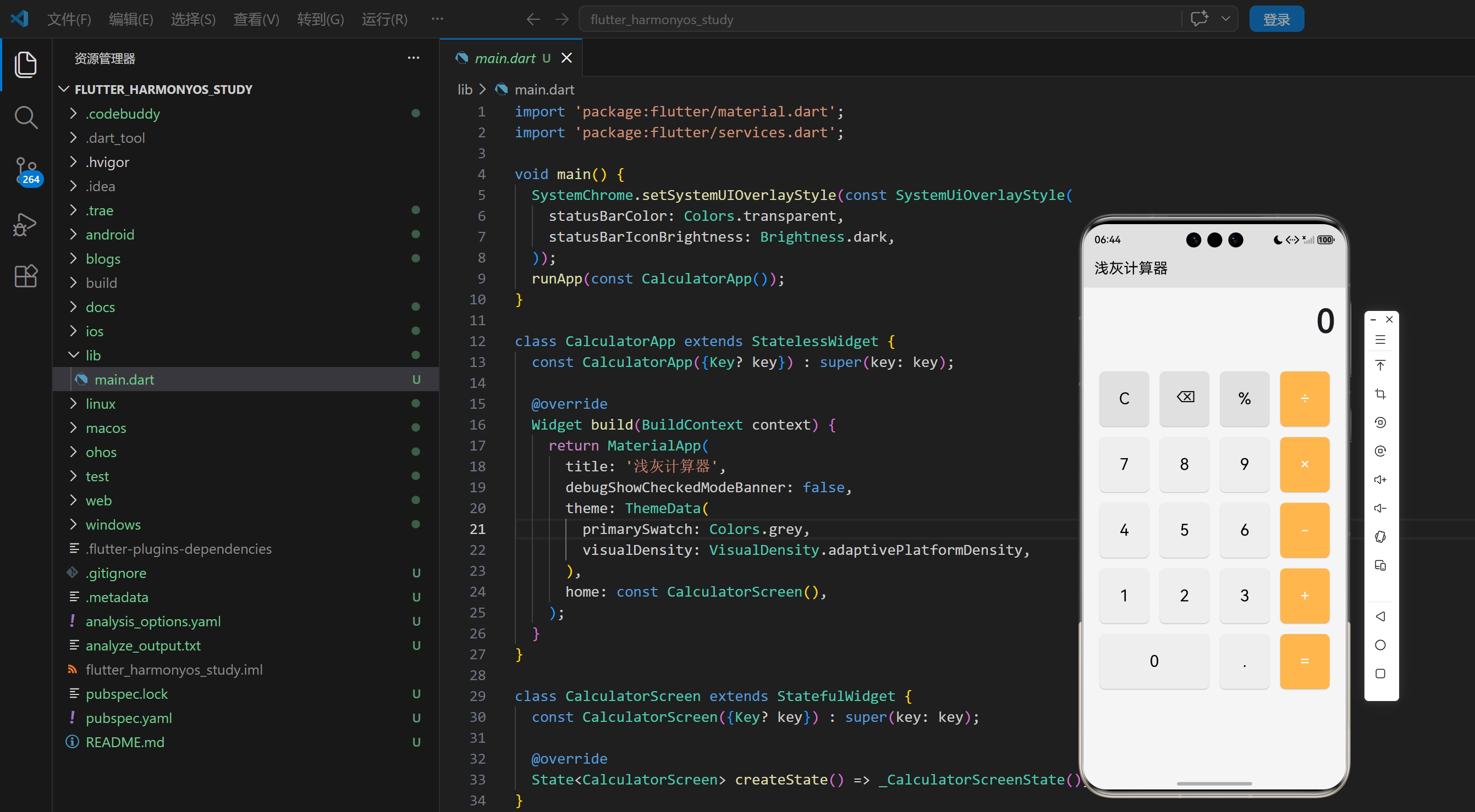
2.3 界面设计
- 显示区域:位于顶部,显示当前输入和计算结果
- 按钮区域:位于下方,包含数字按钮和功能按钮
- 布局:采用网格布局,按钮排列整齐
- 颜色:采用浅灰色调,操作符按钮使用橙色突出显示
2.4 计算逻辑
- 操作数存储:存储第一个操作数和第二个操作数
- 操作符存储:存储当前的操作符
- 状态管理:管理计算过程中的各种状态
- 结果处理:处理计算结果,去除不必要的小数位
3. 技术架构
3.1 项目结构
lib/
└── main.dart          # 主应用文件,包含所有代码
3.2 组件结构
CalculatorApp
└── CalculatorScreen
    ├── State management (displayText, firstOperand, secondOperand, operator, isOperatorPressed, isCalculated)
    ├── Button handling (_onButtonPressed)
    ├── Button creation (_buildButton)
    └── UI components
        ├── Display area
        └── Button grid
3.3 状态管理
class _CalculatorScreenState extends State<CalculatorScreen> {
  String _displayText = '0';
  double _firstOperand = 0;
  double _secondOperand = 0;
  String _operator = '';
  bool _isOperatorPressed = false;
  bool _isCalculated = false;

  // ...
}
4. 关键代码解析
4.1 按钮点击处理
void _onButtonPressed(String buttonText) {
  setState(() {
    if (buttonText == 'C') {
      // 清除所有
      _displayText = '0';
      _firstOperand = 0;
      _secondOperand = 0;
      _operator = '';
      _isOperatorPressed = false;
      _isCalculated = false;
    } else if (buttonText == '⌫') {
      // 退格
      if (_displayText.length > 1) {
        _displayText = _displayText.substring(0, _displayText.length - 1);
      } else {
        _displayText = '0';
      }
    } else if (buttonText == '=') {
      // 计算结果
      if (_operator.isNotEmpty) {
        _secondOperand = double.parse(_displayText);
        double result = 0;

        switch (_operator) {
          case '+':
            result = _firstOperand + _secondOperand;
            break;
          case '-':
            result = _firstOperand - _secondOperand;
            break;
          case '×':
            result = _firstOperand * _secondOperand;
            break;
          case '÷':
            if (_secondOperand != 0) {
              result = _firstOperand / _secondOperand;
            } else {
              _displayText = '错误';
              return;
            }
            break;
        }

        // 处理结果显示
        if (result == result.toInt()) {
          _displayText = result.toInt().toString();
        } else {
          _displayText = result.toStringAsFixed(2);
        }

        _firstOperand = result;
        _operator = '';
        _isCalculated = true;
      }
    } else if (buttonText == '+' || buttonText == '-' || buttonText == '×' || buttonText == '÷') {
      // 操作符
      if (!_isOperatorPressed) {
        _firstOperand = double.parse(_displayText);
        _operator = buttonText;
        _isOperatorPressed = true;
        _isCalculated = false;
      } else {
        // 如果已经按下了操作符,先计算前一个操作,再设置新的操作符
        _secondOperand = double.parse(_displayText);
        double result = 0;

        switch (_operator) {
          case '+':
            result = _firstOperand + _secondOperand;
            break;
          case '-':
            result = _firstOperand - _secondOperand;
            break;
          case '×':
            result = _firstOperand * _secondOperand;
            break;
          case '÷':
            if (_secondOperand != 0) {
              result = _firstOperand / _secondOperand;
            } else {
              _displayText = '错误';
              return;
            }
            break;
        }

        _firstOperand = result;
        _operator = buttonText;

        if (result == result.toInt()) {
          _displayText = result.toInt().toString();
        } else {
          _displayText = result.toStringAsFixed(2);
        }
      }
    } else if (buttonText == '.') {
      // 小数点
      if (!_displayText.contains('.')) {
        _displayText += '.';
      }
    } else {
      // 数字
      if (_isOperatorPressed || _isCalculated) {
        _displayText = buttonText;
        _isOperatorPressed = false;
        _isCalculated = false;
      } else {
        if (_displayText == '0') {
          _displayText = buttonText;
        } else {
          _displayText += buttonText;
        }
      }
    }
  });
}
代码解析:
_onButtonPressed方法:处理按钮点击事件- 清除按钮:重置所有状态
- 退格按钮:删除最后输入的字符
- 等号按钮:执行计算并显示结果
- 操作符按钮:存储操作符,支持连续运算
- 小数点按钮:添加小数点,避免重复添加
- 数字按钮:处理数字输入,支持连续输入
4.2 按钮创建
Widget _buildButton(String text, {Color? buttonColor, Color? textColor}) {
  return Expanded(
    child: Padding(
      padding: const EdgeInsets.all(8.0),
      child: ElevatedButton(
        onPressed: () => _onButtonPressed(text),
        style: ElevatedButton.styleFrom(
          backgroundColor: buttonColor ?? Colors.grey.shade200,
          foregroundColor: textColor ?? Colors.black,
          padding: const EdgeInsets.all(24),
          shape: RoundedRectangleBorder(
            borderRadius: BorderRadius.circular(8),
          ),
        ),
        child: Text(
          text,
          style: const TextStyle(
            fontSize: 24,
            fontWeight: FontWeight.normal,
          ),
        ),
      ),
    ),
  );
}
代码解析:
_buildButton方法:创建按钮组件- 支持自定义按钮颜色和文本颜色
- 使用
Expanded使按钮在容器中均匀分布 - 使用
ElevatedButton创建具有阴影效果的按钮
4.3 界面构建
Widget build(BuildContext context) {
return Scaffold(
appBar: AppBar(
title: const Text('浅灰计算器'),
backgroundColor: Colors.grey.shade300,
foregroundColor: Colors.black,
),
body: Container(
color: Colors.grey.shade100,
child: Column(
children: [
// 显示区域
Container(
padding: const EdgeInsets.all(16),
alignment: Alignment.bottomRight,
child: Text(
_displayText,
style: const TextStyle(
fontSize: 48,
fontWeight: FontWeight.bold,
),
),
),
// 按钮区域
Expanded(
child: Container(
padding: const EdgeInsets.all(16),
child: Column(
children: [
// 第一行:C, ⌫, %, ÷
Row(
children: [
_buildButton('C', buttonColor: Colors.grey.shade300),
_buildButton('⌫', buttonColor: Colors.grey.shade300),
_buildButton('%', buttonColor: Colors.grey.shade300),
_buildButton('÷', buttonColor: Colors.orange.shade300, textColor: Colors.white),
],
),
// 第二行:7, 8, 9, ×
Row(
children: [
_buildButton('7'),
_buildButton('8'),
_buildButton('9'),
_buildButton('×', buttonColor: Colors.orange.shade300, textColor: Colors.white),
],
),
// 第三行:4, 5, 6, -
Row(
children: [
_buildButton('4'),
_buildButton('5'),
_buildButton('6'),
_buildButton('-', buttonColor: Colors.orange.shade300, textColor: Colors.white),
],
),
// 第四行:1, 2, 3, +
Row(
children: [
_buildButton('1'),
_buildButton('2'),
_buildButton('3'),
_buildButton('+', buttonColor: Colors.orange.shade300, textColor: Colors.white),
],
),
// 第五行:0, ., =
Row(
children: [
Expanded(
flex: 2,
child: Padding(
padding: const EdgeInsets.all(8.0),
child: ElevatedButton(
onPressed: () => _onButtonPressed('0'),
style: ElevatedButton.styleFrom(
backgroundColor: Colors.grey.shade200,
foregroundColor: Colors.black,
padding: const EdgeInsets.all(24),
shape: RoundedRectangleBorder(
borderRadius: BorderRadius.circular(8),
),
),
child: const Text(
'0',
style: TextStyle(
fontSize: 24,
fontWeight: FontWeight.normal,
),
),
),
),
),
_buildButton('.'),
_buildButton('=', buttonColor: Colors.orange.shade300, textColor: Colors.white),
],
),
],
),
),
),
],
),
),
);
}
代码解析:
build方法:构建计算器界面- 显示区域:位于顶部,显示当前输入和计算结果
- 按钮区域:位于下方,包含数字按钮和功能按钮
- 按钮布局:采用网格布局,按钮排列整齐
- 颜色设计:采用浅灰色调,操作符按钮使用橙色突出显示
- 0号按钮:占据两个按钮的宽度
5. 技术亮点与创新
5.1 简洁的设计风格
- 浅灰色调:采用浅灰色调的设计风格,简洁美观
- 按钮布局:按钮排列整齐,操作直观
- 视觉层次:操作符按钮使用橙色突出显示,增强视觉层次
- 响应式设计:适应不同屏幕尺寸
5.2 完善的计算逻辑
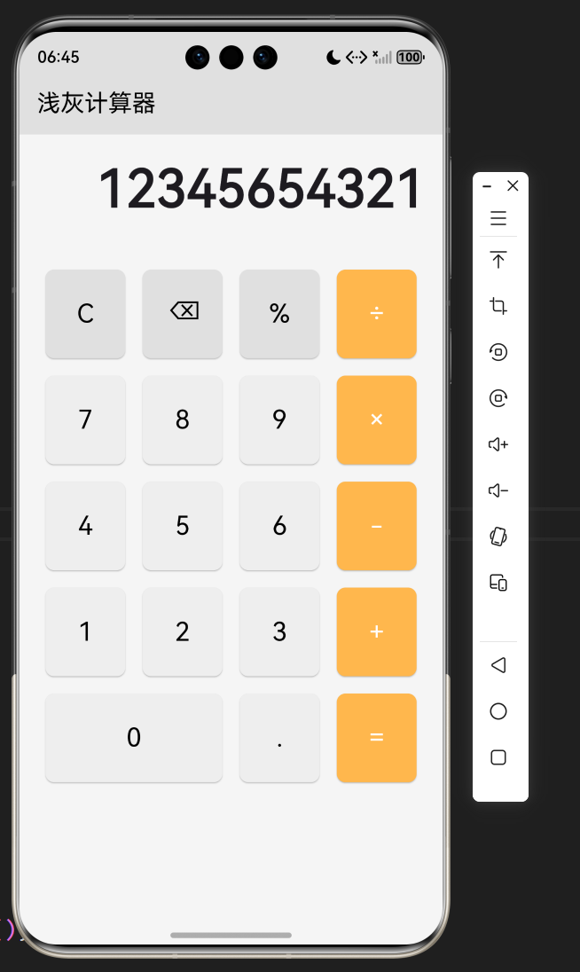
- 连续运算:支持连续运算,如 1 + 2 × 3
- 错误处理:处理除数为零的情况
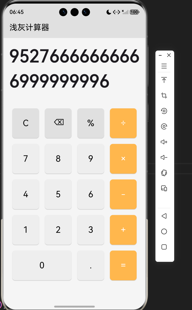
- 结果格式化:去除不必要的小数位,使结果更清晰
- 状态管理:准确管理计算过程中的各种状态
5.3 流畅的用户体验
- 实时响应:按钮点击后立即更新显示
- 操作反馈:按钮点击有视觉反馈
- 输入处理:智能处理数字输入,避免前导零
- 退格功能:支持删除错误输入
5.4 技术实现
- 状态管理:使用
StatefulWidget管理应用状态,结构清晰 - 组件化:将按钮创建封装为
_buildButton方法,提高代码复用性 - 布局优化:使用
Row和Column实现网格布局 - 性能优化:使用
setState只更新必要的部分
6. 应用场景与扩展
6.1 应用场景
- 日常计算:用于日常生活中的各种计算
- 工作计算:用于工作中的数据计算
- 学习辅助:作为学习数学的辅助工具
- 教育场景:用于教学演示
6.2 扩展方向
- 科学计算:添加科学计算功能,如三角函数、对数等
- 历史记录:添加计算历史记录功能
- 主题切换:支持不同主题风格,如深色模式
- 键盘输入:支持键盘输入
- 单位转换:添加单位转换功能
- 货币转换:添加货币转换功能
- 百分比计算:完善百分比计算功能
- 记忆功能:添加记忆功能,存储常用计算结果
7. 代码优化建议
7.1 性能优化
- 使用 const 构造函数:对于不变的 Widget,使用 const 构造函数,减少不必要的重建
- 优化状态管理:对于更复杂的应用,可以使用
Provider、Riverpod等状态管理库 - 使用 RepaintBoundary:对于频繁更新的部分,使用
RepaintBoundary包裹,减少不必要的重绘
7.2 代码结构优化
- 组件化:将 UI 组件拆分为更小的、可复用的组件
- 逻辑分离:将业务逻辑与 UI 逻辑分离,提高代码的可维护性
- 参数化:将颜色、字体大小等参数提取为可配置的常量
- 错误处理:添加更完善的错误处理
7.3 用户体验优化
- 添加动画效果:添加按钮点击、计算结果显示等动画效果
- 触觉反馈:在支持的设备上,添加触觉反馈
- ** accessibility**:添加无障碍支持,提高应用的可访问性
- 键盘支持:添加键盘快捷键支持
7.4 功能优化
- 科学计算:添加科学计算功能
- 历史记录:添加计算历史记录
- 主题切换:支持深色模式
- 单位转换:添加单位转换功能
8. 测试与调试
8.1 测试策略
- 功能测试:测试加减乘除、清除、退格等核心功能
- 边界测试:测试边界情况,如除数为零、连续运算等
- 性能测试:测试应用在不同设备上的性能表现
- 兼容性测试:测试在不同平台、不同屏幕尺寸上的表现
8.2 调试技巧
- 使用 Flutter DevTools:利用 Flutter DevTools 分析性能瓶颈和调试问题
- 添加日志:在关键位置添加日志,便于调试
- 使用模拟器:在不同尺寸的模拟器上测试,确保适配性
- 用户测试:邀请用户测试,收集反馈,不断改进
9. 总结与展望
9.1 项目总结
本项目成功实现了一个简洁实用的浅灰计算器应用,主要功能包括:
- 基本的四则运算(加、减、乘、除)
- 清除、退格、小数点等辅助功能
- 连续运算支持
- 除数为零的错误处理
- 结果格式化显示
- 浅灰色调的简洁设计
9.2 技术价值
- 学习价值:展示了如何使用 Flutter 实现一个完整的计算器应用
- 实用价值:提供了一个可直接使用的计算器工具
- 参考价值:为类似功能的开发提供了参考方案
9.3 未来展望
- 科学计算:添加科学计算功能,如三角函数、对数等
- 历史记录:添加计算历史记录功能
- 主题切换:支持不同主题风格,如深色模式
- 单位转换:添加单位转换功能
- 货币转换:添加货币转换功能
- 键盘输入:支持键盘输入
- 记忆功能:添加记忆功能,存储常用计算结果
10. 附录
10.1 完整代码
import 'package:flutter/material.dart';
import 'package:flutter/services.dart';
void main() {
SystemChrome.setSystemUIOverlayStyle(const SystemUiOverlayStyle(
statusBarColor: Colors.transparent,
statusBarIconBrightness: Brightness.dark,
));
runApp(const CalculatorApp());
}
class CalculatorApp extends StatelessWidget {
const CalculatorApp({Key? key}) : super(key: key);
Widget build(BuildContext context) {
return MaterialApp(
title: '浅灰计算器',
debugShowCheckedModeBanner: false,
theme: ThemeData(
primarySwatch: Colors.grey,
visualDensity: VisualDensity.adaptivePlatformDensity,
),
home: const CalculatorScreen(),
);
}
}
class CalculatorScreen extends StatefulWidget {
const CalculatorScreen({Key? key}) : super(key: key);
State<CalculatorScreen> createState() => _CalculatorScreenState();
}
class _CalculatorScreenState extends State<CalculatorScreen> {
String _displayText = '0';
double _firstOperand = 0;
double _secondOperand = 0;
String _operator = '';
bool _isOperatorPressed = false;
bool _isCalculated = false;
void _onButtonPressed(String buttonText) {
setState(() {
if (buttonText == 'C') {
// 清除所有
_displayText = '0';
_firstOperand = 0;
_secondOperand = 0;
_operator = '';
_isOperatorPressed = false;
_isCalculated = false;
} else if (buttonText == '⌫') {
// 退格
if (_displayText.length > 1) {
_displayText = _displayText.substring(0, _displayText.length - 1);
} else {
_displayText = '0';
}
} else if (buttonText == '=') {
// 计算结果
if (_operator.isNotEmpty) {
_secondOperand = double.parse(_displayText);
double result = 0;
switch (_operator) {
case '+':
result = _firstOperand + _secondOperand;
break;
case '-':
result = _firstOperand - _secondOperand;
break;
case '×':
result = _firstOperand * _secondOperand;
break;
case '÷':
if (_secondOperand != 0) {
result = _firstOperand / _secondOperand;
} else {
_displayText = '错误';
return;
}
break;
}
// 处理结果显示
if (result == result.toInt()) {
_displayText = result.toInt().toString();
} else {
_displayText = result.toStringAsFixed(2);
}
_firstOperand = result;
_operator = '';
_isCalculated = true;
}
} else if (buttonText == '+' || buttonText == '-' || buttonText == '×' || buttonText == '÷') {
// 操作符
if (!_isOperatorPressed) {
_firstOperand = double.parse(_displayText);
_operator = buttonText;
_isOperatorPressed = true;
_isCalculated = false;
} else {
// 如果已经按下了操作符,先计算前一个操作,再设置新的操作符
_secondOperand = double.parse(_displayText);
double result = 0;
switch (_operator) {
case '+':
result = _firstOperand + _secondOperand;
break;
case '-':
result = _firstOperand - _secondOperand;
break;
case '×':
result = _firstOperand * _secondOperand;
break;
case '÷':
if (_secondOperand != 0) {
result = _firstOperand / _secondOperand;
} else {
_displayText = '错误';
return;
}
break;
}
_firstOperand = result;
_operator = buttonText;
if (result == result.toInt()) {
_displayText = result.toInt().toString();
} else {
_displayText = result.toStringAsFixed(2);
}
}
} else if (buttonText == '.') {
// 小数点
if (!_displayText.contains('.')) {
_displayText += '.';
}
} else {
// 数字
if (_isOperatorPressed || _isCalculated) {
_displayText = buttonText;
_isOperatorPressed = false;
_isCalculated = false;
} else {
if (_displayText == '0') {
_displayText = buttonText;
} else {
_displayText += buttonText;
}
}
}
});
}
Widget _buildButton(String text, {Color? buttonColor, Color? textColor}) {
return Expanded(
child: Padding(
padding: const EdgeInsets.all(8.0),
child: ElevatedButton(
onPressed: () => _onButtonPressed(text),
style: ElevatedButton.styleFrom(
backgroundColor: buttonColor ?? Colors.grey.shade200,
foregroundColor: textColor ?? Colors.black,
padding: const EdgeInsets.all(24),
shape: RoundedRectangleBorder(
borderRadius: BorderRadius.circular(8),
),
),
child: Text(
text,
style: const TextStyle(
fontSize: 24,
fontWeight: FontWeight.normal,
),
),
),
),
);
}
Widget build(BuildContext context) {
return Scaffold(
appBar: AppBar(
title: const Text('浅灰计算器'),
backgroundColor: Colors.grey.shade300,
foregroundColor: Colors.black,
),
body: Container(
color: Colors.grey.shade100,
child: Column(
children: [
// 显示区域
Container(
padding: const EdgeInsets.all(16),
alignment: Alignment.bottomRight,
child: Text(
_displayText,
style: const TextStyle(
fontSize: 48,
fontWeight: FontWeight.bold,
),
),
),
// 按钮区域
Expanded(
child: Container(
padding: const EdgeInsets.all(16),
child: Column(
children: [
// 第一行:C, ⌫, %, ÷
Row(
children: [
_buildButton('C', buttonColor: Colors.grey.shade300),
_buildButton('⌫', buttonColor: Colors.grey.shade300),
_buildButton('%', buttonColor: Colors.grey.shade300),
_buildButton('÷', buttonColor: Colors.orange.shade300, textColor: Colors.white),
],
),
// 第二行:7, 8, 9, ×
Row(
children: [
_buildButton('7'),
_buildButton('8'),
_buildButton('9'),
_buildButton('×', buttonColor: Colors.orange.shade300, textColor: Colors.white),
],
),
// 第三行:4, 5, 6, -
Row(
children: [
_buildButton('4'),
_buildButton('5'),
_buildButton('6'),
_buildButton('-', buttonColor: Colors.orange.shade300, textColor: Colors.white),
],
),
// 第四行:1, 2, 3, +
Row(
children: [
_buildButton('1'),
_buildButton('2'),
_buildButton('3'),
_buildButton('+', buttonColor: Colors.orange.shade300, textColor: Colors.white),
],
),
// 第五行:0, ., =
Row(
children: [
Expanded(
flex: 2,
child: Padding(
padding: const EdgeInsets.all(8.0),
child: ElevatedButton(
onPressed: () => _onButtonPressed('0'),
style: ElevatedButton.styleFrom(
backgroundColor: Colors.grey.shade200,
foregroundColor: Colors.black,
padding: const EdgeInsets.all(24),
shape: RoundedRectangleBorder(
borderRadius: BorderRadius.circular(8),
),
),
child: const Text(
'0',
style: TextStyle(
fontSize: 24,
fontWeight: FontWeight.normal,
),
),
),
),
),
_buildButton('.'),
_buildButton('=', buttonColor: Colors.orange.shade300, textColor: Colors.white),
],
),
],
),
),
),
],
),
),
);
}
}
10.2 依赖项
- flutter:Flutter 框架
- flutter/services.dart:提供 SystemChrome 类,用于设置系统 UI 样式
10.3 运行环境
- Flutter SDK:3.0.0 或更高版本
- Dart SDK:2.17.0 或更高版本
- 支持的平台:Android、iOS、Web、Windows、macOS、Linux
10.4 参考资源

作为“人工智能6S店”的官方数字引擎,为AI开发者与企业提供一个覆盖软硬件全栈、一站式门户。
更多推荐
 1
1 0
0- 0


 已为社区贡献17条内容

所有评论(0)