
鸿蒙 hdsEffect 模块全解析:从点光源到流光,视效开发实战指南
本文详解鸿蒙 hdsEffect 视效模块。该模块隶属于 @kit.UIDesignKit,以 HdsEffectBuilder 为核心,通过链式调用可快速实现点光源、按压阴影、双边流光、背景流光等高级视效,无需复杂 Shader 开发。文章逐一解析各视效的支持组件、核心特性与使用场景,搭配完整代码示例与真机实测建议,同时点明 TV 设备流光效果不兼容、性能优化、适度使用等开发避坑要点,助力开发者
鸿蒙视效技术详解
!!重要提醒:文中所有动态视效(点光源交互、流光、按压反馈等),静态截图均无法呈现真实动态美感,建议大家用真机实测,才能感受到满屏炫酷效果哦
概述
鸿蒙系统从API 6.0.0(20)版本开始,通过hdsEffect模块提供了强大的组件拓展视效能力。该模块位于@kit.UIDesignKit包中,为开发者提供了一套完整的视觉特效解决方案,包括点光源效果、按压阴影、双边流光、背景流光等多种视效功能。这些视效能力极大地提升了应用界面的视觉表现力和用户体验,使开发者能够轻松创建出富有吸引力和交互性的用户界面。
hdsEffect模块的核心是HdsEffectBuilder类,它采用链式调用的方式构建各种视觉效果,最终通过buildEffect()方法生成VisualEffect对象并应用到组件上。这种设计模式使得视效的配置和使用变得简洁直观,开发者可以根据实际需求灵活组合不同的视效效果。
点光源效果
如果说普通组件是“平面画”,那点光源效果就是给它加了“3D滤镜”!它模拟现实世界的光源照明,能让组件瞬间跳出屏幕,层次感直接翻倍。只要用HdsEffectBuilder的pointLight()方法,就能轻松实现“一盏灯照亮一片组件”的神奇效果,氛围感直接拉满。
支持的组件
点光源效果支持多种组件类型,包括:Button、Toggle、Row、Column、Image、Flex、Stack、Select、Menu、MenuItem。这意味着开发者可以在各种UI元素上应用点光源效果,创造出丰富的视觉体验。
核心特性
-
多光源支持:单个组件最多可以同时受12个光源照亮,这为创建复杂的光照效果提供了可能。
-
光源类型:通过
PointLightSourceType枚举可以设置光源类型,包括NONE(无光源)和BRIGHT(亮光源)等选项。 -
被照亮类型:通过
PointLightIlluminatedType枚举可以设置被照亮的区域,如BORDER(边框)等。 -
位置特性:光源位置初始化为组件正中心,但不会跟随组件的位移而变化位置。这一特性需要特别注意,因此不建议在滚动组件中使用点光源效果。
使用示例
import { hdsEffect } from '@kit.UIDesignKit';
@Entry
@Component
struct Index {
  @State bloomValue: number = 0;
  @State index: number = 0;
  @State illuminatedType: hdsEffect.PointLightIlluminatedType = hdsEffect.PointLightIlluminatedType.NONE;
  @State button_gradient_state: hdsEffect.PressShadowType = hdsEffect.PressShadowType.NONE;
  @State lightIntensity: number = 10;
  @State types: hdsEffect.PointLightIlluminatedType[] =
    [hdsEffect.PointLightIlluminatedType.NONE, hdsEffect.PointLightIlluminatedType.BORDER,
      hdsEffect.PointLightIlluminatedType.CONTENT, hdsEffect.PointLightIlluminatedType.BORDER_CONTENT,
      hdsEffect.PointLightIlluminatedType.DEFAULT_FEATHERING_BORDER];

  build() {
    Flex({
      direction: FlexDirection.Column,
      justifyContent: FlexAlign.Center,
      alignItems: ItemAlign.Center,
    }) {
      // 纵向循环
      ForEach(Array<number>(4).fill(0), (row: number) => {
        Flex({
          direction: FlexDirection.Row,
          justifyContent: FlexAlign.Center,
          alignItems: ItemAlign.Center,
        }) {
          // 横向循环
          ForEach(Array<number>(4).fill(0), (col: number) => {
            Flex()
              .visualEffect(new hdsEffect.HdsEffectBuilder().pointLight({
                illuminatedType: this.illuminatedType,
              }).buildEffect())
              .backgroundColor(0x808080)
              .size({ width: 60, height: 60 })
              .borderRadius(50)
              .margin({ top: 20, right: 10, left: 10 }) // 添加间距
          })
        }
        .width('100%') // 设置 Row 组件的宽度为 100%
      })

      Flex({
        direction: FlexDirection.Row,
        justifyContent: FlexAlign.Center, // 使用 SpaceBetween 来均匀分布间距
        alignItems: ItemAlign.Center,
      }) {
        Flex()
          .visualEffect(new hdsEffect.HdsEffectBuilder().pointLight({
            illuminatedType: this.illuminatedType,
          }).buildEffect())
          .backgroundColor(0x808080)
          .size({ width: 60, height: 60 })
          .borderRadius(50)
          .margin({ top: 20, right: 10, left: 10 })

        Button('点击发光')
          .size({ width: 140, height: 60 })
          .backgroundColor(0x808080)
          .fontColor(0xADD8E6)
          .visualEffect(new hdsEffect.HdsEffectBuilder()
            .pressShadow(this.button_gradient_state)
            .pointLight({
              options: {
                color: Color.White,
                intensity: this.lightIntensity,
                height: 150
              }
            })
            .pressShadow(this.button_gradient_state)
            .buildEffect())
          .onClick(() => {
            if (this.index <= 3) {
              this.index++;
              this.illuminatedType = this.types[this.index];
              this.button_gradient_state = hdsEffect.PressShadowType.BLEND_GRADIENT;
            }
            let message = 'NONE';
            if (this.illuminatedType == 1) {
              message = 'BORDER';
            } else if (this.illuminatedType == 2) {
              message = 'CONTENT';
            } else if (this.illuminatedType == 3) {
              message = 'BORDER_CONTENT';
            } else {
              message = 'DEFAULT_FEATHERING_BORDER';
            }
            this.getUIContext().getPromptAction().showToast({
              message: message,
              duration: 2000,
              bottom: '80%'
            });
          })
          .margin({ top: 20, right: 10, left: 10 })

        Flex()
          .visualEffect(new hdsEffect.HdsEffectBuilder().pointLight({
            illuminatedType: this.illuminatedType,
          }).buildEffect())
          .backgroundColor(0x808080)
          .size({ width: 60, height: 60 })
          .borderRadius(50)
          .margin({ top: 20, right: 10, left: 10 })
      }
      .width('100%') // 设置 Row 组件的宽度为 100%

      ForEach(Array<number>(4).fill(0), (row: number) => {
        Flex({
          direction: FlexDirection.Row,
          justifyContent: FlexAlign.Center,
          alignItems: ItemAlign.Center,
        }) {
          // 横向循环
          ForEach(Array<number>(4).fill(0), (col: number) => {
            Flex()
              .visualEffect(new hdsEffect.HdsEffectBuilder().pointLight({
                illuminatedType: this.illuminatedType,
              }).buildEffect())
              .backgroundColor(0x808080)
              .size({ width: 60, height: 60 })
              .borderRadius(50)
              .margin({ top: 20, right: 10, left: 10 })
          })
        }
        .width('100%') // 设置 Row 组件的宽度为 100%
      })
    }
    .backgroundColor(Color.Black)
  }
}
这个示例展示了如何创建一个交互式的点光源效果,当用户按下按钮时,按钮会变成光源,照亮周围的组件,重复点击触发不同点光源效果。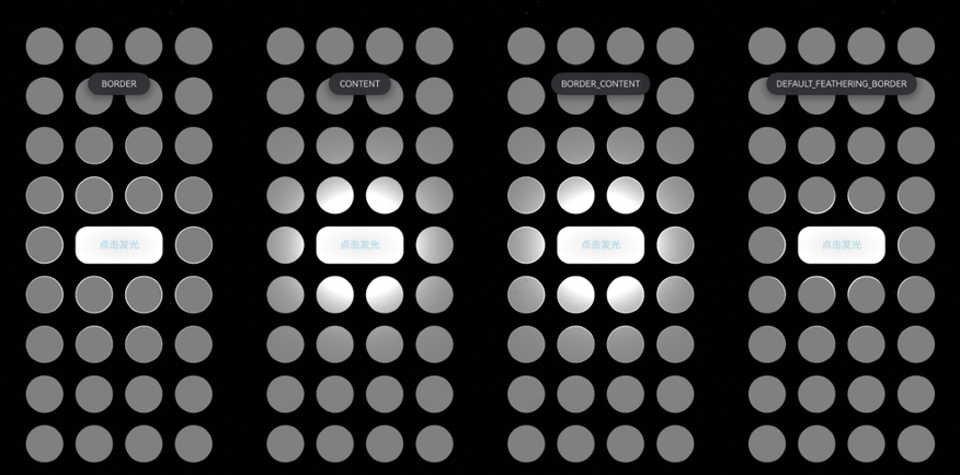
按压阴影
按压阴影效果是专门为Button组件设计的视效功能,它通过HdsEffectBuilder的pressShadow()方法实现,主要用于增强按钮的按压反馈效果,让用户在点击按钮时获得更直观的视觉反馈。
功能特点
-
组件限制:按压阴影效果仅在Button组件上生效,这是其最大的使用限制。
-
按压反馈:一般用于组件按压后背景色变化,提供更丰富的交互体验。
-
多种效果类型:通过
PressShadowType枚举提供多种按压阴影效果:NONE:无按压阴影效果BLEND_WHITE:白色混合按压效果BLEND_GRADIENT:渐变混合按压效果
使用示例
import { hdsEffect } from '@kit.UIDesignKit';

@Entry
@Component
struct PressShadowExample {
  @State button_blend_state: hdsEffect.PressShadowType = hdsEffect.PressShadowType.NONE;
  @State button_gradient_state: hdsEffect.PressShadowType = hdsEffect.PressShadowType.NONE;

  build() {
    NavDestination() {
      Column({ space: 50 }) {
        Button("BLEND_WHITE", { buttonStyle: ButtonStyleMode.EMPHASIZED, role: ButtonRole.ERROR, stateEffect: false })
          .visualEffect(new hdsEffect.HdsEffectBuilder()
            .pressShadow(this.button_blend_state)
            .buildEffect())
          .onTouch((event: TouchEvent) => {
            if (event.type === TouchType.Down) {
              this.button_blend_state = hdsEffect.PressShadowType.BLEND_WHITE;
            } else if (event.type === TouchType.Up || event.type === TouchType.Cancel) {
              this.button_blend_state = hdsEffect.PressShadowType.NONE;
            }
          })

        Button("GRADIENT", { buttonStyle: ButtonStyleMode.NORMAL, stateEffect: false })
          .visualEffect(new hdsEffect.HdsEffectBuilder()
            .pressShadow(this.button_gradient_state)
            .buildEffect())
          .onTouch((event: TouchEvent) => {
            if (event.type === TouchType.Down) {
              this.button_gradient_state = hdsEffect.PressShadowType.BLEND_GRADIENT;
            } else if (event.type === TouchType.Up || event.type === TouchType.Cancel) {
              this.button_gradient_state = hdsEffect.PressShadowType.NONE;
            }
          })
      }
      .height('70%')
      .justifyContent(FlexAlign.Center)
    }
    .width('100%')
    .height('100%')
    .title('Button example')
    .backgroundColor('#040404')
  }
}
按压前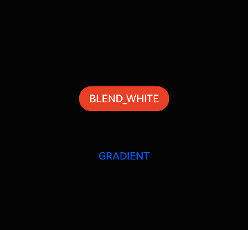
按压后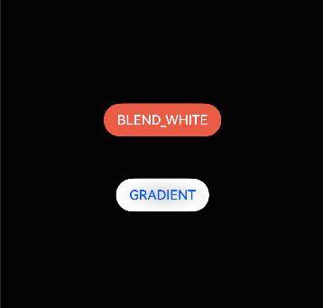
这个示例展示了两种不同的按压阴影效果:白色混合效果和白色渐变混合效果(截图展示效果不好建议真机测试),开发者可以根据设计需求选择合适的按压反馈方式。
双边流光
双边流光是一种高级的视觉效果,通过shaderEffect()方法实现,能够在组件边缘创建两条流动的光线效果,为界面增添动感和科技感。
视效类型
双边流光对应EffectType枚举中的DUAL_EDGE_FLOW_LIGHT值(值为0)。需要注意的是,该视效在TV设备中无效果,但在其他设备类型中可以正常显示。
参数配置
双边流光通过DualEdgeFlowLightParam类型进行参数配置,包含两个边缘流光参数:
- firstEdgeFlowLight:第一条流光参数配置
- secondEdgeFlowLight:第二条流光参数配置
每条流光通过EdgeFlowLightParam配置,包含以下属性:
startPos:流光起始位置endPos:流光结束位置color:流光颜色
动画控制
双边流光支持完整的动画参数配置,包括:
duration:动画播放一次时间(毫秒),默认1000msiterations:播放次数,-1为重复执行,默认1次curve:动画曲线delay:延迟播放时间autoPlay:是否自动执行,默认trueonFinish:结束回调函数expectedFrameRateRange:帧率设置
使用示例
import { hdsEffect } from '@kit.UIDesignKit';

@Entry
@Component
struct DualEdgeFlowLightExample {
  @State controller: hdsEffect.ShaderEffectController = new hdsEffect.ShaderEffectController();

  build() {
    Column() {
      Stack() {
      }
      .visualEffect(new hdsEffect.HdsEffectBuilder()
        .shaderEffect({
          effectType: hdsEffect.EffectType.DUAL_EDGE_FLOW_LIGHT,
          animation: {
            duration: 4000,
            iterations: -1,
            autoPlay: true,
            onFinish: () => {
              console.info('Succeeded in finishing');
            }
          },
          controller: this.controller,
          params: {
            firstEdgeFlowLight: {
              startPos: 0,
              endPos: 1.0,
              color: '#1AD0F1',
            },
            secondEdgeFlowLight: {
              startPos: 0.5,
              endPos: 1.5,
              color: '#FFA4E5',
            }
          }
        })
        .buildEffect())
      .width(200)
      .borderRadius('50%')
      .clip(true)
      .height(200)
      .backgroundColor('#383838')
    }
    .justifyContent(FlexAlign.Center)
    .backgroundColor(Color.Black)
    .width('100%')
    .height('100%')
  }
}
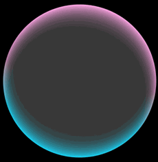
这个示例创建了一个圆形组件,边缘有两条不同颜色的流光在循环播放,营造出科技感的视觉效果(动态效果,建议真机实测)。
这种效果特别适合在头像中应用,效果如下:
背景流光
背景流光是另一种基于shader的视觉效果,通过shaderEffect()方法实现,能够在组件背景上创建流动的光线效果,为界面增添动态美感。
视效类型
背景流光对应EffectType枚举中的UV_BACKGROUND_FLOW_LIGHT值(值为1)。与双边流光类似,该视效在TV设备中无效果,但在其他设备类型中可以正常显示。
参数配置
背景流光通过UVFlowLightColorParam类型进行参数配置,包含以下属性:
- colorSource:背景流光颜色数组(必需参数)
- colorTarget:目标渐变颜色数组(可选参数),默认流光颜色不渐变
这两个参数都是ResourceColor类型的数组,支持使用系统资源颜色或自定义颜色。
动画控制
背景流光同样支持完整的动画参数配置,与双边流光相同的动画控制选项,包括持续时间、播放次数、动画曲线等,为开发者提供了灵活的动画控制能力。
使用示例
import { hdsEffect } from '@kit.UIDesignKit';

@Entry
@Component
struct BackgroundFlowLightExample {
  @State controller: hdsEffect.ShaderEffectController = new hdsEffect.ShaderEffectController();

  build() {
    Column() {
      Stack() {
        Text('Background Flow Light')
          .fontSize(24)
          .fontColor(Color.White)
      }
      .visualEffect(new hdsEffect.HdsEffectBuilder()
        .shaderEffect({
          effectType: hdsEffect.EffectType.UV_BACKGROUND_FLOW_LIGHT,
          animation: {
            duration: 3000,
            iterations: -1,
            autoPlay: true,
          },
          controller: this.controller,
          params: {
            colorSource: ['#1AD0F1', '#FFA4E5', '#F1E81A'],
            colorTarget: ['#0A90C1', '#D084C5', '#D1C80A']
          }
        })
        .buildEffect())
      .width(300)
      .height(200)
      .borderRadius(20)
      .backgroundColor('#383838')
    }
    .justifyContent(FlexAlign.Center)
    .backgroundColor(Color.Black)
    .width('100%')
    .height('100%')
  }
}
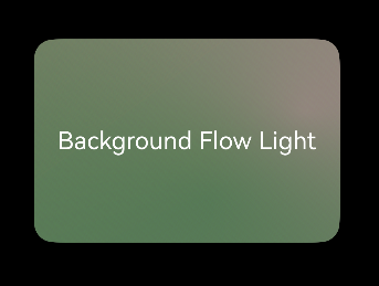
这个示例创建了一个带有背景流光效果的卡片组件,流光颜色会在source和target之间渐变,创造出丰富的色彩变化效果(动态效果,建议真机实测)。
背景双边流光
背景双边流光是结合了背景流光和双边流光效果的高级视效,通过巧妙地组合两种流光效果,可以创造出更加复杂和吸引人的视觉体验。
实现原理
背景双边流光并非一个独立的视效类型,而是通过以下方式实现:
-
双层叠加:使用Stack组件叠加两个层,一层应用背景流光效果,另一层应用双边流光效果。
-
透明度控制:通过调整各层的透明度,实现两种流光效果的完美融合。
-
动画同步:确保两种流光效果的动画参数协调一致,创造出和谐的视觉效果。
参数配置
背景双边流光需要同时配置两种流光效果的参数:
-
背景流光参数:
colorSource:背景流光颜色数组colorTarget:目标渐变颜色数组(可选)
-
双边流光参数:
firstEdgeFlowLight:第一条边缘流光参数secondEdgeFlowLight:第二条边缘流光参数
-
共享动画参数:
duration:动画持续时间iterations:播放次数curve:动画曲线delay:延迟时间autoPlay:是否自动播放expectedFrameRateRange:帧率设置
使用示例
import { hdsEffect } from '@kit.UIDesignKit';

@Entry
@Component
struct BackgroundDualEdgeFlowLightExample {
  @State bgController: hdsEffect.ShaderEffectController = new hdsEffect.ShaderEffectController();
  @State edgeController: hdsEffect.ShaderEffectController = new hdsEffect.ShaderEffectController();

  build() {
    Column() {
      Stack() {
        Stack() {
          Text('Background + Dual Edge')
            .fontSize(20)
            .fontColor(Color.White)
            .fontWeight(FontWeight.Bold)
        }
        .visualEffect(new hdsEffect.HdsEffectBuilder()
          .shaderEffect({
            effectType: hdsEffect.EffectType.UV_BACKGROUND_FLOW_LIGHT,
            animation: {
              duration: 4000,
              iterations: -1,
              autoPlay: true,
            },
            controller: this.bgController,
            params: {
              colorSource: ['#1AD0F1', '#FFA4E5'],
              colorTarget: ['#0A90C1', '#D084C5']
            }
          })
          .buildEffect())
        .width(280)
        .height(180)
        .borderRadius(20)
        .backgroundColor('#383838')
        .opacity(0.8)

        Stack() {
        }
        .visualEffect(new hdsEffect.HdsEffectBuilder()
          .shaderEffect({
            effectType: hdsEffect.EffectType.DUAL_EDGE_FLOW_LIGHT,
            animation: {
              duration: 4000,
              iterations: -1,
              autoPlay: true,
            },
            controller: this.edgeController,
            params: {
              firstEdgeFlowLight: {
                startPos: 0,
                endPos: 1.0,
                color: '#FFFFFF',
              },
              secondEdgeFlowLight: {
                startPos: 0.5,
                endPos: 1.5,
                color: '#FFFFFF',
              }
            }
          })
          .buildEffect())
        .width(280)
        .height(180)
        .borderRadius(20)
        .clip(true)
      }
    }
    .justifyContent(FlexAlign.Center)
    .backgroundColor(Color.Black)
    .width('100%')
    .height('100%')
  }
}
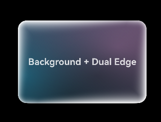
这个示例展示了如何创建一个同时具有背景流光和双边流光效果的组件,通过Stack组件叠加两种效果,创造出层次丰富、动感十足的视觉体验(动态效果,建议真机实测)。
总结:用hdsEffect,让你的App“颜值翻倍”
看到这里,相信你已经get到鸿蒙hdsEffect模块的强大了!从点光源的“3D立体感”,到按压阴影的“丝滑反馈”,再到流光系列的“动感科技感”,这套视效工具简直是开发者的“UI救星”——不用复杂的自定义 shader,不用写一堆动画逻辑,链式调用就能轻松实现各种高级视效,让你的App在众多应用中脱颖而出。
最佳实践:这4个坑,千万别踩!
-
适度使用:视效再炫酷,也不能贪多!过度使用会让界面“花里胡哨”,反而影响用户体验,重点组件用,普通组件简洁就好。
-
考虑性能:低端设备扛不住太多复杂视效,建议在低端机上简化效果(比如减少光源数量、降低动画帧率),保证App流畅运行。
-
设备适配:记牢!双边流光、背景流光在TV设备上无效果,开发时要做好设备判断,避免出现“效果丢失”的尴尬。
-
动画协调:多个视效同时使用时,动画参数(时长、循环次数)要保持一致,不然会显得杂乱无章,视觉体验大打折扣。
未来展望
随着鸿蒙系统的不断发展,视效系统也将持续演进,预计会引入更多创新的视觉效果和更强大的配置能力。开发者应持续关注官方文档更新,及时掌握最新的视效技术,为用户创造更加出色的应用体验。
通过合理运用鸿蒙视效系统,开发者可以轻松创建出既美观又实用的用户界面,在激烈的应用市场竞争中脱颖而出,为用户带来更加愉悦的使用体验。

作为“人工智能6S店”的官方数字引擎,为AI开发者与企业提供一个覆盖软硬件全栈、一站式门户。
更多推荐


 0
0 0
0- 0


 已为社区贡献9条内容

所有评论(0)