
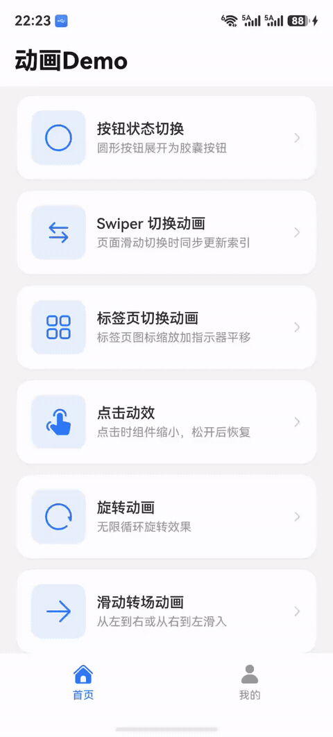
鸿蒙应用如何实现超级丝滑的动画
统一管理:使用工具类集中管理所有动画效果性能优先:提供动画开关,支持多档速度用户体验:使用弹性曲线,控制合理时长代码复用:封装通用动画,减少重复代码灵活配置:支持全局配置和局部定制。
本指南详细介绍了鸿蒙应用中实现丝滑动画的完整方案,包含动画演示、核心 API、工具类封装和性能优化策略。
目录
动画场景演示
以下是项目中实现的各类动画效果,每个场景都包含效果演示和完整实现代码。
场景 1:APP 冷启动动画
效果演示
应用启动时的转场动画效果
实现代码
// 列表项依次出现,形成瀑布流效果
List() {
  ForEach(this.configList, (item: ConfigData, index: number) => {
    ListItem() {
      // 列表项内容
      Row() {
        Image(item.icon).width(40).height(40)
        Text(item.title).fontSize(16)
      }
    }
    .transition(customAnimationUtil.isScaleTran(index, this.uiConfig))
  })
}
核心 API
// 转场缩放动画工具方法
public isScaleTran(i: number, uiConfig: UIConfig) {
  return uiConfig.isAnimation ?
    TransitionEffect.OPACITY
      .combine(TransitionEffect.scale({x: 0, y: 0}))
      .animation({
        duration: uiConfig.animationSpeed,
        curve: curves.springMotion(),
        delay: i * 10 + 30  // 递增延迟
      })
    : null
}
关键要点
-
动画类型:转场缩放动画 (TransitionEffect)
-
动画曲线:弹性曲线
curves.springMotion() -
延迟策略:
index * 10 + 30毫秒,实现瀑布流效果 -
适用场景:列表项加载、配置项显示、卡片展示
场景 2:列表项缩放动画
效果演示
列表项依次从小到大出现
实现代码
// 配置列表项动画
List() {
  ForEach(this.settingsList, (item: SettingItem, index: number) => {
    ListItem() {
      Row() {
        SymbolGlyph(item.icon)
          .fontSize(24)
          .effectStrategy(customAnimationUtil.isIconEffect(this.uiConfig))

        Column() {
          Text(item.title).fontSize(16)
          Text(item.subtitle).fontSize(12).fontColor(Color.Gray)
        }
      }
      .padding(16)
    }
    .transition(customAnimationUtil.isScaleTran(index, this.uiConfig))
    .clickEffect(customAnimationUtil.isClickEffect(this.uiConfig))
  })
}
核心 API
// 组合使用转场动画、点击动效和图标动效
.transition(customAnimationUtil.isScaleTran(index, this.uiConfig))
.clickEffect(customAnimationUtil.isClickEffect(this.uiConfig))
.effectStrategy(customAnimationUtil.isIconEffect(this.uiConfig))
关键要点
-
动画组合:转场 + 点击 + 图标三重动效
-
用户反馈:点击时缩放到 95%,提供触觉反馈
-
图标动效:系统图标的内置缩放效果
-
适用场景:设置列表、功能菜单、选项卡
场景 3:卡片展开动画
效果演示
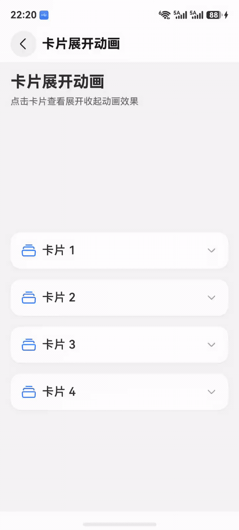
卡片点击后平滑展开或收起
实现代码
// 卡片展开/收起动画
ForEach(this.cardList, (card: CardData, i: number) => {
  Column() {
    // 卡片头部
    Row() {
      Text(card.title).fontSize(18)
      Image($r('sys.symbol.chevron_down'))
        .rotate({ angle: this.theCurrentHomeCard[i] ? 180 : 0 })
        .animation({
          duration: this.uiConfig.animationSpeed,
          curve: curves.springMotion()
        })
    }

    // 卡片内容(可展开)
    if (this.theCurrentHomeCard[i]) {
      Column() {
        Text(card.content)
      }
      .transition(customAnimationUtil.isScaleTran(0, this.uiConfig))
    }
  }
  .onClick(() => {
    animateTo({
      duration: this.uiConfig.animationSpeed,
      curve: curves.springMotion()
    }, () => {
      this.theCurrentHomeCard.splice(i, 1, !this.theCurrentHomeCard[i])
    })
  })
})
核心 API
// 使用 animateTo 包裹状态变化
animateTo({
  duration: this.uiConfig.animationSpeed,
  curve: curves.springMotion()
}, () => {
  this.theCurrentHomeCard.splice(i, 1, !this.theCurrentHomeCard[i])
})
关键要点
-
动画类型:显式动画 (animateTo)
-
状态管理:使用
splice触发响应式更新 -
图标旋转:箭头图标旋转 180 度指示展开状态
-
适用场景:折叠面板、FAQ 列表、详情展开
场景 4:按钮状态切换动画
效果演示
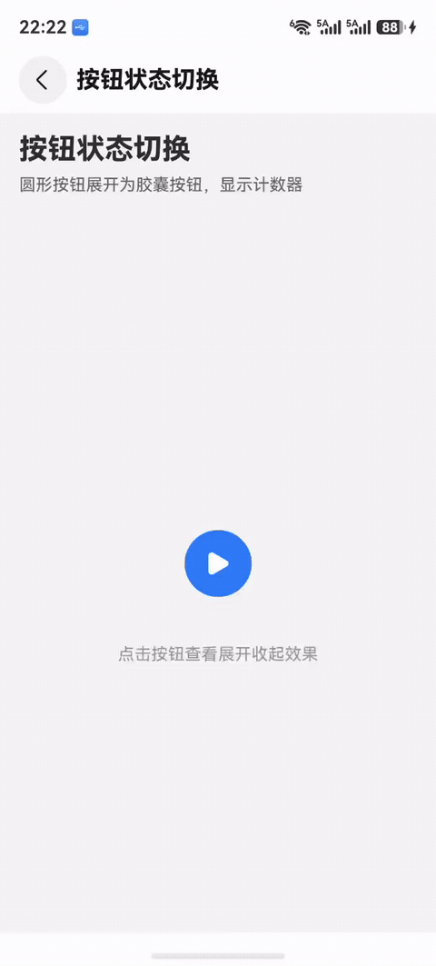
圆形按钮展开为胶囊按钮
实现代码
// 按钮状态切换动画
@Component
struct AnimatedButton {
@Prop Switch: boolean
@Prop Icon1: Resource
@Prop Icon2: Resource
@Prop SubText: string
@StorageLink('uiConfig') uiConfig: UIConfig = new UIConfig()
build() {
Column() {
Row() {
SymbolGlyph(this.Switch ? this.Icon1 : this.Icon2)
.fontSize(24)
.effectStrategy(customAnimationUtil.isIconEffect(this.uiConfig))
Text(this.SubText)
.fontSize(20)
.fontColor(this.Switch ? Color.White : Color.Transparent)
.opacity(this.Switch ? 1 : 0)
}
.padding({ left: 16, right: 16 })
}
.width(this.Switch ?
$r('app.integer.vp_proxy_started_button_width') : // 展开宽度 120
$r('app.integer.vp_proxy_not_start_button_width') // 收缩宽度 56
)
.height($r('app.integer.vp_proxy_not_start_button_height')) // 56
.backgroundColor(this.Switch ? Color.Blue : Color.Gray)
.borderRadius(28)
.animation({
duration: this.uiConfig.animationSpeed,
curve: curves.springMotion()
})
.transition(customAnimationUtil.isSlideSwitch(this.uiConfig))
.clickEffect(customAnimationUtil.isClickEffect(this.uiConfig))
}
}
核心 API
// 宽度属性动画
.width(this.Switch ? 120 : 56)
.animation({
duration: this.uiConfig.animationSpeed,
curve: curves.springMotion()
})
// 非对称转场动画
.transition(customAnimationUtil.isSlideSwitch(this.uiConfig))
关键要点
-
动画类型:属性动画 + 非对称转场
-
宽度变化:圆形 (56x56) ↔ 胶囊 (120x56)
-
文本淡入:透明度从 0 到 1
-
适用场景:开关按钮、状态指示器、计时器
场景 5:点击动效
效果演示
点击时组件缩小反馈
实现代码
// 为所有可点击元素添加点击动效
Button('确认')
.clickEffect(customAnimationUtil.isClickEffect(this.uiConfig))
.onClick(() => {
// 处理点击事件
})
// 自定义组件也可以使用
Row() {
Image($r('app.media.icon')).width(40)
Text('选项').fontSize(16)
}
.clickEffect(customAnimationUtil.isClickEffect(this.uiConfig))
.onClick(() => {
// 处理点击事件
})
核心 API
// 点击动效工具方法
public isClickEffect(uiConfig: UIConfig) {
return uiConfig.isAnimation ?
{
level: ClickEffectLevel.MIDDLE, // 中等强度
scale: 0.95 // 缩放到 95%
}
: null
}
// 使用
.clickEffect(customAnimationUtil.isClickEffect(this.uiConfig))
关键要点
-
动画类型:交互动效 (ClickEffect)
-
缩放级别:LIGHT (0.9) / MIDDLE (0.95) / HEAVY (0.8)
-
自动恢复:松开后自动恢复原始大小
-
适用场景:所有可点击元素(按钮、卡片、列表项)
场景 6:标签页切换动画
效果演示
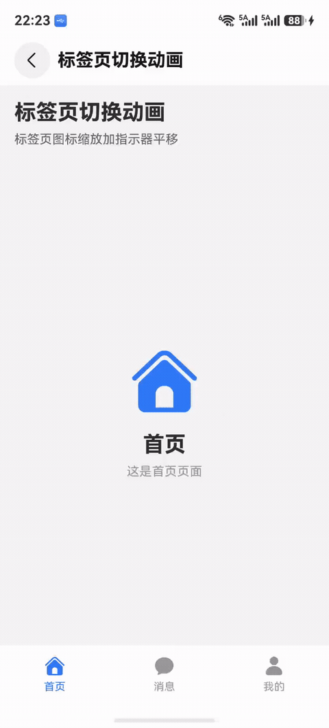
标签页图标缩放 + 指示器平移
实现代码
// 底部标签栏动画
@Component
struct TabBar {
@State tabsIconScale: number = 1
@State tabsSelect: TabsSelect = new TabsSelect()
@StorageLink('uiConfig') uiConfig: UIConfig = new UIConfig()
private SwiperController: SwiperController = new SwiperController()
build() {
Column() {
// Swiper 内容区
Swiper(this.SwiperController) {
ForEach(this.tabsList, (tab: TabData) => {
// 页面内容
Text(tab.content)
})
}
.indicator(false)
.loop(false)
.duration(this.uiConfig.animationSpeed)
.curve(Curve.EaseInOut)
.onChange((index: number) => {
animateTo({
duration: this.uiConfig.animationSpeed,
curve: curves.interpolatingSpring(10, 1, 228, 30),
}, () => {
this.tabsSelect.swiperPage = index
this.switchTranslateX(index)
})
})
// 底部标签栏
Row() {
ForEach(this.tabsList, (tab: TabData, i: number) => {
Column() {
SymbolGlyph(tab.icon)
.fontSize(24)
.fontColor(this.tabsSelect.swiperPage == tab.page ?
Color.Blue : Color.Gray)
.scale(this.tabsSelect.swiperPage == tab.page ?
{x: this.tabsIconScale, y: this.tabsIconScale} :
{x: 1, y: 1}
)
.effectStrategy(customAnimationUtil.isIconEffect(this.uiConfig))
Text(tab.title)
.fontSize(12)
.fontColor(this.tabsSelect.swiperPage == tab.page ?
Color.Blue : Color.Gray)
}
.onTouch((event: TouchEvent) => {
animateTo({
duration: this.uiConfig.animationSpeed,
curve: Curve.Ease,
}, () => {
if (event.type == TouchType.Down) {
this.switchTranslateX(i)
this.tabsSelect.swiperPage = tab.page
this.tabsIconScale = 0.8 // 按下缩小
this.SwiperController.changeIndex(i, true)
} else if (event.type == TouchType.Up) {
this.tabsIconScale = 1 // 松开恢复
}
})
})
})
}
.transition(customAnimationUtil.isTranslate(this.uiConfig))
}
}
switchTranslateX(index: number) {
// 计算指示器位置
}
}
核心 API
// 触摸事件控制缩放
.onTouch((event: TouchEvent) => {
animateTo({
duration: this.uiConfig.animationSpeed,
curve: Curve.Ease,
}, () => {
if (event.type == TouchType.Down) {
this.tabsIconScale = 0.8 // 按下
} else if (event.type == TouchType.Up) {
this.tabsIconScale = 1 // 松开
}
})
})
// Swiper 切换同步动画
.onChange((index: number) => {
animateTo({
duration: this.uiConfig.animationSpeed,
curve: curves.interpolatingSpring(10, 1, 228, 30),
}, () => {
this.tabsSelect.swiperPage = index
})
})
关键要点
-
动画类型:触摸反馈 + Swiper 联动
-
图标缩放:按下 0.8,松开 1.0
-
插值弹簧:
interpolatingSpring(10, 1, 228, 30)实现平滑过渡 -
适用场景:底部导航栏、顶部标签页、分段控制器
场景 7:Swiper 切换动画
效果演示
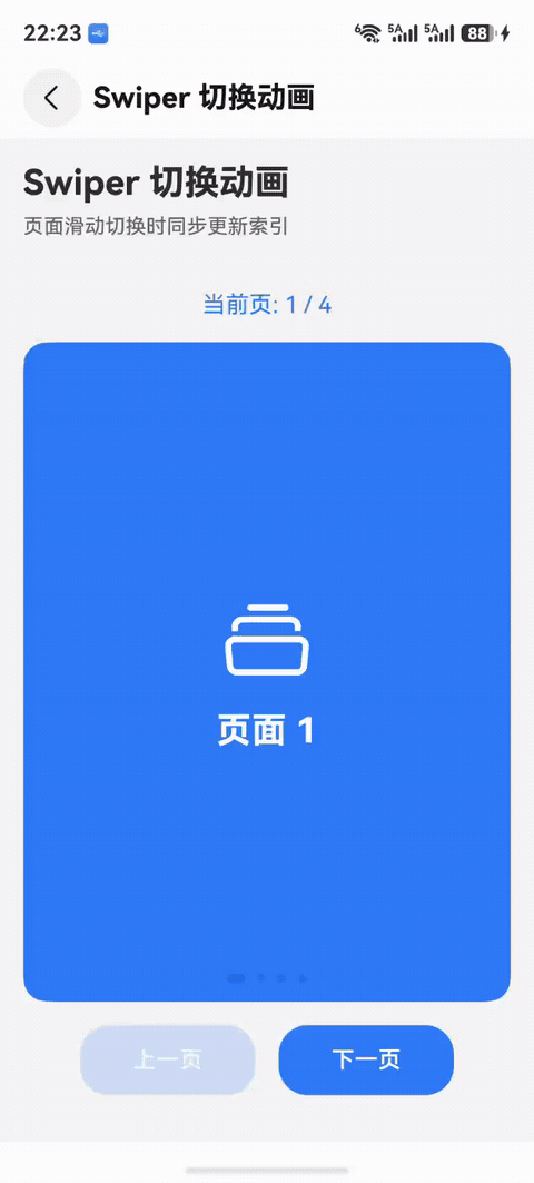
页面滑动切换效果
实现代码
// Swiper 页面切换动画
@Component
struct ProxyGroupSwiper {
@State currentProxyIndex: number = 0
@StorageLink('uiConfig') uiConfig: UIConfig = new UIConfig()
private SwiperController: SwiperController = new SwiperController()
private ListScroller: Scroller = new Scroller()
build() {
Column() {
// 顶部指示器列表
List({ scroller: this.ListScroller }) {
ForEach(this.theProxyGroups, (group: ProxyGroup, index: number) => {
ListItem() {
Text(group.name)
.fontSize(16)
.fontColor(this.currentProxyIndex == index ?
Color.Blue : Color.Gray)
.onClick(() => {
animateTo({
duration: this.uiConfig.animationSpeed
}, () => {
this.currentProxyIndex = index
})
this.SwiperController.changeIndex(
index,
this.uiConfig.animationSpeed != 0 ? true : false
)
})
}
})
}
.listDirection(Axis.Horizontal)
// Swiper 内容区
Swiper(this.SwiperController) {
ForEach(this.theProxyGroups, (group: ProxyGroup) => {
// 页面内容
ProxyGroupContent({ group: group })
})
}
.indicator(false)
.loop(false)
.duration(this.uiConfig.animationSpeed)
.curve(Curve.EaseInOut)
.onGestureSwipe((index: number, extraInfo: SwiperAnimationEvent) => {
animateTo({
duration: this.uiConfig.animationSpeed
}, () => {
// 处理手势滑动逻辑
})
})
.onAnimationStart((index: number, targetIndex: number) => {
animateTo({
duration: this.uiConfig.animationSpeed
}, () => {
this.ListScroller.scrollToIndex(targetIndex)
this.currentProxyIndex = targetIndex
})
})
}
}
}
核心 API
// Swiper 配置
Swiper(this.SwiperController) { }
.duration(this.uiConfig.animationSpeed) // 动画时长
.curve(Curve.EaseInOut) // 缓动曲线
.onGestureSwipe() // 手势滑动回调
.onAnimationStart() // 动画开始回调
// 编程式切换
this.SwiperController.changeIndex(index, true)
关键要点
-
动画类型:手势动画 + 显式动画
-
双向同步:Swiper ↔ 指示器列表
-
手势支持:滑动切换 + 点击切换
-
适用场景:轮播图、引导页、多页表单
场景 8:滑动转场动画
效果演示
页面从左到右滑入效果
实现代码
// 页面滑动转场动画
@Entry
@Component
struct PageTransition {
@State isShow: boolean = false
@StorageLink('uiConfig') uiConfig: UIConfig = new UIConfig()
build() {
Navigation() {
Column() {
Button('打开新页面')
.onClick(() => {
this.isShow = true
})
}
}
.mode(NavigationMode.Stack)
// 新页面
if (this.isShow) {
Column() {
Row() {
Image($r('sys.symbol.chevron_left'))
.onClick(() => {
this.isShow = false
})
Text('新页面').fontSize(18)
}
// 页面内容
List() {
ForEach(this.contentList, (item: ContentData, index: number) => {
ListItem() {
Text(item.title)
}
.transition(customAnimationUtil.isSlide(index * 10, this.uiConfig))
})
}
}
.width('100%')
.height('100%')
.backgroundColor(Color.White)
.transition(customAnimationUtil.isSlide(0, this.uiConfig))
}
}
}
核心 API
// 左滑入动画
public isSlide(i: number, uiConfig: UIConfig) {
return uiConfig.isAnimation ?
TransitionEffect.OPACITY
.animation({
duration: uiConfig.animationSpeed,
curve: curves.springMotion(),
delay: i
})
.combine(TransitionEffect.SLIDE)
: null
}
// 右滑入动画
public isSlideR(i: number, uiConfig: UIConfig) {
return uiConfig.isAnimation ?
TransitionEffect.OPACITY
.animation({
duration: uiConfig.animationSpeed,
curve: curves.springMotion(),
delay: i
})
.combine(TransitionEffect.translate({x: 20}))
: null
}
关键要点
-
动画类型:转场滑动动画 (TransitionEffect.SLIDE)
-
方向支持:左滑入、右滑入、上滑入、下滑入
-
配合透明度:滑动 + 淡入效果更自然
-
适用场景:页面跳转、侧边栏、抽屉菜单
场景 9:旋转动画
效果演示
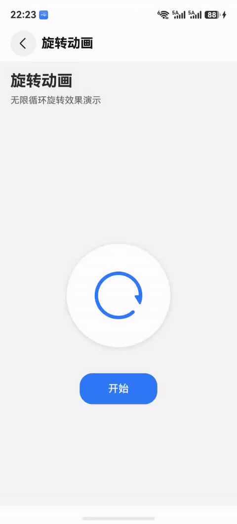
无限循环旋转效果
实现代码
// 加载旋转动画
@Component
struct LoadingSpinner {
@State rotateAngle: number = 0
@StorageLink('uiConfig') uiConfig: UIConfig = new UIConfig()
aboutToAppear() {
this.startAnim()
}
startAnim() {
this.rotateAngle = 0
animateTo({
duration: this.uiConfig.animationSpeed,
curve: Curve.Linear,
iterations: -1, // 无限循环
playMode: PlayMode.Normal
}, () => {
this.rotateAngle = 360
})
}
stopAnim() {
animateTo({
duration: 0
}, () => {
this.rotateAngle = 0
})
}
build() {
Column() {
Image($r('app.media.loading_icon'))
.width(40)
.height(40)
.rotate({
angle: this.uiConfig.isAnimation ? this.rotateAngle : 0
})
}
}
}
// 刷新按钮旋转动画
@Component
struct RefreshButton {
@State rotateAngle: number = 0
@StorageLink('uiConfig') uiConfig: UIConfig = new UIConfig()
build() {
Image($r('sys.symbol.arrow_clockwise'))
.width(24)
.height(24)
.rotate({ angle: this.rotateAngle })
.onClick(() => {
animateTo({
duration: this.uiConfig.animationSpeed,
curve: Curve.EaseOut,
}, () => {
this.rotateAngle += 360
})
// 执行刷新操作
this.refresh()
})
}
refresh() {
// 刷新逻辑
}
}
核心 API
// 无限循环旋转
animateTo({
duration: 300,
curve: Curve.Linear,
iterations: -1, // -1 表示无限循环
playMode: PlayMode.Normal
}, () => {
this.rotateAngle = 360
})
// 单次旋转
animateTo({
duration: 300,
curve: Curve.EaseOut,
}, () => {
this.rotateAngle += 360
})
// 应用旋转
.rotate({ angle: this.rotateAngle })
关键要点
-
动画类型:属性动画 (rotate)
-
循环模式:Normal (正向) / Alternate (往返)
-
曲线选择:Linear (匀速) / EaseOut (缓出)
-
适用场景:加载指示器、刷新按钮、进度动画
动画系统架构
1. 统一动画管理
项目采用集中式动画管理方案,通过 Animation.ets 工具类统一管理所有动画效果:
// entry/src/main/ets/common/utils/Animation.ets
class AnimationUtil {
// 转场缩放动画
public isScaleTran(i: number, uiConfig: UIConfig) { }
// 转场滑动动画
public isSlide(i: number, uiConfig: UIConfig) { }
// 点击动效
public isClickEffect(uiConfig: UIConfig) { }
// 图标动效
public isIconEffect(uiConfig: UIConfig) { }
}
export const customAnimationUtil = new AnimationUtil()
2. 动画配置系统
通过 UIConfig 类实现全局动画配置:
export class UIConfig {
// 动画开关
isAnimation: boolean = true
// 动画速度(毫秒)
animationSpeed: number = 300
// 动画速度档位索引
animationSpeedIndex: number = 1 // 0:快速, 1:正常, 2:慢速, 3:关闭
// 震动反馈
isVibrate: boolean = true
// 按钮位置索引(影响按钮动画方向)
buttonPositionIndex: number = 0
}
// 动画速度映射
const ANIMATION_SPEEDS = [150, 300, 500, 0] // 快速、正常、慢速、关闭
3. 核心动画类型
3.1 转场动画 (TransitionEffect)
用于组件出现和消失时的过渡效果:
-
缩放转场:
TransitionEffect.scale({x: 0, y: 0}) -
滑动转场:
TransitionEffect.SLIDE -
透明度转场:
TransitionEffect.OPACITY -
平移转场:
TransitionEffect.translate({x: 20}) -
非对称转场:
TransitionEffect.asymmetric(进入, 退出)
3.2 显式动画 (animateTo)
用于状态变化时的平滑过渡:
animateTo({
  duration: 300,
  curve: curves.springMotion()
}, () => {
  // 状态变化
  this.value = newValue
})
3.3 属性动画
直接在属性上添加 .animation() 修饰符:
.width(this.isExpanded ? 200 : 100)
.animation({
  duration: 300,
  curve: curves.springMotion()
})
3.4 交互动效
-
点击动效:
.clickEffect() -
悬停效果:
.hoverEffect() -
图标动效:
.effectStrategy()
动画工具类实现
完整工具类代码
import { UIConfig } from "../../entryability/AppState"
import { curves } from "@kit.ArkUI"
let effectEvent: TransitionEffect | null
let clickEffect: ClickEffect | null
let iconEffect: SymbolEffectStrategy | null
class AnimationUtil {
// 1. 转场缩放动画(标准延迟)
public isScaleTran(i: number, uiConfig: UIConfig) {
effectEvent = uiConfig.isAnimation ?
TransitionEffect.OPACITY
.combine(TransitionEffect.scale({x: 0, y: 0}))
.animation({
duration: uiConfig.animationSpeed,
curve: curves.springMotion(),
delay: i * 10 + 30
})
: null
return effectEvent
}
// 2. 转场缩放动画(快速延迟)
public isScaleTranFast(i: number, uiConfig: UIConfig) {
effectEvent = uiConfig.isAnimation ?
TransitionEffect.OPACITY
.combine(TransitionEffect.scale({x: 0, y: 0}))
.animation({
duration: uiConfig.animationSpeed,
curve: curves.springMotion(),
delay: i * 5 + 30
})
: null
return effectEvent
}
// 3. 转场透明度动画
public isOpacity(uiConfig: UIConfig) {
effectEvent = uiConfig.isAnimation ?
TransitionEffect.OPACITY
.animation({
duration: uiConfig.animationSpeed,
curve: Curve.Ease,
delay: 0
})
: null
return effectEvent
}
// 4. 转场滑动动画(左到右)
public isSlide(i: number, uiConfig: UIConfig) {
effectEvent = uiConfig.isAnimation ?
TransitionEffect.OPACITY
.animation({
duration: uiConfig.animationSpeed,
curve: curves.springMotion(),
delay: i
})
.combine(TransitionEffect.SLIDE)
: null
return effectEvent
}
// 5. 转场滑动动画(右到左)
public isSlideR(i: number, uiConfig: UIConfig) {
effectEvent = uiConfig.isAnimation ?
TransitionEffect.OPACITY
.animation({
duration: uiConfig.animationSpeed,
curve: curves.springMotion(),
delay: i
})
.combine(TransitionEffect.translate({x: 20}))
: null
return effectEvent
}
// 6. 转场放大动画
public isSlideScaleBig(i: number, uiConfig: UIConfig) {
effectEvent = uiConfig.isAnimation ?
TransitionEffect.OPACITY
.animation({
duration: uiConfig.animationSpeed,
curve: curves.springMotion(),
delay: i
})
.combine(TransitionEffect.scale({x: 0, y: 0}))
: null
return effectEvent
}
// 7. 转场缩小动画(非对称)
public isSlideScaleSmall(i: number, uiConfig: UIConfig) {
effectEvent = uiConfig.isAnimation ?
TransitionEffect.asymmetric(
TransitionEffect.OPACITY
.animation({
duration: uiConfig.animationSpeed,
curve: curves.springMotion(),
delay: i
})
.combine(TransitionEffect.scale({x: 2, y: 2})),
TransitionEffect.OPACITY
.animation({
duration: uiConfig.animationSpeed,
curve: curves.springMotion(),
delay: i
})
.combine(TransitionEffect.translate({y: -5}))
)
: null
return effectEvent
}
// 8. 按钮滑动切换动画
public isSlideSwitch(uiConfig: UIConfig) {
effectEvent = uiConfig.isAnimation ?
(uiConfig.buttonPositionIndex === 0 ?
TransitionEffect.asymmetric(
TransitionEffect.OPACITY
.animation({
duration: uiConfig.animationSpeed,
curve: curves.springMotion(),
delay: 50
})
.combine(TransitionEffect.SLIDE_SWITCH),
TransitionEffect.OPACITY
.animation({
duration: uiConfig.animationSpeed,
curve: curves.springMotion(),
delay: 50
})
.combine(TransitionEffect.SLIDE)
)
: uiConfig.buttonPositionIndex === 2 ?
TransitionEffect.asymmetric(
TransitionEffect.OPACITY
.animation({
duration: uiConfig.animationSpeed,
curve: curves.springMotion(),
delay: 50
})
.combine(TransitionEffect.SLIDE),
TransitionEffect.OPACITY
.animation({
duration: uiConfig.animationSpeed,
curve: curves.springMotion(),
delay: 50
})
.combine(TransitionEffect.SLIDE_SWITCH)
)
: TransitionEffect.OPACITY
.animation({
duration: uiConfig.animationSpeed,
curve: curves.springMotion(),
delay: 50
})
.combine(TransitionEffect.SLIDE_SWITCH))
: null
return effectEvent
}
// 9. 底部标签栏转场动画
public isTranslate(uiConfig: UIConfig) {
effectEvent = uiConfig.isAnimation ?
TransitionEffect.OPACITY
.animation({
duration: uiConfig.animationSpeed,
delay: 0
})
.combine(TransitionEffect.translate({ y: 50 }))
: null
return effectEvent
}
// 10. 点击动效
public isClickEffect(uiConfig: UIConfig) {
clickEffect = uiConfig.isAnimation ?
{
level: ClickEffectLevel.MIDDLE,
scale: 0.95
}
: null
return clickEffect
}
// 11. 图标动效
public isIconEffect(uiConfig: UIConfig) {
iconEffect = uiConfig.isAnimation ?
SymbolEffectStrategy.SCALE
: null
return iconEffect
}
// 12. 图标转场缩放旋转动画
public isScaleTranIcon(i: number, uiConfig: UIConfig) {
effectEvent = uiConfig.isAnimation ?
TransitionEffect.scale({x: 0, y: 0})
.combine(TransitionEffect.rotate({angle: 360}))
.animation({
duration: uiConfig.animationSpeed,
curve: curves.springMotion(),
delay: i * 10 + 50
})
: null
return effectEvent
}
}
export const customAnimationUtil = new AnimationUtil()
使用方法
// 1. 导入工具类
import { customAnimationUtil } from '../common/utils/Animation'
// 2. 获取配置
@StorageLink('uiConfig') uiConfig: UIConfig = new UIConfig()
// 3. 使用动画
.transition(customAnimationUtil.isScaleTran(index, this.uiConfig))
.clickEffect(customAnimationUtil.isClickEffect(this.uiConfig))
.effectStrategy(customAnimationUtil.isIconEffect(this.uiConfig))
性能优化策略
1. 动画开关控制
实现方案:通过全局配置控制动画开关
export class UIConfig {
isAnimation: boolean = true // 动画总开关
animationSpeed: number = 300 // 动画速度
animationSpeedIndex: number = 1 // 速度档位
}
// 动画速度映射
const ANIMATION_SPEEDS = [150, 300, 500, 0] // 快速、正常、慢速、关闭
优势:
-
用户可根据设备性能选择动画档位
-
低端设备可关闭动画提升流畅度
-
节省电量
2. 条件性应用动画
实现方案:根据配置决定是否应用动画
.transition(
  uiConfig.isAnimation ?
    customAnimationUtil.isScaleTran(index, uiConfig) :
    null
)
优势:
-
避免不必要的动画计算
-
减少渲染负担
3. 延迟优化
标准延迟:适用于普通列表
delay: i * 10 + 30 // 每项延迟10ms
快速延迟:适用于大量元素
delay: i * 5 + 30 // 每项延迟5ms
固定延迟:适用于单个元素
delay: 50 // 固定延迟
4. 动画曲线选择
弹性曲线 (springMotion):适用于大部分场景
curve: curves.springMotion()
-
自然的弹性效果
-
符合物理运动规律
-
用户体验最佳
线性曲线 (Linear):适用于循环动画
curve: Curve.Linear
-
匀速运动
-
适合旋转、进度条等
缓动曲线 (Ease):适用于简单过渡
curve: Curve.Ease
-
先加速后减速
-
适合透明度、位移等
插值弹簧曲线:适用于精细控制
curve: curves.interpolatingSpring(10, 1, 228, 30)
-
参数:速度、阻尼、质量、初始速度
-
可精确控制弹性效果
5. 避免过度动画
问题:同时触发过多动画导致卡顿
解决方案:
-
限制同时播放的动画数量
-
使用虚拟滚动减少渲染元素
-
大列表使用快速延迟模式
// 使用快速延迟 .transition(customAnimationUtil.isScaleTranFast(index, this.uiConfig)) // 限制最大延迟 .transition(customAnimationUtil.isScaleTran( Math.min(index, 10), // 限制最大延迟 this.uiConfig ))
6. 动画状态管理
问题:频繁切换动画状态导致性能问题
解决方案:使用标志位控制动画触发
export class isON {
toggleAnim: boolean = false // 动画触发标志
}
// 使用
.transition(this.isON.toggleAnim ? null : customAnimationUtil.isScaleTran(index, this.uiConfig))
7. 性能监控
// 使用 HiTrace 监控动画性能
import { hiTraceMeter } from '@kit.PerformanceAnalysisKit'
hiTraceMeter.startTrace('animation_performance', 1)
animateTo({ duration: 300 }, () => {
// 动画逻辑
})
hiTraceMeter.finishTrace('animation_performance', 1)
最佳实践建议
1. 动画设计原则
1.1 一致性原则
-
同类型交互使用相同动画效果
-
统一动画时长和曲线
-
保持视觉语言一致
1.2 性能优先原则
-
优先使用 GPU 加速的属性(transform、opacity)
-
避免动画 width、height 等触发重排的属性
-
使用
scale代替width/height动画
1.3 用户体验原则
-
动画时长控制在 200-400ms
-
提供动画开关选项
-
避免过度动画干扰用户操作
2. 代码组织建议
2.1 集中管理动画配置
// 统一的动画工具类
export const customAnimationUtil = new AnimationUtil()
// 统一的配置类
@StorageLink('uiConfig') uiConfig: UIConfig = new UIConfig()
2.2 使用语义化命名
// 好的命名 isScaleTran() // 缩放转场 isSlideSwitch() // 滑动切换 isClickEffect() // 点击效果 // 避免 anim1() effect() trans()
2.3 注释说明动画效果
// 转场缩放动画,i为延迟,在list或foreach中可以将i设为index,达到递增的动画效果
public isScaleTran(i: number, uiConfig: UIConfig) {
  // 实现代码
}
3. 常见动画组合
3.1 列表项出现动画
TransitionEffect.OPACITY
  .combine(TransitionEffect.scale({x: 0, y: 0}))
  .animation({
    duration: 300,
    curve: curves.springMotion(),
    delay: index * 10 + 30
  })
3.2 页面切换动画
TransitionEffect.asymmetric(
  TransitionEffect.move(TransitionEdge.END),
  TransitionEffect.move(TransitionEdge.START)
)
.animation({ duration: 300, curve: Curve.Ease })
.combine(TransitionEffect.OPACITY)
3.3 按钮交互动画
// 点击缩放
.clickEffect({ level: ClickEffectLevel.MIDDLE, scale: 0.95 })
// 悬停效果
.hoverEffect(HoverEffect.Scale)
// 图标动效
.effectStrategy(SymbolEffectStrategy.SCALE)
4. 动画调试技巧
4.1 动画速度调试
// 开发时使用慢速动画便于观察
const DEBUG_MODE = true
const animationSpeed = DEBUG_MODE ? 1000 : 300
4.2 动画开关调试
// 快速切换动画开关测试性能
@StorageLink('uiConfig') uiConfig: UIConfig = new UIConfig()
// 在设置页提供开关
Toggle({ type: ToggleType.Switch, isOn: this.uiConfig.isAnimation })
.onChange((isOn: boolean) => {
this.uiConfig.isAnimation = isOn
})
4.3 日志输出
animateTo({
  duration: this.uiConfig.animationSpeed,
  onFinish: () => {
    console.info('动画完成')
  }
}, () => {
  console.info('动画开始')
  this.currentIndex = targetIndex
})
5. 避免动画卡顿
问题场景:
-
大量元素同时动画
-
复杂布局计算
-
频繁状态更新
解决方案:
// 1. 分批动画
ForEach(this.list, (item, index) => {
ListItem() { }
.transition(customAnimationUtil.isScaleTran(
Math.min(index, 10), // 限制最大延迟
this.uiConfig
))
})
// 2. 使用 LazyForEach
LazyForEach(this.dataSource, (item, index) => {
ListItem() { }
.transition(customAnimationUtil.isScaleTranFast(index, this.uiConfig))
})
// 3. 条件性渲染
if (this.isVisible) {
Component()
.transition(customAnimationUtil.isOpacity(this.uiConfig))
}
动画效果速查表
| 动画类型 | 方法名 | 适用场景 | 延迟参数 | 曲线 |
|---|---|---|---|---|
| 缩放转场 | isScaleTran() |
列表项、卡片 | index * 10 + 30 | springMotion |
| 快速缩放转场 | isScaleTranFast() |
大量元素 | index * 5 + 30 | springMotion |
| 透明度转场 | isOpacity() |
简单显隐 | 0 | Ease |
| 左滑入 | isSlide() |
页面切换 | 固定值 | springMotion |
| 右滑入 | isSlideR() |
侧边栏 | 固定值 | springMotion |
| 放大转场 | isSlideScaleBig() |
强调元素 | 固定值 | springMotion |
| 缩小转场 | isSlideScaleSmall() |
删除动画 | 0 | springMotion |
| 按钮切换 | isSlideSwitch() |
按钮状态 | 50 | springMotion |
| 底部栏 | isTranslate() |
标签栏 | 0 | Ease |
| 点击效果 | isClickEffect() |
所有可点击元素 | - | - |
| 图标效果 | isIconEffect() |
系统图标 | - | - |
| 图标转场 | isScaleTranIcon() |
设置项图标 | index * 10 + 50 | springMotion |
动画曲线对比
| 曲线类型 | 特点 | 适用场景 | 代码 |
|---|---|---|---|
| springMotion | 弹性效果 | 大部分场景 | curves.springMotion() |
| Linear | 匀速运动 | 循环动画 | Curve.Linear |
| Ease | 缓入缓出 | 简单过渡 | Curve.Ease |
| EaseIn | 缓入 | 元素消失 | Curve.EaseIn |
| EaseOut | 缓出 | 元素出现 | Curve.EaseOut |
| EaseInOut | 缓入缓出 | 页面切换 | Curve.EaseInOut |
| interpolatingSpring | 自定义弹簧 | 精细控制 | curves.interpolatingSpring(10, 1, 228, 30) |
总结
核心要点
-
统一管理:使用工具类集中管理所有动画效果
-
性能优先:提供动画开关,支持多档速度
-
用户体验:使用弹性曲线,控制合理时长
-
代码复用:封装通用动画,减少重复代码
-
灵活配置:支持全局配置和局部定制
实现步骤
-
创建
Animation.ets工具类 -
定义
UIConfig配置类 -
在组件中引入并使用
-
提供用户设置界面
-
测试和优化性能
推荐配置
// 推荐的动画配置
export class UIConfig {
isAnimation: boolean = true // 默认开启
animationSpeed: number = 300 // 300ms 最佳
animationSpeedIndex: number = 1 // 正常速度
}
// 推荐的动画曲线
curve: curves.springMotion() // 弹性效果最佳
// 推荐的延迟策略
delay: index * 10 + 30 // 标准列表
delay: index * 5 + 30 // 大量元素
delay: 50 // 单个元素
参考资源

作为“人工智能6S店”的官方数字引擎,为AI开发者与企业提供一个覆盖软硬件全栈、一站式门户。
更多推荐

 10
10 0
0- 0


 已为社区贡献1条内容

所有评论(0)