
鸿蒙6.0应用开发——仿头条首页列表滑动吸顶效果
Tabs嵌套List的吸顶效果,常用于新闻、资讯类应用的首页。本场景以Tabs页签首页内容为例,在首页TabContent的内容区域使用List组件配合其它组件,构建下方列表数据内容。进入页面后,向上滑动内容,中间Tabs页签区域实现吸顶展示的效果。
·
【高心星出品】
文章目录
仿头条首页列表滑动吸顶效果
场景描述
Tabs嵌套List的吸顶效果,常用于新闻、资讯类应用的首页。
本场景以Tabs页签首页内容为例,在首页TabContent的内容区域使用List组件配合其它组件,构建下方列表数据内容。进入页面后,向上滑动内容,中间Tabs页签区域实现吸顶展示的效果。
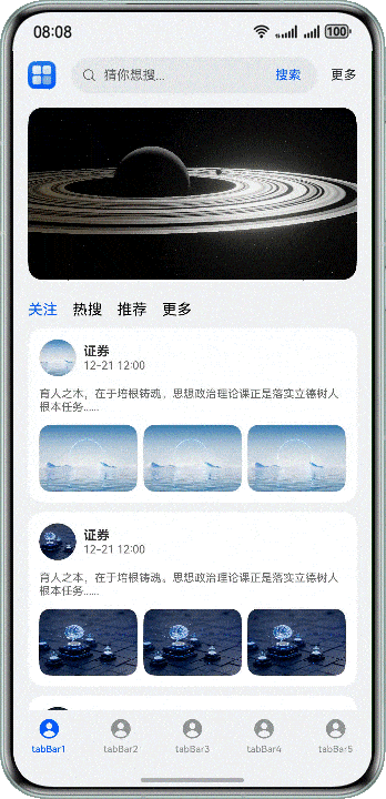
| 页面整体结构图 | 页面效果图 |
|---|---|
 |
 |
实现效果
实现原理
Tabs组件可以在页面内快速实现视图内容的切换,让用户能够聚焦于当前显示的内容,并对页面内容进行分类,提高页面空间利用率。
通过Tabs组件,配合使用Stack、Scroll、Search以及List等基础组件构建完整页面,再使用List组件的nestedScroll属性,结合calc计算高度,实现中间Tabs页签区域吸顶展示的效果。
开发步骤
-
构建Tabs的自定义tabBar内容。
@Builder
tabBuilder(img: Resource, title: Resource, index: number) {
  Column() {
    Image(img)
      // ...
      .fillColor(this.currentIndex === index ? '#0a59f7' : '#66000000')
    Text(title)
      // ...
      .fontColor(this.currentIndex === index ? '#0a59f7' : '#66000000')
  }
  // ...
  .onClick(() => {
    this.currentIndex = index;
    this.tabsController.changeIndex(this.currentIndex);
  })
}
代码逻辑走读:
- 定义构建函数:使用
@Builder装饰器定义了一个名为tabBuilder的函数,该函数接受三个参数:img(图像资源)、title(文本资源)和index(索引号)。 - 创建列组件:在函数内部,使用
Column组件创建一个垂直排列的容器。 - 添加图像:在
Column中添加一个Image组件,使用传入的img参数设置图像资源。 - 设置图像填充颜色:根据当前索引
this.currentIndex是否等于传入的index,动态设置图像的填充颜色。如果相等,颜色为#0a59f7,否则为半透明的黑色#66000000。 - 添加文本:在
Column中添加一个Text组件,使用传入的title参数设置文本内容。 - 设置文本颜色:同样根据当前索引
this.currentIndex是否等于传入的index,动态设置文本的颜色。如果相等,颜色为#0a59f7,否则为半透明的黑色#66000000。 - 设置点击事件:为
Column组件添加点击事件监听器,当用户点击组件时,将this.currentIndex更新为传入的index,并调用this.tabsController.changeIndex(this.currentIndex)方法来处理索引变化。
Tabs({ barPosition: BarPosition.End, controller: this.tabsController }) {
  TabContent() {
    // ...
  }
  .tabBar(this.tabBuilder($r('app.media.mine'), $r('app.string.tabBar1'), 0))

  // ...
}
// ...
.onChange((index: number) => {
  this.currentIndex = index;
})
代码逻辑走读:
- 定义标签栏组件:
- 使用
Tabs组件创建一个标签栏,设置barPosition属性为BarPosition.End,表示标签栏位于末端。 - 使用
controller属性绑定this.tabsController,用于控制标签的切换。
- 使用
- 定义标签内容:
- 使用
TabContent组件包裹标签内容,内容具体实现由// ...表示,可能包含其他组件或布局。
- 使用
- 设置标签栏样式:
- 使用
.tabBar方法设置标签栏的样式,通过this.tabBuilder方法构建标签栏的显示内容,包括图标和文字。
- 使用
- 监听标签切换事件:
- 使用
.onChange方法监听标签切换事件,当标签切换时,更新this.currentIndex为当前选中的标签索引。
- 使用
- 其他可能内容:
- 代码片段中可能还有其他未显示的逻辑,例如标签内容的具体实现和
tabBuilder方法的定义。
- 代码片段中可能还有其他未显示的逻辑,例如标签内容的具体实现和
实现效果:

- 定义构建函数:使用
-
构建顶部搜索区域。
Row() {
  Image($r('app.media.app_icon'))
    // ...
  Search({
    placeholder: 'guess you want to search...',
  })
    .searchButton('search', { fontSize: 14 })
    // ...
  Text('more')
    // ...
}
代码逻辑走读:
- 创建一个Row布局容器,用于水平排列子组件。
- 在Row布局中添加一个Image组件,显示应用的图标。图标通过$r函数引用资源文件。
- 添加一个Search组件,设置占位符文本为“guess you want to search…”。
- 配置Search组件的搜索按钮,设置按钮文本为“search”,字体大小为14。
- 添加一个Text组件,显示文本“more”。
- 注释部分可能用于添加额外的样式或功能,但由于注释内容不详,具体功能无法确定。
实现效果:

-
图片占位区域、自定义导航内容及列表内容构建。
// Home page content.
Scroll(this.scrollController) {
  Column() {
    // Image position-holder area
    Image($r('app.media.pic5'))
      // ...

    Column() {
      // Customize tabBar.
      Row({ space: 16 }) {
        ForEach(this.tabArray, (item: string, index: number) => {
          Text(item)
            .fontColor(this.currentTabIndex === index ? '#0a59f7' : Color.Black)
            .onClick(() => {
              // Click to switch tabs content.
              this.contentTabController.changeIndex(index);
              this.currentTabIndex = index;
            })
        }, (item: string) => item)
      }
      // ...

      // Tabs
      Tabs({ barPosition: BarPosition.Start, controller: this.contentTabController }) {
        TabContent() {
          List({ space: 10, scroller: this.listScroller }) {
            CustomListItem({
              imgUrl: $r('app.media.pic1'),
              title: $r('app.string.manager_content')
            })
            // ...
          }
          // ...
        }
        .tabBar('follow')
        // ...
      }
      // ...
    }
    // ...
  }
}
// ...
.scrollBar(BarState.Off) // Hide the scroll bar
代码逻辑走读:
- Scroll组件:创建一个可滚动的视图容器,使用
this.scrollController控制滚动行为。 - Column布局:在滚动视图中使用列布局,首先放置一个Image组件,用于显示图片。
- 子Column布局:在图片下方嵌套另一个列布局,用于放置标签栏和标签页结构。
- Row布局:在列布局中使用行布局创建标签栏,包含多个Text组件,每个代表一个标签。
- ForEach循环:遍历
this.tabArray数组,为每个标签创建一个文本组件,并根据当前选中的标签索引设置不同的字体颜色。 - 点击事件:为每个标签文本组件绑定点击事件,点击后通过
this.contentTabController.changeIndex(index)切换标签页,并更新this.currentTabIndex为当前选中的标签索引。 - Tabs组件:创建一个标签页结构,包含多个标签页内容。
- TabContent组件:在第一个标签页中创建一个列表,列表项由
CustomListItem组件组成,包含图片和标题。 - 隐藏滚动条:通过
.scrollBar(BarState.Off)隐藏滚动条。
实现效果:

- Scroll组件:创建一个可滚动的视图容器,使用
-
给List组件添加的
nestedScroll
属性,结合calc计算实现中间自定义Tab页签区域吸顶展示的效果。
Tabs({ barPosition: BarPosition.Start, controller: this.contentTabController }) {
  TabContent() {
    List({ space: 10, scroller: this.listScroller }) {
      // ...
    }
    // ...
    // Customize the tabBar to achieve ceiling suction by combining the nestedScroll attribute with Calc to calculate height.
    .nestedScroll({
      scrollForward: NestedScrollMode.PARENT_FIRST, // Set the effect of scrolling the component to the end: The parent component rolls first, and then rolls itself to the edge
      scrollBackward: NestedScrollMode.SELF_FIRST // Set the effect of rolling the component to the start end: Rolls itself first, and then the parent component scrolls to the edge
    })
  }
  .tabBar('follow')
  // ...
}
.barHeight(0)
.height('calc(100% - 100vp)')
.onChange((index: number) => {
  this.currentTabIndex = index;
})
代码逻辑走读:
- Tabs组件初始化:
- 创建一个
Tabs组件,设置barPosition为BarPosition.Start,并绑定contentTabController作为控制器。
- 创建一个
- TabContent定义:
- 定义一个
TabContent,其中包含一个列表(List)。列表的项之间有10单位的间距,并使用listScroller作为滚动控制器。
- 定义一个
- 嵌套滚动模式配置:
- 设置列表的嵌套滚动模式,
scrollForward为NestedScrollMode.PARENT_FIRST,表示在向前滚动时,先滚动父组件,再滚动自身。scrollBackward为NestedScrollMode.SELF_FIRST,表示在向后滚动时,先滚动自身,再滚动父组件。
- 设置列表的嵌套滚动模式,
- 选项卡定制:
- 设置选项卡的标签为
'follow',并隐藏选项卡栏(通过设置barHeight为0)。
- 设置选项卡的标签为
- 高度计算与选项卡切换事件:
- 设置选项卡的高度为计算值
'calc(100% - 100vp)',表示除去100vp的高度外,其余部分为选项卡的高度。 - 当选项卡切换时,调用回调函数,更新
currentTabIndex为当前选中的选项卡索引。
- 设置选项卡的高度为计算值
- Tabs组件初始化:

作为“人工智能6S店”的官方数字引擎,为AI开发者与企业提供一个覆盖软硬件全栈、一站式门户。
更多推荐


 66
66 0
0- 0


 已为社区贡献43条内容

所有评论(0)