
ReactNative for OpenHarmony项目鸿蒙化三方库:react-native-masked-view — 遮罩视图组件
知识点要点定义遮罩形状,不透明区域为可见区域背景色maskElement 父容器背景必须为透明文字颜色遮罩文字颜色必须为不透明颜色容器尺寸必须为 MaskedView 设置明确的高度渐变文字配合 LinearGradient 实现渐变文字效果。
欢迎加入开源鸿蒙跨平台社区:https://openharmonycrossplatform.csdn.net
📌 开发环境声明:本文基于 React Native 0.72.90 版本进行开发适配
🚀 一、开篇引言
遮罩效果是实现复杂 UI 视觉效果的重要技术手段。无论是渐变文字、镂空效果、还是创意动画,遮罩视图都能帮助开发者实现独特的视觉体验。本文将带你深入了解如何在 HarmonyOS 平台上集成和使用 @react-native-oh-tpl/masked-view,实现炫酷的遮罩效果。
1.1 知识点
- ✅ MaskedView 的核心概念与工作原理
- ✅ HarmonyOS 平台的完整集成流程
- ✅ 实战场景的代码实现
- ✅ maskElement 属性的深度解析
- ✅ 常见问题的解决方案
1.2 适用人群
- 正在进行 React Native 鸿蒙化迁移的开发者
- 需要实现遮罩视觉效果的应用开发者
- 对跨平台 UI 开发感兴趣的技术爱好者
📦 二、库概览
2.1 基本信息
| 项目 | 内容 |
|---|---|
| 库名称 | @react-native-oh-tpl/masked-view |
| 原库名称 | @react-native-masked-view/masked-view |
| 版本信息 | 0.2.9-0.2.2 (RN 0.72) |
| 官方仓库 | https://github.com/react-native-oh-library/masked-view |
| 鸿蒙适配仓库 | https://atomgit.com/openharmony-sig/rntpc_masked-view |
| 开源协议 | MIT |
2.2 核心能力矩阵
| 能力项 | 描述 | HarmonyOS 支持 |
|---|---|---|
| 文字遮罩 | 使用文字作为遮罩形状 | ✅ 完全支持 |
| 形状遮罩 | 使用任意形状作为遮罩 | ✅ 完全支持 |
| 渐变文字 | 配合渐变组件实现渐变文字 | ✅ 完全支持 |
| 图片遮罩 | 使用图片作为遮罩 | ✅ 完全支持 |
| 动态遮罩 | 动态更新遮罩元素 | ✅ 完全支持 |
| 组合遮罩 | 多层遮罩叠加效果 | ✅ 完全支持 |
2.3 技术架构图
2.4 与同类方案对比
| 特性 | @react-native-masked-view/masked-view | react-native-mask-text | CSS mask |
|---|---|---|---|
| HarmonyOS 支持 | ✅ | ⚠️ 需适配 | ❌ |
| 原生性能 | 优秀 | 优秀 | 一般 |
| 自定义遮罩 | ✅ | ❌ 仅文本 | ✅ |
| 渐变文字 | ✅ 配合渐变组件 | ✅ 内置支持 | ✅ |
| API 灵活性 | 高 | 中 | 高 |
2.5 典型应用场景
| 场景 | 描述 | 效果示例 |
|---|---|---|
| 渐变文字 | 配合 LinearGradient 实现文字渐变 | 🌈 彩虹文字 |
| 镂空效果 | 创建镂空的视觉元素 | 🔲 镂空按钮 |
| 创意动画 | 实现复杂的遮罩动画 | 🎬 进度动画 |
| 图片遮罩 | 为图片添加特殊形状 | 🖼️ 圆形头像 |
| 启动页标题 | 品牌展示的渐变标题 | ✨ 品牌Logo |
| 营销活动 | 吸引眼球的活动标题 | 🔥 限时特惠 |
⚡ 三、快速开始
3.1 环境要求
| 依赖项 | 版本要求 |
|---|---|
| React Native | 0.72.x |
| RNOH (鸿蒙框架) | 0.72.90 |
| HarmonyOS SDK | 6.0.0.47+ (API 20) |
| DevEco Studio | 5.0.3+ / 6.0+ |
| Node.js | 16.18.0+ / 18.x |
3.2 一键安装
创建鸿蒙项目的过程不再进行描述,不懂得看这篇:https://blog.csdn.net/u011178696/article/details/151932277
或者可以看白老师写的文章Windows 11 OpenHarmony版React Native开发环境搭建完整指南 这是最详细的
# 安装鸿蒙适配包
npm install @react-native-oh-tpl/masked-view@0.2.9-0.2.2
3.3 验证安装
# 检查 package.json
type package.json | findstr masked-view

# 预期输出
# "@react-native-oh-tpl/masked-view": "^0.2.9-0.2.2"
🔧 四、HarmonyOS 集成详解
4.1 配置清单
📌 按顺序完成以下配置,缺一不可
| 步骤 | 配置文件 | 操作 | 重要程度 |
|---|---|---|---|
| 1 | harmony/oh-package.json5 | 添加 overrides | ⭐⭐⭐ |
| 2 | harmony/entry/oh-package.json5 | 添加 har 依赖 | ⭐⭐⭐ |
| 3 | harmony/entry/src/main/cpp/CMakeLists.txt | 配置编译链接 | ⭐⭐⭐ |
| 4 | harmony/entry/src/main/cpp/PackageProvider.cpp | 引入头文件 | ⭐⭐⭐ |
💡 注意:masked-view 在 RN 0.72 版本暂不支持 Autolink,需要手动配置原生依赖。
4.2 步骤详解
步骤一:配置 overrides
打开 harmony/oh-package.json5,添加以下配置:
{
  "overrides": {
    "@rnoh/react-native-openharmony": "0.72.90"
  }
}
步骤二:添加 HAR 依赖
打开 harmony/entry/oh-package.json5,添加以下依赖:
"dependencies": {
  "@rnoh/react-native-openharmony": "0.72.90",
  "@react-native-oh-tpl/masked-view": "file:../../node_modules/@react-native-oh-tpl/masked-view/harmony/masked_view.har"
}
步骤三:配置 CMakeLists.txt
打开 harmony/entry/src/main/cpp/CMakeLists.txt,添加以下配置:
project(rnapp)
cmake_minimum_required(VERSION 3.4.1)

+ set(OH_MODULES "${CMAKE_CURRENT_SOURCE_DIR}/../../../oh_modules")

# 添加 MaskedView 模块
+ add_subdirectory("${OH_MODULES}/@react-native-oh-tpl/masked-view/src/main/cpp" ./masked-view)

add_library(rnoh_app SHARED
    ${GENERATED_CPP_FILES}
    "./PackageProvider.cpp"
)

# 链接 MaskedView 库
+ target_link_libraries(rnoh_app PUBLIC rnoh_masked_view)
步骤四:修改 PackageProvider.cpp
打开 harmony/entry/src/main/cpp/PackageProvider.cpp,添加:
#include "RNOH/PackageProvider.h"
#include "generated/RNOHGeneratedPackage.h"
+ #include "MaskedPackage.h"

using namespace rnoh;

std::vector<std::shared_ptr<Package>> PackageProvider::getPackages(Package::Context ctx) {
    return {
        std::make_shared<RNOHGeneratedPackage>(ctx),
        std::make_shared<MaskedPackage>(ctx),
    };
}
4.3 同步并运行
点击 DevEco Studio 右上角的 sync 按钮,或者在终端执行:
cd harmony/entry
ohpm install
然后编译、运行即可。
💻 五、实战演练
场景:渐变文字效果
需求描述:实现渐变文字效果,文字作为遮罩,渐变色只在文字区域内显示。
实现思路:
- 使用 MaskedView 包裹渐变组件
- 通过
maskElement定义文字遮罩形状 - 子元素使用 LinearGradient 实现渐变效果
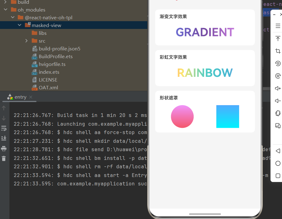
实现代码:
import React from 'react';
import {
  View,
  Text,
  StyleSheet,
  SafeAreaView,
} from 'react-native';
import MaskedView from '@react-native-oh-tpl/masked-view';
import LinearGradient from 'react-native-linear-gradient';

export default function App() {
  return (
    <SafeAreaView style={styles.container}>
      <View style={styles.content}>
        <Text style={styles.title}>🎭 MaskedView 演示</Text>

        {/* 渐变文字效果 */}
        <View style={styles.section}>
          <Text style={styles.sectionTitle}>渐变文字效果</Text>
          <MaskedView
            style={styles.maskedView}
            maskElement={
              <View style={styles.maskContainer}>
                <Text style={styles.maskText}>GRADIENT</Text>
              </View>
            }
          >
            <LinearGradient
              colors={['#667eea', '#764ba2', '#f093fb']}
              start={{ x: 0, y: 0.5 }}
              end={{ x: 1, y: 0.5 }}
              style={styles.gradient}
            />
          </MaskedView>
        </View>

        {/* 彩虹文字效果 */}
        <View style={styles.section}>
          <Text style={styles.sectionTitle}>彩虹文字效果</Text>
          <MaskedView
            style={styles.maskedView}
            maskElement={
              <View style={styles.maskContainer}>
                <Text style={styles.maskText}>RAINBOW</Text>
              </View>
            }
          >
            <LinearGradient
              colors={['#FF6B6B', '#FFE66D', '#4ECDC4', '#45B7D1', '#A78BFA']}
              start={{ x: 0, y: 0.5 }}
              end={{ x: 1, y: 0.5 }}
              style={styles.gradient}
            />
          </MaskedView>
        </View>

        {/* 形状遮罩 */}
        <View style={styles.section}>
          <Text style={styles.sectionTitle}>形状遮罩</Text>
          <View style={styles.shapeRow}>
            <MaskedView
              style={styles.circleMask}
              maskElement={<View style={styles.circle} />}
            >
              <LinearGradient
                colors={['#f093fb', '#f5576c']}
                style={styles.gradient}
              />
            </MaskedView>
            <MaskedView
              style={styles.rectMask}
              maskElement={<View style={styles.rect} />}
            >
              <LinearGradient
                colors={['#4facfe', '#00f2fe']}
                style={styles.gradient}
              />
            </MaskedView>
          </View>
        </View>
      </View>
    </SafeAreaView>
  );
}

const styles = StyleSheet.create({
  container: {
    flex: 1,
    backgroundColor: '#f5f5f5',
  },
  content: {
    flex: 1,
    padding: 20,
  },
  title: {
    fontSize: 24,
    fontWeight: 'bold',
    color: '#333',
    textAlign: 'center',
    marginBottom: 30,
  },
  section: {
    backgroundColor: '#fff',
    borderRadius: 12,
    padding: 16,
    marginBottom: 16,
  },
  sectionTitle: {
    fontSize: 16,
    fontWeight: '600',
    color: '#333',
    marginBottom: 16,
  },
  maskedView: {
    height: 60,
  },
  maskContainer: {
    flex: 1,
    backgroundColor: 'transparent',
    alignItems: 'center',
    justifyContent: 'center',
  },
  maskText: {
    fontSize: 40,
    fontWeight: 'bold',
    color: 'black',
  },
  gradient: {
    flex: 1,
  },
  shapeRow: {
    flexDirection: 'row',
    justifyContent: 'space-around',
  },
  circleMask: {
    width: 80,
    height: 80,
  },
  circle: {
    width: 80,
    height: 80,
    borderRadius: 40,
    backgroundColor: 'black',
  },
  rectMask: {
    width: 80,
    height: 80,
  },
  rect: {
    width: 80,
    height: 80,
    backgroundColor: 'black',
  },
});
📖 六、API 详解
6.1 核心概念
MaskedView 的工作原理是:遮罩元素定义可见区域,子元素只在该区域内显示。
遮罩原理:
- 遮罩元素中的不透明区域将成为可见区域
- 遮罩元素中的透明区域将被隐藏
- 子元素只会在遮罩定义的区域内显示
6.2 Props 属性
| 属性名 | 描述 | 类型 | 默认值 | 必填 |
|---|---|---|---|---|
maskElement |
遮罩元素,定义可见区域 | ReactElement |
- | ✅ |
style |
容器样式 | StyleProp |
- | ❌ |
androidRenderingMode |
安卓渲染模式 | 'software' | 'hardware' |
'hardware' |
❌ |
6.3 maskElement 详解
maskElement 是 MaskedView 最核心的属性,用于定义遮罩的形状和内容。
类型定义
maskElement: React.ReactElement;
工作原理
| 遮罩元素状态 | 子元素显示 |
|---|---|
| 不透明区域 | ✅ 可见 |
| 透明区域 | ❌ 隐藏 |
| 半透明区域 | ⚠️ 半透明 |
使用示例
文字遮罩:
<MaskedView
  style={{ height: 60 }}
  maskElement={
    <View style={{ backgroundColor: 'transparent', alignItems: 'center' }}>
      <Text style={{ fontSize: 40, fontWeight: 'bold', color: 'black' }}>
        HELLO
      </Text>
    </View>
  }
>
  <LinearGradient colors={['#667eea', '#764ba2']} style={{ flex: 1 }} />
</MaskedView>
形状遮罩:
<MaskedView
  style={{ width: 100, height: 100 }}
  maskElement={
    <View style={{
      width: 100,
      height: 100,
      borderRadius: 50,
      backgroundColor: 'black'
    }} />
  }
>
  <LinearGradient colors={['#f093fb', '#f5576c']} style={{ flex: 1 }} />
</MaskedView>
重要提示
- 背景色必须为透明:maskElement 的父容器背景色应为
transparent,否则遮罩效果不正确
// ✅ 正确
<View style={{ backgroundColor: 'transparent' }}>
  <Text style={{ color: 'black' }}>TEXT</Text>
</View>

// ❌ 错误 - 背景不透明会遮挡整个区域
<View style={{ backgroundColor: 'white' }}>
  <Text style={{ color: 'black' }}>TEXT</Text>
</View>
- 文字颜色必须为不透明:遮罩文字颜色应使用不透明颜色(如
black)
// ✅ 正确
<Text style={{ color: 'black' }}>TEXT</Text>

// ❌ 错误 - 透明文字不会产生遮罩
<Text style={{ color: 'transparent' }}>TEXT</Text>
6.4 style 属性
style 用于定义 MaskedView 容器的样式。
常用样式属性
| 属性 | 类型 | 说明 |
|---|---|---|
| width | number/string | 容器宽度 |
| height | number/string | 容器高度 |
| flex | number | 弹性布局 |
使用示例
<MaskedView
  style={{ width: 200, height: 100 }}
  maskElement={...}
>
  {...}
</MaskedView>
6.5 androidRenderingMode 属性
⚠️ HarmonyOS 不支持:此属性仅在 Android 平台有效
androidRenderingMode?: 'software' | 'hardware';
| 值 | 说明 | HarmonyOS 支持 |
|---|---|---|
| software | 软件渲染 | ❌ |
| hardware | 硬件渲染 | ❌ |
🎨 七、进阶技巧
7.1 配合 LinearGradient 实现渐变文字
这是 MaskedView 最常见的应用场景:
<MaskedView
  style={{ height: 50 }}
  maskElement={
    <View style={{ backgroundColor: 'transparent', alignItems: 'center' }}>
      <Text style={{ fontSize: 36, fontWeight: 'bold', color: 'black' }}>
        渐变文字
      </Text>
    </View>
  }
>
  <LinearGradient
    colors={['#667eea', '#764ba2']}
    start={{ x: 0, y: 0.5 }}
    end={{ x: 1, y: 0.5 }}
    style={{ flex: 1 }}
  />
</MaskedView>
7.2 多层遮罩叠加
通过嵌套 MaskedView 实现复杂效果:
<MaskedView
  style={{ height: 80 }}
  maskElement={
    <View style={{ backgroundColor: 'transparent', alignItems: 'center' }}>
      <Text style={{ fontSize: 50, fontWeight: 'bold', color: 'black' }}>
        COMBO
      </Text>
    </View>
  }
>
  <View style={{ flex: 1, backgroundColor: '#FF6B6B' }} />
  <View style={{ flex: 1, backgroundColor: '#4ECDC4' }} />
  <View style={{ flex: 1, backgroundColor: '#45B7D1' }} />
</MaskedView>
7.3 动态遮罩
通过 state 动态更新遮罩内容:
const [text, setText] = useState('LOADING');

useEffect(() => {
  const timer = setInterval(() => {
    setText(prev => prev === 'LOADING' ? 'DONE' : 'LOADING');
  }, 2000);
  return () => clearInterval(timer);
}, []);

return (
  <MaskedView
    style={{ height: 50 }}
    maskElement={
      <View style={{ backgroundColor: 'transparent', alignItems: 'center' }}>
        <Text style={{ fontSize: 36, fontWeight: 'bold', color: 'black' }}>
          {text}
        </Text>
      </View>
    }
  >
    <LinearGradient colors={['#667eea', '#764ba2']} style={{ flex: 1 }} />
  </MaskedView>
);
❓ 八、常见问题
8.1 遮罩效果不显示
问题原因:
- maskElement 的背景色不是透明
- 遮罩元素颜色为透明
解决方案:
// ✅ 正确写法
<MaskedView
  maskElement={
    <View style={{ backgroundColor: 'transparent' }}>
      <Text style={{ color: 'black' }}>TEXT</Text>
    </View>
  }
>
  {...}
</MaskedView>
8.2 渐变文字边缘模糊
问题原因:文字大小过小或设备像素密度问题
解决方案:适当增大文字大小,或使用 fontWeight: 'bold'
<Text style={{ fontSize: 40, fontWeight: 'bold', color: 'black' }}>
  TEXT
</Text>
8.3 子元素不显示
问题原因:MaskedView 没有设置高度
解决方案:为 MaskedView 设置明确的高度
<MaskedView style={{ height: 60 }} maskElement={...}>
  {...}
</MaskedView>
8.4 与其他组件组合使用
问题:如何与其他组件(如 TouchableOpacity)组合?
解决方案:
<TouchableOpacity onPress={handlePress}>
  <MaskedView
    style={{ height: 50 }}
    maskElement={
      <View style={{ backgroundColor: 'transparent', alignItems: 'center' }}>
        <Text style={{ fontSize: 36, color: 'black' }}>点击我</Text>
      </View>
    }
  >
    <LinearGradient colors={['#667eea', '#764ba2']} style={{ flex: 1 }} />
  </MaskedView>
</TouchableOpacity>
📊 九、性能优化
9.1 避免频繁更新 maskElement
maskElement 的更新会触发原生层的重新渲染,应避免在动画中频繁更新:
// ❌ 不推荐 - 每帧更新
<MaskedView maskElement={<Text>{animatedValue}</Text>}>

// ✅ 推荐 - 使用静态遮罩
<MaskedView maskElement={<Text>STATIC</Text>}>
9.2 合理设置容器尺寸
为 MaskedView 设置合理的尺寸,避免不必要的渲染区域:
// ✅ 推荐 - 明确尺寸
<MaskedView style={{ width: 200, height: 50 }}>

// ⚠️ 谨慎 - 可能导致过度渲染
<MaskedView style={{ flex: 1 }}>
9.3 缓存复杂遮罩
对于复杂的遮罩元素,可以考虑使用 useMemo 缓存:
const maskElement = useMemo(() => (
  <View style={{ backgroundColor: 'transparent' }}>
    <Text style={{ fontSize: 40, color: 'black' }}>COMPLEX</Text>
  </View>
), []);

<MaskedView maskElement={maskElement}>
  {...}
</MaskedView>
🎯 十、总结
10.1 核心要点回顾
| 知识点 | 要点 |
|---|---|
| maskElement | 定义遮罩形状,不透明区域为可见区域 |
| 背景色 | maskElement 父容器背景必须为透明 |
| 文字颜色 | 遮罩文字颜色必须为不透明颜色 |
| 容器尺寸 | 必须为 MaskedView 设置明确的高度 |
| 渐变文字 | 配合 LinearGradient 实现渐变文字效果 |

作为“人工智能6S店”的官方数字引擎,为AI开发者与企业提供一个覆盖软硬件全栈、一站式门户。
更多推荐


 2
2 0
0- 0


 已为社区贡献33条内容

所有评论(0)