
ReactNative for OpenHarmony项目鸿蒙化三方库:react-native-image-gallery — 图片画廊组件
问题原因自定义时未正确传递样式解决方案return (<Imagestyle={[]}/><Gallery/>
欢迎加入开源鸿蒙跨平台社区:https://openharmonycrossplatform.csdn.net
📌 开发环境声明:本文基于 React Native 0.72.90 版本进行开发适配
🚀 一、开篇引言
图片画廊(Gallery)是一个非常常见的功能组件。无论是电商应用的商品详情展示、社交应用的照片浏览,还是新闻资讯的图片轮播,都需要一个流畅、交互友好的图片画廊组件。react-native-image-gallery 是 React Native 社区中一款优秀的图片画廊组件,提供了手势缩放、滑动切换、自定义渲染等丰富的功能。本文将带你深入了解如何在 HarmonyOS 平台上集成和使用 react-native-image-gallery,打造出色的图片浏览体验。
1.1 知识点
- ✅ react-native-image-gallery 的核心概念与工作原理
- ✅ HarmonyOS 平台的完整集成流程
- ✅ 多种实战场景的代码实现(基础画廊、手势缩放、自定义渲染)
- ✅ 图片画廊的事件处理与交互
- ✅ 常见问题的解决方案
1.2 适用人群
- 正在进行 React Native 鸿蒙化迁移的开发者
- 需要实现图片画廊功能的应用开发者
- 对跨平台媒体组件开发感兴趣的技术爱好者
📦 二、库概览
2.1 基本信息
| 项目 | 内容 |
|---|---|
| 库名称 | react-native-image-gallery |
| 维护方 | React Native Community |
| 最新版本 | 2.1.5 |
| 鸿蒙适配包 | @react-native-oh-tpl/react-native-image-gallery |
| 官方仓库 | https://github.com/ekawat/react-native-image-gallery |
| 鸿蒙适配仓库 | https://github.com/react-native-oh-library/react-native-image-gallery |
| 开源协议 | ISC |
2.2 核心能力矩阵
| 能力项 | 描述 | HarmonyOS 支持 |
|---|---|---|
| 图片滑动切换 | 左右滑动切换图片 | ✅ 完全支持 |
| 手势缩放 | 双指缩放查看图片细节 | ✅ 完全支持 |
| 初始页面设置 | 指定首次显示的图片 | ✅ 完全支持 |
| 自定义渲染 | 自定义图片渲染组件 | ✅ 完全支持 |
| 错误处理 | 图片加载失败时显示错误组件 | ✅ 完全支持 |
| 页面间距 | 设置图片之间的间距 | ✅ 完全支持 |
| 滚动事件 | 监听页面滚动和选中事件 | ✅ 完全支持 |
| 单击/长按事件 | 处理用户交互事件 | ✅ 完全支持 |
| FlatList 配置 | 传递底层 FlatList 属性 | ✅ 完全支持 |
2.3 技术架构图
2.4 与同类方案对比
| 特性 | react-native-image-gallery | react-native-image-zoom-viewer | react-native-snap-carousel |
|---|---|---|---|
| HarmonyOS 支持 | ✅ | ⚠️ 需适配 | ⚠️ 需适配 |
| 手势缩放 | ✅ | ✅ | ❌ |
| 滑动切换 | ✅ | ✅ | ✅ |
| 自定义渲染 | ✅ | ✅ | ✅ |
| 虚拟化列表 | ✅ | ❌ | ✅ |
| 大量图片性能 | ✅ 优秀 | ⚠️ 一般 | ✅ 优秀 |
| 配置复杂度 | 简单 | 中等 | 中等 |
| 原生依赖 | 无 | 无 | 无 |
⚡ 三、快速开始
3.1 环境要求
| 依赖项 | 版本要求 |
|---|---|
| React Native | 0.72.x |
| RNOH (鸿蒙框架) | 0.72.90 |
| HarmonyOS SDK | 6.0.0.47+ (API 20) |
| DevEco Studio | 5.0.3+ / 6.0+ |
| Node.js | 16.18.0+ / 18.x |
3.2 版本说明
请到三方库的 Releases 发布地址查看配套的版本信息:@react-native-oh-tpl/react-native-image-gallery Releases
| 三方库版本 | 发布信息 | 支持RN版本 |
|---|---|---|
| 2.1.5-0.0.1 | @react-native-oh-tpl/react-native-image-gallery Releases | 0.72 |
3.3 一键安装
创建鸿蒙项目的过程不再进行描述了,不懂的看这篇:https://blog.csdn.net/u011178696/article/details/151932277
# 安装鸿蒙适配包
npm install @react-native-oh-tpl/react-native-image-gallery
3.4 验证安装
# 检查 package.json
type package.json | findstr image-gallery

# 预期输出
# "@react-native-oh-tpl/react-native-image-gallery": "^2.1.5-0.0.1"
🔧 四、HarmonyOS 集成详解
4.1 配置说明
💡 重要说明:react-native-image-gallery 是纯 JavaScript 组件,无需任何原生配置。安装完成后即可直接使用,不需要:
- ❌ 配置 CMake
- ❌ 配置 PackageProvider.cpp
- ❌ 配置 RNPackagesFactory.ts
- ❌ 引入 har 包或链接源码
只需要完成 npm 安装后,即可在代码中直接使用:
import Gallery from 'react-native-image-gallery';
4.2 TypeScript 类型声明配置
由于 react-native-image-gallery 没有内置 TypeScript 类型声明,需要手动添加类型声明文件。
步骤一:在项目根目录创建 react-native-image-gallery.d.ts 文件:
declare module 'react-native-image-gallery' {
  import { Component, ReactNode } from 'react';
  import { ViewStyle, ImageURISource, FlatListProps } from 'react-native';

  export interface ImageSource {
    source: ImageURISource | number;
    dimensions?: {
      width: number;
      height: number;
    };
  }

  export interface GalleryProps {
    images: ImageSource[];
    initialPage?: number;
    imageComponent?: (imageProps: any, dimensions: { width: number; height: number } | undefined) => ReactNode;
    errorComponent?: () => ReactNode;
    flatListProps?: Partial<FlatListProps<any>>;
    pageMargin?: number;
    onPageSelected?: (index: number) => void;
    onPageScrollStateChanged?: (state: 'idle' | 'dragging' | 'settling') => void;
    onPageScroll?: (event: {
      position: number;
      offset: number;
      offsetPixels: number;
    }) => void;
    scrollViewStyle?: ViewStyle;
    onSingleTapConfirmed?: () => void;
    onLongPress?: () => void;
    style?: ViewStyle;
  }

  export default class Gallery extends Component<GalleryProps> {}
}
步骤二:修改 tsconfig.json,添加类型声明文件的引用:
{
  "extends": "@tsconfig/react-native/tsconfig.json",
  "include": [
    "**/*.ts",
    "**/*.tsx"
  ]
}
4.3 添加 harmony 运行环境
在项目中的 package.json 中添加运行命令,harmony 运行使用 npm run harmony 命令
"scripts": {
  "android": "react-native run-android",
  "ios": "react-native run-ios",
  "lint": "eslint .",
  "start": "react-native start",
  "test": "jest",
  "harmony": "react-native bundle-harmony --dev"
},
💻 五、实战演练
场景一:基础图片画廊
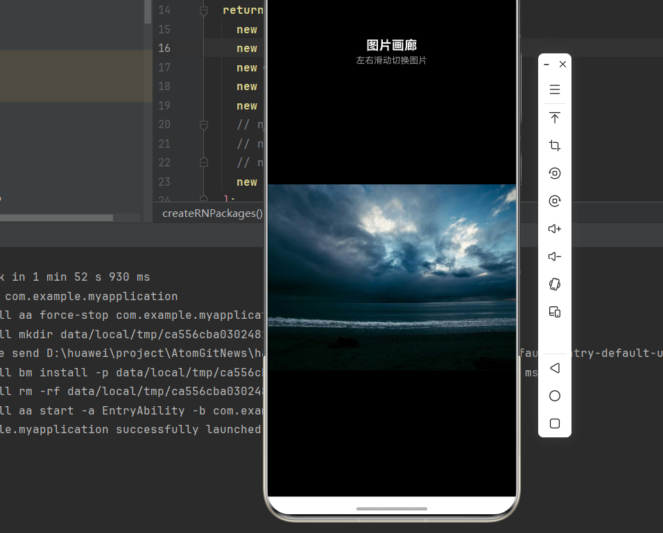
需求描述:实现一个基础的图片画廊功能,支持左右滑动切换图片。
本场景使用的核心属性:
| 属性 | 类型 | 说明 |
|---|---|---|
images |
array |
必填,图片数组,每个元素包含 source 和可选的 dimensions |
initialPage |
number |
初始显示的图片索引,默认为 0 |
pageMargin |
number |
图片之间的间距,单位为像素,默认为 0 |
style |
object |
Gallery 组件的容器样式 |
实现代码:
import React from 'react';
import {
  View,
  StyleSheet,
  SafeAreaView,
  Text,
  StatusBar,
} from 'react-native';
import Gallery from 'react-native-image-gallery';

interface ImageSource {
  source: { uri: string } | number;
  dimensions?: { width: number; height: number };
}

const IMAGES: ImageSource[] = [
  {
    source: { uri: 'https://picsum.photos/id/1015/800/600' },
    dimensions: { width: 800, height: 600 },
  },
  {
    source: { uri: 'https://picsum.photos/id/1016/800/600' },
    dimensions: { width: 800, height: 600 },
  },
  {
    source: { uri: 'https://picsum.photos/id/1018/800/600' },
    dimensions: { width: 800, height: 600 },
  },
  {
    source: { uri: 'https://picsum.photos/id/1019/800/600' },
    dimensions: { width: 800, height: 600 },
  },
  {
    source: { uri: 'https://picsum.photos/id/1020/800/600' },
    dimensions: { width: 800, height: 600 },
  },
];

export default function BasicGallery() {
  return (
    <SafeAreaView style={styles.container}>
      <StatusBar barStyle="light-content" backgroundColor="#000" />
      <View style={styles.header}>
        <Text style={styles.headerTitle}>图片画廊</Text>
        <Text style={styles.headerSubtitle}>左右滑动切换图片</Text>
      </View>
      <Gallery
        style={styles.gallery}
        images={IMAGES}
        initialPage={0}
        pageMargin={10}
      />
    </SafeAreaView>
  );
}

const styles = StyleSheet.create({
  container: {
    flex: 1,
    backgroundColor: '#000',
  },
  header: {
    paddingVertical: 16,
    paddingHorizontal: 20,
    alignItems: 'center',
  },
  headerTitle: {
    fontSize: 20,
    fontWeight: 'bold',
    color: '#fff',
  },
  headerSubtitle: {
    fontSize: 14,
    color: '#999',
    marginTop: 4,
  },
  gallery: {
    flex: 1,
    backgroundColor: '#000',
  },
});
场景二:带页面指示器的画廊
需求描述:在图片画廊底部添加页面指示器,显示当前页面位置。
本场景使用的核心属性:
| 属性 | 类型 | 说明 |
|---|---|---|
images |
array |
图片数组 |
initialPage |
number |
初始显示的图片索引 |
pageMargin |
number |
图片之间的间距 |
onPageSelected |
function |
核心事件,页面选中时触发,参数为当前页面索引 (index: number) => void |
实现思路:
- 使用
useState保存当前页面索引 - 通过
onPageSelected回调更新索引状态 - 根据索引渲染页面指示器(小圆点)和页码文字
实现代码:
import React, { useState, useCallback } from 'react';
import {
  View,
  StyleSheet,
  SafeAreaView,
  Text,
  StatusBar,
  TouchableOpacity,
} from 'react-native';
import Gallery from 'react-native-image-gallery';

interface ImageSource {
  source: { uri: string };
  dimensions?: { width: number; height: number };
}

const IMAGES: ImageSource[] = [
  {
    source: { uri: 'https://picsum.photos/id/1015/800/1200' },
    dimensions: { width: 800, height: 1200 },
  },
  {
    source: { uri: 'https://picsum.photos/id/1016/800/1200' },
    dimensions: { width: 800, height: 1200 },
  },
  {
    source: { uri: 'https://picsum.photos/id/1018/800/1200' },
    dimensions: { width: 800, height: 1200 },
  },
  {
    source: { uri: 'https://picsum.photos/id/1019/800/1200' },
    dimensions: { width: 800, height: 1200 },
  },
  {
    source: { uri: 'https://picsum.photos/id/1020/800/1200' },
    dimensions: { width: 800, height: 1200 },
  },
  {
    source: { uri: 'https://picsum.photos/id/1021/800/1200' },
    dimensions: { width: 800, height: 1200 },
  },
];

export default function GalleryWithIndicator() {
  const [currentIndex, setCurrentIndex] = useState(0);

  const handlePageSelected = useCallback((index: number) => {
    setCurrentIndex(index);
  }, []);

  const renderIndicator = () => (
    <View style={styles.indicatorContainer}>
      <View style={styles.dotsContainer}>
        {IMAGES.map((_, index) => (
          <View
            key={index}
            style={[
              styles.dot,
              index === currentIndex && styles.dotActive,
            ]}
          />
        ))}
      </View>
      <Text style={styles.pageText}>
        {currentIndex + 1} / {IMAGES.length}
      </Text>
    </View>
  );

  return (
    <SafeAreaView style={styles.container}>
      <StatusBar barStyle="light-content" backgroundColor="#000" />
      <Gallery
        style={styles.gallery}
        images={IMAGES}
        initialPage={0}
        pageMargin={10}
        onPageSelected={handlePageSelected}
      />
      {renderIndicator()}
    </SafeAreaView>
  );
}

const styles = StyleSheet.create({
  container: {
    flex: 1,
    backgroundColor: '#000',
  },
  gallery: {
    flex: 1,
    backgroundColor: '#000',
  },
  indicatorContainer: {
    position: 'absolute',
    bottom: 40,
    left: 0,
    right: 0,
    alignItems: 'center',
  },
  dotsContainer: {
    flexDirection: 'row',
    marginBottom: 12,
  },
  dot: {
    width: 8,
    height: 8,
    borderRadius: 4,
    backgroundColor: 'rgba(255, 255, 255, 0.4)',
    marginHorizontal: 4,
  },
  dotActive: {
    backgroundColor: '#fff',
    width: 10,
    height: 10,
    borderRadius: 5,
  },
  pageText: {
    fontSize: 16,
    color: '#fff',
    fontWeight: '600',
  },
});
场景三:带缩放功能的画廊
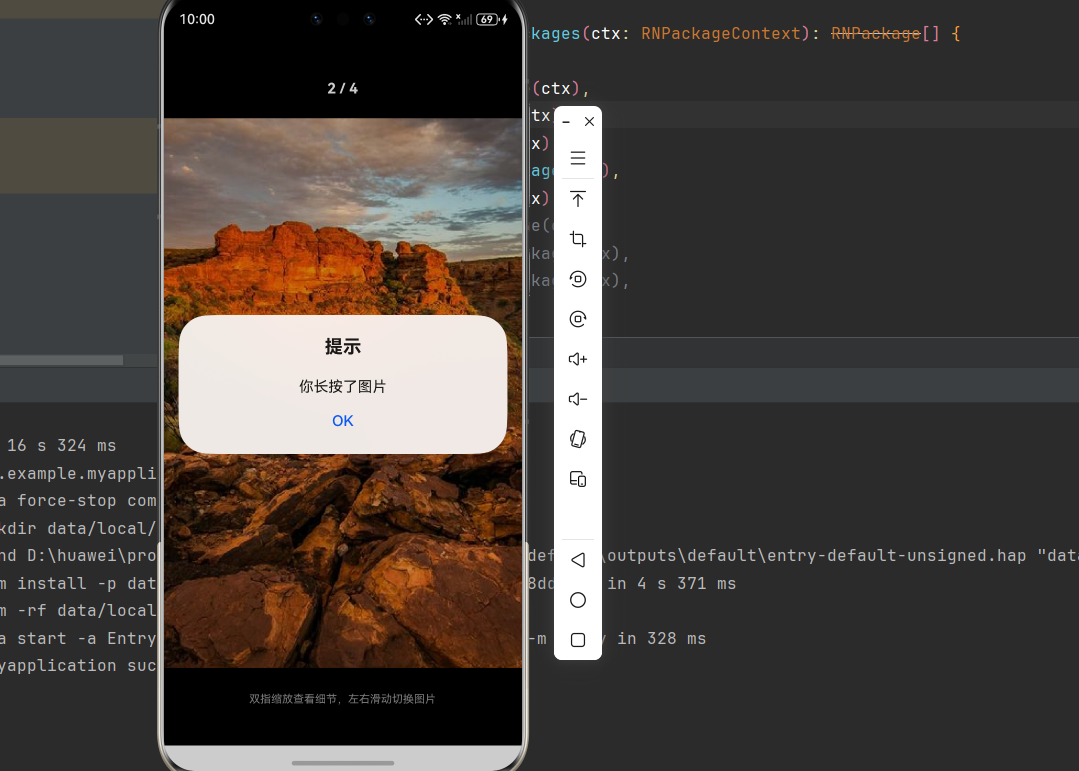
需求描述:实现支持双指缩放的图片画廊,用户可以放大查看图片细节。
本场景使用的核心属性:
| 属性/方法 | 类型 | 说明 |
|---|---|---|
images |
array |
图片数组,使用高分辨率图片 |
onSingleTapConfirmed |
function |
单击图片时触发的回调 () => void |
onLongPress |
function |
长按图片时触发的回调 () => void |
onPageSelected |
function |
页面选中回调,用于更新当前索引 |
实现思路:
- 使用高分辨率图片以获得更好的缩放效果
- 通过
onSingleTapConfirmed和onLongPress处理用户交互事件 - 通过
onPageSelected更新当前页面索引,显示页码
⚠️ 注意:
imageComponent属性在鸿蒙平台上存在兼容性问题,可能导致图片显示错位。建议使用 Gallery 默认的图片渲染。
实现代码:
import React, { useState, useCallback } from 'react';
import {
  View,
  StyleSheet,
  SafeAreaView,
  Text,
  StatusBar,
  Alert,
} from 'react-native';
import Gallery from 'react-native-image-gallery';

interface ImageSource {
  source: { uri: string };
  dimensions?: { width: number; height: number };
}

const HIGH_RES_IMAGES: ImageSource[] = [
  {
    source: { uri: 'https://picsum.photos/id/1015/800/600' },
    dimensions: { width: 800, height: 600 },
  },
  {
    source: { uri: 'https://picsum.photos/id/1016/800/600' },
    dimensions: { width: 800, height: 600 },
  },
  {
    source: { uri: 'https://picsum.photos/id/1018/800/600' },
    dimensions: { width: 800, height: 600 },
  },
  {
    source: { uri: 'https://picsum.photos/id/1019/800/600' },
    dimensions: { width: 800, height: 600 },
  },
];

export default function ZoomableGallery() {
  const [currentIndex, setCurrentIndex] = useState(0);

  const handlePageSelected = useCallback((index: number) => {
    setCurrentIndex(index);
  }, []);

  const handleSingleTap = useCallback(() => {
    Alert.alert('提示', '你单击了图片');
  }, []);

  const handleLongPress = useCallback(() => {
    Alert.alert('提示', '你长按了图片');
  }, []);

  return (
    <SafeAreaView style={styles.container}>
      <StatusBar barStyle="light-content" backgroundColor="#000" />

      <View style={styles.header}>
        <Text style={styles.pageIndicator}>
          {currentIndex + 1} / {HIGH_RES_IMAGES.length}
        </Text>
      </View>

      <Gallery
        style={styles.gallery}
        images={HIGH_RES_IMAGES}
        initialPage={0}
        pageMargin={10}
        onPageSelected={handlePageSelected}
        onSingleTapConfirmed={handleSingleTap}
        onLongPress={handleLongPress}
      />

      <View style={styles.footer}>
        <Text style={styles.hintText}>双指缩放查看细节,左右滑动切换图片</Text>
      </View>
    </SafeAreaView>
  );
}

const styles = StyleSheet.create({
  container: {
    flex: 1,
    backgroundColor: '#000',
  },
  header: {
    flexDirection: 'row',
    justifyContent: 'center',
    alignItems: 'center',
    paddingHorizontal: 16,
    paddingVertical: 12,
    backgroundColor: 'rgba(0, 0, 0, 0.5)',
  },
  pageIndicator: {
    color: '#fff',
    fontSize: 16,
    fontWeight: 'bold',
  },
  gallery: {
    flex: 1,
    backgroundColor: '#000',
  },
  footer: {
    paddingVertical: 16,
    alignItems: 'center',
    backgroundColor: 'rgba(0, 0, 0, 0.5)',
  },
  hintText: {
    color: '#999',
    fontSize: 12,
  },
});
📖 六、API 详解
6.1 Props 属性
| 属性名 | 描述 | 类型 | 默认值 | 必填 |
|---|---|---|---|---|
images |
图片数组,包含 source 和可选的 dimensions | array |
- | ✅ |
initialPage |
初始显示的图片索引 | number |
0 |
❌ |
imageComponent |
自定义图片渲染函数(⚠️ 鸿蒙平台有兼容性问题) | function |
<Image> 组件 |
❌ |
errorComponent |
图片加载失败时显示的自定义组件 | function |
默认错误视图 | ❌ |
flatListProps |
传递给底层 FlatList 的属性 | object |
{windowSize: 3} |
❌ |
pageMargin |
图片之间的间距 | number |
0 |
❌ |
onPageSelected |
页面选中时的回调,参数为页面索引 | function |
- | ❌ |
onPageScrollStateChanged |
页面滚动状态变化时的回调 | function |
- | ❌ |
onPageScroll |
页面滚动事件回调 | function |
- | ❌ |
scrollViewStyle |
FlatList 组件的自定义样式 | object |
{} |
❌ |
onSingleTapConfirmed |
单击图片时的回调 | function |
- | ❌ |
onLongPress |
长按图片时的回调 | function |
- | ❌ |
⚠️ 鸿蒙平台兼容性说明:
imageComponent属性在鸿蒙平台上存在样式传递问题,可能导致图片显示错位。建议在鸿蒙平台上使用 Gallery 默认的图片渲染,避免使用自定义imageComponent。
6.2 images 数组结构
interface ImageItem {
  source: { uri: string } | number;  // 图片源,支持网络 URL 或本地资源
  dimensions?: {
    width: number;
    height: number;
  };
}

// 使用示例
const images: ImageItem[] = [
  {
    source: { uri: 'https://example.com/image.jpg' },
    dimensions: { width: 800, height: 600 }
  },
  {
    source: require('./local-image.png'),
    dimensions: { width: 400, height: 400 }
  }
];
6.3 事件回调参数
onPageSelected
onPageSelected: (index: number) => void;
// index: 当前选中的页面索引(从 0 开始)
onPageScrollStateChanged
type ScrollState = 'idle' | 'dragging' | 'settling';
onPageScrollStateChanged: (state: ScrollState) => void;
// idle: 空闲状态
// dragging: 正在拖动
// settling: 正在自动滚动到目标位置
onPageScroll
onPageScroll: (event: {
  position: number;      // 当前页面索引
  offset: number;        // 偏移量 (0-1)
  offsetPixels: number;  // 像素偏移量
}) => void;
❓ 七、常见问题
7.1 图片不显示或加载失败
问题原因:
- 网络图片 URL 无效或无法访问
- 未配置网络权限
- 图片尺寸未正确设置
解决方案:
- 检查网络权限配置(
module.json5):
{
  "module": {
    "requestPermissions": [
      {
        "name": "ohos.permission.INTERNET"
      }
    ]
  }
}
- 使用
errorComponent处理加载失败:
<Gallery
  images={images}
  errorComponent={() => (
    <View style={styles.errorView}>
      <Text>图片加载失败</Text>
    </View>
  )}
/>
7.2 滑动不流畅
问题原因:
- 图片过大,占用内存过多
- FlatList 虚拟化配置不当
解决方案:
- 优化
flatListProps配置:
<Gallery
  images={images}
  flatListProps={{
    windowSize: 3,
    initialNumToRender: 2,
    maxToRenderPerBatch: 2,
    removeClippedSubviews: true,
  }}
/>
- 使用适当尺寸的图片,避免加载过大的原图
7.3 页面指示器不更新
问题原因:
- 未正确绑定
onPageSelected回调 - 状态更新逻辑有误
解决方案:
const [currentIndex, setCurrentIndex] = useState(0);

const handlePageSelected = useCallback((index: number) => {
  setCurrentIndex(index);
}, []);

<Gallery
  images={images}
  onPageSelected={handlePageSelected}
/>
7.4 自定义图片组件样式问题
问题原因:
- 自定义
imageComponent时未正确传递样式
解决方案:
const renderImageComponent = (imageProps: any, dimensions: any) => {
  return (
    <Image
      {...imageProps}
      style={[
        { flex: 1 },
        dimensions && { width: dimensions.width, height: dimensions.height },
      ]}
      resizeMode="contain"
    />
  );
};

<Gallery
  images={images}
  imageComponent={renderImageComponent}
/>
🎯 八、最佳实践
8.1 性能优化建议
8.2 推荐配置
const OPTIMAL_CONFIG = {
  flatListProps: {
    windowSize: 3,
    initialNumToRender: 2,
    maxToRenderPerBatch: 2,
    removeClippedSubviews: true,
  },
  pageMargin: 10,
};

<Gallery
  images={optimizedImages}
  {...OPTIMAL_CONFIG}
/>
8.3 错误处理最佳实践
const renderErrorComponent = useCallback(() => (
  <View style={styles.errorContainer}>
    <Icon name="image-broken" size={48} color="#999" />
    <Text style={styles.errorText}>图片加载失败</Text>
    <TouchableOpacity
      style={styles.retryButton}
      onPress={handleRetry}
    >
      <Text style={styles.retryText}>点击重试</Text>
    </TouchableOpacity>
  </View>
), [handleRetry]);
8.4 无障碍支持
<Gallery
  images={images}
  flatListProps={{
    accessible: true,
    accessibilityLabel: '图片画廊',
    accessibilityHint: '左右滑动切换图片',
  }}
/>

作为“人工智能6S店”的官方数字引擎,为AI开发者与企业提供一个覆盖软硬件全栈、一站式门户。
更多推荐


 2
2 0
0- 0


 已为社区贡献33条内容

所有评论(0)