
ReactNative for OpenHarmony项目鸿蒙化三方库:react-native-linear-gradient — 绚丽的渐变效果实现
欢迎加入开源鸿蒙跨平台社区:https://openharmonycrossplatform.csdn.net
📌 开发环境声明:本文基于 React Native 0.72.90 版本进行开发适配
🚀 一、开篇引言
在现代移动应用设计中,渐变效果已成为提升视觉体验的重要手段。从按钮背景、卡片装饰到全屏背景,渐变色彩能够为应用增添层次感和现代感。本文将带你深入了解如何在 HarmonyOS 平台上集成和使用 react-native-linear-gradient,实现绚丽的渐变效果。
1.1 你将学到什么?
- ✅ react-native-linear-gradient 的核心概念与工作原理
- ✅ HarmonyOS 平台的完整集成流程
- ✅ 多种实战场景的代码实现(按钮渐变、背景渐变、卡片装饰)
- ✅ 渐变方向与角度的精确控制
- ✅ 常见问题的解决方案
1.2 适用人群
- 正在进行 React Native 鸿蒙化迁移的开发者
- 需要实现渐变视觉效果的应用开发者
- 对跨平台 UI 开发感兴趣的技术爱好者
📦 二、库概览
2.1 基本信息
| 项目 | 内容 |
|---|---|
| 库名称 | react-native-linear-gradient |
| 维护方 | React Native Community |
| 最新版本 | 3.0.0 (RN 0.72) |
| RN 0.72 适配包 | @react-native-oh-tpl/react-native-linear-gradient@3.0.0-0.5.0 |
| RN 0.77 适配包 | @react-native-ohos/react-native-linear-gradient@3.1.0 |
| 官方仓库 | https://github.com/react-native-linear-gradient/react-native-linear-gradient |
| 鸿蒙适配仓库 | https://atomgit.com/openharmony-sig/rntpc_react-native-linear-gradient |
| 开源协议 | MIT |
2.2 核心能力矩阵
| 能力项 | 描述 | HarmonyOS 支持 |
|---|---|---|
| 线性渐变 | 支持多色线性渐变 | ✅ 完全支持 |
| 渐变方向 | 支持起点终点坐标控制 | ✅ 完全支持 |
| 角度渐变 | 支持角度控制渐变方向 | ✅ 完全支持 |
| 颜色位置 | 支持指定颜色位置 | ✅ 完全支持 |
| 角度中心 | 支持角度中心坐标 | ❌ 暂不支持 |
| 透明度渐变 | 支持透明度渐变效果 | ✅ 完全支持 |
2.3 技术架构图
2.4 与同类方案对比
| 特性 | react-native-linear-gradient | expo-linear-gradient | CSS 渐变 |
|---|---|---|---|
| HarmonyOS 支持 | ✅ | ⚠️ 需适配 | ❌ |
| 原生性能 | 优秀 | 优秀 | 一般 |
| 角度控制 | ✅ | ✅ | ✅ |
| 透明度支持 | ✅ | ✅ | ✅ |
| API 简洁度 | 简洁 | 简洁 | 中等 |
| 自定义位置 | ✅ | ✅ | ✅ |
⚡ 三、快速开始
3.1 环境要求
| 依赖项 | 版本要求 |
|---|---|
| React Native | 0.72.x |
| RNOH (鸿蒙框架,我用的这个) | 0.72.90 |
| HarmonyOS SDK | 5.0.0+ |
| DevEco Studio | 5.0.3+ |
| Node.js | 16+ |
3.2 一键安装
创建鸿蒙项目的过程不在进行描述了,不懂得看这篇:https://blog.csdn.net/u011178696/article/details/151932277
# 安装鸿蒙适配包
npm install @react-native-oh-tpl/react-native-linear-gradient@3.0.0-0.5.0
3.3 验证安装
# 检查 package.json
type package.json | findstr linear-gradient

# 预期输出
# "@react-native-oh-tpl/react-native-linear-gradient": "^3.0.0-0.5.0"
🔧 四、HarmonyOS 集成详解
4.1 配置清单
📌 按顺序完成以下配置,缺一不可
| 步骤 | 配置文件 | 操作 | 重要程度 |
|---|---|---|---|
| 1 | harmony/oh-package.json5 | 添加 overrides | ⭐⭐⭐ |
| 2 | harmony/entry/oh-package.json5 | 添加 har 依赖 | ⭐⭐⭐ |
| 3 | harmony/entry/src/main/cpp/CMakeLists.txt | 配置编译链接 | ⭐⭐⭐ |
| 4 | harmony/entry/src/main/cpp/PackageProvider.cpp | 引入头文件 | ⭐⭐⭐ |
💡 注意:react-native-linear-gradient 在 RN 0.72 版本暂不支持 Autolink,需要手动配置原生依赖。
4.2 步骤详解(一定要根据自己的版本来)
步骤一:配置 overrides
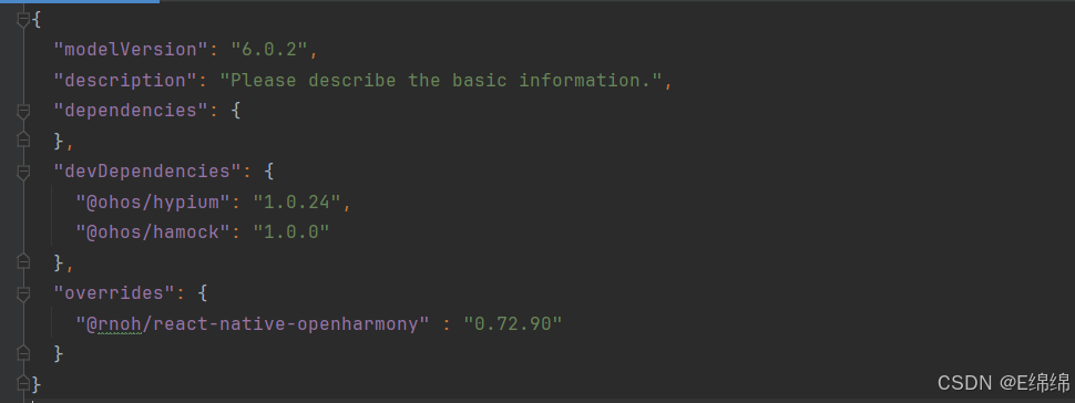
// 文件:harmony/oh-package.json5
{
  "name": "MyApplication",
  "version": "1.0.0",
  "description": "Please describe the basic information.",
  "main": "",
  "author": "",
  "license": "",
  "dependencies": {},
  "overrides": {
    "@rnoh/react-native-openharmony": "0.72.90"
  }
}
步骤二:引入原生端代码
💡 提供两种引入方式,推荐使用 方法一(har 包引入)
方法一:通过 har 包引入(推荐)
📌 har 包位于三方库安装路径的
harmony文件夹下
打开 harmony/entry/oh-package.json5,添加以下依赖:
{
  "name": "entry",
  "version": "1.0.0",
  "description": "Please describe the basic information.",
  "main": "",
  "author": "",
  "license": "",
  "dependencies": {
    "@rnoh/react-native-openharmony": "0.72.90",
    "@react-native-oh-tpl/react-native-linear-gradient": "file:../../node_modules/@react-native-oh-tpl/react-native-linear-gradient/harmony/linear_gradient.har"
  }
}
点击 DevEco Studio 右上角的 Sync Now 按钮,或在终端执行:
cd harmony/entry
ohpm install
方法二:直接链接源码
步骤 1:将 <RN工程>/node_modules/@react-native-oh-tpl/react-native-linear-gradient/harmony 目录下的源码 linear_gradient 复制到 harmony 工程根目录下。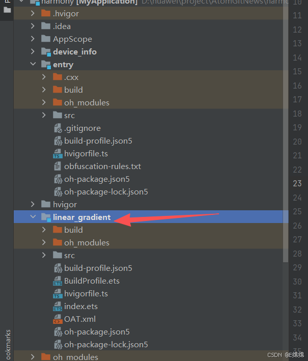
步骤 2:在 harmony 工程根目录的 build-profile.json5 添加以下模块:
{
  "app": {
    "signingConfigs": [],
    "products": [],
    "buildModeSet": []
  },
  "modules": [
    {
      "name": "entry",
      "srcPath": "./entry",
      "targets": []
    },
    {
      "name": "linear_gradient",
      "srcPath": "./linear_gradient"
    }
  ]
}
步骤 3:打开 harmony/linear_gradient/oh-package.json5,修改 @rnoh/react-native-openharmony 版本与项目一致: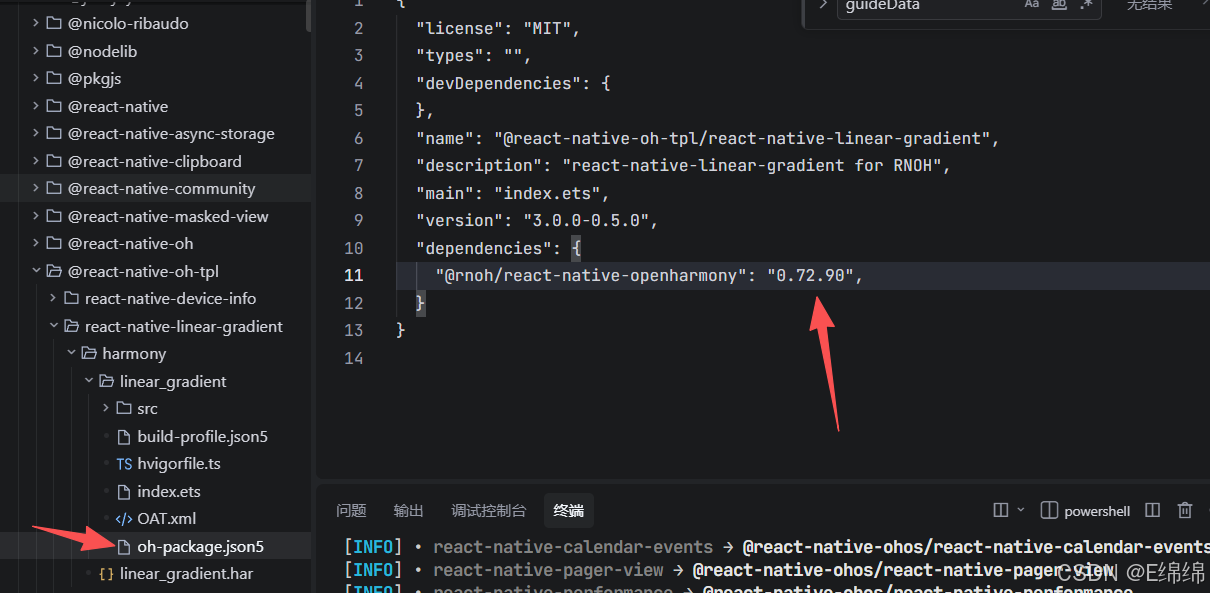
{
  "dependencies": {
    "@rnoh/react-native-openharmony": "0.72.90"
  }
}
步骤 4:打开 harmony/entry/oh-package.json5,添加以下依赖:
{
  "dependencies": {
    "@rnoh/react-native-openharmony": "0.72.90",
    "@react-native-oh-tpl/react-native-linear-gradient": "file:../linear_gradient"
  }
}
步骤 5:点击 DevEco Studio 右上角的 Sync Now 按钮
步骤三:配置 CMake 编译
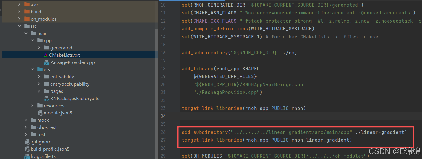
# 文件:harmony/entry/src/main/cpp/CMakeLists.txt

project(rnapp)
cmake_minimum_required(VERSION 3.4.1)
set(CMAKE_SKIP_BUILD_RPATH TRUE)
set(RNOH_APP_DIR "${CMAKE_CURRENT_SOURCE_DIR}")
set(NODE_MODULES "${CMAKE_CURRENT_SOURCE_DIR}/../../../../../node_modules")
+ set(OH_MODULES "${CMAKE_CURRENT_SOURCE_DIR}/../../../oh_modules")
set(RNOH_CPP_DIR "${CMAKE_CURRENT_SOURCE_DIR}/../../../../../../react-native-harmony/harmony/cpp")
set(LOG_VERBOSITY_LEVEL 1)
set(CMAKE_ASM_FLAGS "-Wno-error=unused-command-line-argument -Qunused-arguments")
set(CMAKE_CXX_FLAGS "-fstack-protector-strong -Wl,-z,relro,-z,now,-z,noexecstack -s -fPIE -pie")
set(WITH_HITRACE_SYSTRACE 1)
add_compile_definitions(WITH_HITRACE_SYSTRACE)

add_subdirectory("${RNOH_CPP_DIR}" ./rn)

# RNOH_BEGIN: add_package_subdirectories
add_subdirectory("../../../../sample_package/src/main/cpp" ./sample-package)
# RNOH_END: add_package_subdirectories

# RNOH_BEGIN: manual_package_linking_1
+ add_subdirectory("../../../../linear_gradient/src/main/cpp" ./linear-gradient)
# RNOH_END: manual_package_linking_1

file(GLOB GENERATED_CPP_FILES "./generated/*.cpp")

add_library(rnoh_app SHARED
    ${GENERATED_CPP_FILES}
    "./PackageProvider.cpp"
    "${RNOH_CPP_DIR}/RNOHAppNapiBridge.cpp"
)
target_link_libraries(rnoh_app PUBLIC rnoh)

# RNOH_BEGIN: link_packages
target_link_libraries(rnoh_app PUBLIC rnoh_sample_package)
# RNOH_END: link_packages

# RNOH_BEGIN: manual_package_linking_2
+ target_link_libraries(rnoh_app PUBLIC rnoh_linear_gradient)
# RNOH_END: manual_package_linking_2
步骤四:引入 Package
// 文件:harmony/entry/src/main/cpp/PackageProvider.cpp

#include "RNOH/PackageProvider.h"
#include "generated/RNOHGeneratedPackage.h"
#include "SamplePackage.h"
+ #include "LinearGradientPackage.h"

using namespace rnoh;

std::vector<std::shared_ptr<Package>> PackageProvider::getPackages(Package::Context ctx) {
    return {
        std::make_shared<RNOHGeneratedPackage>(ctx),
        std::make_shared<SamplePackage>(ctx),
        + std::make_shared<LinearGradientPackage>(ctx),
    };
}
4.3 同步与编译
# 进入 entry 目录
cd harmony/entry

# 执行依赖同步
ohpm install

# 返回项目根目录
cd ../..
在 DevEco Studio 中点击右上角的 Sync Now 按钮,等待同步完成后编译运行。
4.4 添加 harmony 运行环境
在项目中的 package.json 中添加运行命令,harmony 运行使用 npm run harmony 命令
"scripts": {
  "android": "react-native run-android",
  "ios": "react-native run-ios",
  "lint": "eslint .",
  "start": "react-native start",
  "test": "jest",
  "harmony": "react-native bundle-harmony --dev"
},
💻 五、实战演练
场景一:渐变按钮
需求描述:实现一个带有渐变背景的按钮,支持点击交互。
实现代码:
import React from 'react';
import {
  View,
  Text,
  StyleSheet,
  TouchableOpacity,
} from 'react-native';
import LinearGradient from 'react-native-linear-gradient';

interface GradientButtonProps {
  title: string;
  onPress?: () => void;
  colors?: string[];
  disabled?: boolean;
}

export default function GradientButton({
  title,
  onPress,
  colors = ['#4c669f', '#3b5998', '#192f6a'],
  disabled = false,
}: GradientButtonProps) {
  return (
    <TouchableOpacity
      onPress={onPress}
      disabled={disabled}
      activeOpacity={0.8}
      style={styles.container}
    >
      <LinearGradient
        colors={disabled ? ['#ccc', '#aaa', '#888'] : colors}
        style={styles.gradient}
        start={{ x: 0, y: 0 }}
        end={{ x: 1, y: 0 }}
      >
        <Text style={[styles.buttonText, disabled && styles.disabledText]}>
          {title}
        </Text>
      </LinearGradient>
    </TouchableOpacity>
  );
}

const styles = StyleSheet.create({
  container: {
    borderRadius: 25,
    overflow: 'hidden',
    elevation: 3,
    shadowColor: '#000',
    shadowOffset: { width: 0, height: 2 },
    shadowOpacity: 0.2,
    shadowRadius: 4,
  },
  gradient: {
    paddingVertical: 14,
    paddingHorizontal: 32,
    alignItems: 'center',
    justifyContent: 'center',
  },
  buttonText: {
    fontSize: 16,
    fontWeight: '600',
    color: '#FFFFFF',
    textAlign: 'center',
  },
  disabledText: {
    color: 'rgba(255,255,255,0.7)',
  },
});
使用示例:
import GradientButton from './GradientButton';

function App() {
  return (
    <View style={styles.container}>
      <GradientButton
        title="登录"
        onPress={() => console.log('登录按钮被点击')}
        colors={['#667eea', '#764ba2']}
      />
      <GradientButton
        title="注册"
        onPress={() => console.log('注册按钮被点击')}
        colors={['#f093fb', '#f5576c']}
      />
      <GradientButton
        title="禁用状态"
        disabled={true}
      />
    </View>
  );
}
场景二:渐变背景页面
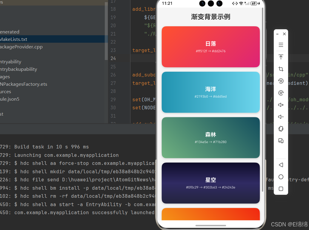
需求描述:实现一个带有渐变背景的页面,支持多种渐变方向和角度。
实现代码:
import React from 'react';
import {
  View,
  Text,
  StyleSheet,
  ScrollView,
  SafeAreaView,
} from 'react-native';
import LinearGradient from 'react-native-linear-gradient';

const gradientPresets = [
  {
    name: '日落',
    colors: ['#ff512f', '#dd2476'],
    start: { x: 0, y: 0 },
    end: { x: 1, y: 1 },
  },
  {
    name: '海洋',
    colors: ['#2193b0', '#6dd5ed'],
    start: { x: 0, y: 0 },
    end: { x: 1, y: 0 },
  },
  {
    name: '森林',
    colors: ['#134e5e', '#71b280'],
    start: { x: 0, y: 1 },
    end: { x: 1, y: 0 },
  },
  {
    name: '星空',
    colors: ['#0f0c29', '#302b63', '#24243e'],
    start: { x: 0, y: 0 },
    end: { x: 0, y: 1 },
  },
  {
    name: '角度渐变',
    colors: ['#f5af19', '#f12711'],
    useAngle: true,
    angle: 45,
  },
];

export default function GradientBackgroundScreen() {
  return (
    <ScrollView style={styles.container}>
      <SafeAreaView>
        <Text style={styles.title}>渐变背景示例</Text>

        {gradientPresets.map((preset, index) => (
          <View key={index} style={styles.cardContainer}>
            <LinearGradient
              colors={preset.colors}
              style={styles.gradientCard}
              start={preset.start}
              end={preset.end}
              useAngle={preset.useAngle}
              angle={preset.angle}
            >
              <Text style={styles.presetName}>{preset.name}</Text>
              <Text style={styles.presetColors}>
                {preset.colors.join(' → ')}
              </Text>
            </LinearGradient>
          </View>
        ))}
      </SafeAreaView>
    </ScrollView>
  );
}

const styles = StyleSheet.create({
  container: {
    flex: 1,
    backgroundColor: '#f5f5f5',
  },
  title: {
    fontSize: 24,
    fontWeight: 'bold',
    textAlign: 'center',
    marginVertical: 20,
    color: '#333',
  },
  cardContainer: {
    marginHorizontal: 16,
    marginBottom: 16,
    borderRadius: 16,
    overflow: 'hidden',
    elevation: 4,
    shadowColor: '#000',
    shadowOffset: { width: 0, height: 2 },
    shadowOpacity: 0.15,
    shadowRadius: 8,
  },
  gradientCard: {
    height: 150,
    justifyContent: 'center',
    alignItems: 'center',
  },
  presetName: {
    fontSize: 20,
    fontWeight: 'bold',
    color: '#FFFFFF',
    marginBottom: 8,
  },
  presetColors: {
    fontSize: 12,
    color: 'rgba(255,255,255,0.8)',
  },
});
场景三:渐变卡片组件
需求描述:实现一个带有渐变装饰的卡片组件,适用于展示列表项或内容卡片。
实现代码:
import React from 'react';
import {
  View,
  Text,
  StyleSheet,
  Image,
  TouchableOpacity,
} from 'react-native';
import LinearGradient from 'react-native-linear-gradient';

interface GradientCardProps {
  title: string;
  subtitle: string;
  imageUrl?: string;
  gradientColors?: string[];
  onPress?: () => void;
}

export default function GradientCard({
  title,
  subtitle,
  imageUrl,
  gradientColors = ['#667eea', '#764ba2'],
  onPress,
}: GradientCardProps) {
  return (
    <TouchableOpacity
      style={styles.container}
      onPress={onPress}
      activeOpacity={0.9}
    >
      <LinearGradient
        colors={gradientColors}
        style={styles.gradient}
        start={{ x: 0, y: 0 }}
        end={{ x: 1, y: 1 }}
      >
        <View style={styles.content}>
          <View style={styles.textContainer}>
            <Text style={styles.title} numberOfLines={2}>
              {title}
            </Text>
            <Text style={styles.subtitle} numberOfLines={3}>
              {subtitle}
            </Text>
          </View>
          {imageUrl && (
            <Image
              source={{ uri: imageUrl }}
              style={styles.image}
              resizeMode="cover"
            />
          )}
        </View>
      </LinearGradient>
    </TouchableOpacity>
  );
}

const styles = StyleSheet.create({
  container: {
    marginHorizontal: 16,
    marginVertical: 8,
    borderRadius: 16,
    overflow: 'hidden',
    elevation: 4,
    shadowColor: '#000',
    shadowOffset: { width: 0, height: 4 },
    shadowOpacity: 0.15,
    shadowRadius: 12,
  },
  gradient: {
    padding: 16,
  },
  content: {
    flexDirection: 'row',
    alignItems: 'center',
  },
  textContainer: {
    flex: 1,
    marginRight: 12,
  },
  title: {
    fontSize: 18,
    fontWeight: 'bold',
    color: '#FFFFFF',
    marginBottom: 8,
  },
  subtitle: {
    fontSize: 14,
    color: 'rgba(255,255,255,0.85)',
    lineHeight: 20,
  },
  image: {
    width: 80,
    height: 80,
    borderRadius: 12,
  },
});
使用示例:
import GradientCard from './GradientCard';

function CardList() {
  const cards = [
    {
      title: '探索宇宙奥秘',
      subtitle: '从地球到火星,探索人类太空探索的伟大征程',
      gradientColors: ['#1a2a6c', '#b21f1f', '#fdbb2d'],
    },
    {
      title: '自然之美',
      subtitle: '记录地球上最壮观的自然景观',
      gradientColors: ['#134e5e', '#71b280'],
    },
    {
      title: '科技创新',
      subtitle: '人工智能如何改变我们的生活',
      gradientColors: ['#0f0c29', '#302b63', '#24243e'],
    },
  ];

  return (
    <ScrollView style={styles.container}>
      {cards.map((card, index) => (
        <GradientCard
          key={index}
          title={card.title}
          subtitle={card.subtitle}
          gradientColors={card.gradientColors}
          onPress={() => console.log('卡片被点击:', card.title)}
        />
      ))}
    </ScrollView>
  );
}
📋 六、API 详解
6.1 Props 属性
| 属性名 | 描述 | 类型 | 必填 | 默认值 |
|---|---|---|---|---|
| colors | 渐变颜色数组 | (string| number)[] | 是 | - |
| start | 渐变起点坐标 | { x: number, y: number } | 否 | { x: 0.5, y: 0 } |
| end | 渐变终点坐标 | { x: number, y: number } | 否 | { x: 0.5, y: 1 } |
| locations | 颜色位置数组 | number[] | 否 | - |
| useAngle | 是否使用角度 | boolean | 否 | false |
| angle | 渐变角度(度) | number | 否 | 0 |
6.2 坐标系统说明
(0,0) ─────────────── (1,0)
  │                      │
  │                      │
  │                      │
  │                      │
(0,1) ─────────────── (1,1)
x: 水平方向,0 表示最左边,1 表示最右边y: 垂直方向,0 表示最上边,1 表示最下边
6.3 常用渐变方向
// 从上到下(默认)
start={{ x: 0.5, y: 0 }}
end={{ x: 0.5, y: 1 }}

// 从左到右
start={{ x: 0, y: 0.5 }}
end={{ x: 1, y: 0.5 }}

// 对角线(左上到右下)
start={{ x: 0, y: 0 }}
end={{ x: 1, y: 1 }}

// 对角线(右上到左下)
start={{ x: 1, y: 0 }}
end={{ x: 0, y: 1 }}

// 使用角度
useAngle={true}
angle={45}  // 45度角渐变
6.4 locations 属性说明
locations 数组用于指定每个颜色在渐变中的位置,值范围 0-1:
<LinearGradient
  colors={['#ff0000', '#00ff00', '#0000ff']}
  locations={[0, 0.5, 1]}  // 红色在0%,绿色在50%,蓝色在100%
  style={styles.gradient}
/>
⚠️ 七、常见问题与解决方案
7.1 渐变不显示
问题描述:设置了渐变颜色但页面没有显示渐变效果。
解决方案:
// ❌ 错误:没有设置样式尺寸
<LinearGradient colors={['#4c669f', '#3b5998']}>
  <Text>内容</Text>
</LinearGradient>

// ✅ 正确:设置 flex: 1 或具体尺寸
<LinearGradient
  colors={['#4c669f', '#3b5998']}
  style={{ flex: 1 }}
>
  <Text>内容</Text>
</LinearGradient>
7.2 颜色格式问题
问题描述:某些颜色格式不被识别。
解决方案:
// ✅ 推荐使用的颜色格式
colors={['#4c669f', '#3b5998']}           // 十六进制
colors={['rgb(76, 102, 159)', 'rgb(59, 89, 152)']}  // RGB
colors={['rgba(76, 102, 159, 0.8)', 'rgba(59, 89, 152, 0.5)']}  // 带透明度
7.3 angleCenter 不支持
问题描述:使用 angleCenter 属性无效。
解决方案:
⚠️ HarmonyOS 当前版本暂不支持
angleCenter属性,建议使用start和end坐标来控制渐变方向。
🎯 八、最佳实践
8.1 性能优化
- 避免频繁更新渐变颜色:渐变计算有一定开销,避免在动画中频繁改变颜色
- 合理使用颜色数量:一般 2-4 个颜色即可满足需求,过多颜色会增加计算量
- 使用缓存:对于固定的渐变配置,可以提取为常量
8.2 代码规范
// ✅ 推荐:提取渐变配置为常量
const GRADIENT_PRESETS = {
  primary: {
    colors: ['#667eea', '#764ba2'],
    start: { x: 0, y: 0 },
    end: { x: 1, y: 1 },
  },
  secondary: {
    colors: ['#f093fb', '#f5576c'],
    start: { x: 0, y: 0.5 },
    end: { x: 1, y: 0.5 },
  },
};

// 使用时
<LinearGradient {...GRADIENT_PRESETS.primary} style={styles.gradient}>
  <Text>内容</Text>
</LinearGradient>
8.3 无障碍支持
<LinearGradient
  colors={['#667eea', '#764ba2']}
  style={styles.gradient}
  accessible={true}
  accessibilityLabel="渐变背景"
>
  <Text style={styles.text}>渐变内容</Text>
</LinearGradient>

作为“人工智能6S店”的官方数字引擎,为AI开发者与企业提供一个覆盖软硬件全栈、一站式门户。
更多推荐


 0
0 0
0- 0


 已为社区贡献37条内容

所有评论(0)