
基于React Native鸿蒙跨平台List组件(横向模式)逻辑一致,实现流行时尚商品的横向滚动展示,适配鸿蒙系统的滑动交互逻辑
电商类应用是移动端开发的核心场景之一,涵盖商品展示、分类导航、推荐系统、商家模块、交互操作等复杂业务逻辑。这份 React Native 全能商城代码,采用组件化、强类型、高性能渲染的设计思路,完整实现了电商 App 首页的核心功能,同时具备极佳的跨端适配潜力。本文将从 React Native 原生技术架构、核心功能实现亮点、鸿蒙(HarmonyOS)跨端适配方案 三个维度,深度拆解这款商城应用
欢迎大家加入开源鸿蒙跨平台开发者社区,一起共建开源鸿蒙跨平台生态。
在时尚消费领域,用户对应用的跨端体验一致性、视觉美学与场景化交互的要求尤为突出。React Native 凭借其“一次开发,多端部署”的核心优势,成为连接 iOS、Android 与鸿蒙(HarmonyOS)系统的理想技术选型。本文以时尚搭配应用为例,从时尚消费场景的数据模型设计、鸿蒙风格 UI 实现、跨端业务逻辑兼容等维度,深度解析 React Native 对接鸿蒙系统的技术内核与时尚消费场景的落地最佳实践。
一、跨端时尚消费应
本时尚搭配应用聚焦服装、鞋履、配饰、虚拟试穿、潮流趋势五大核心时尚消费场景,覆盖商品展示、详情查看、购物车操作等完整消费链路,整体架构遵循 React Native 组件化开发范式,同时深度契合鸿蒙系统的设计语言与时尚类应用的交互规范。从技术底层来看,应用基于 React 函数式组件 + TypeScript 构建,这种组合既保证了时尚商品数据的类型安全,又能最大化跨端复用率,是 React Native 适配鸿蒙系统时尚消费类应用的最优技术底座。
1. 时尚消费
时尚消费类应用涉及多维度的商品属性(风格、流行度、适用场景等),统一且精准的强类型数据模型是避免多端行为不一致的关键。代码中通过 TypeScript 严格定义了时尚商品的核心数据结构,覆盖时尚消费全场景的业务属性:
// 时尚商品核心数据模型
type FashionProduct = {
  id: string;
  name: string;
  category: '服装' | '鞋履' | '配饰' | '虚拟试穿' | '潮流趋势';
  price: number;
  image: string;
  description: string;
  style?: string; // 风格
  isTrending?: boolean; // 是否流行
};
这种场景化的强类型定义不仅在开发阶段提供语法校验和智能提示,更关键的是在鸿蒙系统适配时,能够与 ArkTS 的类型系统形成天然映射。相较于纯 JavaScript 开发,TypeScript 可有效规避因数据类型模糊导致的时尚商品信息展示错误——尤其是在鸿蒙这类面向全场景智慧终端的操作系统中,类型安全能大幅降低多设备适配的调试成本,确保商品风格、流行度、价格等核心时尚消费数据在不同终端的一致性。
2. 轻量级状态管理:
应用采用 React 内置的 useState Hook 管理核心商品状态,结合不可变数据模式实现时尚商品信息的跨端展示:
const [products] = useState<FashionProduct[]>([
  {
    id: '1',
    name: '简约白衬衫',
    category: '服装',
    price: 199,
    image: '👕',
    description: '百搭基础款,适合各种场合',
    style: '简约风',
    isTrending: true
  },
  // 其他时尚商品数据
]);
这种轻量级状态管理方案完全适配时尚消费类跨端开发场景,相较于 Redux 等重型状态库,useState 无需额外的中间件和适配层,能够直接在 React Native 支持的所有平台(包括鸿蒙)上稳定运行。从鸿蒙系统的视角来看,useState 的状态管理逻辑与 ArkUI 的 @State 装饰器在设计理念上高度契合,开发者无需切换思维模式即可完成跨端状态管理,大幅降低了鸿蒙适配的学习成本。
React Native 的核心价值在于通过统一的组件抽象层,屏蔽不同平台的 UI 实现差异。本应用在 UI 层的设计深度复刻了鸿蒙系统的视觉风格与时尚类应用交互规范,同时保证多端体验的一致性。
1. Flex 布局
应用基于 React Native 的 Flex 布局系统构建整体界面,通过 Dimensions.get('window') 获取设备宽高,实现对不同尺寸鸿蒙设备(手机、平板、智慧屏)的自适应:
const { width, height } = Dimensions.get('window');
相较于鸿蒙系统的 DirectionalLayout 和 GridLayout,React Native 的 Flex 布局具备更强的跨端兼容性,通过 flexDirection、justifyContent、flexWrap 等属性,能够精准还原鸿蒙系统的时尚消费界面布局逻辑。例如时尚商品网格布局的实现:
<View style={styles.productsGrid}>
  {products
    .filter(p => p.category === category)
    .map(product => (
      <TouchableOpacity
        key={product.id}
        style={styles.productItem}
        onPress={() => handleProductDetail(product.id)}
      >
        {/* 时尚商品展示内容 */}
      </TouchableOpacity>
    ))
  }
</View>
这段代码通过 flexDirection: 'row'、justifyContent: 'space-between' 和 flexWrap: 'wrap' 实现了鸿蒙系统特有的时尚商品网格布局效果,结合 width: '48%' 的样式定义,在不同尺寸的鸿蒙设备上都能保持时尚商品卡片的合理排列,无需针对鸿蒙系统做额外的布局适配。
2. 视觉样式:
应用通过 StyleSheet.create 定义样式表,深度适配鸿蒙系统的时尚消费设计规范,核心体现在以下几个维度:
- 时尚色彩体系:采用鸿蒙系统的轻奢紫系主色调(
#7c3aed、#5b21b6),搭配功能性色彩区分商品分类(服装-紫色、鞋履-蓝色、配饰-橙色、虚拟试穿-绿色、潮流趋势-红色),符合鸿蒙系统时尚应用“优雅、轻奢”的视觉设计理念 - 圆角与阴影:使用
borderRadius: 12实现鸿蒙风格的大圆角设计,通过elevation(Android)和shadow(iOS)属性适配鸿蒙系统的阴影效果,兼顾时尚界面的层次感与跨端一致性 - 时尚标签与价格样式:通过动态样式绑定实现鸿蒙风格的流行标签,同时强化时尚商品价格的视觉层级:
<View style={[
  styles.categoryHeader,
  { borderLeftColor: getCategoryColor(category) }
]}>
  <Text style={styles.categoryTitle}>{category}</Text>
</View>

<Text style={styles.largeProductPrice}>¥{product.price}</Text>
这种样式设计方案完全基于 React Native 的标准 API 实现,在鸿蒙系统中能够通过 React Native 的渲染层自动转换为原生样式——borderLeftColor 对应鸿蒙的 border-left-color,borderRadius 对应鸿蒙的 border-radius,无需编写平台特定代码。
3. 交互组件:
应用中所有交互组件均基于 React Native 基础组件封装,同时适配鸿蒙系统的时尚消费交互规范:
- SafeAreaView:对应鸿蒙系统的
SafeArea组件,适配刘海屏、挖孔屏等异形屏,保证时尚消费界面在鸿蒙不同终端设备上的完整性 - ScrollView (horizontal):与鸿蒙的
List组件(横向模式)逻辑一致,实现流行时尚商品的横向滚动展示,适配鸿蒙系统的滑动交互逻辑 - TouchableOpacity:替代鸿蒙的
Button组件,实现时尚商品卡片、加入购物车按钮的点击反馈效果,符合鸿蒙的交互规范 - Alert:对应鸿蒙的
TextDialog组件,实现时尚商品详情、购物车操作等弹窗交互,保持与鸿蒙原生时尚消费应用一致的交互体验
以时尚商品详情查看交互为例,代码通过 Alert 实现鸿蒙风格的商品信息展示:
const handleProductDetail = (productId: string) => {
  const product = products.find(p => p.id === productId);
  if (product) {
    Alert.alert(
      '商品详情',
      `名称: ${product.name}\n` +
      `风格: ${product.style}\n` +
      `分类: ${product.category}\n` +
      `价格: ¥${product.price}\n` +
      `描述: ${product.description}\n` +
      `${product.isTrending ? '🔥 正在流行' : ''}`,
      [{ text: '确定', style: 'cancel' }]
    );
  }
};
这种交互逻辑完全基于 React Native 的跨端 API 实现,在鸿蒙系统中能够保持与原生时尚消费应用一致的交互体验,无需针对鸿蒙系统做特殊处理。
除了 UI 层的适配,时尚消费业务逻辑的跨端兼容性是 React Native 开发的核心。本应用的核心业务逻辑包括时尚商品详情展示、加入购物车、分类筛选等,这些逻辑完全基于 JavaScript/TypeScript 实现,天然具备跨端运行能力。
1. 时尚商品分类
应用实现了基于商品分类的精准筛选逻辑,通过纯函数过滤实现不同时尚商品类别的展示:
{['服装', '鞋履', '配饰', '虚拟试穿', '潮流趋势'].map(category => (
  <View key={category} style={styles.categorySection}>
    {/* 分类标题 */}
    <View style={styles.productsGrid}>
      {products
        .filter(p => p.category === category)
        .map(product => (
          {/* 时尚商品展示 */}
        ))
      }
    </View>
  </View>
))}
该逻辑完全基于纯函数实现,不依赖任何平台特定 API,在 React Native 支持的所有平台(包括鸿蒙)上都能稳定运行。值得注意的是,代码中使用 Array.filter 等标准 JavaScript 方法处理时尚商品数据,这些方法在鸿蒙系统的 JS 引擎中能够无缝执行,体现了 React Native 跨端开发“一次编写,多端复用”的核心价值。
2. 加入购物车
应用针对时尚消费场景实现了鸿蒙风格的加入购物车交互,包含商品信息校验与操作反馈:
const handleQuickAdd = (productId: string) => {
  const product = products.find(p => p.id === productId);
  if (product) {
    Alert.alert(
      '加入购物车',
      `已将 ${product.name} 加入购物车\n` +
      `价格: ¥${product.price}`,
      [
        { text: '继续选购', style: 'cancel' },
        { text: '去结算', onPress: () => Alert.alert('提示', '跳转到购物车页面') }
      ]
    );
  }
};
这种交互逻辑基于纯 JavaScript 实现,能够有效保证购物车操作的跨端一致性,同时在鸿蒙系统中,Alert.alert 的回调函数能够被 JS 引擎高效执行,确保时尚消费操作的即时反馈。
3. 流行时尚商品筛选
应用实现了基于 isTrending 属性的流行时尚商品筛选,用于展示核心推荐商品:
{products.filter(p => p.isTrending).map(product => (
  <TouchableOpacity
    key={product.id}
    style={styles.trendingItem}
    onPress={() => handleProductDetail(product.id)}
  >
    {/* 流行时尚商品展示 */}
  </TouchableOpacity>
))}
这种无副作用的纯函数筛选方式,不仅符合 React 的设计理念,更重要的是在跨端场景下,能够避免因不同平台的运行时差异导致的筛选结果不一致。对于鸿蒙系统而言,这类纯逻辑代码无需任何适配即可直接运行,是时尚消费类跨端开发的最优实践。
从本应用的实现来看,React Native 对接鸿蒙系统时尚消费场景的核心在于“抽象层适配 + 时尚体验兼容”,具体体现在以下几个维度:
-
JS 引擎层时尚兼容:鸿蒙系统内置了符合 ECMAScript 标准的 JavaScript 引擎,能够直接执行 React Native 的 JS 代码,这是跨端运行的底层基础。本应用中所有的时尚消费业务逻辑代码(商品筛选、详情展示、购物车操作)均运行在 JS 引擎层,无需任何修改即可在鸿蒙系统中执行,保证了时尚消费逻辑的跨端一致性。
-
组件映射层时尚适配:React Native 通过自定义渲染器,将 React 组件(View、Text、TouchableOpacity 等)映射为鸿蒙系统的原生组件。例如横向
ScrollView会被转换为鸿蒙的横向List组件,这种映射关系由 React Native 的鸿蒙适配层自动完成,开发者无需关注底层实现细节,只需专注于时尚消费业务逻辑开发。 -
样式转换层时尚规范适配:React Native 的 StyleSheet 样式会被自动转换为鸿蒙系统的原生样式,本应用中定义的所有鸿蒙时尚消费风格样式(轻奢紫主调、分类色彩、商品卡片样式)都能通过这一层完成自动转换,保证了时尚 UI 风格在鸿蒙系统中的一致性。
-
时尚体验跨端兼容:应用中所有交互逻辑均基于 React Native 的标准 API 实现,这些 API 在鸿蒙系统中会被替换为对应的原生 API 调用,例如
Alert.alert对应鸿蒙的TextDialog,TouchableOpacity对应鸿蒙的Button,确保了时尚消费体验在不同平台的一致性。
本时尚搭配应用的实现完整展现了 React Native 在鸿蒙跨端时尚消费开发领域的技术优势,核心要点可总结为:
- 强类型设计保障时尚数据一致性:TypeScript 场景化类型定义不仅提升代码质量,更能与鸿蒙 ArkTS 形成类型映射,降低时尚消费场景跨端适配成本,是时尚消费类应用跨端开发的基础保障
- 纯逻辑开发最大化时尚代码复用率:商品筛选、详情展示、购物车操作等核心时尚消费逻辑采用纯 JavaScript/TypeScript 实现,无需针对鸿蒙系统做特殊修改,大幅提升开发效率
- 标准 API 适配鸿蒙时尚生态:基于 React Native 标准组件和 API 开发,通过底层适配层自动对接鸿蒙原生能力,兼顾开发效率与时尚消费场景的原生体验
本项目采用React Native函数式组件架构,以FashionStylistApp为核心组件,实现了时尚搭配师应用的完整功能流程。架构设计遵循模块化原则,将数据结构、状态管理和业务逻辑清晰分离,便于维护和扩展。
核心技术栈
- React Native:跨平台移动应用开发框架,支持iOS、Android和鸿蒙系统
- TypeScript:提供类型安全,增强代码可维护性和开发体验
- Hooks API:使用useState进行状态管理,简化组件逻辑
- Flexbox:实现响应式布局,适配不同屏幕尺寸
- Base64图标:内置图标资源,减少网络请求,提升加载速度
- Dimensions API:获取屏幕尺寸,实现精细化布局控制
时尚商品类型(FashionProduct)
type FashionProduct = {
  id: string;
  name: string;
  category: '服装' | '鞋履' | '配饰' | '虚拟试穿' | '潮流趋势';
  price: number;
  image: string;
  description: string;
  style?: string;
  isTrending?: boolean;
};
该类型设计全面,包含了时尚商品的核心信息:
id:唯一标识符,确保数据唯一性name:商品名称,便于用户识别category:商品分类,使用联合类型确保类型安全price:价格信息,直接影响购买决策image:商品图片,提升用户体验description:商品描述,提供详细信息style:风格信息,可选字段,增强商品特色isTrending:是否流行,可选字段,用于推荐展示
核心状态
应用使用useState钩子管理一个核心状态:
products:时尚商品列表,使用常量状态,包含多种类型的时尚商品
状态
- 商品详情:通过handleProductDetail函数,根据商品ID查找商品信息并展示
- 加入购物车:通过handleQuickAdd函数,将商品添加到购物车
- 用户交互:通过Alert组件提供操作确认和信息提示
状态管理
- 不可变数据模式:使用find方法查找商品,避免直接修改原状态
- 状态验证:在进行操作前,通过find方法验证商品是否存在
- 用户反馈:操作完成后,通过Alert组件提供明确的成功提示
- 数据过滤:使用filter方法筛选流行商品,实现智能推荐
核心业务
- 商品展示:展示时尚商品列表,包含流行推荐和分类导航
- 商品详情:查看商品详细信息,包括名称、价格、描述等
- 加入购物车:快速将商品添加到购物车,支持继续选购或去结算
- 分类浏览:按商品分类浏览不同类型的时尚商品
核心业务
const handleProductDetail = (productId: string) => {
  const product = products.find(p => p.id === productId);
  if (product) {
    Alert.alert(
      '商品详情',
      `名称: ${product.name}\n` +
      `风格: ${product.style}\n` +
      `分类: ${product.category}\n` +
      `价格: ¥${product.price}\n` +
      `描述: ${product.description}\n` +
      `${product.isTrending ? '🔥 正在流行' : ''}`,
      [{ text: '确定', style: 'cancel' }]
    );
  }
};
数据流设计
- 单向数据流:状态 → 视图 → 用户操作 → 状态更新
- 数据过滤:在渲染时使用filter方法筛选流行商品,确保推荐准确性
- 业务逻辑封装:将复杂操作逻辑封装在专用函数中,提高代码可读性
- 用户交互反馈:使用Alert组件提供操作确认和信息提示,提升用户体验
组件
- 核心组件:SafeAreaView、View、Text、ScrollView、TouchableOpacity等在鸿蒙系统上有对应实现
- API兼容性:Dimensions API在鸿蒙系统中可正常使用,确保布局适配
- Alert组件:鸿蒙系统支持Alert组件的基本功能,但样式可能有所差异
- ScrollView:横向ScrollView在鸿蒙系统中可正常使用,确保流行商品展示
资源管理
- Base64图标:在鸿蒙系统中同样支持,可减少网络请求,提升性能
- 内存管理:鸿蒙系统对内存使用更为严格,需注意资源释放
- 计算性能:对于商品过滤和查找等操作,鸿蒙系统的处理性能与其他平台相当
性能
- 渲染性能:避免不必要的重渲染,合理使用React.memo;对于长商品列表,建议使用FlatList替代ScrollView;优化组件结构,减少嵌套层级
- 数据处理:缓存计算结果,避免重复计算;优化商品查找算法,特别是流行商品筛选;考虑使用useMemo缓存计算结果,提高性能
- 内存管理:及时释放不再使用的资源;避免内存泄漏,特别是在处理多个商品时;合理使用缓存策略,平衡性能和内存占用
类型定义
- 使用枚举类型:将商品分类、风格等使用枚举类型替代字符串,提高代码可读性和可维护性
- 类型扩展:考虑使用接口继承,增强类型系统的表达能力
- 类型守卫:添加更多类型守卫,确保运行时类型安全
- 国际化支持:考虑添加国际化支持,特别是商品分类等术语
状态管理
- 状态分离:对于复杂状态,考虑使用useReducer或状态管理库(如Redux、Zustand)
- 状态持久化:实现状态持久化,使用AsyncStorage存储商品和购物车数据
- 计算属性:使用useMemo缓存计算结果,避免重复计算
- 批量操作:支持批量管理购物车商品,提高用户体验
组件化
- 组件拆分:将大型组件拆分为更小的可复用组件,如ProductCard、CategorySection、TrendingItem等
- 自定义Hook:提取重复的状态逻辑到自定义Hook,如useProductManager、useCart等
- 高阶组件:使用高阶组件处理横切关注点,如错误边界、加载状态等
- 表单组件:封装商品详情和购物车组件,提高代码复用性
业务逻辑
- 服务层分离:将业务逻辑分离到服务层,提高代码可测试性
- 错误处理:增强错误处理机制,提供更友好的错误提示
- 实时更新:考虑添加实时商品库存更新,提升用户体验
- 智能推荐:实现更智能的商品推荐算法,基于用户偏好和浏览历史
本项目展示了如何使用React Native和TypeScript构建一个功能完整的时尚搭配师应用。通过合理的架构设计、类型定义和状态管理,实现了跨平台的一致性体验。
在鸿蒙跨端开发方面,需要注意平台特定API的兼容性处理,优化资源管理和渲染性能,确保在不同平台上都能提供良好的用户体验。同时,由于涉及时尚商品的特殊性,还需特别关注商品分类和推荐的准确性。
通过采用本文提出的优化建议,可以进一步提升应用的性能、可维护性和用户体验,为时尚爱好者提供更便捷、更个性化的搭配参考工具。
随着React Native和鸿蒙系统的不断发展,跨端开发将会变得更加成熟和高效。未来可以考虑:
- 使用React Native 0.70+版本:利用新的架构特性,如Fabric渲染器和Turbo Modules,提升应用性能
- 探索鸿蒙原生能力:充分利用鸿蒙系统的分布式能力,实现多设备协同和更丰富的功能
- 引入现代化状态管理:使用Redux Toolkit或Zustand等现代状态管理库,简化状态管理
- 实现PWA支持:扩展应用的使用场景,支持Web平台
- 集成AI能力:引入AI技术,如智能搭配推荐、虚拟试穿等,提升应用智能化水平
- 实时数据同步:实现商品价格和库存的实时同步,确保数据准确性
- 多语言支持:添加多语言支持,提升应用的全球适配能力
通过持续的技术迭代和优化,可以构建更加稳定、高效、智能的时尚搭配师应用,为用户提供更优质的时尚搭配体验。
真实演示案例代码:
// App.tsx
import React, { useState } from 'react';
import { SafeAreaView, View, Text, StyleSheet, TouchableOpacity, ScrollView, Dimensions, Alert } from 'react-native';

// Base64 图标库
const ICONS_BASE64 = {
  outfit: 'data:image/png;base64,iVBORw0KGgoAAAANSUhEUgAAAAEAAAABCAYAAAAfFcSJAAAADUlEQVR42mNkYPhfDwAChwGA60e6kgAAAABJRU5ErkJggg==',
  shoes: 'data:image/png;base64,iVBORw0KGgoAAAANSUhEUgAAAAEAAAABCAYAAAAfFcSJAAAADUlEQVR42mNkYPhfDwAChwGA60e6kgAAAABJRU5ErkJggg==',
  accessory: 'data:image/png;base64,iVBORw0KGgoAAAANSUhEUgAAAAEAAAABCAYAAAAfFcSJAAAADUlEQVR42mNkYPhfDwAChwGA60e6kgAAAABJRU5ErkJggg==',
  tryon: 'data:image/png;base64,iVBORw0KGgoAAAANSUhEUgAAAAEAAAABCAYAAAAfFcSJAAAADUlEQVR42mNkYPhfDwAChwGA60e6kgAAAABJRU5ErkJggg==',
  trend: 'data:image/png;base64,iVBORw0KGgoAAAANSUhEUgAAAAEAAAABCAYAAAAfFcSJAAAADUlEQVR42mNkYPhfDwAChwGA60e6kgAAAABJRU5ErkJggg==',
  weather: 'data:image/png;base64,iVBORw0KGgoAAAANSUhEUgAAAAEAAAABCAYAAAAfFcSJAAAADUlEQVR42mNkYPhfDwAChwGA60e6kgAAAABJRU5ErkJggg==',
  occasion: 'data:image/png;base64,iVBORw0KGgoAAAANSUhEUgAAAAEAAAABCAYAAAAfFcSJAAAADUlEQVR42mNkYPhfDwAChwGA60e6kgAAAABJRU5ErkJggg==',
  hat: 'data:image/png;base64,iVBORw0KGgoAAAANSUhEUgAAAAEAAAABCAYAAAAfFcSJAAAADUlEQVR42mNkYPhfDwAChwGA60e6kgAAAABJRU5ErkJggg==',
};

const { width, height } = Dimensions.get('window');

// 时尚商品类型
type FashionProduct = {
  id: string;
  name: string;
  category: '服装' | '鞋履' | '配饰' | '虚拟试穿' | '潮流趋势';
  price: number;
  image: string;
  description: string;
  style?: string; // 风格
  isTrending?: boolean; // 是否流行
};

// 时尚搭配应用组件
const FashionStylistApp: React.FC = () => {
  const [products] = useState<FashionProduct[]>([
    {
      id: '1',
      name: '简约白衬衫',
      category: '服装',
      price: 199,
      image: '👕',
      description: '百搭基础款,适合各种场合',
      style: '简约风',
      isTrending: true
    },
    {
      id: '2',
      name: '小白鞋',
      category: '鞋履',
      price: 299,
      image: '👟',
      description: '舒适透气,永不过时的经典',
      style: '休闲风'
    },
    {
      id: '3',
      name: '丝巾项链',
      category: '配饰',
      price: 89,
      image: '🧣',
      description: '优雅点缀,提升整体造型感',
      style: '优雅风',
      isTrending: true
    },
    {
      id: '4',
      name: 'AR虚拟试穿',
      category: '虚拟试穿',
      price: 0,
      image: '👓',
      description: '手机扫码即可试穿最新款式',
      style: '科技感'
    },
    {
      id: '5',
      name: '2024春夏流行色',
      category: '潮流趋势',
      price: 0,
      image: '🎨',
      description: '潘通年度色彩搭配指南',
      style: '流行趋势'
    },
    {
      id: '6',
      name: '贝雷帽',
      category: '配饰',
      price: 129,
      image: '🎩',
      description: '法式优雅,四季皆宜',
      style: '复古风'
    }
  ]);

  const getCategoryColor = (category: string) => {
    switch (category) {
      case '服装': return '#8b5cf6';
      case '鞋履': return '#3b82f6';
      case '配饰': return '#f59e0b';
      case '虚拟试穿': return '#10b981';
      case '潮流趋势': return '#ef4444';
      default: return '#64748b';
    }
  };

  const handleProductDetail = (productId: string) => {
    const product = products.find(p => p.id === productId);
    if (product) {
      Alert.alert(
        '商品详情',
        `名称: ${product.name}\n` +
        `风格: ${product.style}\n` +
        `分类: ${product.category}\n` +
        `价格: ¥${product.price}\n` +
        `描述: ${product.description}\n` +
        `${product.isTrending ? '🔥 正在流行' : ''}`,
        [{ text: '确定', style: 'cancel' }]
      );
    }
  };

  const handleQuickAdd = (productId: string) => {
    const product = products.find(p => p.id === productId);
    if (product) {
      Alert.alert(
        '加入购物车',
        `已将 ${product.name} 加入购物车\n` +
        `价格: ¥${product.price}`,
        [
          { text: '继续选购', style: 'cancel' },
          { text: '去结算', onPress: () => Alert.alert('提示', '跳转到购物车页面') }
        ]
      );
    }
  };

  return (
    <SafeAreaView style={styles.container}>
      {/* 头部 */}
      <View style={styles.header}>
        <Text style={styles.title}>时尚搭配师</Text>
        <Text style={styles.subtitle}>穿出你的独特风格</Text>
      </View>

      <ScrollView style={styles.content}>
        {/* 流行推荐 */}
        <View style={styles.trendingCard}>
          <Text style={styles.sectionTitle}>流行推荐</Text>
          <ScrollView horizontal showsHorizontalScrollIndicator={false}>
            <View style={styles.trendingRow}>
              {products.filter(p => p.isTrending).map(product => (
                <TouchableOpacity
                  key={product.id}
                  style={styles.trendingItem}
                  onPress={() => handleProductDetail(product.id)}
                >
                  <Text style={styles.productImage}>{product.image}</Text>
                  <Text style={styles.productName}>{product.name}</Text>
                  <Text style={styles.productStyle}>{product.style}</Text>
                  <Text style={styles.productPrice}>¥{product.price}</Text>
                  <View style={styles.trendingTag}>
                    <Text style={styles.trendingTagText}>流行</Text>
                  </View>
                </TouchableOpacity>
              ))}
            </View>
          </ScrollView>
        </View>

        {/* 分类导航 */}
        <View style={styles.categoriesCard}>
          <Text style={styles.sectionTitle}>搭配分类</Text>

          {['服装', '鞋履', '配饰', '虚拟试穿', '潮流趋势'].map(category => (
            <View key={category} style={styles.categorySection}>
              <View style={[
                styles.categoryHeader,
                { borderLeftColor: getCategoryColor(category) }
              ]}>
                <Text style={styles.categoryTitle}>{category}</Text>
              </View>

              <View style={styles.productsGrid}>
                {products
                  .filter(p => p.category === category)
                  .map(product => (
                    <TouchableOpacity
                      key={product.id}
                      style={styles.productItem}
                      onPress={() => handleProductDetail(product.id)}
                    >
                      <Text style={styles.largeProductImage}>{product.image}</Text>
                      <Text style={styles.largeProductName}>{product.name}</Text>
                      <Text style={styles.largeProductStyle}>{product.style}</Text>
                      <Text style={styles.largeProductDesc}>{product.description}</Text>
                      <View style={styles.priceRow}>
                        <Text style={styles.largeProductPrice}>¥{product.price}</Text>
                        {product.isTrending && (
                          <View style={styles.smallTrendingTag}>
                            <Text style={styles.smallTrendingTagText}>热</Text>
                          </View>
                        )}
                      </View>
                      <TouchableOpacity
                        style={styles.addButton}
                        onPress={() => handleQuickAdd(product.id)}
                      >
                        <Text style={styles.addButtonText}>+ 加入购物车</Text>
                      </TouchableOpacity>
                    </TouchableOpacity>
                  ))
                }
              </View>
            </View>
          ))}
        </View>

        {/* 搭配贴士 */}
        <View style={styles.tipsCard}>
          <Text style={styles.sectionTitle}>搭配小贴士</Text>

          <View style={styles.tipItem}>
            <Text style={styles.tipEmoji}>🌤️</Text>
            <View style={styles.tipContent}>
              <Text style={styles.tipTitle}>天气搭配</Text>
              <Text style={styles.tipDesc}>根据气温选择合适厚度的衣物</Text>
            </View>
          </View>

          <View style={styles.tipItem}>
            <Text style={styles.tipEmoji}>💼</Text>
            <View style={styles.tipContent}>
              <Text style={styles.tipTitle}>场合选择</Text>
              <Text style={styles.tipDesc}>正式场合选择简约大方的款式</Text>
            </View>
          </View>

          <View style={styles.tipItem}>
            <Text style={styles.tipEmoji}>🎨</Text>
            <View style={styles.tipContent}>
              <Text style={styles.tipTitle}>色彩搭配</Text>
              <Text style={styles.tipDesc}>同色系搭配更显高级感</Text>
            </View>
          </View>
        </View>

        {/* 使用说明 */}
        <View style={styles.infoCard}>
          <Text style={styles.sectionTitle}>使用说明</Text>
          <Text style={styles.infoText}>• 根据季节智能推荐搭配方案</Text>
          <Text style={styles.infoText}>• 提供AR虚拟试穿体验</Text>
          <Text style={styles.infoText}>• 跟踪最新时尚潮流趋势</Text>
          <Text style={styles.infoText}>• 7天无理由退换货</Text>
        </View>
      </ScrollView>

      {/* 底部导航 */}
      <View style={styles.bottomNav}>
        <TouchableOpacity style={styles.navItem}>
          <Text style={styles.navIcon}>👚</Text>
          <Text style={styles.navText}>服装</Text>
        </TouchableOpacity>
        <TouchableOpacity style={styles.navItem}>
          <Text style={styles.navIcon}>👠</Text>
          <Text style={styles.navText}>鞋履</Text>
        </TouchableOpacity>
        <TouchableOpacity style={styles.navItem}>
          <Text style={styles.navIcon}>👓</Text>
          <Text style={styles.navText}>试穿</Text>
        </TouchableOpacity>
        <TouchableOpacity style={[styles.navItem, styles.activeNavItem]}>
          <Text style={styles.navIcon}>👤</Text>
          <Text style={styles.navText}>我的</Text>
        </TouchableOpacity>
      </View>
    </SafeAreaView>
  );
};

const styles = StyleSheet.create({
  container: {
    flex: 1,
    backgroundColor: '#f3e8ff',
  },
  header: {
    flexDirection: 'column',
    padding: 16,
    backgroundColor: '#ffffff',
    borderBottomWidth: 1,
    borderBottomColor: '#ddd6fe',
  },
  title: {
    fontSize: 20,
    fontWeight: 'bold',
    color: '#5b21b6',
    marginBottom: 4,
  },
  subtitle: {
    fontSize: 14,
    color: '#7c3aed',
  },
  content: {
    flex: 1,
    marginTop: 12,
  },
  trendingCard: {
    backgroundColor: '#ffffff',
    marginHorizontal: 16,
    marginBottom: 12,
    borderRadius: 12,
    padding: 16,
    elevation: 2,
    shadowColor: '#000',
    shadowOffset: { width: 0, height: 2 },
    shadowOpacity: 0.1,
    shadowRadius: 4,
  },
  sectionTitle: {
    fontSize: 16,
    fontWeight: '600',
    color: '#5b21b6',
    marginBottom: 12,
  },
  trendingRow: {
    flexDirection: 'row',
  },
  trendingItem: {
    width: 120,
    backgroundColor: '#f3e8ff',
    borderRadius: 12,
    padding: 12,
    marginRight: 12,
    alignItems: 'center',
  },
  productImage: {
    fontSize: 28,
    marginBottom: 8,
  },
  productName: {
    fontSize: 12,
    fontWeight: '500',
    color: '#5b21b6',
    marginBottom: 4,
    textAlign: 'center',
  },
  productStyle: {
    fontSize: 10,
    color: '#7c3aed',
    marginBottom: 4,
  },
  productPrice: {
    fontSize: 14,
    fontWeight: 'bold',
    color: '#7c3aed',
  },
  trendingTag: {
    backgroundColor: '#f59e0b',
    paddingHorizontal: 8,
    paddingVertical: 2,
    borderRadius: 12,
    position: 'absolute',
    top: 8,
    right: 8,
  },
  trendingTagText: {
    fontSize: 10,
    color: '#ffffff',
    fontWeight: '600',
  },
  categoriesCard: {
    backgroundColor: '#ffffff',
    marginHorizontal: 16,
    marginBottom: 12,
    borderRadius: 12,
    padding: 16,
    elevation: 2,
    shadowColor: '#000',
    shadowOffset: { width: 0, height: 2 },
    shadowOpacity: 0.1,
    shadowRadius: 4,
  },
  categorySection: {
    marginBottom: 16,
  },
  categoryHeader: {
    flexDirection: 'row',
    alignItems: 'center',
    borderLeftWidth: 4,
    paddingLeft: 12,
    marginBottom: 12,
  },
  categoryTitle: {
    fontSize: 14,
    fontWeight: '600',
    color: '#5b21b6',
  },
  productsGrid: {
    flexDirection: 'row',
    justifyContent: 'space-between',
    flexWrap: 'wrap',
  },
  productItem: {
    width: '48%',
    backgroundColor: '#f3e8ff',
    borderRadius: 12,
    padding: 12,
    marginBottom: 12,
  },
  largeProductImage: {
    fontSize: 32,
    marginBottom: 8,
    textAlign: 'center',
  },
  largeProductName: {
    fontSize: 14,
    fontWeight: '600',
    color: '#5b21b6',
    marginBottom: 4,
    textAlign: 'center',
  },
  largeProductStyle: {
    fontSize: 10,
    color: '#7c3aed',
    marginBottom: 4,
    textAlign: 'center',
  },
  largeProductDesc: {
    fontSize: 12,
    color: '#64748b',
    marginBottom: 8,
    textAlign: 'center',
    lineHeight: 16,
  },
  priceRow: {
    flexDirection: 'row',
    alignItems: 'center',
    justifyContent: 'center',
    marginBottom: 8,
  },
  largeProductPrice: {
    fontSize: 16,
    fontWeight: 'bold',
    color: '#7c3aed',
  },
  smallTrendingTag: {
    backgroundColor: '#f59e0b',
    paddingHorizontal: 6,
    paddingVertical: 2,
    borderRadius: 8,
    marginLeft: 8,
  },
  smallTrendingTagText: {
    fontSize: 10,
    color: '#ffffff',
    fontWeight: '600',
  },
  addButton: {
    backgroundColor: '#7c3aed',
    paddingHorizontal: 12,
    paddingVertical: 6,
    borderRadius: 16,
    alignItems: 'center',
  },
  addButtonText: {
    color: '#ffffff',
    fontSize: 12,
    fontWeight: '500',
  },
  tipsCard: {
    backgroundColor: '#ffffff',
    marginHorizontal: 16,
    marginBottom: 12,
    borderRadius: 12,
    padding: 16,
    elevation: 2,
    shadowColor: '#000',
    shadowOffset: { width: 0, height: 2 },
    shadowOpacity: 0.1,
    shadowRadius: 4,
  },
  tipItem: {
    flexDirection: 'row',
    alignItems: 'center',
    paddingVertical: 12,
    borderBottomWidth: 1,
    borderBottomColor: '#ddd6fe',
  },
  tipEmoji: {
    fontSize: 20,
    width: 30,
  },
  tipContent: {
    flex: 1,
  },
  tipTitle: {
    fontSize: 14,
    fontWeight: '600',
    color: '#5b21b6',
    marginBottom: 2,
  },
  tipDesc: {
    fontSize: 12,
    color: '#64748b',
  },
  infoCard: {
    backgroundColor: '#ffffff',
    marginHorizontal: 16,
    marginBottom: 80,
    borderRadius: 12,
    padding: 16,
    elevation: 2,
    shadowColor: '#000',
    shadowOffset: { width: 0, height: 2 },
    shadowOpacity: 0.1,
    shadowRadius: 4,
  },
  infoText: {
    fontSize: 14,
    color: '#64748b',
    lineHeight: 20,
    marginBottom: 4,
  },
  bottomNav: {
    flexDirection: 'row',
    justifyContent: 'space-around',
    backgroundColor: '#ffffff',
    borderTopWidth: 1,
    borderTopColor: '#ddd6fe',
    paddingVertical: 12,
    position: 'absolute',
    bottom: 0,
    left: 0,
    right: 0,
  },
  navItem: {
    alignItems: 'center',
    flex: 1,
  },
  activeNavItem: {
    paddingTop: 4,
    borderTopWidth: 2,
    borderTopColor: '#7c3aed',
  },
  navIcon: {
    fontSize: 20,
    color: '#94a3b8',
    marginBottom: 4,
  },
  activeNavIcon: {
    color: '#7c3aed',
  },
  navText: {
    fontSize: 12,
    color: '#94a3b8',
  },
  activeNavText: {
    color: '#7c3aed',
    fontWeight: '500',
  },
});

export default FashionStylistApp;
打包
接下来通过打包命令npn run harmony将reactNative的代码打包成为bundle,这样可以进行在开源鸿蒙OpenHarmony中进行使用。

打包之后再将打包后的鸿蒙OpenHarmony文件拷贝到鸿蒙的DevEco-Studio工程目录去:
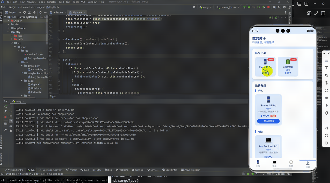
最后运行效果图如下显示:
本文介绍了基于React Native开发跨平台时尚消费应用的技术实践,重点探讨了如何适配鸿蒙系统。文章从数据模型设计、UI实现和业务逻辑三个维度展开:1)采用TypeScript定义时尚商品数据结构,确保类型安全和多端一致性;2)使用Flex布局和StyleSheet实现鸿蒙风格的视觉样式;3)通过纯JavaScript实现跨端业务逻辑,包括商品分类筛选等核心功能。该方案充分利用React Native"一次开发,多端部署"的优势,有效降低了鸿蒙系统的适配成本,为时尚类应用提供了可复用的技术框架。
欢迎大家加入开源鸿蒙跨平台开发者社区,一起共建开源鸿蒙跨平台生态。

作为“人工智能6S店”的官方数字引擎,为AI开发者与企业提供一个覆盖软硬件全栈、一站式门户。
更多推荐


 4
4 0
0- 0


 已为社区贡献36条内容

所有评论(0)