
HarmonyOS6半年磨一剑 - RcButton组件使用示例完整指南
各位开发者,大家好!我是若城。在鸿蒙应用开发过程中,我发现许多组件样式和工具方法具有高度的复用性,但每次新项目都需要重复编写,这极大地降低了开发效率。因此,我决定投入半年时间,打造一款专为鸿蒙生态设计的 UI 组件库 ——rchoui。rchoui是一个面向 HarmonyOS6 的企业级 UI 组件库,旨在提供开箱即用的高质量组件,让开发者告别"重复造轮子"。当预设尺寸不能满足需求时,可以自定义
文章目录
前言
各位开发者,大家好!我是若城。
在鸿蒙应用开发过程中,我发现许多组件样式和工具方法具有高度的复用性,但每次新项目都需要重复编写,这极大地降低了开发效率。因此,我决定投入半年时间,打造一款专为鸿蒙生态设计的 UI 组件库 —— rchoui。
项目简介
rchoui 是一个面向 HarmonyOS6 的企业级 UI 组件库,旨在提供开箱即用的高质量组件,让开发者告别"重复造轮子"。
核心特性
- 丰富组件:涵盖基础组件、表单组件、弹窗组件、布局组件等
- 设计规范:遵循统一的色彩体系和设计语言
- 工具集成:内置常用工具方法,提升开发效率
- 完善文档:每个模块都配有详细的设计思路和使用说明
开源计划
项目预计于 2026 年 7 月中旬正式开源,届时可通过三方库直接下载使用。在此期间,我会通过系列文章逐一介绍每个模块的设计思路与实现细节。
文档说明
本文档基于HarmonyOS6平台,通过丰富的实际案例,全面展示RcButton组件的各种使用场景和最佳实践。每个示例都包含完整的代码和效果说明,帮助开发者快速掌握组件的使用方法。
一、基础使用
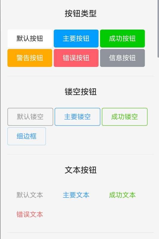
1.1 按钮类型展示
RcButton提供了6种预设的按钮类型,满足不同场景的视觉需求。
// 导入必要的组件和类型
import { RcButton, RcButtonType } from 'rchoui'

// 使用示例
Flex({ wrap: FlexWrap.Wrap, space: {main: LengthMetrics.px(10), cross: LengthMetrics.px(10)} }) {
  RcButton({ text: '默认按钮', type: RcButtonType.DEFAULT })
  RcButton({ text: '主要按钮', type: RcButtonType.PRIMARY })
  RcButton({ text: '成功按钮', type: RcButtonType.SUCCESS })
  RcButton({ text: '警告按钮', type: RcButtonType.WARNING })
  RcButton({ text: '错误按钮', type: RcButtonType.ERROR })
  RcButton({ text: '信息按钮', type: RcButtonType.INFO })
}
类型说明:
| 类型 | 枚举值 | 使用场景 | 视觉特点 |
|---|---|---|---|
| 默认按钮 | RcButtonType.DEFAULT |
普通操作、次要功能 | 灰色系,视觉权重低 |
| 主要按钮 | RcButtonType.PRIMARY |
主要操作、核心功能 | 蓝色系,视觉权重最高 |
| 成功按钮 | RcButtonType.SUCCESS |
成功提示、确认操作 | 绿色系,表示正向反馈 |
| 警告按钮 | RcButtonType.WARNING |
警告提示、需谨慎操作 | 橙色系,提示用户注意 |
| 错误按钮 | RcButtonType.ERROR |
危险操作、删除功能 | 红色系,强烈警示 |
| 信息按钮 | RcButtonType.INFO |
信息提示、辅助操作 | 青色系,中性提示 |
使用建议:
- 一个页面中主要按钮不宜超过2个,保持视觉焦点
- 删除等危险操作使用ERROR类型,并配合二次确认
- 表单提交使用PRIMARY类型,取消使用DEFAULT类型
1.2 镂空按钮
镂空按钮适用于需要降低视觉权重但仍需保持类型特征的场景。
Flex({ wrap: FlexWrap.Wrap, space: {main: LengthMetrics.px(10), cross: LengthMetrics.px(10)} }) {
  RcButton({ text: '默认镂空', plain: true })
  RcButton({ text: '主要镂空', type: RcButtonType.PRIMARY, plain: true })
  RcButton({ text: '成功镂空', type: RcButtonType.SUCCESS, plain: true })
  RcButton({ text: '细边框', type: RcButtonType.PRIMARY, plain: true, hairline: true })
}
属性说明:
plain: true- 开启镂空模式,背景透明,显示边框和文字hairline: true- 细线边框模式(0.5px),更加精致
镂空按钮特点:
- 背景色变为透明
- 文字颜色使用类型对应的主色
- 边框颜色使用类型对应的主色
- 按压时背景色显示为浅色
应用场景:
- 次要操作按钮(如"取消"按钮)
- 需要并列多个按钮且避免视觉过重
- 在深色背景上需要保持轻盈感
1.3 文本按钮
文本按钮是视觉权重最低的按钮形式,适合辅助性操作。
Flex({ wrap: FlexWrap.Wrap, space: {main: LengthMetrics.px(10), cross: LengthMetrics.px(10)} }) {
  RcButton({ text: '默认文本', textButton: true })
  RcButton({ text: '主要文本', type: RcButtonType.PRIMARY, textButton: true })
  RcButton({ text: '成功文本', type: RcButtonType.SUCCESS, textButton: true })
  RcButton({ text: '错误文本', type: RcButtonType.ERROR, textButton: true })
}
文本按钮特点:
- 无背景色,无边框
- 仅显示文字,占用空间最小
- 点击态为文字颜色加深
应用场景:
- 导航链接
- 工具栏小操作
- 表格行内操作
- 需要密集排列的操作按钮
二、尺寸控制
2.1 预设尺寸
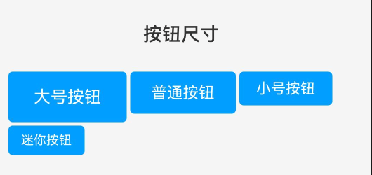
RcButton提供了4种预设尺寸,覆盖常见使用场景。
import { RcButtonSize } from 'rchoui'

Flex({ wrap: FlexWrap.Wrap, space: {main: LengthMetrics.px(10), cross: LengthMetrics.px(10)} }) {
  RcButton({ text: '大号按钮', btnSize: RcButtonSize.LARGE, type: RcButtonType.PRIMARY })
  RcButton({ text: '普通按钮', btnSize: RcButtonSize.NORMAL, type: RcButtonType.PRIMARY })
  RcButton({ text: '小号按钮', btnSize: RcButtonSize.SMALL, type: RcButtonType.PRIMARY })
  RcButton({ text: '迷你按钮', btnSize: RcButtonSize.MINI, type: RcButtonType.PRIMARY })
}
尺寸规格表:
| 尺寸 | 枚举值 | 高度 | 内边距(横向) | 字号 | 使用场景 |
|---|---|---|---|---|---|
| 大号 | RcButtonSize.LARGE |
50px | 20px | 18px | 页面主要操作、移动端 |
| 普通 | RcButtonSize.NORMAL |
40px | 16px | 16px | 默认尺寸、通用场景 |
| 小号 | RcButtonSize.SMALL |
32px | 12px | 14px | 工具栏、表格操作 |
| 迷你 | RcButtonSize.MINI |
24px | 8px | 12px | 标签、筛选条件 |
选择建议:
- 移动端主按钮推荐使用LARGE尺寸,提升可点击性
- 桌面端表单推荐使用NORMAL尺寸
- 数据表格中的操作按钮推荐使用SMALL尺寸
- 标签类按钮推荐使用MINI尺寸
2.2 自定义尺寸
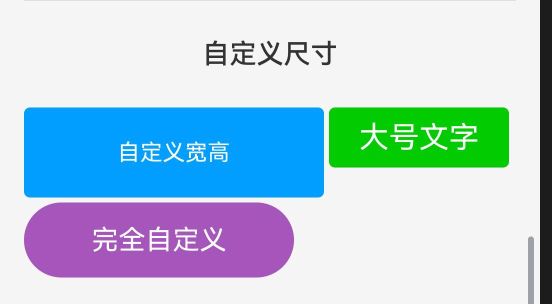
当预设尺寸不能满足需求时,可以自定义按钮尺寸。
Flex({ wrap: FlexWrap.Wrap, space: {main: LengthMetrics.px(10), cross: LengthMetrics.px(10)} }) {
  // 自定义宽高
  RcButton({
    text: '自定义宽高',
    btnWidth: 200,
    btnHeight: 60,
    type: RcButtonType.PRIMARY
  })

  // 自定义字号
  RcButton({
    text: '大号文字',
    fontSize: 20,
    type: RcButtonType.SUCCESS
  })

  // 完全自定义
  RcButton({
    text: '完全自定义',
    btnWidth: 180,
    btnHeight: 50,
    fontSize: 18,
    bordersRadius: 25,
    color: '#9b59b6'
  })
}
自定义属性说明:
btnWidth: number- 按钮宽度(单位:vp)btnHeight: number- 按钮高度(单位:vp)fontSize: number- 文字大小(单位:fp)bordersRadius: number- 圆角大小(单位:vp)
注意事项:
- 自定义宽高会覆盖
btnSize设置 - 建议高度不低于44px,保证触摸区域足够
- 圆角值不应超过高度的一半(圆形按钮除外)
三、形状变化
3.1 三种预设形状
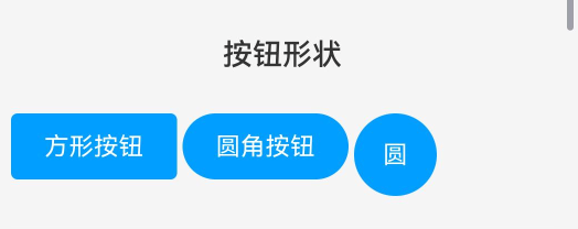
RcButton支持三种形状,满足不同设计风格需求。
import { RcButtonShape } from 'rchoui'

Flex({ wrap: FlexWrap.Wrap, space: {main: LengthMetrics.px(10), cross: LengthMetrics.px(10)} }) {
  RcButton({ text: '方形按钮', shape: RcButtonShape.SQUARE, type: RcButtonType.PRIMARY })
  RcButton({ text: '圆角按钮', shape: RcButtonShape.ROUND, type: RcButtonType.PRIMARY })
  RcButton({ text: '圆', shape: RcButtonShape.CIRCLE, type: RcButtonType.PRIMARY, btnWidth: 50, btnHeight: 50 })
}
形状特点:
| 形状 | 枚举值 | 圆角值 | 视觉效果 | 适用场景 |
|---|---|---|---|---|
| 方形 | RcButtonShape.SQUARE |
4px | 轻微圆角,现代感 | 后台管理、数据表格 |
| 圆角 | RcButtonShape.ROUND |
高度的一半 | 两端圆润,友好感 | 移动应用、社交类APP |
| 圆形 | RcButtonShape.CIRCLE |
50% | 完全圆形,聚焦感 | 悬浮按钮、快捷操作 |
圆形按钮使用建议:
- 必须设置相等的宽高值
- 通常不设置文字,仅显示符号
- 适合作为页面悬浮操作按钮
- 建议尺寸:44×44、56×56、72×72
四、状态控制
4.1 禁用状态
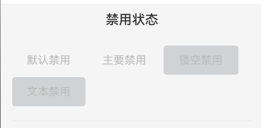
禁用状态用于不可操作的场景,保持视觉存在但阻止交互。
 Flex({ wrap: FlexWrap.Wrap, space: {main: LengthMetrics.px(10), cross: LengthMetrics.px(10)} }) {
          RcButton({ text: '默认禁用', disabled: true ,  textColor: '#000000' })
          RcButton({ text: '主要禁用',   disabled: true , textColor: '#000000'})
          RcButton({ text: '镂空禁用',  plain: true, disabled: true , textColor: '#000000'})
          RcButton({ text: '文本禁用',   textButton: true, disabled: true, textColor: '#000000' })
        }
        .width('100%')
禁用效果:
- 按钮不可点击
- 颜色变淡(透明度降低)
- 鼠标悬停无效果
- 不触发点击事件
典型应用场景:
@Component
struct FormExample {
  @State username: string = ''
  @State password: string = ''

  build() {
    Column({ space: 20 }) {
      TextInput({ placeholder: '请输入用户名' })
        .onChange((value) => this.username = value)

      TextInput({ placeholder: '请输入密码', type: InputType.Password })
        .onChange((value) => this.password = value)

      // 根据表单验证结果动态控制禁用状态
      RcButton({
        text: '登录',
        type: RcButtonType.PRIMARY,
        block: true,
        disabled: !this.username || !this.password,
        onBtnClick: () => {
          console.log('执行登录')
        }
      })
    }
  }
}
4.2 加载状态
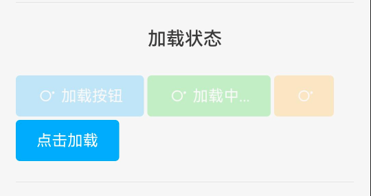
加载状态用于异步操作,提供视觉反馈,提升用户体验。
@Component
struct LoadingExample {
  @State loadingState: boolean = false

  build() {
    Flex({ wrap: FlexWrap.Wrap, space: {main: LengthMetrics.px(10), cross: LengthMetrics.px(10)} }) {
      // 静态加载状态
      RcButton({ text: '加载按钮', loading: true, type: RcButtonType.PRIMARY })

      // 自定义加载文字
      RcButton({ loadingText: '加载中...', loading: true, type: RcButtonType.SUCCESS })

      // 仅显示加载动画
      RcButton({ loading: true, type: RcButtonType.WARNING })

      // 动态控制加载状态
      RcButton({
        text: this.loadingState ? '加载中...' : '点击加载',
        loading: this.loadingState,
        type: RcButtonType.PRIMARY,
        onBtnClick: () => {
          this.loadingState = true
          setTimeout(() => {
            this.loadingState = false
          }, 2000)
        }
      })
    }
  }
}
加载状态特点:
- 显示旋转的加载动画
- 自动禁用按钮,阻止重复点击
- 可自定义加载时的文字提示
- 符号自动隐藏(避免布局冲突)
完整的异步操作示例:
@Component
struct AsyncOperationExample {
  @State loading: boolean = false
  @State resultMessage: string = ''

  // 模拟API请求
  async submitData() {
    this.loading = true
    this.resultMessage = ''

    try {
      // 模拟网络请求
      await new Promise((resolve) => setTimeout(resolve, 2000))
      this.resultMessage = '提交成功!'
    } catch (error) {
      this.resultMessage = '提交失败,请重试'
    } finally {
      this.loading = false
    }
  }

  build() {
    Column({ space: 15 }) {
      RcButton({
        text: '提交数据',
        loading: this.loading,
        loadingText: '提交中...',
        type: RcButtonType.PRIMARY,
        block: true,
        onBtnClick: () => this.submitData()
      })

      if (this.resultMessage) {
        Text(this.resultMessage)
          .fontSize(14)
          .fontColor(this.resultMessage.includes('成功') ? '#52c41a' : '#ff4d4f')
      }
    }
  }
}
五、视觉定制
5.1 自定义颜色
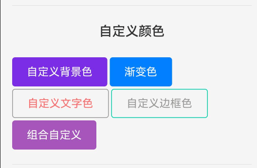
RcButton支持完全自定义颜色方案,满足品牌定制需求。
Flex({ wrap: FlexWrap.Wrap, space: {main: LengthMetrics.px(10), cross: LengthMetrics.px(10)} }) {
  // 自定义背景色
  RcButton({ text: '自定义背景色', color: '#7232dd' })

  // 渐变色背景
  RcButton({ text: '渐变色', color: 'linear-gradient(to right, #4254d8, #d533ba)' })

  // 自定义文字颜色(镂空按钮)
  RcButton({ text: '自定义文字色', textColor: '#ff6b6b', plain: true })

  // 自定义边框颜色(镂空按钮)
  RcButton({ text: '自定义边框色', bordersColor: '#00d4aa', plain: true })

  // 组合自定义
  RcButton({
    text: '组合自定义',
    color: '#9b59b6',
    textColor: '#ffffff',
    bordersColor: '#8e44ad'
  })
}
颜色属性说明:
| 属性 | 类型 | 说明 | 适用场景 |
|---|---|---|---|
color |
string | ResourceColor | 背景颜色,支持纯色和渐变 | 实心按钮 |
textColor |
string | ResourceColor | 文字颜色 | 所有按钮 |
bordersColor |
string | ResourceColor | 边框颜色 | 镂空按钮 |
颜色值支持格式:
- 十六进制:
'#ff0000'、'#f00' - RGB:
'rgb(255, 0, 0)' - RGBA:
'rgba(255, 0, 0, 0.5)' - 线性渐变:
'linear-gradient(to right, #ff0000, #00ff00)' - 资源引用:
$r('app.color.primary')
品牌色定制示例:
// 定义品牌色常量
const BrandColors = {
  primary: '#5B8FF9',
  success: '#52C41A',
  warning: '#FAAD14',
  danger: '#F5222D',
  gradient: 'linear-gradient(135deg, #667eea 0%, #764ba2 100%)'
}

// 使用品牌色
RcButton({
  text: '品牌主色',
  color: BrandColors.primary,
  type: RcButtonType.PRIMARY
})

RcButton({
  text: '渐变风格',
  color: BrandColors.gradient
})
5.2 自定义边框
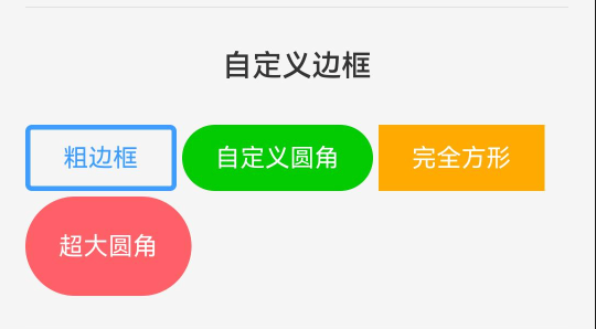
精细化的边框控制可以创造更多视觉变化。
Flex({ wrap: FlexWrap.Wrap, space: {main: LengthMetrics.px(10), cross: LengthMetrics.px(10)} }) {
  // 粗边框
  RcButton({
    text: '粗边框',
    plain: true,
    bordersWidth: 3,
    bordersColor: '#3c9cff',
    type: RcButtonType.PRIMARY
  })

  // 自定义圆角
  RcButton({
    text: '自定义圆角',
    bordersRadius: 20,
    type: RcButtonType.SUCCESS
  })

  // 完全方形
  RcButton({
    text: '完全方形',
    bordersRadius: 0,
    type: RcButtonType.WARNING
  })

  // 超大圆角
  RcButton({
    text: '超大圆角',
    bordersRadius: 30,
    btnHeight: 60,
    type: RcButtonType.ERROR
  })
}
边框属性说明:
bordersWidth: number- 边框宽度(单位:vp),默认1bordersRadius: number- 圆角大小(单位:vp)bordersColor: string | ResourceColor- 边框颜色
边框细节控制技巧:
// 细线边框(0.5px效果)
RcButton({
  text: '细线边框',
  plain: true,
  hairline: true,  // 启用细线模式
  type: RcButtonType.PRIMARY
})

// 不同粗细的边框对比
Row({ space: 10 }) {
  RcButton({ text: '1px', plain: true, bordersWidth: 1 })
  RcButton({ text: '2px', plain: true, bordersWidth: 2 })
  RcButton({ text: '3px', plain: true, bordersWidth: 3 })
}

// 圆角渐变:从方形到圆形
Row({ space: 10 }) {
  RcButton({ text: '0', bordersRadius: 0, btnWidth: 60 })
  RcButton({ text: '4', bordersRadius: 4, btnWidth: 60 })
  RcButton({ text: '8', bordersRadius: 8, btnWidth: 60 })
  RcButton({ text: '20', bordersRadius: 20, btnWidth: 60 })
}
六、布局应用
6.1 块级按钮
块级按钮占据父容器全部宽度,适合需要强调的主要操作。
Flex({ wrap: FlexWrap.Wrap, space: {main: LengthMetrics.px(10), cross: LengthMetrics.px(10)} }) {
  RcButton({ text: '块级按钮', block: true, type: RcButtonType.PRIMARY })
  RcButton({ text: '块级镂空', block: true, type: RcButtonType.SUCCESS, plain: true })
  RcButton({ text: '块级文本', block: true, type: RcButtonType.WARNING, textButton: true })
}
块级按钮特点:
- 宽度自动填充父容器
- 常用于移动端页面底部操作
- 适合表单提交按钮
- 可与其他块级按钮垂直堆叠
移动端底部操作栏示例:
@Component
struct MobileFooterExample {
  build() {
    Column() {
      // 页面内容区域
      Scroll() {
        Column({ space: 20 }) {
          Text('页面内容...')
        }
      }
      .layoutWeight(1)

      // 底部固定操作栏
      Column({ space: 12 }) {
        RcButton({
          text: '立即购买',
          block: true,
          type: RcButtonType.PRIMARY,
          btnHeight: 48,
          fontSize: 16
        })

        RcButton({
          text: '加入购物车',
          block: true,
          plain: true,
          type: RcButtonType.PRIMARY,
          btnHeight: 48,
          fontSize: 16
        })
      }
      .padding({ left: 16, right: 16, bottom: 20 })
      .backgroundColor('#ffffff')
    }
    .height('100%')
  }
}
6.2 按钮组合
通过合理组合可以创建丰富的交互界面。
// 表单操作按钮组(右对齐)
Row({ space: 10 }) {
  RcButton({
    text: '取消',
    type: RcButtonType.DEFAULT,
    plain: true,
    onBtnClick: () => {
      console.log('取消操作')
    }
  })
  RcButton({
    text: '确定',
    type: RcButtonType.PRIMARY,
    onBtnClick: () => {
      console.log('确定操作')
    }
  })
}
.width('100%')
.justifyContent(FlexAlign.End)

// 带符号的操作按钮组
Row({ space: 10 }) {
  RcButton({
    text: '编辑',
    icon: 'icon-houi_flash',
    type: RcButtonType.PRIMARY,
    btnSize: RcButtonSize.SMALL
  })
  RcButton({
    text: '删除',
    icon: 'icon-houi_tv',
    type: RcButtonType.ERROR,
    btnSize: RcButtonSize.SMALL
  })
  RcButton({
    text: '分享',
    icon: 'icon-houi_github',
    type: RcButtonType.SUCCESS,
    btnSize: RcButtonSize.SMALL
  })
}
.width('100%')
常见按钮组合模式:
1. 对话框按钮组
// 水平排列,右侧对齐
Row({ space: 12 }) {
  RcButton({ text: '取消', plain: true })
  RcButton({ text: '确定', type: RcButtonType.PRIMARY })
}
.width('100%')
.justifyContent(FlexAlign.End)
2. 表格操作按钮
// 小尺寸,文本按钮
Row({ space: 8 }) {
  RcButton({ text: '编辑', textButton: true, btnSize: RcButtonSize.SMALL })
  RcButton({ text: '删除', textButton: true, btnSize: RcButtonSize.SMALL, type: RcButtonType.ERROR })
}
3. 标签页切换按钮组
@State activeTab: number = 0

Row({ space: 0 }) {
  RcButton({
    text: '全部',
    type: this.activeTab === 0 ? RcButtonType.PRIMARY : RcButtonType.DEFAULT,
    plain: this.activeTab !== 0,
    shape: RcButtonShape.SQUARE,
    onBtnClick: () => this.activeTab = 0
  })
  RcButton({
    text: '进行中',
    type: this.activeTab === 1 ? RcButtonType.PRIMARY : RcButtonType.DEFAULT,
    plain: this.activeTab !== 1,
    shape: RcButtonShape.SQUARE,
    onBtnClick: () => this.activeTab = 1
  })
  RcButton({
    text: '已完成',
    type: this.activeTab === 2 ? RcButtonType.PRIMARY : RcButtonType.DEFAULT,
    plain: this.activeTab !== 2,
    shape: RcButtonShape.SQUARE,
    onBtnClick: () => this.activeTab = 2
  })
}
七、交互功能
7.1 点击事件处理
RcButton通过onBtnClick回调处理点击事件。
@Component
struct ClickEventExample {
  @State clickCount: number = 0

  build() {
    Column({ space: 15 }) {
      Text(`点击次数: ${this.clickCount}`)
        .fontSize(16)

      RcButton({
        text: '点击我',
        type: RcButtonType.PRIMARY,
        onBtnClick: () => {
          this.clickCount++
        }
      })

      RcButton({
        text: '重置计数',
        type: RcButtonType.WARNING,
        plain: true,
        onBtnClick: () => {
          this.clickCount = 0
        }
      })
    }
  }
}
事件回调参数:
onBtnClick?: (event: ClickEvent) => void

// ClickEvent 包含的信息:
// - x: 点击的X坐标
// - y: 点击的Y坐标
// - timestamp: 时间戳
// - source: 事件源信息
实际应用示例:
// 1. 表单提交
RcButton({
  text: '提交',
  type: RcButtonType.PRIMARY,
  onBtnClick: () => {
    // 表单验证
    if (this.validateForm()) {
      // 提交数据
      this.submitForm()
    }
  }
})

// 2. 导航跳转
RcButton({
  text: '查看详情',
  type: RcButtonType.PRIMARY,
  onBtnClick: () => {
    router.pushUrl({
      url: 'pages/Detail',
      params: { id: this.itemId }
    })
  }
})

// 3. 对话框触发
RcButton({
  text: '删除',
  type: RcButtonType.ERROR,
  onBtnClick: () => {
    AlertDialog.show({
      title: '确认删除',
      message: '此操作不可恢复,确定要删除吗?',
      primaryButton: {
        value: '取消',
        action: () => {}
      },
      secondaryButton: {
        value: '确定',
        action: () => {
          this.deleteItem()
        }
      }
    })
  }
})
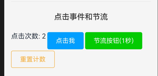
7.2 节流控制
节流机制防止用户短时间内重复点击,保护接口和提升体验。
@Component
struct ThrottleExample {
  @State clickCount: number = 0

  build() {
    Column({ space: 15 }) {
      Text(`点击次数: ${this.clickCount}`)
        .fontSize(16)

      // 普通按钮(无节流)
      RcButton({
        text: '普通点击',
        type: RcButtonType.DEFAULT,
        onBtnClick: () => {
          this.clickCount++
          console.log('点击时间: ' + Date.now())
        }
      })

      // 节流按钮(1秒内只能点击一次)
      RcButton({
        text: '节流按钮(1秒)',
        type: RcButtonType.SUCCESS,
        throttleTime: 1000,
        onBtnClick: () => {
          this.clickCount++
          console.log('节流点击: ' + Date.now())
        }
      })

      // 长节流(3秒)- 适合提交操作
      RcButton({
        text: '提交(3秒节流)',
        type: RcButtonType.PRIMARY,
        throttleTime: 3000,
        onBtnClick: () => {
          console.log('执行提交操作')
          this.clickCount++
        }
      })
    }
  }
}
节流时间设置建议:
| 操作类型 | 推荐节流时间 | 说明 |
|---|---|---|
| 普通点击 | 300-500ms | 防止误触,保持流畅 |
| 数据提交 | 1000-2000ms | 防止重复提交 |
| 接口调用 | 1500-3000ms | 保护后端接口 |
| 支付操作 | 3000-5000ms | 防止重复扣款 |
节流机制工作原理:
- 首次点击立即触发回调
- 在节流时间内的后续点击被忽略
- 节流时间结束后,才能再次触发
- 不影响按钮的视觉反馈(按压态仍然正常)
节流与加载状态结合:
@State submitting: boolean = false

RcButton({
  text: '提交',
  loading: this.submitting,
  loadingText: '提交中...',
  type: RcButtonType.PRIMARY,
  throttleTime: 2000,
  onBtnClick: async () => {
    this.submitting = true
    try {
      await this.submitData()
      promptAction.showToast({ message: '提交成功' })
    } catch (error) {
      promptAction.showToast({ message: '提交失败' })
    } finally {
      this.submitting = false
    }
  }
})
八、总结
RcButton是一个功能强大且高度可定制的按钮组件,具有以下核心优势:
核心特性
- 6种预设类型:覆盖常见业务场景
- 4种尺寸规格:满足不同界面需求
- 3种形状样式:适配多样设计风格
- 完整状态管理:禁用、加载、交互状态
- 高度可定制:颜色、尺寸、边框全面可控
- 性能优化:节流控制、状态联动
组件引入
import { RcButton, RcButtonType, RcButtonSize, RcButtonShape } from 'rchoui'
相关文档

作为“人工智能6S店”的官方数字引擎,为AI开发者与企业提供一个覆盖软硬件全栈、一站式门户。
更多推荐
 11
11 0
0- 0


 已为社区贡献11条内容

所有评论(0)