
HarmonyOS6半年磨一剑 - RcButton组件样式系统深度剖析
各位开发者,大家好!我是若城。在鸿蒙应用开发过程中,我发现许多组件样式和工具方法具有高度的复用性,但每次新项目都需要重复编写,这极大地降低了开发效率。因此,我决定投入半年时间,打造一款专为鸿蒙生态设计的 UI 组件库 ——rchoui。rchoui是一个面向 HarmonyOS6 的企业级 UI 组件库,旨在提供开箱即用的高质量组件,让开发者告别"重复造轮子"。样式系统是RcButton组件的核心
前言
各位开发者,大家好!我是若城。
在鸿蒙应用开发过程中,我发现许多组件样式和工具方法具有高度的复用性,但每次新项目都需要重复编写,这极大地降低了开发效率。因此,我决定投入半年时间,打造一款专为鸿蒙生态设计的 UI 组件库 —— rchoui。
项目简介
rchoui 是一个面向 HarmonyOS6 的企业级 UI 组件库,旨在提供开箱即用的高质量组件,让开发者告别"重复造轮子"。
核心特性
- 丰富组件:涵盖基础组件、表单组件、弹窗组件、布局组件等
- 设计规范:遵循统一的色彩体系和设计语言
- 工具集成:内置常用工具方法,提升开发效率
- 完善文档:每个模块都配有详细的设计思路和使用说明
开源计划
项目预计于 2026 年 7 月中旬正式开源,届时可通过三方库直接下载使用。在此期间,我会通过系列文章逐一介绍每个模块的设计思路与实现细节。
一、概述
样式系统是RcButton组件的核心,决定了按钮的视觉呈现。本文将深入剖析组件的样式计算逻辑、颜色体系、尺寸系统以及样式优先级规则,帮助开发者理解如何精确控制按钮外观。
二、颜色体系解析
2.1 颜色常量定义
组件引入了一套完整的颜色常量系统:
import {
  RcPrimary, RcPrimaryDark, RcPrimaryDisabled, RcPrimaryLight,
  RcSuccess, RcSuccessDark, RcSuccessDisabled, RcSuccessLight,
  RcWarning, RcWarningDark, RcWarningDisabled, RcWarningLight,
  RcError, RcErrorDark, RcErrorDisabled, RcErrorLight,
  RcInfo, RcInfoDark, RcInfoDisabled, RcInfoLight,
  RcBgColor, RcMainColor, RcContentColor, RcBorder1Color
} from '../RcColor/index'
颜色分类体系:
主题颜色组
每种按钮类型都有4种颜色变体:
- 基础色 (如RcPrimary): 默认状态背景色
- 深色 (如RcPrimaryDark): 按下/激活状态背景色
- 禁用色 (如RcPrimaryDisabled): 禁用状态背景色
- 浅色 (如RcPrimaryLight): 可用于镂空按钮背景
中性颜色组
- RcBgColor: 页面背景色,用于DEFAULT类型和禁用状态
- RcMainColor: 主要文字颜色
- RcContentColor: 次要文字颜色,禁用状态的文字色
- RcBorder1Color: 边框颜色,用于DEFAULT类型边框
2.2 颜色配置策略
主色配置方法
private getColorConfig(): RcButtonColorConfig {
  // 优先使用自定义颜色
  if (this.color !== undefined) {
    return {
      bg: this.color,
      text: Color.White,
      border: this.color,
      activeBg: this.color
    }
  }

  // 根据类型返回颜色
  switch (this.type) {
    case RcButtonType.PRIMARY:
      return {
        bg: RcPrimary,
        text: Color.White,
        border: RcPrimary,
        activeBg: RcPrimaryDark
      }
    // ...其他类型
  }
}
配置逻辑解析:
- 自定义颜色最高优先级: 如果设置了
color属性,直接使用,文字默认白色 - 类型映射: 每种按钮类型对应一套颜色方案
- 完整状态: 返回配置包含bg(背景)、text(文字)、border(边框)、activeBg(激活背景)
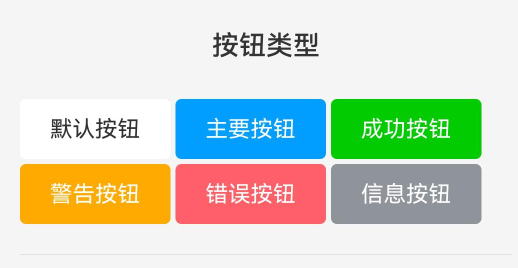
各类型颜色特征
PRIMARY 主要按钮
case RcButtonType.PRIMARY:
  return {
    bg: RcPrimary,           // 通常是品牌主色(如蓝色)
    text: Color.White,       // 白色文字确保对比度
    border: RcPrimary,       // 边框与背景同色
    activeBg: RcPrimaryDark  // 按下时颜色加深
  }
SUCCESS 成功按钮
case RcButtonType.SUCCESS:
  return {
    bg: RcSuccess,           // 绿色系
    text: Color.White,
    border: RcSuccess,
    activeBg: RcSuccessDark
  }
WARNING 警告按钮
case RcButtonType.WARNING:
  return {
    bg: RcWarning,           // 橙色/黄色系
    text: Color.White,
    border: RcWarning,
    activeBg: RcWarningDark
  }
ERROR 错误按钮
case RcButtonType.ERROR:
  return {
    bg: RcError,             // 红色系
    text: Color.White,
    border: RcError,
    activeBg: RcErrorDark
  }
INFO 信息按钮
case RcButtonType.INFO:
  return {
    bg: RcInfo,              // 灰色系
    text: Color.White,
    border: RcInfo,
    activeBg: RcInfoDark
  }
DEFAULT 默认按钮
case RcButtonType.DEFAULT:
default:
  return {
    bg: Color.White,         // 白色背景
    text: RcMainColor,       // 深色文字
    border: RcBorder1Color,  // 灰色边框
    activeBg: RcBgColor      // 按下时浅灰背景
  }
DEFAULT类型的设计特点:
- 背景为白色,适合融入浅色背景
- 文字使用主题文字色,而非白色
- 有边框,增强视觉边界
- 激活态使用浅灰色,而非深色
2.3 文字颜色计算
文字颜色计算逻辑较复杂,需考虑多种状态:
private getTextColor(): ResourceColor {
  // 优先使用自定义文字颜色
  if (this.textColor !== undefined) {
    return this.textColor
  }

  if (this.disabled) {
    return this.getDisabledColor()
  }

  return (this.plain || this.textButton) ?
    this.getColorConfig().border :
    this.getColorConfig().text
}
计算规则:
- 自定义优先:
textColor属性优先级最高 - 禁用状态: 使用禁用颜色
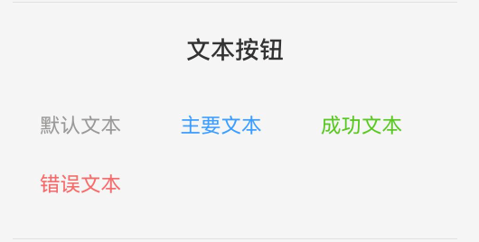
- 镂空/文本按钮: 使用边框色作为文字色(与按钮类型相同的彩色文字)
- 实体按钮: 使用配置的文字色(通常是白色)
不同模式的文字色:
| 按钮模式 | 文字颜色来源 | 示例效果 |
|---|---|---|
| 实体按钮 | getColorConfig().text | PRIMARY按钮白色文字 |
| 镂空按钮 | getColorConfig().border | PRIMARY按钮蓝色文字 |
| 文本按钮 | getColorConfig().border | PRIMARY按钮蓝色文字 |
| 禁用状态 | getDisabledColor() | 灰色文字 |
2.4 禁用状态颜色
禁用颜色根据按钮模式和类型决定:
private getDisabledColor(): ResourceColor {
  if (this.plain || this.textButton) {
    return RcContentColor
  }

  switch (this.type) {
    case RcButtonType.PRIMARY:
      return RcPrimaryDisabled
    case RcButtonType.SUCCESS:
      return RcSuccessDisabled
    case RcButtonType.WARNING:
      return RcWarningDisabled
    case RcButtonType.ERROR:
      return RcErrorDisabled
    case RcButtonType.INFO:
      return RcInfoDisabled
    default:
      return RcBgColor
  }
}
设计逻辑:
- 镂空/文本按钮: 统一使用次要文字色(RcContentColor),因为没有背景色需求
- 实体按钮: 使用对应类型的禁用色,保持品牌色系但降低饱和度
- DEFAULT类型: 使用背景色(RcBgColor),呈现浅灰效果
2.5 边框颜色计算
private getBorderColorValue(): ResourceColor {
  // 优先使用自定义边框颜色
  if (this.bordersColor !== undefined) {
    return this.bordersColor
  }

  return this.disabled ?
    this.getDisabledColor() :
    this.getColorConfig().border
}
计算规则:
- 自定义
bordersColor优先级最高 - 禁用状态使用禁用颜色
- 正常状态使用类型配置的边框色
边框颜色应用场景:
- 实体按钮: 边框色与背景色相同,视觉上无边框
- 镂空按钮: 边框色显示,定义按钮轮廓
- 文本按钮: 无边框(宽度为0)
三、尺寸系统解析
3.1 尺寸配置体系
尺寸配置接口定义了一个按钮尺寸的所有维度:
export interface RcButtonSizeConfig {
  height: number       // 按钮高度
  fontSize: number     // 文字大小
  paddingH: number     // 水平内边距
  iconSize: number     // 图标大小
}
3.2 四档尺寸规格
private getSizeConfig(): RcButtonSizeConfig {
  switch (this.btnSize) {
    case RcButtonSize.LARGE:
      return { height: 48, fontSize: 16, paddingH: 24, iconSize: 20 }
    case RcButtonSize.SMALL:
      return { height: 32, fontSize: 14, paddingH: 16, iconSize: 16 }
    case RcButtonSize.MINI:
      return { height: 28, fontSize: 12, paddingH: 12, iconSize: 14 }
    case RcButtonSize.NORMAL:
    default:
      return { height: 40, fontSize: 15, paddingH: 20, iconSize: 18 }
  }
}
尺寸规格对照表:
| 尺寸 | 高度 | 字体 | 水平边距 | 图标 | 增减比例 |
|---|---|---|---|---|---|
| LARGE | 48px | 16px | 24px | 20px | +20% |
| NORMAL | 40px | 15px | 20px | 18px | 基准 |
| SMALL | 32px | 14px | 16px | 16px | -20% |
| MINI | 28px | 12px | 12px | 14px | -30% |
设计规律分析:
- 高度递减: 48 → 40 → 32 → 28,以8px为主要步进单位
- 字体递减: 16 → 15 → 14 → 12,保持可读性
- 内边距比例: 约为高度的50%,确保按钮不过于狭长
- 图标尺寸: 略小于字体大小,但保持视觉平衡
3.3 高度计算逻辑
private getButtonHeight(): Length {
  if (this.btnHeight !== undefined) {
    return this.btnHeight
  }
  return this.getSizeConfig().height
}
优先级规则:
- 自定义高度(
btnHeight)优先 - 使用尺寸配置的默认高度
3.4 宽度计算逻辑
private getButtonWidth(): Length | undefined {
  if (this.btnWidth !== undefined) {
    return this.btnWidth
  }
  return this.block ? '100%' : undefined
}
宽度行为:
| 配置 | 宽度表现 | 说明 |
|---|---|---|
| btnWidth有值 | 使用btnWidth | 精确控制宽度 |
| block=true | 100% | 占满父容器宽度 |
| 默认 | undefined | 自适应内容宽度 |
自适应宽度计算:
- 内容宽度 = 水平内边距 × 2 + 文字宽度 + 图标宽度 + 图标与文字间距
3.5 文字大小计算
private getTextSize(): number | string {
  if (this.fontSize !== undefined) {
    return getSizeByUnit(this.fontSize, true)
  }
  return this.getSizeConfig().fontSize
}
计算细节:
- 自定义
fontSize优先 - 使用
getSizeByUnit工具函数处理单位转换 - 默认使用尺寸配置的字体大小
getSizeByUnit函数的作用:
- 接受数字或字符串
- 数字自动添加
vp单位 - 字符串原样返回(支持如"16px"、"1.2em"等)
四、形状与圆角系统
4.1 圆角计算逻辑
private getBorderRadius(): Length {
  // 优先使用自定义圆角
  if (this.bordersRadius !== undefined) {
    return this.bordersRadius
  }

  if (this.shape === RcButtonShape.CIRCLE) {
    return '100%'
  } else if (this.shape === RcButtonShape.ROUND) {
    return getSizeByUnit(this.getSizeConfig().height / 2)
  }
  return getSizeByUnit(4)
}
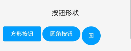
三种形状的圆角规则:
| 形状 | 圆角值 | 计算方式 | 视觉效果 |
|---|---|---|---|
| SQUARE | 4vp | 固定值 | 轻微圆角的方形 |
| ROUND | 高度/2 | 动态计算 | 胶囊形状 |
| CIRCLE | 100% | 百分比 | 正圆形 |
形状适用场景:
-
SQUARE (默认)
- 适用: 大部分场景
- 特点: 保持方形感,4px圆角软化边缘
- 示例: 表单提交、对话框按钮
-
ROUND (胶囊)
- 适用: 需要强调按钮整体性
- 特点: 圆角等于高度一半,形成胶囊状
- 示例: CTA按钮、导航按钮
- 计算: NORMAL尺寸(40px高)的ROUND按钮圆角为20px
-
CIRCLE (圆形)
- 适用: 纯图标按钮
- 特点: 宽高相等时形成正圆
- 示例: 悬浮操作按钮、工具栏图标按钮
- 注意: 需设置图标但不设置文本,且不使用内边距
4.2 圆形按钮的特殊处理
圆形按钮在内边距上有特殊逻辑:
.padding({
  left: this.shape === RcButtonShape.CIRCLE ? 0 : this.getSizeConfig().paddingH,
  right: this.shape === RcButtonShape.CIRCLE ? 0 : this.getSizeConfig().paddingH
})
设计原因:
- 圆形按钮通常只包含图标,不需要内边距
- 移除内边距使按钮宽度等于高度,形成正圆
- 非圆形按钮需要内边距让内容与边缘保持距离
五、边框系统
5.1 边框宽度计算
private getBorderWidthValue(): Length {
  if (this.bordersWidth !== undefined) {
    return this.bordersWidth
  }
  return this.plain ? (this.hairline ? 0.5 : 1) : 0
}
边框宽度规则:
| 按钮模式 | hairline | 边框宽度 |
|---|---|---|
| 实体按钮 | - | 0 (无边框) |
| 镂空按钮 | false | 1px (标准边框) |
| 镂空按钮 | true | 0.5px (细线边框) |
| 自定义 | - | bordersWidth值 |
细线边框(hairline)的意义:
- 0.5px边框在高DPI屏幕上呈现极细的线条
- 适合需要精致感的设计
- 移动端推荐使用,视觉更轻盈
5.2 边框应用场景
实体按钮(plain=false)
RcButton({
  text: '主要按钮',
  type: RcButtonType.PRIMARY
})
- 边框宽度为0
- 边框色与背景色相同(视觉上无边框)
- 依靠背景色定义按钮区域
镂空按钮(plain=true)
RcButton({
  text: '镂空按钮',
  type: RcButtonType.PRIMARY,
  plain: true
})
- 背景透明
- 边框宽度1px
- 边框色为按钮类型对应的主色
- 文字色与边框色相同
细边框镂空按钮(plain=true + hairline=true)
RcButton({
  text: '细边框',
  type: RcButtonType.PRIMARY,
  plain: true,
  hairline: true
})
- 边框宽度0.5px
- 其他同普通镂空按钮
- 视觉更精致,但要确保显示设备支持
文本按钮(textButton=true)
RcButton({
  text: '文本按钮',
  type: RcButtonType.PRIMARY,
  textButton: true
})
- 边框宽度0
- 背景透明
- 只显示文字
六、背景颜色系统
6.1 背景色应用逻辑
.backgroundColor(this.disabled ?
  this.getDisabledColor() :
  (this.plain || this.textButton ? Color.Transparent : this.getColorConfig().bg))
背景色决策树:
是否禁用?
├─ 是 → 使用禁用颜色
└─ 否 → 是否镂空或文本按钮?
    ├─ 是 → 透明背景
    └─ 否 → 使用类型配置的背景色
各模式背景色:
| 模式 | 正常状态 | 禁用状态 |
|---|---|---|
| 实体按钮 | 类型主色 | 类型禁用色 |
| 镂空按钮 | 透明 | 透明 |
| 文本按钮 | 透明 | 透明 |
6.2 按压态背景色
按压态通过stateStyles定义:
.stateStyles({
  pressed: {
    .backgroundColor(this.disabled || this.plain || this.textButton ?
      undefined :
      this.getColorConfig().activeBg)
    .opacity(this.disabled ? 0.6 : (this.plain || this.textButton ? 0.7 : 1))
  }
})
按压反馈策略:
| 按钮类型 | 按压反馈 | 实现方式 |
|---|---|---|
| 实体按钮 | 背景色加深 | 切换到activeBg |
| 镂空按钮 | 降低透明度 | opacity: 0.7 |
| 文本按钮 | 降低透明度 | opacity: 0.7 |
| 禁用按钮 | 无反馈 | 保持原样 |
设计思考:
- 实体按钮: 背景色从
bg切换到activeBg(通常是深一级的颜色),提供明确的触觉反馈 - 镂空/文本按钮: 无实色背景,通过降低透明度到0.7提供视觉反馈
- 禁用按钮: 按压时保持0.6透明度,强化不可交互的状态
七、样式优先级体系
7.1 优先级规则总览
RcButton的样式计算遵循明确的优先级规则:
优先级从高到低:
- 自定义样式属性 (如btnWidth、fontSize、color等)
- 状态属性 (如disabled、loading、plain)
- 配置属性 (如type、btnSize、shape)
- 默认值
7.2 宽度优先级
btnWidth → block → 自适应
示例:
// btnWidth优先级最高
RcButton({ text: '按钮', btnWidth: 200, block: true })
// 结果: 宽度为200,block被覆盖

// block生效
RcButton({ text: '按钮', block: true })
// 结果: 宽度100%

// 自适应
RcButton({ text: '按钮' })
// 结果: 根据内容自适应宽度
7.3 高度优先级
btnHeight → btnSize配置
示例:
// btnHeight优先
RcButton({ text: '按钮', btnHeight: 60, btnSize: RcButtonSize.SMALL })
// 结果: 高度60,btnSize的32被覆盖

// btnSize生效
RcButton({ text: '按钮', btnSize: RcButtonSize.LARGE })
// 结果: 高度48
7.4 颜色优先级
背景色:
disabled → plain/textButton → color → type配置
文字色:
textColor → disabled → plain/textButton → type配置
边框色:
bordersColor → disabled → type配置
示例:
// textColor覆盖所有
RcButton({
  text: '按钮',
  type: RcButtonType.PRIMARY,
  textColor: '#ff0000'
})
// 结果: 红色文字,无论实体还是镂空

// plain影响文字色
RcButton({
  text: '按钮',
  type: RcButtonType.PRIMARY,
  plain: true
})
// 结果: 蓝色文字(PRIMARY的边框色)
7.5 圆角优先级
bordersRadius → shape配置
示例:
// bordersRadius覆盖shape
RcButton({
  text: '按钮',
  shape: RcButtonShape.ROUND,
  bordersRadius: 10
})
// 结果: 圆角10,ROUND的圆角被覆盖

// 完全方形
RcButton({
  text: '按钮',
  bordersRadius: 0
})
// 结果: 圆角0,完全方形
7.6 字体大小优先级
fontSize → btnSize配置
示例:
// fontSize覆盖btnSize
RcButton({
  text: '按钮',
  btnSize: RcButtonSize.MINI,
  fontSize: 20
})
// 结果: 字体20,MINI的12被覆盖
八、透明度系统
8.1 透明度控制
透明度用于表达按钮的交互状态:
.opacity(this.disabled ? 0.6 : 1)
基础透明度规则:
- 正常状态: 1.0 (完全不透明)
- 禁用状态: 0.6 (降低透明度表示不可用)
8.2 按压态透明度
pressed: {
  .opacity(this.disabled ? 0.6 : (this.plain || this.textButton ? 0.7 : 1))
}
按压态透明度规则:
| 按钮状态 | 按压透明度 | 说明 |
|---|---|---|
| 禁用 | 0.6 | 保持禁用态透明度 |
| 镂空/文本 | 0.7 | 降低透明度提供反馈 |
| 实体 | 1.0 | 不改变透明度(通过背景色变化反馈) |
设计意图:
- 实体按钮有明确的背景色变化,不需要透明度变化
- 镂空和文本按钮无背景或背景透明,通过透明度变化提供视觉反馈
- 禁用按钮在按压时保持禁用外观
九、自定义样式系统
9.1 自定义样式属性
组件提供了完整的自定义选项:
@Param customStyle?: Record<string, string | number> = {}
虽然代码中定义了customStyle属性,但实际在build方法中未使用。这是预留的扩展点,未来可以支持:
// 潜在用法(需要额外实现)
.attributeModifier(this.customStyle)
9.2 实用自定义技巧
渐变背景
RcButton({
  text: '渐变按钮',
  color: 'linear-gradient(to right, #4254d8, #d533ba)'
})
color属性支持渐变,因为其类型为ResourceColor,可以接受:
- 纯色:
'#4254d8'、Color.Blue - 渐变:
'linear-gradient(...)'
完全自定义尺寸
RcButton({
  text: '自定义',
  btnWidth: 180,
  btnHeight: 50,
  fontSize: 18,
  bordersRadius: 25,
  color: '#9b59b6'
})
通过组合多个自定义属性实现完全定制。
自定义边框
RcButton({
  text: '粗边框',
  plain: true,
  bordersWidth: 3,
  bordersColor: '#FF5722',
  type: RcButtonType.PRIMARY
})
可以独立控制边框宽度和颜色。
十、总结
RcButton的样式系统具有以下特点:
- 完整的颜色体系: 涵盖6种类型,每种类型4种颜色状态
- 灵活的尺寸系统: 4档预设尺寸,支持完全自定义
- 清晰的优先级: 自定义 > 状态 > 配置 > 默认
- 多样的形状支持: 方形、圆角、圆形满足不同场景
- 精细的状态控制: 正常、按压、禁用等状态细致呈现
理解样式系统的计算逻辑和优先级规则,可以帮助开发者精确控制按钮外观,创造出符合设计规范的UI组件。

作为“人工智能6S店”的官方数字引擎,为AI开发者与企业提供一个覆盖软硬件全栈、一站式门户。
更多推荐
 10
10 0
0- 0


 已为社区贡献11条内容

所有评论(0)