
Flutter for OpenHarmony 实战:convex_bottom_bar 仿原生凸起式底部导航栏
摘要: Flutter 插件 convex_bottom_bar 为 OpenHarmony/HarmonyOS NEXT 提供仿原生凸起式底部导航栏,增强视觉吸引力和交互体验。该组件通过贝塞尔曲线动态绘制凹陷弧度,支持多种动效和样式定制,如渐变背景、联动消息红点等,提升核心功能点击率。集成简单,只需添加依赖即可快速实现符合鸿蒙现代审美的导航栏设计。示例代码展示了如何结合 TabControlle
Flutter for OpenHarmony 实战:convex_bottom_bar 仿原生凸起式底部导航栏

前言
如何让你的 App 底部导航栏在一众竞品中脱颖而出?一个带有“凸起(Convex)”质感的中心按钮往往能给用户留下极深的视觉记忆,并显著提升核心功能(如发布、拍照、主页)的点击率。
在 HarmonyOS NEXT 这个追求“极致设计感”的生态中,使用 convex_bottom_bar 可以让你以极低的成本,实现出一套既具有动感、又非常符合鸿蒙现代审美的底部交互方案。
一、 为什么在鸿蒙开发中尝试 ConvexBar?
1.1 打破“平面化”的视觉疲劳
在大厂纷纷追求扁平化的今天,一个带有“物理深度”感的中心凸起按钮能瞬间抓住用户眼球。这在 HarmonyOS NEXT 这个强调“灵动与秩序”平衡的生态中,能显著提升核心业务功能的点击转化率。
1.2 物理阻尼式的微交互
该插件内置了多种动效。每一种切换效果都经过了精细的曲线调优,能完美适配鸿蒙设备的高采样率触控层,给用户一种手指与 UI “亲密纠缠”的流畅感。
二、 技术内幕:拆解 ConvexBar 的贝塞尔曲线魔法
2.1 基于 CustomPainter 的动态绘制
convex_bottom_bar 背景那个平滑的凹陷弧度,并不是使用图片拼接,而是利用**三次贝塞尔曲线(Cubic Bezier Curve)**在 CustomPainter 中实时计算并绘制出来的。
三、 集成指南
3.1 添加依赖
在 pubspec.yaml 中添加以下代码:
dependencies:
  convex_bottom_bar: ^3.2.0
四、 核心关键技术分解
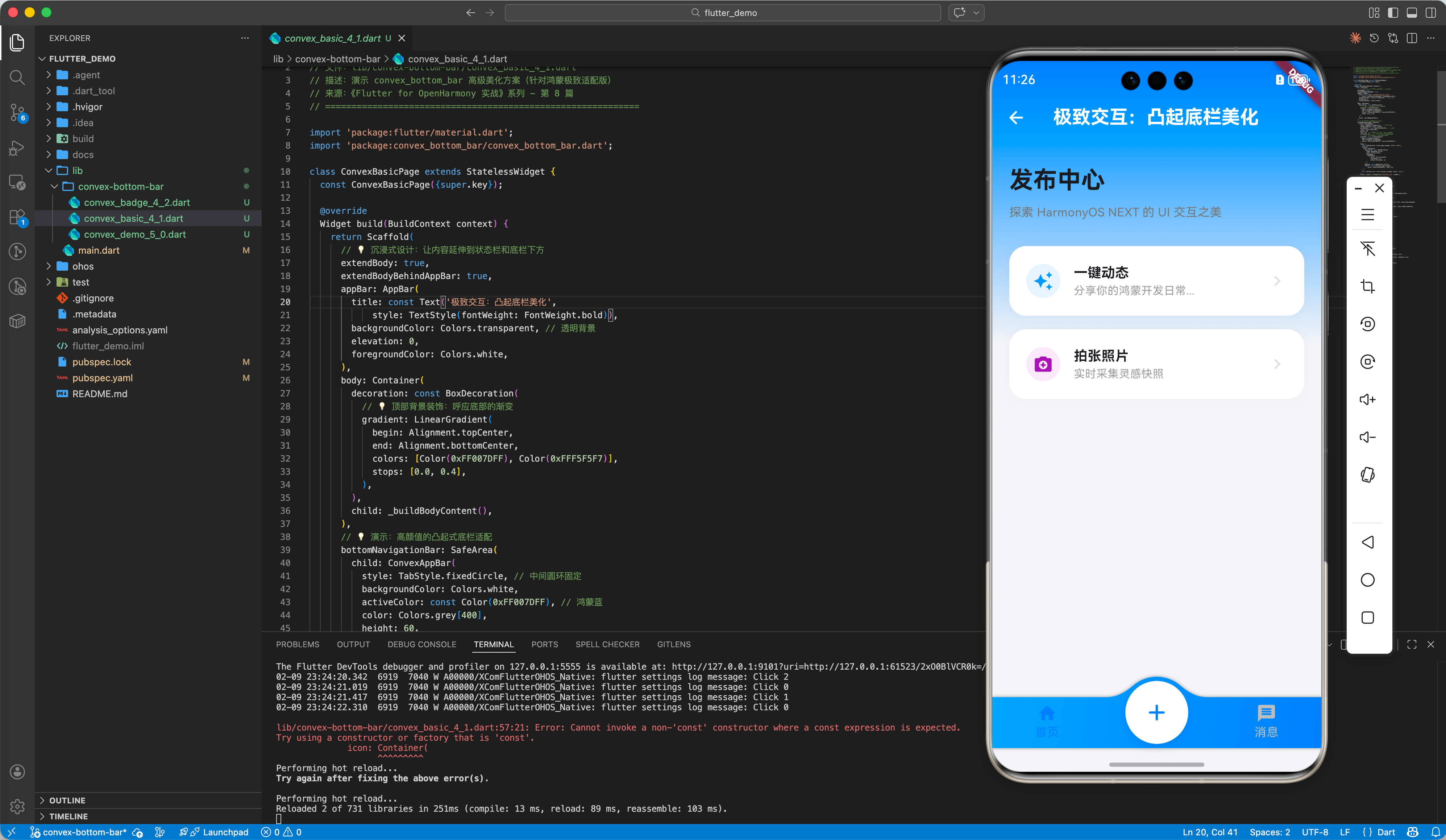
4.1 高级样式定制与渐变背景
在鸿蒙端,我们推荐使用品牌色渐变来增加 UI 的通透感。
📂 示例代码:
lib/convex-bottom-bar/convex_basic_4_1.dart
ConvexAppBar(
  style: TabStyle.fixedCircle, // 中间圆环固定
   backgroundColor: Colors.white,
   activeColor: const Color(0xFF007DFF), // 鸿蒙蓝
   color: Colors.grey[400],
   height: 60,
   top: -24, // 💡 亮点:让中间按钮凸出感更协调
   curveSize: 85, // 💡 动效:控制中间弧度的深度
   // 💡 技巧:利用渐变让背景看起来更高端
   gradient: const LinearGradient(
     begin: Alignment.topLeft,
     end: Alignment.bottomRight,
     colors: [Color(0xFF00A3FF), Color(0xFF007DFF)],
   ),
   items: [
     const TabItem(icon: Icons.home_rounded, title: '首页'),
     TabItem(
       icon: Container(
         decoration: const BoxDecoration(
           shape: BoxShape.circle,
           color: Colors.white,
           boxShadow: [
             BoxShadow(
                 color: Colors.black12,
                 blurRadius: 10,
                 offset: Offset(0, 4))
           ],
         ),
         padding: const EdgeInsets.all(12),
         child: const Icon(Icons.add_rounded,
             color: Color(0xFF007DFF), size: 32),
       ),
     ),
     const TabItem(icon: Icons.message_rounded, title: '消息'),
   ],
   onTap: (index) => debugPrint('Selected index: $index'),
 )
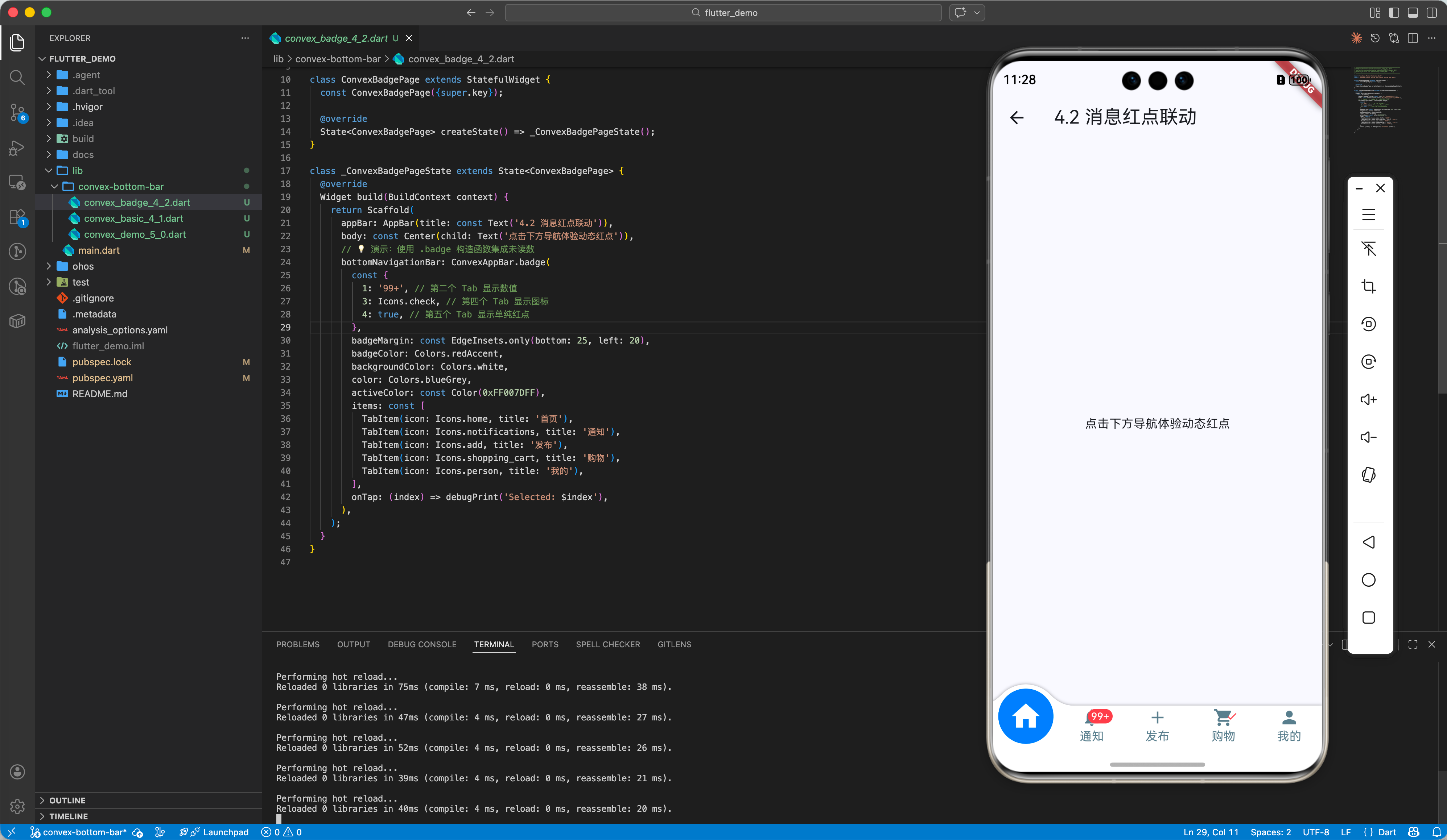
4.2 联动消息红点 (Badge)
鸿蒙应用常用的未读数标记可通过 .badge 快速集成。
📂 示例代码:
lib/convex-bottom-bar/convex_badge_4_2.dart
ConvexAppBar.badge(
  {1: '99+', 3: Icons.check}, // 为指定索引位置添加 Badge
  items: [...],
  onTap: (index) => _handleTap(index),
)
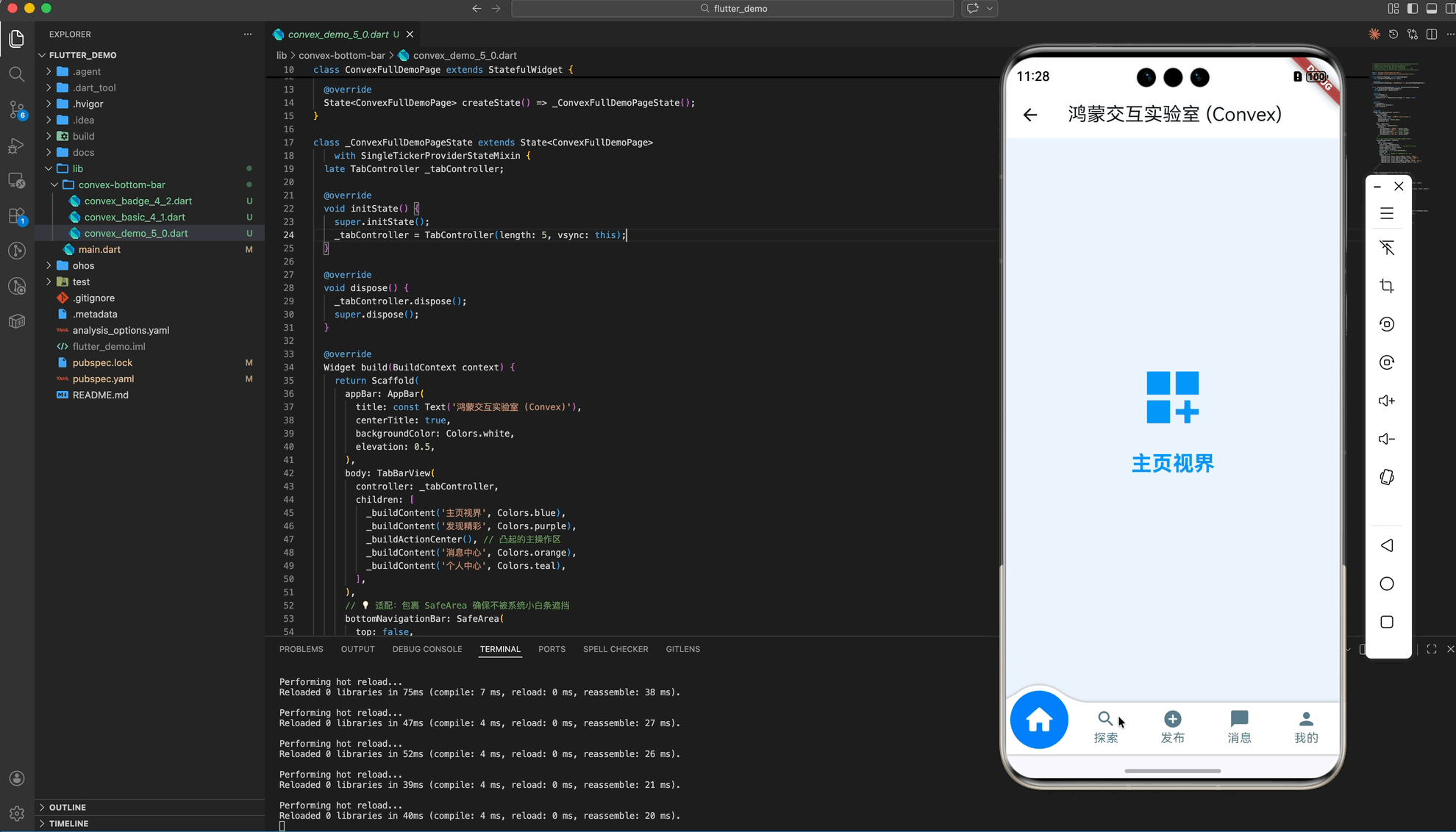
五、 完整示例:鸿蒙灵动交互实验室
这是一个集成度最高的工程化示例,展示了如何配合 TabController 实现多页面滑动与凸起导航的丝滑联动。
import 'package:flutter/material.dart';
import 'package:convex_bottom_bar/convex_bottom_bar.dart';
class ConvexFullDemoPage extends StatefulWidget {
const ConvexFullDemoPage({super.key});
State<ConvexFullDemoPage> createState() => _ConvexFullDemoPageState();
}
class _ConvexFullDemoPageState extends State<ConvexFullDemoPage>
with SingleTickerProviderStateMixin {
late TabController _tabController;
void initState() {
super.initState();
_tabController = TabController(length: 5, vsync: this);
}
void dispose() {
_tabController.dispose();
super.dispose();
}
Widget build(BuildContext context) {
return Scaffold(
appBar: AppBar(
title: const Text('鸿蒙交互实验室 (Convex)'),
centerTitle: true,
backgroundColor: Colors.white,
elevation: 0.5,
),
body: TabBarView(
controller: _tabController,
children: [
_buildContent('主页视界', Colors.blue),
_buildContent('发现精彩', Colors.purple),
_buildActionCenter(), // 凸起的主操作区
_buildContent('消息中心', Colors.orange),
_buildContent('个人中心', Colors.teal),
],
),
// 💡 适配:包裹 SafeArea 确保不被系统小白条遮挡
bottomNavigationBar: SafeArea(
top: false,
child: ConvexAppBar(
controller: _tabController,
style: TabStyle.reactCircle, // 选中时圆环缩放效果
backgroundColor: Colors.white,
color: Colors.blueGrey,
activeColor: const Color(0xFF007DFF),
height: 60,
top: -20, // 💡 亮点:让中心凸起效果更加明显
items: const [
TabItem(icon: Icons.home_rounded, title: '首页'),
TabItem(icon: Icons.search_rounded, title: '探索'),
TabItem(icon: Icons.add_circle, title: '发布'),
TabItem(icon: Icons.chat_bubble_rounded, title: '消息'),
TabItem(icon: Icons.person_rounded, title: '我的'),
],
),
),
);
}
Widget _buildContent(String title, Color color) {
return Container(
color: color.withOpacity(0.05),
child: Center(
child: Column(
mainAxisAlignment: MainAxisAlignment.center,
children: [
Icon(Icons.dashboard_customize, size: 80, color: color),
const SizedBox(height: 20),
Text(title,
style: TextStyle(
fontSize: 24, fontWeight: FontWeight.bold, color: color)),
],
),
),
);
}
Widget _buildActionCenter() {
return Container(
padding: const EdgeInsets.all(24),
child: Center(
child: Column(
mainAxisAlignment: MainAxisAlignment.center,
children: [
const Text('🚀 鸿蒙超级入口已就绪',
style: TextStyle(fontSize: 20, fontWeight: FontWeight.bold)),
const SizedBox(height: 12),
const Text('这里可以放置您 App 的核心业务功能',
style: TextStyle(color: Colors.grey)),
const SizedBox(height: 40),
ElevatedButton(
onPressed: () {},
style: ElevatedButton.styleFrom(
backgroundColor: const Color(0xFF007DFF),
foregroundColor: Colors.white,
minimumSize: const Size(200, 50),
),
child: const Text('去发布新动态'),
),
],
),
),
);
}
}
六、 适配鸿蒙的避坑指南
6.1 适配沉浸式底栏与小白条
鸿蒙系统底部通常有系统指示条。在使用 ConvexAppBar 时,务必通过 SafeArea 包裹,防止凸起按钮底部的 Title 被系统小白条遮挡。
6.2 调整 top 参数规避遮挡
由于 ConvexAppBar 背景是溢出绘制的,在某些沉浸式布局下,如果 top 参数设置过小,可能会导致背景在某些机型上看起来“断层”。建议在鸿蒙端将 top 显式设置为 -15 到 -25 之间。
七、 总结
底部导航是应用的“基地”。通过 convex_bottom_bar 方案,我们不仅在鸿蒙平台上实现了一个美观的组件,更通过“打破平庸布局”的设计语言向系统传递了产品的温度。
🌐 欢迎加入开源鸿蒙跨平台社区:开源鸿蒙跨平台开发者社区

作为“人工智能6S店”的官方数字引擎,为AI开发者与企业提供一个覆盖软硬件全栈、一站式门户。
更多推荐

 30
30 0
0- 0


 已为社区贡献30条内容

所有评论(0)