
Flutter for OpenHarmony 实战:AnimatedPositioned在Stack内实现定位动画
在移动开发领域,我们总是面临着选择与适配。今天,你的Flutter应用在Android和iOS上运行流畅,明天可能就需要考虑一个新的平台:HarmonyOS(鸿蒙)。这并非选答题,而是许多团队正在面对的现实。Flutter的优势显而易见——编写一套代码,即可在多个平台运行,开发体验流畅。而鸿蒙代表的是下一个时代的互联生态,它不仅是手机系统,更着眼于未来全场景的体验。将现有的Flutter应用适配到
欢迎加入开源鸿蒙跨平台社区: https://openharmonycrossplatform.csdn.net
前言:跨生态开发的新机遇
在移动开发领域,我们总是面临着选择与适配。今天,你的Flutter应用在Android和iOS上运行流畅,明天可能就需要考虑一个新的平台:HarmonyOS(鸿蒙)。这并非选答题,而是许多团队正在面对的现实。
Flutter的优势显而易见——编写一套代码,即可在多个平台运行,开发体验流畅。而鸿蒙代表的是下一个时代的互联生态,它不仅是手机系统,更着眼于未来全场景的体验。将现有的Flutter应用适配到鸿蒙,听起来像是一项“跨界”任务,但本质上是一次有价值的技术拓展:让产品触达更多用户,也让技术栈覆盖更广。
不过,这条路走起来并不像听起来那么简单。Flutter和鸿蒙,从底层架构到上层工具链,都有着各自的设计逻辑。开发过程中会遇到一些具体问题:代码如何组织?原有的功能在鸿蒙上如何实现?平台特有的能力该如何调用?更实际的是,从编译打包到上架部署,整个流程都需要重新摸索。
本文旨在将我们的开发经验、遇到的问题及解决方案清晰地呈现给大家。我们不仅会介绍“怎么做”,还会解释“为什么得这么做”,以及“如果出了问题该如何解决”。这更像是一份实战笔记,源自真实的项目经验,聚焦于那些真正困扰过我们的环节。
无论你是在为成熟产品寻找新的落地平台,还是从一开始就希望构建能面向多端的应用,这里的思路和解决方案都能提供直接的参考。理解两套体系之间的异同,掌握关键的衔接技术,不仅能完成本次迁移,更能积累起应对未来技术变化的能力。
混合工程结构深度解析
项目目录架构
当Flutter项目集成鸿蒙支持后,典型的项目结构会发生显著变化。以下是经过ohos_flutter插件初始化后的项目结构:
my_flutter_harmony_app/
├── lib/                          # Flutter业务代码(基本不变)
│   ├── main.dart                 # 应用入口
│   ├── components/              # 组件目录
│   │   └── animated_positioned_demo.dart  # AnimatedPositioned组件
├── pubspec.yaml                  # Flutter依赖配置
├── ohos/                         # 鸿蒙原生层(核心适配区)
│   ├── entry/                    # 主模块
│   │   └── src/main/
│   │       ├── ets/              # ArkTS代码
│   │       │   ├── entryability/
│   │       │   │   └── EntryAbility.ets       # 主Ability
│   │       │   └── pages/
│   │       │       └── Index.ets           # 主页面
│   │       ├── resources/        # 鸿蒙资源文件
│   │       │   ├── base/
│   │       │   │   ├── element/  # 字符串等
│   │       │   │   ├── media/    # 图片资源
│   │       │   │   └── profile/  # 配置文件
│   │       └── module.json5
└── README.md
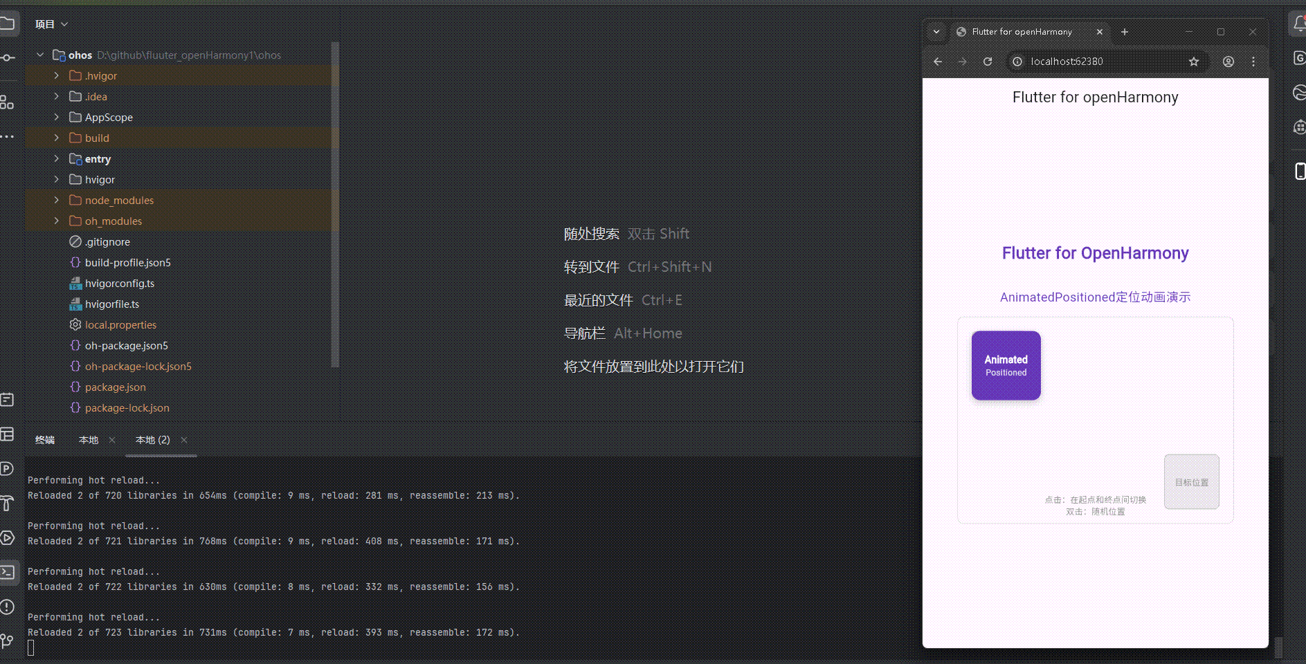
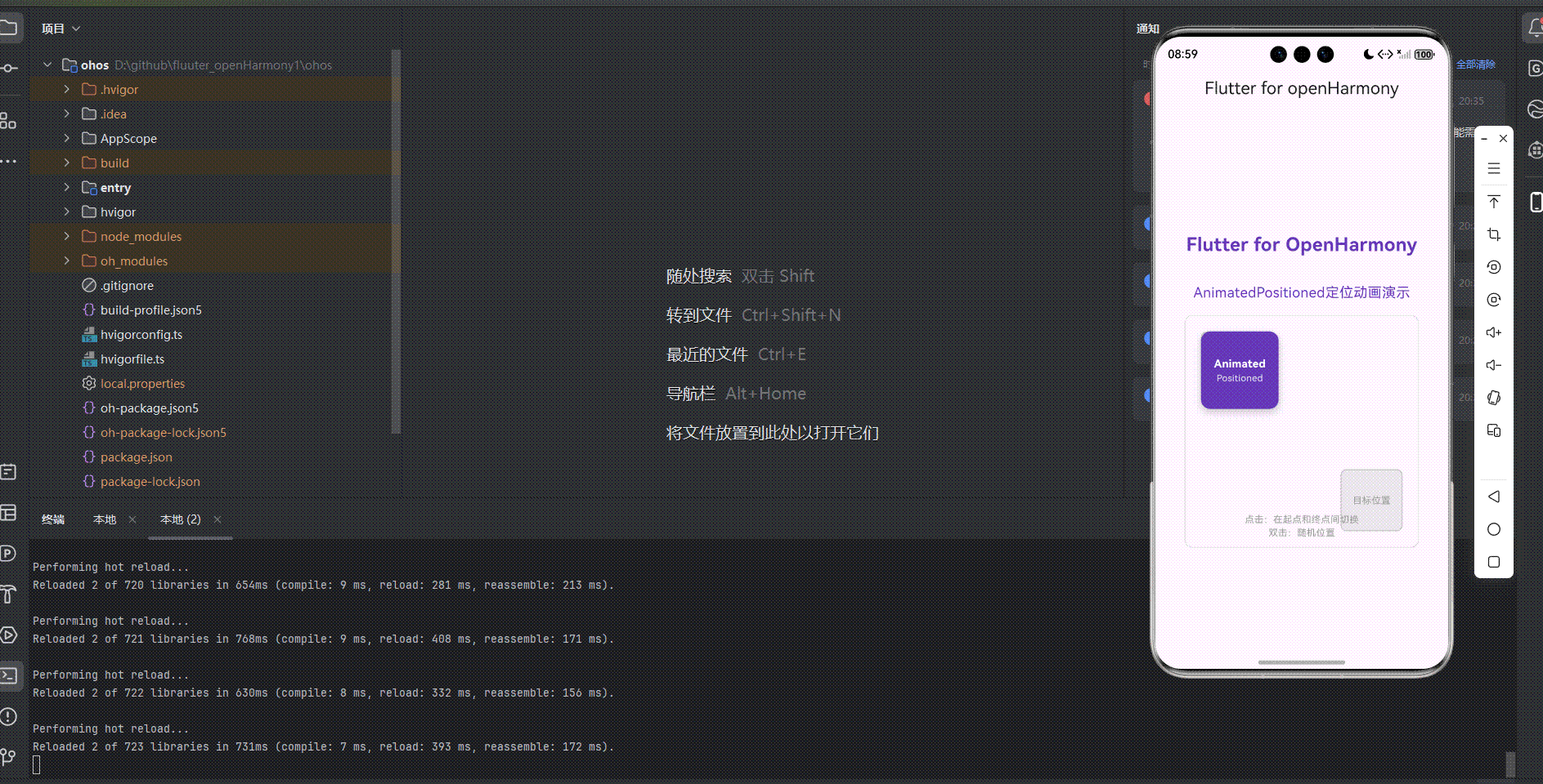
展示效果图片
-
Flutter 实时预览效果展示
-
运行到鸿蒙虚拟设备中效果展示
目录
功能代码实现
AnimatedPositioned组件
AnimatedPositioned组件是一个使用Flutter的AnimatedPositioned实现的具有定位动画效果的组件,它可以在Stack内展示元素的平滑位置变化,增强用户交互体验。
核心代码实现
组件结构
import 'package:flutter/material.dart';
class AnimatedPositionedDemo extends StatefulWidget {
final double width;
final double height;
const AnimatedPositionedDemo({
Key? key,
required this.width,
required this.height,
}) : super(key: key);
State<AnimatedPositionedDemo> createState() => _AnimatedPositionedDemoState();
}
class _AnimatedPositionedDemoState extends State<AnimatedPositionedDemo> {
bool _isAnimated = false;
double _top = 20;
double _left = 20;
double? _right;
double? _bottom;
void _toggleAnimation() {
setState(() {
_isAnimated = !_isAnimated;
if (_isAnimated) {
_top = widget.height - 120;
_left = widget.width - 120;
_right = null;
_bottom = null;
} else {
_top = 20;
_left = 20;
_right = null;
_bottom = null;
}
});
}
void _moveToRandomPosition() {
setState(() {
_isAnimated = true;
// 生成随机位置
double randomX = (widget.width - 100) * (1 - (2 * DateTime.now().millisecond / 1000).abs() % 1);
double randomY = (widget.height - 100) * (1 - (2 * DateTime.now().millisecond / 1000).abs() % 1);
_top = randomY;
_left = randomX;
_right = null;
_bottom = null;
});
}
Widget build(BuildContext context) {
return GestureDetector(
onTap: _toggleAnimation,
onDoubleTap: _moveToRandomPosition,
child: Container(
width: widget.width,
height: widget.height,
decoration: BoxDecoration(
border: Border.all(color: Colors.grey.withOpacity(0.3)),
borderRadius: BorderRadius.circular(10),
),
child: Stack(
children: [
// 固定位置的参考元素
Positioned(
top: 20,
left: 20,
child: Container(
width: 80,
height: 80,
decoration: BoxDecoration(
color: Colors.grey.withOpacity(0.2),
borderRadius: BorderRadius.circular(8),
border: Border.all(color: Colors.grey.withOpacity(0.5)),
),
child: Center(
child: Text(
'起始位置',
style: TextStyle(
fontSize: 12,
color: Colors.grey,
),
),
),
),
),
Positioned(
bottom: 20,
right: 20,
child: Container(
width: 80,
height: 80,
decoration: BoxDecoration(
color: Colors.grey.withOpacity(0.2),
borderRadius: BorderRadius.circular(8),
border: Border.all(color: Colors.grey.withOpacity(0.5)),
),
child: Center(
child: Text(
'目标位置',
style: TextStyle(
fontSize: 12,
color: Colors.grey,
),
),
),
),
),
// 动画元素
AnimatedPositioned(
top: _top,
left: _left,
right: _right,
bottom: _bottom,
duration: const Duration(milliseconds: 500),
curve: Curves.easeInOut,
child: Container(
width: 100,
height: 100,
decoration: BoxDecoration(
color: Colors.deepPurple,
borderRadius: BorderRadius.circular(12),
boxShadow: [
BoxShadow(
color: Colors.black.withOpacity(0.2),
blurRadius: 8,
offset: const Offset(0, 4),
),
],
),
child: Center(
child: Column(
mainAxisAlignment: MainAxisAlignment.center,
children: [
Text(
'Animated',
style: TextStyle(
color: Colors.white,
fontSize: 14,
fontWeight: FontWeight.bold,
),
),
Text(
'Positioned',
style: TextStyle(
color: Colors.white.withOpacity(0.8),
fontSize: 12,
),
),
],
),
),
),
),
// 提示文字
Positioned(
bottom: 10,
left: 0,
right: 0,
child: Center(
child: Column(
children: [
Text(
'点击:在起点和终点间切换',
style: TextStyle(
color: Colors.grey,
fontSize: 12,
),
),
Text(
'双击:随机位置',
style: TextStyle(
color: Colors.grey,
fontSize: 12,
),
),
],
),
),
),
],
),
),
);
}
}
组件开发实现详解
1. 定位动画实现
实现原理:
使用Flutter的AnimatedPositioned组件实现元素在Stack内的平滑位置变化动画,这是组件的核心功能。我们通过以下步骤实现:
- 状态管理:使用StatefulWidget管理元素的位置状态
- 位置控制:通过修改top、left、right、bottom属性,触发AnimatedPositioned的位置动画
- 交互处理:使用GestureDetector处理点击和双击事件,切换元素位置
- 随机位置:实现双击生成随机位置的功能,增加交互趣味性
核心代码:
void _toggleAnimation() {
  setState(() {
    _isAnimated = !_isAnimated;
    if (_isAnimated) {
      _top = widget.height - 120;
      _left = widget.width - 120;
      _right = null;
      _bottom = null;
    } else {
      _top = 20;
      _left = 20;
      _right = null;
      _bottom = null;
    }
  });
}

void _moveToRandomPosition() {
  setState(() {
    _isAnimated = true;
    // 生成随机位置
    double randomX = (widget.width - 100) * (1 - (2 * DateTime.now().millisecond / 1000).abs() % 1);
    double randomY = (widget.height - 100) * (1 - (2 * DateTime.now().millisecond / 1000).abs() % 1);

    _top = randomY;
    _left = randomX;
    _right = null;
    _bottom = null;
  });
}

// 动画元素
AnimatedPositioned(
  top: _top,
  left: _left,
  right: _right,
  bottom: _bottom,
  duration: const Duration(milliseconds: 500),
  curve: Curves.easeInOut,
  child: Container(
    width: 100,
    height: 100,
    decoration: BoxDecoration(
      color: Colors.deepPurple,
      borderRadius: BorderRadius.circular(12),
      boxShadow: [
        BoxShadow(
          color: Colors.black.withOpacity(0.2),
          blurRadius: 8,
          offset: const Offset(0, 4),
        ),
      ],
    ),
    child: Center(
      child: Column(
        mainAxisAlignment: MainAxisAlignment.center,
        children: [
          Text(
            'Animated',
            style: TextStyle(
              color: Colors.white,
              fontSize: 14,
              fontWeight: FontWeight.bold,
            ),
          ),
          Text(
            'Positioned',
            style: TextStyle(
              color: Colors.white.withOpacity(0.8),
              fontSize: 12,
            ),
          ),
        ],
      ),
    ),
  ),
),
2. 参考元素和交互提示
实现原理:
为了更直观地展示动画效果,我们添加了固定位置的参考元素和交互提示文字。
- 参考元素:在起始位置和目标位置添加半透明的参考元素,帮助用户理解动画的起始和结束位置
- 交互提示:在组件底部添加文字提示,说明不同交互操作的效果
核心代码:
// 固定位置的参考元素
Positioned(
  top: 20,
  left: 20,
  child: Container(
    width: 80,
    height: 80,
    decoration: BoxDecoration(
      color: Colors.grey.withOpacity(0.2),
      borderRadius: BorderRadius.circular(8),
      border: Border.all(color: Colors.grey.withOpacity(0.5)),
    ),
    child: Center(
      child: Text(
        '起始位置',
        style: TextStyle(
          fontSize: 12,
          color: Colors.grey,
        ),
      ),
    ),
  ),
);

// 提示文字
Positioned(
  bottom: 10,
  left: 0,
  right: 0,
  child: Center(
    child: Column(
      children: [
        Text(
          '点击:在起点和终点间切换',
          style: TextStyle(
            color: Colors.grey,
            fontSize: 12,
          ),
        ),
        Text(
          '双击:随机位置',
          style: TextStyle(
            color: Colors.grey,
            fontSize: 12,
          ),
        ),
      ],
    ),
  ),
);
在主应用中的集成
以下是在主应用中集成AnimatedPositioned组件的代码:
import 'package:flutter/material.dart';
import 'components/animated_positioned_demo.dart';

// 在主页面中使用
AnimatedPositionedDemo(
  width: constraints.maxWidth * 0.8,
  height: 300,
)
使用方法
基本使用
import 'components/animated_positioned_demo.dart';

// 在需要的地方使用
AnimatedPositionedDemo(
  width: 300,
  height: 300,
)
自定义配置
// 自定义配置
AnimatedPositionedDemo(
  width: 400,
  height: 350,
)
交互说明
- 点击切换:点击组件任意位置,紫色方块会平滑过渡到终点位置,再次点击会回到起始位置
- 双击随机:双击组件任意位置,紫色方块会平滑过渡到一个随机位置
- 动画效果:位置变化动画使用easeInOut曲线,持续时间为500毫秒
- 参考元素:组件会显示起始位置和目标位置的参考元素,帮助用户理解动画范围
开发中需要注意的点
-
状态管理:使用StatefulWidget正确管理元素的位置状态,确保状态更新能触发UI刷新
-
动画配置:选择合适的动画曲线和持续时间,确保位置变化效果自然流畅
-
响应式设计:根据父容器的约束动态调整元素的位置,确保在不同设备上都有良好的显示效果
-
交互体验:添加清晰的视觉反馈和交互提示,提升用户体验
-
随机位置计算:确保生成的随机位置不会超出组件边界,避免元素显示异常
-
可空类型处理:在Dart 2.12+中,需要正确处理可空类型,使用
double?代替double来允许null值
本次开发中容易遇到的问题
在开发Flutter for OpenHarmony项目时,我们遇到了以下几个常见问题:
1. 文件路径和导入错误
问题:在main.dart中引用组件文件时,可能会出现路径错误或文件不存在的情况。
解决方案:确保文件路径正确,文件名大小写一致,并且文件确实存在于指定位置。
2. 权限问题
问题:运行flutter run命令时遇到权限错误,无法访问Flutter SDK缓存文件。
解决方案:确保当前用户对Flutter SDK目录有读写权限,必要时使用chown命令修改权限。
3. 响应式设计适配
问题:在不同屏幕尺寸上,组件可能无法正确显示。
解决方案:使用LayoutBuilder获取父容器的约束,并根据约束动态调整组件大小和位置。
4. 交互体验优化
问题:在实现交互效果时,可能会出现动画不流畅或交互反馈不清晰的情况。
解决方案:选择合适的动画曲线和持续时间,添加清晰的视觉反馈,如高亮显示和状态指示。
5. 组件状态管理
问题:在复杂组件中,可能会出现状态管理混乱的情况,导致动画效果异常。
解决方案:合理组织组件状态,使用setState正确更新状态,确保状态变化能触发相应的动画效果。
6. 可空类型处理
问题:在Dart 2.12+中,可能会遇到非空类型错误,特别是当尝试将null赋值给非空类型变量时。
解决方案:使用可空类型(如double?)来允许null值,或为变量提供默认值。
总结本次开发中用到的技术点
在本次Flutter for OpenHarmony开发中,我们使用了以下关键技术点:
1. Flutter核心组件
- StatefulWidget:用于管理需要状态的组件,如动画状态和交互状态
- AnimatedPositioned:实现元素在Stack内的平滑位置变化动画
- GestureDetector:处理点击和触摸事件,支持单击和双击等多种交互
- Stack:实现层叠布局,用于叠加多个视觉元素
- Positioned:在Stack中精确定位子组件
- Container:创建带样式和装饰的容器
- BoxDecoration:定义容器的背景、边框和阴影
2. 布局和样式
- LayoutBuilder:根据父容器约束动态调整布局
- Scaffold:创建应用的基本结构,包含AppBar和Body
- AppBar:创建应用的顶部导航栏
- SingleChildScrollView:实现可滚动的内容区域
- Column:垂直排列子组件
- Text:显示文本内容
- SizedBox:创建固定大小的空间
3. 状态管理
- setState:更新组件状态并触发UI重绘
- StatefulWidget:管理组件的状态
4. 响应式设计
- LayoutBuilder:根据父容器约束调整布局
- MediaQuery:获取设备屏幕信息
5. 代码组织
- 组件抽离:将功能组件分离到独立的文件中,提高代码可维护性
- 模块化开发:将不同功能模块分离到不同文件和目录中
6. 类型系统
- 可空类型:使用
?标记允许null值的类型,如double?
通过掌握这些技术点,我们成功实现了具有良好用户体验的Flutter for OpenHarmony应用,特别是AnimatedPositioned定位动画效果,为用户提供了流畅的交互体验。
欢迎加入开源鸿蒙跨平台社区:https://openharmonycrossplatform.csdn.net

作为“人工智能6S店”的官方数字引擎,为AI开发者与企业提供一个覆盖软硬件全栈、一站式门户。
更多推荐

 19
19 0
0- 0


 已为社区贡献9条内容

所有评论(0)