
Flutter for OpenHarmony 实战:开发直观的拖拽交互式决策辅助工具
在移动开发领域,我们总是面临着选择与适配。今天,你的Flutter应用在Android和iOS上跑得正欢,明天可能就需要考虑一个新的平台:HarmonyOS(鸿蒙)。这不是一道选答题,而是很多团队正在面对的现实。Flutter的优势很明确——写一套代码,就能在两个主要平台上运行,开发体验流畅。而鸿蒙代表的是下一个时代的互联生态,它不仅仅是手机系统,更着眼于未来全场景的体验。
欢迎加入开源鸿蒙跨平台社区: https://openharmonycrossplatform.csdn.net
前言:跨生态开发的新机遇
在移动开发领域,我们总是面临着选择与适配。今天,你的Flutter应用在Android和iOS上跑得正欢,明天可能就需要考虑一个新的平台:HarmonyOS(鸿蒙)。这不是一道选答题,而是很多团队正在面对的现实。
Flutter的优势很明确——写一套代码,就能在两个主要平台上运行,开发体验流畅。而鸿蒙代表的是下一个时代的互联生态,它不仅仅是手机系统,更着眼于未来全场景的体验。将现有的Flutter应用适配到鸿蒙,听起来像是一个“跨界”任务,但它本质上是一次有价值的技术拓展:让产品触达更多用户,也让技术栈覆盖更广。
不过,这条路走起来并不像听起来那么简单。Flutter和鸿蒙,从底层的架构到上层的工具链,都有着各自的设计逻辑。会遇到一些具体的问题:代码如何组织?原有的功能在鸿蒙上如何实现?那些平台特有的能力该怎么调用?更实际的是,从编译打包到上架部署,整个流程都需要重新摸索。
这篇文章想做的,就是把这些我们趟过的路、踩过的坑,清晰地摊开给你看。我们不会只停留在“怎么做”,还会聊到“为什么得这么做”,以及“如果出了问题该往哪想”。这更像是一份实战笔记,源自真实的项目经验,聚焦于那些真正卡住过我们的环节。
无论你是在为一个成熟产品寻找新的落地平台,还是从一开始就希望构建能面向多端的应用,这里的思路和解决方案都能提供直接的参考。理解了两套体系之间的异同,掌握了关键的衔接技术,不仅能完成这次迁移,更能积累起应对未来技术变化的能力。
混合工程结构深度解析
项目目录架构
当Flutter项目集成鸿蒙支持后,典型的项目结构会发生显著变化。以下是经过ohos_flutter插件初始化后的项目结构:
my_flutter_harmony_app/
├── lib/                          # Flutter业务代码(基本不变)
│   ├── main.dart                 # 应用入口
│   ├── home_page.dart           # 首页
│   └── utils/
│       └── platform_utils.dart  # 平台工具类
├── pubspec.yaml                  # Flutter依赖配置
├── ohos/                         # 鸿蒙原生层(核心适配区)
│   ├── entry/                    # 主模块
│   │   └── src/main/
│   │       ├── ets/              # ArkTS代码
│   │       │   ├── MainAbility/
│   │       │   │   ├── MainAbility.ts       # 主Ability
│   │       │   │   └── MainAbilityContext.ts
│   │       │   └── pages/
│   │       │       ├── Index.ets           # 主页面
│   │       │       └── Splash.ets          # 启动页
│   │       ├── resources/        # 鸿蒙资源文件
│   │       │   ├── base/
│   │       │   │   ├── element/  # 字符串等
│   │       │   │   ├── media/    # 图片资源
│   │       │   │   └── profile/  # 配置文件
│   │       │   └── en_US/        # 英文资源
│   │       └── config.json       # 应用核心配置
│   ├── ohos_test/               # 测试模块
│   ├── build-profile.json5      # 构建配置
│   └── oh-package.json5         # 鸿蒙依赖管理
└── README.md
展示效果图片
flutter 实时预览 效果展示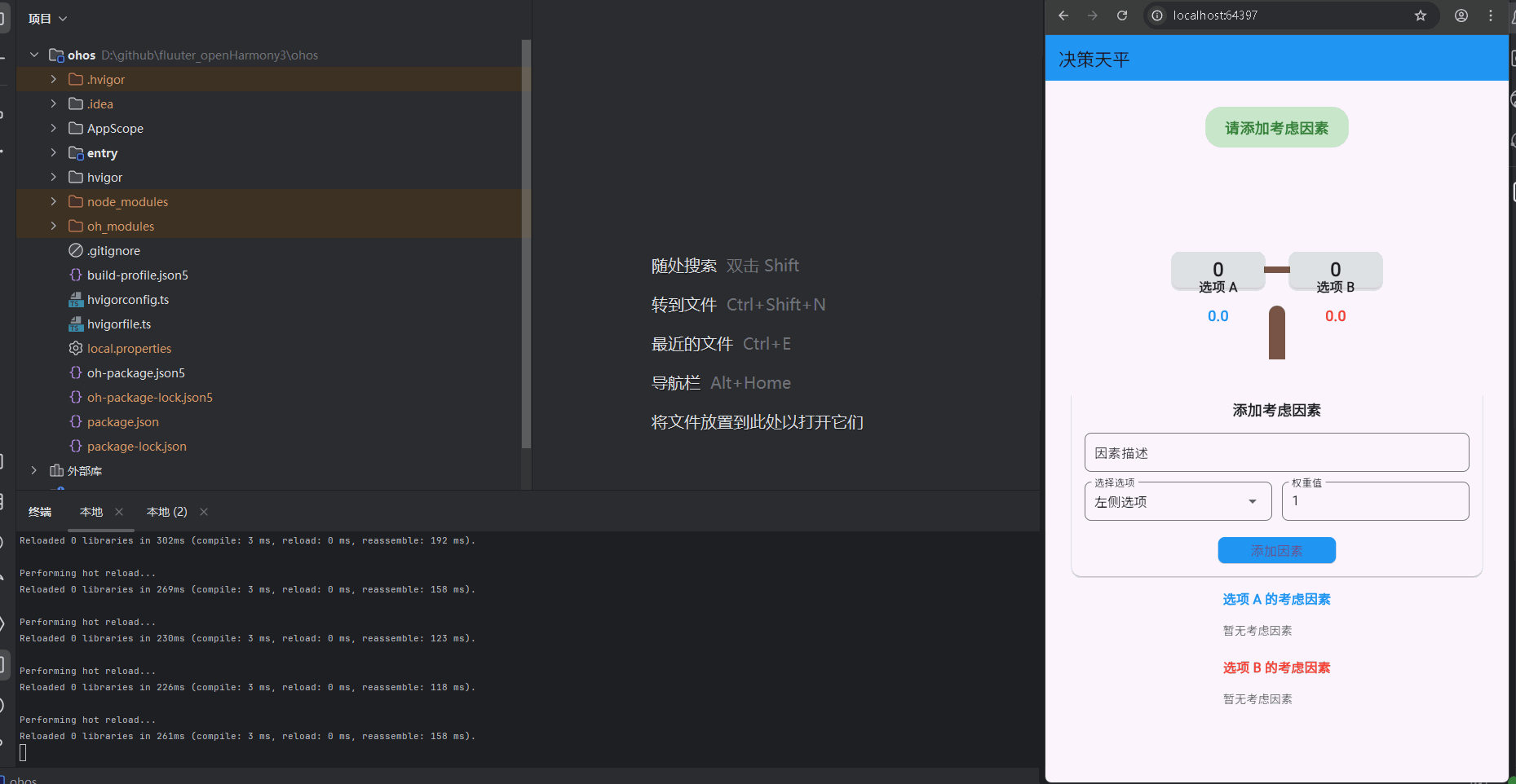
运行到鸿蒙虚拟设备中效果展示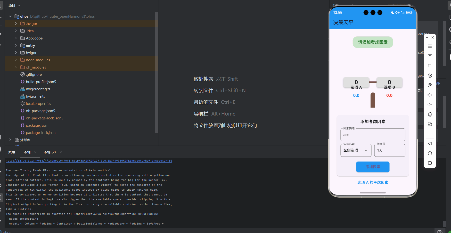
功能代码实现
核心组件开发实现
1. 数据模型 (decision_model.dart)
实现分析:
定义了决策选项和砝码的数据结构,包含必要的字段和方法。采用不可变数据结构设计,每次修改都返回新实例,确保数据一致性。
代码实现:
class DecisionOption {
  final String id;
  final String title;
  final List<Weight> weights;

  DecisionOption({
    required this.id,
    required this.title,
    List<Weight>? weights,
  }) : weights = weights ?? [];

  double get totalWeight {
    return weights.fold(0, (sum, weight) => sum + weight.value);
  }

  DecisionOption addWeight(Weight weight) {
    return DecisionOption(
      id: id,
      title: title,
      weights: [...weights, weight],
    );
  }

  DecisionOption removeWeight(String weightId) {
    return DecisionOption(
      id: id,
      title: title,
      weights: weights.where((w) => w.id != weightId).toList(),
    );
  }
}

class Weight {
  final String id;
  final String description;
  final double value;

  Weight({
    required this.id,
    required this.description,
    required this.value,
  });
}
使用方法:
- 用于创建和管理决策选项
- 计算选项的总权重
- 添加和删除砝码
开发注意点:
- 使用不可变数据结构,每次修改都返回新实例
- 提供便捷的方法操作砝码
- 使用fold方法高效计算总权重
2. 天平组件 (balance_scale.dart)
实现分析:
可视化展示两个选项的权重对比,根据权重差异计算倾斜角度。使用Stack和Transform实现天平的层叠布局和旋转效果。
代码实现:
class BalanceScale extends StatelessWidget {
final DecisionOption leftOption;
final DecisionOption rightOption;
final double width;
final double height;
const BalanceScale({
Key? key,
required this.leftOption,
required this.rightOption,
this.width = 300,
this.height = 200,
}) : super(key: key);
double get _tiltAngle {
  final totalWeight = leftOption.totalWeight + rightOption.totalWeight;
  if (totalWeight == 0) return 0;

  final difference = leftOption.totalWeight - rightOption.totalWeight;
  final normalizedDifference = difference / totalWeight;

  // Limit the angle to +/- 30 degrees (in radians)
  return normalizedDifference * 0.5236; // 30 degrees in radians
}
Widget build(BuildContext context) {
return Container(
width: width,
height: height,
child: Stack(
alignment: Alignment.center,
children: [
// Balance base
Positioned(
bottom: 0,
child: Container(
width: 20,
height: height * 0.3,
decoration: BoxDecoration(
color: Colors.brown,
borderRadius: BorderRadius.only(
topLeft: Radius.circular(10),
topRight: Radius.circular(10),
),
),
),
),
// Balance beam
Transform.rotate(
angle: _tiltAngle,
child: Container(
width: width * 0.8,
height: 8,
decoration: BoxDecoration(
color: Colors.brown,
borderRadius: BorderRadius.circular(4),
),
),
),
// Left pan
Positioned(
left: width * 0.1,
top: height * 0.4,
child: Transform.translate(
offset: Offset(0, _tiltAngle * 50),
child: _buildPan(leftOption),
),
),
// Right pan
Positioned(
right: width * 0.1,
top: height * 0.4,
child: Transform.translate(
offset: Offset(0, -_tiltAngle * 50),
child: _buildPan(rightOption),
),
),
// Option titles
Positioned(
left: width * 0.1,
bottom: height * 0.35,
child: Container(
width: width * 0.35,
child: Text(
leftOption.title,
textAlign: TextAlign.center,
style: TextStyle(
fontWeight: FontWeight.bold,
fontSize: 16,
),
),
),
),
Positioned(
right: width * 0.1,
bottom: height * 0.35,
child: Container(
width: width * 0.35,
child: Text(
rightOption.title,
textAlign: TextAlign.center,
style: TextStyle(
fontWeight: FontWeight.bold,
fontSize: 16,
),
),
),
),
// Weight values
Positioned(
left: width * 0.1,
top: height * 0.7,
child: Container(
width: width * 0.35,
child: Text(
'${leftOption.totalWeight.toStringAsFixed(1)}',
textAlign: TextAlign.center,
style: TextStyle(
color: Colors.blue,
fontWeight: FontWeight.bold,
fontSize: 18,
),
),
),
),
Positioned(
right: width * 0.1,
top: height * 0.7,
child: Container(
width: width * 0.35,
child: Text(
'${rightOption.totalWeight.toStringAsFixed(1)}',
textAlign: TextAlign.center,
style: TextStyle(
color: Colors.red,
fontWeight: FontWeight.bold,
fontSize: 18,
),
),
),
),
],
),
);
}
Widget _buildPan(DecisionOption option) {
return Container(
width: width * 0.35,
height: height * 0.2,
decoration: BoxDecoration(
color: Colors.grey[300],
borderRadius: BorderRadius.circular(8),
boxShadow: [
BoxShadow(
color: Colors.black26,
blurRadius: 4,
offset: Offset(0, 2),
),
],
),
child: Center(
child: Text(
option.weights.length.toString(),
style: TextStyle(
fontWeight: FontWeight.bold,
fontSize: 24,
),
),
),
);
}
}
使用方法:
- 在决策天平主组件中使用,展示两个选项的权重对比
- 自动根据权重差异计算并显示倾斜角度
开发注意点:
- 限制倾斜角度,避免过度倾斜影响视觉效果
- 使用Transform实现平滑的倾斜动画效果
- 使用Stack和Positioned实现天平的层叠布局
3. 添加砝码表单 (add_weight_form.dart)
实现分析:
用于用户添加考虑因素和权重,包含表单验证。使用Form和GlobalKey进行表单管理和验证。
代码实现:
class AddWeightForm extends StatefulWidget {
final Function(String, double, String) onAddWeight;
const AddWeightForm({
Key? key,
required this.onAddWeight,
}) : super(key: key);
_AddWeightFormState createState() => _AddWeightFormState();
}
class _AddWeightFormState extends State<AddWeightForm> {
final _formKey = GlobalKey<FormState>();
final _descriptionController = TextEditingController();
double _weightValue = 1.0;
String _selectedOption = 'left';
void dispose() {
_descriptionController.dispose();
super.dispose();
}
void _submitForm() {
if (_formKey.currentState!.validate()) {
widget.onAddWeight(
_descriptionController.text,
_weightValue,
_selectedOption,
);
_resetForm();
}
}
void _resetForm() {
_descriptionController.clear();
setState(() {
_weightValue = 1.0;
_selectedOption = 'left';
});
}
Widget build(BuildContext context) {
return Card(
margin: EdgeInsets.symmetric(horizontal: 16, vertical: 8),
elevation: 2,
shape: RoundedRectangleBorder(
borderRadius: BorderRadius.circular(12),
),
child: Padding(
padding: EdgeInsets.all(16),
child: Form(
key: _formKey,
child: Column(
children: [
Text(
'添加考虑因素',
style: TextStyle(
fontSize: 18,
fontWeight: FontWeight.bold,
),
),
SizedBox(height: 16),
TextFormField(
controller: _descriptionController,
decoration: InputDecoration(
labelText: '因素描述',
border: OutlineInputBorder(
borderRadius: BorderRadius.circular(8),
),
),
validator: (value) {
if (value == null || value.isEmpty) {
return '请输入因素描述';
}
return null;
},
),
SizedBox(height: 12),
Row(
children: [
Expanded(
child: DropdownButtonFormField<String>(
value: _selectedOption,
decoration: InputDecoration(
labelText: '选择选项',
border: OutlineInputBorder(
borderRadius: BorderRadius.circular(8),
),
),
items: [
DropdownMenuItem(
value: 'left',
child: Text('左侧选项'),
),
DropdownMenuItem(
value: 'right',
child: Text('右侧选项'),
),
],
onChanged: (value) {
setState(() {
_selectedOption = value!;
});
},
),
),
SizedBox(width: 12),
Expanded(
child: TextFormField(
initialValue: _weightValue.toString(),
keyboardType: TextInputType.number,
decoration: InputDecoration(
labelText: '权重值',
border: OutlineInputBorder(
borderRadius: BorderRadius.circular(8),
),
),
validator: (value) {
if (value == null || value.isEmpty) {
return '请输入权重值';
}
final doubleValue = double.tryParse(value);
if (doubleValue == null || doubleValue <= 0) {
return '请输入有效的权重值';
}
return null;
},
onChanged: (value) {
final doubleValue = double.tryParse(value!);
if (doubleValue != null) {
setState(() {
_weightValue = doubleValue;
});
}
},
),
),
],
),
SizedBox(height: 20),
ElevatedButton(
onPressed: _submitForm,
style: ElevatedButton.styleFrom(
backgroundColor: Colors.blue,
padding: EdgeInsets.symmetric(horizontal: 40, vertical: 12),
shape: RoundedRectangleBorder(
borderRadius: BorderRadius.circular(8),
),
),
child: Text(
'添加因素',
style: TextStyle(fontSize: 16),
),
),
],
),
),
),
);
}
}
使用方法:
- 在决策天平主组件中使用,允许用户添加考虑因素
- 提交后会调用回调函数添加砝码
开发注意点:
- 实现表单验证,确保输入数据的有效性
- 及时释放控制器资源,避免内存泄漏
- 提供清晰的错误提示信息
- 表单提交后自动重置,提高用户体验
4. 砝码列表 (weight_list.dart)
实现分析:
显示用户添加的考虑因素,允许用户删除它们。实现空状态处理,当没有考虑因素时显示友好提示。
代码实现:
class WeightList extends StatelessWidget {
final DecisionOption leftOption;
final DecisionOption rightOption;
final Function(String, String) onRemoveWeight;
const WeightList({
Key? key,
required this.leftOption,
required this.rightOption,
required this.onRemoveWeight,
}) : super(key: key);
Widget build(BuildContext context) {
return Column(
children: [
// Left option weights
_buildOptionWeights(leftOption, 'left'),
SizedBox(height: 16),
// Right option weights
_buildOptionWeights(rightOption, 'right'),
],
);
}
Widget _buildOptionWeights(DecisionOption option, String optionSide) {
return Column(
crossAxisAlignment: CrossAxisAlignment.start,
children: [
Text(
'${option.title} 的考虑因素',
style: TextStyle(
fontSize: 16,
fontWeight: FontWeight.bold,
color: optionSide == 'left' ? Colors.blue : Colors.red,
),
),
SizedBox(height: 8),
if (option.weights.isEmpty)
Padding(
padding: EdgeInsets.symmetric(vertical: 8),
child: Text(
'暂无考虑因素',
style: TextStyle(color: Colors.grey[600]),
),
)
else
Column(
children: option.weights.map((weight) {
return Card(
margin: EdgeInsets.symmetric(vertical: 4),
elevation: 1,
shape: RoundedRectangleBorder(
borderRadius: BorderRadius.circular(8),
),
child: Padding(
padding: EdgeInsets.all(12),
child: Row(
mainAxisAlignment: MainAxisAlignment.spaceBetween,
children: [
Expanded(
child: Column(
crossAxisAlignment: CrossAxisAlignment.start,
children: [
Text(
weight.description,
style: TextStyle(fontSize: 14),
),
SizedBox(height: 4),
Text(
'权重: ${weight.value.toStringAsFixed(1)}',
style: TextStyle(
fontSize: 12,
color: Colors.grey[600],
),
),
],
),
),
IconButton(
onPressed: () => onRemoveWeight(weight.id, optionSide),
icon: Icon(Icons.delete, color: Colors.red[400]),
iconSize: 18,
),
],
),
),
);
}).toList(),
),
],
);
}
}
使用方法:
- 在决策天平主组件中使用,展示两个选项的考虑因素
- 点击删除按钮可以移除对应的考虑因素
开发注意点:
- 实现空状态处理,当没有考虑因素时显示友好提示
- 使用不同颜色区分两个选项的考虑因素
- 使用Card组件展示每个考虑因素,提高视觉效果
5. 决策天平主组件 (decision_balance.dart)
实现分析:
整合所有子组件,管理应用状态,实现完整的决策辅助功能。使用setState进行状态管理,确保UI与数据同步。
代码实现:
class DecisionBalance extends StatefulWidget {
final String leftOptionTitle;
final String rightOptionTitle;
const DecisionBalance({
Key? key,
this.leftOptionTitle = '选项 A',
this.rightOptionTitle = '选项 B',
}) : super(key: key);
_DecisionBalanceState createState() => _DecisionBalanceState();
}
class _DecisionBalanceState extends State<DecisionBalance> {
late DecisionOption _leftOption;
late DecisionOption _rightOption;
void initState() {
super.initState();
_leftOption = DecisionOption(
id: 'left',
title: widget.leftOptionTitle,
);
_rightOption = DecisionOption(
id: 'right',
title: widget.rightOptionTitle,
);
}
void _addWeight(String description, double value, String optionSide) {
  setState(() {
    final weight = Weight(
      id: DateTime.now().toString(),
      description: description,
      value: value,
    );

    if (optionSide == 'left') {
      _leftOption = _leftOption.addWeight(weight);
    } else {
      _rightOption = _rightOption.addWeight(weight);
    }
  });
}
void _removeWeight(String weightId, String optionSide) {
setState(() {
if (optionSide == 'left') {
_leftOption = _leftOption.removeWeight(weightId);
} else {
_rightOption = _rightOption.removeWeight(weightId);
}
});
}
String get _decisionResult {
final leftWeight = _leftOption.totalWeight;
final rightWeight = _rightOption.totalWeight;
if (leftWeight == 0 && rightWeight == 0) {
return '请添加考虑因素';
} else if (leftWeight > rightWeight) {
return '${_leftOption.title} 更优';
} else if (rightWeight > leftWeight) {
return '${_rightOption.title} 更优';
} else {
return '两者相当';
}
}
Widget build(BuildContext context) {
return Container(
padding: EdgeInsets.all(16),
child: Column(
crossAxisAlignment: CrossAxisAlignment.center,
children: [
// Decision result
Container(
margin: EdgeInsets.symmetric(vertical: 16),
padding: EdgeInsets.symmetric(horizontal: 24, vertical: 12),
decoration: BoxDecoration(
color: Colors.green[100],
borderRadius: BorderRadius.circular(20),
),
child: Text(
_decisionResult,
style: TextStyle(
fontSize: 18,
fontWeight: FontWeight.bold,
color: Colors.green[800],
),
),
),
// Balance scale
Container(
alignment: Alignment.center,
margin: EdgeInsets.symmetric(vertical: 24),
child: BalanceScale(
leftOption: _leftOption,
rightOption: _rightOption,
width: 320,
height: 220,
),
),
// Add weight form
AddWeightForm(onAddWeight: _addWeight),
// Weight lists
Expanded(
child: SingleChildScrollView(
padding: EdgeInsets.symmetric(vertical: 8),
child: WeightList(
leftOption: _leftOption,
rightOption: _rightOption,
onRemoveWeight: _removeWeight,
),
),
),
],
),
);
}
}
使用方法:
- 在首页直接使用,提供完整的决策辅助功能
- 可以通过构造函数自定义两个选项的标题
开发注意点:
- 实现状态管理,确保UI与数据同步
- 计算并显示决策结果
- 提供良好的用户交互体验
- 使用SingleChildScrollView确保内容可滚动
6. 主页面集成 (main.dart)
实现分析:
在应用首页集成决策天平组件,提供完整的决策辅助功能。使用Scaffold和AppBar构建应用的基本结构。
代码实现:
import 'package:flutter/material.dart';
import 'decision_balance/decision_balance.dart';
void main() {
runApp(const MyApp());
}
class MyApp extends StatelessWidget {
const MyApp({super.key});
Widget build(BuildContext context) {
return MaterialApp(
title: 'Flutter for OpenHarmony',
theme: ThemeData(
colorScheme: ColorScheme.fromSeed(seedColor: Colors.deepPurple),
useMaterial3: true,
),
debugShowCheckedModeBanner: false,
home: const MyHomePage(title: '决策天平'),
);
}
}
class MyHomePage extends StatefulWidget {
const MyHomePage({super.key, required this.title});
final String title;
State<MyHomePage> createState() => _MyHomePageState();
}
class _MyHomePageState extends State<MyHomePage> {
Widget build(BuildContext context) {
return Scaffold(
appBar: AppBar(
title: Text(widget.title),
backgroundColor: Colors.blue,
),
body: SafeArea(
child: DecisionBalance(
leftOptionTitle: '选项 A',
rightOptionTitle: '选项 B',
),
),
);
}
}
使用方法:
- 应用的启动点,集成决策天平组件
- 可以通过DecisionBalance的构造函数自定义选项标题
开发注意点:
- 使用SafeArea避免内容被系统UI遮挡
- 配置应用主题和标题
- 移除调试横幅,提高用户体验
开发中容易遇到的问题
1. 天平倾斜角度计算
问题描述:
如何根据两个选项的权重差异计算合理的倾斜角度,既要直观又不过度夸张。
解决方案:
- 使用归一化处理,将权重差异转化为0-1之间的值
- 限制最大倾斜角度为30度,确保视觉效果自然
- 使用弧度制进行计算,适配Transform.rotate
代码示例:
double get _tiltAngle {
final totalWeight = leftOption.totalWeight + rightOption.totalWeight;
if (totalWeight == 0) return 0;
final difference = leftOption.totalWeight - rightOption.totalWeight;
final normalizedDifference = difference / totalWeight;
// Limit the angle to +/- 30 degrees (in radians)
return normalizedDifference * 0.5236; // 30 degrees in radians
}
2. 状态管理
问题描述:
如何高效管理多个组件之间的状态,确保数据一致性。
解决方案:
- 在主组件中集中管理状态
- 使用不可变数据结构,每次修改都返回新实例
- 通过回调函数传递状态更新方法给子组件
代码示例:
void _addWeight(String description, double value, String optionSide) {
setState(() {
final weight = Weight(
id: DateTime.now().toString(),
description: description,
value: value,
);
if (optionSide == 'left') {
_leftOption = _leftOption.addWeight(weight);
} else {
_rightOption = _rightOption.addWeight(weight);
}
});
}
3. 表单验证
问题描述:
如何确保用户输入的考虑因素和权重值有效。
解决方案:
- 使用Form和GlobalKey进行表单验证
- 对必填字段和数值类型进行验证
- 提供清晰的错误提示信息
代码示例:
validator: (value) {
  if (value == null || value.isEmpty) {
    return '请输入权重值';
  }
  final doubleValue = double.tryParse(value);
  if (doubleValue == null || doubleValue <= 0) {
    return '请输入有效的权重值';
  }
  return null;
},
4. 内存管理
问题描述:
如何避免内存泄漏,尤其是在使用TextEditingController时。
解决方案:
- 在dispose方法中及时释放控制器资源
- 避免在构建方法中创建不必要的对象
代码示例:
void dispose() {
_descriptionController.dispose();
super.dispose();
}
5. 空状态处理
问题描述:
如何在没有考虑因素时提供友好的用户提示。
解决方案:
- 检查列表是否为空,显示友好的空状态提示
- 使用不同的样式区分空状态和有数据状态
代码示例:
if (option.weights.isEmpty)
  Padding(
    padding: EdgeInsets.symmetric(vertical: 8),
    child: Text(
      '暂无考虑因素',
      style: TextStyle(color: Colors.grey[600]),
    ),
  )
else
  // 显示砝码列表
总结开发中用到的技术点
1. Flutter 基础组件
- Container:用于布局和样式设置
- Stack:实现天平的层叠布局
- Transform:实现天平的旋转效果
- Form:表单管理和验证
- TextFormField:文本输入和验证
- DropdownButtonFormField:下拉选择框
- ElevatedButton:操作按钮
- Card:卡片式容器
- SingleChildScrollView:滚动视图
- IconButton:图标按钮
- Positioned:在Stack中定位子组件
- SizedBox:设置固定大小的空白区域
- Column:垂直布局
- Row:水平布局
2. 状态管理
- setState:Flutter 内置的状态管理方法
- StatefulWidget:有状态的组件
- StatelessWidget:无状态的组件
- 不可变数据结构:使用不可变对象管理状态
3. 数据处理
- 数据模型:使用类定义数据结构
- 列表操作:使用add、remove等方法操作列表
- 折叠计算:使用fold方法计算总权重
- 时间戳:使用DateTime.now().toString()生成唯一ID
- 类型转换:使用double.tryParse进行字符串到数值的转换
4. UI 设计与用户体验
- 响应式布局:使用Expanded、SizedBox等组件实现灵活布局
- 安全区域:使用SafeArea避免内容被系统UI遮挡
- 视觉反馈:使用颜色、字体大小和权重区分重要信息
- 交互反馈:点击事件和表单验证的使用
- 空状态处理:显示友好的空状态提示
- 阴影效果:使用BoxShadow添加卡片阴影
- 圆角设计:使用BorderRadius实现圆角效果
5. 代码优化
- 组件拆分:将功能拆分为多个组件,提高代码可读性和可维护性
- 控制器管理:及时释放控制器资源,避免内存泄漏
- 表单验证:确保输入数据的有效性
- 错误处理:提供清晰的错误提示信息
- 代码组织:按功能模块组织代码文件
6. 鸿蒙适配
- 跨平台兼容:代码设计考虑跨平台兼容性,确保在鸿蒙设备上正常运行
- 资源管理:遵循鸿蒙的资源管理规范
- 项目结构:按照Flutter for OpenHarmony的项目结构组织代码
通过以上技术点的应用,我们成功实现了一个功能完整、用户体验良好的决策天平应用,并且确保了其在鸿蒙平台上的正常运行。该应用直观地帮助用户在面对选择时,通过添加考虑因素和权重,可视化地展示决策倾向,为用户提供有价值的决策参考。
欢迎加入开源鸿蒙跨平台社区: https://openharmonycrossplatform.csdn.net

作为“人工智能6S店”的官方数字引擎,为AI开发者与企业提供一个覆盖软硬件全栈、一站式门户。
更多推荐

 21
21 0
0- 0


 已为社区贡献9条内容

所有评论(0)