
Flutter for OpenHarmony 实战:开发一个JSON Schema解析器与动态UI渲染引擎
在移动开发领域,我们总是面临着选择与适配。今天,你的Flutter应用在Android和iOS上跑得正欢,明天可能就需要考虑一个新的平台:HarmonyOS(鸿蒙)。这不是一道选答题,而是很多团队正在面对的现实。Flutter的优势很明确——写一套代码,就能在两个主要平台上运行,开发体验流畅。而鸿蒙代表的是下一个时代的互联生态,它不仅仅是手机系统,更着眼于未来全场景的体验。
欢迎加入开源鸿蒙跨平台社区: https://openharmonycrossplatform.csdn.net
前言:跨生态开发的新机遇
在移动开发领域,我们总是面临着选择与适配。今天,你的Flutter应用在Android和iOS上跑得正欢,明天可能就需要考虑一个新的平台:HarmonyOS(鸿蒙)。这不是一道选答题,而是很多团队正在面对的现实。
Flutter的优势很明确——写一套代码,就能在两个主要平台上运行,开发体验流畅。而鸿蒙代表的是下一个时代的互联生态,它不仅仅是手机系统,更着眼于未来全场景的体验。将现有的Flutter应用适配到鸿蒙,听起来像是一个“跨界”任务,但它本质上是一次有价值的技术拓展:让产品触达更多用户,也让技术栈覆盖更广。
不过,这条路走起来并不像听起来那么简单。Flutter和鸿蒙,从底层的架构到上层的工具链,都有着各自的设计逻辑。会遇到一些具体的问题:代码如何组织?原有的功能在鸿蒙上如何实现?那些平台特有的能力该怎么调用?更实际的是,从编译打包到上架部署,整个流程都需要重新摸索。
这篇文章想做的,就是把这些我们趟过的路、踩过的坑,清晰地摊开给你看。我们不会只停留在“怎么做”,还会聊到“为什么得这么做”,以及“如果出了问题该往哪想”。这更像是一份实战笔记,源自真实的项目经验,聚焦于那些真正卡住过我们的环节。
无论你是在为一个成熟产品寻找新的落地平台,还是从一开始就希望构建能面向多端的应用,这里的思路和解决方案都能提供直接的参考。理解了两套体系之间的异同,掌握了关键的衔接技术,不仅能完成这次迁移,更能积累起应对未来技术变化的能力。
混合工程结构深度解析
项目目录架构
当Flutter项目集成鸿蒙支持后,典型的项目结构会发生显著变化。以下是经过ohos_flutter插件初始化后的项目结构:
my_flutter_harmony_app/
├── lib/                          # Flutter业务代码(基本不变)
│   ├── main.dart                 # 应用入口
│   ├── home_page.dart           # 首页
│   └── utils/
│       └── platform_utils.dart  # 平台工具类
├── pubspec.yaml                  # Flutter依赖配置
├── ohos/                         # 鸿蒙原生层(核心适配区)
│   ├── entry/                    # 主模块
│   │   └── src/main/
│   │       ├── ets/              # ArkTS代码
│   │       │   ├── MainAbility/
│   │       │   │   ├── MainAbility.ts       # 主Ability
│   │       │   │   └── MainAbilityContext.ts
│   │       │   └── pages/
│   │       │       ├── Index.ets           # 主页面
│   │       │       └── Splash.ets          # 启动页
│   │       ├── resources/        # 鸿蒙资源文件
│   │       │   ├── base/
│   │       │   │   ├── element/  # 字符串等
│   │       │   │   ├── media/    # 图片资源
│   │       │   │   └── profile/  # 配置文件
│   │       │   └── en_US/        # 英文资源
│   │       └── config.json       # 应用核心配置
│   ├── ohos_test/               # 测试模块
│   ├── build-profile.json5      # 构建配置
│   └── oh-package.json5         # 鸿蒙依赖管理
└── README.md
展示效果图片
flutter 实时预览 效果展示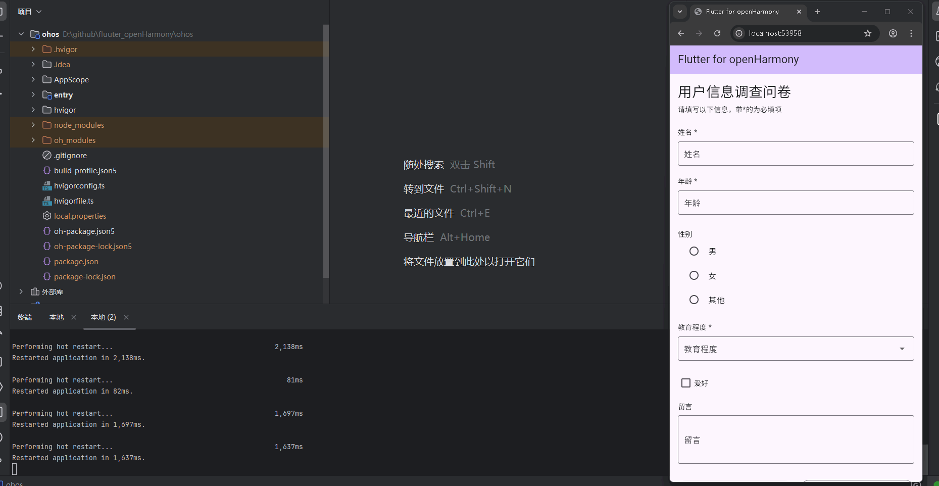
运行到鸿蒙虚拟设备中效果展示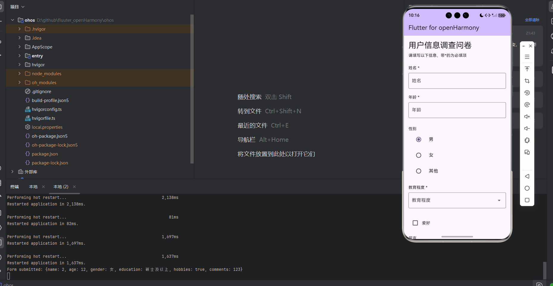
目录
功能代码实现
JSON Schema解析器
JSON Schema解析器负责将JSON配置转换为表单模型,是动态表单生成的核心部分。
核心实现
1. 表单字段类型定义
// 表单字段类型
enum FormFieldType {
  text,       // 文本输入
  number,     // 数字输入
  checkbox,   // 复选框
  radio,      // 单选框
  select,     // 下拉选择
  textarea,   // 多行文本
}
2. 表单字段模型
// 表单字段模型
class FormField {
  final String id;
  final String label;
  final FormFieldType type;
  final bool required;
  final String? placeholder;
  final List<String>? options; // 用于radio和select
  final dynamic defaultValue;

  FormField({
    required this.id,
    required this.label,
    required this.type,
    this.required = false,
    this.placeholder,
    this.options,
    this.defaultValue,
  });

  // 从JSON创建FormField
  factory FormField.fromJson(Map<String, dynamic> json) {
    return FormField(
      id: json['id'],
      label: json['label'],
      type: _parseType(json['type']),
      required: json['required'] ?? false,
      placeholder: json['placeholder'],
      options: json['options'] != null ? List<String>.from(json['options']) : null,
      defaultValue: json['defaultValue'],
    );
  }

  // 解析字段类型
  static FormFieldType _parseType(String type) {
    switch (type) {
      case 'text':
        return FormFieldType.text;
      case 'number':
        return FormFieldType.number;
      case 'checkbox':
        return FormFieldType.checkbox;
      case 'radio':
        return FormFieldType.radio;
      case 'select':
        return FormFieldType.select;
      case 'textarea':
        return FormFieldType.textarea;
      default:
        return FormFieldType.text;
    }
  }
}
3. 表单模型
// 表单模型
class FormSchema {
  final String title;
  final String description;
  final List<FormField> fields;

  FormSchema({
    required this.title,
    required this.description,
    required this.fields,
  });

  // 从JSON创建FormSchema
  factory FormSchema.fromJson(Map<String, dynamic> json) {
    return FormSchema(
      title: json['title'],
      description: json['description'],
      fields: (json['fields'] as List)
          .map((field) => FormField.fromJson(field))
          .toList(),
    );
  }
}
开发注意事项
-
类型安全:使用枚举类型定义表单字段类型,确保类型安全。
-
JSON解析:实现了从JSON到表单模型的自动转换,支持可选字段和默认值。
-
错误处理:在解析过程中,对无效的字段类型设置默认值,提高系统的健壮性。
-
数据结构:设计了清晰的数据结构,便于后续的UI渲染和数据处理。
动态UI渲染引擎
动态UI渲染引擎负责根据表单模型生成对应的UI组件,支持多种字段类型的渲染。
核心实现
1. 动态表单生成器组件
// 动态表单生成器组件
class DynamicFormGenerator extends StatefulWidget {
final FormSchema formSchema;
const DynamicFormGenerator({super.key, required this.formSchema});
State<DynamicFormGenerator> createState() => _DynamicFormGeneratorState();
}
class _DynamicFormGeneratorState extends State<DynamicFormGenerator> {
final Map<String, dynamic> _formData = {};
final GlobalKey<FormState> _formKey = GlobalKey<FormState>();
bool _isSubmitted = false;
void initState() {
super.initState();
// 初始化表单数据
for (var field in widget.formSchema.fields) {
_formData[field.id] = field.defaultValue;
}
}
// 处理表单提交
void _submitForm() {
if (_formKey.currentState?.validate() ?? false) {
setState(() {
_isSubmitted = true;
});
// 这里可以添加提交逻辑,如API调用等
print('Form submitted: $_formData');
}
}
// 重置表单
void _resetForm() {
setState(() {
_isSubmitted = false;
_formKey.currentState?.reset();
for (var field in widget.formSchema.fields) {
_formData[field.id] = field.defaultValue;
}
});
}
2. 表单字段渲染
// 渲染表单字段
Widget _buildFormField(FormField field) {
  switch (field.type) {
    case FormFieldType.text:
      return TextFormField(
        initialValue: field.defaultValue as String? ?? '',
        decoration: InputDecoration(
          labelText: field.label,
          hintText: field.placeholder,
          border: const OutlineInputBorder(),
        ),
        validator: field.required
            ? (value) => value?.isEmpty ?? true
                ? '${field.label}不能为空'
                : null
            : null,
        onChanged: (value) => _formData[field.id] = value,
      );

    case FormFieldType.number:
      return TextFormField(
        initialValue: field.defaultValue?.toString() ?? '',
        keyboardType: TextInputType.number,
        decoration: InputDecoration(
          labelText: field.label,
          hintText: field.placeholder,
          border: const OutlineInputBorder(),
        ),
        validator: field.required
            ? (value) => value?.isEmpty ?? true
                ? '${field.label}不能为空'
                : null
            : null,
        onChanged: (value) => _formData[field.id] = double.tryParse(value ?? ''),
      );

    case FormFieldType.checkbox:
      return Row(
        children: [
          Checkbox(
            value: _formData[field.id] ?? false,
            onChanged: (value) => setState(() {
              _formData[field.id] = value;
            }),
          ),
          Text(field.label),
        ],
      );

    case FormFieldType.radio:
      return Column(
        crossAxisAlignment: CrossAxisAlignment.start,
        children: [
          Text(field.label),
          ...(field.options ?? []).asMap().entries.map((entry) {
            int index = entry.key;
            String option = entry.value;
            return RadioListTile<String>(
              title: Text(option),
              value: option,
              groupValue: _formData[field.id],
              onChanged: (value) => setState(() {
                _formData[field.id] = value;
              }),
            );
          }).toList(),
        ],
      );

    case FormFieldType.select:
      return DropdownButtonFormField<String>(
        value: _formData[field.id] as String?,
        decoration: InputDecoration(
          labelText: field.label,
          border: const OutlineInputBorder(),
        ),
        items: (field.options ?? [])
            .map((option) => DropdownMenuItem(
                  value: option,
                  child: Text(option),
                ))
            .toList(),
        onChanged: (value) => _formData[field.id] = value,
        validator: field.required
            ? (value) => value == null
                ? '${field.label}不能为空'
                : null
            : null,
      );

    case FormFieldType.textarea:
      return TextFormField(
        initialValue: field.defaultValue as String? ?? '',
        maxLines: 3,
        decoration: InputDecoration(
          labelText: field.label,
          hintText: field.placeholder,
          border: const OutlineInputBorder(),
        ),
        validator: field.required
            ? (value) => value?.isEmpty ?? true
                ? '${field.label}不能为空'
                : null
            : null,
        onChanged: (value) => _formData[field.id] = value,
      );

    default:
      return Container();
  }
}
3. 表单布局
Widget build(BuildContext context) {
return Container(
padding: const EdgeInsets.all(16),
child: Form(
key: _formKey,
child: Column(
crossAxisAlignment: CrossAxisAlignment.start,
children: [
// 表单标题和描述
Text(
widget.formSchema.title,
style: Theme.of(context).textTheme.headlineMedium,
),
const SizedBox(height: 8),
Text(
widget.formSchema.description,
style: Theme.of(context).textTheme.bodyMedium,
),
const SizedBox(height: 24),
// 表单字段
...widget.formSchema.fields.asMap().entries.map((entry) {
int index = entry.key;
FormField field = entry.value;
return Column(
crossAxisAlignment: CrossAxisAlignment.start,
children: [
if (field.type != FormFieldType.checkbox && field.type != FormFieldType.radio)
Text(
field.required ? '${field.label} *' : field.label,
style: Theme.of(context).textTheme.bodyMedium,
),
const SizedBox(height: 8),
_buildFormField(field),
if (index < widget.formSchema.fields.length - 1)
const SizedBox(height: 20),
],
);
}).toList(),
const SizedBox(height: 32),
// 提交和重置按钮
Row(
children: [
Expanded(
child: ElevatedButton(
onPressed: _submitForm,
style: ElevatedButton.styleFrom(
padding: const EdgeInsets.symmetric(vertical: 16),
),
child: const Text('提交'),
),
),
const SizedBox(width: 16),
Expanded(
child: OutlinedButton(
onPressed: _resetForm,
style: OutlinedButton.styleFrom(
padding: const EdgeInsets.symmetric(vertical: 16),
),
child: const Text('重置'),
),
),
],
),
// 提交结果
if (_isSubmitted)
Container(
margin: const EdgeInsets.only(top: 24),
padding: const EdgeInsets.all(16),
decoration: BoxDecoration(
color: Colors.green[50],
border: Border.all(color: Colors.green),
borderRadius: BorderRadius.circular(8),
),
child: Column(
crossAxisAlignment: CrossAxisAlignment.start,
children: [
const Text(
'提交成功!',
style: TextStyle(
color: Colors.green,
fontWeight: FontWeight.bold,
),
),
const SizedBox(height: 12),
Text('表单数据:${_formData.toString()}'),
],
),
),
],
),
),
);
}
4. 动态表单包装器
// 动态表单生成器包装器
class DynamicFormWrapper extends StatelessWidget {
final Map<String, dynamic> formSchemaJson;
const DynamicFormWrapper({super.key, required this.formSchemaJson});
Widget build(BuildContext context) {
try {
// 解析JSON Schema
final formSchema = FormSchema.fromJson(formSchemaJson);
return DynamicFormGenerator(formSchema: formSchema);
} catch (e) {
return Container(
padding: const EdgeInsets.all(16),
child: Column(
children: [
const Icon(
Icons.error_outline,
color: Colors.red,
size: 48,
),
const SizedBox(height: 16),
Text(
'表单配置解析失败',
style: Theme.of(context).textTheme.headlineSmall,
),
const SizedBox(height: 8),
Text('错误信息:$e'),
],
),
);
}
}
}
开发注意事项
-
状态管理:使用
setState()管理表单状态,确保数据变化时 UI 能够及时更新。 -
表单验证:为必填字段添加验证逻辑,确保数据的完整性。
-
错误处理:在
DynamicFormWrapper中添加 try-catch 块,捕获 JSON 解析错误并显示友好的错误提示。 -
UI 适配:根据不同字段类型渲染对应的 UI 组件,确保用户体验的一致性。
-
数据绑定:实时更新表单数据,确保提交时能够获取到完整的表单数据。
组件使用方法
在首页直接使用
import 'package:flutter/material.dart';
import 'components/dynamic_form_generator.dart';
class MyHomePage extends StatefulWidget {
const MyHomePage({super.key, required this.title});
final String title;
State<MyHomePage> createState() => _MyHomePageState();
}
class _MyHomePageState extends State<MyHomePage> {
Widget build(BuildContext context) {
// 示例表单JSON配置
final formSchemaJson = {
"title": "用户信息调查问卷",
"description": "请填写以下信息,带*的为必填项",
"fields": [
{
"id": "name",
"label": "姓名",
"type": "text",
"required": true,
"placeholder": "请输入您的姓名"
},
{
"id": "age",
"label": "年龄",
"type": "number",
"required": true,
"placeholder": "请输入您的年龄"
},
{
"id": "gender",
"label": "性别",
"type": "radio",
"required": true,
"options": ["男", "女", "其他"]
},
{
"id": "education",
"label": "教育程度",
"type": "select",
"required": true,
"options": ["初中及以下", "高中", "大专", "本科", "硕士及以上"]
},
{
"id": "hobbies",
"label": "爱好",
"type": "checkbox",
"defaultValue": false
},
{
"id": "comments",
"label": "留言",
"type": "textarea",
"placeholder": "请输入您的留言"
}
]
};
return Scaffold(
appBar: AppBar(
title: Text(widget.title),
backgroundColor: Theme.of(context).colorScheme.inversePrimary,
),
body: SingleChildScrollView(
child: DynamicFormWrapper(formSchemaJson: formSchemaJson),
),
);
}
}
使用步骤
-
准备JSON配置:按照指定格式创建表单配置,包括表单标题、描述和字段信息。
-
导入组件:在需要使用的文件中导入
dynamic_form_generator.dart。 -
使用组件:使用
DynamicFormWrapper组件并传入JSON配置。 -
表单提交:用户填写表单后点击提交按钮,可在控制台查看提交的数据。
-
表单重置:点击重置按钮可清空表单数据并恢复默认值。
本次开发中容易遇到的问题
1. JSON Schema 格式错误
问题描述:JSON配置格式不正确,导致解析失败,表单无法渲染。
解决方案:
- 确保JSON格式正确,所有字段名和字符串值都使用双引号
- 按照指定的格式创建表单配置,确保必填字段存在
- 使用
DynamicFormWrapper组件,它会捕获解析错误并显示友好的错误提示
2. 字段类型不支持
问题描述:使用了不支持的字段类型,导致表单渲染异常。
解决方案:
- 仅使用支持的字段类型:text、number、checkbox、radio、select、textarea
- 对于不支持的类型,系统会默认使用text类型
3. 表单验证问题
问题描述:必填字段验证不生效,或者验证逻辑有误。
解决方案:
- 确保在JSON配置中正确设置
required: true - 对于radio和select类型,确保提供了有效的options数组
- 对于checkbox类型,验证逻辑需要特殊处理,因为它的值是布尔类型
4. 数据类型转换问题
问题描述:表单提交的数据类型与预期不符,导致后续处理出错。
解决方案:
- 对于number类型,使用
double.tryParse()进行数据转换 - 对于其他类型,确保数据类型的一致性
- 在提交前对数据进行验证和转换
5. UI 渲染问题
问题描述:表单字段渲染不完整,或者布局混乱。
解决方案:
- 使用
SingleChildScrollView确保在小屏幕上也能正常显示 - 为不同字段类型提供合适的渲染逻辑
- 确保表单字段之间有足够的间距,提高可读性
6. 性能问题
问题描述:表单字段较多时,渲染和交互可能会出现卡顿。
解决方案:
- 合理使用
setState(),避免不必要的重绘 - 对于复杂的表单,可以考虑使用
ListView.builder等懒加载组件 - 优化JSON解析逻辑,减少解析时间
总结本次开发中用到的技术点
1. Flutter 基础组件
- StatefulWidget:用于管理有状态的组件,如表单数据和提交状态。
- StatelessWidget:用于构建无状态的 UI 组件,如表单包装器。
- Form:用于管理表单状态和验证。
- TextFormField:用于文本和数字输入。
- Checkbox:用于复选框输入。
- RadioListTile:用于单选框输入。
- DropdownButtonFormField:用于下拉选择输入。
- ElevatedButton:用于提交按钮。
- OutlinedButton:用于重置按钮。
- Container:用于布局和样式控制。
- Column:用于垂直布局。
- Row:用于水平布局。
- SingleChildScrollView:用于处理内容溢出。
2. 状态管理
- setState():用于更新组件状态,触发 UI 重新构建。
- GlobalKey:用于表单验证和状态管理。
- Map<String, dynamic>:用于存储表单数据。
3. JSON 解析
- factory 构造函数:用于从 JSON 创建表单模型。
- try-catch:用于捕获 JSON 解析错误。
- 类型转换:用于将 JSON 数据转换为相应的 Dart 类型。
4. 表单验证
- validator:用于表单字段验证。
- FormState.validate():用于触发表单验证。
5. 动态 UI 渲染
- switch-case:根据字段类型渲染对应的 UI 组件。
- map():用于遍历字段列表并生成 UI 组件。
- 条件渲染:根据字段属性动态调整 UI 渲染逻辑。
6. 错误处理
- try-catch:用于捕获和处理异常。
- 友好错误提示:为用户提供清晰的错误信息。
7. 响应式设计
- MediaQuery:用于获取屏幕尺寸和设备信息。
- SingleChildScrollView:确保在小屏幕上也能正常显示。
- 主题适配:使用
Theme.of(context)获取主题样式,确保组件在不同主题下的一致性。
8. 组件化开发
- 模块化设计:将表单解析和渲染逻辑分离为独立的组件。
- 可重用性:设计通用的表单生成器,支持不同的表单配置。
- 封装性:将复杂的逻辑封装在组件内部,提供简单的使用接口。
9. 跨平台适配
- Flutter 跨平台特性:利用 Flutter 的跨平台能力,确保组件在不同平台上的一致性。
- OpenHarmony 适配:遵循 OpenHarmony 平台的开发规范,确保应用能够正常运行。
欢迎加入开源鸿蒙跨平台社区: https://openharmonycrossplatform.csdn.net

作为“人工智能6S店”的官方数字引擎,为AI开发者与企业提供一个覆盖软硬件全栈、一站式门户。
更多推荐


 15
15 0
0- 0


 已为社区贡献8条内容

所有评论(0)