
基础入门 React Native 鸿蒙跨平台开发:react-native-button三方库适配
Button 按钮是移动应用中最常见的交互组件之一,用于触发用户的操作行为。react-native-button 是一个简单易用的按钮组件库,提供丰富的样式配置和交互效果,完全支持鸿蒙系统。使用 react-native-button 可以快速构建美观的按钮,大大提升开发效率。库名称当前版本: 3.1.0官方仓库主要功能提供简洁易用的按钮组件支持自定义样式和禁用状态支持加载状态和嵌套子组件完全兼
欢迎加入开源鸿蒙跨平台社区:https://openharmonycrossplatform.csdn.net
📋 前言
Button 按钮是移动应用中最常见的交互组件之一,用于触发用户的操作行为。react-native-button 是一个简单易用的按钮组件库,提供丰富的样式配置和交互效果,完全支持鸿蒙系统。使用 react-native-button 可以快速构建美观的按钮,大大提升开发效率。
🎯 库简介
基本信息
- 库名称: react-native-button
- 当前版本: 3.1.0
- 官方仓库: https://github.com/react-native-community/react-native-button
- 主要功能:
- 提供简洁易用的按钮组件
- 支持自定义样式和禁用状态
- 支持加载状态和嵌套子组件
- 完全兼容 Android、iOS 和 HarmonyOS
为什么需要这个库?
- 零配置: 纯 JavaScript 实现,无需原生配置
- 轻量级: 代码简洁,体积小
- 易用性: API 简单直观,开箱即用
- 跨平台: 在三端提供一致的体验
- 灵活性: 支持自定义样式和布局
📦 安装步骤
1. 使用 npm 安装
在项目根目录执行以下命令:
npm install react-native-button@3.1.0
2. 验证安装
安装完成后,检查 package.json 文件,应该能看到新增的依赖:
{
  "dependencies": {
    "react-native-button": "^3.1.0",
    // ... 其他依赖
  }
}
🔧 HarmonyOS 平台配置
react-native-button 是纯 JavaScript 组件,无需任何原生配置。
配置说明
- ✅ 无需 Manual Link: 不需要手动链接原生代码
- ✅ 无需 CMakeLists 配置: 不需要修改 CMakeLists.txt
- ✅ 无需 PackageProvider 配置: 不需要修改 PackageProvider.cpp
- ✅ 无需 ArkTs 配置: 不需要修改任何 ArkTs 文件
- ✅ 即装即用: 安装后直接 import 使用
TypeScript 类型声明(可选)
如果使用 TypeScript,可能会遇到类型声明缺失的问题。解决方法:
方法1:创建类型声明文件(推荐)
在项目根目录创建 react-native-button.d.ts 文件:
// react-native-button.d.ts
declare module 'react-native-button' {
  import { Component, ReactNode } from 'react';
  import { StyleProp, ViewStyle } from 'react-native';

  export interface ButtonProps {
    children?: ReactNode;
    style?: StyleProp<ViewStyle>;
    styleDisabled?: StyleProp<ViewStyle>;
    disabled?: boolean;
    onPress?: () => void;
    onLongPress?: () => void;
    onPressIn?: () => void;
    onPressOut?: () => void;
  }

  export default class Button extends Component<ButtonProps> {}
}
在 tsconfig.json 中添加类型根目录配置:
{"extends": "@tsconfig/react-native/tsconfig.json", "include": ["**/*.ts", "**/*.tsx", "**/*.d.ts"]}
这样 TypeScript 就能自动识别项目根目录下的所有 .d.ts 类型声明文件。
💻 完整代码示例
下面是一个完整的示例,展示了 react-native-button 的各种使用场景:
import React, { useState } from 'react';
import {
View,
Text,
StyleSheet,
ScrollView,
Alert,
} from 'react-native';
import Button from 'react-native-button';
function ButtonLibraryScreen() {
const [loading, setLoading] = useState(false);
const [disabled, setDisabled] = useState(false);
const [selectedCount, setSelectedCount] = useState(0);
const handleAsyncOperation = async () => {
setLoading(true);
await new Promise(resolve => setTimeout(resolve, 2000));
setLoading(false);
Alert.alert('成功', '异步操作完成!');
};
const handleToggleDisabled = () => {
setDisabled(!disabled);
};
const handleIncrement = () => {
setSelectedCount(prev => prev + 1);
};
const handleDecrement = () => {
setSelectedCount(prev => Math.max(0, prev - 1));
};
return (
<ScrollView style={styles.container}>
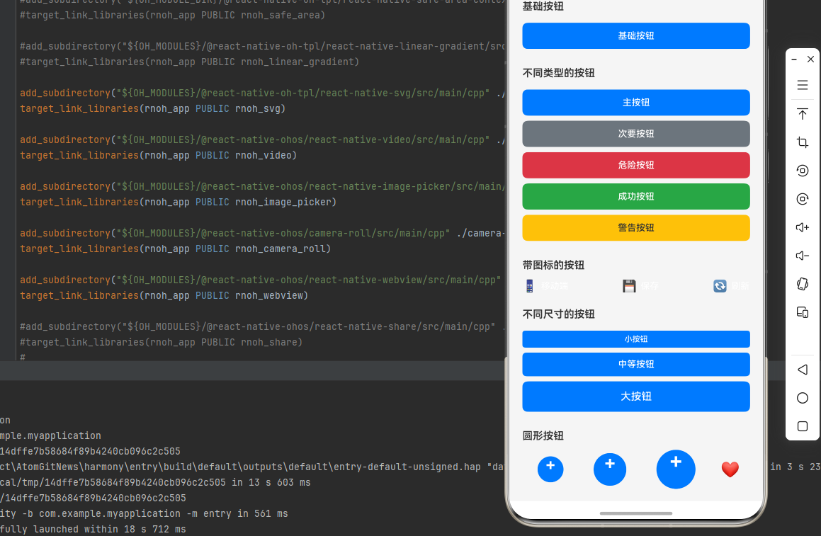
<Text style={styles.pageTitle}>按钮组件库</Text>
{/* 基础按钮 */}
<View style={styles.section}>
<Text style={styles.sectionTitle}>基础按钮</Text>
<Button style={styles.basicButton} onPress={() => Alert.alert('提示', '基础按钮被点击')}>
基础按钮
</Button>
</View>
{/* 不同类型的按钮 */}
<View style={styles.section}>
<Text style={styles.sectionTitle}>不同类型的按钮</Text>
<Button style={styles.primaryButton}>主按钮</Button>
<Button style={styles.secondaryButton}>次要按钮</Button>
<Button style={styles.dangerButton}>危险按钮</Button>
<Button style={styles.successButton}>成功按钮</Button>
<Button style={styles.warningButton}>警告按钮</Button>
</View>
{/* 带图标的按钮 */}
<View style={styles.section}>
<Text style={styles.sectionTitle}>带图标的按钮</Text>
<View style={styles.iconButtonsRow}>
<Button style={styles.iconButton}>
<Text style={styles.iconEmoji}>📱</Text>
<Text style={styles.iconButtonText}>移动端</Text>
</Button>
<Button style={styles.iconButton}>
<Text style={styles.iconEmoji}>💾</Text>
<Text style={styles.iconButtonText}>保存</Text>
</Button>
<Button style={styles.iconButton}>
<Text style={styles.iconEmoji}>🔄</Text>
<Text style={styles.iconButtonText}>刷新</Text>
</Button>
</View>
</View>
{/* 不同尺寸的按钮 */}
<View style={styles.section}>
<Text style={styles.sectionTitle}>不同尺寸的按钮</Text>
<Button style={styles.smallButton}>小按钮</Button>
<Button style={styles.mediumButton}>中等按钮</Button>
<Button style={styles.largeButton}>大按钮</Button>
</View>
{/* 圆形按钮 */}
<View style={styles.section}>
<Text style={styles.sectionTitle}>圆形按钮</Text>
<View style={styles.roundButtonsRow}>
<Button style={styles.smallRoundButton}>+</Button>
<Button style={styles.mediumRoundButton}>+</Button>
<Button style={styles.largeRoundButton}>+</Button>
<Button style={styles.roundButtonWithIcon}>
<Text style={styles.roundIcon}>❤️</Text>
</Button>
</View>
</View>
{/* 加载状态按钮 */}
<View style={styles.section}>
<Text style={styles.sectionTitle}>加载状态按钮</Text>
<Button
style={styles.loadingButton}
disabled={loading}
onPress={handleAsyncOperation}
>
{loading ? '提交中...' : '提交'}
</Button>
<Button
style={styles.loadingButton}
disabled={loading}
onPress={handleAsyncOperation}
>
{loading ? '保存中...' : '保存'}
</Button>
</View>
{/* 禁用状态按钮 */}
<View style={styles.section}>
<Text style={styles.sectionTitle}>禁用状态按钮</Text>
<View style={styles.disabledButtonRow}>
<Button
style={styles.disabledButton}
styleDisabled={styles.disabledButton}
disabled={disabled}
>
{disabled ? '已禁用' : '可点击'}
</Button>
<Button
style={styles.toggleButton}
onPress={handleToggleDisabled}
>
{disabled ? '启用按钮' : '禁用按钮'}
</Button>
</View>
</View>
{/* 计数器按钮 */}
<View style={styles.section}>
<Text style={styles.sectionTitle}>计数器按钮</Text>
<View style={styles.counterContainer}>
<Button style={styles.counterButton} onPress={handleDecrement}>
-
</Button>
<Text style={styles.counterText}>{selectedCount}</Text>
<Button style={styles.counterButton} onPress={handleIncrement}>
+
</Button>
</View>
</View>
{/* 自定义样式按钮 */}
<View style={styles.section}>
<Text style={styles.sectionTitle}>自定义样式按钮</Text>
<Button style={styles.gradientButton}>渐变按钮</Button>
<Button style={styles.outlineButton}>边框按钮</Button>
<Button style={styles.textButton}>文本按钮</Button>
</View>
{/* 使用说明 */}
<View style={styles.section}>
<Text style={styles.sectionTitle}>使用说明</Text>
<Text style={styles.instructionText}>
1. react-native-button 是纯 JavaScript 组件,无需原生配置
</Text>
<Text style={styles.instructionText}>
2. 支持 style 和 styleDisabled 属性自定义样式
</Text>
<Text style={styles.instructionText}>
3. 支持 disabled 属性控制按钮禁用状态
</Text>
<Text style={styles.instructionText}>
4. 可以嵌套子组件实现复杂的按钮布局
</Text>
<Text style={styles.instructionText}>
5. 完全兼容鸿蒙系统,跨平台可用
</Text>
</View>
</ScrollView>
);
}
const styles = StyleSheet.create({
container: {
flex: 1,
backgroundColor: '#f5f5f5',
padding: 20,
},
pageTitle: {
fontSize: 24,
fontWeight: 'bold',
marginBottom: 20,
textAlign: 'center',
color: '#333',
},
section: {
marginBottom: 24,
},
sectionTitle: {
fontSize: 16,
fontWeight: '600',
marginBottom: 12,
color: '#333',
},
basicButton: {
backgroundColor: '#007AFF',
borderRadius: 8,
paddingVertical: 12,
paddingHorizontal: 24,
marginVertical: 4,
color: '#fff',
fontSize: 14,
fontWeight: '500',
},
primaryButton: {
backgroundColor: '#007AFF',
borderRadius: 8,
paddingVertical: 12,
paddingHorizontal: 24,
marginVertical: 4,
color: '#fff',
fontSize: 14,
fontWeight: '500',
},
secondaryButton: {
backgroundColor: '#6c757d',
borderRadius: 8,
paddingVertical: 12,
paddingHorizontal: 24,
marginVertical: 4,
color: '#fff',
fontSize: 14,
fontWeight: '500',
},
dangerButton: {
backgroundColor: '#dc3545',
borderRadius: 8,
paddingVertical: 12,
paddingHorizontal: 24,
marginVertical: 4,
color: '#fff',
fontSize: 14,
fontWeight: '500',
},
successButton: {
backgroundColor: '#28a745',
borderRadius: 8,
paddingVertical: 12,
paddingHorizontal: 24,
marginVertical: 4,
color: '#fff',
fontSize: 14,
fontWeight: '500',
},
warningButton: {
backgroundColor: '#ffc107',
borderRadius: 8,
paddingVertical: 12,
paddingHorizontal: 24,
marginVertical: 4,
color: '#333',
fontSize: 14,
fontWeight: '500',
},
iconButtonsRow: {
flexDirection: 'row',
justifyContent: 'space-between',
},
iconButton: {
flex: 1,
backgroundColor: '#007AFF',
borderRadius: 8,
paddingVertical: 12,
marginHorizontal: 4,
flexDirection: 'row',
alignItems: 'center',
justifyContent: 'center',
},
iconEmoji: {
fontSize: 18,
marginRight: 6,
},
iconButtonText: {
color: '#fff',
fontSize: 14,
fontWeight: '500',
},
smallButton: {
backgroundColor: '#007AFF',
borderRadius: 4,
paddingVertical: 6,
paddingHorizontal: 12,
marginVertical: 4,
color: '#fff',
fontSize: 12,
fontWeight: '500',
},
mediumButton: {
backgroundColor: '#007AFF',
borderRadius: 6,
paddingVertical: 10,
paddingHorizontal: 20,
marginVertical: 4,
color: '#fff',
fontSize: 14,
fontWeight: '500',
},
largeButton: {
backgroundColor: '#007AFF',
borderRadius: 8,
paddingVertical: 14,
paddingHorizontal: 28,
marginVertical: 4,
color: '#fff',
fontSize: 16,
fontWeight: '500',
},
roundButtonsRow: {
flexDirection: 'row',
alignItems: 'center',
justifyContent: 'space-around',
},
smallRoundButton: {
width: 40,
height: 40,
borderRadius: 20,
backgroundColor: '#007AFF',
marginHorizontal: 8,
color: '#fff',
fontSize: 24,
fontWeight: 'bold',
},
mediumRoundButton: {
width: 50,
height: 50,
borderRadius: 25,
backgroundColor: '#007AFF',
marginHorizontal: 8,
color: '#fff',
fontSize: 28,
fontWeight: 'bold',
},
largeRoundButton: {
width: 60,
height: 60,
borderRadius: 30,
backgroundColor: '#007AFF',
marginHorizontal: 8,
color: '#fff',
fontSize: 32,
fontWeight: 'bold',
},
roundButtonWithIcon: {
width: 60,
height: 60,
borderRadius: 30,
backgroundColor: '#dc3545',
marginHorizontal: 8,
},
roundIcon: {
fontSize: 24,
},
loadingButton: {
backgroundColor: '#28a745',
borderRadius: 8,
paddingVertical: 12,
paddingHorizontal: 24,
marginVertical: 4,
color: '#fff',
fontSize: 14,
fontWeight: '500',
},
disabledButton: {
backgroundColor: '#6c757d',
borderRadius: 8,
paddingVertical: 12,
paddingHorizontal: 24,
marginVertical: 4,
opacity: 0.6,
color: '#fff',
fontSize: 14,
fontWeight: '500',
},
disabledButtonRow: {
flexDirection: 'row',
justifyContent: 'space-between',
},
toggleButton: {
backgroundColor: '#007AFF',
borderRadius: 8,
paddingVertical: 12,
paddingHorizontal: 16,
marginVertical: 4,
flex: 1,
marginLeft: 8,
color: '#fff',
fontSize: 14,
fontWeight: '500',
},
counterContainer: {
flexDirection: 'row',
alignItems: 'center',
justifyContent: 'center',
backgroundColor: '#fff',
borderRadius: 8,
padding: 8,
},
counterButton: {
backgroundColor: '#007AFF',
width: 40,
height: 40,
borderRadius: 20,
marginHorizontal: 8,
color: '#fff',
fontSize: 20,
fontWeight: 'bold',
},
counterText: {
fontSize: 20,
fontWeight: 'bold',
color: '#333',
minWidth: 40,
textAlign: 'center',
},
gradientButton: {
backgroundColor: '#007AFF',
borderRadius: 8,
paddingVertical: 12,
paddingHorizontal: 24,
marginVertical: 4,
color: '#fff',
fontSize: 14,
fontWeight: '500',
},
outlineButton: {
backgroundColor: 'transparent',
borderRadius: 8,
paddingVertical: 12,
paddingHorizontal: 24,
marginVertical: 4,
borderWidth: 2,
borderColor: '#007AFF',
color: '#007AFF',
fontSize: 14,
fontWeight: '500',
},
textButton: {
backgroundColor: 'transparent',
paddingVertical: 8,
paddingHorizontal: 16,
marginVertical: 4,
color: '#007AFF',
fontSize: 14,
fontWeight: '500',
},
instructionText: {
fontSize: 14,
lineHeight: 22,
marginBottom: 6,
color: '#666',
},
});
export default ButtonLibraryScreen;
💻 代码讲解
1. 基础按钮
<Button style={styles.basicButton} onPress={() => Alert.alert('提示', '基础按钮被点击')}>
  基础按钮
</Button>
最简单的按钮使用方式,通过 style 属性设置样式,onPress 处理点击事件。
2. 不同类型的按钮
<Button style={styles.primaryButton}>主按钮</Button>
<Button style={styles.secondaryButton}>次要按钮</Button>
<Button style={styles.dangerButton}>危险按钮</Button>
通过不同的样式对象实现不同类型的按钮(主按钮、次要按钮、危险按钮等)。
3. 带图标的按钮
<Button style={styles.iconButton}>
  <Text style={styles.iconEmoji}>📱</Text>
  <Text style={styles.iconButtonText}>移动端</Text>
</Button>
可以在按钮内部嵌套子组件,实现带图标、图片等复杂布局。
4. 加载状态按钮
<Button
  style={styles.loadingButton}
  disabled={loading}
  onPress={handleAsyncOperation}
>
  {loading ? '提交中...' : '提交'}
</Button>
通过 disabled 属性控制按钮禁用状态,根据状态显示不同的文字。
5. 禁用状态按钮
<Button
  style={styles.disabledButton}
  styleDisabled={styles.disabledButton}
  disabled={disabled}
>
  {disabled ? '已禁用' : '可点击'}
</Button>
使用 styleDisabled 属性设置禁用状态下的样式。
6. 圆形按钮
<Button style={styles.smallRoundButton}>+</Button>
通过设置 borderRadius 为宽度的一半实现圆形按钮。
⚠️ 注意事项与最佳实践
1. 样式配置
- 使用
StyleSheet.create创建样式对象 - 支持动态样式(根据条件应用不同样式)
- 使用
styleDisabled设置禁用样式
2. 事件处理
onPress={() => {
  // 处理点击事件
}}
确保 onPress 回调函数不为空。
3. 禁用状态
<Button
  disabled={true}
  styleDisabled={styles.disabledStyle}
>
  禁用按钮
</Button>
禁用状态下按钮不会响应点击事件。
4. 嵌套子组件
<Button style={styles.button}>
  <Icon name="home" />
  <Text>带图标的按钮</Text>
</Button>
可以嵌套任意子组件实现复杂的按钮布局。
5. HarmonyOS 兼容性
react-native-button 是纯 JavaScript 组件,在 HarmonyOS 上完全兼容,无需任何额外配置。
🧪 测试验证
1. Android 平台测试
npm run android
测试要点:
- 检查按钮点击响应
- 验证禁用状态
- 测试加载状态
- 验证样式显示
2. iOS 平台测试
npm run ios
测试要点:
- 检查按钮样式一致性
- 测试触摸反馈
- 验证不同尺寸按钮
3. HarmonyOS 平台测试
npm run harmony
测试要点:
- 验证按钮渲染
- 测试点击响应
- 检查样式应用
4. 常见问题排查
问题 1: 按钮无响应
- 确保
onPress属性已设置 - 检查
disabled属性是否为 false
问题 2: 样式不生效
- 确保使用
StyleSheet.create创建样式 - 检查样式对象格式是否正确
问题 3: 禁用样式不显示
- 确保设置了
styleDisabled属性 - 检查禁用样式对象是否正确
📊 对比:TouchableOpacity vs react-native-button
| 特性 | TouchableOpacity | react-native-button |
|---|---|---|
| 开箱即用 | ⚠️ 需要自定义样式 | ✅ 开箱即用 |
| 禁用状态 | ⚠️ 需要手动实现 | ✅ 内置支持 |
| 样式配置 | ✅ 完全自定义 | ✅ 灵活配置 |
| 代码简洁性 | ⚠️ 需要更多代码 | ✅ 简洁明了 |
| 学习成本 | ⚠️ 需要了解 RN API | ✅ 简单易用 |
📝 总结
通过集成 react-native-button,我们为项目添加了一个简单易用的按钮组件库。这个库提供了丰富的样式配置、禁用状态支持和跨平台的一致性,可以大大提升开发效率。
关键要点回顾
- ✅ 安装依赖:
npm install react-native-button@3.1.0 - ✅ 配置平台: 纯 JavaScript 库,无需手动配置
- ✅ 集成代码: 使用 Button 组件和相关属性
- ✅ 样式定制: 使用 style 和 styleDisabled 属性
- ✅ 测试验证: 确保三端表现一致
实际效果
- Android: 显示 Material Design 风格的按钮
- iOS: 显示 iOS 风格的按钮
- HarmonyOS: 显示 HarmonyOS 风格的按钮
希望这篇教程能帮助你顺利集成 react-native-button,提升应用的用户体验!

作为“人工智能6S店”的官方数字引擎,为AI开发者与企业提供一个覆盖软硬件全栈、一站式门户。
更多推荐


 9
9 0
0- 0


 已为社区贡献32条内容

所有评论(0)