
React Native鸿蒙跨平台自定义复选框组件,通过样式数组实现选中/未选中状态的样式切换,使用链式调用替代样式数组,实现状态驱动的样式变化
本文探讨了React Native服务条款应用的实现方案,分析了其组件化架构、状态管理和用户交互设计。该应用采用单组件结构,通过useState管理用户接受状态,实现条款内容展示和交互功能。文章建议优化方向包括:组件拆分提高可维护性、使用useReducer管理复杂状态、集成AsyncStorage实现数据持久化,以及引入React Navigation实现页面导航。这些改进可增强应用的扩展性和用
在移动应用开发中,服务条款和隐私政策页面是应用的重要组成部分,通常作为用户首次使用应用时的必看内容。本文将深入分析一个功能完备的 React Native 服务条款应用实现,探讨其架构设计、状态管理、用户交互以及跨端兼容性策略。
组件化
该实现采用了简洁的单组件架构,主要包含以下部分:
- 主应用组件 (
TermsOfServiceApp) - 负责整体布局和状态管理 - 头部 - 显示应用标题和设置按钮
- 内容区域 - 显示服务条款内容,包含多个章节
- 用户交互 - 提供接受/拒绝服务条款的功能
- 附加信息 - 显示重要提醒和相关链接
这种架构设计使得代码结构清晰,易于维护。主应用组件负责管理全局状态和业务逻辑,而各个UI部分则负责具体的展示,实现了关注点分离。
状态管理
TermsOfServiceApp 组件使用 useState 钩子管理一个关键状态:
const [acceptedTerms, setAcceptedTerms] = useState(false);
这种状态管理方式简洁高效,通过状态更新触发组件重新渲染,实现了服务条款接受状态的切换。当用户点击复选框时,会更新 acceptedTerms 状态,进而影响接受按钮的可用性。
服务条款
应用实现了完整的服务条款展示功能:
- 章节结构 - 将服务条款分为多个章节,每个章节有标题和内容
- 滚动视图 - 使用 ScrollView 组件实现条款内容的滚动浏览
- 格式化文本 - 使用不同的文本样式区分标题和正文,提高可读性
这种实现方式确保了服务条款内容的清晰展示,用户可以方便地阅读完整的条款内容。
1. 组件拆分
当前实现将所有功能都放在一个组件中,可以考虑拆分为多个组件,提高代码的可维护性:
// 优化前
const TermsOfServiceApp: React.FC = () => {
  // 所有代码...
};

// 优化后
const TermsHeader: React.FC = () => (
  <View style={styles.header}>
    <Text style={styles.title}>Steam 资讯</Text>
    <TouchableOpacity style={styles.settingsButton} onPress={() => Alert.alert('设置', '应用设置选项')}>
      <Text style={styles.settingsIcon}>⚙️</Text>
    </TouchableOpacity>
  </View>
);

const TermsContent: React.FC = () => (
  <View style={styles.termsContainer}>
    {/* 条款内容... */}
  </View>
);

const TermsActions: React.FC<{ accepted: boolean; onAccept: () => void; onReject: () => void }> = ({
  accepted,
  onAccept,
  onReject
}) => (
  <>
    <View style={styles.checkboxContainer}>
      {/* 复选框... */}
    </View>
    <View style={styles.buttonContainer}>
      {/* 按钮... */}
    </View>
  </>
);

const TermsOfServiceApp: React.FC = () => {
  const [acceptedTerms, setAcceptedTerms] = useState(false);

  // 处理函数...

  return (
    <SafeAreaView style={styles.container}>
      <TermsHeader />
      <ScrollView style={styles.content}>
        {/* 横幅... */}
        <TermsContent />
        <TermsActions
          accepted={acceptedTerms}
          onAccept={handleAcceptTerms}
          onReject={handleRejectTerms}
        />
        {/* 附加信息... */}
        {/* 底部链接... */}
      </ScrollView>
    </SafeAreaView>
  );
};
2. 状态管理
当前实现使用 useState 钩子管理接受状态,可以考虑使用 useReducer 或状态管理库来管理更复杂的状态:
// 优化前
const [acceptedTerms, setAcceptedTerms] = useState(false);

// 优化后
type TermsState = {
  accepted: boolean;
  termsVersion: string;
  lastUpdated: string;
};

type TermsAction =
  | { type: 'ACCEPT_TERMS' }
  | { type: 'REJECT_TERMS' }
  | { type: 'UPDATE_TERMS'; payload: { version: string; date: string } };

const initialState: TermsState = {
  accepted: false,
  termsVersion: '1.0',
  lastUpdated: '2023-01-01',
};

const termsReducer = (state: TermsState, action: TermsAction): TermsState => {
  switch (action.type) {
    case 'ACCEPT_TERMS':
      return { ...state, accepted: true };
    case 'REJECT_TERMS':
      return { ...state, accepted: false };
    case 'UPDATE_TERMS':
      return {
        ...state,
        accepted: false,
        termsVersion: action.payload.version,
        lastUpdated: action.payload.date
      };
    default:
      return state;
  }
};

const [state, dispatch] = useReducer(termsReducer, initialState);
3. 数据持久化
当前实现使用内存状态存储接受状态,可以考虑集成本地存储实现数据持久化:
import AsyncStorage from '@react-native-async-storage/async-storage';

const STORAGE_KEYS = {
  TERMS_ACCEPTED: '@terms_accepted',
  TERMS_VERSION: '@terms_version',
};

const TermsOfServiceApp = () => {
  const [acceptedTerms, setAcceptedTerms] = useState(false);

  // 加载数据
  useEffect(() => {
    loadTermsStatus();
  }, []);

  const loadTermsStatus = async () => {
    try {
      const accepted = await AsyncStorage.getItem(STORAGE_KEYS.TERMS_ACCEPTED);
      if (accepted === 'true') {
        setAcceptedTerms(true);
      }
    } catch (error) {
      console.error('加载条款状态失败:', error);
    }
  };

  const saveTermsStatus = async (accepted: boolean) => {
    try {
      await AsyncStorage.setItem(STORAGE_KEYS.TERMS_ACCEPTED, accepted.toString());
      await AsyncStorage.setItem(STORAGE_KEYS.TERMS_VERSION, '1.0');
    } catch (error) {
      console.error('保存条款状态失败:', error);
    }
  };

  const handleAcceptTerms = () => {
    setAcceptedTerms(true);
    saveTermsStatus(true);
    Alert.alert('服务条款', '您已接受服务条款!');
  };

  // 其他代码...
};
4. 导航系统
可以集成 React Navigation 实现不同页面之间的导航:
import { createStackNavigator } from '@react-navigation/stack';

const Stack = createStackNavigator();

const App = () => {
  return (
    <NavigationContainer>
      <Stack.Navigator>
        <Stack.Screen
          name="TermsOfService"
          component={TermsOfServiceApp}
          options={{ title: '服务条款' }}
        />
        <Stack.Screen
          name="MainApp"
          component={MainAppScreen}
          options={{ title: 'Steam 资讯' }}
        />
        <Stack.Screen
          name="PrivacyPolicy"
          component={PrivacyPolicyScreen}
          options={{ title: '隐私政策' }}
        />
        <Stack.Screen
          name="UserAgreement"
          component={UserAgreementScreen}
          options={{ title: '用户协议' }}
        />
      </Stack.Navigator>
    </NavigationContainer>
  );
};
本文深入分析了一个功能完备的 React Native 服务条款应用实现,从架构设计、状态管理、用户交互到跨端兼容性都进行了详细探讨。该实现不仅功能完整,而且代码结构清晰,具有良好的可扩展性和可维护性。
解这个 Steam 资讯应用的服务条款页面在 React Native 中的实现逻辑,并掌握其向鸿蒙(HarmonyOS)平台跨端适配的完整方案。该页面作为典型的协议类展示交互页面,涵盖了富文本展示、状态控制、交互反馈、样式适配等移动端开发的核心场景,是跨端开发中常见的基础页面类型。
1. 应用架构
该服务条款页面采用极简但完整的 React Native 架构,核心聚焦于用户协议交互和状态控制:
// 核心状态管理 - 控制条款接受状态
const [acceptedTerms, setAcceptedTerms] = useState(false);

// 业务逻辑处理函数
const handleAcceptTerms = () => {
  setAcceptedTerms(true);
  Alert.alert('服务条款', '您已接受服务条款!');
};

const handleRejectTerms = () => {
  Alert.alert('服务条款', '您必须接受服务条款才能使用本应用。');
};
状态设计亮点:
- 单一状态源:仅通过
acceptedTerms布尔值控制整个页面的交互逻辑,符合 React 状态设计的最小化原则; - 状态驱动交互:复选框选中状态、按钮可用状态均由该状态统一驱动,避免状态不一致问题;
- 纯函数处理:业务逻辑函数无副作用,仅处理状态更新和用户反馈,便于测试和维护;
- 用户体验优化:拒绝操作仅给出提示而非直接退出,提升用户体验。
(1)头部导航栏
实现了移动端标准的头部导航栏,包含应用标题和设置按钮:
<View style={styles.header}>
  <Text style={styles.title}>Steam 资讯</Text>
  <TouchableOpacity style={styles.settingsButton} onPress={() => Alert.alert('设置', '应用设置选项')}>
    <Text style={styles.settingsIcon}>⚙️</Text>
  </TouchableOpacity>
</View>
设计要点:
- Flex 布局:使用
flexDirection: 'row'+justifyContent: 'space-between'实现左右布局; - 圆形按钮:通过
width/height+borderRadius: 18实现圆形设置按钮; - 视觉分层:使用
borderBottomWidth实现底部分割线,增强视觉层次。
(2)横幅区域
<View style={styles.banner}>
  <Text style={styles.bannerTitle}>服务条款</Text>
  <Text style={styles.bannerSubtitle}>使用前请仔细阅读</Text>
</View>
视觉设计:
- 品牌色应用:使用
#3b82f6(蓝色)作为主色调,符合移动端应用设计规范; - 居中对齐:通过
alignItems: 'center'实现文本居中,提升视觉体验; - 圆角设计:
borderRadius: 12实现现代UI的圆角效果。
(3)条款内容
这是页面的核心内容区域,采用结构化的文本展示方式:
<View style={styles.termsContainer}>
  <Text style={styles.termsTitle}>Steam 资讯服务条款</Text>

  <Text style={styles.sectionTitle}>1. 服务概述</Text>
  <Text style={styles.termsText}>
    本应用为您提供 Steam 平台相关的最新资讯、游戏新闻、折扣信息等内容。
    本服务仅供信息参考,不构成任何购买建议或合同要约。
  </Text>

  {/* 其他条款章节... */}
</View>
布局特点:
- 卡片式容器:使用
backgroundColor: '#ffffff'+borderRadius: 12+ 阴影效果实现卡片容器; - 文本层级:通过不同的字体大小、颜色、字重区分标题、章节标题和正文;
- 行高优化:
lineHeight: 22提升长文本的可读性; - 间距控制:精细化的
marginTop/marginBottom控制文本间距,符合阅读习惯。
(4)自定义复选框组件
这是页面的核心交互组件,实现了自定义样式的复选框:
<View style={styles.checkboxContainer}>
  <TouchableOpacity
    style={[styles.checkbox, acceptedTerms && styles.checkedCheckbox]}
    onPress={() => setAcceptedTerms(!acceptedTerms)}
  >
    {acceptedTerms && <Text style={styles.checkmark}>✓</Text>}
  </TouchableOpacity>
  <Text style={styles.checkboxText}>
    我已阅读并同意上述服务条款
  </Text>
</View>
实现技巧:
- 样式组合:通过样式数组实现选中/未选中状态的样式切换;
- 条件渲染:仅在选中状态下显示勾选标记;
- Flex 布局:复选框与文本的水平排列,文本自动占满剩余空间;
- 可点击区域:整个容器可点击,提升交互体验。
(5)操作按钮
<View style={styles.buttonContainer}>
  <TouchableOpacity
    style={[styles.button, styles.acceptButton, !acceptedTerms && styles.disabledButton]}
    onPress={handleAcceptTerms}
    disabled={!acceptedTerms}
  >
    <Text style={styles.buttonText}>同意并继续</Text>
  </TouchableOpacity>

  <TouchableOpacity
    style={[styles.button, styles.rejectButton]}
    onPress={handleRejectTerms}
  >
    <Text style={styles.buttonText}>拒绝访问</Text>
  </TouchableOpacity>
</View>
交互设计:
- 状态联动:同意按钮的样式和可用状态与复选框状态联动;
- 视觉反馈:禁用状态使用浅灰色背景,明确告知用户不可点击;
- 按钮样式:不同操作按钮使用不同背景色,区分主次操作;
- 统一尺寸:标准化的内边距和圆角,符合移动端按钮设计规范。
3. 样式
该页面的样式系统体现了 React Native 样式设计的最佳实践:
const styles = StyleSheet.create({
  container: {
    flex: 1,
    backgroundColor: '#f8fafc',
  },
  // 其他样式定义...
});
将该 React Native 服务条款页面适配到鸿蒙平台,核心是将 React 的状态管理、自定义组件、样式系统等核心能力映射到鸿蒙 ArkTS + ArkUI 生态,以下是完整的适配方案。
1. 核心技术栈映射
| React Native 核心能力 | 鸿蒙 ArkTS 对应实现 | 适配关键说明 |
|---|---|---|
useState 状态管理 |
@State 装饰器 |
状态声明语法替换 |
TouchableOpacity |
Button + stateEffect(false) |
可点击组件替换 |
StyleSheet.create |
@Styles/@Extend + 内联样式 |
样式体系重构 |
Alert.alert |
AlertDialog 组件 |
弹窗交互替换 |
ScrollView |
Scroll 组件 |
滚动容器替换 |
SafeAreaView |
safeArea(true) 属性 |
安全区域适配 |
| 条件样式(数组语法) | 三元运算符 + 链式样式调用 | 样式条件判断适配 |
Dimensions 尺寸获取 |
@ohos.window API |
屏幕尺寸获取(本案例未使用) |
| 自定义复选框 | Button + 状态控制 |
组件结构重构 |
2. 鸿蒙端
// index.ets - 鸿蒙端Steam资讯服务条款完整实现
import router from '@ohos.router';
import { BusinessError } from '@ohos.base';

@Entry
@Component
struct TermsOfServiceApp {
  // 核心状态管理(对应RN的useState)
  @State acceptedTerms: boolean = false;

  // 通用样式封装 - 卡片容器样式
  @Styles
  cardStyle() {
    .backgroundColor('#ffffff')
    .borderRadius(12)
    .shadow({ radius: 2, color: '#000', opacity: 0.1, offsetX: 0, offsetY: 1 });
  }

  // 通用样式封装 - 按钮基础样式
  @Styles
  baseButtonStyle() {
    .padding(16)
    .borderRadius(8)
    .width('100%')
    .justifyContent(FlexAlign.Center);
  }

  // 处理接受条款逻辑(对应RN的handleAcceptTerms)
  private handleAcceptTerms() {
    this.acceptedTerms = true;
    AlertDialog.show({
      title: '服务条款',
      message: '您已接受服务条款!',
      confirm: {
        value: '确定',
        action: () => {
          // 可在此处添加跳转到主页面的逻辑
          // router.pushUrl({ url: 'pages/main' });
        }
      }
    });
  }

  // 处理拒绝条款逻辑(对应RN的handleRejectTerms)
  private handleRejectTerms() {
    AlertDialog.show({
      title: '服务条款',
      message: '您必须接受服务条款才能使用本应用。',
      confirm: { value: '确定' }
    });
  }

  build() {
    Column({ space: 0 }) {
      // 头部导航栏
      this.Header();

      // 内容区域(滚动容器)
      Scroll() {
        Column({ space: 16 }) {
          // 顶部横幅
          this.Banner();

          // 条款内容
          this.TermsContent();

          // 接受条款复选框
          this.TermsCheckbox();

          // 操作按钮
          this.ActionButtons();

          // 附加信息
          this.InfoSection();

          // 底部链接
          this.LinksSection();
        }
        .padding(16)
        .width('100%');
      }
      .flex(1)
      .width('100%');

      // 底部导航
      this.BottomNav();
    }
    .width('100%')
    .height('100%')
    .backgroundColor('#f8fafc')
    .safeArea(true); // 对应RN的SafeAreaView
  }

  // 头部导航栏 - Builder函数封装
  @Builder
  Header() {
    Row({ space: 0 }) {
      Text('Steam 资讯')
        .fontSize(20)
        .fontWeight(FontWeight.Bold)
        .fontColor('#1e293b');

      // 设置按钮
      Button()
        .width(36)
        .height(36)
        .borderRadius(18)
        .backgroundColor('#f1f5f9')
        .stateEffect(true)
        .onClick(() => {
          AlertDialog.show({
            title: '设置',
            message: '应用设置选项',
            confirm: { value: '确定' }
          });
        }) {
          Text('⚙️')
            .fontSize(18)
            .fontColor('#64748b');
        }
        .marginLeft('auto');
    }
    .padding(20)
    .backgroundColor('#ffffff')
    .borderBottom({ width: 1, color: '#e2e8f0' })
    .width('100%');
  }

  // 顶部横幅 - Builder函数封装
  @Builder
  Banner() {
    Column({ space: 8 }) {
      Text('服务条款')
        .fontSize(20)
        .fontWeight(FontWeight.Bold)
        .fontColor('#ffffff');

      Text('使用前请仔细阅读')
        .fontSize(14)
        .fontColor('#e0f2fe');
    }
    .backgroundColor('#3b82f6')
    .borderRadius(12)
    .padding(20)
    .alignItems(ItemAlign.Center)
    .width('100%');
  }

  // 条款内容 - Builder函数封装
  @Builder
  TermsContent() {
    Column({ space: 12 }) {
      Text('Steam 资讯服务条款')
        .fontSize(18)
        .fontWeight(FontWeight.Bold)
        .fontColor('#1e293b')
        .textAlign(TextAlign.Center)
        .marginBottom(4);

      // 1. 服务概述
      Column({ space: 8 }) {
        Text('1. 服务概述')
          .fontSize(16)
          .fontWeight(FontWeight.SemiBold)
          .fontColor('#3b82f6');

        Text(`本应用为您提供 Steam 平台相关的最新资讯、游戏新闻、折扣信息等内容。
本服务仅供信息参考,不构成任何购买建议或合同要约。`)
          .fontSize(14)
          .fontColor('#64748b')
          .lineHeight(22);
      }

      // 2. 用户账户
      Column({ space: 8 }) {
        Text('2. 用户账户')
          .fontSize(16)
          .fontWeight(FontWeight.SemiBold)
          .fontColor('#3b82f6');

        Text(`使用本服务需要注册账户。您有责任保护账户安全,不得将账户转让给他人。
对于因账户泄露导致的损失,本应用概不负责。`)
          .fontSize(14)
          .fontColor('#64748b')
          .lineHeight(22);
      }

      // 3. 内容使用
      Column({ space: 8 }) {
        Text('3. 内容使用')
          .fontSize(16)
          .fontWeight(FontWeight.SemiBold)
          .fontColor('#3b82f6');

        Text(`本应用内的所有内容(包括但不限于文字、图片、视频)均受版权保护。
未经许可,不得复制、传播或商业使用本应用内容。`)
          .fontSize(14)
          .fontColor('#64748b')
          .lineHeight(22);
      }

      // 4. 免责声明
      Column({ space: 8 }) {
        Text('4. 免责声明')
          .fontSize(16)
          .fontWeight(FontWeight.SemiBold)
          .fontColor('#3b82f6');

        Text(`本应用提供的信息仅供参考,我们不对信息的准确性、完整性或时效性承担责任。
用户在使用本服务过程中产生的风险由用户自行承担。`)
          .fontSize(14)
          .fontColor('#64748b')
          .lineHeight(22);
      }

      // 5. 隐私政策
      Column({ space: 8 }) {
        Text('5. 隐私政策')
          .fontSize(16)
          .fontWeight(FontWeight.SemiBold)
          .fontColor('#3b82f6');

        Text(`我们尊重用户隐私,不会出售或泄露您的个人信息。
有关详细信息,请参阅我们的隐私政策。`)
          .fontSize(14)
          .fontColor('#64748b')
          .lineHeight(22);
      }

      // 6. 服务变更
      Column({ space: 8 }) {
        Text('6. 服务变更')
          .fontSize(16)
          .fontWeight(FontWeight.SemiBold)
          .fontColor('#3b82f6');

        Text(`我们保留随时修改服务条款的权利。修改后的条款将在应用内公布,
继续使用服务即表示接受修改后的条款。`)
          .fontSize(14)
          .fontColor('#64748b')
          .lineHeight(22);
      }

      // 7. 法律适用
      Column({ space: 8 }) {
        Text('7. 法律适用')
          .fontSize(16)
          .fontWeight(FontWeight.SemiBold)
          .fontColor('#3b82f6');

        Text(`本服务条款的解释和执行适用中华人民共和国法律。
如发生争议,双方应友好协商解决;协商不成的,提交有管辖权的法院解决。`)
          .fontSize(14)
          .fontColor('#64748b')
          .lineHeight(22);
      }
    }
    .cardStyle() // 应用通用卡片样式
    .padding(16)
    .width('100%');
  }

  // 接受条款复选框 - Builder函数封装
  @Builder
  TermsCheckbox() {
    Row({ space: 12 }) {
      // 自定义复选框
      Button()
        .width(24)
        .height(24)
        .borderRadius(4)
        .borderWidth(2)
        .borderColor(this.acceptedTerms ? '#3b82f6' : '#cbd5e1')
        .backgroundColor(this.acceptedTerms ? '#3b82f6' : Color.Transparent)
        .stateEffect(true)
        .onClick(() => this.acceptedTerms = !this.acceptedTerms) {
          if (this.acceptedTerms) {
            Text('✓')
              .fontSize(16)
              .fontWeight(FontWeight.Bold)
              .fontColor('#ffffff');
          }
        }

      Text('我已阅读并同意上述服务条款')
        .fontSize(14)
        .fontColor('#1e293b')
        .flex(1);
    }
    .cardStyle() // 应用通用卡片样式
    .padding(16)
    .width('100%');
  }

  // 操作按钮 - Builder函数封装
  @Builder
  ActionButtons() {
    Column({ space: 12 }) {
      // 同意按钮
      Button('同意并继续')
        .baseButtonStyle() // 应用通用按钮样式
        .backgroundColor(this.acceptedTerms ? '#3b82f6' : '#cbd5e1')
        .fontSize(16)
        .fontWeight(FontWeight.Bold)
        .fontColor('#ffffff')
        .stateEffect(this.acceptedTerms) // 仅在可用状态下有点击效果
        .onClick(() => this.handleAcceptTerms())
        .enabled(this.acceptedTerms); // 禁用状态控制

      // 拒绝按钮
      Button('拒绝访问')
        .baseButtonStyle() // 应用通用按钮样式
        .backgroundColor('#f1f5f9')
        .fontSize(16)
        .fontWeight(FontWeight.Bold)
        .fontColor('#ffffff')
        .stateEffect(true)
        .onClick(() => this.handleRejectTerms());
    }
    .width('100%');
  }

  // 附加信息 - Builder函数封装
  @Builder
  InfoSection() {
    Column({ space: 8 }) {
      Text('重要提醒')
        .fontSize(16)
        .fontWeight(FontWeight.Bold)
        .fontColor('#1e293b')
        .marginBottom(4);

      Text('• 请定期查看服务条款更新')
        .fontSize(14)
        .fontColor('#64748b')
        .lineHeight(22);

      Text('• 如有疑问请联系客服')
        .fontSize(14)
        .fontColor('#64748b')
        .lineHeight(22);

      Text('• 本条款最终解释权归本应用所有')
        .fontSize(14)
        .fontColor('#64748b')
        .lineHeight(22);
    }
    .cardStyle() // 应用通用卡片样式
    .padding(16)
    .width('100%');
  }

  // 底部链接 - Builder函数封装
  @Builder
  LinksSection() {
    Row({ space: 0 }) {
      // 隐私政策链接
      Button('隐私政策')
        .backgroundColor(Color.Transparent)
        .fontSize(14)
        .fontColor('#3b82f6')
        .fontWeight(FontWeight.Medium)
        .stateEffect(true)
        .flex(1)
        .onClick(() => {
          AlertDialog.show({
            title: '隐私政策',
            message: '详细的隐私政策内容',
            confirm: { value: '确定' }
          });
        });

      // 用户协议链接
      Button('用户协议')
        .backgroundColor(Color.Transparent)
        .fontSize(14)
        .fontColor('#3b82f6')
        .fontWeight(FontWeight.Medium)
        .stateEffect(true)
        .flex(1)
        .onClick(() => {
          AlertDialog.show({
            title: '用户协议',
            message: '完整的用户协议内容',
            confirm: { value: '确定' }
          });
        });

      // 联系我们链接
      Button('联系我们')
        .backgroundColor(Color.Transparent)
        .fontSize(14)
        .fontColor('#3b82f6')
        .fontWeight(FontWeight.Medium)
        .stateEffect(true)
        .flex(1)
        .onClick(() => {
          AlertDialog.show({
            title: '联系我们',
            message: '客服联系方式',
            confirm: { value: '确定' }
          });
        });
    }
    .cardStyle() // 应用通用卡片样式
    .padding(16)
    .width('100%');
  }

  // 底部导航 - Builder函数封装
  @Builder
  BottomNav() {
    Row({ space: 0 }) {
      // 首页
      Button()
        .flex(1)
        .backgroundColor(Color.Transparent)
        .stateEffect(true)
        .onClick(() => {
          // 可添加跳转逻辑
        }) {
          Column({ space: 4 }) {
            Text('🏠')
              .fontSize(20)
              .fontColor('#94a3b8');

            Text('首页')
              .fontSize(12)
              .fontColor('#94a3b8');
          }
        };

      // 资讯
      Button()
        .flex(1)
        .backgroundColor(Color.Transparent)
        .stateEffect(true)
        .onClick(() => {
          // 可添加跳转逻辑
        }) {
          Column({ space: 4 }) {
            Text('📰')
              .fontSize(20)
              .fontColor('#94a3b8');

            Text('资讯')
              .fontSize(12)
              .fontColor('#94a3b8');
          }
        };

      // 游戏
      Button()
        .flex(1)
        .backgroundColor(Color.Transparent)
        .stateEffect(true)
        .onClick(() => {
          // 可添加跳转逻辑
        }) {
          Column({ space: 4 }) {
            Text('🎮')
              .fontSize(20)
              .fontColor('#94a3b8');

            Text('游戏')
              .fontSize(12)
              .fontColor('#94a3b8');
          }
        };

      // 我的
      Button()
        .flex(1)
        .backgroundColor(Color.Transparent)
        .stateEffect(true)
        .onClick(() => {
          // 可添加跳转逻辑
        }) {
          Column({ space: 4 }) {
            Text('👤')
              .fontSize(20)
              .fontColor('#94a3b8');

            Text('我的')
              .fontSize(12)
              .fontColor('#94a3b8');
          }
        };
    }
    .backgroundColor('#ffffff')
    .borderTop({ width: 1, color: '#e2e8f0' })
    .paddingVertical(12)
    .width('100%');
  }
}
(1)状态管理
React Native 的 useState 替换为鸿蒙的 @State 装饰器,状态更新逻辑完全一致:
// React Native
const [acceptedTerms, setAcceptedTerms] = useState(false);
// 更新状态
setAcceptedTerms(!acceptedTerms);

// 鸿蒙
@State acceptedTerms: boolean = false;
// 更新状态
this.acceptedTerms = !this.acceptedTerms;
适配优势:
- 状态声明更简洁,无需调用 setState 函数;
- 状态访问通过
this关键字,符合面向对象编程习惯; - 状态变更自动触发UI刷新,与 React 机制一致。
(2)自定义复选框
React Native 的 TouchableOpacity 组合组件替换为鸿蒙的 Button 组件:
// React Native
<TouchableOpacity
  style={[styles.checkbox, acceptedTerms && styles.checkedCheckbox]}
  onPress={() => setAcceptedTerms(!acceptedTerms)}
>
  {acceptedTerms && <Text style={styles.checkmark}>✓</Text>}
</TouchableOpacity>

// 鸿蒙
Button()
  .width(24)
  .height(24)
  .borderRadius(4)
  .borderWidth(2)
  .borderColor(this.acceptedTerms ? '#3b82f6' : '#cbd5e1')
  .backgroundColor(this.acceptedTerms ? '#3b82f6' : Color.Transparent)
  .stateEffect(true)
  .onClick(() => this.acceptedTerms = !this.acceptedTerms) {
    if (this.acceptedTerms) {
      Text('✓')
        .fontSize(16)
        .fontWeight(FontWeight.Bold)
        .fontColor('#ffffff');
    }
  }
适配技巧:
- 使用链式调用替代样式数组,实现状态驱动的样式变化;
- 内部文本的条件渲染使用 if 语句,比 JSX 的 && 运算符更直观;
stateEffect(true)启用点击反馈,替代 React Native 的 TouchableOpacity 效果。
(3)按钮禁用
React Native 的 disabled 属性 + 样式数组替换为鸿蒙的 enabled() + 条件样式:
// React Native
<TouchableOpacity
  style={[styles.button, styles.acceptButton, !acceptedTerms && styles.disabledButton]}
  onPress={handleAcceptTerms}
  disabled={!acceptedTerms}
>

// 鸿蒙
Button('同意并继续')
  .backgroundColor(this.acceptedTerms ? '#3b82f6' : '#cbd5e1')
  .stateEffect(this.acceptedTerms)
  .onClick(() => this.handleAcceptTerms())
  .enabled(this.acceptedTerms);
适配优化:
- 鸿蒙的
enabled()方法直接控制按钮是否可点击; stateEffect()可单独控制点击反馈效果,精细化控制交互体验;- 背景色通过三元运算符直接设置,无需维护多个样式类。
该 Steam 资讯服务条款页面的跨端适配实践验证了协议类页面从 React Native 向鸿蒙迁移的高效性,核心的状态管理和业务逻辑可实现完全复用,仅需适配UI组件层和样式系统,这种适配模式特别适合以展示和基础交互为主的静态页面开发,能够显著提升跨端开发效率,同时保持一致的用户体验。
真实演示案例代码:
// app.tsx
import React, { useState } from 'react';
import { SafeAreaView, View, Text, StyleSheet, TouchableOpacity, ScrollView, Dimensions, Alert } from 'react-native';

// Base64 图标库
const ICONS_BASE64 = {
  home: 'data:image/png;base64,iVBORw0KGgoAAAANSUhEUgAAAAEAAAABCAYAAAAfFcSJAAAADUlEQVR42mNkYPhfDwAChwGA60e6kgAAAABJRU5ErkJggg==',
  terms: 'data:image/png;base64,iVBORw0KGgoAAAANSUhEUgAAAAEAAAABCAYAAAAfFcSJAAAADUlEQVR42mNkYPhfDwAChwGA60e6kgAAAABJRU5ErkJggg==',
  privacy: 'data:image/png;base64,iVBORw0KGgoAAAANSUhEUgAAAAEAAAABCAYAAAAfFcSJAAAADUlEQVR42mNkYPhfDwAChwGA60e6kgAAAABJRU5ErkJggg==',
  support: 'data:image/png;base64,iVBORw0KGgoAAAANSUhEUgAAAAEAAAABCAYAAAAfFcSJAAAADUlEQVR42mNkYPhfDwAChwGA60e6kgAAAABJRU5ErkJggg==',
  about: 'data:image/png;base64,iVBORw0KGgoAAAANSUhEUgAAAAEAAAABCAYAAAAfFcSJAAAADUlEQVR42mNkYPhfDwAChwGA60e6kgAAAABJRU5ErkJggg==',
  contact: 'data:image/png;base64,iVBORw0KGgoAAAANSUhEUgAAAAEAAAABCAYAAAAfFcSJAAAADUlEQVR42mNkYPhfDwAChwGA60e6kgAAAABJRU5ErkJggg==',
  settings: 'data:image/png;base64,iVBORw0KGgoAAAANSUhEUgAAAAEAAAABCAYAAAAfFcSJAAAADUlEQVR42mNkYPhfDwAChwGA60e6kgAAAABJRU5ErkJggg==',
  more: 'data:image/png;base64,iVBORw0KGgoAAAANSUhEUgAAAAEAAAABCAYAAAAfFcSJAAAADUlEQVR42mNkYPhfDwAChwGA60e6kgAAAABJRU5ErkJggg==',
};

const { width, height } = Dimensions.get('window');

const TermsOfServiceApp = () => {
  const [acceptedTerms, setAcceptedTerms] = useState(false);

  const handleAcceptTerms = () => {
    setAcceptedTerms(true);
    Alert.alert('服务条款', '您已接受服务条款!');
  };

  const handleRejectTerms = () => {
    Alert.alert('服务条款', '您必须接受服务条款才能使用本应用。');
  };

  return (
    <SafeAreaView style={styles.container}>
      {/* 头部 */}
      <View style={styles.header}>
        <Text style={styles.title}>Steam 资讯</Text>
        <TouchableOpacity style={styles.settingsButton} onPress={() => Alert.alert('设置', '应用设置选项')}>
          <Text style={styles.settingsIcon}>⚙️</Text>
        </TouchableOpacity>
      </View>

      <ScrollView style={styles.content}>
        {/* 顶部横幅 */}
        <View style={styles.banner}>
          <Text style={styles.bannerTitle}>服务条款</Text>
          <Text style={styles.bannerSubtitle}>使用前请仔细阅读</Text>
        </View>

        {/* 条款内容 */}
        <View style={styles.termsContainer}>
          <Text style={styles.termsTitle}>Steam 资讯服务条款</Text>

          <Text style={styles.sectionTitle}>1. 服务概述</Text>
          <Text style={styles.termsText}>
            本应用为您提供 Steam 平台相关的最新资讯、游戏新闻、折扣信息等内容。
            本服务仅供信息参考,不构成任何购买建议或合同要约。
          </Text>

          <Text style={styles.sectionTitle}>2. 用户账户</Text>
          <Text style={styles.termsText}>
            使用本服务需要注册账户。您有责任保护账户安全,不得将账户转让给他人。
            对于因账户泄露导致的损失,本应用概不负责。
          </Text>

          <Text style={styles.sectionTitle}>3. 内容使用</Text>
          <Text style={styles.termsText}>
            本应用内的所有内容(包括但不限于文字、图片、视频)均受版权保护。
            未经许可,不得复制、传播或商业使用本应用内容。
          </Text>

          <Text style={styles.sectionTitle}>4. 免责声明</Text>
          <Text style={styles.termsText}>
            本应用提供的信息仅供参考,我们不对信息的准确性、完整性或时效性承担责任。
            用户在使用本服务过程中产生的风险由用户自行承担。
          </Text>

          <Text style={styles.sectionTitle}>5. 隐私政策</Text>
          <Text style={styles.termsText}>
            我们尊重用户隐私,不会出售或泄露您的个人信息。
            有关详细信息,请参阅我们的隐私政策。
          </Text>

          <Text style={styles.sectionTitle}>6. 服务变更</Text>
          <Text style={styles.termsText}>
            我们保留随时修改服务条款的权利。修改后的条款将在应用内公布,
            继续使用服务即表示接受修改后的条款。
          </Text>

          <Text style={styles.sectionTitle}>7. 法律适用</Text>
          <Text style={styles.termsText}>
            本服务条款的解释和执行适用中华人民共和国法律。
            如发生争议,双方应友好协商解决;协商不成的,提交有管辖权的法院解决。
          </Text>
        </View>

        {/* 接受条款复选框 */}
        <View style={styles.checkboxContainer}>
          <TouchableOpacity
            style={[styles.checkbox, acceptedTerms && styles.checkedCheckbox]}
            onPress={() => setAcceptedTerms(!acceptedTerms)}
          >
            {acceptedTerms && <Text style={styles.checkmark}>✓</Text>}
          </TouchableOpacity>
          <Text style={styles.checkboxText}>
            我已阅读并同意上述服务条款
          </Text>
        </View>

        {/* 操作按钮 */}
        <View style={styles.buttonContainer}>
          <TouchableOpacity
            style={[styles.button, styles.acceptButton, !acceptedTerms && styles.disabledButton]}
            onPress={handleAcceptTerms}
            disabled={!acceptedTerms}
          >
            <Text style={styles.buttonText}>同意并继续</Text>
          </TouchableOpacity>

          <TouchableOpacity
            style={[styles.button, styles.rejectButton]}
            onPress={handleRejectTerms}
          >
            <Text style={styles.buttonText}>拒绝访问</Text>
          </TouchableOpacity>
        </View>

        {/* 附加信息 */}
        <View style={styles.infoContainer}>
          <Text style={styles.infoTitle}>重要提醒</Text>
          <Text style={styles.infoText}>• 请定期查看服务条款更新</Text>
          <Text style={styles.infoText}>• 如有疑问请联系客服</Text>
          <Text style={styles.infoText}>• 本条款最终解释权归本应用所有</Text>
        </View>

        {/* 底部链接 */}
        <View style={styles.linkContainer}>
          <TouchableOpacity onPress={() => Alert.alert('隐私政策', '详细的隐私政策内容')}>
            <Text style={styles.linkText}>隐私政策</Text>
          </TouchableOpacity>
          <TouchableOpacity onPress={() => Alert.alert('用户协议', '完整的用户协议内容')}>
            <Text style={styles.linkText}>用户协议</Text>
          </TouchableOpacity>
          <TouchableOpacity onPress={() => Alert.alert('联系我们', '客服联系方式')}>
            <Text style={styles.linkText}>联系我们</Text>
          </TouchableOpacity>
        </View>
      </ScrollView>

      {/* 底部导航 */}
      <View style={styles.bottomNav}>
        <TouchableOpacity style={styles.navItem}>
          <Text style={styles.navIcon}>🏠</Text>
          <Text style={styles.navText}>首页</Text>
        </TouchableOpacity>
        <TouchableOpacity style={styles.navItem}>
          <Text style={styles.navIcon}>📰</Text>
          <Text style={styles.navText}>资讯</Text>
        </TouchableOpacity>
        <TouchableOpacity style={styles.navItem}>
          <Text style={styles.navIcon}>🎮</Text>
          <Text style={styles.navText}>游戏</Text>
        </TouchableOpacity>
        <TouchableOpacity style={styles.navItem}>
          <Text style={styles.navIcon}>👤</Text>
          <Text style={styles.navText}>我的</Text>
        </TouchableOpacity>
      </View>
    </SafeAreaView>
  );
};

const styles = StyleSheet.create({
  container: {
    flex: 1,
    backgroundColor: '#f8fafc',
  },
  header: {
    flexDirection: 'row',
    alignItems: 'center',
    justifyContent: 'space-between',
    padding: 20,
    backgroundColor: '#ffffff',
    borderBottomWidth: 1,
    borderBottomColor: '#e2e8f0',
  },
  title: {
    fontSize: 20,
    fontWeight: 'bold',
    color: '#1e293b',
  },
  settingsButton: {
    width: 36,
    height: 36,
    borderRadius: 18,
    backgroundColor: '#f1f5f9',
    alignItems: 'center',
    justifyContent: 'center',
  },
  settingsIcon: {
    fontSize: 18,
    color: '#64748b',
  },
  content: {
    flex: 1,
    padding: 16,
  },
  banner: {
    backgroundColor: '#3b82f6',
    borderRadius: 12,
    padding: 20,
    alignItems: 'center',
    marginBottom: 20,
  },
  bannerTitle: {
    fontSize: 20,
    fontWeight: 'bold',
    color: '#ffffff',
    marginBottom: 8,
  },
  bannerSubtitle: {
    fontSize: 14,
    color: '#e0f2fe',
  },
  termsContainer: {
    backgroundColor: '#ffffff',
    borderRadius: 12,
    padding: 16,
    marginBottom: 16,
    elevation: 1,
    shadowColor: '#000',
    shadowOffset: { width: 0, height: 1 },
    shadowOpacity: 0.1,
    shadowRadius: 2,
  },
  termsTitle: {
    fontSize: 18,
    fontWeight: 'bold',
    color: '#1e293b',
    marginBottom: 16,
    textAlign: 'center',
  },
  sectionTitle: {
    fontSize: 16,
    fontWeight: '600',
    color: '#3b82f6',
    marginTop: 12,
    marginBottom: 8,
  },
  termsText: {
    fontSize: 14,
    color: '#64748b',
    lineHeight: 22,
    marginBottom: 12,
  },
  checkboxContainer: {
    flexDirection: 'row',
    alignItems: 'center',
    backgroundColor: '#ffffff',
    borderRadius: 12,
    padding: 16,
    marginBottom: 16,
    elevation: 1,
    shadowColor: '#000',
    shadowOffset: { width: 0, height: 1 },
    shadowOpacity: 0.1,
    shadowRadius: 2,
  },
  checkbox: {
    width: 24,
    height: 24,
    borderRadius: 4,
    borderWidth: 2,
    borderColor: '#cbd5e1',
    alignItems: 'center',
    justifyContent: 'center',
    marginRight: 12,
  },
  checkedCheckbox: {
    backgroundColor: '#3b82f6',
    borderColor: '#3b82f6',
  },
  checkmark: {
    color: '#ffffff',
    fontSize: 16,
    fontWeight: 'bold',
  },
  checkboxText: {
    fontSize: 14,
    color: '#1e293b',
    flex: 1,
  },
  buttonContainer: {
    marginBottom: 16,
  },
  button: {
    padding: 16,
    borderRadius: 8,
    alignItems: 'center',
    marginBottom: 12,
  },
  acceptButton: {
    backgroundColor: '#3b82f6',
  },
  rejectButton: {
    backgroundColor: '#f1f5f9',
  },
  disabledButton: {
    backgroundColor: '#cbd5e1',
  },
  buttonText: {
    fontSize: 16,
    fontWeight: 'bold',
    color: '#ffffff',
  },
  infoContainer: {
    backgroundColor: '#ffffff',
    borderRadius: 12,
    padding: 16,
    marginBottom: 16,
    elevation: 1,
    shadowColor: '#000',
    shadowOffset: { width: 0, height: 1 },
    shadowOpacity: 0.1,
    shadowRadius: 2,
  },
  infoTitle: {
    fontSize: 16,
    fontWeight: 'bold',
    color: '#1e293b',
    marginBottom: 12,
  },
  infoText: {
    fontSize: 14,
    color: '#64748b',
    lineHeight: 22,
    marginBottom: 8,
  },
  linkContainer: {
    flexDirection: 'row',
    justifyContent: 'space-around',
    backgroundColor: '#ffffff',
    borderRadius: 12,
    padding: 16,
    elevation: 1,
    shadowColor: '#000',
    shadowOffset: { width: 0, height: 1 },
    shadowOpacity: 0.1,
    shadowRadius: 2,
  },
  linkText: {
    fontSize: 14,
    color: '#3b82f6',
    fontWeight: '500',
  },
  bottomNav: {
    flexDirection: 'row',
    justifyContent: 'space-around',
    backgroundColor: '#ffffff',
    borderTopWidth: 1,
    borderTopColor: '#e2e8f0',
    paddingVertical: 12,
  },
  navItem: {
    alignItems: 'center',
    flex: 1,
  },
  navIcon: {
    fontSize: 20,
    color: '#94a3b8',
    marginBottom: 4,
  },
  navText: {
    fontSize: 12,
    color: '#94a3b8',
  },
});

export default TermsOfServiceApp;
打包
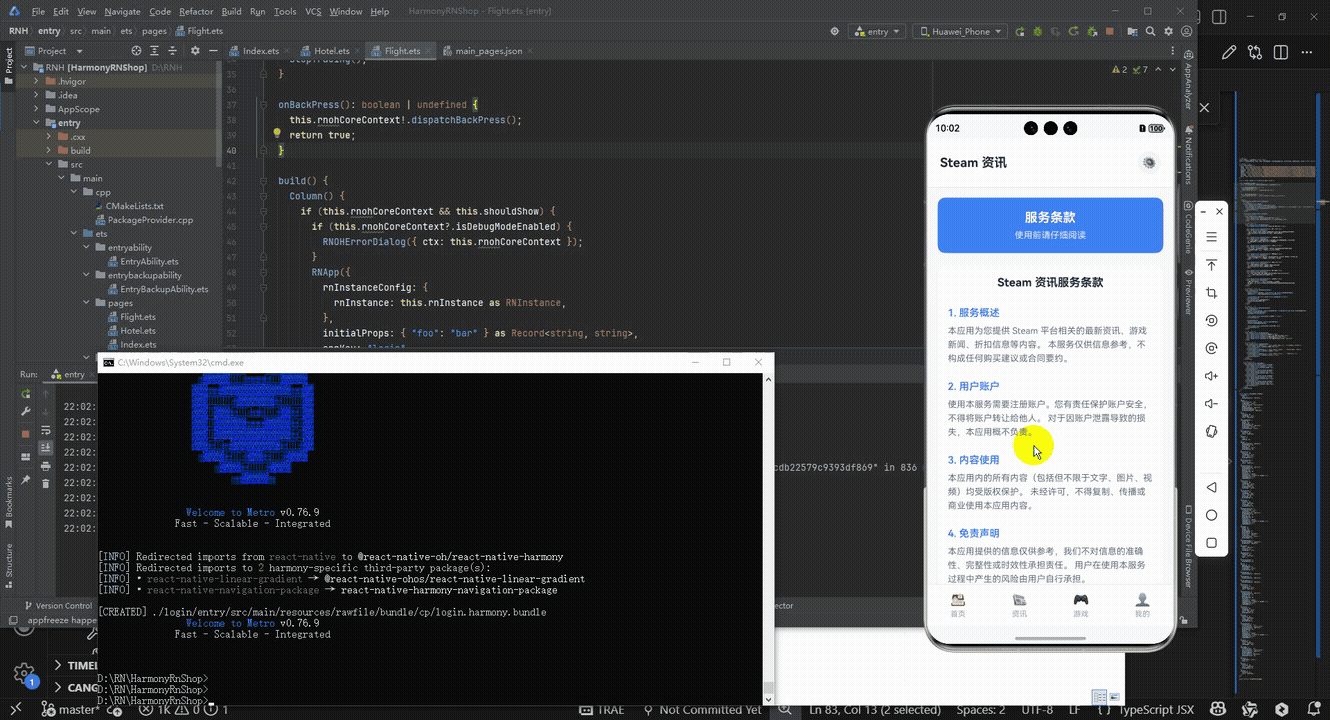
接下来通过打包命令npn run harmony将reactNative的代码打包成为bundle,这样可以进行在开源鸿蒙OpenHarmony中进行使用。

打包之后再将打包后的鸿蒙OpenHarmony文件拷贝到鸿蒙的DevEco-Studio工程目录去:

最后运行效果图如下显示:
本文探讨了React Native服务条款应用的实现方案,分析了其组件化架构、状态管理和用户交互设计。该应用采用单组件结构,通过useState管理用户接受状态,实现条款内容展示和交互功能。文章建议优化方向包括:组件拆分提高可维护性、使用useReducer管理复杂状态、集成AsyncStorage实现数据持久化,以及引入React Navigation实现页面导航。这些改进可增强应用的扩展性和用户体验,为移动应用中服务条款页面的开发提供了实用参考方案。
欢迎大家加入开源鸿蒙跨平台开发者社区,一起共建开源鸿蒙跨平台生态。

作为“人工智能6S店”的官方数字引擎,为AI开发者与企业提供一个覆盖软硬件全栈、一站式门户。
更多推荐

 2
2 0
0- 0


 已为社区贡献25条内容

所有评论(0)