
# Flutter for OpenHarmony 实战之基础组件:第三篇 Stack 层叠布局详解
在 UI 开发中,元素重叠显示是常见需求,例如图片上的标签、头像旁的红点等。本文将深入讲解 Flutter 的 Stack 层叠布局模型,Positioned 定位组件的使用技巧,并演示如何利用 IndexedStack 优化鸿蒙应用的状态切换性能。
Flutter for OpenHarmony 实战之基础组件:第三篇 Stack 层叠布局详解
前言
如果你习惯了 CSS 中的 absolute(绝对定位)或者 Android 中的 FrameLayout,那么 Flutter 中的 Stack 对你来说将非常亲切。
Row 和 Column 解决了线性排列的问题,而 Stack 则解决了重叠展示的需求。它是构建复杂 UI(如视频播放器界面、带角标的图标、全屏加载动画)不可或缺的工具。
本文你将学到:
- Stack 的对齐原理与层级顺序
- Positioned 与 Align 的精准定位
- 构建带角标(Badge)的通用组件
- 实战:打造精美的新闻 Banner 组件
- 性能优化:IndexedStack 在鸿蒙开发中的应用
一、Stack 基础概念
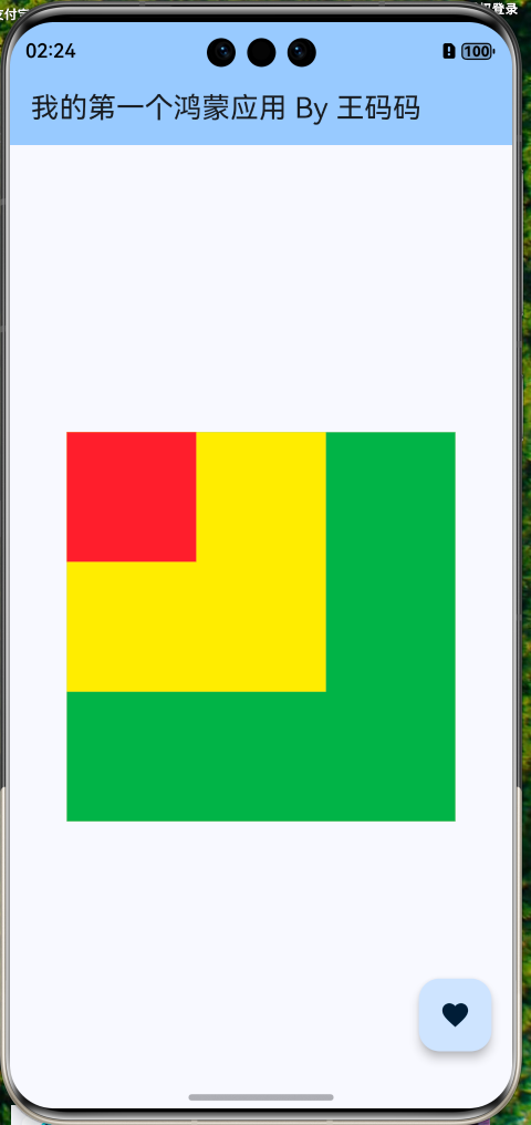
1.1 堆叠原理 (Z-Order)
Stack 像一叠扑克牌,子组件按照添加顺序从下往上堆叠:
children列表中的第一个组件在最底层 (Bottom)。children列表中的最后一个组件在最顶层 (Top)。
my_first_app/lib/widgets/basic_stack.dart
import 'package:flutter/material.dart';
class BasicStack extends StatelessWidget {
const BasicStack({super.key});
Widget build(BuildContext context) {
return Stack(
children: [
// 底层:绿色背景
Container(width: 300, height: 300, color: Colors.green),
// 中层:黄色方块
Container(width: 200, height: 200, color: Colors.yellow),
// 顶层:红色圆圈
Container(width: 100, height: 100, color: Colors.red),
],
);
}
}
my_first_app/lib/main.dart
import 'package:flutter/material.dart';
import 'package:my_first_app/widgets/basic_stack.dart';

/// 应用入口函数
void main() {
  // 运行 Flutter 应用
  runApp(const MyApp());
}

/// 根 Widget - 应用程序的顶层组件
class MyApp extends StatelessWidget {
  const MyApp({super.key});

  @override
  Widget build(BuildContext context) {
    return MaterialApp(
      title: 'Flutter for OpenHarmony', // 应用标题
      debugShowCheckedModeBanner: false, // 隐藏调试标签
      theme: ThemeData(
        // 主题配置
        colorScheme: ColorScheme.fromSeed(seedColor: Colors.blue),
        useMaterial3: true, // 使用 Material 3 设计
      ),
      home: const HomePage(), // 首页
    );
  }
}

/// 首页 Widget
class HomePage extends StatelessWidget {
  const HomePage({super.key});

  @override
  Widget build(BuildContext context) {
    return Scaffold(
      // 应用栏
      appBar: AppBar(
        title: const Text('我的第一个鸿蒙应用 By 王码码'),
        backgroundColor: Theme.of(context).colorScheme.inversePrimary,
      ),
      // 页面主体
      body: const Center(
        child: Column(
          mainAxisAlignment: MainAxisAlignment.center,
          children: [
            BasicStack(),
          ],
        ),
      ),
      // 悬浮按钮
      floatingActionButton: FloatingActionButton(
        onPressed: () {
          // 显示提示
          ScaffoldMessenger.of(context).showSnackBar(
            const SnackBar(content: Text('Flutter + OpenHarmony = ❤️')),
          );
        },
        child: const Icon(Icons.favorite),
      ),
    );
  }
}
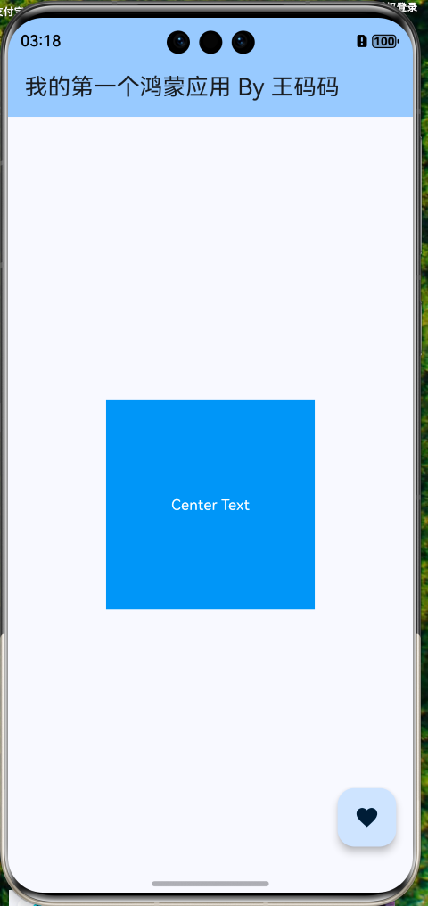
1.2 对齐方式 (Alignment)
当子组件没有被 Positioned 包裹时,它们是非定位(non-positioned)组件,由 Stack.alignment 属性统一控制位置。
my_first_app/lib/widgets/basic_alignment.dart
import 'package:flutter/material.dart';
class BasicAlignment extends StatelessWidget {
const BasicAlignment({super.key});
Widget build(BuildContext context) {
return Stack(
alignment: Alignment.center, // 所有非定位子组件居中
children: [
Container(width: 200, height: 200, color: Colors.blue),
const Text('Center Text', style: TextStyle(color: Colors.white)),
],
);
}
}
Alignment 常用坐标系:
(0, 0): 中心点(-1, -1): 左上角(1, 1): 右下角(0, 1): 底部中心
二、精准定位:Positioned 组件
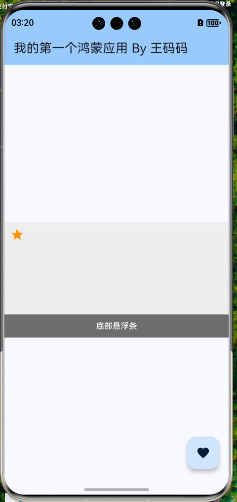
Positioned 组件只能作为 Stack 的直接子节点使用,用于控制子组件的精确位置和尺寸。
2.1 核心属性
left,top,right,bottom: 距离 Stack 边缘的距离。width,height: 强制指定子组件尺寸。
my_first_app/lib/widgets/basic_position.dart
import 'package:flutter/material.dart';
class BasicPosition extends StatelessWidget {
const BasicPosition({super.key});
Widget build(BuildContext context) {
return Stack(
children: [
// 底图
Container(color: Colors.grey[200], height: 200),
// 左上角距离 10px
const Positioned(
left: 10,
top: 10,
child: const Icon(Icons.star, color: Colors.orange),
),
// 底部横幅 (left=0, right=0 相当于只有 width=parentWidth)
Positioned(
left: 0,
right: 0,
bottom: 0,
height: 40,
child: Container(
color: Colors.black54,
alignment: Alignment.center,
child: const Text('底部悬浮条', style: TextStyle(color: Colors.white)),
),
),
],
);
}
}
2.2 常见误区
❌ 错误用法:在 Stack 外部使用 Positioned
Column(
  children: [
    Positioned(...) // 报错:Positioned 必须是 Stack 的子组件
  ],
)
✅ 技巧:Positioned.fill
如果想让子组件填满整个 Stack,可以使用简写:
Positioned.fill(
  child: Image.asset('bg.png', fit: BoxFit.cover),
)
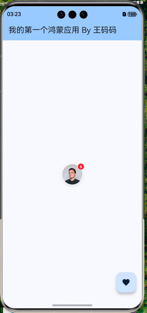
三、实战案例 1:消息角标 (Badge) 组件
这是 APP 中最常见的设计:头像右上角有个红色未读数字。
my_first_app/lib/widgets/avatar_badge.dart
import 'package:flutter/material.dart';
class AvatarWithBadge extends StatelessWidget {
final String imageUrl;
final int count;
const AvatarWithBadge({
super.key,
required this.imageUrl,
required this.count,
});
Widget build(BuildContext context) {
return Stack(
// 允许子组件略微超出 Stack 范围 (clipBehavior 默认是 hardEdge,需要改为 none)
clipBehavior: Clip.none,
children: [
// 1. 头像
Container(
width: 60,
height: 60,
decoration: BoxDecoration(
shape: BoxShape.circle,
image: DecorationImage(
// 根据路径自动选择图片来源:本地资源 or 网络
image: imageUrl.startsWith('http')
? NetworkImage(imageUrl)
: AssetImage(imageUrl) as ImageProvider,
fit: BoxFit.cover,
),
border: Border.all(color: Colors.white, width: 2),
boxShadow: const [
BoxShadow(
color: Colors.black12,
blurRadius: 4,
offset: Offset(0, 2),
),
],
),
),
// 2. 红色角标 (仅当数量 > 0 时显示)
if (count > 0)
Positioned(
right: -4, // 向右偏移,制造破局跟随效果
top: -4, // 向上偏移
child: Container(
padding: const EdgeInsets.all(4),
constraints: const BoxConstraints(
minWidth: 20,
minHeight: 20,
),
decoration: BoxDecoration(
color: Colors.red,
shape: BoxShape.circle,
border: Border.all(color: Colors.white, width: 1.5),
),
child: Center(
child: Text(
count > 99 ? '99+' : count.toString(),
style: const TextStyle(
color: Colors.white,
fontSize: 10,
fontWeight: FontWeight.bold,
),
),
),
),
),
],
);
}
}
my_first_app/lib/main.dart
import 'package:flutter/material.dart';
import 'package:my_first_app/widgets/basic_position.dart';
import 'package:my_first_app/widgets/basic_stack.dart';
import 'package:my_first_app/widgets/basic_alignment.dart';
import 'package:my_first_app/widgets/avatar_badge.dart';
/// 应用入口函数
void main() {
// 运行 Flutter 应用
runApp(const MyApp());
}
/// 根 Widget - 应用程序的顶层组件
class MyApp extends StatelessWidget {
const MyApp({super.key});
Widget build(BuildContext context) {
return MaterialApp(
title: 'Flutter for OpenHarmony', // 应用标题
debugShowCheckedModeBanner: false, // 隐藏调试标签
theme: ThemeData(
// 主题配置
colorScheme: ColorScheme.fromSeed(seedColor: Colors.blue),
useMaterial3: true, // 使用 Material 3 设计
),
home: const HomePage(), // 首页
);
}
}
/// 首页 Widget
class HomePage extends StatelessWidget {
const HomePage({super.key});
Widget build(BuildContext context) {
return Scaffold(
// 应用栏
appBar: AppBar(
title: const Text('我的第一个鸿蒙应用 By 王码码'),
backgroundColor: Theme.of(context).colorScheme.inversePrimary,
),
// 页面主体
body: const Center(
child: Column(
mainAxisAlignment: MainAxisAlignment.center,
children: [
// BasicStack(),
// BasicAlignment(),
// BasicPosition(),
AvatarWithBadge(
imageUrl:
'https://images.unsplash.com/photo-1535713875002-d1d0cf377fde?w=120&h=120&fit=crop', // Unsplash 头像
count: 5,
),
],
),
),
// 悬浮按钮
floatingActionButton: FloatingActionButton(
onPressed: () {
// 显示提示
ScaffoldMessenger.of(context).showSnackBar(
const SnackBar(content: Text('Flutter + OpenHarmony = ❤️')),
);
},
child: const Icon(Icons.favorite),
),
);
}
}
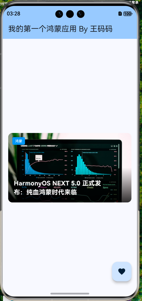
四、实战案例 2:新闻 Banner 组件
我们需要实现一个典型的 Banner 效果:图片 + 渐变蒙层 + 左下角文字 + 右下角指示器。
my_first_app/lib/widgets/news_banner.dart
import 'package:flutter/material.dart';
class NewsBanner extends StatelessWidget {
final String title;
final String imageUrl;
final String tag;
const NewsBanner({
super.key,
required this.title,
required this.imageUrl,
required this.tag,
});
Widget build(BuildContext context) {
return Container(
height: 200,
margin: const EdgeInsets.all(16),
// ClipRRect 用于裁剪 Stack 的圆角
child: ClipRRect(
borderRadius: BorderRadius.circular(12),
child: Stack(
children: [
// 1. 背景图 (填满)
Positioned.fill(
child: Image.network(
imageUrl,
fit: BoxFit.cover,
),
),
// 2. 渐变蒙层 (提升文字可读性)
Positioned(
left: 0,
right: 0,
bottom: 0,
height: 100, // 仅底部有渐变
child: Container(
decoration: BoxDecoration(
gradient: LinearGradient(
begin: Alignment.topCenter,
end: Alignment.bottomCenter,
colors: [
Colors.transparent,
Colors.black.withOpacity(0.8),
],
),
),
),
),
// 3. 标签 (左上角)
Positioned(
left: 12,
top: 12,
child: Container(
padding: const EdgeInsets.symmetric(horizontal: 8, vertical: 4),
decoration: BoxDecoration(
color: Colors.blue,
borderRadius: BorderRadius.circular(4),
),
child: Text(
tag,
style: const TextStyle(color: Colors.white, fontSize: 10),
),
),
),
// 4. 标题 (左下角)
Positioned(
left: 16,
bottom: 16,
right: 60, // 留出空间给指示器等
child: Text(
title,
style: const TextStyle(
color: Colors.white,
fontSize: 18,
fontWeight: FontWeight.bold,
),
maxLines: 2,
overflow: TextOverflow.ellipsis,
),
),
],
),
),
);
}
}
my_first_app/lib/main.dart
import 'package:flutter/material.dart';
import 'package:my_first_app/widgets/basic_position.dart';
import 'package:my_first_app/widgets/basic_stack.dart';
import 'package:my_first_app/widgets/basic_alignment.dart';
import 'package:my_first_app/widgets/avatar_badge.dart';
import 'package:my_first_app/widgets/news_banner.dart';
/// 应用入口函数
void main() {
// 运行 Flutter 应用
runApp(const MyApp());
}
/// 根 Widget - 应用程序的顶层组件
class MyApp extends StatelessWidget {
const MyApp({super.key});
Widget build(BuildContext context) {
return MaterialApp(
title: 'Flutter for OpenHarmony', // 应用标题
debugShowCheckedModeBanner: false, // 隐藏调试标签
theme: ThemeData(
// 主题配置
colorScheme: ColorScheme.fromSeed(seedColor: Colors.blue),
useMaterial3: true, // 使用 Material 3 设计
),
home: const HomePage(), // 首页
);
}
}
/// 首页 Widget
class HomePage extends StatelessWidget {
const HomePage({super.key});
Widget build(BuildContext context) {
return Scaffold(
// 应用栏
appBar: AppBar(
title: const Text('我的第一个鸿蒙应用 By 王码码'),
backgroundColor: Theme.of(context).colorScheme.inversePrimary,
),
// 页面主体
body: const Center(
child: Column(
mainAxisAlignment: MainAxisAlignment.center,
children: [
// BasicStack(),
// BasicAlignment(),
// BasicPosition(),
// AvatarWithBadge(
// imageUrl:
// 'https://images.unsplash.com/photo-1535713875002-d1d0cf377fde?w=120&h=120&fit=crop', // Unsplash 头像
// count: 5,
// ),
NewsBanner(
title: 'HarmonyOS NEXT 5.0 正式发布:纯血鸿蒙时代来临',
imageUrl:
'https://images.unsplash.com/photo-1551288049-bebda4e38f71?w=600&h=400&fit=crop', // 科技发布会配图
tag: '鸿蒙',
),
],
),
),
// 悬浮按钮
floatingActionButton: FloatingActionButton(
onPressed: () {
// 显示提示
ScaffoldMessenger.of(context).showSnackBar(
const SnackBar(content: Text('Flutter + OpenHarmony = ❤️')),
);
},
child: const Icon(Icons.favorite),
),
);
}
}
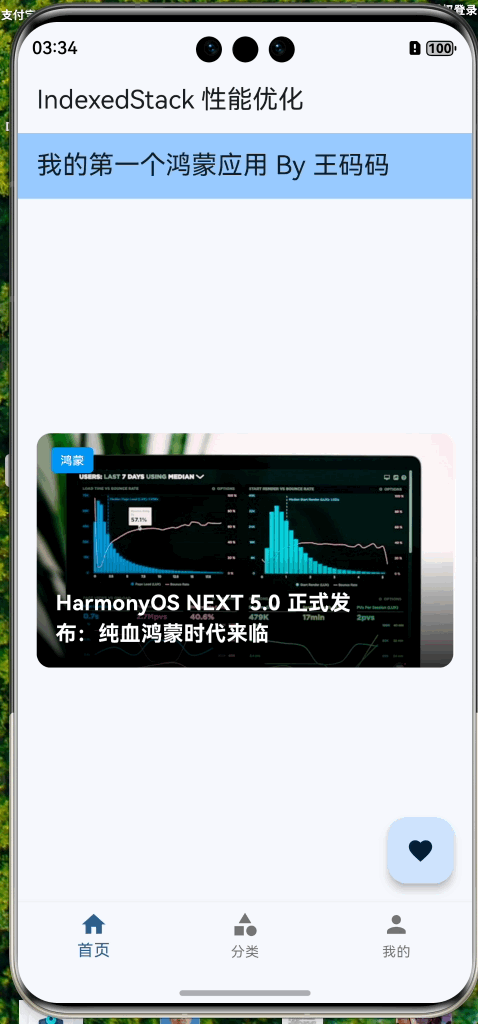
五、鸿蒙开发技巧:IndexedStack
在 OpenHarmony 应用开发中,我们经常需要实现底部导航栏(BottomNavigationBar)的页面切换。
5.1 传统方式的痛点
如果直接使用 body: pages[currentIndex],每次切换页面时,原来的页面会被销毁,新页面会被重建。如果页面包含复杂的网络请求或地图组件,重建成本非常高,且无法保持滚动位置。
5.2 使用 IndexedStack 优化
IndexedStack 是一个特殊的 Stack,它一次性加载所有子组件,但只显示 index 对应的那个。其他组件虽然不可见,但状态依然保持(State Keep Alive)。
my_first_app/lib/main_page.dart
import 'package:flutter/material.dart';
import 'package:my_first_app/main.dart';
import 'package:my_first_app/category_page.dart';
import 'package:my_first_app/profile_page.dart';
class MainPage extends StatefulWidget {
const MainPage({super.key});
State<MainPage> createState() => _MainPageState();
}
class _MainPageState extends State<MainPage> {
int _currentIndex = 0;
// 页面列表
final List<Widget> _pages = const [
HomePage(),
CategoryPage(),
ProfilePage(),
];
Widget build(BuildContext context) {
return Scaffold(
appBar: AppBar(title: const Text('IndexedStack 性能优化')),
// ✅ 优化:使用 IndexedStack 保持页面状态
body: IndexedStack(
index: _currentIndex,
children: _pages,
),
bottomNavigationBar: BottomNavigationBar(
currentIndex: _currentIndex,
onTap: (index) {
setState(() {
_currentIndex = index;
});
},
items: const [
BottomNavigationBarItem(icon: Icon(Icons.home), label: '首页'),
BottomNavigationBarItem(icon: Icon(Icons.category), label: '分类'),
BottomNavigationBarItem(icon: Icon(Icons.person), label: '我的'),
],
),
);
}
}
my_first_app/lib/category_page.dart
import 'package:flutter/material.dart';
class CategoryPage extends StatelessWidget {
const CategoryPage({super.key});
Widget build(BuildContext context) {
return const Center(
child: Text('分类页面'),
);
}
}
my_first_app/lib/profile_page.dart
import 'package:flutter/material.dart';
class ProfilePage extends StatelessWidget {
const ProfilePage({super.key});
Widget build(BuildContext context) {
return const Center(
child: Text('我的页面'),
);
}
}
my_first_app/lib/main.dart
// ...
import 'package:my_first_app/main_page.dart';
// ...省略
/// 根 Widget - 应用程序的顶层组件
class MyApp extends StatelessWidget {
const MyApp({super.key});
Widget build(BuildContext context) {
return MaterialApp(
title: 'Flutter for OpenHarmony', // 应用标题
debugShowCheckedModeBanner: false, // 隐藏调试标签
theme: ThemeData(
// 主题配置
colorScheme: ColorScheme.fromSeed(seedColor: Colors.blue),
useMaterial3: true, // 使用 Material 3 设计
),
home: const MainPage(), // 首页
);
}
}
// ...省略
⚠️ 性能注意:IndexedStack 适合页面数量较少(3-5 个)且需要保持状态的场景。如果页面非常多,建议配合 PageView 或自定义缓存策略。
六、层叠上下文陷阱 (Z-Index 不存在?)
Flutter 中没有 Web 开发中的 z-index 属性。如果你想调整层级,只能通过调整 children 列表的顺序。
如何让点击事件穿透?
有时候上层的透明蒙层会挡住下层按钮的点击事件。
- 使用
IgnorePointer: 忽略自己和子组件的点击事件。 - 使用
AbsorbPointer: 吸收点击事件,不让其传递给下层。
Stack(
  children: [
    ElevatedButton(onPressed: () {}, child: Text('点我')),

    // 这个透明层会挡住按钮点击
    // 解决方法:包裹 IgnorePointer
    IgnorePointer(
      child: Container(color: Colors.transparent),
    ),
  ],
)
七、总结
Stack 赋予了我们在 Z 轴上的布局能力,配合 Positioned 可以实现像素级的精确控制。
核心知识点
- 层叠顺序:代码在后的在上面。
- 定位控制:使用
Positioned+top/bottom/left/right。 - 溢出处理:设置
clipBehavior: Clip.none允许子组件画出界。 - 性能优化:状态保持场景优先选
IndexedStack。
下一篇预告
我们已经掌握了基本的布局和定位。接下来的文章我们将进入最基础但也最复杂的组件——文本。
《Flutter for OpenHarmony 实战之基础组件:第四篇 Text 文本组件全解》
我们将讨论富文本(RichText)、文本溢出处理、自定义字体以及鸿蒙系统下的字体适配。
📦 完整代码已上传至 AtomGit:open-harmony-example (分支: basic/3-stack)
🌐 欢迎加入开源鸿蒙跨平台社区:开源鸿蒙跨平台开发者社区

作为“人工智能6S店”的官方数字引擎,为AI开发者与企业提供一个覆盖软硬件全栈、一站式门户。
更多推荐

 17
17 0
0- 0


 已为社区贡献12条内容

所有评论(0)