
通过Flutter侧滑操作库flutter_slidable优化鸿蒙版天气预报城市管理列表更易操作
Flutter Slidable 侧滑操作在天气应用中的应用 本文介绍了如何在Flutter天气应用中使用flutter_slidable库实现高效的侧滑操作功能。该库提供多种动画效果和高度定制化选项,支持左右滑动显示操作按钮。 在天气应用中,侧滑操作可实现删除城市、置顶常用城市等核心功能,显著提升用户体验。通过简单API即可集成,支持跨平台使用。文章详细解析了组件架构、基本用法和城市列表侧滑的具
1. 概述
1.1 什么是 Flutter Slidable?
flutter_slidable 是一个强大的 Flutter 侧滑操作库,提供了:
- ✅ 侧滑操作:支持左滑和右滑显示操作按钮
- ✅ 多种动画:DrawerMotion、ScrollMotion、BehindMotion 等
- ✅ 高度可定制:自定义操作按钮、颜色、图标等
- ✅ 易于使用:简单的 API,几行代码即可集成
- ✅ 跨平台:支持 Android、iOS、Web、HarmonyOS 等平台
1.2 为什么在天气应用中使用 Flutter Slidable?
在天气应用中,侧滑操作可以:
| 功能 | 说明 |
|---|---|
| 🗑️ 删除城市 | 快速删除不需要的城市 |
| 📌 置顶城市 | 将常用城市置顶,方便查看 |
| ⭐ 设为常用 | 标记常用城市,快速识别 |
| 📊 提升效率 | 减少点击次数,提升操作效率 |
1.3 应用场景
在天气应用中,我们使用 Flutter Slidable 实现:
- 🏙️ 城市列表侧滑:删除、置顶、设为常用
- 📜 历史记录侧滑:删除、置顶、设为常用
- ⚡ 快速操作:无需长按或进入详情页即可操作
1.4 功能流程图
2. 引入三方库
2.1 添加依赖
在 pubspec.yaml 文件的 dependencies 部分添加:
dependencies:
  flutter:
    sdk: flutter

  # 侧滑操作组件
  flutter_slidable: ^3.1.1
2.2 安装依赖
在项目根目录运行:
flutter pub get
预期输出:
Resolving dependencies...
Downloading packages...
+ flutter_slidable 3.1.2
Got dependencies!
2.3 依赖说明
| 依赖包 | 版本 | 用途 |
|---|---|---|
flutter_slidable |
^3.1.1 | 侧滑操作组件核心库,提供侧滑操作功能 |
2.4 导入库
在需要使用侧滑操作的文件中导入:
import 'package:flutter_slidable/flutter_slidable.dart';
3. 目录结构
3.1 项目结构
lib/
├── screens/
│   ├── city_manage_page.dart    # 城市管理页(使用侧滑操作)
│   └── history_page.dart        # 历史记录页(使用侧滑操作)
└── models/
    └── weather_models.dart      # 天气数据模型
3.2 文件说明
-
city_manage_page.dart:城市管理页面- 使用
Slidable包装城市列表项 - 实现删除、置顶、设为常用功能
- 使用
-
history_page.dart:历史记录页面- 使用
Slidable包装历史记录项 - 实现删除、置顶、设为常用功能
- 使用
4. 核心代码解读
4.1 Slidable 组件架构
4.2 Slidable 基本用法
Slidable(
  key: ValueKey(item.id),  // 唯一标识
  endActionPane: ActionPane(
    motion: const DrawerMotion(),  // 动画类型
    extentRatio: 0.75,  // 操作面板宽度比例
    children: [
      // 操作按钮列表
      SlidableAction(
        onPressed: (_) => _handleAction(),
        backgroundColor: Colors.blue,
        foregroundColor: Colors.white,
        icon: Icons.star,
        label: '设为常用',
      ),
    ],
  ),
  child: ListTile(
    // 列表项内容
    title: Text('城市名称'),
    subtitle: Text('城市信息'),
  ),
)
关键属性说明:
key:唯一标识,用于区分不同的 Slidable 实例endActionPane:右侧操作面板(左滑显示)startActionPane:左侧操作面板(右滑显示)motion:动画类型(DrawerMotion、ScrollMotion 等)extentRatio:操作面板宽度比例(0.0-1.0)
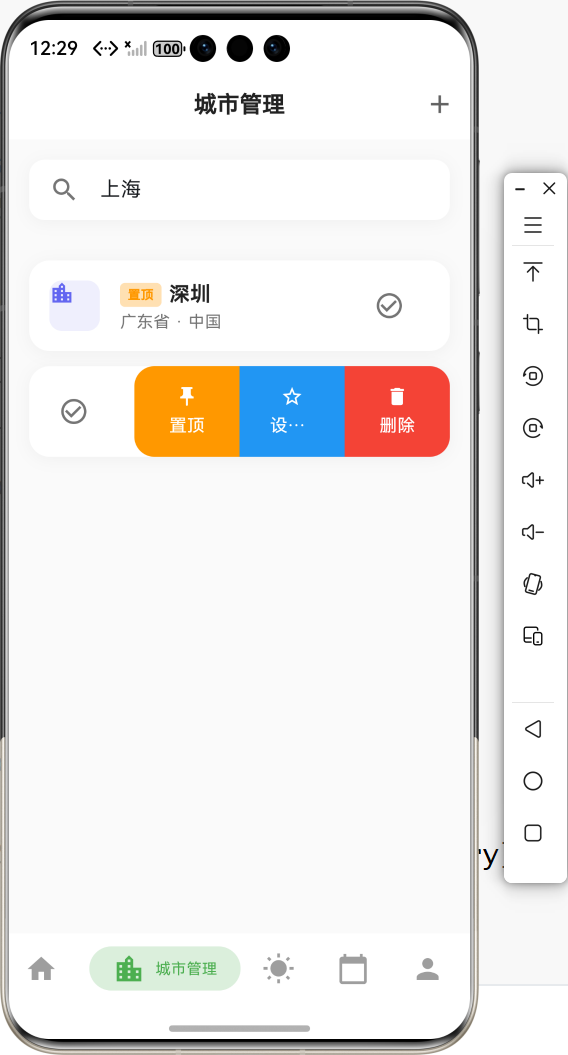
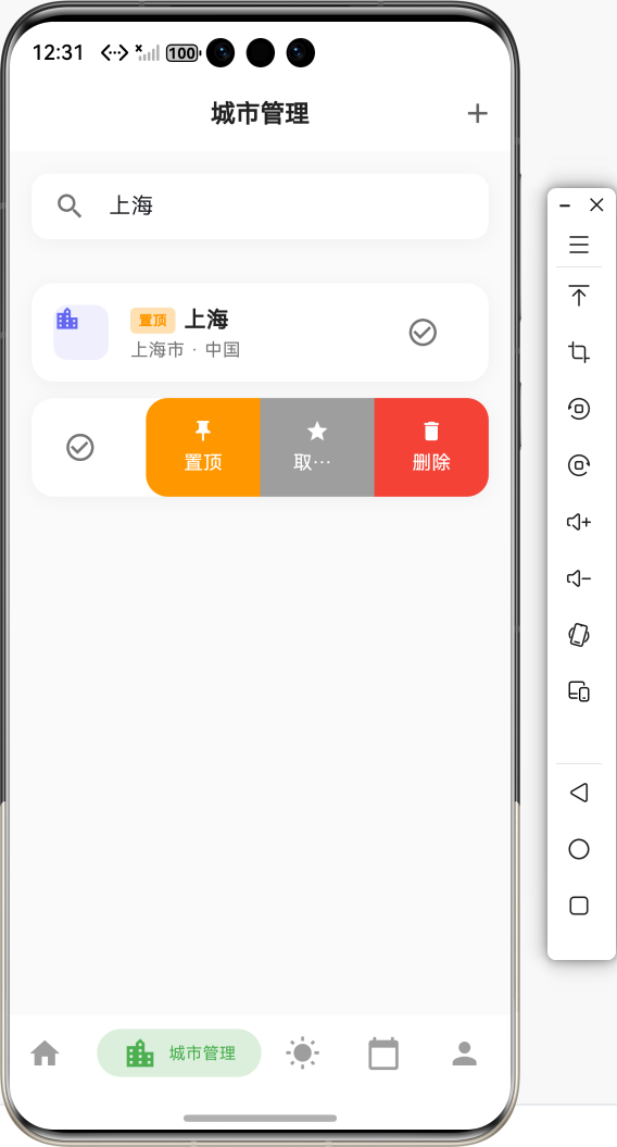
4.3 城市列表侧滑实现
Slidable(
  key: ValueKey(city.id),
  endActionPane: ActionPane(
    motion: const DrawerMotion(),
    extentRatio: 0.75,
    children: [
      // 置顶操作
      SlidableAction(
        onPressed: (_) => _pinCity(index),
        backgroundColor: Colors.orange,
        foregroundColor: Colors.white,
        icon: Icons.push_pin,
        label: index == 0 ? '已置顶' : '置顶',
        borderRadius: const BorderRadius.only(
          topLeft: Radius.circular(16),
          bottomLeft: Radius.circular(16),
        ),
      ),
      // 设为常用/取消常用
      SlidableAction(
        onPressed: (_) => _toggleFavorite(city.id),
        backgroundColor: isFavorite ? Colors.grey : Colors.blue,
        foregroundColor: Colors.white,
        icon: isFavorite ? Icons.star : Icons.star_border,
        label: isFavorite ? '取消常用' : '设为常用',
      ),
      // 删除操作
      SlidableAction(
        onPressed: (_) => _deleteCity(index),
        backgroundColor: Colors.red,
        foregroundColor: Colors.white,
        icon: Icons.delete,
        label: '删除',
        borderRadius: const BorderRadius.only(
          topRight: Radius.circular(16),
          bottomRight: Radius.circular(16),
        ),
      ),
    ],
  ),
  child: ListTile(
    // 列表项内容
    leading: Icon(Icons.location_city),
    title: Text(city.name),
    subtitle: Text('${city.adm1} · ${city.country}'),
  ),
)
4.4 操作处理流程
5. 实际步骤
5.1 步骤1:添加依赖
在 pubspec.yaml 中添加:
dependencies:
  flutter_slidable: ^3.1.1
运行 flutter pub get 安装依赖。
5.2 步骤2:导入库
在需要使用侧滑操作的页面中导入:
import 'package:flutter_slidable/flutter_slidable.dart';
5.3 步骤3:包装列表项
将原来的 ListTile 或 Card 包装在 Slidable 中:
原来的代码:
ListTile(
  leading: Icon(Icons.location_city),
  title: Text(city.name),
  subtitle: Text('${city.adm1} · ${city.country}'),
  trailing: IconButton(
    icon: Icon(Icons.delete),
    onPressed: () => _deleteCity(index),
  ),
)
替换后的代码:
Slidable(
  key: ValueKey(city.id),
  endActionPane: ActionPane(
    motion: const DrawerMotion(),
    extentRatio: 0.75,
    children: [
      SlidableAction(
        onPressed: (_) => _deleteCity(index),
        backgroundColor: Colors.red,
        foregroundColor: Colors.white,
        icon: Icons.delete,
        label: '删除',
      ),
    ],
  ),
  child: ListTile(
    leading: Icon(Icons.location_city),
    title: Text(city.name),
    subtitle: Text('${city.adm1} · ${city.country}'),
  ),
)
5.4 步骤4:实现操作函数
/// 📌 置顶城市
void _pinCity(int index) {
if (index == 0) {
ToastUtil.showInfo('该城市已在顶部');
return;
}
setState(() {
final city = _cities.removeAt(index);
_cities.insert(0, city);
});
_saveCities();
ToastUtil.showSuccess('已置顶 ${_cities[0].name}');
}
/// ⭐ 切换常用城市
void _toggleFavorite(String cityId) {
setState(() {
if (_favoriteCityIds.contains(cityId)) {
_favoriteCityIds.remove(cityId);
ToastUtil.showInfo('已取消常用');
} else {
_favoriteCityIds.add(cityId);
ToastUtil.showSuccess('已设为常用');
}
});
_saveFavoriteCities();
}
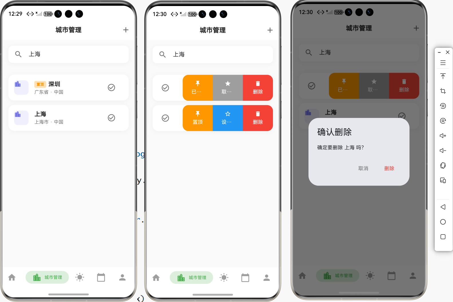
/// 🗑️ 删除城市
void _deleteCity(int index) {
final city = _cities[index];
showDialog(
context: context,
builder: (context) => AlertDialog(
title: const Text('确认删除'),
content: Text('确定要删除 ${city.name} 吗?'),
actions: [
TextButton(
onPressed: () => Navigator.pop(context),
child: const Text('取消'),
),
TextButton(
onPressed: () {
setState(() {
_cities.removeAt(index);
_favoriteCityIds.remove(city.id);
});
_saveCities();
_saveFavoriteCities();
Navigator.pop(context);
ToastUtil.showSuccess('已删除 ${city.name}');
},
child: const Text('删除', style: TextStyle(color: Colors.red)),
),
],
),
);
}
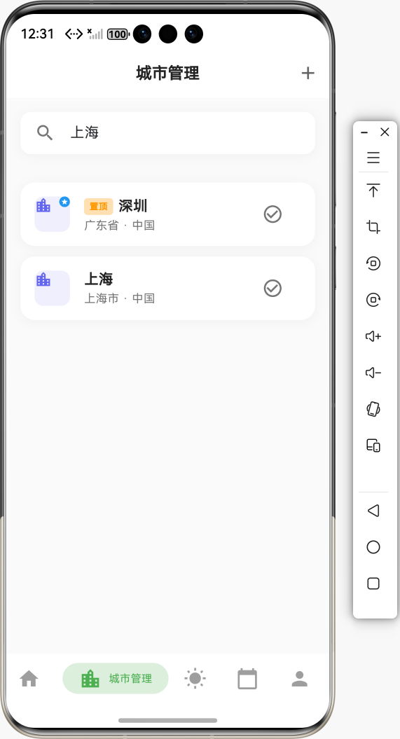
5.5 步骤5:添加常用城市标记
在列表项中显示常用城市标记:
leading: Container(
  width: 40,
  height: 40,
  decoration: BoxDecoration(
    color: const Color(0xFF6366F1).withValues(alpha: 0.1),
    borderRadius: BorderRadius.circular(10),
  ),
  child: Stack(
    children: [
      const Icon(
        Icons.location_city,
        color: Color(0xFF6366F1),
        size: 20,
      ),
      // 常用城市标记
      if (isFavorite)
        Positioned(
          right: 0,
          top: 0,
          child: Container(
            width: 12,
            height: 12,
            decoration: const BoxDecoration(
              color: Colors.blue,
              shape: BoxShape.circle,
            ),
            child: const Icon(
              Icons.star,
              size: 8,
              color: Colors.white,
            ),
          ),
        ),
    ],
  ),
),
5.6 步骤6:添加置顶标记
在列表项标题中显示置顶标记:
title: Row(
  children: [
    if (index == 0)
      Container(
        margin: const EdgeInsets.only(right: 6),
        padding: const EdgeInsets.symmetric(horizontal: 6, vertical: 2),
        decoration: BoxDecoration(
          color: Colors.orange.shade100,
          borderRadius: BorderRadius.circular(4),
        ),
        child: const Text(
          '置顶',
          style: TextStyle(
            fontSize: 10,
            color: Colors.orange,
            fontWeight: FontWeight.bold,
          ),
        ),
      ),
    Expanded(
      child: Text(
        city.name,
        style: const TextStyle(
          fontSize: 16,
          fontWeight: FontWeight.w600,
          color: Colors.black87,
        ),
      ),
    ),
  ],
),
5.7 步骤7:测试侧滑操作
运行应用,检查:
- ✅ 左滑列表项是否显示操作面板
- ✅ 操作按钮是否正确显示
- ✅ 点击操作按钮是否执行相应操作
- ✅ 操作后列表是否正确更新
6. 常见错误与解决方案
6.1 错误:侧滑不显示
错误信息:
Slidable 不响应滑动操作
可能原因:
key未设置或重复child被其他 Widget 包裹- 滑动方向设置错误
解决方案:
// ✅ 正确:设置唯一的 key
Slidable(
  key: ValueKey(city.id),  // 使用唯一标识
  endActionPane: ActionPane(...),
  child: ListTile(...),
)

// ❌ 错误:key 重复或未设置
Slidable(
  // 缺少 key
  endActionPane: ActionPane(...),
  child: ListTile(...),
)
6.2 错误:操作按钮不显示
可能原因:
extentRatio设置太小ActionPane配置错误SlidableAction未正确添加
解决方案:
// ✅ 正确:设置合适的 extentRatio
endActionPane: ActionPane(
  motion: const DrawerMotion(),
  extentRatio: 0.75,  // 操作面板占屏幕宽度的 75%
  children: [
    SlidableAction(...),
  ],
),

// ❌ 错误:extentRatio 太小
endActionPane: ActionPane(
  extentRatio: 0.1,  // 太小,按钮可能显示不全
  children: [...],
)
6.3 错误:操作后列表不更新
可能原因:
- 未调用
setState - 数据未保存到本地存储
解决方案:
// ✅ 正确:更新状态并保存
void _pinCity(int index) {
  setState(() {
    final city = _cities.removeAt(index);
    _cities.insert(0, city);
  });
  _saveCities();  // 保存到本地存储
  ToastUtil.showSuccess('已置顶');
}

// ❌ 错误:未调用 setState
void _pinCity(int index) {
  _cities.removeAt(index);  // 不会更新UI
  _cities.insert(0, city);
}
6.4 错误:多个 Slidable 同时打开
可能原因:
- 未使用
SlidableAutoCloseBehavior - 缺少状态管理
解决方案:
// ✅ 正确:使用 SlidableAutoCloseBehavior
SlidableAutoCloseBehavior(
  child: ListView.builder(
    itemBuilder: (context, index) {
      return Slidable(...);
    },
  ),
)

// 或者手动管理状态
final SlidableController _slidableController = SlidableController();

Slidable(
  controller: _slidableController,
  ...
)
6.5 错误:操作按钮样式不正确
可能原因:
- 颜色设置错误
- 图标未正确导入
- 圆角设置不当
解决方案:
// ✅ 正确:设置完整的样式
SlidableAction(
  onPressed: (_) => _deleteCity(index),
  backgroundColor: Colors.red,  // 背景色
  foregroundColor: Colors.white,  // 前景色(图标和文字)
  icon: Icons.delete,  // 图标
  label: '删除',  // 标签
  borderRadius: const BorderRadius.only(
    topRight: Radius.circular(16),
    bottomRight: Radius.circular(16),
  ),
)
7. 进阶功能
7.1 左右双向滑动
Slidable(
  key: ValueKey(city.id),
  startActionPane: ActionPane(
    motion: const DrawerMotion(),
    children: [
      SlidableAction(
        onPressed: (_) => _switchCity(city),
        backgroundColor: Colors.green,
        foregroundColor: Colors.white,
        icon: Icons.check_circle,
        label: '切换',
      ),
    ],
  ),
  endActionPane: ActionPane(
    motion: const DrawerMotion(),
    children: [
      SlidableAction(
        onPressed: (_) => _deleteCity(index),
        backgroundColor: Colors.red,
        foregroundColor: Colors.white,
        icon: Icons.delete,
        label: '删除',
      ),
    ],
  ),
  child: ListTile(...),
)
7.2 自定义动画效果
// DrawerMotion:抽屉式动画(推荐)
ActionPane(
  motion: const DrawerMotion(),
  children: [...],
)

// ScrollMotion:滚动式动画
ActionPane(
  motion: const ScrollMotion(),
  children: [...],
)

// BehindMotion:背后式动画
ActionPane(
  motion: const BehindMotion(),
  children: [...],
)

// StretchMotion:拉伸式动画
ActionPane(
  motion: const StretchMotion(),
  children: [...],
)
7.3 自定义操作按钮样式
SlidableAction(
  onPressed: (_) => _handleAction(),
  backgroundColor: Colors.blue,
  foregroundColor: Colors.white,
  icon: Icons.star,
  label: '设为常用',
  // 自定义样式
  flex: 2,  // 按钮宽度比例
  spacing: 8,  // 按钮间距
  borderRadius: BorderRadius.circular(8),  // 圆角
  // 自定义图标大小
  iconSize: 24,
  // 自定义字体样式
  labelStyle: const TextStyle(
    fontSize: 14,
    fontWeight: FontWeight.bold,
  ),
)
7.4 操作确认和撤销
/// 删除操作(带撤销功能)
void _deleteCityWithUndo(int index) {
  final city = _cities[index];
  final cityName = city.name;

  // 临时删除
  setState(() {
    _cities.removeAt(index);
  });

  // 显示撤销提示
  ScaffoldMessenger.of(context).showSnackBar(
    SnackBar(
      content: Text('已删除 $cityName'),
      action: SnackBarAction(
        label: '撤销',
        onPressed: () {
          // 恢复城市
          setState(() {
            _cities.insert(index, city);
          });
          _saveCities();
        },
      ),
      duration: const Duration(seconds: 3),
    ),
  );

  // 延迟保存(给用户撤销的时间)
  Future.delayed(const Duration(seconds: 3), () {
    if (mounted && !_cities.contains(city)) {
      _saveCities();
    }
  });
}
8. 总结
8.1 实现的功能
本教程详细介绍了如何使用 flutter_slidable 实现侧滑操作功能,已完成的功能包括:
- ✅ 引入三方库:添加
flutter_slidable依赖 - ✅ 城市列表侧滑:删除、置顶、设为常用操作
- ✅ 历史记录侧滑:删除、置顶、设为常用操作
- ✅ 常用城市管理:保存和加载常用城市列表
- ✅ 置顶功能:将城市移动到列表顶部
- ✅ 视觉反馈:常用标记、置顶标记
- ✅ 操作确认:删除操作需要确认
8.2 核心功能
- 🗑️ 删除操作:快速删除城市或历史记录
- 📌 置顶操作:将重要项移动到顶部
- ⭐ 设为常用:标记常用项,快速识别
- 🎨 美观的UI:现代化的侧滑操作设计
- 🔧 易于使用:简单的 API,几行代码即可集成
- 💾 数据持久化:操作结果保存到本地存储
8.3 使用示例总结
// 🏙️ 城市列表侧滑
Slidable(
  key: ValueKey(city.id),
  endActionPane: ActionPane(
    motion: const DrawerMotion(),
    extentRatio: 0.75,
    children: [
      SlidableAction(
        onPressed: (_) => _pinCity(index),
        backgroundColor: Colors.orange,
        icon: Icons.push_pin,
        label: '置顶',
      ),
      SlidableAction(
        onPressed: (_) => _toggleFavorite(city.id),
        backgroundColor: Colors.blue,
        icon: Icons.star,
        label: '设为常用',
      ),
      SlidableAction(
        onPressed: (_) => _deleteCity(index),
        backgroundColor: Colors.red,
        icon: Icons.delete,
        label: '删除',
      ),
    ],
  ),
  child: ListTile(...),
)
8.4 最佳实践
-
唯一标识
- 始终为
Slidable设置唯一的key - 使用
ValueKey(item.id)确保唯一性
- 始终为
-
操作确认
- 删除操作应该显示确认对话框
- 重要操作提供撤销功能
-
状态管理
- 操作后及时调用
setState更新UI - 保存数据到本地存储
- 操作后及时调用
-
用户体验
- 提供清晰的操作反馈(Toast 提示)
- 使用合适的颜色区分不同操作
- 操作按钮大小适中,易于点击
8.5 完整使用流程图
9. 参考资料
10. 功能演示流程图
🎉 祝你开发顺利! 🚀
欢迎加入开源鸿蒙跨平台社区

作为“人工智能6S店”的官方数字引擎,为AI开发者与企业提供一个覆盖软硬件全栈、一站式门户。
更多推荐
 8
8 0
0- 0


 已为社区贡献21条内容

所有评论(0)