
Flutter for OpenHarmony 实战:打造高颜值运动排行榜(上)— 自定义 Sliver 头部与动态卡片
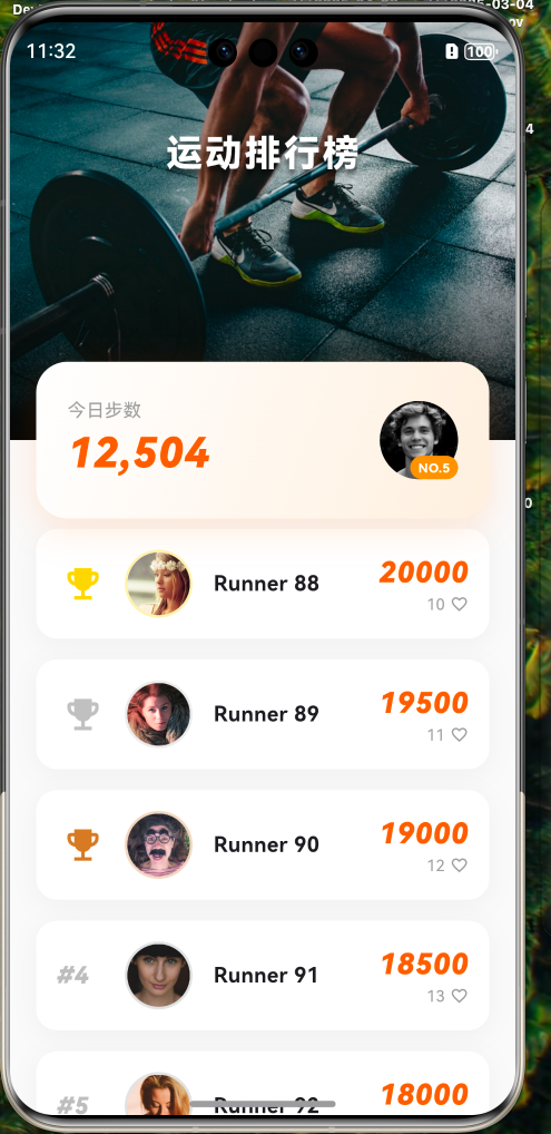
Flutter for OpenHarmony 实战:打造高颜值运动排行榜(上)— 自定义 Sliver 头部与动态卡片
摘要:。
前言
排行榜是激发用户活跃度的核心功能。一个优秀的排行榜页面应该具备:
- 沉浸感:头部背景图支持视差滚动。
- 个人高光:用户自己的数据要醒目展示,且能随滚动优雅淡出。
- 清晰排名:前三名要有金银铜的特殊视觉标识。
在上篇中,我们将完成整个项目的初始化、UI 骨架搭建,特别是那个能随滚动动态变化的智能头部。
本文你将学到:
- Flutter for OpenHarmony 项目创建与配置
SliverPersistentHeader自定义 Delegate 的高级用法- 如何实现卡片"压"在背景上且不遮挡列表的布局技巧
- OpenHarmony 下的沉浸式状态栏适配进阶
一、项目初始化
首先,我们需要创建一个专门针对 OpenHarmony 平台的 Flutter 项目。
1.1 创建项目
在终端执行以下命令:
# 创建项目 (项目名:sport_ranks)
flutter create --platforms ohos sport_ranks

# 进入项目目录
cd sport_ranks
1.2 配置资源与字体
为了让界面更具运动感,我们需要配置图片资源和数字字体。在 pubspec.yaml 中添加:
flutter:
  assets:
    - assets/images/
  fonts:
    - family: Barlow
      fonts:
        - asset: assets/fonts/Barlow-Bold.ttf
          weight: 700
注意:请确保你已在 assets 目录下放入了相应的资源文件。
二、页面整体结构设计
为了实现头部背景随滑动拉伸、收缩的效果,我们必须抛弃普通的 ListView,转而投向强大的 Sliver 大家族。
2.1 颜色体系 (Sport Edition)
我们采用更具运动感的配色方案:
- 主色 (Primary):
#FF6B00(活力橙,用于排名和高亮) - 背景 (Background):
#FAFAFA(极简灰白) - 卡片 (Surface):
#FFFFFF(纯白) - 文本 (Text):
#1A1A1A(主要),#999999(次要)
2.2 核心代码骨架
修改 lib/main.dart,设置全局主题并指向排行榜页面。
import 'package:flutter/material.dart';
import 'package:flutter/services.dart';
import 'pages/leaderboard_page.dart';
void main() {
WidgetsFlutterBinding.ensureInitialized();
// 1. 设置鸿蒙沉浸式透明状态栏
SystemChrome.setSystemUIOverlayStyle(const SystemUiOverlayStyle(
statusBarColor: Colors.transparent,
statusBarIconBrightness: Brightness.light, // 浅色图标适应深色头部
));
runApp(const SportRanksApp());
}
class SportRanksApp extends StatelessWidget {
const SportRanksApp({super.key});
Widget build(BuildContext context) {
return MaterialApp(
debugShowCheckedModeBanner: false,
title: 'Sport Ranks',
theme: ThemeData(
scaffoldBackgroundColor: const Color(0xFFFAFAFA),
primaryColor: const Color(0xFFFF6B00),
useMaterial3: true,
),
home: const LeaderboardPage(),
);
}
}
三、核心突破:自定义 SliverPersistentHeader
这是本文的重点。我们将通过自定义 SliverPersistentHeaderDelegate 来实现:
- 背景图与卡片的完美融合。
- 卡片随滚动动态淡出。
- 双标题切换(展开态大标题 ↔ 收起态小标题)。
新建 lib/pages/leaderboard_page.dart:
import 'dart:ui';
import 'package:flutter/material.dart';
class LeaderboardPage extends StatelessWidget {
const LeaderboardPage({super.key});
Widget build(BuildContext context) {
return Scaffold(
body: CustomScrollView(
slivers: [
// 1 & 2. 组合 Header:将 AppBar 和 个人卡片放在一起处理,实现真正的"压"效果
_buildCombinedHeader(context),
// 3. 排行榜列表
_buildRankList(),
],
),
);
}
Widget _buildCombinedHeader(BuildContext context) {
final double statusBarHeight = MediaQuery.paddingOf(context).top;
return SliverPersistentHeader(
pinned: true,
delegate: _LeaderboardHeaderDelegate(
expandedHeight: 260,
minHeight: statusBarHeight + 56.0, // 56.0 是标准 Toolbar 高度
userStatsCard: _buildUserStatsCard(context),
),
);
}
// ... 后续代码
}
四、自定义 Delegate:实现动态头部
这是整个页面的"大脑"。我们通过继承 SliverPersistentHeaderDelegate 来完全控制头部的渲染逻辑。
class _LeaderboardHeaderDelegate extends SliverPersistentHeaderDelegate {
final double expandedHeight;
final double minHeight;
final Widget userStatsCard;
_LeaderboardHeaderDelegate({
required this.expandedHeight,
required this.minHeight,
required this.userStatsCard,
});
Widget build(BuildContext context, double shrinkOffset, bool overlapsContent) {
// 计算进度和透明度
final double progress = (shrinkOffset / (expandedHeight - minHeight)).clamp(0.0, 1.0);
final double cardOpacity = 1.0 - progress; // 卡片随滑动淡出
return Stack(
clipBehavior: Clip.none, // 🔴 允许子组件溢出
children: [
// 1. 最底层:背景图 (填满整个区域)
Positioned.fill(
child: _buildBackground(context, shrinkOffset),
),
// 2. 中间层:展开状态的大标题 (位置微调)
Positioned(
top: 0,
left: 0,
right: 0,
bottom: 120,
child: Opacity(
opacity: (1.0 - progress * 2).clamp(0.0, 1.0),
child: const Center(
child: Text(
'运动排行榜',
style: TextStyle(
color: Colors.white,
fontSize: 28,
fontWeight: FontWeight.w900,
letterSpacing: 2,
shadows: [
Shadow(blurRadius: 10, color: Colors.black54, offset: Offset(0, 4)),
],
),
),
),
),
),
// 3. 顶层:压在背景底部的卡片 - 让它延伸到背景图之外,产生错位美感
Positioned(
left: 0,
right: 0,
bottom: -60, // 🔴 负值让卡片的下半部分延伸到背景图之外
child: Opacity(
opacity: cardOpacity,
child: userStatsCard,
),
),
// 4. 最顶层:固定 AppBar 标题 (由于卡片淡出后这里依然是顶部焦点)
Positioned(
top: 0,
left: 0,
right: 0,
height: minHeight,
child: Opacity(
opacity: (progress * 2 - 1.0).clamp(0.0, 1.0),
child: Container(
decoration: BoxDecoration(
gradient: LinearGradient(
begin: Alignment.topCenter,
end: Alignment.bottomCenter,
colors: [
Colors.black.withOpacity(0.4),
Colors.transparent,
],
),
),
alignment: Alignment.center,
padding: EdgeInsets.only(top: MediaQuery.paddingOf(context).top),
child: const Text(
'运动排行榜',
style: TextStyle(
color: Colors.white,
fontSize: 18,
fontWeight: FontWeight.bold,
),
),
),
),
),
],
);
}
Widget _buildBackground(BuildContext context, double shrinkOffset) {
return Container(
color: const Color(0xFF1A1A1A),
child: Stack(
fit: StackFit.expand,
children: [
// 图片背景 (移除淡出逻辑,常驻显示)
Image.network(
'https://images.unsplash.com/photo-1517836357463-d25dfeac3438?q=80&w=1000',
fit: BoxFit.cover,
),
// 蒙层 (常驻显示)
Container(
decoration: BoxDecoration(
gradient: LinearGradient(
begin: Alignment.topCenter,
end: Alignment.bottomCenter,
colors: [
Colors.black.withOpacity(0.2),
Colors.transparent,
Colors.black.withOpacity(0.8),
],
),
),
),
],
),
);
}
double get maxExtent => expandedHeight + 60; // 🔴 增加高度以容纳溢出的卡片
double get minExtent => minHeight;
bool shouldRebuild(covariant _LeaderboardHeaderDelegate oldDelegate) => true;
}
五、个人数据卡片
卡片不再使用 Transform.translate,而是直接通过 Positioned(bottom: -60) 实现溢出效果。
// 在 LeaderboardPage 中添加

Widget _buildUserStatsCard(BuildContext context) {
  return Padding(
    padding: const EdgeInsets.fromLTRB(20, 0, 20, 0),
    child: Container(
      height: 120,
      decoration: BoxDecoration(
        borderRadius: BorderRadius.circular(24),
        gradient: const LinearGradient(
          colors: [Colors.white, Color(0xFFFFF0E0)],
          begin: Alignment.topLeft,
          end: Alignment.bottomRight,
        ),
        boxShadow: [
          BoxShadow(
            color: const Color(0xFFFF6B00).withOpacity(0.15),
            blurRadius: 24,
            offset: const Offset(0, 8),
          ),
        ],
      ),
      padding: const EdgeInsets.all(24),
      child: Row(
        children: [
          // 左侧:步数大字
          Expanded(
            child: Column(
              crossAxisAlignment: CrossAxisAlignment.start,
              mainAxisAlignment: MainAxisAlignment.center,
              children: [
                const Text('今日步数', style: TextStyle(fontSize: 14, color: Colors.grey)),
                Text(
                  '12,504',
                  style: TextStyle(
                    fontSize: 32,
                    fontWeight: FontWeight.w900,
                    fontFamily: 'Barlow',
                    fontStyle: FontStyle.italic,
                    color: Theme.of(context).primaryColor,
                  ),
                ),
              ],
            ),
          ),
          // 右侧:用户头像
          Stack(
            alignment: Alignment.bottomRight,
            children: [
              const CircleAvatar(
                radius: 30,
                backgroundImage: NetworkImage('https://i.pravatar.cc/150?img=12'),
              ),
              Container(
                padding: const EdgeInsets.symmetric(horizontal: 6, vertical: 2),
                decoration: BoxDecoration(
                  color: Colors.orange,
                  borderRadius: BorderRadius.circular(10),
                ),
                child: const Text('NO.5', style: TextStyle(color: Colors.white, fontSize: 10, fontWeight: FontWeight.bold)),
              )
            ],
          ),
        ],
      ),
    ),
  );
}
六、高性能排名列表 (SliverList)
由于卡片通过 bottom: -60 延伸到了背景外,我们需要给列表增加 60px 的顶部间距。
Widget _buildRankList() {
  // 模拟数据
  final List<Map<String, dynamic>> users = List.generate(20, (index) => {
    'name': 'Runner ${index + 88}',
    'steps': 20000 - index * 500,
    'likes': 10 + index,
    'avatar': 'https://i.pravatar.cc/150?img=${index + 20}',
  });

  // 🔴 调整顶部 padding,为卡片的下半部分留出空间
  return SliverPadding(
    padding: const EdgeInsets.only(top: 60), // 🔴 与卡片溢出高度匹配
    sliver: SliverList(
      delegate: SliverChildBuilderDelegate(
        (context, index) {
          final user = users[index];
          final rank = index + 1;

          return RankListItem(
            rank: rank,
            name: user['name'],
            steps: user['steps'],
            avatarUrl: user['avatar'],
            likes: user['likes'],
          );
        },
        childCount: users.length,
      ),
    ),
  );
}
七、列表项组件 (RankListItem)
前三名使用皇冠图标,数字采用斜体粗体,增强视觉冲击力。
class RankListItem extends StatelessWidget {
final int rank;
final String name;
final int steps;
final String avatarUrl;
final int likes;
const RankListItem({
super.key,
required this.rank,
required this.name,
required this.steps,
required this.avatarUrl,
required this.likes,
});
Color _getRankColor(int rank) {
switch (rank) {
case 1: return const Color(0xFFFFD700); // 金
case 2: return const Color(0xFFC0C0C0); // 银
case 3: return const Color(0xFFCD7F32); // 铜
default: return Colors.grey.withOpacity(0.5);
}
}
Widget build(BuildContext context) {
return Container(
margin: const EdgeInsets.symmetric(horizontal: 20, vertical: 8),
padding: const EdgeInsets.all(16),
decoration: BoxDecoration(
color: Colors.white,
borderRadius: BorderRadius.circular(16),
boxShadow: [
BoxShadow(
color: Colors.black.withOpacity(0.04),
blurRadius: 16,
offset: const Offset(0, 4),
)
],
),
child: Row(
children: [
// 排名 (前三名显示图标,后面显示数字)
SizedBox(
width: 40,
child: rank <= 3
? Icon(Icons.emoji_events, color: _getRankColor(rank), size: 32)
: Text(
'#$rank',
style: TextStyle(
fontSize: 18,
fontWeight: FontWeight.w900,
fontStyle: FontStyle.italic, // 斜体增加速度感
color: Colors.grey[400], // 弱化非前三名
),
),
),
const SizedBox(width: 12),
// 头像 (增加边框)
Container(
decoration: BoxDecoration(
shape: BoxShape.circle,
border: Border.all(color: _getRankColor(rank).withOpacity(0.3), width: 2),
),
child: CircleAvatar(
radius: 24,
backgroundImage: NetworkImage(avatarUrl),
),
),
const SizedBox(width: 16),
// 姓名
Expanded(
child: Text(name, style: const TextStyle(fontWeight: FontWeight.bold, fontSize: 16)),
),
// 步数 (使用类似 LCD 屏的斜体数字)
Column(
crossAxisAlignment: CrossAxisAlignment.end,
children: [
Text(
'$steps',
style: const TextStyle(
color: Color(0xFFFF6B00),
fontWeight: FontWeight.w900,
fontSize: 22,
fontStyle: FontStyle.italic, // 斜体
fontFamily: 'Barlow',
),
),
Row(
children: [
Text('$likes', style: const TextStyle(fontSize: 12, color: Colors.grey)),
const SizedBox(width: 4),
const Icon(Icons.favorite_border, size: 14, color: Colors.grey),
],
)
],
),
],
),
);
}
}
八、小结
我们成功使用 SliverPersistentHeader 自定义 Delegate 搭建了一个极具现代感的运动排行榜骨架。
核心亮点:
- 智能头部:通过
shrinkOffset计算滚动进度,实现卡片动态淡出和双标题切换。 - 无遮挡布局:使用
clipBehavior: Clip.none+bottom: -60让卡片延伸到背景外,完美解决了遮挡问题。 - 视觉冲击:前三名皇冠图标 + 斜体数字,竞争感扑面而来。
但目前页面还是静态的。如何让数字像老虎机一样滚动?点赞时如何爆出满屏爱心?
下篇预告:
《Flutter for OpenHarmony 实战:打造高颜值运动排行榜(下)— 动效交互与性能优化》
我们将引入 CountUp 动画和粒子系统,让排行榜不仅好看,更"好玩"。
🌐 欢迎加入开源鸿蒙跨平台社区:开源鸿蒙跨平台开发者社区

作为“人工智能6S店”的官方数字引擎,为AI开发者与企业提供一个覆盖软硬件全栈、一站式门户。
更多推荐

 11
11 0
0- 0


 已为社区贡献2条内容

所有评论(0)