
【HarmonyOS6开源组件】手把手教你开发一个“动”起来超丝滑的首页(代码已开源,组件已上架)
本文介绍鸿蒙开源组件 bottomdrawerslideplus,核心实现底部抽屉分阶滑动,还联动浮动按钮跟随、齿轮旋转动效,ohpm 一键安装即可快速集成。组件以 RelativeContainer+Stack 布局,通过 PanGesture 监听滑动,实现列表高度实时调整与松手自动归位,按钮、齿轮动效动画时长统一,交互丝滑。组件支持视图自定义,适配多设备,二次开发成本低。
超丝滑鸿蒙底部抽屉分阶滑动组件使用教程
一 效果先赏
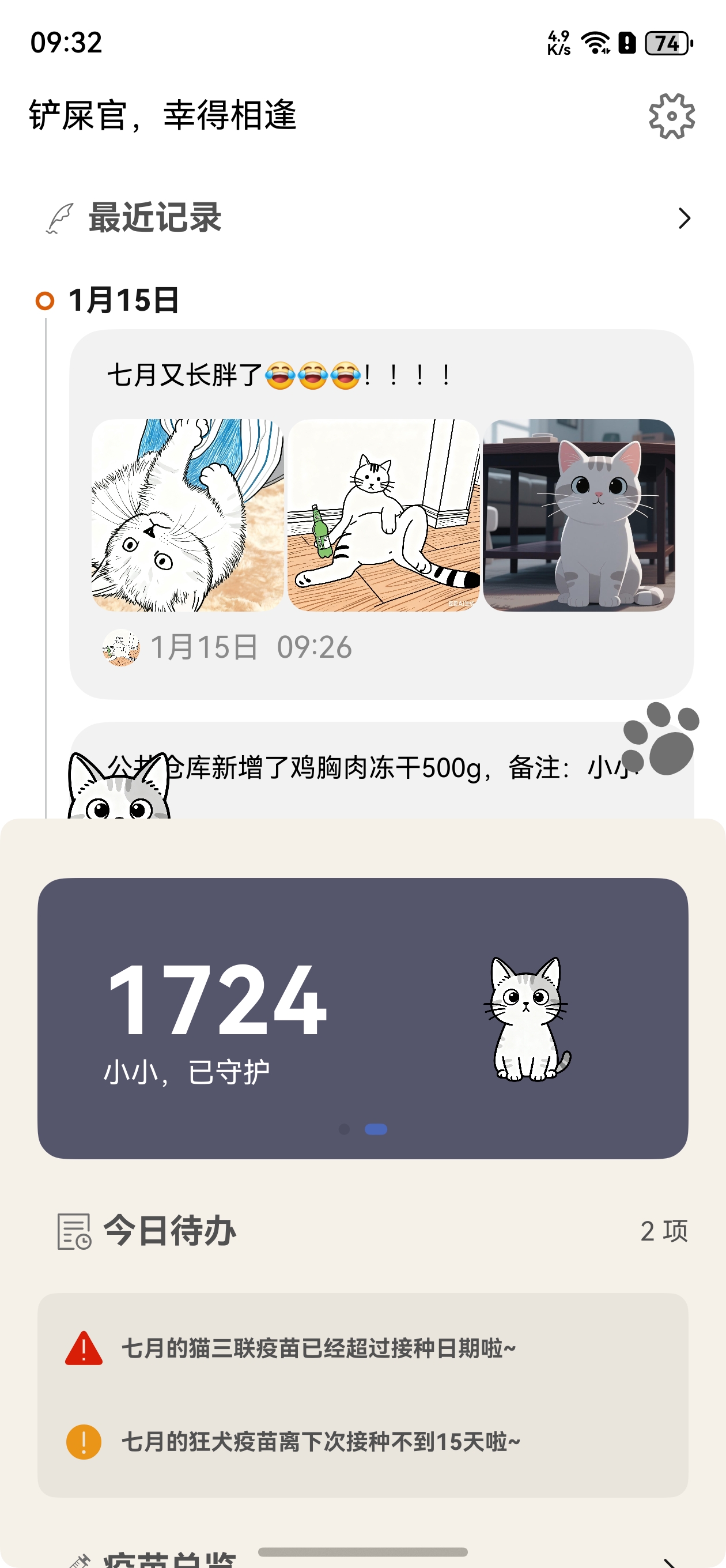
站内没法传GIF,动态丝滑效果咱直接戳链接看~不管是组件市场、代码仓库,还是直接下载喵屿APP看首页实景效果,都随你挑!
喵屿下载链接
二 上手使用,手残党也能秒会
本示例基于底部抽屉滑动效果案例开发,这个组件主打底部列表分阶抽屉式滑动,还能联动齿轮旋转、浮动按钮跟随,几步就能集成到你的鸿蒙项目里~
下载安装
两步搞定安装,零门槛上手:
- 用ohpm一键装包,终端敲这行就行:
ohpm install bottomdrawerslideplus
- 在你的ets文件里导入组件,想用的功能都在这:
import { BottomDrawer, BottomDrawerHeight, TopTitle } from 'bottomdrawerslideplus';
快速使用
BottomDrawer 快速实现抽屉滑动
核心就是一个抽屉组件,列表还能自定义,超灵活:
- 先建点初始列表数据,随便造几个项就行:
const LIST_ITEM: SettingItem[] = [
  new SettingItem('list_item_id_first'),
  new SettingItem('list_item_id_second'),
  new SettingItem('list_item_id_third'),
  new SettingItem('list_item_id_fourth'),
  new SettingItem('list_item_id_fifth'),
  new SettingItem('list_item_id_sixth'),
  new SettingItem('list_item_id_seventh'),
  new SettingItem('list_item_id_eighth'),
  ];
- 直接把BottomDrawer怼到布局里,listBuilder自定义你的列表,其他参数传好就行:
 BottomDrawer({
  searchAddress: this.searchAddress,
  listBuilder: this.listBuilder,
  isShow: this.isShow,
  bottomDrawerHeight: this.bottomDrawerHeight
})
BottomDrawer 属性说明
这些属性按需传,主打一个精准控制:
| 属性 | 类型 | 释义 | 默认值 |
|---|---|---|---|
| searchBuilder | ()=>void | 搜索视图 | - |
| listBuilder | ()=>void | 列表视图(可自定义) | - |
| isShow | boolean | 控制标题栏是否显示 | false |
| bottomDrawerHeight | BottomDrawerHeight | 抽屉分阶高度配置 | false |
TopTitle 快速实现顶部标题栏
顶部标题栏自带浮动按钮、设置按钮,还能和抽屉联动,直接用就行:
- 把TopTitle组件加到布局里,传好图标、事件,剩下的交给组件:
TopTitle({
  isShow: this.isShow,
  windowHeight: this.windowHeight,
  windowWidth: this.windowWidth,
  listHeight: this.listHeight,
  bottomDrawerHeight: this.bottomDrawerHeight,
  floatIcon: $r("app.media.icon"),
  settingIcon: $r("app.media.setting"),
  onFloatClick: () => {
    // 浮动按钮点击事件处理
    promptAction.showToast({
      message: $r("app.string.bottomdrawerslidecase_promotion"),
      duration: 2000
    })
  },
  onSettingClick: () => {
    // 设置按钮点击事件处理
    promptAction.showToast({
      message: $r("app.string.bottomdrawerslidecase_promotion"),
      duration: 2000
    })
  }
})
TopTitle 属性说明
每个属性都有明确作用,按需配置不踩坑:
| 属性 | 类型 | 释义 | 默认值 |
|---|---|---|---|
| windowHeight | number | 窗口高度 | - |
| windowWidth | number | 窗口宽度 | - |
| isShow | boolean | 控制顶部标题栏是否显示 | false |
| listHeight | number | 列表高度 | - |
| bottomDrawerHeight | BottomDrawerHeight | 抽屉组件分阶高度配置 | - |
| floatIcon | Resource | 浮动按钮图标资源 | - |
| settingIcon | Resource | 设置按钮图标资源 | - |
| onFloatClick | ()=>void | 浮动按钮点击事件 | - |
| onSettingClick | ()=>void | 设置按钮点击事件 | - |
实现思路,揭秘丝滑效果的底层逻辑
看似复杂的动效,其实都是靠基础API组合实现的,核心就5点,看完你也能复刻~
- 布局巧设计,列表藏底部
用RelativeContainer+Stack组合布局,让列表乖乖待在页面底部,还能实现「列表滑到顶部,标题栏自动显示」的效果,布局层级一目了然:
Stack({ alignContent: Alignment.TopStart }) {
  RelativeContainer() {
    // Image地图
    ImageMapView()
    // 底部可变分阶段滑动列表
    BottomDrawer({
      searchAddress: this.searchAddress,
      listBuilder: this.listBuilder,
      isShow: this.isShow,
      bottomDrawerHeight: this.bottomDrawerHeight
    }).id('scrollPart')
      .alignRules({
        'bottom': { 'anchor': '__container__', 'align': VerticalAlign.Bottom },
        'left': { 'anchor': '__container__', 'align': HorizontalAlign.Start },
        'right': { 'anchor': '__container__', 'align': HorizontalAlign.End },
      })
  }
  TopTitle({
    isShow: this.isShow
  })
    .id('title_bar')
}
- 手势监听,判断上下滑
给List加手势控制,记录手指按下的纵坐标,滑动时实时对比坐标,精准判断你是上滑还是下滑,组件的“感知力”就来自这:
Column() {
  List(){
    ...
  }
}.gesture(
  // 以下组合手势为顺序识别,当长按手势事件未正常触发时则不会触发拖动手势事件
   GestureGroup(GestureMode.Sequence,
     PanGesture()
       .onActionStart((event: GestureEvent) => {
         this.yStart = event.offsetY;
      })
       .onActionUpdate((event: GestureEvent) => {
         const yEnd = event.offsetY; // 手指离开屏幕的纵坐标
         const height = Math.abs(Math.abs(yEnd) - Math.abs(this.yStart)); // 手指在屏幕上的滑动距离
         if (yEnd < this.yStart) {
           this.isUp = true;
           const temHeight = this.listHeight + height;
           if (temHeight >= this.bottomDrawerHeight.maxHeight) {
             this.isScroll = true;
             this.isShow = true;
             this.listHeight = this.bottomDrawerHeight.maxHeight;
           } else {
             this.isScroll = false;
             this.listHeight = temHeight;
           }
         }
         // 判断下滑,且list跟随手势滑动
         else {
           this.isUp = false;
           const temHeight = this.listHeight - height;
           if (this.itemNumber === 0) {
             // 列表高度随滑动高度变化
             this.listHeight = temHeight;
           } else {
             this.listHeight = this.bottomDrawerHeight.maxHeight;
           }
         }
         this.yStart = event?.offsetY;
      })
       .onActionEnd(() => {
         ...
       })
   )
 )
- 滑动实时响应,列表高度跟着变
手指滑动时,根据滑动距离实时计算并修改列表高度,让列表跟着手势走,上滑增高、下滑变矮,手感超跟手:
this.isScroll = false;
this.listHeight = temHeight;
- 手指松开自动归位,实现分阶滑动
这是抽屉分阶的核心!手指松开后,组件会判断当前列表高度在哪个预设区间,自动把列表归位到最小/中间/最大高度,不用精准滑动,松手就到位,懒人友好:
.onActionEnd(() => {
  if (this.isUp) {
    // 分阶段滑动,当list高度位于第一个item和第二个item之间时,滑动到第二个item
    if (this.listHeight > this.bottomDrawerHeight.minHeight &&
      this.listHeight <= this.bottomDrawerHeight.middleHeight + this.bottomAvoidHeight) {
      this.listHeight = this.bottomDrawerHeight.middleHeight;
      this.isScroll = false;
      this.isShow = false;
      return;
    }
    // 分阶段滑动,当list高度位于顶部和第二个item之间时,滑动到页面顶部
    else if (this.bottomDrawerHeight.middleHeight + this.bottomAvoidHeight < this.listHeight &&
      this.listHeight <= this.bottomDrawerHeight.maxHeight) {
      this.listHeight = this.bottomDrawerHeight.maxHeight;
      this.isShow = true;
      return;
    }
  }
  // 列表下滑时,分阶段滑动
  else {
    if (this.listHeight === this.bottomDrawerHeight.maxHeight) {
      this.isShow = true;
      this.isScroll = true;
      this.listHeight = this.bottomDrawerHeight.maxHeight;
    }
    // 分阶段滑动,当list高度位于顶部和第二个item之间时,滑动到第二个item
    else if (this.listHeight >=
    this.bottomDrawerHeight.middleHeight &&
      this.listHeight <= this.bottomDrawerHeight.maxHeight) {
      this.listHeight =
        this.bottomDrawerHeight.middleHeight;
      this.isShow = false;
      this.isScroll = false;
      return;
    }
    // 分阶段滑动,当list高度位于第一个item和第二个item之间时,滑动到第一个item
    else if (this.listHeight <=
      this.bottomDrawerHeight.middleHeight + this.bottomAvoidHeight ||
      this.listHeight <= this.bottomDrawerHeight.minHeight) {
      this.listHeight = this.bottomDrawerHeight.minHeight;
      this.isShow = false;
      this.isScroll = false;
      return;
    }
  }
})
- 标题栏动效,浮动按钮超灵动
顶部的浮动按钮不是固定的,会跟着抽屉滑动改变位置、缩放大小、淡入淡出,还加了动画过渡,飘移动效拉满:
Image(this.floatIcon)
  .width(35)
  .height(35)
  //通过标题栏的显示状态控制图片缩放
  .scale({ x: (this.isShow && this.showClaw) ? 1 : 1.7, y: (this.isShow && this.showClaw) ? 1 : 1.7 })
  .draggable(false)
  .clickEffect({ level: ClickEffectLevel.HEAVY, scale: 0.5 })
  .opacity(this.showClaw ? 1 : 0)
  .margin({
    right: $r("app.integer.bottomdrawerslidecase_number_15"),
  })
  //通过跟随this.listHeight变化控制图片位置,通过动画时长来实现延迟漂浮效果
  .position((this.isShow || !this.showClaw) ? null :
    { x: this.windowWidth - 50, y: this.windowHeight - this.listHeight - 95 })
  .animation({
    duration: 1000, // 动画持续时间,单位毫秒
    curve: Curve.EaseOut, // 动画曲线
    iterations: 1, // 动画播放次数
    playMode: PlayMode.Normal// 动画播放模式
  })
  .onClick(() => {
    this.onFloatClick()
  })
三 浮动按钮跟随详解,打造灵动交互
浮动按钮的跟随效果是组件的亮点之一,看似复杂,其实就是靠几个属性联动实现的,代码不动,咱拆解下细节~
Image(this.floatIcon)
  .width(35)
  .height(35)
  //通过标题栏的显示状态控制图片缩放
  .scale({ x: (this.isShow && this.showClaw) ? 1 : 1.7, y: (this.isShow && this.showClaw) ? 1 : 1.7 })
  .draggable(false)
  .clickEffect({ level: ClickEffectLevel.HEAVY, scale: 0.5 })
  .opacity(this.showClaw ? 1 : 0)
  .margin({
    right: $r("app.integer.bottomdrawerslidecase_number_15"),
  })
  //通过跟随this.listHeight变化控制图片位置,通过动画时长来实现延迟漂浮效果
  .position((this.isShow || !this.showClaw) ? null :
    { x: this.windowWidth - 50, y: this.windowHeight - this.listHeight - 95 })
  .animation({
    duration: 1000, // 动画持续时间,单位毫秒
    curve: Curve.EaseOut, // 动画曲线
    iterations: 1, // 动画播放次数
    playMode: PlayMode.Normal// 动画播放模式
  })
  .onClick(() => {
    this.onFloatClick()
  })
按钮双状态切换,丝滑不卡顿
按钮有两个核心状态:标题栏常驻状态、页面漂浮状态,切换全靠参数控制,效果超自然:
- 缩放控制:靠
isShow(标题栏显隐)+showClaw(首屏延迟显示)联动,抽屉下滑时按钮放大1.7倍,回到标题栏就恢复原大小; - 点击反馈:加了
ClickEffectLevel.HEAVY,点击时缩小到0.5倍,手感直接拉满; - 淡入淡出:
opacity绑定showClaw,首屏延迟显示,后续全程可见,避免突兀。
位置跟随核心,跟着抽屉跑不迷路
按钮能精准跟随抽屉,关键在position属性:
通过windowWidth(窗口宽)、windowHeight(窗口高)+实时变化的listHeight(列表高度)计算坐标,抽屉滑多少,按钮的y轴坐标就变多少,实现“抽屉走到哪,按钮跟到哪”。
动画加持,漂浮感拉满
所有属性变化都加了1000ms动画,曲线用Curve.EaseOut(慢出),让按钮的移动、缩放不是“硬跳”,而是慢慢过渡,完美营造出“漂浮”的视觉效果。
四 齿轮联动,小细节拉满体验
齿轮图标会跟着抽屉滑动旋转,还能响应触摸事件,小细节让交互更有趣,动画时长和按钮保持同步,丝滑度一致~
		Image(this.settingIcon)
            .width(28)
            .height(28)
            .draggable(false)
            .margin({
              right: $r("app.integer.bottomdrawerslidecase_number_15"),
            })
            //.opacity(this.isShow ? 1 : 0)
            .rotate({ angle: this.angle })
            // 增加动画效果
            .animation({
              duration: 1000,
              curve: Curve.EaseOut,
              iterations: 1, // 动画播放次数
              playMode: PlayMode.Normal// 动画播放模式
            })
            .onClick(() => {
              this.onSettingClick()
            })
            .onTouch((event?: TouchEvent) => {
              if (event) {
                if (event.type === TouchType.Down) {
                  this.angle += 90;
                }
                if (event.type === TouchType.Up) {
                  this.angle -= 90
                }
              }
            })
核心实现两点,简单又好玩
- 滑动联动旋转:用
rotate绑定angle变量,抽屉滑动时修改angle,齿轮就会跟着转,动画时长设为1000ms,和浮动按钮保持同步,整体动效更协调; - 触摸触发旋转:加了
onTouch事件,手指按下时齿轮旋转90°,松开时恢复,轻触就有反馈,互动感直接拉满。
五 教程总结
由于通过ohpm直接下载的包里集成了效果图gif,导致体积较大,只建议下载试用。如果需要集成到 项目中建议直接下载源码集成,修改更方便,赶紧拉取代码试试吧~
下载APP查看实际使用效果
喵屿下载链接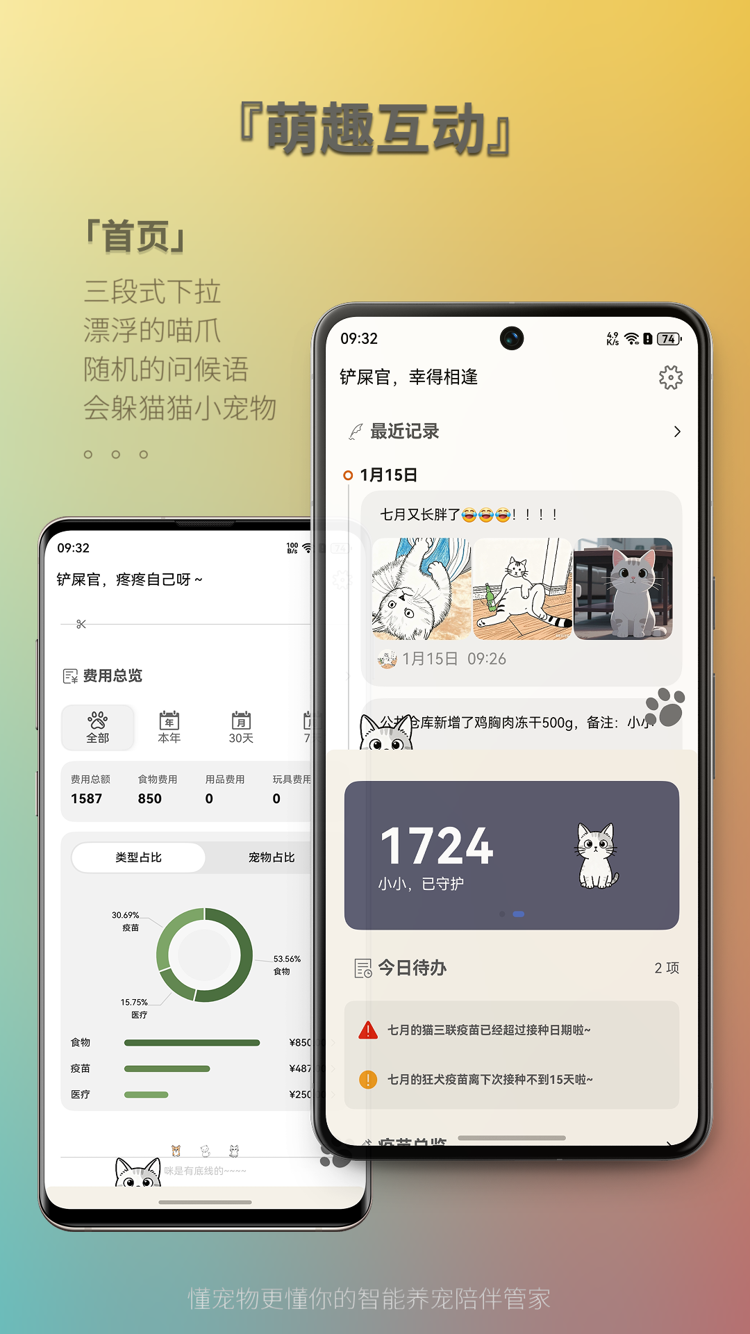

作为“人工智能6S店”的官方数字引擎,为AI开发者与企业提供一个覆盖软硬件全栈、一站式门户。
更多推荐


 26
26 0
0- 0


 已为社区贡献5条内容

所有评论(0)