
鸿蒙应用程序中可以使用Flutter按钮组件FloatingActionButton、IconButton等提升视觉效果
Flutter提供了多种按钮组件,包括ElevatedButton、TextButton、OutlinedButton等,适用于不同交互场景。ElevatedButton是凸起的主要操作按钮,TextButton适合次要操作,OutlinedButton介于两者之间。此外还有IconButton、FloatingActionButton等专用按钮。每种按钮都支持自定义样式,如颜色、内边距、圆角等。
📖 前言
按钮是移动应用中最常用的交互组件之一。Flutter 提供了丰富的按钮组件,包括 ElevatedButton、TextButton、OutlinedButton、IconButton、FloatingActionButton 等,每种按钮都有其特定的使用场景和视觉效果。
🎯 按钮组件概览
Flutter 提供了以下按钮组件:
| 组件名 | 功能说明 | 适用场景 |
|---|---|---|
ElevatedButton |
凸起按钮 | 主要操作按钮 |
TextButton |
文本按钮 | 次要操作、链接式按钮 |
OutlinedButton |
轮廓按钮 | 中等重要性操作 |
IconButton |
图标按钮 | 工具栏、操作栏 |
FloatingActionButton |
悬浮按钮 | 主要操作、快速操作 |
PopupMenuButton |
弹出菜单按钮 | 更多操作菜单 |
ButtonStyleButton |
按钮基类 | 自定义按钮 |
🔘 ElevatedButton 组件
ElevatedButton 是 Material Design 风格的凸起按钮,具有阴影效果,适合作为主要操作按钮。
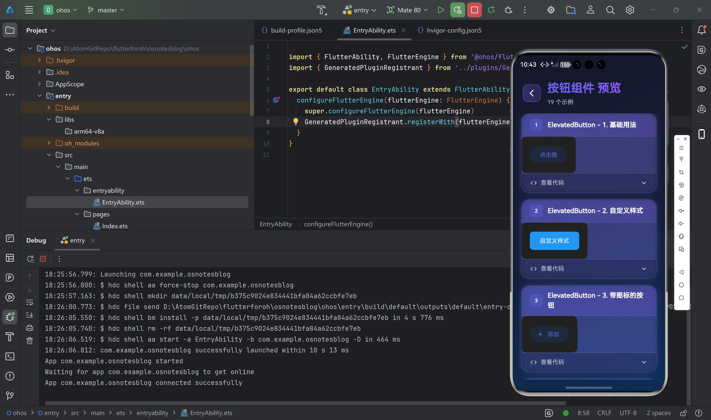
基础用法
ElevatedButton(
  onPressed: () {
    print('按钮被点击');
  },
  child: Text('点击我'),
)
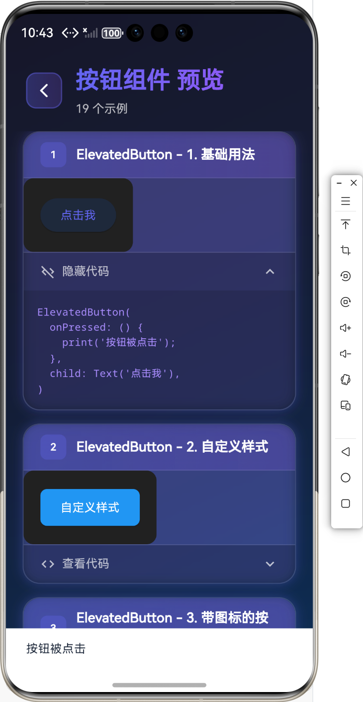
自定义样式
ElevatedButton(
  onPressed: () {},
  style: ElevatedButton.styleFrom(
    primary: Colors.blue,
    onPrimary: Colors.white,
    padding: EdgeInsets.symmetric(horizontal: 24, vertical: 12),
    shape: RoundedRectangleBorder(
      borderRadius: BorderRadius.circular(8),
    ),
  ),
  child: Text('自定义样式'),
)
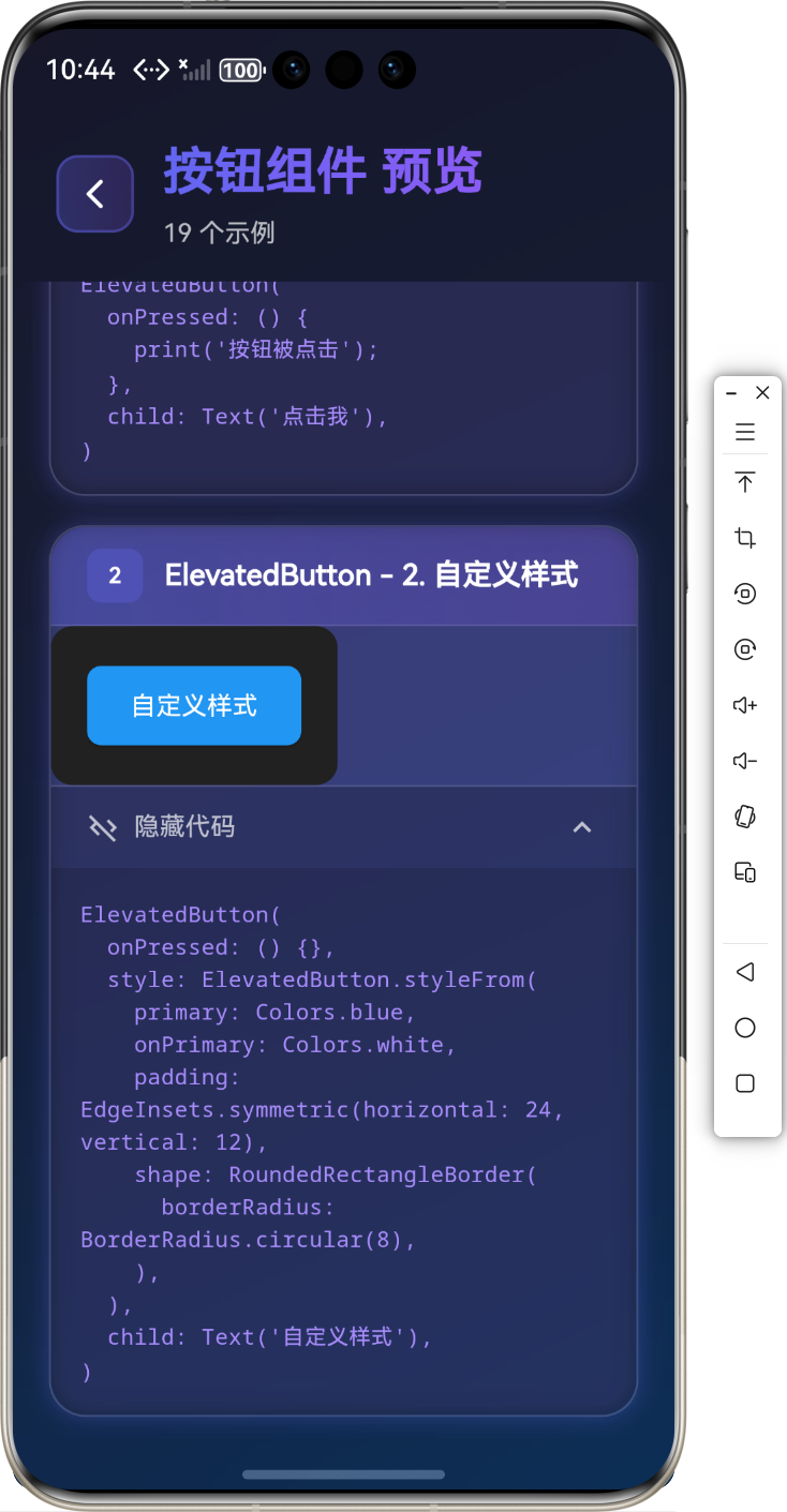
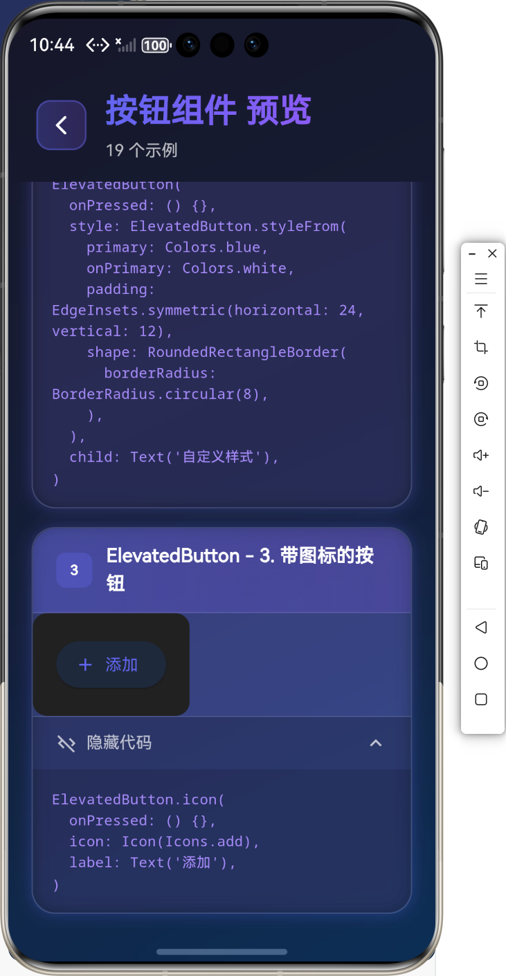
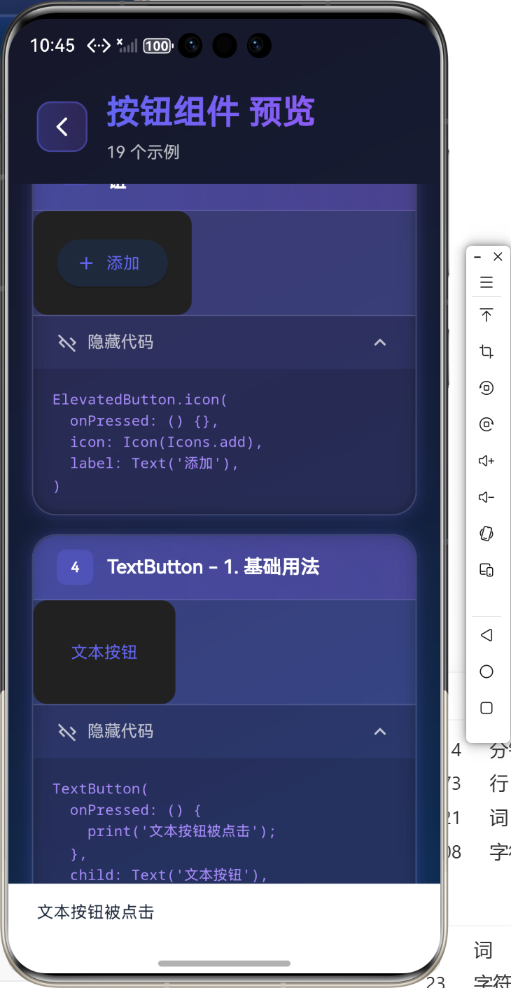
带图标的按钮
ElevatedButton.icon(
  onPressed: () {},
  icon: Icon(Icons.add),
  label: Text('添加'),
)
📝 TextButton 组件
TextButton 是扁平化的文本按钮,没有背景和阴影,适合次要操作。
基础用法
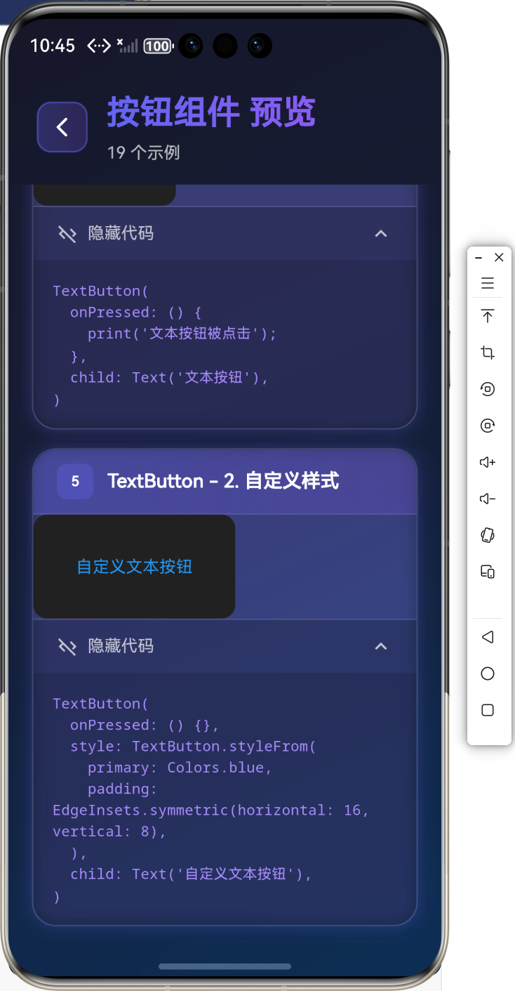
TextButton(
  onPressed: () {
    print('文本按钮被点击');
  },
  child: Text('文本按钮'),
)
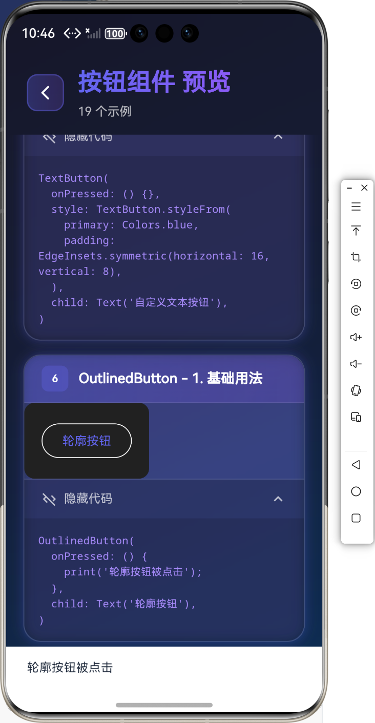
自定义样式
TextButton(
  onPressed: () {},
  style: TextButton.styleFrom(
    primary: Colors.blue,
    padding: EdgeInsets.symmetric(horizontal: 16, vertical: 8),
  ),
  child: Text('自定义文本按钮'),
)
🔲 OutlinedButton 组件
OutlinedButton 是带轮廓的按钮,介于 ElevatedButton 和 TextButton 之间。
基础用法
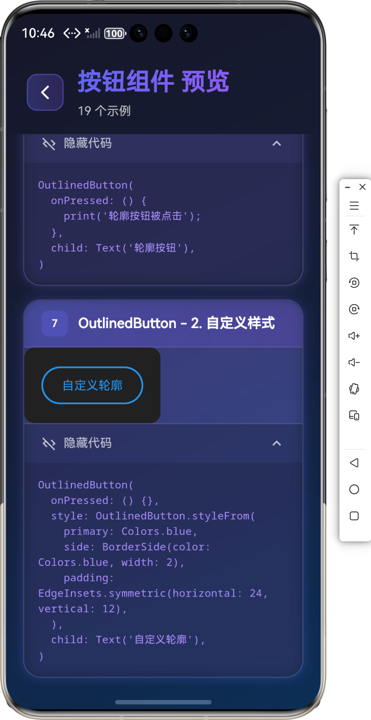
OutlinedButton(
  onPressed: () {
    print('轮廓按钮被点击');
  },
  child: Text('轮廓按钮'),
)
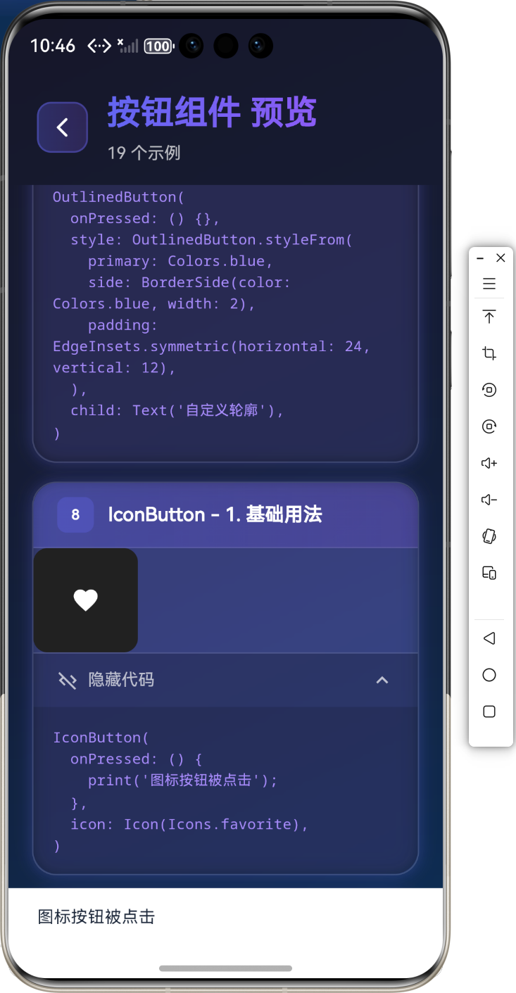
自定义样式
OutlinedButton(
  onPressed: () {},
  style: OutlinedButton.styleFrom(
    primary: Colors.blue,
    side: BorderSide(color: Colors.blue, width: 2),
    padding: EdgeInsets.symmetric(horizontal: 24, vertical: 12),
  ),
  child: Text('自定义轮廓'),
)
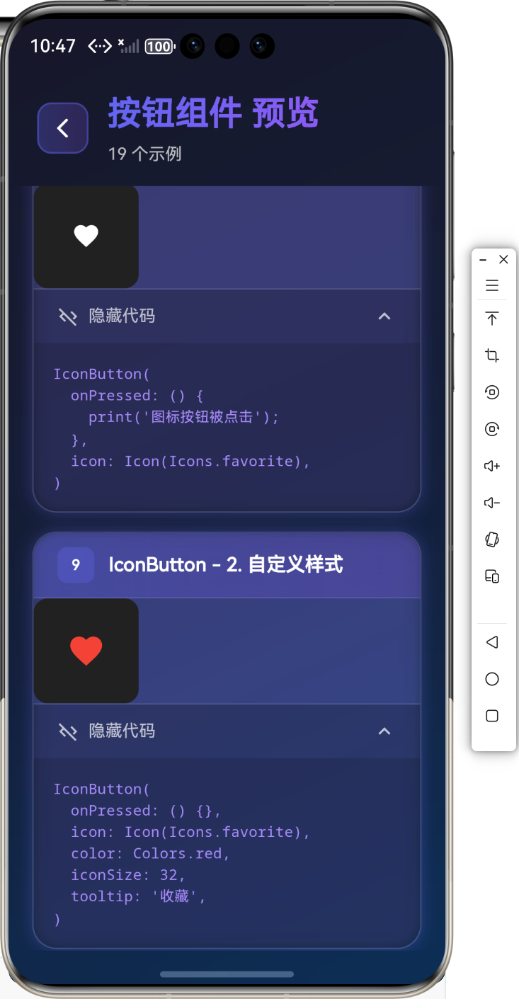
🎯 IconButton 组件
IconButton 是只显示图标的按钮,常用于工具栏和操作栏。
基础用法
IconButton(
  onPressed: () {
    print('图标按钮被点击');
  },
  icon: Icon(Icons.favorite),
)
自定义样式
IconButton(
  onPressed: () {},
  icon: Icon(Icons.favorite),
  color: Colors.red,
  iconSize: 32,
  tooltip: '收藏',
)
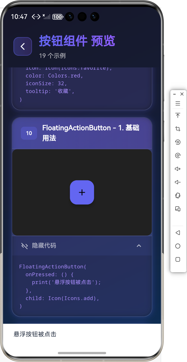
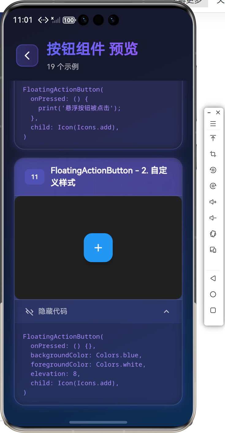
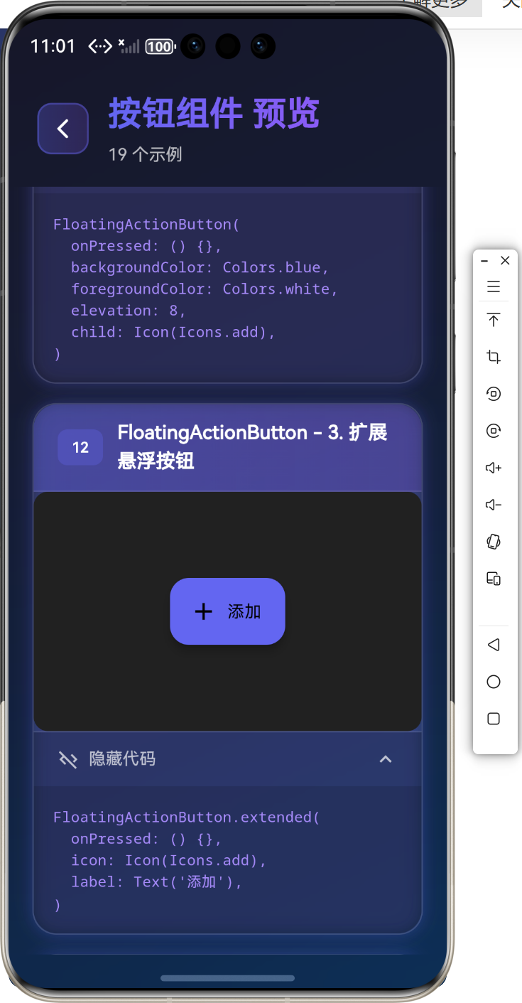
➕ FloatingActionButton 组件
FloatingActionButton 是悬浮在界面上的圆形按钮,通常用于主要操作。
基础用法
FloatingActionButton(
  onPressed: () {
    print('悬浮按钮被点击');
  },
  child: Icon(Icons.add),
)
自定义样式
FloatingActionButton(
  onPressed: () {},
  backgroundColor: Colors.blue,
  foregroundColor: Colors.white,
  elevation: 8,
  child: Icon(Icons.add),
)
扩展悬浮按钮
FloatingActionButton.extended(
  onPressed: () {},
  icon: Icon(Icons.add),
  label: Text('添加'),
)
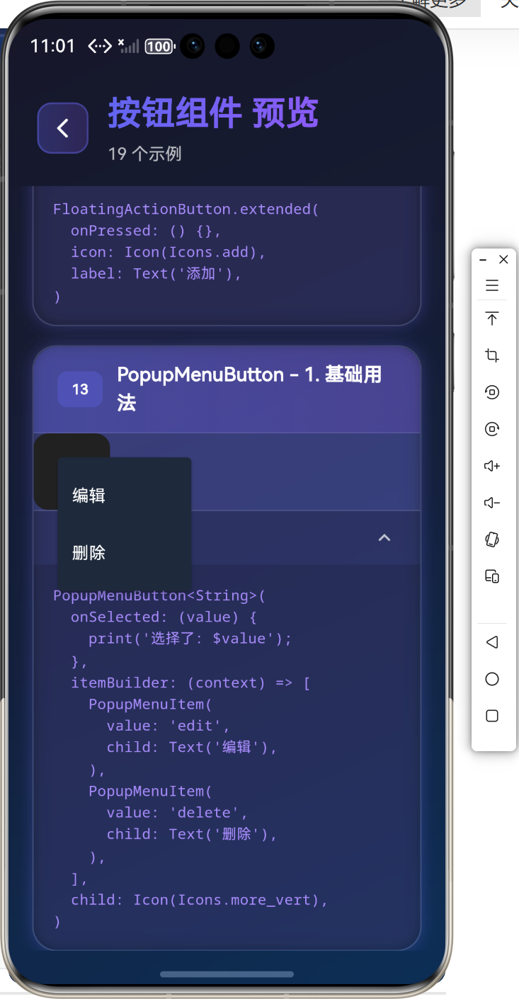
📋 PopupMenuButton 组件
PopupMenuButton 是弹出菜单按钮,点击后显示菜单选项。
基础用法
PopupMenuButton<String>(
  onSelected: (value) {
    print('选择了: $value');
  },
  itemBuilder: (context) => [
    PopupMenuItem(
      value: 'edit',
      child: Text('编辑'),
    ),
    PopupMenuItem(
      value: 'delete',
      child: Text('删除'),
    ),
  ],
  child: Icon(Icons.more_vert),
)
💡 实际应用场景
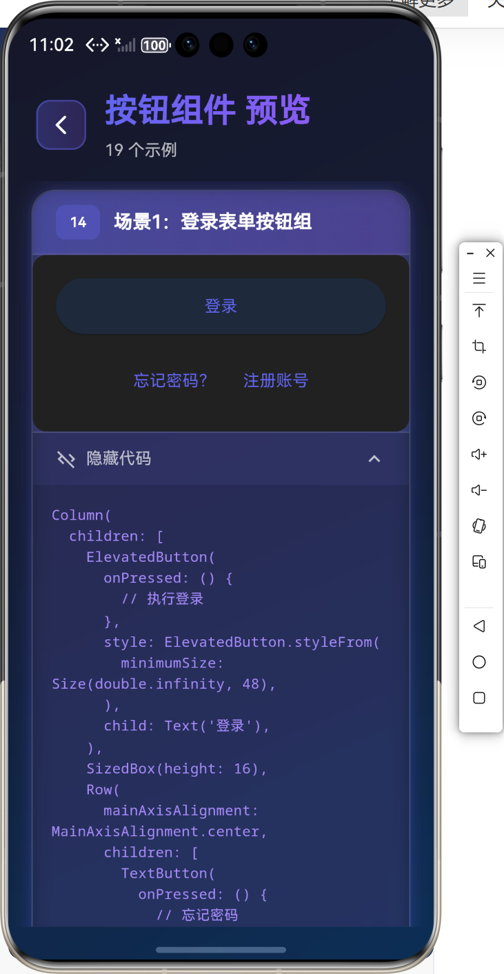
场景1:登录表单按钮组
Column(
  children: [
    ElevatedButton(
      onPressed: () {
        // 执行登录
      },
      style: ElevatedButton.styleFrom(
        minimumSize: Size(double.infinity, 48),
      ),
      child: Text('登录'),
    ),
    SizedBox(height: 16),
    Row(
      mainAxisAlignment: MainAxisAlignment.center,
      children: [
        TextButton(
          onPressed: () {
            // 忘记密码
          },
          child: Text('忘记密码?'),
        ),
        TextButton(
          onPressed: () {
            // 注册
          },
          child: Text('注册账号'),
        ),
      ],
    ),
  ],
)
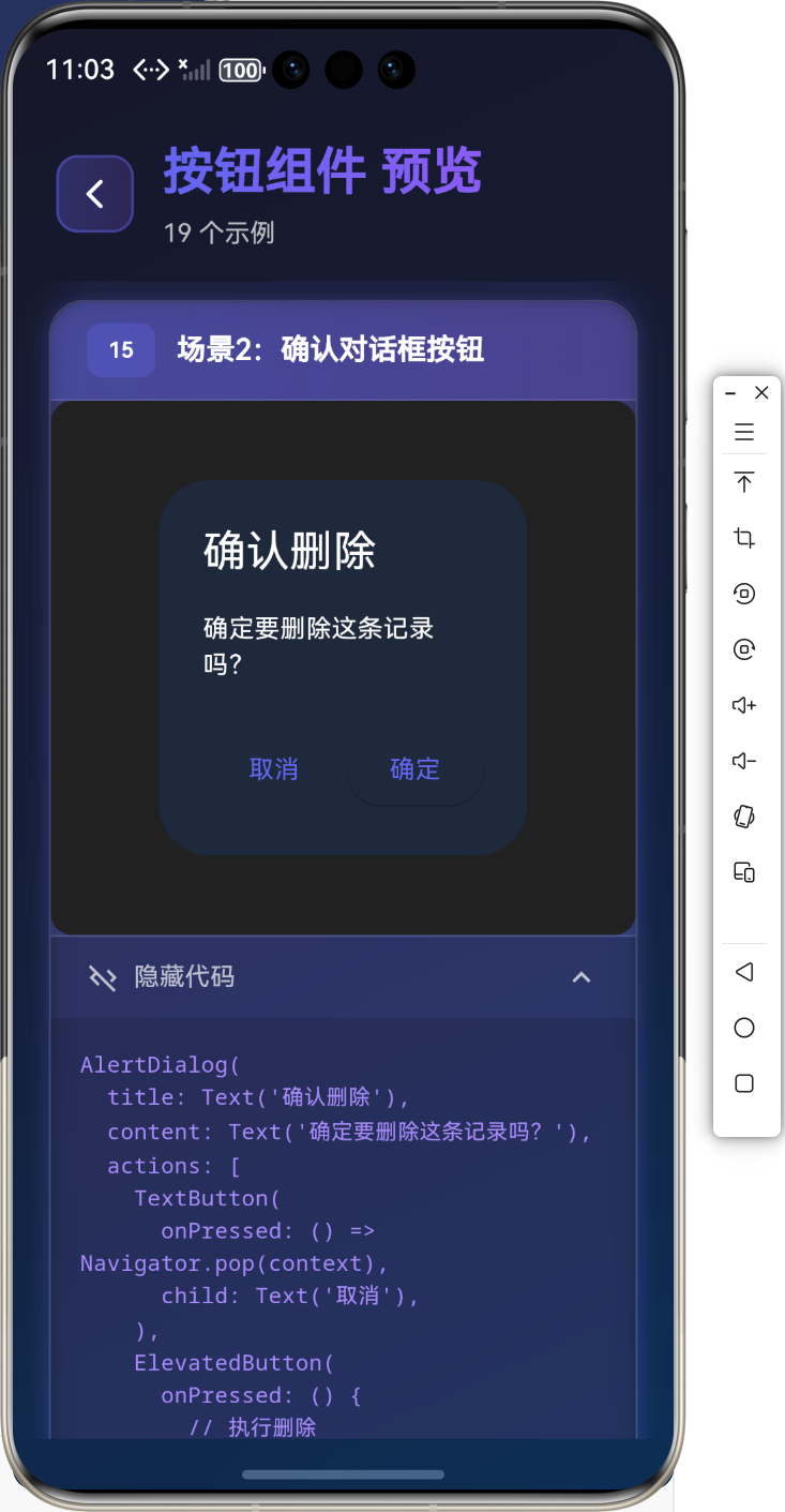
场景2:确认对话框按钮
AlertDialog(
  title: Text('确认删除'),
  content: Text('确定要删除这条记录吗?'),
  actions: [
    TextButton(
      onPressed: () => Navigator.pop(context),
      child: Text('取消'),
    ),
    ElevatedButton(
      onPressed: () {
        // 执行删除
        Navigator.pop(context);
      },
      child: Text('确定'),
    ),
  ],
)
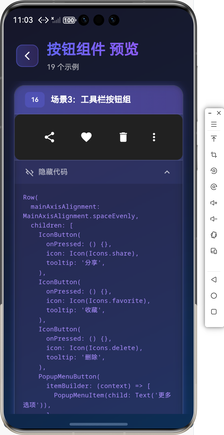
场景3:工具栏按钮组
Row(
  mainAxisAlignment: MainAxisAlignment.spaceEvenly,
  children: [
    IconButton(
      onPressed: () {},
      icon: Icon(Icons.share),
      tooltip: '分享',
    ),
    IconButton(
      onPressed: () {},
      icon: Icon(Icons.favorite),
      tooltip: '收藏',
    ),
    IconButton(
      onPressed: () {},
      icon: Icon(Icons.delete),
      tooltip: '删除',
    ),
    PopupMenuButton(
      itemBuilder: (context) => [
        PopupMenuItem(child: Text('更多选项')),
      ],
    ),
  ],
)
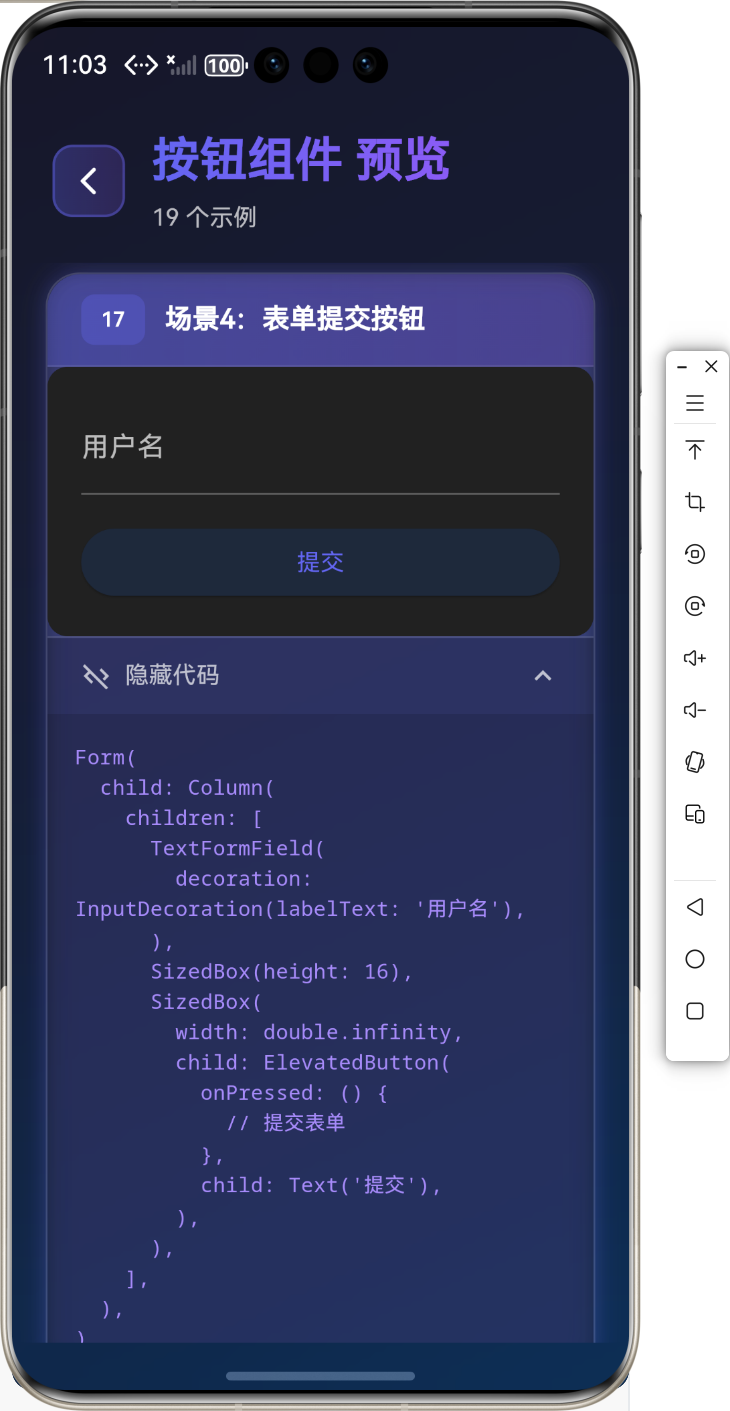
场景4:表单提交按钮
Form(
  child: Column(
    children: [
      TextFormField(
        decoration: InputDecoration(labelText: '用户名'),
      ),
      SizedBox(height: 16),
      SizedBox(
        width: double.infinity,
        child: ElevatedButton(
          onPressed: () {
            // 提交表单
          },
          child: Text('提交'),
        ),
      ),
    ],
  ),
)
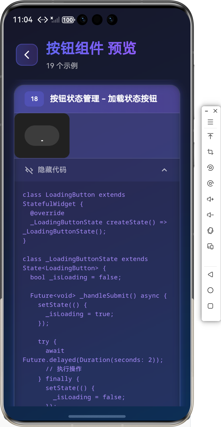
🎨 按钮状态管理
加载状态按钮
class LoadingButton extends StatefulWidget {
_LoadingButtonState createState() => _LoadingButtonState();
}
class _LoadingButtonState extends State<LoadingButton> {
bool _isLoading = false;
Future<void> _handleSubmit() async {
setState(() {
_isLoading = true;
});
try {
await Future.delayed(Duration(seconds: 2));
// 执行操作
} finally {
setState(() {
_isLoading = false;
});
}
}
Widget build(BuildContext context) {
return ElevatedButton(
onPressed: _isLoading ? null : _handleSubmit,
child: _isLoading
? SizedBox(
width: 20,
height: 20,
child: CircularProgressIndicator(
strokeWidth: 2,
valueColor: AlwaysStoppedAnimation<Color>(Colors.white),
),
)
: Text('提交'),
);
}
}
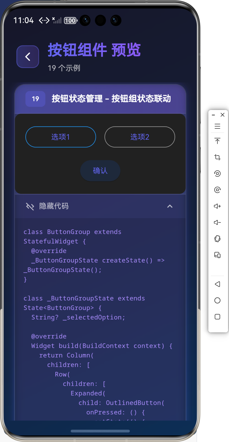
按钮组状态联动
class ButtonGroup extends StatefulWidget {
_ButtonGroupState createState() => _ButtonGroupState();
}
class _ButtonGroupState extends State<ButtonGroup> {
String? _selectedOption;
Widget build(BuildContext context) {
return Column(
children: [
Row(
children: [
Expanded(
child: OutlinedButton(
onPressed: () {
setState(() {
_selectedOption = 'option1';
});
},
style: OutlinedButton.styleFrom(
side: BorderSide(
color: _selectedOption == 'option1'
? Colors.blue
: Colors.grey,
),
),
child: Text('选项1'),
),
),
SizedBox(width: 16),
Expanded(
child: OutlinedButton(
onPressed: () {
setState(() {
_selectedOption = 'option2';
});
},
style: OutlinedButton.styleFrom(
side: BorderSide(
color: _selectedOption == 'option2'
? Colors.blue
: Colors.grey,
),
),
child: Text('选项2'),
),
),
],
),
SizedBox(height: 16),
ElevatedButton(
onPressed: _selectedOption == null
? null
: () {
print('选择了: $_selectedOption');
},
child: Text('确认'),
),
],
);
}
}
⚠️ 常见问题与解决方案
问题1:按钮样式不生效
解决方案:
- 确保使用
styleFrom或ButtonStyle - 检查主题设置是否覆盖了按钮样式
- 使用
MaterialStateProperty处理不同状态
问题2:按钮点击区域太小
解决方案:
- 使用
minimumSize设置最小尺寸 - 增加
padding值 - 使用
SizedBox包裹按钮
问题3:按钮禁用状态不明显
解决方案:
- 使用
MaterialStateProperty自定义禁用状态样式 - 设置合适的
disabledColor和disabledForegroundColor
💼 最佳实践
1. 统一的按钮样式
class AppButtonStyles {
  static ButtonStyle primaryButton = ElevatedButton.styleFrom(
    primary: Colors.blue,
    onPrimary: Colors.white,
    padding: EdgeInsets.symmetric(horizontal: 24, vertical: 12),
    shape: RoundedRectangleBorder(
      borderRadius: BorderRadius.circular(8),
    ),
  );

  static ButtonStyle secondaryButton = OutlinedButton.styleFrom(
    primary: Colors.blue,
    padding: EdgeInsets.symmetric(horizontal: 24, vertical: 12),
  );
}
2. 按钮组件封装
class AppButton extends StatelessWidget {
final String text;
final VoidCallback? onPressed;
final bool isLoading;
const AppButton({
required this.text,
this.onPressed,
this.isLoading = false,
});
Widget build(BuildContext context) {
return ElevatedButton(
onPressed: isLoading ? null : onPressed,
style: AppButtonStyles.primaryButton,
child: isLoading
? SizedBox(
width: 20,
height: 20,
child: CircularProgressIndicator(
strokeWidth: 2,
valueColor: AlwaysStoppedAnimation<Color>(Colors.white),
),
)
: Text(text),
);
}
}
📚 总结
通过本教程,我们学习了:
- ✅
ElevatedButton凸起按钮的使用 - ✅
TextButton文本按钮的使用 - ✅
OutlinedButton轮廓按钮的使用 - ✅
IconButton图标按钮的使用 - ✅
FloatingActionButton悬浮按钮的使用 - ✅
PopupMenuButton弹出菜单按钮的使用 - ✅ 实际应用场景和最佳实践
按钮组件是 Flutter 应用中最常用的交互组件,掌握好这些组件的用法,能够让你的应用交互更加完善和用户友好!
🔗 相关资源
Happy Coding! 🎨✨
欢迎加入开源鸿蒙跨平台社区

作为“人工智能6S店”的官方数字引擎,为AI开发者与企业提供一个覆盖软硬件全栈、一站式门户。
更多推荐

 5
5 0
0- 0


 已为社区贡献20条内容

所有评论(0)