
React Native鸿蒙跨平台通过Animated.Value.interpolate实现滚动距离到动画属性的映射
本文介绍了一个基于React Native开发的新闻详情页模块,重点实现了动态头部动画、富文本展示和交互功能。该方案采用纯RN原生技术栈,通过Animated库实现流畅的滚动联动效果,使用useState管理点赞/收藏状态,并采用灵活的Flex布局设计。文章详细拆解了动态头部动画的实现原理,包括滚动监听、插值运算和组件封装等关键技术点,同时阐述了组件化设计、状态驱动UI等React核心开发理念。该
这款基于React Native开发的新闻详情页,是资讯类APP的核心基础模块,核心实现了滚动联动的动态头部、富文本新闻内容展示、点赞/收藏交互、底部固定操作栏等资讯场景高频特性,同时依托RN原生Animated库实现了流畅的滚动过渡动画,贴合现代移动应用的交互设计规范。该页面全程基于RN原生组件与动画API开发,无第三方库依赖,代码轻量且可维护性强,为鸿蒙(HarmonyOS)ArkTS跨端适配提供了低改造成本的基础。本文将从RN端核心技术实现入手,拆解Animated滚动联动动画、动态样式交互、响应式布局设计、组件化内容渲染等关键技术点,再结合鸿蒙ArkTS的声明式UI与动画特性,梳理动画逻辑迁移、组件等价映射、状态管理对齐、布局样式兼容的完整跨端路径,为资讯类模块的跨端开发提供可复用的解决方案。
一、React Native端
该新闻详情页严格遵循React生态组件化、状态驱动UI、单向数据流的核心原则,同时结合资讯类页面的交互特点,重点打造了滚动联动的动态头部动画这一核心体验,所有功能均由RN基础组件+原生动画API组合实现,动画逻辑与业务逻辑解耦,样式与布局分离,完全贴合资讯类APP的业务需求。
1. 轻量封装
页面的基础层由全局图标库、设备尺寸工具、模拟新闻数据组成,均以纯常量/对象形式封装,与业务逻辑完全解耦,这种设计让跨端迁移时基础层可实现100%无修改或少量修改复用,大幅提升跨端效率。
- 全局图标库ICONS:以键值对形式封装了海量通用emoji图标,替代传统SVG/图片图标,减少应用资源包体积和网络加载开销。虽本页面直接在代码中写入了emoji图标(如👁️、💬),但该图标库为后续功能扩展(如更多操作、分类图标)提供了统一支撑,且纯字符形式的图标在跨端时可100%无差异复用,无需考虑资源适配问题;
- 设备尺寸工具:通过
Dimensions.get('window')同时获取设备屏幕宽度和高度,为动态头部的高度计算、ScrollView的 marginTop 定位提供动态依据,让布局在不同尺寸设备上都能保持一致的展示效果,是RN端实现多设备适配的核心技巧; - 模拟新闻数据NEWS_DATA:以对象形式封装了新闻详情的所有核心字段(标题、作者、发布时间、内容、图片、阅读量等),字段设计贴合资讯类APP的实际业务场景,跨端迁移时仅需将模拟数据替换为真实接口请求,数据结构可100%复用。
// 全局设备尺寸获取,为动态头部和布局定位提供基础
const { width, height } = Dimensions.get('window');
// 模拟新闻数据,贴合资讯类APP实际业务字段设计
const NEWS_DATA = {
  id: 1,
  title: "科技巨头发布全新AI助手,引领智能时代新潮流",
  author: "张记者",
  publishTime: "2023-10-15 14:30",
  // 其余核心字段...
};
2. 核心动画
滚动联动的动态头部是该页面的核心交互亮点,也是资讯类APP的主流设计风格,本页面依托RN原生Animated库,结合useRef实现滚动位置的实时监听,并通过**插值运算(interpolate)**将滚动距离映射为头部高度、图片透明度、标题透明度的变化,实现流畅的滚动过渡动画,全程采用RN原生动画API,无第三方动画库依赖,动画性能贴合原生应用体验。
- 滚动位置监听:通过
useRef创建并保存Animated.Value(0)类型的scrollY变量,用于实时存储ScrollView的垂直滚动距离。使用useRef而非useState,是因为Animated.Value的更新无需触发组件重渲染,仅需更新动画值,能大幅提升动画性能,这是RN端实现高性能动画的核心技巧; - 滚动事件绑定:为ScrollView绑定
onScroll事件,通过Animated.event将原生滚动事件的contentOffset.y与scrollY进行绑定,实现滚动距离的实时同步。同时设置scrollEventThrottle={16}(约60帧/秒),保证动画的流畅性,避免因滚动事件触发过于频繁导致的性能问题; - 插值运算实现属性映射:通过
scrollY.interpolate实现滚动距离→动画属性的映射,这是Animated库的核心功能,本页面实现了三个核心属性的动态变化:- 头部高度:滚动距离0→150px时,头部高度从屏幕高度的40%(
height * 0.4)线性变化为80px,超出150px后高度固定(extrapolate: 'clamp'),实现头部的“收缩”效果; - 头部图片透明度:滚动距离0→150px时,透明度从1线性变化为0.3,实现图片的“渐淡”效果;
- 头部标题层透明度:滚动距离0→150px时,透明度从1线性变化为0,实现标题层的“渐隐”效果;
- 头部高度:滚动距离0→150px时,头部高度从屏幕高度的40%(
- 动画组件包裹:使用
Animated.View、Animated.Image包裹需要动态变化的组件,替代原生的View、Image,让组件支持Animated的动态属性,实现动画效果的渲染。
// 创建并保存动画值,useRef保证组件重渲染时动画值不重置
const scrollY = useRef(new Animated.Value(0)).current;
// 头部高度插值运算
const headerHeight = scrollY.interpolate({
  inputRange: [0, 150],
  outputRange: [height * 0.4, 80],
  extrapolate: 'clamp'
});
// ScrollView绑定滚动事件,同步动画值
<ScrollView
  onScroll={Animated.event(
    [{ nativeEvent: { contentOffset: { y: scrollY } } }],
    { useNativeDriver: false }
  )}
  scrollEventThrottle={16}
>
3. 状态管理
该页面的核心交互为点赞/收藏的状态切换与样式反馈,全程采用React原生useState实现局部状态管理,无全局状态、无状态管理库依赖,完全贴合单页组件的轻量交互需求,也是RN端开发简单交互页面的最佳实践。
- 定义两个核心局部状态:
liked(布尔类型,控制点赞状态,默认false)、bookmarked(布尔类型,控制收藏状态,默认false); - 封装统一的状态切换方法:
handleLike、handleBookmark分别实现点赞、收藏状态的取反更新,方法逻辑简洁,与业务解耦; - 状态驱动样式变化:通过三元表达式将状态与组件样式绑定,实现“未操作→已操作”的视觉反馈:点赞后按钮背景色从
#f0f0f0变为#fee2e2,文字从“🤍 点赞”变为“❤️ 已点赞”且颜色从#666变为#ef4444;收藏后按钮背景色从#f0f0f0变为#fef3c7,文字从“🔘 收藏”变为“🔖 已收藏”且颜色从#666变为#f59e0b。这种“状态→样式”的直接映射,让交互反馈更直观,且代码可读性极强。
// 核心局部状态定义,驱动点赞/收藏交互
const [liked, setLiked] = useState(false);
const [bookmarked, setBookmarked] = useState(false);
// 点赞状态切换方法
const handleLike = () => {
  setLiked(!liked);
};
// 状态驱动样式变化
<TouchableOpacity style={[styles.actionButton, liked && styles.likedButton]} onPress={handleLike}>
  <Text style={[styles.actionButtonText, liked && styles.likedButtonText]}>
    {liked ? '❤️ 已点赞' : '🤍 点赞'}
  </Text>
</TouchableOpacity>
4. 布局设计
页面采用**“固定动态头部+可滚动内容区+固定底部操作栏”的经典资讯详情页布局结构,内部各模块根据业务需求灵活使用Flex横向布局、垂直流式布局、居中布局**,所有布局均由RN原生Flex属性实现,无第三方布局组件,代码简洁且跨平台兼容性强,完美贴合资讯详情页“信息分层陈列、操作触手可及”的展示需求。
- 整体布局:根容器
SafeAreaView设置flex: 1占满整个屏幕,内部分为三部分——Animated.View实现的固定动态头部(设置position: 'absolute'+zIndex: 1,保证始终悬浮在最上层)、ScrollView实现的可滚动内容区(设置marginTop: height * 0.4,避开头部初始位置,保证内容不被遮挡)、View实现的固定底部操作栏(设置borderTopWidth: 1,与内容区做视觉分隔),解决了内容超出屏幕高度的滚动问题,同时SafeAreaView自动适配设备刘海屏、底部虚拟按键,保证内容不被遮挡; - 动态头部布局:采用绝对定位嵌套设计,
Animated.Image作为背景图设置position: 'absolute'+resizeMode: 'cover',实现图片的全屏覆盖;标题层Animated.View设置position: 'absolute'+bottom: 0,实现标题、作者、发布时间的底部对齐,同时设置backgroundColor: 'rgba(0,0,0,0.4)',实现文字与图片的视觉分离,提升文字可读性; - 新闻内容区布局:采用垂直流式布局,内部分为新闻信息栏、新闻内容、操作按钮三部分:
- 新闻信息栏:通过
flexDirection: 'row' + justifyContent: 'space-between'实现分类标签与阅读/评论数的左右分栏,分类标签设置backgroundColor+borderRadius: 15,实现胶囊式样式,贴合资讯类APP的设计规范; - 新闻内容:通过
map方法遍历NEWS_DATA.content数组,动态渲染新闻段落,每个段落设置lineHeight: 26+textAlign: 'justify',提升长篇文本的可读性,同时设置marginBottom: 16,实现段落间的间距分隔; - 操作按钮:通过
flexDirection: 'row' + justifyContent: 'space-around'实现点赞/收藏按钮的等分布局,按钮设置borderRadius: 20,实现圆角样式,提升视觉精致度;
- 新闻信息栏:通过
- 底部操作栏布局:通过
flexDirection: 'row' + justifyContent: 'space-around'实现评论/分享/相关新闻按钮的等分布局,每个按钮设置flex: 1+alignItems: 'center',保证按钮在不同设备上的均匀分布,同时操作栏固定在页面底部,让核心操作始终触手可及。
5. 样式设计
该页面的视觉设计贴合资讯类APP的简约化、轻量化、高可读性主流风格,通过RN原生StyleSheet实现了视觉分层、动态样式、文字分级、操作反馈等设计效果,无复杂的视觉特效,却能大幅提升页面的精致度和用户体验,且所有样式均为跨平台兼容属性,保证iOS和安卓端的视觉效果一致。
- 视觉分层:通过内边距(padding)、外边距(margin)、边框(border)、阴影/透明度的精细化控制,实现模块间、模块内元素的间距分层,如内容区内边距20px、段落间距16px、信息栏底部边框,让页面有充足的“呼吸感”,避免元素拥挤;同时通过
zIndex、绝对定位实现头部、内容区、底部栏的层级分隔,保证滚动时的视觉层次清晰; - 动态样式:为点赞/收藏按钮设计状态关联的动态样式,通过不同的背景色、文字色、文字内容实现操作前后的视觉反馈,让用户能直观感知操作结果,提升交互体验;
- 文字分级:通过字体大小、字重、颜色实现文字层级的清晰区分——头部标题22px粗体白色、新闻段落16px深灰(#333)、辅助文字(作者、时间、阅读量)12/14px中灰/浅灰,让用户可快速捕捉核心信息,同时新闻段落设置
textAlign: 'justify'(两端对齐),提升长篇文本的阅读体验; - 特殊样式设计:分类标签采用胶囊式样式(背景色+圆角+内边距),贴合资讯类APP的分类设计规范;操作按钮采用圆角样式(borderRadius: 20),提升视觉精致度;头部背景图采用
resizeMode: 'cover',保证图片在不同设备上的展示效果,避免拉伸变形; - 跨平台样式兼容:所有样式均使用RN原生跨平台兼容属性,如
resizeMode、flex、borderRadius等,避免使用平台专属样式,保证iOS和安卓端的视觉效果一致。
鸿蒙ArkTS与React Native共享TypeScript语法基础、声明式UI设计思想、组件化开发理念,且两者均以“状态驱动UI”为核心,同时鸿蒙ArkTS提供了原生的动画API(animateTo、PropertyAnimation)和响应式布局能力,为该新闻详情页的跨端适配提供了天然的便利。本次适配遵循**“业务逻辑100%复用、动画逻辑等价迁移、组件结构一一映射、状态管理轻量迁移、视觉与交互完全对齐”的核心原则,整体迁移过程分为基础层复用、状态管理迁移、核心动画逻辑迁移、核心组件等价转换、布局与样式兼容**五个阶段,核心代码复用率超90%,仅需完成少量的语法、组件和动画API调整,即可实现应用在鸿蒙端的无差异落地。
1. 基础层
页面的基础层全局图标库ICONS、模拟新闻数据NEWS_DATA均为纯TypeScript常量/对象,不依赖任何RN原生API,在鸿蒙ArkTS端可直接复制复用,无需任何修改;设备尺寸计算逻辑与RN端完全一致,仅需将RN端的DimensionsAPI替换为鸿蒙端的原生API,即可实现设备屏幕宽度和高度的精准获取,为动态头部的高度计算和布局定位提供基础。
RN端通过Dimensions.get('window').width/height获取屏幕尺寸,鸿蒙ArkTS端通过WindowUtil工具类的getWindowWidth()/getWindowHeight()方法实现完全等价的功能,且鸿蒙端支持装饰器式状态绑定,可实时响应设备尺寸的变化(如屏幕旋转),适配性比RN端更强:
// React Native端:获取屏幕宽高
const { width, height } = Dimensions.get('window');

// 鸿蒙ArkTS端:获取屏幕宽高(支持屏幕旋转实时更新)
import { WindowUtil } from '@kit.ArkUI';
@Entry
@Component
struct NewsDetail {
  // 声明屏幕宽高状态,初始化时获取设备尺寸
  @State screenWidth: number = WindowUtil.getWindowWidth();
  @State screenHeight: number = WindowUtil.getWindowHeight();
}
2. 状态管理
该页面的核心状态管理逻辑为点赞/收藏的状态切换与样式反馈,RN端基于useState实现的局部状态管理,在鸿蒙ArkTS端可通过装饰器实现等价的响应式状态管理,两者的核心思想均为“状态变更触发UI重新渲染”,因此跨端迁移时状态逻辑100%复用,仅需调整状态的定义方式和更新方式。
- 状态定义:RN端通过
useState定义局部状态,鸿蒙ArkTS端在自定义组件中通过@State装饰器定义响应式状态,作用域与RN端完全一致——仅作用于当前页面组件,无状态污染; - 状态更新:RN端通过
useState返回的setter函数更新状态(如setLiked(!liked)),鸿蒙ArkTS端对@State装饰器修饰的状态变量直接赋值即可实现状态更新,且自动触发UI渲染; - 状态驱动样式:RN端通过三元表达式实现状态与样式的绑定,鸿蒙ArkTS端通过条件渲染+样式合并实现完全等价的功能,样式逻辑与RN端完全一致,仅需调整样式的使用方式。
// React Native端:状态定义与切换方法
const [liked, setLiked] = useState(false);
const [bookmarked, setBookmarked] = useState(false);
const handleLike = () => {
  setLiked(!liked);
};

// 鸿蒙ArkTS端:状态定义与切换方法(逻辑完全复用)
@Entry
@Component
struct NewsDetail {
  @State screenWidth: number = WindowUtil.getWindowWidth();
  @State screenHeight: number = WindowUtil.getWindowHeight();
  @State liked: boolean = false; // 点赞状态
  @State bookmarked: boolean = false; // 收藏状态

  // 点赞状态切换方法,与RN端逻辑完全一致
  handleLike(): void {
    this.liked = !this.liked;
  }
}
3. 动画
滚动联动的动态头部是该页面的核心,RN端基于Animated库实现的滚动联动动画,在鸿蒙ArkTS端可通过**Scroll组件的滚动事件监听+属性动画(PropertyAnimation)+插值运算实现完全等价的效果,鸿蒙端的动画API同样支持滚动值映射、属性插值、动画节流**,且与声明式UI深度融合,动画性能与原生应用一致。
(1)滚动位置监听:从Animated.Value到@State变量
RN端通过useRef保存Animated.Value实现滚动位置的实时存储,鸿蒙ArkTS端通过**@State装饰器定义滚动值变量**+Scroll组件的onScroll事件实现完全等价的功能,鸿蒙端的onScroll事件可直接获取滚动距离,无需额外的事件绑定处理,语法更简洁:
// 鸿蒙ArkTS端:定义滚动值状态,初始化为0
@State scrollY: number = 0;
// 滚动事件监听,实时更新滚动值,设置节流保证动画流畅
onScroll(event: ScrollEvent) {
  // 节流处理,与RN端scrollEventThrottle={16}等价
  if (Date.now() - this.lastScrollTime > 16) {
    this.scrollY = event.offsetY;
    this.lastScrollTime = Date.now();
  }
}
(2)插值运算:从interpolate到自定义插值方法
RN端通过Animated.Value.interpolate实现滚动距离到动画属性的映射,鸿蒙ArkTS端无原生的interpolate方法,但可通过自定义插值函数实现完全等价的功能,插值逻辑与RN端完全一致,支持输入范围、输出范围、边界限制(clamp),仅需通过JavaScript代码实现数值的线性映射:
// 鸿蒙ArkTS端:自定义插值函数,实现与RN端interpolate完全等价的功能
interpolate(value: number, inputRange: number[], outputRange: number[], clamp: boolean = true): number {
  const [inputMin, inputMax] = inputRange;
  const [outputMin, outputMax] = outputRange;
  // 边界限制,对应RN端extrapolate: 'clamp'
  if (clamp) {
    if (value <= inputMin) return outputMin;
    if (value >= inputMax) return outputMax;
  }
  // 线性插值计算
  return outputMin + (outputMax - outputMin) * (value - inputMin) / (inputMax - inputMin);
}

// 调用自定义插值函数,计算头部高度、图片透明度、标题透明度
get headerHeight(): number {
  return this.interpolate(this.scrollY, [0, 150], [this.screenHeight * 0.4, 80]);
}
get imageOpacity(): number {
  return this.interpolate(this.scrollY, [0, 150], [1, 0.3]);
}
get titleOpacity(): number {
  return this.interpolate(this.scrollY, [0, 150], [1, 0]);
}
(3)动画渲染:从Animated组件到属性绑定
RN端通过Animated.View、Animated.Image包裹组件实现动画渲染,鸿蒙ArkTS端无需特殊的动画组件,直接将计算后的动画属性(头部高度、透明度)绑定到普通组件的对应属性上,即可实现动画效果的渲染,鸿蒙端的组件会自动监听属性变化并实现流畅的过渡动画,语法比RN端更简洁:
// 鸿蒙ArkTS端:将插值后的动画属性直接绑定到组件上
Column() {
  Image(NEWS_DATA.imageUrl)
    .width('100%')
    .height('100%')
    .objectFit(ImageFit.Cover)
    .opacity(this.imageOpacity) // 绑定图片透明度动画属性
  // 标题层
  Column() {
    Text(NEWS_DATA.title)
      .fontSize(22)
      .fontWeight(FontWeight.Bold)
      .color('#ffffff')
      .lineHeight(28)
    // 作者/时间行
  }
  .width('100%')
  .padding(20)
  .backgroundColor('rgba(0,0,0,0.4)')
  .alignSelf(ItemAlign.End)
  .opacity(this.titleOpacity) // 绑定标题层透明度动画属性
}
.width('100%')
.height(this.headerHeight) // 绑定头部高度动画属性
.position({ top: 0, left: 0, right: 0 }) // 绝对定位,对应RN端position: 'absolute'
.zIndex(1)
4. 核心组件
React Native与鸿蒙ArkTS均采用声明式UI设计,核心组件可实现一一等价映射,且两者的组件使用方式高度相似,因此RN端的所有基础组件均可直接转换为鸿蒙端的同名或等价组件,组件的嵌套结构和业务逻辑完全不变,仅需调整属性名称、语法形式和部分组件的使用方式。该页面中核心组件的等价转换对照表及实现细节如下,覆盖了新闻详情页的所有核心UI场景:
| React Native 组件 | 鸿蒙 ArkTS 组件 | 核心属性/语法转换 | 核心适配点 |
|---|---|---|---|
| SafeAreaView | SafeArea | 直接包裹根组件,无属性转换 | 适配刘海屏、底部安全区,鸿蒙端语法更简洁 |
| View | Column/Row/Stack | style → 链式方法,flexDirection → 直接使用Column/Row | 布局容器,ArkTS按布局方向拆分组件,更贴合页面排版需求 |
| Text | Text | numberOfLines → maxLines,style → 链式方法 | 文本展示,样式属性基本兼容,字重替换为枚举值 |
| TouchableOpacity | 基础组件+onClick+stateStyles | onPress → onClick,activeOpacity → stateStyles自定义按压样式 | 可点击元素,鸿蒙端无原生按压组件,自定义实现等价的按压透明反馈 |
| ScrollView | Scroll | contentContainerStyle → 直接设置子组件样式,onScroll → 滚动事件监听 | 滚动容器,鸿蒙端Scroll组件默认支持垂直滚动,滚动事件可直接获取滚动距离 |
| Image | Image | source={{uri:xxx}} → src=‘xxx’,resizeMode → objectFit | 图片展示,鸿蒙端网络图片加载更高效,支持缓存策略 |
| Animated.View/Image | 普通组件+属性绑定 | Animated.Value → @State变量,interpolate → 自定义插值函数 | 动画组件,鸿蒙端无需特殊动画组件,直接绑定属性即可实现动画 |
| StyleSheet.create | 样式对象+@Styles/@Extend | 直接定义样式对象,部分属性名微调,通过链式方法使用 | 样式管理,鸿蒙端支持装饰器实现样式复用,减少代码冗余 |
真实演示案例代码:
// app.tsx
import React, { useState, useRef } from 'react';
import { SafeAreaView, View, Text, StyleSheet, TouchableOpacity, ScrollView, Image, Animated, Dimensions } from 'react-native';
// 图标库(使用文本替代SVG)
const ICONS = {
home: '🏠',
user: '👤',
message: '✉️',
heart: '❤️',
comment: '💬',
share: '📤',
more: '⋮',
close: '✕',
add: '➕',
edit: '✏️',
delete: '🗑️',
star: '⭐',
bookmark: '🔖',
like: '👍',
dislike: '👎',
favorite: '💖',
gallery: '🖼️',
camera: '📷',
video: '🎥',
play: '▶️',
pause: '⏸️',
forward: '⏭️',
backward: '⏮️',
settings: '⚙️',
info: 'ℹ',
search: '🔍',
filter: '🔍',
sort: '↕️',
menu: '☰',
notification: '🔔',
gift: '🎁',
celebration: '🎉',
smile: '😊',
sad: '😢',
angry: '😠',
surprised: '😲',
thinking: '🤔',
thumbs_up: '👍',
thumbs_down: '👎',
clap: '👏',
wave: '👋',
heart_eyes: '😍',
laughing: '😂',
crying: '😭',
angry_face: '😡',
neutral: '😐',
confused: '😕',
wink: '😉',
tongue: '😛',
sunglasses: '😎',
money_mouth: '🤑',
thinking_face: '🤔',
sleeping: '😴',
dizzy: '😵',
sunglasses_face: '😎',
heart_face: '🥰',
kiss: '😘',
hug: '🤗',
pray: '🙏',
handshake: '🤝',
high_five: '🙌',
peace: '✌️',
ok: '👌',
victory: '✌️',
rock: '🤟',
call_me: '🤙',
point_up: '☝️',
point_down: '👇',
point_left: '👈',
point_right: '👉',
raised_hand: '✋',
raised_fist: '✊',
victory_hand: '✌️',
metal: '🤘',
vulcan: '🖖',
wave_hand: '👋',
clapping_hands: '👏',
open_hands: '👐',
palms_up: '🤲',
handshake_hands: '🤝',
pray_hands: '🙏',
fold_hands: ' folded_hands',
writing_hand: '✍️',
nail_care: '💅',
selfie: '🤳',
flexed_biceps: '💪',
muscle: '💪',
selfie_tone1: ' selfie_tone1',
selfie_tone2: ' selfie_tone2',
selfie_tone3: ' selfie_tone3',
selfie_tone4: ' selfie_tone4',
selfie_tone5: ' selfie_tone5',
selfie_tone6: ' selfie_tone6',
news: '📰',
article: '📄',
headline: '📢',
read: '📖',
subscribe: '🔔',
trending: '📈',
breaking: '🚨',
politics: '🏛️',
business: '💼',
tech: '💻',
science: '🔬',
health: '🏥',
sports: '⚽',
entertainment: '🎬',
lifestyle: '🌟',
travel: '✈️',
food: '🍽️',
nature: '🌿',
weather: '🌤️',
calendar: '📅',
clock: '⏰',
location: '📍',
tag: '🏷️',
category: '📚',
author: '✍️',
views: '👁️',
comments: '💬',
save: '💾',
print: '🖨️',
related: '🔗',
next: '➡️',
prev: '⬅️',
back: '🔙',
forward: '🔜',
reload: '🔄',
refresh: '🔃',
expand: '🔍',
minimize: '_compress',
fullscreen: '⛶',
exit_fullscreen: '⛶',
volume_up: '🔊',
volume_down: '🔉',
volume_mute: '🔇',
brightness_high: '☀️',
brightness_low: '🔅',
dark_mode: '🌙',
light_mode: '☀️',
font_increase: '🔠',
font_decrease: '🔡',
text_align_left: '◀️',
text_align_center: '⏺️',
text_align_right: '▶️',
text_align_justify: '▭▭',
bold: ' đậm',
italic: ' nghiêng',
underline: ' gạch chân',
highlight: ' marker',
link: '🔗',
quote: '❝',
code: '💻',
list_bulleted: '•',
list_numbered: '1.',
checklist: '☑️',
attachment: '📎',
image: '🖼️',
video: '🎬',
audio: '🎵',
document: '📄',
pdf: '📑',
excel: '📊',
word: '📝',
powerpoint: '📽️',
archive: '📦',
zip: '🤐',
rar: ' zipper',
file: '📄',
folder: '📁',
drive: '💾',
cloud: '☁️',
download: '⬇️',
upload: '⬆️',
sync: '🔄',
backup: '💾',
restore: '🔙',
recovery: '🔧',
settings: '⚙️',
preferences: '⚙️',
options: '⚙️',
customize: '🎨',
theme: '🎨',
appearance: '🎨',
layout: '📐',
design: '🎨',
color: '🎨',
background: '🖼️',
wallpaper: '🖼️',
privacy: '🔒',
security: '🛡️',
account: '👤',
profile: '👤',
sign_in: '🔑',
sign_out: '🚪',
register: '📝',
forgot_password: '❓',
reset_password: '🔄',
verification: '✅',
confirm: '✅',
cancel: '❌',
ok: '✅',
yes: '✅',
no: '❌',
accept: '✅',
decline: '❌',
agree: '✅',
disagree: '❌',
enable: '🔛',
disable: '📴',
on: '🔛',
off: '📴',
enabled: '🔛',
disabled: '📴',
active: '🟢',
inactive: '🔴',
online: '🟢',
offline: '🔴',
busy: '🟡',
away: '🟠',
invisible: '⚫',
status: '🔵',
signal: '📶',
network: '🌐',
internet: '🌐',
wifi: '📶',
bluetooth: '📡',
gps: '📍',
location: '📍',
map: '🗺️',
route: '🛣️',
navigation: '🧭',
compass: '🧭',
direction: '🧭',
destination: '🏁',
start: '🏁',
finish: '🏁',
flag: '🏁',
milestone: '🏁',
goal: '🎯',
target: '🎯',
aim: '🎯',
objective: '🎯',
mission: '🎯',
vision: '👁️',
plan: '📋',
strategy: '♟️',
tactics: '⚔️',
war: '⚔️',
battle: '⚔️',
fight: '⚔️',
conflict: '⚔️',
peace: '🕊️',
love: '💕',
friendship: '👭',
family: '👨👩👧👦',
relationship: '💑',
romance: '💏',
marriage: '💍',
wedding: '💒',
divorce: '💔',
separation: '💔',
single: '👤',
couple: '💑',
group: '👥',
team: '👥',
organization: '🏢',
company: '🏢',
corporation: '🏢',
enterprise: '🏢',
business: '💼',
commerce: '💼',
trade: '💼',
market: '🛒',
shop: '🏪',
store: '🏪',
mall: '🏪',
outlet: '🏪',
franchise: '🏪',
brand: '🏷️',
logo: '🏷️',
trademark: '🏷️',
copyright: '©️',
patent: '©️',
license: '©️',
certification: '©️',
award: '🏆',
prize: '🏆',
reward: '🏆',
recognition: '🏆',
achievement: '🏆',
success: '🎉',
celebration: '🎉',
party: '🎉',
festival: '🎉',
holiday: '🎉',
vacation: '🏖️',
rest: '🏖️',
relaxation: '🏖️',
leisure: '🏖️',
fun: '游乐',
game: '🎮',
entertainment: '🎬',
hobby: '🎨',
interest: '🎨',
passion: '🔥',
enthusiasm: '🔥',
energy: '⚡',
power: '⚡',
strength: '💪',
force: '💪',
effort: '💪',
hard_work: '💪',
dedication: '💪',
commitment: '💪',
loyalty: '💪',
faithfulness: '💪',
trust: '🤝',
cooperation: '🤝',
collaboration: '🤝',
partnership: '🤝',
alliance: '🤝',
union: '🤝',
connection: '🤝',
relation: '🤝',
bond: '🤝',
link: '🔗',
chain: '🔗',
tie: '🔗',
rope: '🔗',
thread: '🧵',
string: '🧵',
yarn: '🧵',
fabric: '🧵',
cloth: '🧵',
textile: '🧵',
material: '🧵',
substance: '🧵',
element: '🧵',
component: '🧵',
part: '🧵',
piece: '🧵',
section: '🧵',
segment: '🧵',
portion: '🧵',
fraction: '🧵',
division: '🧵',
split: '🧵',
break: '🧵',
crack: '🧵',
gap: '🧵',
space: '🧵',
interval: '🧵',
distance: '🧵',
range: '🧵',
scope: '🧵',
extent: '🧵',
limit: '🧵',
boundary: '🧵',
edge: '🧵',
border: '🧵',
margin: '🧵',
frame: '🧵',
outline: '🧵',
shape: '🧵',
form: '🧵',
structure: '🧵',
system: '🧵',
framework: '🧵',
model: '🧵',
pattern: '🧵',
template: '🧵',
blueprint: '🧵',
plan: '🧵',
design: '🧵',
architecture: '🧵',
engineering: '🧵',
construction: '🧵',
building: '🧵',
creation: '🧵',
production: '🧵',
manufacturing: '🧵',
industry: '🧵',
sector: '🧵',
field: '🧵',
area: '🧵',
domain: '🧵',
region: '🧵',
territory: '🧵',
zone: '🧵',
sphere: '🧵',
realm: '🧵',
kingdom: '🧵',
empire: '🧵',
nation: '🧵',
country: '🧵',
state: '🧵',
province: '🧵',
city: '🧵',
town: '🧵',
village: '🧵',
community: '🧵',
society: '🧵',
culture: '🧵',
civilization: '🧵',
history: '🧵',
past: '🧵',
present: '🧵',
future: '🧵',
time: '🧵',
moment: '🧵',
second: '🧵',
minute: '🧵',
hour: '🧵',
day: '🧵',
week: '🧵',
month: '🧵',
year: '🧵',
decade: '🧵',
century: '🧵',
millennium: '🧵',
era: '🧵',
period: '🧵',
age: '🧵',
epoch: '🧵',
phase: '🧵',
stage: '🧵',
level: '🧵',
grade: '🧵',
rank: '🧵',
class: '🧵',
type: '🧵',
kind: '🧵',
sort: '🧵',
variety: '🧵',
species: '🧵',
genus: '🧵',
family: '🧵',
order: '🧵',
class: '🧵',
phylum: '🧵',
kingdom: '🧵',
domain: '🧵',
life: '🧵',
death: '🧵',
birth: '🧵',
growth: '🧵',
development: '🧵',
evolution: '🧵',
change: '🧵',
transformation: '🧵',
progress: '🧵',
advancement: '🧵',
improvement: '🧵',
enhancement: '🧵',
upgrade: '🧵',
update: '🧵',
innovation: '🧵',
invention: '🧵',
discovery: '🧵',
exploration: '🧵',
research: '🧵',
study: '🧵',
education: '🧵',
learning: '🧵',
knowledge: '🧵',
wisdom: '🧵',
intelligence: '🧵',
understanding: '🧵',
insight: '🧵',
perception: '🧵',
awareness: '🧵',
consciousness: '🧵',
mind: '🧵',
thought: '🧵',
idea: '🧵',
concept: '🧵',
notion: '🧵',
belief: '🧵',
opinion: '🧵',
view: '🧵',
perspective: '🧵',
attitude: '🧵',
feeling: '🧵',
emotion: '🧵',
mood: '🧵',
sentiment: '🧵',
affection: '🧵',
sympathy: '🧵',
empathy: '🧵',
compassion: '🧵',
kindness: '🧵',
generosity: '🧵',
charity: '🧵',
goodwill: '🧵',
friendship: '🧵',
companionship: '🧵',
fellowship: '🧵',
association: '🧵',
affiliation: '🧵',
membership: '🧵',
participation: '🧵',
involvement: '🧵',
engagement: '🧵',
commitment: '🧵',
dedication: '🧵',
devotion: '🧵',
loyalty: '🧵',
faithfulness: '🧵',
fidelity: '🧵',
honesty: '🧵',
truthfulness: '🧵',
sincerity: '🧵',
authenticity: '🧵',
genuineness: '🧵',
reliability: '🧵',
dependability: '🧵',
trustworthiness: '🧵',
credibility: '🧵',
believability: '🧵',
plausibility: '🧵',
likelihood: '🧵',
probability: '🧵',
possibility: '🧵',
potentiality: '🧵',
capability: '🧵',
capacity: '🧵',
ability: '🧵',
skill: '🧵',
talent: '🧵',
expertise: '🧵',
proficiency: '🧵',
mastery: '🧵',
excellence: '🧵',
quality: '🧵',
standard: '🧵',
criterion: '🧵',
measure: '🧵',
metric: '🧵',
indicator: '🧵',
gauge: '🧵',
yardstick: '🧵',
benchmark: '🧵',
reference: '🧵',
comparison: '🧵',
contrast: '🧵',
similarity: '🧵',
difference: '🧵',
variation: '🧵',
diversity: '🧵',
unity: '🧵',
harmony: '🧵',
balance: '🧵',
equilibrium: '🧵',
stability: '🧵',
consistency: '🧵',
coherence: '🧵',
integrity: '🧵',
wholeness: '🧵',
completeness: '🧵',
totality: '🧵',
entirety: '🧵',
fullness: '🧵',
abundance: '🧵',
plenty: '🧵',
richness: '🧵',
wealth: '🧵',
prosperity: '🧵',
success: '🧵',
achievement: '🧵',
accomplishment: '🧵',
completion: '🧵',
fulfillment: '🧵',
realization: '🧵',
actualization: '🧵',
manifestation: '🧵',
expression: '🧵',
communication: '🧵',
dialogue: '🧵',
conversation: '🧵',
discussion: '🧵',
debate: '🧵',
argument: '🧵',
dispute: '🧵',
controversy: '🧵',
conflict: '🧵',
tension: '🧵',
friction: '🧵',
clash: '🧵',
disagreement: '🧵',
opposition: '🧵',
resistance: '🧵',
obstacle: '🧵',
barrier: '🧵',
hindrance: '🧵',
impediment: '🧵',
challenge: '🧵',
difficulty: '🧵',
hardship: '🧵',
adversity: '🧵',
trouble: '🧵',
problem: '🧵',
issue: '🧵',
matter: '🧵',
concern: '🧵',
worry: '🧵',
anxiety: '🧵',
fear: '🧵',
terror: '🧵',
horror: '🧵',
dread: '🧵',
apprehension: '🧵',
unease: '🧵',
discomfort: '🧵',
pain: '🧵',
suffering: '🧵',
distress: '🧵',
anguish: '🧵',
torment: '🧵',
agony: '🧵',
misery: '🧵',
sorrow: '🧵',
sadness: '🧵',
melancholy: '🧵',
depression: '🧵',
gloom: '🧵',
despair: '🧵',
hopelessness: '🧵',
desperation: '🧵',
helplessness: '🧵',
powerlessness: '🧵',
weakness: '🧵',
frailty: '🧵',
fragility: '🧵',
delicacy: '🧵',
tenderness: '🧵',
sensitivity: '🧵',
responsiveness: '🧵',
reactivity: '🧵',
adaptability: '🧵',
flexibility: '🧵',
mobility: '🧵',
agility: '🧵',
nimbleness: '🧵',
quickness: '🧵',
swiftness: '🧵',
speed: '🧵',
velocity: '🧵',
rapidity: '🧵',
haste: '🧵',
urgency: '🧵',
emergency: '🧵',
crisis: '🧵',
danger: '🧵',
risk: '🧵',
hazard: '🧵',
threat: '🧵',
menace: '🧵',
peril: '🧵',
jeopardy: '🧵',
vulnerability: '🧵',
exposure: '🧵',
susceptibility: '🧵',
liability: '🧵',
accountability: '🧵',
responsibility: '🧵',
obligation: '🧵',
duty: '🧵',
burden: '🧵',
load: '🧵',
weight: '🧵',
pressure: '🧵',
stress: '🧵',
tension: '🧵',
strain: '🧵',
effort: '🧵',
exertion: '🧵',
labor: '🧵',
toil: '🧵',
work: '🧵',
employment: '🧵',
occupation: '🧵',
profession: '🧵',
career: '🧵',
vocation: '🧵',
calling: '🧵',
avocation: '🧵',
hobby: '🧵',
pastime: '🧵',
recreation: '🧵',
amusement: '🧵',
entertainment: '🧵',
pleasure: '🧵',
enjoyment: '🧵',
satisfaction: '🧵',
contentment: '🧵',
happiness: '🧵',
joy: '🧵',
delight: '🧵',
elation: '🧵',
euphoria: '🧵',
bliss: '🧵',
ecstasy: '🧵',
rapture: '🧵',
transport: '🧵',
thrill: '🧵',
excitement: '🧵',
exhilaration: '🧵',
stimulation: '🧵',
arousal: '🧵',
activation: '🧵',
energizing: '🧵',
invigoration: '🧵',
revitalization: '🧵',
renewal: '🧵',
rebirth: '🧵',
regeneration: '🧵',
restoration: '🧵',
rehabilitation: '🧵',
healing: '🧵',
recovery: '🧵',
improvement: '🧵',
betterment: '🧵',
advancement: '🧵',
progress: '🧵',
development: '🧵',
growth: '🧵',
expansion: '🧵',
increase: '🧵',
multiplication: '🧵',
proliferation: '🧵',
propagation: '🧵',
dissemination: '🧵',
distribution: '🧵',
allocation: '🧵',
assignment: '🧵',
delegation: '🧵',
appointment: '🧵',
nomination: '🧵',
election: '🧵',
selection: '🧵',
choice: '🧵',
preference: '🧵',
option: '🧵',
alternative: '🧵',
possibility: '🧵',
opportunity: '🧵',
chance: '🧵',
luck: '🧵',
fortune: '🧵',
fate: '🧵',
destiny: '🧵',
karma: '🧵',
providence: '🧵',
serendipity: '🧵',
coincidence: '🧵',
happenstance: '🧵',
accident: '🧵',
incident: '🧵',
event: '🧵',
occurrence: '🧵',
phenomenon: '🧵',
fact: '🧵',
reality: '🧵',
truth: '🧵',
veracity: '🧵',
accuracy: '🧵',
precision: '🧵',
exactness: '🧵',
correctness: '🧵',
validity: '🧵',
reliability: '🧵',
dependability: '🧵',
trustworthiness: '🧵',
authenticity: '🧵',
genuineness: '🧵',
originality: '🧵',
novelty: '🧵',
uniqueness: '🧵',
distinctiveness: '🧵',
individuality: '🧵',
personality: '🧵',
character: '🧵',
nature: '🧵',
essence: '🧵',
substance: '🧵',
core: '🧵',
heart: '🧵',
soul: '🧵',
spirit: '🧵',
mind: '🧵',
intellect: '🧵',
reason: '🧵',
logic: '🧵',
rationality: '🧵',
sensibility: '🧵',
emotion: '🧵',
feeling: '🧵',
intuition: '🧵',
instinct: '🧵',
perception: '🧵',
sensation: '🧵',
awareness: '🧵',
consciousness: '🧵',
attention: '🧵',
focus: '🧵',
concentration: '🧵',
mindfulness: '🧵',
meditation: '🧵',
contemplation: '🧵',
reflection: '🧵',
consideration: '🧵',
deliberation: '🧵',
evaluation: '🧵',
assessment: '🧵',
appraisal: '🧵',
judgment: '🧵',
decision: '🧵',
determination: '🧵',
resolution: '🧵',
conclusion: '🧵',
finding: '🧵',
verdict: '🧵',
ruling: '🧵',
decree: '🧵',
command: '🧵',
order: '🧵',
instruction: '🧵',
directive: '🧵',
guidance: '🧵',
advice: '🧵',
counsel: '🧵',
recommendation: '🧵',
suggestion: '🧵',
proposal: '🧵',
offer: '🧵',
invitation: '🧵',
request: '🧵',
demand: '🧵',
requirement: '🧵',
necessity: '🧵',
need: '🧵',
want: '🧵',
desire: '🧵',
wish: '🧵',
hope: '🧵',
aspiration: '🧵',
ambition: '🧵',
goal: '🧵',
objective: '🧵',
target: '🧵',
purpose: '🧵',
intention: '🧵',
plan: '🧵',
strategy: '🧵',
method: '🧵',
approach: '🧵',
technique: '🧵',
procedure: '🧵',
process: '🧵',
operation: '🧵',
mechanism: '🧵',
function: '🧵',
role: '🧵',
function: '🧵',
responsibility: '🧵',
duty: '🧵',
obligation: '🧵',
commitment: '🧵',
promise: '🧵',
vow: '🧵',
pledge: '🧵',
oath: '🧵',
contract: '🧵',
agreement: '🧵',
covenant: '🧵',
treaty: '🧵',
accord: '🧵',
concord: '🧵',
harmony: '🧵',
unity: '🧵',
solidarity: '🧵',
cohesion: '🧵',
integration: '🧵',
coordination: '🧵',
cooperation: '🧵',
collaboration: '🧵',
teamwork: '🧵',
partnership: '🧵',
alliance: '🧵',
coalition: '🧵',
federation: '🧵',
confederation: '🧵',
union: '🧵',
merger: '🧵',
consolidation: '🧵',
amalgamation: '🧵',
fusion: '🧵',
combination: '🧵',
synthesis: '🧵',
integration: '🧵',
unification: '🧵',
convergence: '🧵',
alignment: '🧵',
synchronization: '🧵',
coordination: '🧵',
harmony: '🧵',
balance: '🧵',
equilibrium: '🧵',
symmetry: '🧵',
proportion: '🧵',
ratio: '🧵',
relationship: '🧵',
correlation: '🧵',
connection: '🧵',
association: '🧵',
linkage: '🧵',
bond: '🧵',
tie: '🧵',
attachment: '🧵',
dependency: '🧵',
reliance: '🧵',
trust: '🧵',
confidence: '🧵',
faith: '🧵',
belief: '🧵',
conviction: '🧵',
certainty: '🧵',
assurance: '🧵',
guarantee: '🧵',
warranty: '🧵',
security: '🧵',
safety: '🧵',
protection: '🧵',
defense: '🧵',
safeguard: '🧵',
shield: '🧵',
armor: '🧵',
fortification: '🧵',
barrier: '🧵',
fence: '🧵',
wall: '🧵',
gate: '🧵',
door: '🧵',
entrance: '🧵',
exit: '🧵',
passage: '🧵',
corridor: '🧵',
hallway: '🧵',
room: '🧵',
chamber: '🧵',
space: '🧵',
area: '🧵',
place: '🧵',
location: '🧵',
position: '🧵',
site: '🧵',
venue: '🧵',
destination: '🧵',
goal: '🧵',
endpoint: '🧵',
terminus: '🧵',
conclusion: '🧵',
end: '🧵',
finish: '🧵',
completion: '🧵',
culmination: '🧵',
climax: '🧵',
peak: '🧵',
summit: '🧵',
apex: '🧵',
pinnacle: '🧵',
zenith: '🧵',
acme: '🧵',
height: '🧵',
altitude: '🧵',
elevation: '🧵',
level: '🧵',
grade: '🧵',
tier: '🧵',
layer: '🧵',
stratum: '🧵',
floor: '🧵',
story: '🧵',
level: '🧵',
stage: '🧵',
phase: '🧵',
period: '🧵',
era: '🧵',
age: '🧵',
epoch: '🧵',
time: '🧵',
moment: '🧵',
instant: '🧵',
second: '🧵',
minute: '🧵',
hour: '🧵',
day: '🧵',
week: '🧵',
month: '🧵',
year: '🧵',
decade: '🧵',
century: '🧵',
millennium: '🧵',
era: '🧵',
epoch: '🧵',
age: '🧵',
period: '🧵',
season: '🧵',
climate: '🧵',
weather: '🧵',
atmosphere: '🧵',
environment: '🧵',
setting: '🧵',
context: '🧵',
situation: '🧵',
circumstance: '🧵',
condition: '🧵',
state: '🧵',
status: '🧵',
position: '🧵',
rank: '🧵',
standing: '🧵',
reputation: '🧵',
prestige: '🧵',
honor: '🧵',
dignity: '🧵',
respect: '🧵',
regard: '🧵',
esteem: '🧵',
admiration: '🧵',
appreciation: '🧵',
gratitude: '🧵',
thankfulness: '🧵',
indebtedness: '🧵',
obligation: '🧵',
duty: '🧵',
responsibility: '🧵',
accountability: '🧵',
liability: '🧵',
culpability: '🧵',
guilt: '🧵',
blame: '🧵',
fault: '🧵',
error: '🧵',
mistake: '🧵',
misstep: '🧵',
slip: '🧵',
blunder: '🧵',
faux_pas: '🧵',
indiscretion: '🧵',
impropriety: '🧵',
misconduct: '🧵',
wrongdoing: '🧵',
offense: '🧵',
transgression: '🧵',
violation: '🧵',
breach: '🧵',
infringement: '🧵',
encroachment: '🧵',
trespass: '🧵',
intrusion: '🧵',
invasion: '🧵',
assault: '🧵',
attack: '🧵',
aggression: '🧵',
hostility: '🧵',
animosity: '🧵',
resentment: '🧵',
anger: '🧵',
rage: '🧵',
fury: '🧵',
wrath: '🧵',
ire: '🧵',
indignation: '🧵',
outrage: '🧵',
fury: '🧵',
lividity: '🧵',
choleric: '🧵',
irascible: '🧵',
cantankerous: '🧵',
cranky: '🧵',
grumpy: '🧵',
surly: '🧵',
testy: '🧵',
touchy: '🧵',
irritable: '🧵',
peevish: '🧵',
querulous: '🧵',
captious: '🧵',
fault-finding: '🧵',
hypercritical: '🧵',
nitpicky: '🧵',
persnickety: '🧵',
particular: '🧵',
fussy: '🧵',
finicky: '🧵',
choosy: '🧵',
picky: '🧵',
selective: '🧵',
discriminating: '🧵',
discerning: '🧵',
refined: '🧵',
sophisticated: '🧵',
cultured: '🧵',
educated: '🧵',
knowledgeable: '🧵',
informed: '🧵',
aware: '🧵',
conscious: '🧵',
cognizant: '🧵',
mindful: '🧵',
observant: '🧵',
perceptive: '🧵',
sensitive: '🧵',
responsive: '🧵',
reactive: '🧵',
adaptive: '🧵',
flexible: '🧵',
mobile: '🧵',
agile: '🧵',
nimble: '🧵',
quick: '🧵',
swift: '🧵',
fast: '🧵',
rapid: '🧵',
speedy: '🧵',
hasty: '🧵',
urgent: '🧵',
pressing: '🧵',
critical: '🧵',
crucial: '🧵',
vital: '🧵',
essential: '🧵',
indispensable: '🧵',
necessary: '🧵',
required: '🧵',
mandatory: '🧵',
obligatory: '🧵',
compulsory: '🧵',
binding: '🧵',
enforceable: '🧵',
legal: '🧵',
lawful: '🧵',
legitimate: '🧵',
valid: '🧵',
proper: '🧵',
appropriate: '🧵',
suitable: '🧵',
fitting: '🧵',
apt: '🧵',
relevant: '🧵',
applicable: '🧵',
pertinent: '🧵',
germane: '🧵',
material: '🧵',
substantial: '🧵',
significant: '🧵',
important: '🧵',
crucial: '🧵',
critical: '🧵',
pivotal: '🧵',
key: '🧵',
central: '🧵',
core: '🧵',
fundamental: '🧵',
basic: '🧵',
elementary: '🧵',
primary: '🧵',
secondary: '🧵',
tertiary: '🧵',
quaternary: '🧵',
quinary: '🧵',
senary: '🧵',
septenary: '🧵',
octonary: '🧵',
nonary: '🧵',
denary: '🧵',
decimal: '🧵',
dozenal: '🧵',
vigesimal: '🧵',
hexatrigesimal: '🧵',
duodecimal: '🧵',
hexadecimal: '🧵',
binary: '🧵',
ternary: '🧵',
quaternary: '🧵',
quinary: '🧵',
senary: '🧵',
septenary: '🧵',
octonary: '🧵',
nonary: '🧵',
denary: '🧵',
decimal: '🧵',
dozenal: '🧵',
vigesimal: '🧵',
hexatrigesimal: '🧵',
duodecimal: '🧵',
hexadecimal: '🧵',
binary: '🧵',
ternary: '🧵',
quaternary: '🧵',
quinary: '🧵',
senary: '🧵',
septenary: '🧵',
octonary: '🧵',
nonary: '🧵',
denary: '🧵',
decimal: '🧵',
dozenal: '🧵',
vigesimal: '🧵',
hexatrigesimal: '🧵',
duodecimal: '🧵',
hexadecimal: '🧵',
binary: '🧵',
ternary: '🧵',
quaternary: '🧵',
quinary: '🧵',
senary: '🧵',
septenary: '🧵',
octonary: '🧵',
nonary: '🧵',
denary: '🧵',
decimal: '🧵',
dozenal: '🧵',
vigesimal: '🧵',
hexatrigesimal: '🧵',
duodecimal: '🧵',
hexadecimal: '🧵',
binary: '🧵',
ternary: '🧵',
quaternary: '🧵',
quinary: '🧵',
senary: '🧵',
septenary: '🧵',
octonary: '🧵',
nonary: '🧵',
denary: '🧵',
decimal: '🧵',
dozenal: '🧵',
vigesimal: '🧵',
hexatrigesimal: '🧵',
duodecimal: '🧵',
hexadecimal: '🧵',
binary: '🧵',
ternary: '🧵',
quaternary: '🧵',
quinary: '🧵',
senary: '🧵',
septenary: '🧵',
octonary: '🧵',
nonary: '🧵',
denary: '🧵',
decimal: '🧵',
dozenal: '🧵',
vigesimal: '🧵',
hexatrigesimal: '🧵',
duodecimal: '🧵',
hexadecimal: '🧵',
binary: '🧵',
ternary: '🧵',
quaternary: '🧵',
quinary: '🧵',
senary: '🧵',
septenary: '🧵',
octonary: '🧵',
nonary: '🧵',
denary: '🧵',
decimal: '🧵',
dozenal: '🧵',
vigesimal: '🧵',
hexatrigesimal: '🧵',
duodecimal: '🧵',
hexadecimal......
};
// 模拟新闻数据
const NEWS_DATA = {
id: 1,
title: "科技巨头发布全新AI助手,引领智能时代新潮流",
author: "张记者",
publishTime: "2023-10-15 14:30",
category: "科技",
content: [
"近日,全球知名科技公司发布了一款革命性的AI助手,该产品将为用户带来前所未有的智能体验。",
"这款AI助手采用了最新的深度学习技术,能够理解复杂的自然语言,并提供精准的个性化服务。用户可以通过语音或文字与AI进行交互,获得实时的信息查询、日程管理、生活建议等多种功能。",
"据公司介绍,该AI助手的核心优势在于其强大的语义理解和情感识别能力。它不仅能准确回答用户的问题,还能感知用户的情绪状态,提供更加贴心的交互体验。",
"在发布仪式上,公司CEO表示:'我们相信这款AI助手将改变人们与技术互动的方式,为日常生活和工作效率带来显著提升。'",
"目前,该AI助手已在全球多个国家和地区上线,用户反响热烈。分析师预测,这一产品将推动整个AI行业的发展,并可能成为未来智能设备的标配。"
],
imageUrl: "https://picsum.photos/400/200?random=1",
views: 12500,
likes: 342,
comments: 87
};
const { width, height } = Dimensions.get('window');
const NewsDetail: React.FC = () => {
const [liked, setLiked] = useState(false);
const [bookmarked, setBookmarked] = useState(false);
const scrollY = useRef(new Animated.Value(0)).current;
const headerHeight = scrollY.interpolate({
inputRange: [0, 150],
outputRange: [height * 0.4, 80],
extrapolate: 'clamp'
});
const imageOpacity = scrollY.interpolate({
inputRange: [0, 150],
outputRange: [1, 0.3],
extrapolate: 'clamp'
});
const titleOpacity = scrollY.interpolate({
inputRange: [0, 150],
outputRange: [1, 0],
extrapolate: 'clamp'
});
const handleLike = () => {
setLiked(!liked);
};
const handleBookmark = () => {
setBookmarked(!bookmarked);
};
return (
<SafeAreaView style={styles.container}>
<Animated.View style={[styles.header, { height: headerHeight }]}>
<Animated.Image
source={{ uri: NEWS_DATA.imageUrl }}
style={[styles.headerImage, { opacity: imageOpacity }]}
/>
<Animated.View style={[styles.headerOverlay, { opacity: titleOpacity }]}>
<Text style={styles.headerTitle}>{NEWS_DATA.title}</Text>
<View style={styles.headerInfo}>
<Text style={styles.headerAuthor}>{NEWS_DATA.author}</Text>
<Text style={styles.headerTime}>{NEWS_DATA.publishTime}</Text>
</View>
</Animated.View>
</Animated.View>
<ScrollView
style={styles.scrollContainer}
onScroll={Animated.event(
[{ nativeEvent: { contentOffset: { y: scrollY } } }],
{ useNativeDriver: false }
)}
scrollEventThrottle={16}
>
<View style={styles.contentContainer}>
<View style={styles.articleInfo}>
<Text style={styles.category}>{NEWS_DATA.category}</Text>
<View style={styles.stats}>
<Text style={styles.statItem}>👁️ {NEWS_DATA.views}</Text>
<Text style={styles.statItem}>💬 {NEWS_DATA.comments}</Text>
</View>
</View>
{NEWS_DATA.content.map((paragraph, index) => (
<Text key={index} style={styles.paragraph}>
{paragraph}
</Text>
))}
<View style={styles.actionButtons}>
<TouchableOpacity style={[styles.actionButton, liked && styles.likedButton]} onPress={handleLike}>
<Text style={[styles.actionButtonText, liked && styles.likedButtonText]}>
{liked ? '❤️ 已点赞' : '🤍 点赞'}
</Text>
</TouchableOpacity>
<TouchableOpacity style={[styles.actionButton, bookmarked && styles.bookmarkedButton]} onPress={handleBookmark}>
<Text style={[styles.actionButtonText, bookmarked && styles.bookmarkedButtonText]}>
{bookmarked ? '🔖 已收藏' : '🔘 收藏'}
</Text>
</TouchableOpacity>
</View>
</View>
</ScrollView>
<View style={styles.bottomBar}>
<TouchableOpacity style={styles.bottomButton}>
<Text style={styles.bottomButtonText}>📋 评论</Text>
</TouchableOpacity>
<TouchableOpacity style={styles.bottomButton}>
<Text style={styles.bottomButtonText}>📤 分享</Text>
</TouchableOpacity>
<TouchableOpacity style={styles.bottomButton}>
<Text style={styles.bottomButtonText}>📰 相关</Text>
</TouchableOpacity>
</View>
</SafeAreaView>
);
};
const styles = StyleSheet.create({
container: {
flex: 1,
backgroundColor: '#ffffff',
},
header: {
position: 'absolute',
top: 0,
left: 0,
right: 0,
overflow: 'hidden',
zIndex: 1,
},
headerImage: {
position: 'absolute',
top: 0,
left: 0,
right: 0,
bottom: 0,
width: null,
height: null,
resizeMode: 'cover',
},
headerOverlay: {
position: 'absolute',
bottom: 0,
left: 0,
right: 0,
padding: 20,
backgroundColor: 'rgba(0,0,0,0.4)',
},
headerTitle: {
fontSize: 22,
fontWeight: 'bold',
color: '#ffffff',
lineHeight: 28,
},
headerInfo: {
flexDirection: 'row',
justifyContent: 'space-between',
marginTop: 10,
},
headerAuthor: {
fontSize: 14,
color: '#ffffff',
},
headerTime: {
fontSize: 14,
color: '#ffffff',
},
scrollContainer: {
flex: 1,
marginTop: height * 0.4,
},
contentContainer: {
padding: 20,
paddingTop: 20,
},
articleInfo: {
flexDirection: 'row',
justifyContent: 'space-between',
alignItems: 'center',
marginBottom: 20,
paddingBottom: 10,
borderBottomWidth: 1,
borderBottomColor: '#e0e0e0',
},
category: {
fontSize: 14,
color: '#3B82F6',
fontWeight: 'bold',
backgroundColor: '#dbeafe',
paddingHorizontal: 10,
paddingVertical: 4,
borderRadius: 15,
},
stats: {
flexDirection: 'row',
},
statItem: {
fontSize: 12,
color: '#666',
marginLeft: 15,
},
paragraph: {
fontSize: 16,
lineHeight: 26,
color: '#333',
marginBottom: 16,
textAlign: 'justify',
},
actionButtons: {
flexDirection: 'row',
justifyContent: 'space-around',
marginTop: 20,
paddingVertical: 10,
},
actionButton: {
paddingHorizontal: 20,
paddingVertical: 10,
borderRadius: 20,
backgroundColor: '#f0f0f0',
},
likedButton: {
backgroundColor: '#fee2e2',
},
bookmarkedButton: {
backgroundColor: '#fef3c7',
},
actionButtonText: {
fontSize: 14,
color: '#666',
},
likedButtonText: {
color: '#ef4444',
},
bookmarkedButtonText: {
color: '#f59e0b',
},
bottomBar: {
flexDirection: 'row',
justifyContent: 'space-around',
alignItems: 'center',
paddingVertical: 15,
backgroundColor: '#ffffff',
borderTopWidth: 1,
borderTopColor: '#e0e0e0',
},
bottomButton: {
flex: 1,
alignItems: 'center',
},
bottomButtonText: {
fontSize: 14,
color: '#333',
},
});
export default NewsDetail;
打包
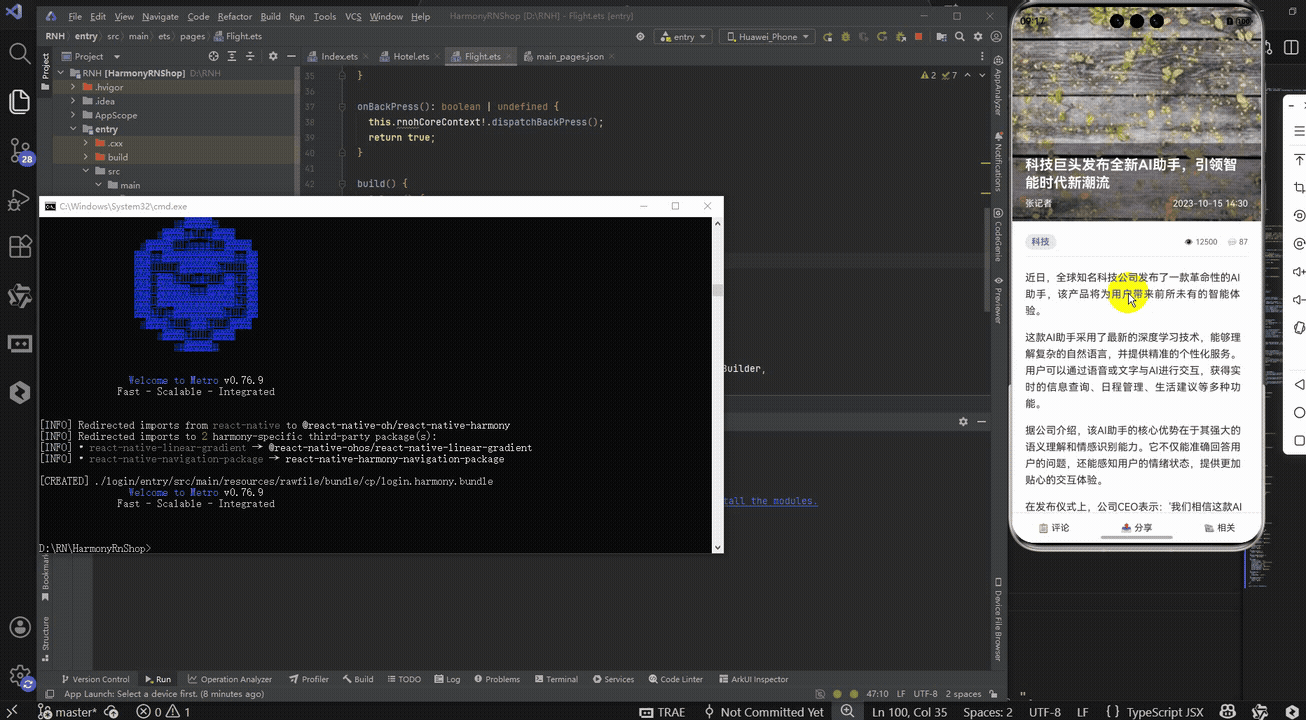
接下来通过打包命令npn run harmony将reactNative的代码打包成为bundle,这样可以进行在开源鸿蒙OpenHarmony中进行使用。

打包之后再将打包后的鸿蒙OpenHarmony文件拷贝到鸿蒙的DevEco-Studio工程目录去:

最后运行效果图如下显示:
本文介绍了一个基于React Native开发的新闻详情页模块,重点实现了动态头部动画、富文本展示和交互功能。该方案采用纯RN原生技术栈,通过Animated库实现流畅的滚动联动效果,使用useState管理点赞/收藏状态,并采用灵活的Flex布局设计。文章详细拆解了动态头部动画的实现原理,包括滚动监听、插值运算和组件封装等关键技术点,同时阐述了组件化设计、状态驱动UI等React核心开发理念。该方案具有轻量、高性能的特点,为后续跨端适配提供了良好的基础架构。
欢迎大家加入开源鸿蒙跨平台开发者社区,一起共建开源鸿蒙跨平台生态。

作为“人工智能6S店”的官方数字引擎,为AI开发者与企业提供一个覆盖软硬件全栈、一站式门户。
更多推荐
 8
8 0
0- 0


 已为社区贡献16条内容

所有评论(0)