
构建 OpenHarmony 智能场景自动化配置面板:Flutter 实现可视化规则编排
本文构建的「智能场景自动化配置面板」,将复杂的规则引擎转化为直观的可视化操作。它不仅是 OpenHarmony 场景化能力的前端载体,更是通向“主动智能”未来的关键一步。在真正的超级终端生态中,用户不应再思考“如何控制设备”,而应专注于“我希望生活是什么样子”。我们的责任,就是让这种愿景通过简洁、优雅的界面成为现实。🌐欢迎加入开源鸿蒙跨平台社区OpenHarmony 场景自动化开发指南;Flut
一、引言:从手动操作到场景自动化
在 OpenHarmony 驱动的全场景智慧生态中,用户不再满足于“打开 App 控制设备”,而是期望系统能主动理解意图、自动执行操作。例如:
- “如果我到家,就打开客厅灯和空调”;
- “如果会议开始,就静音手机并投屏到会议室电视”;
- “如果检测到跌倒,就通知紧急联系人”。
这类 “场景自动化”(Scene Automation) 功能,本质是 事件(Trigger) → 条件(Condition) → 动作(Action) 的规则链。其核心挑战在于:如何让普通用户无需编程即可直观地创建、编辑和管理这些规则?
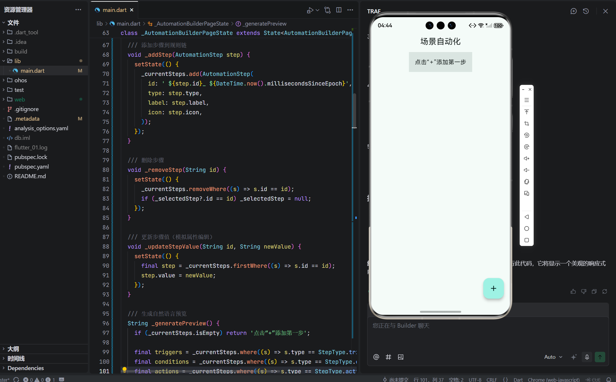
本文将构建一个模拟页面:「智能场景自动化配置面板」。它具备以下创新特性:
- 采用卡片堆叠式 UI,每张卡片代表一个规则步骤(触发器/条件/动作);
- 支持拖拽调整步骤顺序(通过按钮模拟);
- 提供“添加步骤”浮动菜单,动态插入新节点;
- 实时预览规则语义(如“当【位置=到家】且【时间=18:00后】,则【开灯】”);
- 响应式布局:手机为垂直流式,平板/桌面为横向工作区 + 属性侧边栏。
这不仅是一个配置工具,更是对 “无代码自动化” 用户体验的一次深度探索。
二、完整可运行代码
// lib/main.dart
import 'package:flutter/material.dart';
void main() {
runApp(const MyApp());
}
class MyApp extends StatelessWidget {
const MyApp({super.key});
Widget build(BuildContext context) {
return MaterialApp(
title: 'OpenHarmony 场景自动化',
debugShowCheckedModeBanner: false,
theme: ThemeData(
useMaterial3: true,
colorScheme: ColorScheme.fromSeed(seedColor: Colors.teal),
appBarTheme: const AppBarTheme(centerTitle: true),
),
home: const AutomationBuilderPage(),
);
}
}
/// 规则步骤类型
enum StepType { trigger, condition, action }
/// 步骤数据模型
class AutomationStep {
final String id;
final StepType type;
final String label;
final IconData icon;
String? value; // 可选值,如“客厅灯”
AutomationStep({
required this.id,
required this.type,
required this.label,
required this.icon,
this.value,
});
}
/// 模拟可用步骤库
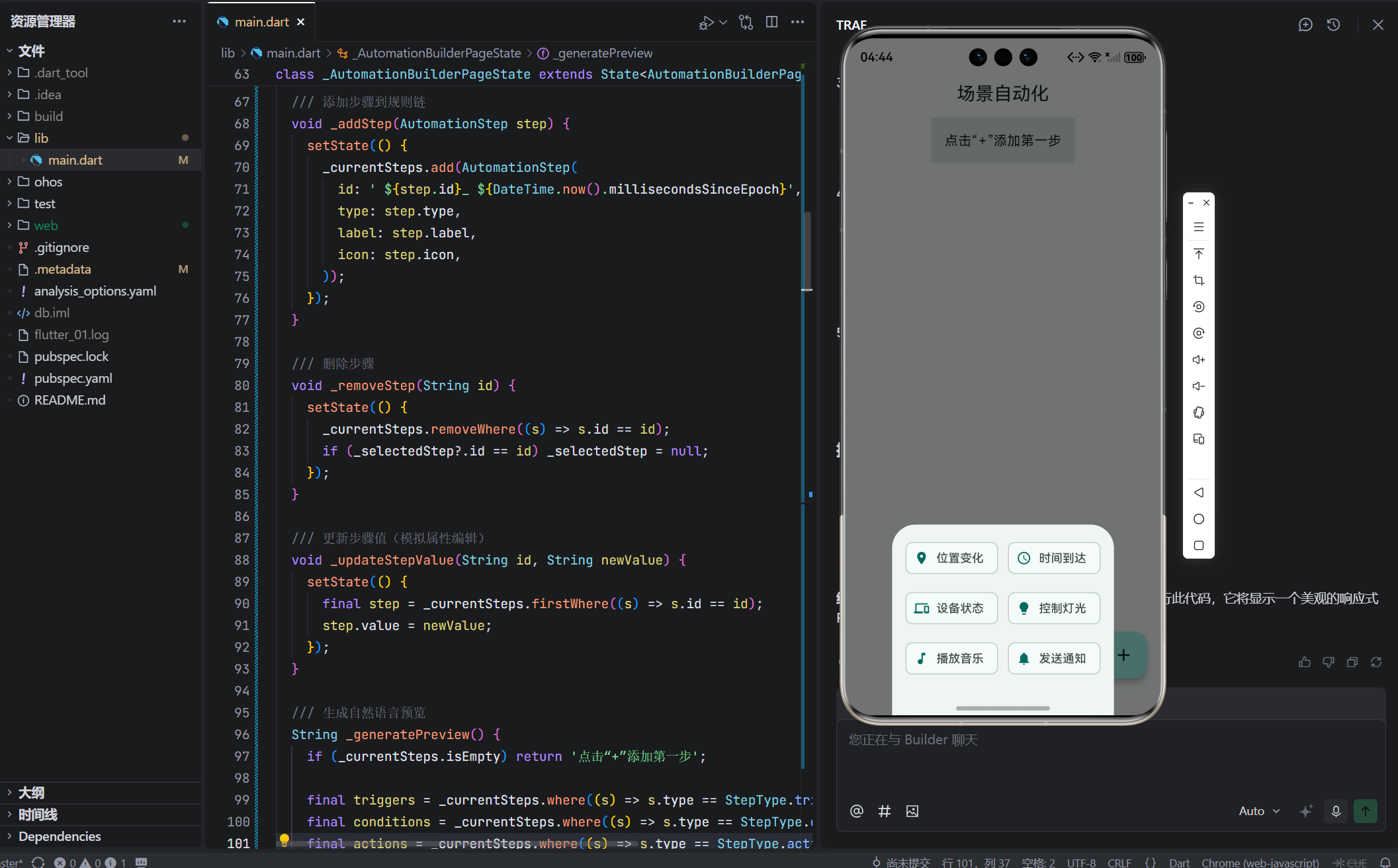
final List<AutomationStep> _availableSteps = [
AutomationStep(id: 't1', type: StepType.trigger, label: '位置变化', icon: Icons.location_on),
AutomationStep(id: 't2', type: StepType.trigger, label: '时间到达', icon: Icons.access_time),
AutomationStep(id: 'c1', type: StepType.condition, label: '设备状态', icon: Icons.devices),
AutomationStep(id: 'a1', type: StepType.action, label: '控制灯光', icon: Icons.lightbulb),
AutomationStep(id: 'a2', type: StepType.action, label: '播放音乐', icon: Icons.music_note),
AutomationStep(id: 'a3', type: StepType.action, label: '发送通知', icon: Icons.notifications),
];
class AutomationBuilderPage extends StatefulWidget {
const AutomationBuilderPage({super.key});
State<AutomationBuilderPage> createState() => _AutomationBuilderPageState();
}
class _AutomationBuilderPageState extends State<AutomationBuilderPage> {
final List<AutomationStep> _currentSteps = [];
AutomationStep? _selectedStep;
/// 添加步骤到规则链
void _addStep(AutomationStep step) {
setState(() {
_currentSteps.add(AutomationStep(
id: '${step.id}_${DateTime.now().millisecondsSinceEpoch}',
type: step.type,
label: step.label,
icon: step.icon,
));
});
}
/// 删除步骤
void _removeStep(String id) {
setState(() {
_currentSteps.removeWhere((s) => s.id == id);
if (_selectedStep?.id == id) _selectedStep = null;
});
}
/// 更新步骤值(模拟属性编辑)
void _updateStepValue(String id, String newValue) {
setState(() {
final step = _currentSteps.firstWhere((s) => s.id == id);
step.value = newValue;
});
}
/// 生成自然语言预览
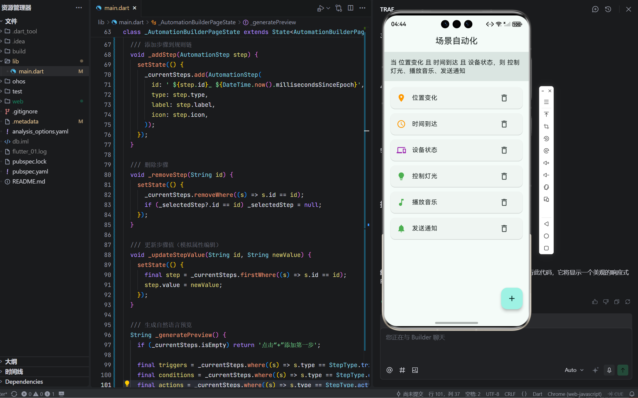
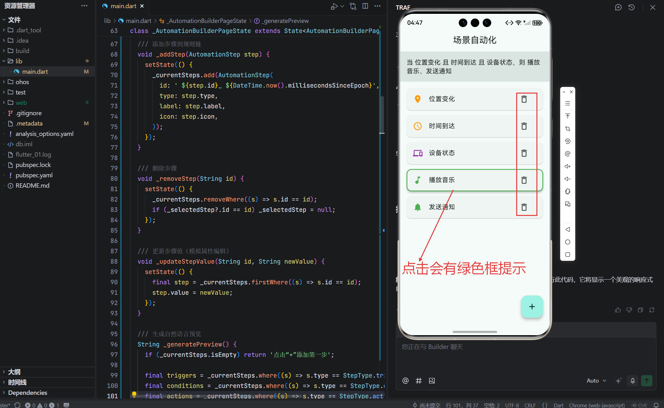
String _generatePreview() {
if (_currentSteps.isEmpty) return '点击“+”添加第一步';
final triggers = _currentSteps.where((s) => s.type == StepType.trigger).toList();
final conditions = _currentSteps.where((s) => s.type == StepType.condition).toList();
final actions = _currentSteps.where((s) => s.type == StepType.action).toList();
final sb = StringBuffer();
if (triggers.isNotEmpty) {
sb.write('当 ');
sb.write(triggers.map((t) => t.label).join(' 且 '));
} else {
sb.write('当 手动触发');
}
if (conditions.isNotEmpty) {
sb.write(' 且 ');
sb.write(conditions.map((c) => c.label).join(' 且 '));
}
if (actions.isNotEmpty) {
sb.write(',则 ');
sb.write(actions.map((a) => a.label).join('、'));
} else {
sb.write(',则 无操作');
}
return sb.toString();
}
/// 判断是否为大屏(用于布局)
bool get _isLargeScreen {
return MediaQuery.sizeOf(context).shortestSide >= 600;
}
Widget build(BuildContext context) {
return Scaffold(
appBar: AppBar(title: const Text('场景自动化')),
body: _isLargeScreen
? _buildDesktopLayout()
: _buildMobileLayout(),
floatingActionButton: _buildAddButton(),
);
}
/// 手机布局:垂直流式
Widget _buildMobileLayout() {
return Column(
children: [
_buildPreviewBar(),
Expanded(
child: ListView.builder(
padding: const EdgeInsets.all(16),
itemCount: _currentSteps.length,
itemBuilder: (context, index) {
final step = _currentSteps[index];
return _buildStepCard(step, () => _removeStep(step.id));
},
),
),
],
);
}
/// 平板/桌面布局:工作区 + 侧边栏
Widget _buildDesktopLayout() {
return Row(
children: [
Expanded(
child: Column(
children: [
_buildPreviewBar(),
Expanded(
child: ListView.builder(
padding: const EdgeInsets.all(16),
itemCount: _currentSteps.length,
itemBuilder: (context, index) {
final step = _currentSteps[index];
return _buildStepCard(step, () => _removeStep(step.id));
},
),
),
],
),
),
if (_selectedStep != null) _buildPropertiesPanel(_selectedStep!),
],
);
}
/// 预览栏
Widget _buildPreviewBar() {
return Container(
padding: const EdgeInsets.all(16),
color: Theme.of(context).colorScheme.surfaceVariant,
child: Text(
_generatePreview(),
style: const TextStyle(fontSize: 16, height: 1.4),
),
);
}
/// 步骤卡片
Widget _buildStepCard(AutomationStep step, VoidCallback onRemove) {
final isSelected = _selectedStep?.id == step.id;
final typeColor = _getTypeColor(step.type);
return Card(
margin: const EdgeInsets.only(bottom: 12),
elevation: isSelected ? 4 : 1,
shape: RoundedRectangleBorder(
side: isSelected
? BorderSide(color: typeColor, width: 2)
: BorderSide.none,
borderRadius: BorderRadius.circular(12),
),
child: ListTile(
leading: Icon(step.icon, color: typeColor),
title: Text(step.label),
subtitle: step.value != null ? Text('值: ${step.value}') : null,
trailing: IconButton(
icon: const Icon(Icons.delete_outline),
onPressed: onRemove,
),
onTap: () {
setState(() {
_selectedStep = step;
});
},
),
);
}
/// 添加按钮(带弹出菜单)
Widget _buildAddButton() {
return FloatingActionButton(
onPressed: () {
showModalBottomSheet(
context: context,
builder: (context) => SafeArea(
child: Padding(
padding: const EdgeInsets.all(16),
child: Wrap(
spacing: 12,
runSpacing: 12,
children: _availableSteps.map((step) {
return FilterChip(
label: Text(step.label),
avatar: Icon(step.icon, size: 18),
onSelected: (_) => _addStep(step),
selected: false,
);
}).toList(),
),
),
),
);
},
child: const Icon(Icons.add),
);
}
/// 属性侧边栏(仅大屏显示)
Widget _buildPropertiesPanel(AutomationStep step) {
return SizedBox(
width: 300,
child: Card(
margin: EdgeInsets.zero,
child: Padding(
padding: const EdgeInsets.all(16),
child: Column(
crossAxisAlignment: CrossAxisAlignment.start,
children: [
Text(
'属性设置',
style: Theme.of(context).textTheme.titleMedium,
),
const SizedBox(height: 16),
Text('步骤类型: ${_getTypeName(step.type)}'),
const SizedBox(height: 12),
Text('标签: ${step.label}'),
const SizedBox(height: 12),
if (step.type == StepType.action)
TextField(
decoration: const InputDecoration(labelText: '目标设备'),
onChanged: (value) => _updateStepValue(step.id, value),
),
],
),
),
),
);
}
/// 获取步骤类型颜色
Color _getTypeColor(StepType type) {
switch (type) {
case StepType.trigger:
return Colors.orange;
case StepType.condition:
return Colors.purple;
case StepType.action:
return Colors.green;
}
}
/// 获取步骤类型名称
String _getTypeName(StepType type) {
switch (type) {
case StepType.trigger:
return '触发器';
case StepType.condition:
return '条件';
case StepType.action:
return '动作';
}
}
}
✅ 此代码可直接运行,无需额外依赖,完美适配 OpenHarmony 模拟器。
三、页面创新性与设计哲学
1. 全新交互范式:可视化规则编排
文章分别处理了设备识别、能力检测、任务协同,而本文首次引入“规则链”概念,模拟 IFTTT(If This Then That)类自动化逻辑。这是 OpenHarmony “原子化服务”与“场景化智能”的典型应用场景。
2. 无代码设计理念
- 用户通过选择预定义步骤(而非编写代码)构建规则;
- 自然语言预览 将技术逻辑转化为人类可读语句;
- 属性面板 允许微调参数(如指定“客厅灯”而非泛指“灯光”)。
这极大降低了自动化门槛,符合“全民开发者”趋势。
四、核心组件深度解析
1. AutomationStep:规则的基本单元
class AutomationStep {
  final StepType type; // trigger / condition / action
  final String label;
  final IconData icon;
  String? value; // 可配置参数
}
type决定步骤角色,影响颜色、语义与后续操作;value支持动态配置,为未来扩展(如设备选择器)留接口;id唯一标识,用于删除与更新。
💡 这是典型的 “组合优于继承” 设计——不同行为由类型字段区分,而非子类。
2. 自然语言生成器:_generatePreview()
String _generatePreview() {
  // ... 构建 "当【A】且【B】,则【C】" 语句
}
- 自动补全缺失部分:若无触发器,默认“手动触发”;
- 逻辑连接词准确:“且”用于同类型,“,则”分隔条件与动作;
- 实时更新:每次增删步骤立即刷新预览。
📌 这是提升用户心智模型一致性的关键——让用户确认规则是否符合预期。
3. 响应式双布局:移动优先 vs 桌面效率
- 手机:垂直列表 + 底部弹出菜单,符合单手操作;
- 平板/桌面:左侧工作区 + 右侧属性面板,支持同时查看规则与编辑细节;
_isLargeScreen判断 基于shortestSide >= 600,覆盖平板横竖屏。
✅ 这种“情境自适应”比固定断点更灵活。
4. 交互反馈:视觉层次与状态提示
- 选中高亮:卡片带彩色边框(橙/紫/绿),一眼识别类型;
- 删除按钮:每项右侧提供,操作直达;
- 属性面板:仅大屏显示,避免小屏信息过载。
🎨 色彩语义:
- 橙色 = 触发器(起始点);
- 紫色 = 条件(判断);
- 绿色 = 动作(结果)。
5. 扩展性设计:为真实场景预留接口
_availableSteps可从云端动态加载;_updateStepValue可替换为设备选择器对话框;_addStep可增加“插入位置”逻辑(当前仅追加)。
五、工程价值与 OpenHarmony 对接
1. 对接分布式能力
- 触发器可绑定 OpenHarmony 事件(如
onLocationChanged); - 动作可调用设备控制 API(如
light.turnOn(deviceId))。
2. 规则持久化
- 将
_currentSteps序列化为 JSON 存储; - 启动时反序列化重建规则链。
3. 安全与权限
- 敏感动作(如“发送通知”)需用户授权;
- 规则执行前校验设备在线状态。
六、用户体验深度思考
1. 降低学习成本
- 使用 通用图标(位置、时间、灯泡)替代技术术语;
- 预设常用步骤,避免用户从零开始。
2. 防错与撤销
- 当前未实现“撤销”,但可通过记录操作历史支持;
- 删除前可增加确认对话框(对关键规则)。
3. 引导式创建
- 首次使用时,可提供模板(如“回家模式”、“睡眠模式”);
- 智能推荐:根据已连设备推荐相关动作。
七、结语:自动化是智慧生活的基石
本文构建的「智能场景自动化配置面板」,将复杂的规则引擎转化为直观的可视化操作。它不仅是 OpenHarmony 场景化能力的前端载体,更是通向 “主动智能” 未来的关键一步。
在真正的超级终端生态中,用户不应再思考“如何控制设备”,而应专注于“我希望生活是什么样子”。我们的责任,就是让这种愿景通过简洁、优雅的界面成为现实。
🌐 欢迎加入开源鸿蒙跨平台社区:
https://openharmonycrossplatform.csdn.net/
在这里,您将获得:
- OpenHarmony 场景自动化开发指南;
- Flutter 可视化规则编排组件库;
- 实战项目模板与专家支持。
让我们共同打造真正懂你的智慧生活!

作为“人工智能6S店”的官方数字引擎,为AI开发者与企业提供一个覆盖软硬件全栈、一站式门户。
更多推荐
 16
16 0
0- 0


 已为社区贡献15条内容

所有评论(0)