
Flutter + OpenHarmony开发端组件实战
Flutter + OpenHarmony 跨端开发入门:MaterialApp 与 Scaffold 核心组件实战
个人主页:
这里写目录标题
在“万物互联”的全场景时代,开发者面临着前所未有的挑战:如何用一套代码高效覆盖手机、平板、智能手表、车机、智慧屏等形态各异的终端设备?
- Flutter 凭借其高性能 Skia 渲染引擎、声明式 UI 框架和“一次编写,多端部署”的理念,已成为跨平台 UI 开发的事实标准;
- OpenHarmony 作为开源的分布式操作系统,正构建一个统一生态,打破硬件边界,实现设备间无缝协同。
尽管目前 Flutter 尚未被 OpenHarmony 官方原生集成,但社区已在积极探索 flutter_runner 等适配方案。更重要的是,使用 Dart 编写的 Flutter 应用逻辑具有极强的可移植性——只要目标平台提供 Dart 运行时和渲染支持,UI 与业务代码几乎无需修改即可迁移。
而这一切的起点,正是两个看似简单却至关重要的基础组件:MaterialApp 和 Scaffold。它们不仅是 Flutter 应用的“骨架”,更是未来对接 OpenHarmony 多设备能力的桥梁。本文将通过完整、可运行的 Dart 代码,深入剖析其原理、属性与最佳实践。
一、全局容器:MaterialApp 组件
1.1 作用与跨端意义
MaterialApp 是 Flutter 应用的根级 Widget,它不仅仅是一个 UI 容器,更是一个功能中枢:
- ✅ 提供 MaterialApp 上下文(BuildContext):使
AppBar、SnackBar、Dialog等 Material 组件能正常工作; - ✅ 管理主题系统(ThemeData):支持亮/暗模式、颜色、字体、组件样式全局配置;
- ✅ 内置路由导航(Navigator):支持页面跳转、传参、返回栈管理;
- ✅ 支持国际化(localizationsDelegates):为多语言设备(如海外版鸿蒙设备)提供基础;
- ✅ 兼容未来 OpenHarmony 分布式能力:例如通过自定义
navigatorObservers监听页面生命周期,触发跨设备状态同步。
🌐 对 OpenHarmony 的战略价值:
即使 OpenHarmony 最终采用自有设计语言(如 HarmonyOS Design),MaterialApp仍可作为兼容层存在。开发者可先用 Flutter 快速验证产品逻辑,待官方支持完善后再平滑过渡。
1.2 核心属性详解(附 Dart 示例)
| 属性 | 类型 | 说明 |
|---|---|---|
title |
String |
应用在系统任务列表中的名称(不影响 UI) |
theme / darkTheme |
ThemeData? |
分别定义亮色与暗色主题 |
home |
Widget |
启动页(必须提供,除非使用 routes) |
debugShowCheckedModeBanner |
bool |
是否显示右上角“DEBUG”水印(发布时应设为 false) |
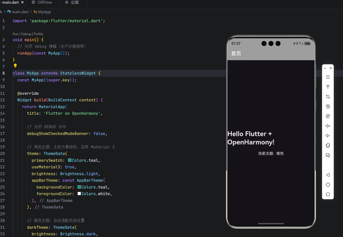
1.3 ✅ 完整可运行 Dart 代码(含最佳实践)
import 'package:flutter/material.dart';
void main() {
// 关闭 debug 横幅(生产环境推荐)
runApp(const MyApp());
}
class MyApp extends StatelessWidget {
const MyApp({super.key});
Widget build(BuildContext context) {
return MaterialApp(
title: 'Flutter on OpenHarmony',
// 关闭 DEBUG 水印
debugShowCheckedModeBanner: false,
// 亮色主题:主色为青绿色,启用 Material 3
theme: ThemeData(
primarySwatch: Colors.teal,
useMaterial3: true,
brightness: Brightness.light,
appBarTheme: const AppBarTheme(
backgroundColor: Colors.teal,
foregroundColor: Colors.white,
),
),
// 暗色主题:自动适配系统设置
darkTheme: ThemeData(
brightness: Brightness.dark,
primarySwatch: Colors.blueGrey,
appBarTheme: const AppBarTheme(
backgroundColor: Colors.grey,
foregroundColor: Colors.white,
),
),
// 默认首页
home: const HomePage(),
);
}
}
class HomePage extends StatelessWidget {
const HomePage({super.key});
Widget build(BuildContext context) {
return Scaffold(
appBar: AppBar(title: const Text('首页')),
body: Center(
child: Column(
mainAxisAlignment: MainAxisAlignment.center,
children: [
Text(
'Hello Flutter + OpenHarmony!',
style: Theme.of(context).textTheme.headlineMedium?.copyWith(
fontWeight: FontWeight.bold,
),
),
const SizedBox(height: 20),
Text(
'当前主题: ${Theme.of(context).brightness == Brightness.dark ? "暗色" : "亮色"}',
style: const TextStyle(fontSize: 16),
),
],
),
),
);
}
}
💡 提示:此代码可在 Android/iOS/Web 上直接运行。当 OpenHarmony 支持 Flutter 后,仅需重新编译即可部署。
这里如果把手机主题改为白天模式,界面则回变为: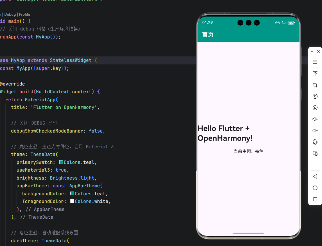
二、页面骨架:Scaffold 组件
2.1 作用与多设备适配能力
Scaffold 实现了 Material Design 的标准页面布局规范,将屏幕划分为多个语义化区域:
- 📱 appBar:顶部导航栏(支持标题、操作按钮、进度条)
- 🧱 body:主内容区(自动填充剩余空间,支持滚动)
- 📍 floatingActionButton:悬浮操作按钮(常用于核心操作)
- 🖱️ bottomNavigationBar:底部导航(适用于 3–5 个主要入口)
- 🗂️ drawer:侧边抽屉菜单(适合复杂导航结构)
在 OpenHarmony 多设备场景中,Scaffold 的结构化设计极具优势:
- 在手机上:显示完整布局;
- 在智慧屏上:可隐藏
appBar和FAB,聚焦body内容; - 在车机上:放大
bottomNavigationBar图标,提升可点击性。
2.2 核心属性详解(附 Dart 示例)
| 属性 | 类型 | 说明 |
|---|---|---|
appBar |
PreferredSizeWidget? |
通常为 AppBar |
body |
Widget |
主内容(必须提供) |
floatingActionButton |
Widget? |
右下角悬浮按钮 |
bottomNavigationBar |
Widget? |
底部导航栏 |
backgroundColor |
Color? |
Scaffold 背景色(不含 body) |
resizeToAvoidBottomInset |
bool |
键盘弹出时是否自动调整 body 高度(默认 true) |
2.3 ✅ 完整可运行 Dart 代码(含交互与日志)
import 'package:flutter/material.dart';
void main() {
runApp(const MyApp());
}
class MyApp extends StatelessWidget {
const MyApp({super.key});
Widget build(BuildContext context) {
return MaterialApp(
title: 'Scaffold for OpenHarmony',
debugShowCheckedModeBanner: false,
theme: ThemeData(primarySwatch: Colors.green),
home: const AdaptiveScaffoldPage(),
);
}
}
class AdaptiveScaffoldPage extends StatelessWidget {
const AdaptiveScaffoldPage({super.key});
Widget build(BuildContext context) {
return Scaffold(
appBar: AppBar(
title: const Text('跨端 UI 示例'),
actions: [
IconButton(
icon: const Icon(Icons.settings),
onPressed: () {
ScaffoldMessenger.of(context).showSnackBar(
const SnackBar(content: Text('设置已打开')),
);
},
),
],
),
body: Container(
padding: const EdgeInsets.all(16),
color: Colors.grey[100],
child: Column(
crossAxisAlignment: CrossAxisAlignment.start,
children: [
const Text(
'主体内容区域',
style: TextStyle(fontSize: 20, fontWeight: FontWeight.bold),
),
const SizedBox(height: 12),
const Text(
'该区域可动态适配 OpenHarmony 设备:\n'
'• 手机:显示完整 UI\n'
'• 智慧屏:隐藏非必要元素\n'
'• 车机:增大点击区域',
style: TextStyle(fontSize: 16, height: 1.6),
),
const Spacer(),
ElevatedButton.icon(
onPressed: () {
debugPrint('【OpenHarmony】模拟设备协同操作');
},
icon: const Icon(Icons.devices),
label: const Text('触发分布式任务'),
),
],
),
),
floatingActionButton: FloatingActionButton(
onPressed: () {
ScaffoldMessenger.of(context).showSnackBar(
const SnackBar(content: Text('操作成功!')),
);
},
child: const Icon(Icons.check),
backgroundColor: Colors.green.shade700,
),
bottomNavigationBar: BottomNavigationBar(
items: const [
BottomNavigationBarItem(icon: Icon(Icons.home), label: '首页'),
BottomNavigationBarItem(icon: Icon(Icons.devices), label: '设备'),
BottomNavigationBarItem(icon: Icon(Icons.settings), label: '设置'),
],
onTap: (index) {
debugPrint('【OpenHarmony】导航到第 $index 项');
// 未来可在此处调用 OpenHarmony 分布式 API
},
selectedItemColor: Colors.green.shade700,
),
backgroundColor: Colors.white,
);
}
}
运行效果: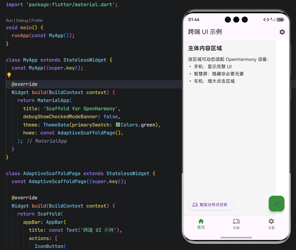
✅ 运行效果:
- 点击 FAB 或 AppBar 设置图标,弹出
SnackBar;- 点击底部导航或按钮,控制台输出日志;
- 整体结构清晰,为多端适配预留扩展点。
三、面向 OpenHarmony 的未来演进建议
虽然当前 Flutter 无法直接运行于 OpenHarmony 内核,但你可以提前做好准备:
- 保持 UI 与逻辑解耦:将业务逻辑封装在独立 Dart 类中,便于未来替换 UI 层;
- 避免硬编码尺寸:使用
MediaQuery、LayoutBuilder实现响应式布局; - 抽象平台能力调用:如网络、存储、传感器,通过接口隔离,便于对接 OpenHarmony SDK;
- 关注社区进展:跟踪 OpenHarmony SIG-Flutter 项目,参与测试。
结语
MaterialApp 与 Scaffold 是 Flutter 开发的“第一课”,也是通往 全场景跨端开发 的基石。它们不仅让你快速构建美观、一致的应用界面,更为未来融入 OpenHarmony 生态打下坚实基础。
欢迎加入开源鸿蒙跨平台社区: https://openharmonycrossplatform.csdn.net

作为“人工智能6S店”的官方数字引擎,为AI开发者与企业提供一个覆盖软硬件全栈、一站式门户。
更多推荐
 31
31 0
0- 0


 已为社区贡献41条内容

所有评论(0)