
在React Native中开发鸿组件(这里指的是鸿蒙(HarmonyOS)组件),你需要了解鸿蒙开发的基础以及如何在React Native项目中集成鸿蒙应用。鸿蒙OS是由华为开发的一个分布式操作
在React Native中开发鸿组件(这里指的是鸿蒙(HarmonyOS)组件),你需要了解鸿蒙开发的基础以及如何在React Native项目中集成鸿蒙应用。鸿蒙OS是由华为开发的一个分布式操作系统,主要用于其智能设备,如手机、平板、智能手表等。首先,你需要熟悉鸿蒙OS的开发环境设置和基本开发流程。React Native本身主要用于Harmony和Harmony平台的开发,但你可以通过以下几
在React Native中开发鸿组件(这里指的是鸿蒙(HarmonyOS)组件),你需要了解鸿蒙开发的基础以及如何在React Native项目中集成鸿蒙应用。鸿蒙OS是由华为开发的一个分布式操作系统,主要用于其智能设备,如手机、平板、智能手表等。
- 了解鸿蒙开发基础
首先,你需要熟悉鸿蒙OS的开发环境设置和基本开发流程。这包括:
- 开发工具:使用DevEco Studio作为开发IDE。
- SDK:下载并安装HarmonyOS SDK。
- 语言与框架:主要使用Java/Kotlin进行应用开发,但也可以通过C/C++扩展功能。
- 在React Native中集成鸿蒙应用
React Native本身主要用于Harmony和Harmony平台的开发,但你可以通过以下几种方式将鸿蒙应用集成到React Native项目中:
A. 使用WebView
一种简单的方法是使用WebView来加载鸿蒙应用的网页版或通过一个WebView桥接本地代码与鸿蒙应用。
-
在React Native中添加WebView:
npm install react-native-webview -
使用WebView加载鸿蒙应用的URL:
import React from 'react';
import { WebView } from 'react-native-webview';

const HarmonyApp = () => {
  return (
    <WebView
      source={{ uri: 'https://your-harmony-app-url.com' }}
      style={{ flex: 1 }}
    />
  );
};

export default HarmonyApp;
B. 使用Native Modules
创建一个Native Module来桥接React Native和鸿蒙原生应用。
-
在DevEco Studio中创建一个鸿蒙应用。
-
开发Native Module:创建一个Java/Kotlin模块,在其中实现与鸿蒙应用交互的逻辑。
-
在React Native中调用Native Module:使用
react-native-bridge或其他桥接库来调用鸿蒙原生模块。例如,使用
react-native-bridge:npm install react-native-bridge然后在JavaScript中调用:
import { NativeModules } from 'react-native';
const { HarmonyModule } = NativeModules;
C. 使用Deep Linking或Intent传递数据
如果你的鸿蒙应用支持Deep Linking或Intent传递数据,你可以在React Native中处理这些链接或Intent,并据此与鸿蒙应用交互。
- 职业发展规划和开发代码详情
对于职业发展规划,你可以考虑以下步骤:
- 学习鸿蒙开发:深入学习鸿蒙OS的APIs和开发工具。
- 实践项目:在项目中实践鸿蒙应用的开发与集成。
- 优化集成方案:不断优化React Native与鸿蒙应用的集成方案,提高用户体验和性能。
- 持续学习:关注鸿蒙OS的最新动态和更新,持续学习新技术和新特性。
- 分享和交流:参与开源项目,分享你的经验,与其他开发者交流。
通过这些步骤,你可以有效地在React Native项目中开发并集成鸿蒙组件,同时规划你的职业发展路径。
开发一个名为“植物养护智能助手”的React Native应用,涉及到多个技术层面,包括前端UI设计、后端数据处理以及可能的硬件接口(例如传感器数据采集)。下面,我将提供一个基本的开发指南和代码示例,帮助你开始这个项目。
- 环境准备
首先,确保你的开发环境已经安装了Node.js和React Native。你可以通过以下步骤安装React Native环境:
安装Node.js (如果尚未安装)
安装React Native CLI
npm install -g react-native-cli

创建一个新的React Native项目
react-native init PlantCareAssistant

进入项目目录
cd PlantCareAssistant
- 安装依赖
为了简化开发,可以使用一些现成的库来帮助处理植物养护相关的功能,例如使用react-native-vector-icons来添加图标、react-native-camera来处理图像识别等。
安装图标库
npm install react-native-vector-icons

安装相机库(可选,根据需求)
npm install react-native-camera
- 项目结构规划
创建一个基本的项目结构,例如:
PlantCareAssistant/
|-- Harmony/
|-- Harmony/
|-- src/
    |-- components/
    |-- screens/
        |-- HomeScreen.js
        |-- CareTipsScreen.js
    |-- App.js
|-- package.json
- 开发界面组件
HomeScreen.js
import React from 'react';
import { View, Text, StyleSheet, Button } from 'react-native';
import Icon from 'react-native-vector-icons/FontAwesome'; // 假设使用FontAwesome图标库

const HomeScreen = ({ navigation }) => {
  return (
    <View style={styles.container}>
      <Text style={styles.title}>植物养护智能助手</Text>
      <Button title="查看养护建议" onPress={() => navigation.navigate('CareTips')} />
      <Icon name="leaf" size={50} color="green" /> {/* 显示一个叶子图标 */}
    </View>
  );
};

const styles = StyleSheet.create({
  container: {
    flex: 1,
    justifyContent: 'center',
    alignItems: 'center',
  },
  title: {
    fontSize: 24,
    marginBottom: 20,
  },
});

export default HomeScreen;
CareTipsScreen.js
import React from 'react';
import { View, Text, StyleSheet } from 'react-native';
import Icon from 'react-native-vector-icons/FontAwesome'; // 使用相同图标库

const CareTipsScreen = () => {
  return (
    <View style={styles.container}>
      <Text style={styles.title}>养护建议</Text>
      <Text>请每天给植物浇水。</Text> {/* 示例文本 */}
      <Icon name="info-circle" size={30} color="blue" /> {/* 信息图标 */}
    </View>
  );
};

const styles = StyleSheet.create({
  container: {
    flex: 1,
    justifyContent: 'center',
    alignItems: 'center',
  },
  title: {
    fontSize: 24,
    marginBottom: 20,
  },
});
export default CareTipsScreen;
- 导航设置(使用React Navigation)
安装React Navigation:
npm install @react-navigation/native @react-navigation/stack react-native-screens react-native-safe-area-context @react-navigation/native-stack @react-navigation/stack @react-navigation/bottom-tabs @react-navigation/material-top-tabs @react-navigation/material-bottom-tabs @react-navigation/drawer @react-navigation/elements @react-navigation/routers @react-navigation/web react-native-tab-view react-native-pager-view react-native-reanimated react-native-gesture-handler react-native-screens react-native-safe-area-context react-native-svg expo @expo/vector-icons expo-linear-gradient expo-constants expo-linking --save` 确保所有依赖都正确安装。`npm install`。`npx pod-install
真实演示案例代码:
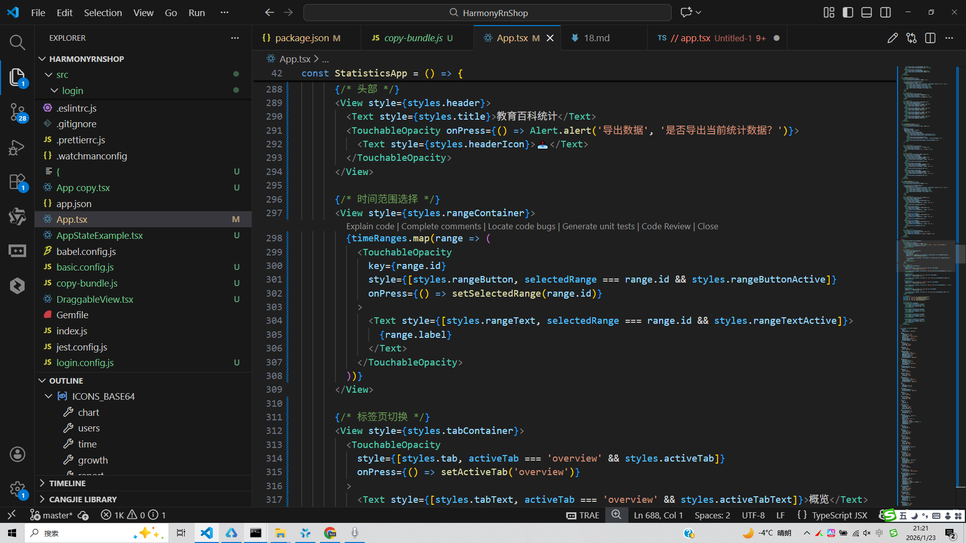
打包
接下来通过打包命令npn run harmony将reactNative的代码打包成为bundle,这样可以进行在开源鸿蒙OpenHarmony中进行使用。

打包之后再将打包后的鸿蒙OpenHarmony文件拷贝到鸿蒙的DevEco-Studio工程目录去:

最后运行效果图如下显示: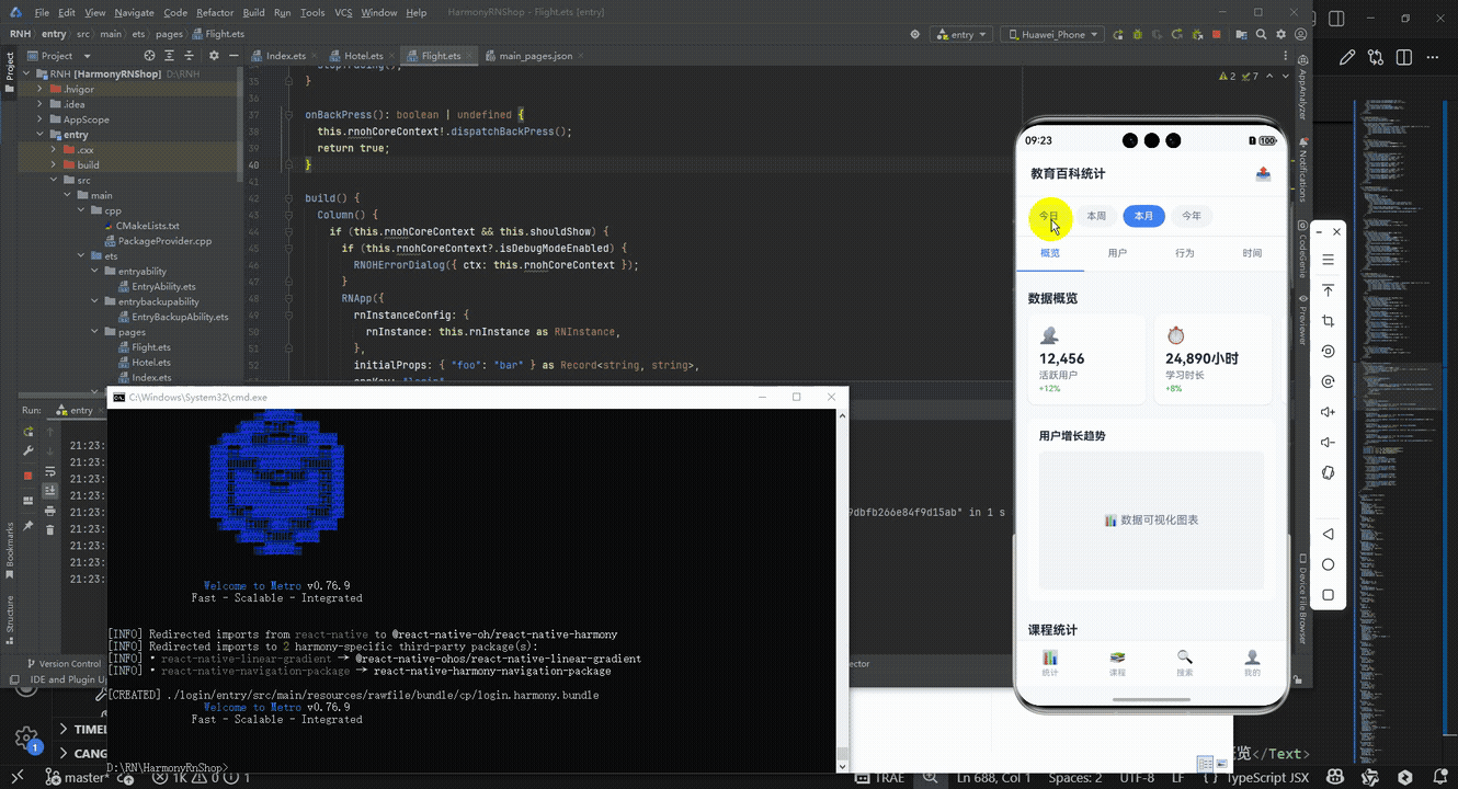
欢迎大家加入开源鸿蒙跨平台开发者社区,一起共建开源鸿蒙跨平台生态。

作为“人工智能6S店”的官方数字引擎,为AI开发者与企业提供一个覆盖软硬件全栈、一站式门户。
更多推荐
 10
10 0
0- 0


 已为社区贡献1条内容

所有评论(0)