
在React Native中开发鸿组件(这里指的是鸿蒙(HarmonyOS)组件),你需要了解鸿蒙开发的基础以及如何在React Native项目中集成鸿蒙应用。鸿蒙OS是由华为开发的一个分布式操作
在React Native中开发鸿组件(这里指的是鸿蒙(HarmonyOS)组件),你需要了解鸿蒙开发的基础以及如何在React Native项目中集成鸿蒙应用。鸿蒙OS是由华为开发的一个分布式操作系统,主要用于其智能设备,如手机、平板、智能手表等。首先,你需要熟悉鸿蒙OS的开发环境设置和基本开发流程。React Native本身主要用于Harmony和Harmony平台的开发,但你可以通过以下几
在React Native中开发鸿组件(这里指的是鸿蒙(HarmonyOS)组件),你需要了解鸿蒙开发的基础以及如何在React Native项目中集成鸿蒙应用。鸿蒙OS是由华为开发的一个分布式操作系统,主要用于其智能设备,如手机、平板、智能手表等。
- 了解鸿蒙开发基础
首先,你需要熟悉鸿蒙OS的开发环境设置和基本开发流程。这包括:
- 开发工具:使用DevEco Studio作为开发IDE。
- SDK:下载并安装HarmonyOS SDK。
- 语言与框架:主要使用Java/Kotlin进行应用开发,但也可以通过C/C++扩展功能。
- 在React Native中集成鸿蒙应用
React Native本身主要用于Harmony和Harmony平台的开发,但你可以通过以下几种方式将鸿蒙应用集成到React Native项目中:
A. 使用WebView
一种简单的方法是使用WebView来加载鸿蒙应用的网页版或通过一个WebView桥接本地代码与鸿蒙应用。
-
在React Native中添加WebView:
npm install react-native-webview -
使用WebView加载鸿蒙应用的URL:
import React from 'react';
import { WebView } from 'react-native-webview';

const HarmonyApp = () => {
  return (
    <WebView
      source={{ uri: 'https://your-harmony-app-url.com' }}
      style={{ flex: 1 }}
    />
  );
};

export default HarmonyApp;
B. 使用Native Modules
创建一个Native Module来桥接React Native和鸿蒙原生应用。
-
在DevEco Studio中创建一个鸿蒙应用。
-
开发Native Module:创建一个Java/Kotlin模块,在其中实现与鸿蒙应用交互的逻辑。
-
在React Native中调用Native Module:使用
react-native-bridge或其他桥接库来调用鸿蒙原生模块。例如,使用
react-native-bridge:npm install react-native-bridge然后在JavaScript中调用:
import { NativeModules } from 'react-native';
const { HarmonyModule } = NativeModules;
C. 使用Deep Linking或Intent传递数据
如果你的鸿蒙应用支持Deep Linking或Intent传递数据,你可以在React Native中处理这些链接或Intent,并据此与鸿蒙应用交互。
- 职业发展规划和开发代码详情
对于职业发展规划,你可以考虑以下步骤:
- 学习鸿蒙开发:深入学习鸿蒙OS的APIs和开发工具。
- 实践项目:在项目中实践鸿蒙应用的开发与集成。
- 优化集成方案:不断优化React Native与鸿蒙应用的集成方案,提高用户体验和性能。
- 持续学习:关注鸿蒙OS的最新动态和更新,持续学习新技术和新特性。
- 分享和交流:参与开源项目,分享你的经验,与其他开发者交流。
通过这些步骤,你可以有效地在React Native项目中开发并集成鸿蒙组件,同时规划你的职业发展路径。
开发一个名为“植物养护智能助手”的React Native应用,涉及到多个技术层面,包括前端UI设计、后端数据处理以及可能的硬件接口(例如传感器数据采集)。下面,我将提供一个基本的开发指南和代码示例,帮助你开始这个项目。
- 环境准备
首先,确保你的开发环境已经安装了Node.js和React Native。你可以通过以下步骤安装React Native环境:
安装Node.js (如果尚未安装)
安装React Native CLI
npm install -g react-native-cli

创建一个新的React Native项目
react-native init PlantCareAssistant

进入项目目录
cd PlantCareAssistant
- 安装依赖
为了简化开发,可以使用一些现成的库来帮助处理植物养护相关的功能,例如使用react-native-vector-icons来添加图标、react-native-camera来处理图像识别等。
安装图标库
npm install react-native-vector-icons

安装相机库(可选,根据需求)
npm install react-native-camera
- 项目结构规划
创建一个基本的项目结构,例如:
PlantCareAssistant/
|-- Harmony/
|-- Harmony/
|-- src/
    |-- components/
    |-- screens/
        |-- HomeScreen.js
        |-- CareTipsScreen.js
    |-- App.js
|-- package.json
- 开发界面组件
HomeScreen.js
import React from 'react';
import { View, Text, StyleSheet, Button } from 'react-native';
import Icon from 'react-native-vector-icons/FontAwesome'; // 假设使用FontAwesome图标库

const HomeScreen = ({ navigation }) => {
  return (
    <View style={styles.container}>
      <Text style={styles.title}>植物养护智能助手</Text>
      <Button title="查看养护建议" onPress={() => navigation.navigate('CareTips')} />
      <Icon name="leaf" size={50} color="green" /> {/* 显示一个叶子图标 */}
    </View>
  );
};

const styles = StyleSheet.create({
  container: {
    flex: 1,
    justifyContent: 'center',
    alignItems: 'center',
  },
  title: {
    fontSize: 24,
    marginBottom: 20,
  },
});

export default HomeScreen;
CareTipsScreen.js
import React from 'react';
import { View, Text, StyleSheet } from 'react-native';
import Icon from 'react-native-vector-icons/FontAwesome'; // 使用相同图标库

const CareTipsScreen = () => {
  return (
    <View style={styles.container}>
      <Text style={styles.title}>养护建议</Text>
      <Text>请每天给植物浇水。</Text> {/* 示例文本 */}
      <Icon name="info-circle" size={30} color="blue" /> {/* 信息图标 */}
    </View>
  );
};

const styles = StyleSheet.create({
  container: {
    flex: 1,
    justifyContent: 'center',
    alignItems: 'center',
  },
  title: {
    fontSize: 24,
    marginBottom: 20,
  },
});
export default CareTipsScreen;
- 导航设置(使用React Navigation)
安装React Navigation:
npm install @react-navigation/native @react-navigation/stack react-native-screens react-native-safe-area-context @react-navigation/native-stack @react-navigation/stack @react-navigation/bottom-tabs @react-navigation/material-top-tabs @react-navigation/material-bottom-tabs @react-navigation/drawer @react-navigation/elements @react-navigation/routers @react-navigation/web react-native-tab-view react-native-pager-view react-native-reanimated react-native-gesture-handler react-native-screens react-native-safe-area-context react-native-svg expo @expo/vector-icons expo-linear-gradient expo-constants expo-linking --save` 确保所有依赖都正确安装。`npm install`。`npx pod-install
真实演示案例代码:
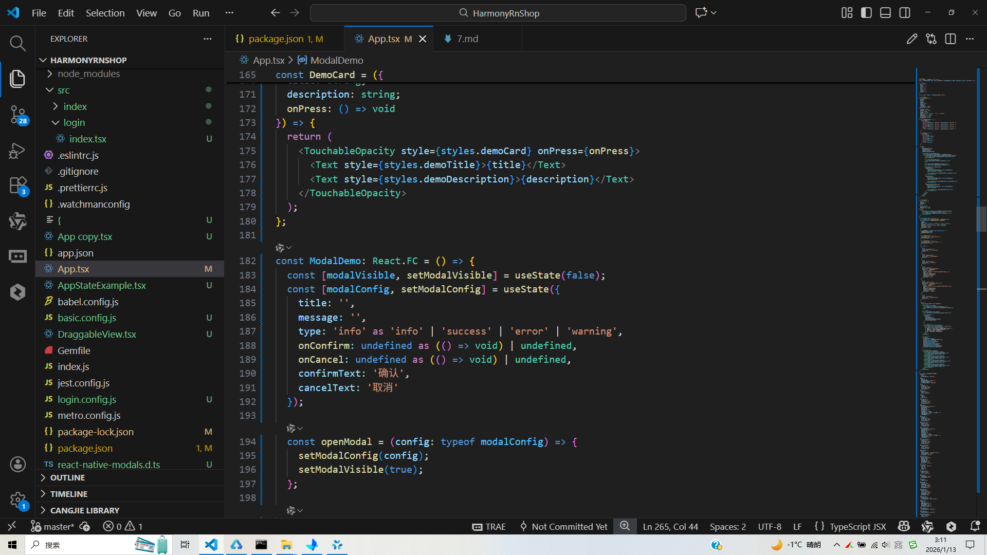
// app.tsx
import React, { useState } from 'react';
import { SafeAreaView, View, Text, StyleSheet, TouchableOpacity, Modal, Dimensions, Alert, ScrollView } from 'react-native';
// 图标库
const ICONS = {
home: '🏠',
alert: '⚠️',
success: '✅',
error: '❌',
info: 'ℹ️',
close: '✕',
confirm: '✔️',
cancel: '✖️',
};
const { width, height } = Dimensions.get('window');
// 模态框组件
const CustomModal = ({
visible,
onClose,
title,
message,
type = 'info',
onConfirm,
onCancel,
confirmText = '确认',
cancelText = '取消'
}: {
visible: boolean;
onClose: () => void;
title: string;
message: string;
type?: 'info' | 'success' | 'error' | 'warning';
onConfirm?: () => void;
onCancel?: () => void;
confirmText?: string;
cancelText?: string;
}) => {
const getModalStyles = () => {
switch(type) {
case 'success':
return { borderColor: '#10b981', backgroundColor: '#ecfdf5' };
case 'error':
return { borderColor: '#ef4444', backgroundColor: '#fef2f2' };
case 'warning':
return { borderColor: '#f59e0b', backgroundColor: '#fffbeb' };
default:
return { borderColor: '#3b82f6', backgroundColor: '#eff6ff' };
}
};
const getIcon = () => {
switch(type) {
case 'success':
return ICONS.success;
case 'error':
return ICONS.error;
case 'warning':
return ICONS.alert;
default:
return ICONS.info;
}
};
return (
<Modal
animationType="fade"
transparent={true}
visible={visible}
onRequestClose={onClose}
>
<View style={styles.modalOverlay}>
<View style={[styles.modalContainer, getModalStyles()]}>
<TouchableOpacity style={styles.closeButton} onPress={onClose}>
<Text style={styles.closeButtonText}>{ICONS.close}</Text>
</TouchableOpacity>
<View style={styles.modalIcon}>
<Text style={styles.iconText}>{getIcon()}</Text>
</View>
<Text style={styles.modalTitle}>{title}</Text>
<Text style={styles.modalMessage}>{message}</Text>
<View style={styles.modalActions}>
{onCancel && (
<TouchableOpacity
style={[styles.modalButton, styles.cancelButton]}
onPress={onCancel || onClose}
>
<Text style={styles.cancelButtonText}>{cancelText}</Text>
</TouchableOpacity>
)}
{onConfirm && (
<TouchableOpacity
style={[styles.modalButton, styles.confirmButton]}
onPress={onConfirm}
>
<Text style={styles.confirmButtonText}>{confirmText}</Text>
</TouchableOpacity>
)}
{!onConfirm && !onCancel && (
<TouchableOpacity
style={[styles.modalButton, styles.confirmButton]}
onPress={onClose}
>
<Text style={styles.confirmButtonText}>确定</Text>
</TouchableOpacity>
)}
</View>
</View>
</View>
</Modal>
);
};
// 演示卡片组件
const DemoCard = ({
title,
description,
onPress
}: {
title: string;
description: string;
onPress: () => void
}) => {
return (
<TouchableOpacity style={styles.demoCard} onPress={onPress}>
<Text style={styles.demoTitle}>{title}</Text>
<Text style={styles.demoDescription}>{description}</Text>
</TouchableOpacity>
);
};
const ModalDemo: React.FC = () => {
const [modalVisible, setModalVisible] = useState(false);
const [modalConfig, setModalConfig] = useState({
title: '',
message: '',
type: 'info' as 'info' | 'success' | 'error' | 'warning',
onConfirm: undefined as (() => void) | undefined,
onCancel: undefined as (() => void) | undefined,
confirmText: '确认',
cancelText: '取消'
});
const openModal = (config: typeof modalConfig) => {
setModalConfig(config);
setModalVisible(true);
};
const handleConfirm = () => {
Alert.alert('确认', '您点击了确认按钮');
setModalVisible(false);
};
const handleCancel = () => {
Alert.alert('取消', '您点击了取消按钮');
setModalVisible(false);
};
const demos = [
{
id: 1,
title: '信息提示模态框',
description: '显示一般信息提示',
action: () => openModal({
title: '信息提示',
message: '这是一个普通的信息提示模态框,用于显示一般性信息。',
type: 'info'
})
},
{
id: 2,
title: '成功提示模态框',
description: '显示操作成功信息',
action: () => openModal({
title: '操作成功',
message: '您的操作已成功完成!',
type: 'success'
})
},
{
id: 3,
title: '错误提示模态框',
description: '显示错误信息',
action: () => openModal({
title: '操作失败',
message: '由于网络问题,操作未能完成,请稍后重试。',
type: 'error'
})
},
{
id: 4,
title: '确认对话框',
description: '需要用户确认的操作',
action: () => openModal({
title: '确认操作',
message: '您确定要删除这个项目吗?此操作无法撤销。',
type: 'warning',
onConfirm: handleConfirm,
onCancel: handleCancel,
confirmText: '删除',
cancelText: '取消'
})
},
{
id: 5,
title: '自定义按钮文本',
description: '自定义确认和取消按钮文本',
action: () => openModal({
title: '订阅确认',
message: '您确定要订阅我们的高级服务吗?每月费用为¥29.9',
type: 'info',
onConfirm: handleConfirm,
onCancel: handleCancel,
confirmText: '立即订阅',
cancelText: '暂时不要'
})
},
{
id: 6,
title: '警告模态框',
description: '显示重要警告信息',
action: () => openModal({
title: '重要警告',
message: '您的账户存在安全风险,请尽快修改密码以保障账户安全。',
type: 'warning'
})
}
];
return (
<SafeAreaView style={styles.container}>
{/* 头部 */}
<View style={styles.header}>
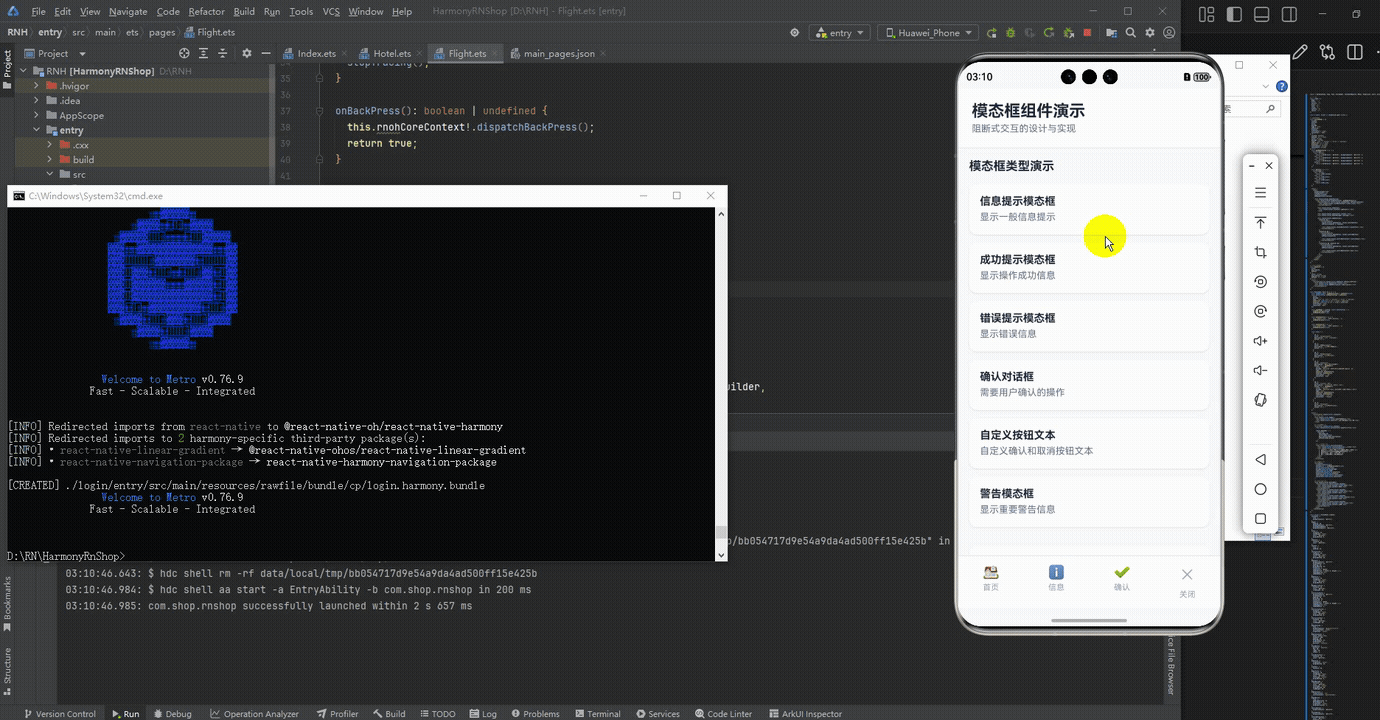
<Text style={styles.title}>模态框组件演示</Text>
<Text style={styles.subtitle}>阻断式交互的设计与实现</Text>
</View>
{/* 演示列表 */}
<ScrollView style={styles.content}>
<Text style={styles.sectionTitle}>模态框类型演示</Text>
{demos.map(demo => (
<DemoCard
key={demo.id}
title={demo.title}
description={demo.description}
onPress={demo.action}
/>
))}
{/* 使用说明 */}
<View style={styles.instructionCard}>
<Text style={styles.instructionTitle}>使用说明</Text>
<Text style={styles.instructionText}>
1. 模态框用于阻断当前操作流程,需要用户做出决策{'\n'}
2. 支持不同类型:信息、成功、错误、警告{'\n'}
3. 可自定义按钮文本和回调函数{'\n'}
4. 点击背景或关闭按钮可关闭模态框
</Text>
</View>
</ScrollView>
{/* 模态框 */}
<CustomModal
visible={modalVisible}
onClose={() => setModalVisible(false)}
title={modalConfig.title}
message={modalConfig.message}
type={modalConfig.type}
onConfirm={modalConfig.onConfirm}
onCancel={modalConfig.onCancel}
confirmText={modalConfig.confirmText}
cancelText={modalConfig.cancelText}
/>
{/* 底部导航 */}
<View style={styles.bottomNav}>
<TouchableOpacity style={styles.navItem}>
<Text style={styles.navIcon}>{ICONS.home}</Text>
<Text style={styles.navText}>首页</Text>
</TouchableOpacity>
<TouchableOpacity style={styles.navItem}>
<Text style={styles.navIcon}>{ICONS.info}</Text>
<Text style={styles.navText}>信息</Text>
</TouchableOpacity>
<TouchableOpacity style={styles.navItem}>
<Text style={styles.navIcon}>{ICONS.confirm}</Text>
<Text style={styles.navText}>确认</Text>
</TouchableOpacity>
<TouchableOpacity style={styles.navItem}>
<Text style={styles.navIcon}>{ICONS.close}</Text>
<Text style={styles.navText}>关闭</Text>
</TouchableOpacity>
</View>
</SafeAreaView>
);
};
const styles = StyleSheet.create({
container: {
flex: 1,
backgroundColor: '#f8fafc',
},
header: {
padding: 20,
backgroundColor: '#ffffff',
borderBottomWidth: 1,
borderBottomColor: '#e2e8f0',
},
title: {
fontSize: 24,
fontWeight: 'bold',
color: '#1e293b',
marginBottom: 4,
},
subtitle: {
fontSize: 14,
color: '#64748b',
},
content: {
flex: 1,
padding: 16,
},
sectionTitle: {
fontSize: 18,
fontWeight: 'bold',
color: '#1e293b',
marginBottom: 16,
},
demoCard: {
backgroundColor: '#ffffff',
borderRadius: 12,
padding: 16,
marginBottom: 12,
elevation: 2,
shadowColor: '#000',
shadowOffset: { width: 0, height: 1 },
shadowOpacity: 0.1,
shadowRadius: 2,
},
demoTitle: {
fontSize: 16,
fontWeight: 'bold',
color: '#1e293b',
marginBottom: 4,
},
demoDescription: {
fontSize: 14,
color: '#64748b',
lineHeight: 20,
},
instructionCard: {
backgroundColor: '#ffffff',
borderRadius: 12,
padding: 16,
marginTop: 16,
elevation: 2,
shadowColor: '#000',
shadowOffset: { width: 0, height: 1 },
shadowOpacity: 0.1,
shadowRadius: 2,
},
instructionTitle: {
fontSize: 16,
fontWeight: 'bold',
color: '#1e293b',
marginBottom: 8,
},
instructionText: {
fontSize: 14,
color: '#64748b',
lineHeight: 20,
},
modalOverlay: {
flex: 1,
backgroundColor: 'rgba(0,0,0,0.5)',
justifyContent: 'center',
alignItems: 'center',
},
modalContainer: {
width: width * 0.8,
maxWidth: 400,
padding: 20,
borderRadius: 12,
borderWidth: 2,
position: 'relative',
},
closeButton: {
position: 'absolute',
top: 10,
right: 10,
zIndex: 1,
},
closeButtonText: {
fontSize: 18,
color: '#64748b',
},
modalIcon: {
alignItems: 'center',
marginBottom: 16,
},
iconText: {
fontSize: 48,
},
modalTitle: {
fontSize: 18,
fontWeight: 'bold',
color: '#1e293b',
textAlign: 'center',
marginBottom: 8,
},
modalMessage: {
fontSize: 14,
color: '#64748b',
textAlign: 'center',
marginBottom: 20,
lineHeight: 20,
},
modalActions: {
flexDirection: 'row',
justifyContent: 'space-between',
},
modalButton: {
flex: 1,
paddingVertical: 12,
borderRadius: 8,
alignItems: 'center',
marginHorizontal: 4,
},
confirmButton: {
backgroundColor: '#3b82f6',
},
cancelButton: {
backgroundColor: '#f1f5f9',
},
confirmButtonText: {
color: '#ffffff',
fontSize: 16,
fontWeight: '500',
},
cancelButtonText: {
color: '#64748b',
fontSize: 16,
fontWeight: '500',
},
bottomNav: {
flexDirection: 'row',
justifyContent: 'space-around',
backgroundColor: '#ffffff',
borderTopWidth: 1,
borderTopColor: '#e2e8f0',
paddingVertical: 12,
},
navItem: {
alignItems: 'center',
},
navIcon: {
fontSize: 20,
color: '#94a3b8',
marginBottom: 4,
},
navText: {
fontSize: 12,
color: '#94a3b8',
},
});
export default ModalDemo;
打包
接下来通过打包命令npn run harmony将reactNative的代码打包成为bundle,这样可以进行在开源鸿蒙OpenHarmony中进行使用。

打包之后再将打包后的鸿蒙OpenHarmony文件拷贝到鸿蒙的DevEco-Studio工程目录去:

最后运行效果图如下显示:
欢迎大家加入开源鸿蒙跨平台开发者社区,一起共建开源鸿蒙跨平台生态。

作为“人工智能6S店”的官方数字引擎,为AI开发者与企业提供一个覆盖软硬件全栈、一站式门户。
更多推荐

 10
10 0
0- 0


 已为社区贡献8条内容

所有评论(0)