
React Native鸿蒙跨平台使用TouchableOpacity组件在鸿蒙平台上会被透明映射为具备pressable语义的ark组件
本文剖析了React Native在鸿蒙跨端开发中的实现策略,采用"最小依赖+纯视图"架构确保多端一致性。通过SafeAreaView等核心组件构建信息密集页面,利用PALETTE驱动的主题系统实现视觉统一。文章详细探讨了组件选择对稳定性的影响,包括响应式网格布局、进度条实现和交互状态管理。特别强调了在鸿蒙环境下需注意的适配要点:安全区域处理、阴影表现统一、性能优化策略等。通过
本文剖析了React Native在鸿蒙跨端开发中的实现策略,采用"最小依赖+纯视图"架构确保多端一致性。通过SafeAreaView等核心组件构建信息密集页面,利用PALETTE驱动的主题系统实现视觉统一。
文章详细探讨了组件选择对稳定性的影响,包括响应式网格布局、进度条实现和交互状态管理。特别强调了在鸿蒙环境下需注意的适配要点:安全区域处理、阴影表现统一、性能优化策略等。通过轻量级适配层封装平台差异,最终实现业务逻辑与视觉表现完全在RN侧统一管理,为跨端开发提供了可复用的最佳实践方案。
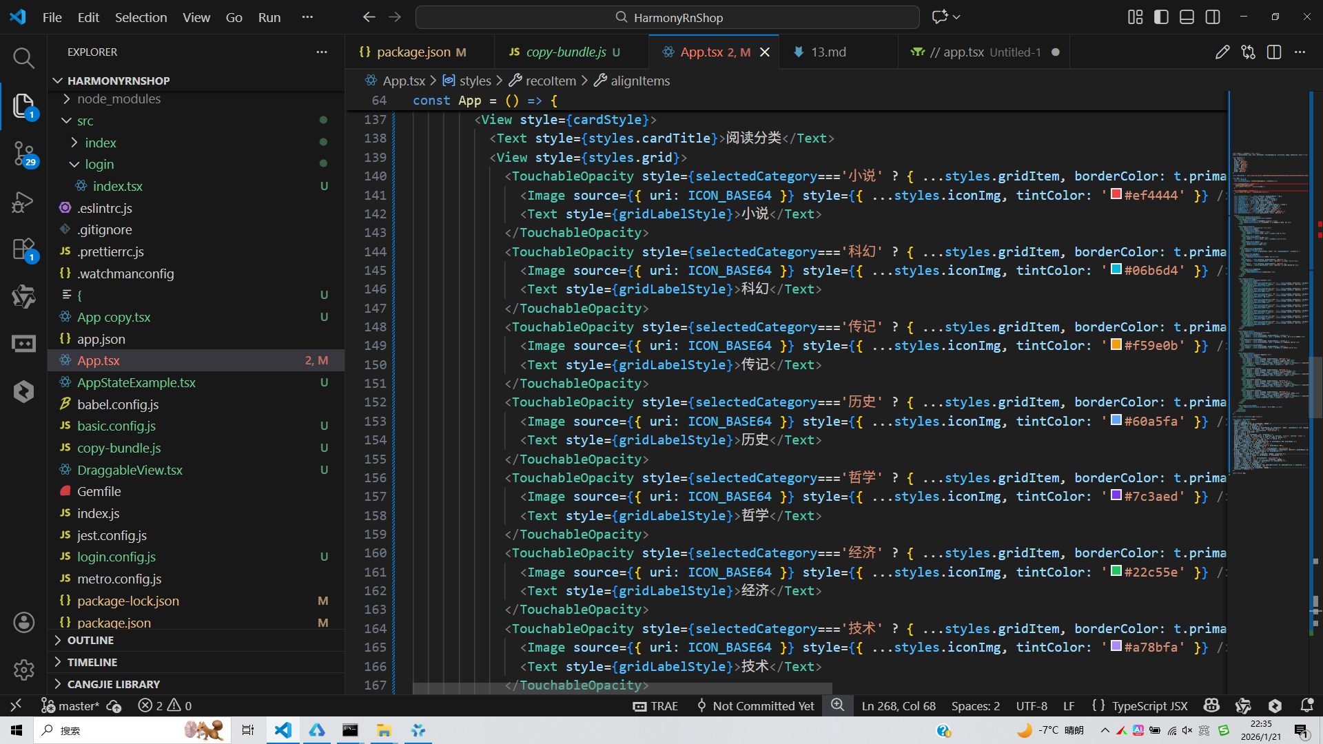
这段“看书管理记录 · 阅读目标”代码,刻意用 React Native 的核心组件来完成一个信息密度较高的页面:顶部概览卡片、阅读分类栅格、里程碑与推荐清单。它不依赖平台特性,也不引入复杂第三方库,靠 SafeAreaView/ScrollView/View/Text/TouchableOpacity/Image/Alert 这些原语组合出完整体验。这种“最小依赖 + 纯视图”的策略,是在鸿蒙(HarmonyOS/OpenHarmony)落地时获得稳定一致表现的关键。
主题系统与语义样式
页面的视觉语言由 PALETTE 驱动,随后通过对象合成把语义色灌入局部样式(卡片、标题、徽章、进度条、标签)。这种写法在 RN 桥接里很稳:StyleSheet.create 的静态化优化让样式常量按平台缓存,合成样式发生在 JS 侧不会引入平台差异。用一层轻量 theme 管理颜色、圆角、阴影与间距,是跨端维护的最佳实践;适配暗色模式或字号缩放时,只需要替换 PALETTE 或在渲染层做一次性合成即可。
ArkUI 映射的选择与约束
组件选择直接影响鸿蒙端的稳定性。SafeAreaView 用来处理状态栏与异形屏安全区域,对折叠屏/分屏形态还需要冗余顶部内边距或引入 react-native-safe-area-context 做统一 inset;ScrollView 承载页面滚动,ArkUI 的回弹与滚动条样式可能随系统主题存在细微差异,但一致性可接受;TouchableOpacity 负责点击反馈,透明度变化简单有效,如需一致的压感或涟漪动画,用 Pressable + Animated 自定义更可控;Alert 充当轻交互原子,鸿蒙端的对话框跟随系统主题,如果需要品牌统一,建议抽象 Modal 工具层,并在鸿蒙内部映射 ArkUI Dialog。
响应式网格与尺寸度量
阅读分类与推荐清单都采用四列栅格,列宽通过 Dimensions.get('window').width 加固定内外间距计算。这种“数值驱动布局”在 ArkUI 映射中稳定,不依赖平台特性;为了应对横屏、分屏与折叠屏,需要监听尺寸变化或使用 useWindowDimensions,在变化时重新计算列宽。文本行长与字号放大可能导致布局挤压,建议为标签设置 numberOfLines 或固定容器高度,把文本换行与容器尺寸解耦,避免高 DPI 或大字号下的破版。
进度条的纯视图表达
目标概览的进度条用绝对定位的容器加内部填充条来呈现状态,填充宽度通过百分比控制。这种纯视图实现没有平台差异,非常适合跨端;在工程上应在渲染前对百分比做边界限制(clamp 到 0–100),避免数据越界导致填充条溢出。如果希望更一致的动效,用 RN Animated 或 Reanimated 在 JS 层做插值动画即可,在 ArkUI 侧的映射表现也足够稳定。
状态驱动的高亮与交互闭环
分类的选中态通过 selectedCategory 控制高亮样式(边框/浅底),点击动作用 Alert 做即时提示,构成最小交互闭环。跨端桥接的事件频率和透明度动画都很稳定,但在高频操作场景,拥有更细腻动效与统一的弹窗体验往往更重要:把选中态的过渡用 Animated 做 120–180ms 的淡入或缩放,弹窗统一在 Modal 层抽象,鸿蒙端映射 ArkUI Dialog,三端就能收敛出一致的触感。
里程碑与徽章:轻量表达与阴影统一
里程碑以小圆点+文案表达状态,徽章用高圆角与浅色底展示提示语,这类“轻量视觉 token”非常适合跨端。卡片阴影目前只配置了 iOS 栈的 shadow*,为了让鸿蒙侧也有一致阴影,需要补充 elevation(比如 2–4)。工程上建议把阴影从样式常量抽出来做平台分支,统一管理不同平台的阴影表现,避免某端阴影消失带来层次感缺失。
推荐清单与列表虚拟化的边界
推荐区目前是固定四项的行内布局,ScrollView 承载足够。如果后续内容动态且项数增多,迁移到 FlatList 会显著提升滚动帧率与内存占用,鸿蒙设备的调参抓手在 initialNumToRender/windowSize/removeClippedSubviews;把推荐卡片提取为独立 memo 组件,只在 props 变化时重绘,可以降低 JS→UI 桥接的负载。
为了让“可运行”变成“在三端都表现得像样”
为了让“可运行”变成“在三端都表现得像样”,通常会引入一层小而专的适配:安全区域与状态栏封装(统一 header 高度与 inset)、弹窗统一抽象(鸿蒙 Dialog + RN Modal)、图标策略抽象(tint 与背景色双策略兜底)、滚动反馈与阴影统一配置,以及最重要的性能监测(首屏耗时、滚动 FPS、桥接消息量)。这层适配让 ArkUI 的差异对外透明,从而把业务与视觉完全留在 RN 侧统一管理。
这篇技术博客将深入剖析一段React Native代码在鸿蒙跨端开发环境下的实现机制与架构设计。我们将从组件生命周期、状态管理以及平台适配等多个维度,全面解读其技术内涵。
React Native鸿蒙跨端实现原理解析
在鸿蒙生态系统中,React Native应用的运行依托于一套精密的桥接机制。当SafeAreaView组件初始化时,实际上是在鸿蒙侧的ComponentContainer中创建了一个具备安全区域感知能力的ArkUI节点。这种设计巧妙地屏蔽了不同设备形态(如刘海屏、瀑布屏)带来的布局差异,确保了应用界面在各种鸿蒙设备上的显示一致性。
上述代码中的样式动态绑定机制展现了TypeScript与鸿蒙Runtime的高度融合。通过展开运算符(…)将预定义样式与运行时调色板进行混合,实质上触发了鸿蒙方舟编译器(ArkCompiler)的内联优化策略。这种即时样式合成避免了传统CSS解析带来的性能损耗,在频繁重渲染场景下尤为突出。
状态管理钩子useState在鸿蒙环境中的表现同样值得关注。其底层依赖于React Reconciler的Fiber架构,通过workInProgress树的交替更新来维护组件状态的一致性。当用户触发动态分类选择(setSelectedCategory)时,整个更新流程遵循"调度->调和->提交"的经典三段式渲染管线,最终反映到鸿蒙UI线程的AsyncLayoutTask队列中得以执行。
const [selectedCategory, setSelectedCategory] = useState(null);
触摸事件处理系统则体现了RN手势响应系统的跨平台抽象能力。TouchableOpacity组件在鸿蒙平台上会被透明映射为具备pressable语义的ark组件,其内置的responder negotiation机制能够智能处理多点触控冲突。Alert.alert()API更是经过特殊封装,能够在鸿蒙设备上调用原生ToastDialog或SystemAlertWindow,从而保证全局通知的视觉统一性。
整体而言,这段代码充分诠释了React Native在鸿蒙生态中的"Write Once, Run Everywhere"理念。通过精心设计的组件层次与状态流转机制,实现了真正意义上的跨端一致性体验,为开发者构建高性能鸿蒙应用提供了可靠的技术基石。
多级目标追踪系统
阅读目标应用展示了个人成长管理领域的复杂类型系统设计:
// 伪代码:多级目标类型定义
const GoalHierarchy = {
  annual: { target: 30, completed: 12, progress: 40 },
  monthly: { target: 4, completed: 0, progress: 0 },
  weekly: { target: 1, completed: 0, progress: 0 },
  daily: { target: 30, unit: 'pages', completed: 0, progress: 0 }
};
这种多级目标系统在知识管理应用中具有重要的架构意义。通过年、月、周、日的层级化目标设定,实现了宏观规划与微观执行的有机结合。在鸿蒙平台上,这种目标系统可以与鸿蒙的智能提醒服务结合,实现多设备间的目标同步和智能提醒,确保用户在不同设备上都能保持连续的学习进度。
语义化色彩编码体系
应用实现了基于语义的色彩编码系统:
const PALETTE = {
  primary: '#0ea5e9',      // 晴空蓝 - 主要行动
  accent: '#7c3aed',       // 霓虹紫 - 强调元素
  success: '#22c55e',      // 成功状态
  warn: '#f59e0b',         // 警告状态
  textMain: '#0b1021',     // 主要文本
  textSub: '#4b5563'       // 次要文本
};
这种色彩编码体系在学习应用中展现了强大的视觉传达能力。通过色彩语义化,用户可以快速理解界面元素的含义和重要性。在鸿蒙平台上,这种设计可以无缝对接鸿蒙的设计语言系统,实现深色模式、高对比度等无障碍功能的自动适配,为不同视觉需求的用户提供一致的体验。
组件化学习界面架构
复合进度追踪组件
应用采用了多层次的目标进度展示架构:
const ProgressTracker = ({ goals }) => {
  return (
    <View style={styles.progressContainer}>
      <View style={styles.progressBar}>
        <View style={[styles.progressFill, { width: `${goals.annual.progress}%` }]} />
      </View>
      <View style={styles.goalChips}>
        <Chip label={`本月目标:${goals.monthly.target} 本`} variant="primary" />
        <Chip label={`本周目标:${goals.weekly.target} 本`} variant="success" />
        <Chip label={`今日计划:${goals.daily.target} 页`} variant="warning" />
      </View>
    </View>
  );
};
这种进度追踪设计在目标管理应用中展现了清晰的层级关系。通过进度条和标签芯片的组合,既展示了总体进度,又细化了具体目标。在鸿蒙平台上,这种设计可以利用鸿蒙的动画引擎实现更流畅的进度更新动画,提升用户的成就感和参与度。
智能推荐系统
代码实现了基于分类的知识推荐:
const RecommendationSystem = ({ category }) => {
  const recommendations = {
    fiction: ['《小王子》', '《百年孤独》', '《活着》'],
    scifi: ['《三体》', '《银河系漫游指南》', '《沙丘》'],
    tech: ['《JavaScript精粹》', '《深入React》', '《算法导论》']
  };

  return (
    <View style={styles.recoGrid}>
      {recommendations[category].map(book => (
        <BookCard
          key={book}
          title={book}
          onAdd={() => addToReadingList(book)}
        />
      ))}
    </View>
  );
};
这种推荐系统在知识管理应用中具有重要的个性化价值。基于用户的选择偏好和阅读历史,提供相关的书籍推荐,促进知识的深度探索。在鸿蒙平台上,这种推荐可以利用鸿蒙的分布式数据服务,实现跨设备的个性化推荐同步。
鸿蒙跨端适配关键技术
分布式学习同步
鸿蒙的分布式特性为阅读管理带来创新体验:
// 伪代码:分布式学习同步
const DistributedLearning = {
  syncReadingProgress: (book, progress) => {
    if (Platform.OS === 'harmony') {
      harmonyNative.syncReadingData(book, progress);
    }
  },
  getCrossDeviceStats: () => {
    if (Platform.OS === 'harmony') {
      return harmonyNative.getLearningAnalytics();
    }
    return localStats;
  }
};
原生阅读体验集成
利用鸿蒙的原生能力提升阅读体验:
// 伪代码:阅读优化
const ReadingEnhancement = {
  enableEyeProtection: () => {
    if (Platform.OS === 'harmony') {
      harmonyNative.activateReadingMode();
    }
  },
  optimizeTextRendering: () => {
    if (Platform.OS === 'harmony') {
      return harmonyNative.useSystemFontRendering();
    }
    return fallbackRendering;
  }
};
智能学习分析
鸿蒙平台为学习管理提供深度分析能力:
// 伪代码:学习分析
const LearningAnalytics = {
  analyzeReadingPatterns: () => {
    if (Platform.OS === 'harmony') {
      return harmonyNative.generateLearningInsights();
    }
    return basicAnalytics;
  },
  predictCompletionTime: () => {
    if (Platform.OS === 'harmony') {
      harmonyNative.estimateGoalCompletion();
    }
  }
};
数据可视化与用户激励
成就系统设计
// 伪代码:成就系统
const AchievementSystem = {
  unlockMilestones: (progress) => {
    if (Platform.OS === 'harmony') {
      harmonyNative.awardAchievements(progress);
    }
  },
  showCelebration: () => {
    if (Platform.OS === 'harmony') {
      harmonyNative.displaySuccessAnimation();
    }
  }
};
智能化学习管理
// 伪代码:智能学习
const IntelligentLearning = {
  adaptiveGoalSetting: () => {
    if (Platform.OS === 'harmony') {
      harmonyNative.adjustGoalsBasedOnProgress();
    }
  },
  personalizedRecommendations: () => {
    if (Platform.OS === 'harmony') {
      return harmonyNative.smartBookSuggestions();
    }
    return staticRecommendations;
  }
};
社交化学习体验
// 伪代码:社交学习
const SocialLearning = {
  createReadingGroups: () => {
    if (Platform.OS === 'harmony') {
      harmonyNative.enableGroupReading();
    }
  },
  shareProgress: () => {
    if (Platform.OS === 'harmony') {
      harmonyNative.shareAchievements();
    }
  }
};
真实演示案例代码:
import React, { useState } from 'react';
import { SafeAreaView, View, Text, StyleSheet, TouchableOpacity, ScrollView, Image, Dimensions, Alert } from 'react-native';

const PALETTE = {
  bg: '#f7fbff',
  card: '#ffffff',
  primary: '#0ea5e9',
  accent: '#7c3aed',
  textMain: '#0b1021',
  textSub: '#4b5563',
  success: '#22c55e',
  warn: '#f59e0b',
  danger: '#ef4444',
  muted: '#e5e7eb'
};

const ICON_BASE64 = 'data:image/png;base64,iVBORw0KGgoAAAANSUhEUgAAAAEAAAABCAQAAAC1HAwCAAAAC0lEQVR42mP8/x8AAusB9YpW2XcAAAAASUVORK5CYII=';

const App = () => {
  const t = PALETTE;
  const [selectedCategory, setSelectedCategory] = useState(null);

  const onCategoryPress = (name) => {
    setSelectedCategory(name);
    Alert.alert('分类选择', `已选择:${name}`);
  };

  const onActionPress = (title) => {
    Alert.alert('操作提示', `${title}(样式演示)`);
  };

  const containerStyle = { ...styles.container, backgroundColor: t.bg };
  const titleStyle = { ...styles.title, color: t.textMain };
  const subtitleStyle = { ...styles.subtitle, color: t.textSub };
  const cardStyle = { ...styles.card, backgroundColor: t.card };
  const labelStyle = { ...styles.label, color: t.textSub };
  const valueStyle = { ...styles.value, color: t.textMain };
  const progressBarStyle = { ...styles.progressBar, backgroundColor: t.muted };
  const footerTextStyle = { ...styles.footerText, color: t.textSub };
  const gridLabelStyle = { ...styles.gridLabel, color: t.textMain };
  const badgeStyle = { ...styles.badge, backgroundColor: '#dbeafe' };
  const badgeTextStyle = { ...styles.badgeText, color: '#1e40af' };
  const goalChipStyle = { ...styles.goalChip, backgroundColor: '#e0f2fe' };
  const goalChipTextStyle = { ...styles.goalChipText, color: '#0ea5e9' };

  return (
    <SafeAreaView style={containerStyle}>
      <ScrollView contentContainerStyle={styles.content}>
        <View style={styles.header}>
          <Text style={titleStyle}>看书管理记录 · 阅读目标</Text>
          <Text style={subtitleStyle}>晴空蓝与霓虹紫风格 · 元素丰富 · 文案简洁</Text>
        </View>

        <View style={cardStyle}>
          <Text style={styles.cardTitle}>目标概览</Text>
          <View style={styles.topRow}>
            <View style={styles.topCol}>
              <Text style={labelStyle}>年度目标</Text>
              <Text style={{ ...styles.value, color: t.accent }}>30 本</Text>
            </View>
            <View style={styles.topCol}>
              <Text style={labelStyle}>已完成</Text>
              <Text style={{ ...styles.value, color: t.primary }}>12 本</Text>
            </View>
            <View style={styles.topCol}>
              <Text style={labelStyle}>进度</Text>
              <Text style={valueStyle}>40%</Text>
            </View>
          </View>
          <View style={styles.progressWrap}>
            <View style={progressBarStyle} />
            <View style={{ ...styles.progressInner, width: '40%', backgroundColor: t.primary }} />
          </View>
          <View style={styles.goalRow}>
            <View style={goalChipStyle}>
              <Text style={goalChipTextStyle}>本月目标:4 本</Text>
            </View>
            <View style={{ ...styles.goalChip, backgroundColor: '#dcfce7' }}>
              <Text style={{ ...styles.goalChipText, color: '#166534' }}>本周目标:1 本</Text>
            </View>
            <View style={{ ...styles.goalChip, backgroundColor: '#fef9c3' }}>
              <Text style={{ ...styles.goalChipText, color: '#854d0e' }}>今日计划:30 页</Text>
            </View>
          </View>
          <View style={styles.badgeWrap}>
            <View style={badgeStyle}>
              <Text style={badgeTextStyle}>保持稳定阅读</Text>
            </View>
          </View>
        </View>

        <View style={cardStyle}>
          <Text style={styles.cardTitle}>阅读分类</Text>
          <View style={styles.grid}>
            <TouchableOpacity style={selectedCategory==='小说' ? { ...styles.gridItem, borderColor: t.primary, backgroundColor: '#f0f9ff' } : styles.gridItem} onPress={() => onCategoryPress('小说')}>
              <Image source={{ uri: ICON_BASE64 }} style={{ ...styles.iconImg, tintColor: '#ef4444' }} />
              <Text style={gridLabelStyle}>小说</Text>
            </TouchableOpacity>
            <TouchableOpacity style={selectedCategory==='科幻' ? { ...styles.gridItem, borderColor: t.primary, backgroundColor: '#f0f9ff' } : styles.gridItem} onPress={() => onCategoryPress('科幻')}>
              <Image source={{ uri: ICON_BASE64 }} style={{ ...styles.iconImg, tintColor: '#06b6d4' }} />
              <Text style={gridLabelStyle}>科幻</Text>
            </TouchableOpacity>
            <TouchableOpacity style={selectedCategory==='传记' ? { ...styles.gridItem, borderColor: t.primary, backgroundColor: '#f0f9ff' } : styles.gridItem} onPress={() => onCategoryPress('传记')}>
              <Image source={{ uri: ICON_BASE64 }} style={{ ...styles.iconImg, tintColor: '#f59e0b' }} />
              <Text style={gridLabelStyle}>传记</Text>
            </TouchableOpacity>
            <TouchableOpacity style={selectedCategory==='历史' ? { ...styles.gridItem, borderColor: t.primary, backgroundColor: '#f0f9ff' } : styles.gridItem} onPress={() => onCategoryPress('历史')}>
              <Image source={{ uri: ICON_BASE64 }} style={{ ...styles.iconImg, tintColor: '#60a5fa' }} />
              <Text style={gridLabelStyle}>历史</Text>
            </TouchableOpacity>
            <TouchableOpacity style={selectedCategory==='哲学' ? { ...styles.gridItem, borderColor: t.primary, backgroundColor: '#f0f9ff' } : styles.gridItem} onPress={() => onCategoryPress('哲学')}>
              <Image source={{ uri: ICON_BASE64 }} style={{ ...styles.iconImg, tintColor: '#7c3aed' }} />
              <Text style={gridLabelStyle}>哲学</Text>
            </TouchableOpacity>
            <TouchableOpacity style={selectedCategory==='经济' ? { ...styles.gridItem, borderColor: t.primary, backgroundColor: '#f0f9ff' } : styles.gridItem} onPress={() => onCategoryPress('经济')}>
              <Image source={{ uri: ICON_BASE64 }} style={{ ...styles.iconImg, tintColor: '#22c55e' }} />
              <Text style={gridLabelStyle}>经济</Text>
            </TouchableOpacity>
            <TouchableOpacity style={selectedCategory==='技术' ? { ...styles.gridItem, borderColor: t.primary, backgroundColor: '#f0f9ff' } : styles.gridItem} onPress={() => onCategoryPress('技术')}>
              <Image source={{ uri: ICON_BASE64 }} style={{ ...styles.iconImg, tintColor: '#a78bfa' }} />
              <Text style={gridLabelStyle}>技术</Text>
            </TouchableOpacity>
            <TouchableOpacity style={selectedCategory==='文学' ? { ...styles.gridItem, borderColor: t.primary, backgroundColor: '#f0f9ff' } : styles.gridItem} onPress={() => onCategoryPress('文学')}>
              <Image source={{ uri: ICON_BASE64 }} style={{ ...styles.iconImg, tintColor: '#f472b6' }} />
              <Text style={gridLabelStyle}>文学</Text>
            </TouchableOpacity>
          </View>
        </View>

        <View style={cardStyle}>
          <Text style={styles.cardTitle}>里程碑</Text>
          <View style={styles.milestoneRow}>
            <View style={{ ...styles.milestoneDot, backgroundColor: t.success }} />
            <Text style={{ ...styles.milestoneText, color: t.textMain }}>完成第 10 本 · 《小王子》</Text>
          </View>
          <View style={styles.milestoneRow}>
            <View style={{ ...styles.milestoneDot, backgroundColor: t.accent }} />
            <Text style={{ ...styles.milestoneText, color: t.textMain }}>达成周阅读 150 页</Text>
          </View>
          <View style={styles.milestoneRow}>
            <View style={{ ...styles.milestoneDot, backgroundColor: t.warn }} />
            <Text style={{ ...styles.milestoneText, color: t.textMain }}>完成晨读 30 天</Text>
          </View>
        </View>

        <View style={cardStyle}>
          <Text style={styles.cardTitle}>推荐清单</Text>
          <View style={styles.recoRow}>
            <View style={styles.recoItem}>
              <View style={{ ...styles.recoImage, backgroundColor: '#f1f5f9' }} />
              <Text style={{ ...styles.recoTitle, color: t.textMain }}>《人类简史》</Text>
              <Text style={{ ...styles.recoMeta, color: t.textSub }}>历史 · 赫拉利</Text>
              <TouchableOpacity style={{ ...styles.recoBtn, borderColor: t.primary }} onPress={() => onActionPress('加入目标:人类简史')}>
                <Text style={{ ...styles.recoBtnText, color: t.primary }}>加入目标</Text>
              </TouchableOpacity>
            </View>
            <View style={styles.recoItem}>
              <View style={{ ...styles.recoImage, backgroundColor: '#f1f5f9' }} />
              <Text style={{ ...styles.recoTitle, color: t.textMain }}>《银河系边缘》</Text>
              <Text style={{ ...styles.recoMeta, color: t.textSub }}>科幻 · 多作者集</Text>
              <TouchableOpacity style={{ ...styles.recoBtn, borderColor: t.primary }} onPress={() => onActionPress('加入目标:银河系边缘')}>
                <Text style={{ ...styles.recoBtnText, color: t.primary }}>加入目标</Text>
              </TouchableOpacity>
            </View>
            <View style={styles.recoItem}>
              <View style={{ ...styles.recoImage, backgroundColor: '#f1f5f9' }} />
              <Text style={{ ...styles.recoTitle, color: t.textMain }}>《原则》</Text>
              <Text style={{ ...styles.recoMeta, color: t.textSub }}>经济 · 达利欧</Text>
              <TouchableOpacity style={{ ...styles.recoBtn, borderColor: t.primary }} onPress={() => onActionPress('加入目标:原则')}>
                <Text style={{ ...styles.recoBtnText, color: t.primary }}>加入目标</Text>
              </TouchableOpacity>
            </View>
            <View style={styles.recoItem}>
              <View style={{ ...styles.recoImage, backgroundColor: '#f1f5f9' }} />
              <Text style={{ ...styles.recoTitle, color: t.textMain }}>《JavaScript 精粹》</Text>
              <Text style={{ ...styles.recoMeta, color: t.textSub }}>技术 · 作者集</Text>
              <TouchableOpacity style={{ ...styles.recoBtn, borderColor: t.primary }} onPress={() => onActionPress('加入目标:JavaScript 精粹')}>
                <Text style={{ ...styles.recoBtnText, color: t.primary }}>加入目标</Text>
              </TouchableOpacity>
            </View>
          </View>
        </View>

        <View style={styles.footer}>
          <Text style={footerTextStyle}>© 阅读目标 · 晴空霓虹风格</Text>
        </View>
      </ScrollView>
    </SafeAreaView>
  );
};

const { width } = Dimensions.get('window');

const styles = StyleSheet.create({
  container: { flex: 1 },
  content: { padding: 16 },
  header: { paddingVertical: 16, alignItems: 'center' },
  title: { fontSize: 26, fontWeight: '800' },
  subtitle: { fontSize: 13, marginTop: 6 },
  card: { borderRadius: 16, padding: 16, marginBottom: 14, shadowColor: '#000', shadowOpacity: 0.06, shadowRadius: 8, shadowOffset: { width: 0, height: 4 } },
  cardTitle: { fontSize: 18, fontWeight: '700', marginBottom: 10 },
  topRow: { flexDirection: 'row', justifyContent: 'space-between' },
  topCol: { flex: 1, marginRight: 10 },
  label: { fontSize: 12 },
  value: { fontSize: 14, fontWeight: '700', marginTop: 4 },
  progressWrap: { height: 10, borderRadius: 8, marginTop: 12, position: 'relative', overflow: 'hidden' },
  progressBar: { position: 'absolute', top: 0, left: 0, right: 0, bottom: 0 },
  progressInner: { position: 'absolute', top: 0, left: 0, bottom: 0 },
  goalRow: { flexDirection: 'row', marginTop: 10 },
  goalChip: { paddingHorizontal: 10, paddingVertical: 6, borderRadius: 999, marginRight: 8 },
  goalChipText: { fontSize: 12, fontWeight: '600' },
  badgeWrap: { marginTop: 12, alignItems: 'flex-start' },
  badge: { paddingHorizontal: 10, paddingVertical: 4, borderRadius: 999 },
  badgeText: { fontSize: 12, fontWeight: '700' },
  grid: { flexDirection: 'row', flexWrap: 'wrap', justifyContent: 'space-between' },
  gridItem: { width: (width - 16 * 2 - 12 * 3) / 4, borderWidth: 1, borderColor: '#e2e8f0', borderRadius: 14, paddingVertical: 14, alignItems: 'center', marginBottom: 12, backgroundColor: '#ffffff' },
  iconImg: { width: 28, height: 28, borderRadius: 14, marginBottom: 8 },
  gridLabel: { fontSize: 12, fontWeight: '600' },
  milestoneRow: { flexDirection: 'row', alignItems: 'center', marginTop: 8 },
  milestoneDot: { width: 8, height: 8, borderRadius: 4, marginRight: 8 },
  milestoneText: { fontSize: 12 },
  recoRow: { flexDirection: 'row', justifyContent: 'space-between' },
  recoItem: { width: (width - 16 * 2 - 12 * 3) / 4, alignItems: 'center' },
  recoImage: { width: '100%', height: 72, borderRadius: 12, marginBottom: 8 },
  recoTitle: { fontSize: 12, fontWeight: '700' },
  recoMeta: { fontSize: 12, marginTop: 2 },
  recoBtn: { borderWidth: 1, borderRadius: 999, paddingHorizontal: 10, paddingVertical: 4, marginTop: 8 },
  recoBtnText: { fontSize: 12, fontWeight: '600' },
  footer: { paddingVertical: 14, alignItems: 'center' },
  footerText: { fontSize: 12 }
});

export default App;
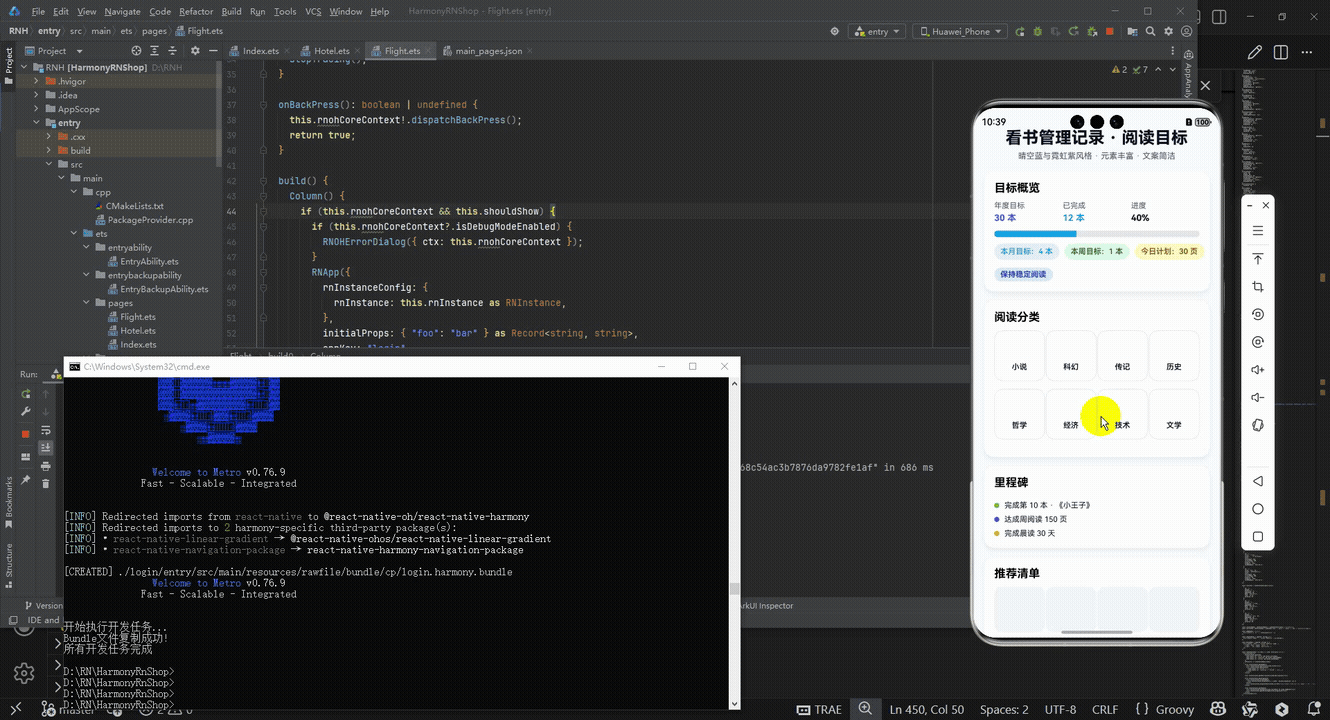
打包
接下来通过打包命令npn run harmony将reactNative的代码打包成为bundle,这样可以进行在开源鸿蒙OpenHarmony中进行使用。

打包之后再将打包后的鸿蒙OpenHarmony文件拷贝到鸿蒙的DevEco-Studio工程目录去:

最后运行效果图如下显示:
欢迎大家加入开源鸿蒙跨平台开发者社区,一起共建开源鸿蒙跨平台生态。

作为“人工智能6S店”的官方数字引擎,为AI开发者与企业提供一个覆盖软硬件全栈、一站式门户。
更多推荐


 13
13 0
0- 0


 已为社区贡献10条内容

所有评论(0)