
跨平台框架Flutter Icon组件在鸿蒙上的实战示例
Flutter的Icon组件教程摘要:本文介绍了Flutter中用于显示矢量图标的Icon组件,包括基础用法(大小、颜色、透明度设置)、Material Design和Cupertino两套图标库的使用(包含2000+内置图标),以及图标样式定制技巧(统一主题、阴影、渐变效果)。同时还介绍了带交互功能的IconButton组件。教程通过代码示例和分类图标展示,帮助开发者快速掌握图标在UI设计中的应
📖 前言
Icon 组件是 Flutter 中用于显示图标的组件。图标是 UI 设计中不可或缺的元素,能够直观地传达信息、增强用户体验。Flutter 提供了丰富的内置图标,同时也支持自定义图标库。本教程将带你深入了解 Icon 组件的各种用法和高级特性,并在鸿蒙设备上运行实战示例。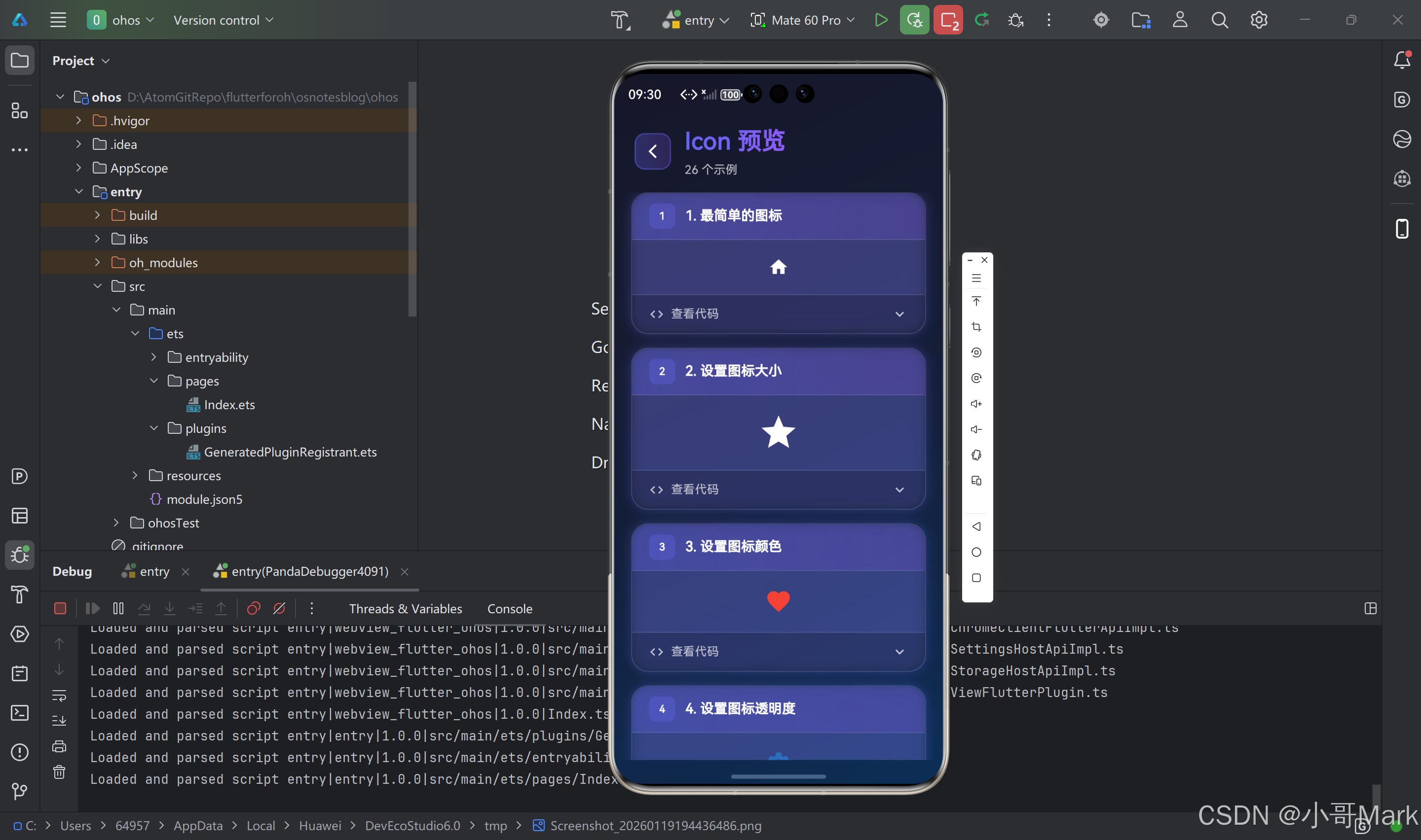
🎯 什么是 Icon 组件?
Icon 组件是 Flutter 中用于显示矢量图标的组件。它基于字体图标系统,可以轻松缩放而不失真,支持颜色、大小等属性的自定义。Flutter 内置了 Material Design 和 Cupertino 两套图标库,包含数千个常用图标。
基本语法
Icon(
  Icons.star,
  size: 24,
  color: Colors.blue,
)
🚀 基础用法

1. 最简单的图标显示
Icon(Icons.home)
这是最基础的用法,直接传入图标常量即可。Flutter 使用 Icons 类提供 Material Design 图标。
2. 设置图标大小
Icon(
  Icons.star,
  size: 48,  // 图标大小(像素)
)
size 属性控制图标的显示大小,单位为逻辑像素。
3. 设置图标颜色
Icon(
  Icons.favorite,
  color: Colors.red,  // 图标颜色
  size: 32,
)
color 属性控制图标的颜色。可以使用 Colors 类提供的预定义颜色,也可以使用自定义颜色。
4. 设置图标透明度
Icon(
  Icons.settings,
  color: Colors.blue.withOpacity(0.5),  // 50% 透明度
  size: 32,
)
📚 Material Design 图标库
Flutter 内置了 Material Design 图标库,包含超过 2000 个图标。
常用图标分类
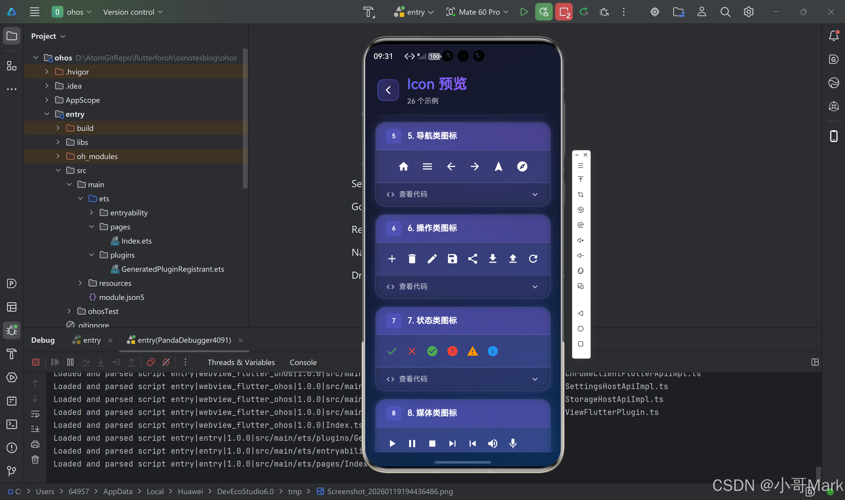
导航类图标
Icon(Icons.home)           // 首页
Icon(Icons.menu)           // 菜单
Icon(Icons.arrow_back)     // 返回
Icon(Icons.arrow_forward)  // 前进
Icon(Icons.navigation)    // 导航
Icon(Icons.explore)        // 探索
操作类图标
Icon(Icons.add)            // 添加
Icon(Icons.delete)         // 删除
Icon(Icons.edit)           // 编辑
Icon(Icons.save)           // 保存
Icon(Icons.share)          // 分享
Icon(Icons.download)       // 下载
Icon(Icons.upload)         // 上传
Icon(Icons.refresh)        // 刷新
状态类图标
Icon(Icons.check)          // 选中
Icon(Icons.close)          // 关闭
Icon(Icons.check_circle)   // 成功
Icon(Icons.error)          // 错误
Icon(Icons.warning)        // 警告
Icon(Icons.info)           // 信息
媒体类图标
Icon(Icons.play_arrow)     // 播放
Icon(Icons.pause)          // 暂停
Icon(Icons.stop)           // 停止
Icon(Icons.skip_next)      // 下一首
Icon(Icons.skip_previous)  // 上一首
Icon(Icons.volume_up)      // 音量
Icon(Icons.mic)            // 麦克风

社交类图标
Icon(Icons.favorite)      // 喜欢
Icon(Icons.favorite_border) // 未喜欢
Icon(Icons.thumb_up)       // 点赞
Icon(Icons.thumb_down)     // 点踩
Icon(Icons.comment)        // 评论
Icon(Icons.person)         // 用户
文件类图标
Icon(Icons.folder)        // 文件夹
Icon(Icons.insert_drive_file) // 文件
Icon(Icons.image)         // 图片
Icon(Icons.video_library) // 视频
Icon(Icons.audiotrack)    // 音频
Icon(Icons.description)  // 文档
图标变体
Material Design 图标库提供了多种变体:
// 填充样式(默认)
Icon(Icons.star)

// 轮廓样式
Icon(Icons.star_border)

// 圆形填充
Icon(Icons.star_circle)

// 圆形轮廓
Icon(Icons.star_circle_outlined)

// 其他变体
Icon(Icons.star_outline)
Icon(Icons.star_half)
Icon(Icons.star_rate)
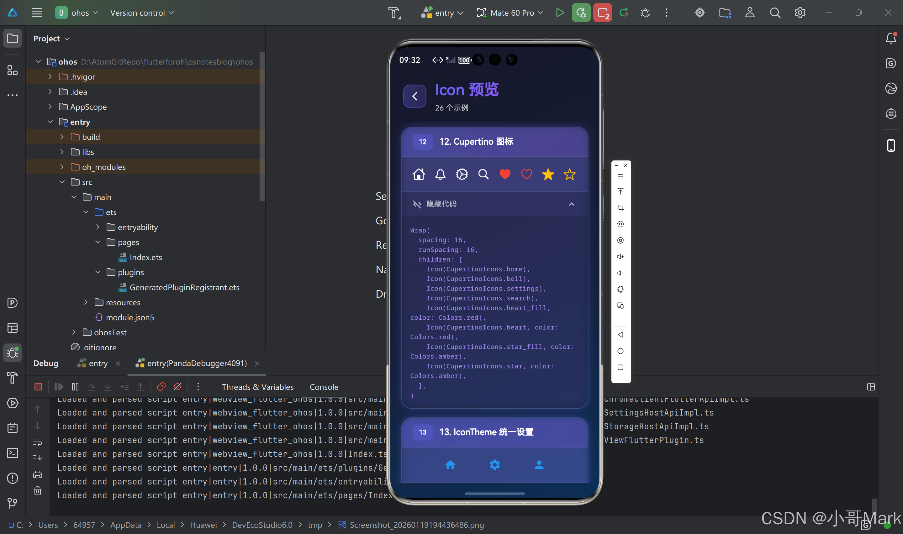
🍎 Cupertino 图标库
Flutter 还提供了 iOS 风格的 Cupertino 图标库:
import 'package:flutter/cupertino.dart';

Icon(
  CupertinoIcons.star_fill,  // iOS 风格图标
  size: 32,
  color: Colors.blue,
)
常用 Cupertino 图标
CupertinoIcons.home              // 首页
CupertinoIcons.bell              // 通知
CupertinoIcons.settings          // 设置
CupertinoIcons.search            // 搜索
CupertinoIcons.heart_fill        // 喜欢(填充)
CupertinoIcons.heart             // 喜欢(轮廓)
CupertinoIcons.star_fill         // 星星(填充)
CupertinoIcons.star              // 星星(轮廓)
CupertinoIcons.person_fill       // 用户(填充)
CupertinoIcons.person            // 用户(轮廓)
CupertinoIcons.camera_fill       // 相机(填充)
CupertinoIcons.camera            // 相机(轮廓)
🎨 图标样式定制
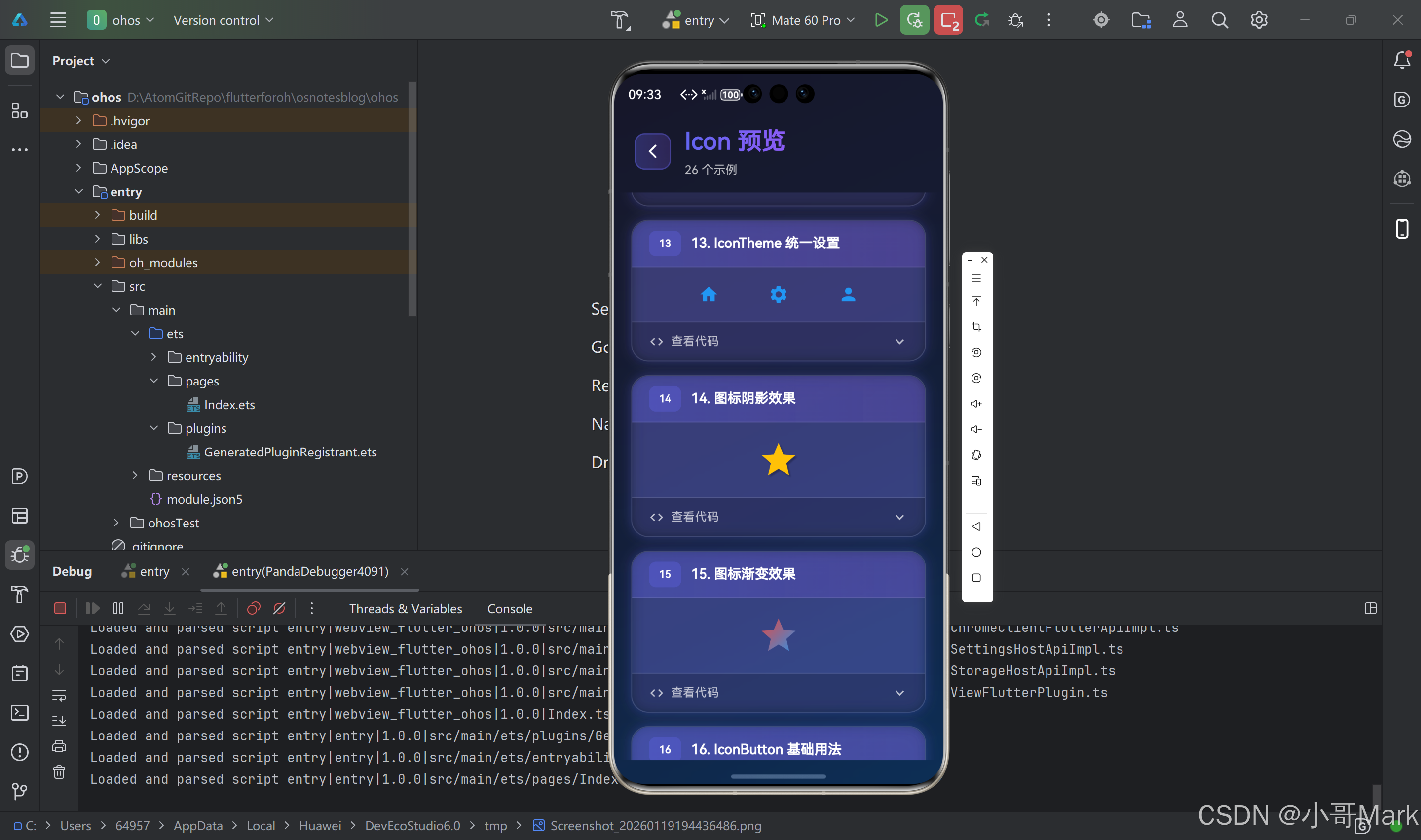
1. 使用 IconTheme 统一设置
IconTheme(
  data: IconThemeData(
    color: Colors.blue,
    size: 24,
  ),
  child: Row(
    children: [
      Icon(Icons.home),      // 继承主题设置
      Icon(Icons.settings),   // 继承主题设置
      Icon(Icons.person),     // 继承主题设置
    ],
  ),
)
2. 使用 IconThemeData 全局设置
MaterialApp(
  theme: ThemeData(
    iconTheme: IconThemeData(
      color: Colors.blue,
      size: 24,
    ),
  ),
  home: MyHomePage(),
)
3. 图标阴影效果
Icon(
  Icons.star,
  size: 48,
  color: Colors.amber,
  shadows: [
    Shadow(
      color: Colors.black26,
      blurRadius: 4,
      offset: Offset(2, 2),
    ),
  ],
)
4. 图标渐变效果
ShaderMask(
  shaderCallback: (bounds) => LinearGradient(
    colors: [Colors.red, Colors.blue],
    begin: Alignment.topLeft,
    end: Alignment.bottomRight,
  ).createShader(bounds),
  child: Icon(
    Icons.star,
    size: 48,
    color: Colors.white,  // 必须设置为白色
  ),
)
🎯 图标按钮(IconButton)
IconButton 是带有点击功能的图标组件,常用于工具栏、导航栏等场景。
基础用法
IconButton(
  icon: Icon(Icons.favorite),
  onPressed: () {
    print('图标被点击');
  },
)
完整配置示例
IconButton(
  icon: Icon(Icons.settings),
  iconSize: 32,                    // 图标大小
  color: Colors.blue,              // 图标颜色
  tooltip: '设置',                 // 提示文字
  padding: EdgeInsets.all(8),      // 内边距
  constraints: BoxConstraints(),   // 约束条件
  splashRadius: 24,                // 点击波纹半径
  onPressed: () {
    // 点击回调
  },
)
禁用状态
IconButton(
  icon: Icon(Icons.delete),
  onPressed: null,  // null 表示禁用
  disabledColor: Colors.grey,  // 禁用时的颜色
)
🎨 自定义图标
1. 使用字体图标文件
步骤1:添加字体文件
在 pubspec.yaml 中添加字体配置:
flutter:
  fonts:
    - family: CustomIcons
      fonts:
        - asset: fonts/custom_icons.ttf
步骤2:定义图标常量
class CustomIcons {
  static const IconData customIcon = IconData(
    0xe900,  // Unicode 码点
    fontFamily: 'CustomIcons',
    fontPackage: null,
  );
}
步骤3:使用自定义图标
Icon(
  CustomIcons.customIcon,
  size: 32,
  color: Colors.blue,
)
2. 使用图片作为图标
ImageIcon(
  AssetImage('assets/icons/custom_icon.png'),
  size: 32,
  color: Colors.blue,
)
3. 使用 SVG 图标
需要添加 flutter_svg 包:
dependencies:
  flutter_svg: ^2.0.0
import 'package:flutter_svg/flutter_svg.dart';

SvgPicture.asset(
  'assets/icons/custom_icon.svg',
  width: 32,
  height: 32,
  colorFilter: ColorFilter.mode(
    Colors.blue,
    BlendMode.srcIn,
  ),
)
🎯 图标组合和布局
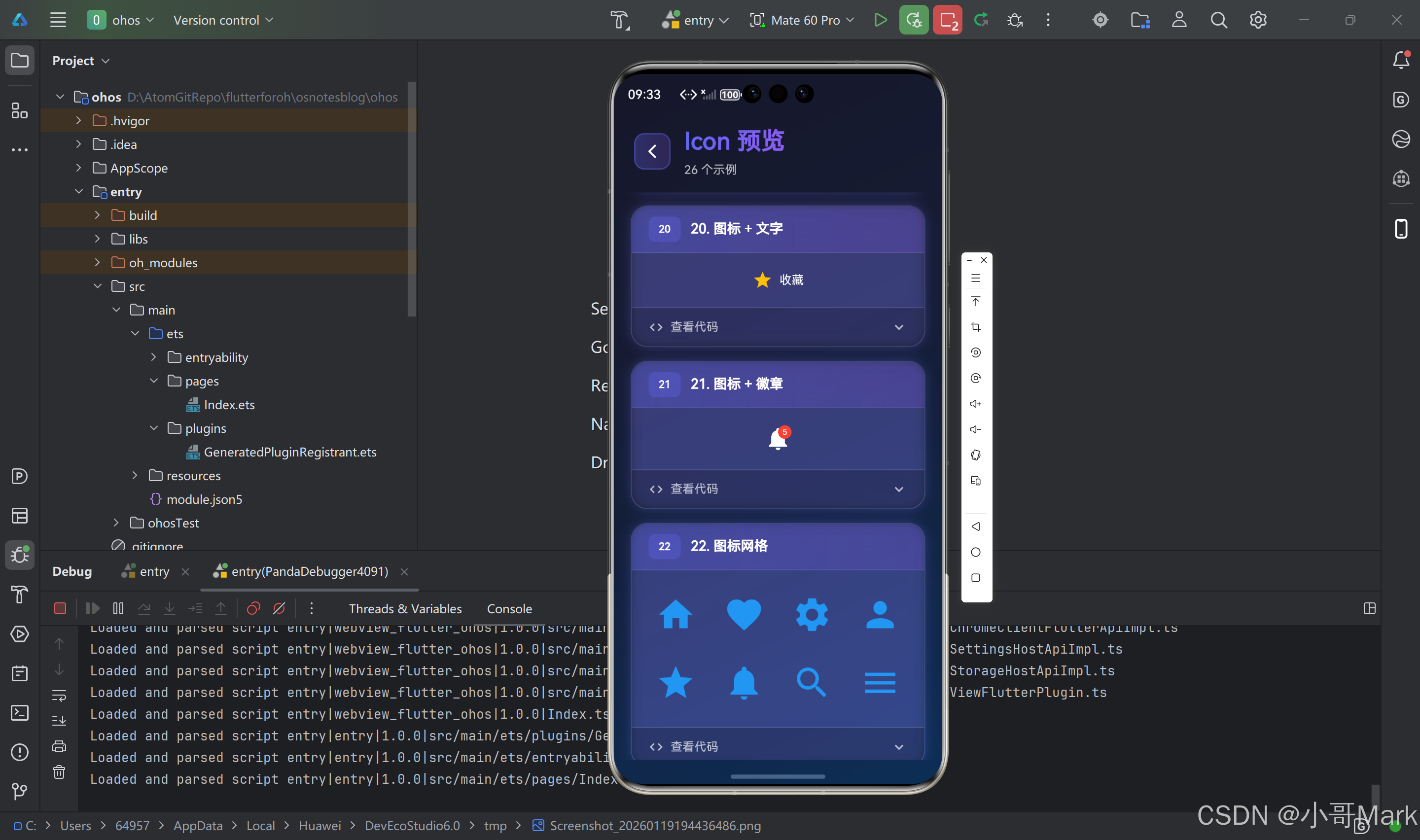
1. 图标 + 文字
Row(
  children: [
    Icon(Icons.star, color: Colors.amber),
    SizedBox(width: 8),
    Text('收藏'),
  ],
)
2. 图标 + 徽章
Stack(
  children: [
    Icon(Icons.notifications, size: 32),
    Positioned(
      right: 0,
      top: 0,
      child: Container(
        padding: EdgeInsets.all(4),
        decoration: BoxDecoration(
          color: Colors.red,
          shape: BoxShape.circle,
        ),
        child: Text(
          '5',
          style: TextStyle(
            color: Colors.white,
            fontSize: 10,
          ),
        ),
      ),
    ),
  ],
)
3. 图标网格
GridView.builder(
  gridDelegate: SliverGridDelegateWithFixedCrossAxisCount(
    crossAxisCount: 4,
    crossAxisSpacing: 16,
    mainAxisSpacing: 16,
  ),
  itemCount: icons.length,
  itemBuilder: (context, index) {
    return Icon(
      icons[index],
      size: 48,
      color: Colors.blue,
    );
  },
)
🎨 图标动画效果

1. 旋转动画
class RotatingIcon extends StatefulWidget {
_RotatingIconState createState() => _RotatingIconState();
}
class _RotatingIconState extends State<RotatingIcon>
with SingleTickerProviderStateMixin {
late AnimationController _controller;
void initState() {
super.initState();
_controller = AnimationController(
duration: Duration(seconds: 2),
vsync: this,
)..repeat();
}
Widget build(BuildContext context) {
return RotationTransition(
turns: _controller,
child: Icon(Icons.refresh, size: 32),
);
}
void dispose() {
_controller.dispose();
super.dispose();
}
}
2. 缩放动画
class PulsingIcon extends StatefulWidget {
_PulsingIconState createState() => _PulsingIconState();
}
class _PulsingIconState extends State<PulsingIcon>
with SingleTickerProviderStateMixin {
late AnimationController _controller;
late Animation<double> _animation;
void initState() {
super.initState();
_controller = AnimationController(
duration: Duration(milliseconds: 1000),
vsync: this,
)..repeat(reverse: true);
_animation = Tween<double>(begin: 1.0, end: 1.5).animate(
CurvedAnimation(parent: _controller, curve: Curves.easeInOut),
);
}
Widget build(BuildContext context) {
return ScaleTransition(
scale: _animation,
child: Icon(Icons.favorite, color: Colors.red, size: 32),
);
}
void dispose() {
_controller.dispose();
super.dispose();
}
}
3. 颜色过渡动画
class ColorTransitionIcon extends StatefulWidget {
_ColorTransitionIconState createState() => _ColorTransitionIconState();
}
class _ColorTransitionIconState extends State<ColorTransitionIcon>
with SingleTickerProviderStateMixin {
late AnimationController _controller;
late Animation<Color?> _colorAnimation;
void initState() {
super.initState();
_controller = AnimationController(
duration: Duration(seconds: 2),
vsync: this,
)..repeat(reverse: true);
_colorAnimation = ColorTween(
begin: Colors.blue,
end: Colors.red,
).animate(_controller);
}
Widget build(BuildContext context) {
return AnimatedBuilder(
animation: _colorAnimation,
builder: (context, child) {
return Icon(
Icons.star,
color: _colorAnimation.value,
size: 32,
);
},
);
}
void dispose() {
_controller.dispose();
super.dispose();
}
}
🎯 图标列表和选择器
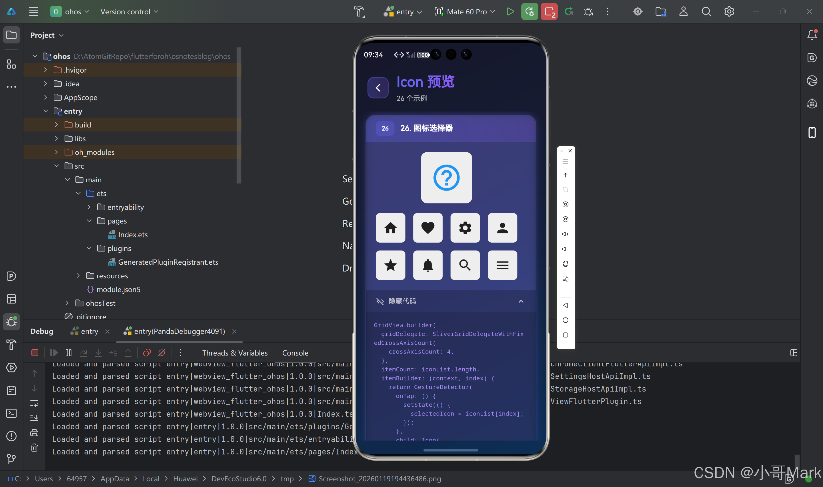
图标选择器组件
class IconPicker extends StatefulWidget {
_IconPickerState createState() => _IconPickerState();
}
class _IconPickerState extends State<IconPicker> {
IconData? _selectedIcon;
final List<IconData> _icons = [
Icons.home,
Icons.favorite,
Icons.settings,
Icons.person,
Icons.star,
Icons.notifications,
Icons.search,
Icons.menu,
];
Widget build(BuildContext context) {
return Column(
children: [
// 显示选中的图标
Container(
padding: EdgeInsets.all(20),
decoration: BoxDecoration(
color: Colors.grey[200],
borderRadius: BorderRadius.circular(12),
),
child: Icon(
_selectedIcon ?? Icons.help_outline,
size: 64,
color: Colors.blue,
),
),
SizedBox(height: 20),
// 图标网格
Expanded(
child: GridView.builder(
gridDelegate: SliverGridDelegateWithFixedCrossAxisCount(
crossAxisCount: 4,
crossAxisSpacing: 16,
mainAxisSpacing: 16,
),
itemCount: _icons.length,
itemBuilder: (context, index) {
final icon = _icons[index];
final isSelected = _selectedIcon == icon;
return GestureDetector(
onTap: () {
setState(() {
_selectedIcon = icon;
});
},
child: Container(
decoration: BoxDecoration(
color: isSelected ? Colors.blue : Colors.grey[200],
borderRadius: BorderRadius.circular(8),
),
child: Icon(
icon,
size: 32,
color: isSelected ? Colors.white : Colors.black87,
),
),
);
},
),
),
],
);
}
}
🎨 图标主题适配
根据主题切换图标
class ThemedIcon extends StatelessWidget {
Widget build(BuildContext context) {
final isDark = Theme.of(context).brightness == Brightness.dark;
return Icon(
isDark ? Icons.brightness_2 : Icons.brightness_7,
size: 32,
color: isDark ? Colors.white : Colors.black,
);
}
}
使用 IconTheme 适配
Builder(
  builder: (context) {
    final iconTheme = IconTheme.of(context);
    return Icon(
      Icons.star,
      size: iconTheme.size ?? 24,
      color: iconTheme.color ?? Colors.black,
    );
  },
)
🎯 图标性能优化
1. 图标缓存
Flutter 会自动缓存图标字体,无需手动管理。
2. 避免频繁重建
// ❌ 不推荐:每次重建都创建新的 Icon
Widget build(BuildContext context) {
  return Icon(Icons.star);
}

// ✅ 推荐:使用 const 构造函数
Widget build(BuildContext context) {
  return const Icon(Icons.star);
}
3. 图标列表优化
// 使用 ListView.builder 而不是 ListView
ListView.builder(
  itemCount: icons.length,
  itemBuilder: (context, index) {
    return Icon(icons[index]);
  },
)
⚠️ 常见问题与解决方案
问题1:图标显示为方块
原因:字体文件未正确加载或图标代码点错误。
解决方案:
// 1. 检查 pubspec.yaml 配置
flutter:
  fonts:
    - family: CustomIcons
      fonts:
        - asset: fonts/custom_icons.ttf

// 2. 运行 flutter pub get
// 3. 重启应用

// 4. 检查图标代码点是否正确
IconData(
  0xe900,  // 确保这个代码点在字体文件中存在
  fontFamily: 'CustomIcons',
)
问题2:图标颜色不生效
原因:图标字体不支持颜色,或使用了不支持颜色的图标。
解决方案:
// 1. 确保使用支持颜色的图标
Icon(
  Icons.star,
  color: Colors.blue,  // Material Icons 支持颜色
)

// 2. 对于不支持颜色的图标,使用 ImageIcon
ImageIcon(
  AssetImage('assets/icons/icon.png'),
  color: Colors.blue,  // 会应用颜色滤镜
)
问题3:图标大小不一致
原因:不同图标的视觉大小可能不同。
解决方案:
// 使用固定大小的容器
Container(
  width: 32,
  height: 32,
  alignment: Alignment.center,
  child: Icon(Icons.star, size: 24),
)
问题4:自定义图标不显示
原因:字体文件路径错误、代码点错误或未重启应用。
解决方案:
// 1. 检查字体文件路径(相对于项目根目录)
flutter:
  fonts:
    - family: CustomIcons
      fonts:
        - asset: fonts/custom_icons.ttf  // 确保路径正确

// 2. 检查代码点
// 使用字体查看工具(如 FontForge)查看字体的 Unicode 码点

// 3. 确保重启应用(热重载可能不够)
// 4. 检查字体文件格式(必须是 TTF 或 OTF)
问题5:图标在不同设备上显示不一致
原因:不同设备的字体渲染可能略有差异。
解决方案:
// 1. 使用固定大小
Icon(Icons.star, size: 24)

// 2. 使用 Container 固定尺寸
Container(
  width: 24,
  height: 24,
  child: Icon(Icons.star),
)

// 3. 测试不同设备
🎯 最佳实践总结
✅ 推荐做法
-
使用 const 构造函数:提高性能
const Icon(Icons.star) -
统一图标主题:使用
IconTheme统一设置IconTheme( data: IconThemeData(color: Colors.blue, size: 24), child: Row(children: [Icon(Icons.home), Icon(Icons.settings)]), ) -
提供无障碍支持:使用
semanticLabelIcon( Icons.star, semanticLabel: '收藏', ) -
合理选择图标库:Material Icons 用于 Android,Cupertino Icons 用于 iOS
// Android Icon(Icons.star) // iOS Icon(CupertinoIcons.star_fill) -
使用 IconButton 添加交互:而不是 GestureDetector + Icon
IconButton(
  icon: Icon(Icons.favorite),
  onPressed: () {},
)
❌ 避免的做法
- 不要频繁重建图标:使用 const 或缓存
- 不要忽略无障碍支持:添加 semanticLabel
- 不要混用不同风格的图标:保持一致性
- 不要使用过大的图标:影响性能
- 不要忽略主题适配:考虑深色模式
📚 相关资源
🎉 总结
Icon 组件是 Flutter 中功能强大且灵活的图标显示组件。通过合理使用内置图标库、自定义图标、动画效果等特性,可以创建出精美且一致的 UI 界面。记住始终考虑性能、无障碍支持和主题适配,这样就能构建出高质量的应用界面。
Happy Coding! 🎨✨

作为“人工智能6S店”的官方数字引擎,为AI开发者与企业提供一个覆盖软硬件全栈、一站式门户。
更多推荐
 1
1 0
0- 0


 已为社区贡献5条内容

所有评论(0)