
鸿蒙ArkUI组件封装实战:3招告别重复代码
ArkUI组件封装实战指南 本文针对鸿蒙ArkUI开发中的代码复用问题,详细讲解三种组件封装方法: 公共样式封装:通过AttributeModifier接口实现样式复用,适用于系统组件样式统一场景 自定义组件封装:使用@Component装饰器打包样式+布局+逻辑,支持参数配置 组件工厂模式:集中管理多个组件,提供统一调用接口 核心优势: 减少80%重复代码 维护成本降低90% 团队协作更规范 每
做鸿蒙ArkUI开发的兄弟姐妹们,是不是总被重复代码折磨?登录页的确认按钮、购物页的结算按钮,样式一模一样还要写两遍;图片加文字的布局,换个页面又得重新拼一遍——改样式时逐个文件找,维护起来头都大了!其实只要学会组件封装,把重复代码“打包”起来,下次直接拿过来用,效率直接翻倍,还方便团队协作。今天就照着华为官方文档,手把手教你三种核心封装方式,新手也能轻松拿捏!
一、先搞懂:组件封装到底好在哪?
简单说,封装就是把相同或相似的UI样式、布局、逻辑“装起来”,核心好处就三个:
- 少写重复代码:写一次能用N次,不用复制粘贴
- 维护超方便:要改样式/逻辑,只改封装组件,所有用到的地方自动同步
- 团队不吵架:统一组件风格,不用纠结“你写的按钮和我不一样”
鸿蒙里最常用的封装场景就三种:只复用样式、复用样式+布局+逻辑、批量管理多个组件,咱们一个个说清楚。
二、第一种:组件公共样式封装(只复用样式)
适用场景
如果只是多个组件要共用一套样式,比如所有确认按钮都是胶囊形、一样的大小和颜色,就用这种方式。比如登录页的“登录”按钮和购物页的“结算”按钮,功能不同但样式一致,直接封装样式就行。
核心思路
用系统提供的AttributeModifier接口,把公共样式写在一个类里,之后哪个组件要用,直接套用这个类就行。
手把手操作
第一步:封装公共样式类
先创建一个类,实现AttributeModifier接口,把按钮的默认态、按压态样式都写进去:
// 封装按钮的公共样式
export class MyButtonModifier implements AttributeModifier<ButtonAttribute> {
  // 默认是普通按钮,后续可修改
  private buttonType: ButtonType = ButtonType.Normal;

  // 设置按钮类型(比如胶囊形、普通形)
  type(type: ButtonType): MyButtonModifier {
    this.buttonType = type;
    return this;
  }

  // 按钮默认状态的样式
  applyNormalAttribute(instance: ButtonAttribute): void {
    instance.type(this.buttonType); // 按钮类型
    instance.width(200); // 宽度
    instance.height(50); // 高度
    instance.fontSize(20); // 字体大小
    instance.fontColor('#0A59F7'); // 字体颜色
    instance.backgroundColor('#0D000000'); // 背景色
  }

  // 按钮按压状态的样式
  applyPressedAttribute(instance: ButtonAttribute): void {
    instance.fontColor('#0A59F7');
    instance.backgroundColor('#26000000'); // 按压时背景色加深
  }
}
第二步:使用封装好的样式
在需要的页面里,创建样式实例,通过attributeModifier()方法应用到按钮上:
@Entry
@Component
struct AttributeStylePage {
  // 创建样式实例,设置为胶囊形按钮
  modifier = new MyButtonModifier().type(ButtonType.Capsule);

  build() {
    NavDestination() {
      Column() {
        // 直接套用封装好的样式
        Button('确认按钮')
          .attributeModifier(this.modifier)
      }
      .margin({ top: $r('app.float.margin_top') })
      .width('100%')
      .height('100%')
    }
    .title(getResourceString($r('app.string.common_style_extract'), this))
  }
}
小提醒
- 这种样式只能用在系统组件上(比如Button、Image),自定义组件暂时不支持
- 样式类可以跨文件导出,整个项目都能复用,还能灵活改参数(比如改按钮类型、颜色)
三、第二种:自定义组件封装(样式+布局+逻辑一起复用)
适用场景
如果不仅要复用样式,连布局和逻辑都要复用,比如商品卡片(图片+名称+价格固定布局)、个人信息项(图标+文字+箭头),就适合封装成自定义组件。而且还能让使用方灵活修改部分属性,比如图片大小、文字内容。
核心思路
用@Component装饰器把组件“打包”,不变的部分(比如图片和文字的排列方式)写在内部,可变的部分(比如图片地址、大小)用参数暴露出去,让使用方按需配置。
手把手操作
咱们以“图片+文字”的组合组件为例:
第一步:先封装子组件的样式(可选)
分别给Image和Text组件写样式类,方便后续修改:
// 图片组件的样式封装
export class CustomImageModifier implements AttributeModifier<ImageAttribute> {
  private imageWidth: Length = 0;
  private imageHeight: Length = 0;

  // 初始化图片大小
  constructor(width: Length, height: Length) {
    this.imageWidth = width;
    this.imageHeight = height;
  }

  // 提供修改宽高的方法
  width(width: Length) {
    this.imageWidth = width;
    return this;
  }

  height(height: Length) {
    this.imageHeight = height;
    return this;
  }

  // 应用图片样式
  applyNormalAttribute(instance: ImageAttribute): void {
    instance.width(this.imageWidth);
    instance.height(this.imageHeight);
    instance.borderRadius($r('app.float.border_radius')); // 圆角
  }
}

// 文字组件的样式封装
export class CustomTextModifier implements AttributeModifier<TextAttribute> {
  applyNormalAttribute(instance: TextAttribute): void {
    instance.fontSize($r('app.float.font_size_l')); // 字体大小
  }
}
第二步:封装自定义组件
把图片和文字的布局、点击事件都封装进去,暴露可变参数:
@Component
export struct CustomImageText {
  // 图片样式(默认100x100)
  @Prop imageAttribute: AttributeModifier<ImageAttribute> = new CustomImageModifier(100, 100);
  // 文字样式(默认样式)
  @Prop textAttribute: AttributeModifier<TextAttribute> = new CustomTextModifier();
  // 图片资源(必须由使用方传入)
  @Prop imageSrc: PixelMap | ResourceStr | DrawableDescriptor;
  // 文字内容(必须由使用方传入)
  @Prop text: string;
  // 点击事件(可选,使用方按需传入)
  onClickEvent?: () => void;

  build() {
    // 固定布局:图片和文字纵向排列
    Column({ space: 12 }) {
      Image(this.imageSrc)
        .attributeModifier(this.imageAttribute)
      Text(this.text)
        .attributeModifier(this.textAttribute)
    }
    // 点击事件触发
    .onClick(() => {
      if (this.onClickEvent !== undefined) {
        this.onClickEvent();
      }
    })
  }
}
第三步:使用自定义组件
按需传入图片资源、文字、样式和点击事件:
@Component
struct CommonComponent {
  // 自定义图片大小为330x330
  imageAttribute: CustomImageModifier = new CustomImageModifier(330, 330);

  build() {
    NavDestination() {
      Column() {
        CustomImageText({
          imageAttribute: this.imageAttribute, // 传入自定义图片大小
          imageSrc: $r('app.media.image'), // 图片资源
          text: 'Scenery', // 文字内容
          onClickEvent: () => {
            // 点击组件显示提示
            this.getUIContext().getPromptAction().showToast({ message: 'Clicked' })
          }
        })
      }
      .margin({ top: $r('app.float.margin_top') })
      .width('100%')
      .height('100%')
    }
    .title(getResourceString($r('app.string.common'), this))
  }
}
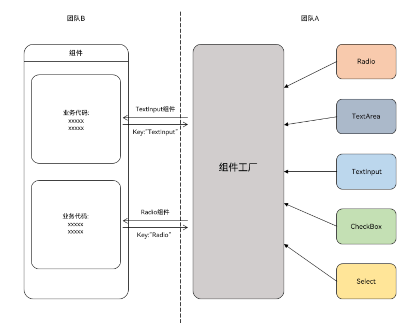
四、第三种:组件工厂类封装(批量管理多个组件)
适用场景
如果项目里有很多零散组件(比如单选框、复选框、输入框),想统一管理,让业务团队通过组件名直接获取使用,就用这种方式。比如传入“Radio”拿单选框,传入“Checkbox”拿复选框,不用逐个导入。
核心思路
用@Builder装饰器定义组件模板,再用wrapBuilder函数包装,存入一个Map(键是组件名,值是组件对象),最后导出这个“组件工厂”,使用方按名字取就行。
手把手操作
第一步:定义组件模板
用@Builder写全局的组件模板(比如单选框、复选框):
// 单选框组件模板
@Builder
function myRadio() {
  Text($r('app.string.radio'))
    .width('100%')
    .fontColor($r('sys.color.mask_secondary'))
  // 男选项
  Row() {
    Radio({ value: '1', group: 'radioGroup' })
      .margin({ right: $r('app.float.margin_right') })
    Text('man')
  }
  .width('100%')
  // 女选项
  Row() {
    Radio({ value: '0', group: 'radioGroup' })
      .margin({ right: $r('app.float.margin_right') })
    Text('woman')
  }
  .width('100%')
}

// 复选框组件模板
@Builder
function myCheckBox() {
  Text($r('app.string.checkbox'))
    .width('100%')
    .fontColor($r('sys.color.mask_secondary'))
  // 全选
  Row() {
    CheckboxGroup({ group: 'checkboxGroup' })
      .checkboxShape(CheckBoxShape.ROUNDED_SQUARE)
    Text('all')
      .margin({ left: $r('app.float.margin_right') })
  }
  .width('100%')
  // 选项1
  Row() {
    Checkbox({ name: '1', group: 'checkboxGroup' })
      .shape(CheckBoxShape.ROUNDED_SQUARE)
      .margin({ right: $r('app.float.margin_right') })
    Text('text1')
  }
  .width('100%')
  // 选项2
  Row() {
    Checkbox({ name: '0', group: 'checkboxGroup' })
      .shape(CheckBoxShape.ROUNDED_SQUARE)
      .margin({ right: $r('app.float.margin_right') })
    Text('text2')
  }
  .width('100%')
}
第二步:创建组件工厂
把组件模板包装后存入Map,再导出工厂:
// 定义组件工厂Map,键是组件名,值是组件对象
let factoryMap: Map<string, object> = new Map();

// 把组件存入工厂(用wrapBuilder包装@Builder方法)
factoryMap.set('Radio', wrapBuilder(myRadio));
factoryMap.set('Checkbox', wrapBuilder(myCheckBox));

// 导出工厂,供外部使用
export { factoryMap };
第三步:使用工厂里的组件
导入工厂,按组件名获取并渲染:
// 导入组件工厂(路径要按实际项目调整)
import { factoryMap } from '../view/FactoryMap';

@Component
struct ComponentFactory {
  build() {
    NavDestination() {
      Column({ space: 12 }) {
        // 按名字获取单选框组件并渲染
        (factoryMap.get('Radio') as WrappedBuilder<[]>).builder();
        // 按名字获取复选框组件并渲染
        (factoryMap.get('Checkbox') as WrappedBuilder<[]>).builder();
      }
      .width('100%')
      .padding($r('app.float.padding'))
    }
    .title(getResourceString($r('app.string.factory'), this))
  }
}
小提醒
- 只有全局的
@Builder方法才能用wrapBuilder包装 - 从工厂拿的组件,只能在
struct的build方法里使用
五、封装后常见问题:直接抄作业就行!
1. 怎么调用子组件里的方法?
三种实用方法,按需选:
方法一:用Controller类(推荐)
定义一个控制器,子组件把方法“交”给控制器,父组件通过控制器调用:
// 定义控制器
export class Controller {
  action = () => {}; // 用来存子组件的方法
}

// 子组件
@Component
export struct ChildComponent {
  @State bgColor: ResourceColor = Color.White;
  controller: Controller | undefined = undefined;

  // 子组件的方法:切换背景色
  private switchColor = () => {
    this.bgColor = this.bgColor === Color.White ? Color.Red : Color.White;
  }

  // 组件初始化时,把方法赋值给控制器
  aboutToAppear(): void {
    if (this.controller) {
      this.controller.action = this.switchColor;
    }
  }

  build() {
    Column() {
      Text('Child Component')
    }.backgroundColor(this.bgColor).borderWidth(1)
  }
}

// 父组件
@Entry
@Component
struct Index {
  private childRef = new Controller(); // 创建控制器实例

  build() {
    Column() {
      // 把控制器传给子组件
      ChildComponent({ controller: this.childRef })
      Button('切换子组件颜色')
        .onClick(() => {
          this.childRef.action(); // 调用子组件方法
        })
        .margin({ top: 16 })
    }
    .width('100%')
    .alignItems(HorizontalAlign.Center)
  }
}
方法二:用@Watch监听
父组件改状态变量,子组件监听变量变化,触发方法:
// 子组件
@Component
export struct ChildComponent {
  @State bgColor: ResourceColor = Color.White;
  // 监听checkFlag变量变化
  @Link @Watch('switchColor') checkFlag: boolean;

  // 变量变化时触发的方法
  private switchColor() {
    this.bgColor = this.checkFlag ? Color.Red : Color.White;
  }

  build() {
    Column() {
      Text('Child Component')
    }.backgroundColor(this.bgColor).borderWidth(1)
  }
}

// 父组件
@Entry
@Component
struct Index {
  @State childCheckFlag: boolean = false;

  build() {
    Column() {
      ChildComponent({ checkFlag: this.childCheckFlag })
      Button('切换颜色')
        .onClick(() => {
          this.childCheckFlag = !this.childCheckFlag; // 改变量
        })
        .margin({ top: 16 })
    }
    .width('100%')
    .alignItems(HorizontalAlign.Center)
  }
}
方法三:用Emitter事件通信
子组件监听事件,父组件发送事件,触发子组件方法:
// 子组件
@Component
export struct ChildComponent {
  // 定义事件ID
  public static readonly EVENT_ID_SWITCH_COLOR = 'SWITCH_COLOR';
  @State bgColor: ResourceColor = Color.White;

  private switchColor = () => {
    this.bgColor = this.bgColor === Color.White ? Color.Red : Color.White;
  }

  // 组件初始化时监听事件
  aboutToAppear(): void {
    emitter.on(ChildComponent.EVENT_ID_SWITCH_COLOR, this.switchColor);
  }

  // 组件销毁时取消监听
  aboutToDisappear(): void {
    emitter.off(ChildComponent.EVENT_ID_SWITCH_COLOR, this.switchColor);
  }

  build() {
    Column() {
      Text('Child Component')
    }.backgroundColor(this.bgColor).borderWidth(1)
  }
}

// 父组件
@Entry
@Component
struct Index {
  build() {
    Column() {
      ChildComponent()
      Button('切换颜色')
        .onClick(() => {
          emitter.emit(ChildComponent.EVENT_ID_SWITCH_COLOR); // 发送事件
        })
        .margin({ top: 16 })
    }
    .width('100%')
    .alignItems(HorizontalAlign.Center)
  }
}
2. 怎么调用父组件里的方法?
超简单!子组件留个回调参数,父组件把自己的方法传进去:
// 子组件
@Component
export struct ChildComponent {
  call = () => {}; // 回调参数,用来存父组件的方法

  build() {
    Column() {
      Button('调用父组件方法')
        .onClick(() => {
          this.call(); // 触发父组件方法
        })
    }
  }
}

// 父组件
@Entry
@Component
struct Index {
  // 父组件的方法
  parentAction() {
    try {
      this.getUIContext().getPromptAction().showToast({ message: 'Parent Action' });
    } catch (error) {
      let err = error as BusinessError;
      hilog.warn(0x000, 'testTag', `showToast failed, code=${err.code}, message=${err.message}`);
    }
  }

  build() {
    Column() {
      // 把父组件方法传给子组件
      ChildComponent({ call: this.parentAction })
    }
    .width('100%')
    .alignItems(HorizontalAlign.Center)
  }
}
3. 怎么实现“插槽”(可变UI部分)?
用@BuilderParam!子组件留个位置,父组件按需传入UI内容:
// 子组件
@Component
export struct ChildComponent {
  // 默认空UI
  @Builder
  customBuilder() {}

  // 暴露给父组件的UI参数
  @BuilderParam customBuilderParam: () => void = this.customBuilder;

  build() {
    Column() {
      Text('子组件固定内容')
      this.customBuilderParam(); // 父组件传入的可变UI
    }
  }
}

// 父组件
@Entry
@Component
struct Index {
  // 父组件定义的可变UI
  @Builder
  componentBuilder() {
    Text(`父组件传入的UI`)
  }

  build() {
    Column() {
      // 传入可变UI
      ChildComponent() {
        this.componentBuilder();
      }
    }
    .width('100%')
    .alignItems(HorizontalAlign.Center)
  }
}
4. 怎么传递组件数组,实现循环渲染?
先把组件包装成全局@Builder,再用wrapBuilder封装成数组,最后用ForEach循环:
// 1. 定义全局组件模板
@Builder
function itemBuilder(text: string) {
  Text(text)
    .width('100%')
    .padding(10)
    .borderWidth(1)
}

// 2. 封装成组件数组
const componentArray = [
  wrapBuilder(itemBuilder, '项目1'),
  wrapBuilder(itemBuilder, '项目2'),
  wrapBuilder(itemBuilder, '项目3')
];

// 3. 循环渲染
@Component
struct ForEachComponent {
  build() {
    Column() {
      ForEach(componentArray, (item) => {
        item.builder(); // 渲染每个组件
      })
    }
  }
}
总结
组件封装的核心就是“提取重复,暴露可变”:
- 只复用样式:用
AttributeModifier - 复用样式+布局+逻辑:用
@Component写自定义组件 - 批量管理组件:用组件工厂(Map+wrapBuilder)
掌握这三招,再也不用写重复代码,项目维护起来也省心。遇到调用方法、插槽这些问题,直接抄上面的作业就行~ 赶紧把你项目里的重复组件封装起来试试吧!

作为“人工智能6S店”的官方数字引擎,为AI开发者与企业提供一个覆盖软硬件全栈、一站式门户。
更多推荐
 4
4 0
0- 0


 已为社区贡献1条内容

所有评论(0)