
React Native社交帖子详情系统与鸿蒙跨端适配技术深度解析,并且实现敏感词识别、滥用举报入口、隐私字段脱敏
本文分析了一个基于React Native构建的社交帖子详情应用,展示了其组件化架构设计、状态管理和交互系统。应用采用分层组件设计,如PostDetail、CommentItem和CommentInput组件,各司其职实现帖子展示、评论和交互功能。通过useState管理帖子、评论和互动状态,并实现评论提交逻辑。交互系统支持点赞、分享和回复等操作。这种设计思路对鸿蒙OS等跨平台开发具有参考价值,体
概述
本文分析的是一个基于React Native构建的社交帖子详情应用,集成了帖子展示、评论系统、互动操作、相关推荐等核心功能。该应用采用了组件化的界面设计、实时状态管理和流畅的交互体验,展现了社交类应用的典型技术架构。在鸿蒙OS的跨端适配场景中,这种涉及复杂内容展示和多层次交互的应用具有重要的技术参考价值。
核心架构设计深度解析
多层次组件化架构
应用采用了清晰的多层次组件划分,每个组件职责单一且高度内聚:
// 帖子详情组件
const PostDetail = ({ title, content, author, time, location, likes, comments, shares }) => {
  return (
    <View style={styles.postCard}>
      <View style={styles.postHeader}>
        <View style={styles.avatar}>
          <Text style={styles.avatarText}>{ICONS.user}</Text>
        </View>
        <View style={styles.userInfo}>
          <Text style={styles.username}>{author}</Text>
          <View style={styles.postMeta}>
            <Text style={styles.metaItem}>{ICONS.time} {time}</Text>
            <Text style={styles.metaItem}>{ICONS.location} {location}</Text>
          </View>
        </View>
      </View>
      <Text style={styles.postTitle}>{title}</Text>
      <Text style={styles.postContent}>{content}</Text>
    </View>
  );
};

// 评论项组件
const CommentItem = ({ comment, onReply }) => {
  return (
    <View style={styles.commentItem}>
      <View style={styles.commentAvatar}>
        <Text style={styles.avatarText}>{comment.avatar}</Text>
      </View>
      <View style={styles.commentContent}>
        <Text style={styles.commentText}>{comment.content}</Text>
      </View>
    </View>
  );
};

// 发表评论组件
const CommentInput = ({ value, onChangeText, onSubmit }) => {
  return (
    <View style={styles.commentInputContainer}>
      <TextInput
        style={styles.commentInput}
        placeholder="写下你的评论..."
        value={value}
        onChangeText={onChangeText}
        multiline
      />
      <TouchableOpacity style={styles.commentButton} onPress={onSubmit}>
        <Text style={styles.commentButtonText}>发送</Text>
      </TouchableOpacity>
    </View>
  );
};
这种组件化设计的核心优势在于关注点分离。PostDetail组件专注于帖子内容的展示,CommentItem组件处理单条评论的渲染,而CommentInput组件则负责评论输入的交互逻辑。三个组件各司其职,通过props接口进行通信,形成了清晰的数据流。
在鸿蒙ArkUI体系中,组件化的实现采用基于装饰器的结构:
@Component
struct PostDetail {
  @Prop title: string;
  @Prop content: string;
  @Prop author: string;
  @Prop time: string;
  @Prop location: string;

  build() {
    Column() {
      // 帖子头部
      Row() {
        Column() { /* 头像 */ }
        Column() {
          Text(this.author)
          Row() {
            Text(`${ICONS.time} ${this.time}`)
            Text(`${ICONS.location} ${this.location}`)
          }
        }
      }

      Text(this.title)
      Text(this.content)
    }
    .backgroundColor(Color.White)
    .borderRadius(12)
    .padding(16)
  }
}

@Component
struct CommentItem {
  @Prop comment: Comment;
  @Prop onReply: (id: string) => void;

  build() {
    Row() {
      Column() { /* 头像 */ }
      Column() {
        Text(this.comment.content)
      }
    }
  }
}

@Component
struct CommentInput {
  @State value: string = '';
  @Prop onSubmit: () => void;

  build() {
    Row() {
      TextInput({ placeholder: '写下你的评论...', text: this.value })
        .onChange((value: string) => this.value = value)

      Button('发送', { type: ButtonType.Normal })
        .onClick(() => this.onSubmit())
    }
    .backgroundColor(Color.White)
    .padding(12)
  }
}
状态管理与数据流
应用采用了组合式状态管理,通过useState钩子管理不同的状态维度:
const [post] = useState({ /* 帖子数据 */ });
const [comments, setComments] = useState<Comment[]>([]);
const [newComment, setNewComment] = useState('');
const [liked, setLiked] = useState(false);
这种状态划分策略体现了良好的工程实践。post状态用于存储只读的帖子数据,comments和newComment状态用于管理可变的评论数据,而liked状态则用于追踪用户的互动行为。不同的状态具有不同的更新频率和生命周期,合理的划分有助于提升代码的可维护性。
评论提交逻辑展示了典型的数据流操作:
const handleCommentSubmit = () => {
  if (newComment.trim() === '') {
    Alert.alert('提示', '请输入评论内容');
    return;
  }

  const newCommentObj: Comment = {
    id: (comments.length + 1).toString(),
    username: '当前用户',
    avatar: '👤',
    content: newComment,
    time: '刚刚',
    likes: 0,
    replies: 0,
  };

  setComments([newCommentObj, ...comments]);
  setNewComment('');
};
这种前置验证加状态更新的模式是React应用中的常见实践。在鸿蒙平台,状态管理的实现需要通过@State和@Prop装饰器来定义响应式状态:
@State post: Post = { /* 初始数据 */ };
@State comments: Comment[] = [];
@State newComment: string = '';
@State liked: boolean = false;

handleCommentSubmit() {
  if (this.newComment.trim() === '') {
    prompt.showToast({ message: '请输入评论内容' });
    return;
  }

  const commentObj: Comment = {
    id: (this.comments.length + 1).toString(),
    username: '当前用户',
    avatar: '👤',
    content: this.newComment,
    time: '刚刚',
    likes: 0,
    replies: 0,
  };

  this.comments = [commentObj, ...this.comments];
  this.newComment = '';
}
交互系统设计
应用提供了丰富的交互操作,包括点赞、收藏、分享和评论:
const handleLike = () => {
  setLiked(!liked);
  Alert.alert('点赞', liked ? '已取消点赞' : '已点赞');
};

const handleShare = () => {
  Alert.alert('分享', '分享功能即将推出,敬请期待!');
};

const handleReply = (commentId: string) => {
  Alert.alert('回复', `正在回复评论ID: ${commentId}`);
};
这些交互设计体现了良好的用户体验考量。点赞操作提供了即时反馈,分享功能预留了扩展空间,回复操作则支持具体评论的定位。
鸿蒙平台的交互实现需要适配其事件处理机制:
handleLike() {
  this.liked = !this.liked;
  prompt.showToast({
    message: this.liked ? '已点赞' : '已取消点赞'
  });
}

handleShare() {
  prompt.showDialog({
    title: '分享',
    message: '分享功能即将推出,敬请期待!',
    buttons: [{ text: '确定' }]
  });
}

handleReply(commentId: string) {
  prompt.showDialog({
    title: '回复',
    message: `正在回复评论ID: ${commentId}`
  });
}
界面布局与视觉设计
卡片式布局架构
应用广泛采用了卡片式布局,通过统一的Card组件承载不同类型的内容:
// 帖子卡片
<View style={styles.postCard}>
  {/* 帖子内容 */}
</View>

// 评论卡片(列表形式)
<View style={styles.commentList}>
  {comments.map(comment => (
    <CommentItem key={comment.id} comment={comment} />
  ))}
</View>

// 相关推荐卡片
<View style={styles.recommendationList}>
  {/* 推荐内容 */}
</View>

// 广告卡片
<View style={styles.adContainer}>
  {/* 广告内容 */}
</View>
卡片式设计的优势在于内容的模块化和视觉的层次化。每个卡片都是一个独立的内容单元,用户可以快速定位和理解信息。统一的阴影、圆角和内边距规范确保了界面的整体一致性。
鸿蒙平台上的卡片布局实现采用Column和Row的组合:
Column() {
  // 帖子卡片
  Column() { /* 帖子内容 */ }
    .backgroundColor(Color.White)
    .borderRadius(12)
    .shadow({ /* 阴影效果 */ })

  // 评论列表
  Column() {
    ForEach(this.comments, (comment: Comment) => {
      CommentItem({ comment: comment })
    })
  }

  // 相关推荐
  Column() { /* 推荐内容 */ }
    .backgroundColor(Color.White)
    .borderRadius(12)
}
.padding(16)
列表渲染优化
对于评论列表这种可能包含大量数据的场景,应用采用了map函数进行渲染:
{comments.map(comment => (
  <CommentItem
    key={comment.id}
    comment={comment}
    onReply={handleReply}
  />
))}
这种实现方式简单直观,但在评论数量较大时可能存在性能问题。在实际项目中,建议使用FlatList组件替代ScrollView+map组合:
<FlatList
  data={comments}
  renderItem={({ item }) => (
    <CommentItem comment={item} onReply={handleReply} />
  )}
  keyExtractor={(item) => item.id}
/>
鸿蒙平台的列表渲染推荐使用List组件配合LazyForEach:
List() {
  LazyForEach(this.dataSource, (comment: Comment) => {
    ListItem() {
      CommentItem({
        comment: comment,
        onReply: (id: string) => this.handleReply(id)
      })
    }
  }, (comment: Comment) => comment.id)
}
跨端适配技术方案
组件映射策略
| React Native组件 | 鸿蒙ArkUI组件 | 适配说明 |
|---|---|---|
| ScrollView | Scroll | 滚动行为基本一致 |
| TextInput | TextInput | 属性和样式需要调整 |
| TouchableOpacity | Button | 交互反馈机制不同 |
| Alert.alert | prompt.showDialog | 对话框API完全不同 |
文本输入适配
文本输入组件在跨端迁移时需要注意属性差异:
// React Native
<TextInput
  style={styles.commentInput}
  placeholder="写下你的评论..."
  value={value}
  onChangeText={onChangeText}
  multiline
/>

// 鸿蒙
TextInput({ placeholder: '写下你的评论...', text: this.value })
  .onChange((value: string) => this.onChangeText(value))
  .maxLines(5)
对话框系统迁移
对话框是最需要完全重写的组件:
// React Native
Alert.alert('提示', '请输入评论内容', [
  { text: '取消', style: 'cancel' },
  { text: '确定', onPress: () => handleSubmit() }
]);

// 鸿蒙
prompt.showDialog({
  title: '提示',
  message: '请输入评论内容',
  buttons: [
    { text: '取消', color: '#666666' },
    { text: '确定', color: '#007AFF' }
  ]
})
.onAction((index: number) => {
  if (index === 1) {
    this.handleSubmit();
  }
})
性能优化与最佳实践
渲染性能优化
组件记忆化可以有效避免不必要的重渲染:
const PostDetail = React.memo(({ title, content, author, time, location, likes, comments, shares }) => {
  return (
    <View style={styles.postCard}>
      {/* 组件内容 */}
    </View>
  );
});

const CommentItem = React.memo(({ comment, onReply }) => {
  return (
    <View style={styles.commentItem}>
      {/* 组件内容 */}
    </View>
  );
});
状态更新优化
对于频繁更新的状态,可以使用函数式更新确保状态准确性:
// 推荐写法
setComments(prevComments => [newCommentObj, ...prevComments]);

// 不推荐写法(可能产生闭包问题)
setComments([newCommentObj, ...comments]);
鸿蒙平台的状态更新直接赋值即可,框架会自动处理依赖追踪:
// 鸿蒙状态更新
this.comments = [newCommentObj, ...this.comments];
总结与实施建议
这个React Native社交帖子详情应用展示了社交类应用的典型技术架构,其组件化的界面设计、清晰的状态管理和丰富的交互操作为鸿蒙跨端适配提供了优秀的基础。
这个任务是代码讲解,不需要额外的专用工具或技能支持;下面直接开始技术解读。
React Native × 鸿蒙跨端技术解读:帖子详情、评论与社交交互
这段代码实现一个“帖子详情页”,包含帖子信息、点赞收藏分享、评论列表与发表评论、相关推荐与广告位、底部导航等社交常见模块。整体基于 React Native 函数组件与本地状态,视图以多卡片组合和滚动容器组织;在 iOS/Android 上走 RN 标准组件栈;面向鸿蒙(OpenHarmony)落地时,需要通过 RN 的鸿蒙适配层将分享、返回导航、输入法、触觉反馈与图像渲染等能力桥接到 ArkUI/系统服务,确保交互与表现一致。
[app.tsx](file:///Users/david/workspace/demo/book/app.tsx)
帖子详情组件:数据契约与最小呈现
PostDetail 采用“头像 + 用户名 + 时间/位置元信息 + 标题/内容 + 点赞/评论/分享统计”结构。统计区以三组触控项呈现单值,不直接修改状态,这与后续页面级交互区分清晰。
const PostDetail = ({
  title, content, author, time, location, likes, comments, shares
}: {
  title: string; content: string; author: string; time: string; location: string; likes: number; comments: number; shares: number;
}) => {
  return (
    <View>
      <View>
        <View><Text>👤</Text></View>
        <View>
          <Text>{author}</Text>
          <View>
            <Text>⏱️ {time}</Text>
            <Text>📍 {location}</Text>
          </View>
        </View>
        <TouchableOpacity><Text>⋮</Text></TouchableOpacity>
      </View>

      <Text>{title}</Text>
      <Text>{content}</Text>

      <View>
        <TouchableOpacity><Text>👍</Text><Text>{likes}</Text></TouchableOpacity>
        <TouchableOpacity><Text>💬</Text><Text>{comments}</Text></TouchableOpacity>
        <TouchableOpacity><Text>📤</Text><Text>{shares}</Text></TouchableOpacity>
      </View>
    </View>
  );
};
- 跨端图标:当前用 emoji,开发便利但在不同系统字体下可能出现对齐与渲染差异。生产建议统一矢量/字体图标栈,并在鸿蒙端通过 ArkUI 渲染能力映射,保证像素与基线一致。
- 时间/位置:“2小时前”“奥森公园”均为文案值。落地时应统一时间格式(时区/locale)与位置权限管理(授权、拒绝后的提示),鸿蒙端通过 Ability 与定位能力桥接。
评论项与发表评论:输入法、本地化与状态更新
CommentItem 聚合“头像 + 用户名/时间 + 文本 + 点赞/回复按钮”,并把回复事件上抛;CommentInput 则承载多行输入与发送按钮。
const CommentItem = ({ comment, onReply }: { comment: Comment; onReply: (id: string) => void }) => {
  return (
    <View>
      <View><Text>{comment.avatar}</Text></View>
      <View>
        <View>
          <Text>{comment.username}</Text>
          <Text>{comment.time}</Text>
        </View>
        <Text>{comment.content}</Text>
        <View>
          <TouchableOpacity><Text>👍 {comment.likes}</Text></TouchableOpacity>
          <TouchableOpacity onPress={() => onReply(comment.id)}><Text>回复</Text></TouchableOpacity>
        </View>
      </View>
    </View>
  );
};

const CommentInput = ({ value, onChangeText, onSubmit }: { value: string; onChangeText: (text: string) => void; onSubmit: () => void }) => {
  return (
    <View>
      <TextInput
        placeholder="写下你的评论..."
        value={value}
        onChangeText={onChangeText}
        multiline
      />
      <TouchableOpacity onPress={onSubmit}><Text>发送</Text></TouchableOpacity>
    </View>
  );
};
- 输入法合成事件(中文 IME):TextInput 在中文输入时涉及 composition(候选词合成)与光标移动,三端行为不尽相同。鸿蒙适配层需要正确映射 composition 与 onChangeText,避免“多次回调”或“光标错位”。
- 发表流程:handleCommentSubmit 做空值校验并插入评论对象,随后清空输入。生产建议加入防抖、错误回滚与服务端持久化,并处理敏感词与风控(合规要求)。
- 多行输入与键盘遮挡:评论输入常见“键盘遮挡与滚动失焦”。在 RN 层可用 KeyboardAvoidingView 与滚动到可视区域;鸿蒙端需验证窗口与键盘事件传递一致。
页面状态与交互:点赞、分享与回复
页面用 useState 管理评论列表、新评论文本与点赞状态;点赞切换 liked 并以 Alert 提示,分享同样占位提示。回复事件在 CommentItem 上抛到页面级处理。
const [comments, setComments] = useState<Comment[]>([ /* 初始数据 */ ]);
const [newComment, setNewComment] = useState('');
const [liked, setLiked] = useState(false);

const handleLike = () => {
  setLiked(!liked);
  Alert.alert('点赞', liked ? '已取消点赞' : '已点赞');
};

const handleShare = () => {
  Alert.alert('分享', '分享功能即将推出,敬请期待!');
};
- 点赞一致性:当前只改本地 liked,不更新统计计数。生产应引入乐观更新(先改UI,失败回滚)与统一埋点,保障数据一致与分析准确。
- 原生分享能力:真正的分享需要调用系统 Share/Intent/Ability,包含图文与深度链接(帖子详情页),并在拒绝权限或失败时统一提示。鸿蒙端通过适配层桥接分享面板与结果回传。
- 返回与导航:返回按钮使用 Alert 占位;生产建议接入跨端导航(如 React Navigation 的鸿蒙适配),并验证返回手势与状态恢复一致。
列表与布局:ScrollView 的快速组织
评论列表当前以数组 map,适合少量数据;数量增多应改用 FlatList 获取虚拟化性能、稳定的滚动事件与更低内存占用。相关推荐区域与广告位使用触控项构成卡片,具备扩展为详情页或落地页的可能。
- 滚动物理与 onEnd:不同平台的回弹/阻尼与惯性手感不同;鸿蒙端的滚动容器需由适配层桥接到 ArkUI,确保交互一致性。
- 图片与头像:目前使用 emoji 模拟头像。生产场景需使用 Image 组件加载网络图片(带缓存策略与占位图),鸿蒙端确保图像解码与缓存一致。
安全与合规:内容治理与隐私处理
社交评论与帖子内容涉及合规要求:敏感词识别、滥用举报入口、隐私字段脱敏(如“138****8888”风格),以及数据收集告知与同意流程。跨端落地需统一策略与接口,鸿蒙端通过适配层与平台合规指引对齐。
完整代码示例:
// app.tsx
import React, { useState } from 'react';
import { SafeAreaView, View, Text, StyleSheet, TouchableOpacity, ScrollView, Dimensions, Alert, TextInput, Image } from 'react-native';
// 图标库
const ICONS = {
post: '📝',
comment: '💬',
like: '👍',
share: '📤',
user: '👤',
time: '⏱️',
location: '📍',
more: '⋮',
};
const { width } = Dimensions.get('window');
// 评论类型
type Comment = {
id: string;
username: string;
avatar: string;
content: string;
time: string;
likes: number;
replies: number;
};
// 帖子详情组件
const PostDetail = ({
title,
content,
author,
time,
location,
likes,
comments,
shares
}: {
title: string;
content: string;
author: string;
time: string;
location: string;
likes: number;
comments: number;
shares: number;
}) => {
return (
<View style={styles.postCard}>
<View style={styles.postHeader}>
<View style={styles.avatar}>
<Text style={styles.avatarText}>{ICONS.user}</Text>
</View>
<View style={styles.userInfo}>
<Text style={styles.username}>{author}</Text>
<View style={styles.postMeta}>
<Text style={styles.metaItem}>{ICONS.time} {time}</Text>
<Text style={styles.metaItem}>{ICONS.location} {location}</Text>
</View>
</View>
<TouchableOpacity style={styles.moreButton}>
<Text style={styles.moreText}>{ICONS.more}</Text>
</TouchableOpacity>
</View>
<Text style={styles.postTitle}>{title}</Text>
<Text style={styles.postContent}>{content}</Text>
<View style={styles.postStats}>
<TouchableOpacity style={styles.statItem}>
<Text style={styles.statIcon}>{ICONS.like}</Text>
<Text style={styles.statText}>{likes}</Text>
</TouchableOpacity>
<TouchableOpacity style={styles.statItem}>
<Text style={styles.statIcon}>{ICONS.comment}</Text>
<Text style={styles.statText}>{comments}</Text>
</TouchableOpacity>
<TouchableOpacity style={styles.statItem}>
<Text style={styles.statIcon}>{ICONS.share}</Text>
<Text style={styles.statText}>{shares}</Text>
</TouchableOpacity>
</View>
</View>
);
};
// 评论项组件
const CommentItem = ({
comment,
onReply
}: {
comment: Comment;
onReply: (id: string) => void
}) => {
return (
<View style={styles.commentItem}>
<View style={styles.commentAvatar}>
<Text style={styles.avatarText}>{comment.avatar}</Text>
</View>
<View style={styles.commentContent}>
<View style={styles.commentHeader}>
<Text style={styles.commentUsername}>{comment.username}</Text>
<Text style={styles.commentTime}>{comment.time}</Text>
</View>
<Text style={styles.commentText}>{comment.content}</Text>
<View style={styles.commentActions}>
<TouchableOpacity style={styles.commentAction}>
<Text style={styles.commentActionText}>{ICONS.like} {comment.likes}</Text>
</TouchableOpacity>
<TouchableOpacity style={styles.commentAction} onPress={() => onReply(comment.id)}>
<Text style={styles.commentActionText}>回复</Text>
</TouchableOpacity>
</View>
</View>
</View>
);
};
// 发表评论组件
const CommentInput = ({
value,
onChangeText,
onSubmit
}: {
value: string;
onChangeText: (text: string) => void;
onSubmit: () => void
}) => {
return (
<View style={styles.commentInputContainer}>
<TextInput
style={styles.commentInput}
placeholder="写下你的评论..."
value={value}
onChangeText={onChangeText}
multiline
/>
<TouchableOpacity style={styles.commentButton} onPress={onSubmit}>
<Text style={styles.commentButtonText}>发送</Text>
</TouchableOpacity>
</View>
);
};
// 主页面组件
const SportPostDetailApp: React.FC = () => {
const [post] = useState({
id: '1',
title: '晨跑5公里感受分享',
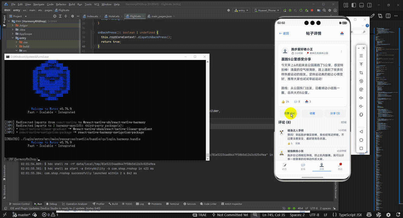
content: '今天早上6点起床去公园晨跑了5公里,感觉特别棒!清晨的空气很清新,路上遇到了很多同样热爱运动的朋友。坚持运动真的能让心情变好,推荐大家也试试早起运动!\n\n路线:从公园东门出发,沿着湖边小径跑一圈,总共大约5公里。',
author: '跑步爱好者小王',
time: '2小时前',
location: '奥林匹克森林公园',
likes: 24,
comments: 8,
shares: 3,
});
const [comments, setComments] = useState<Comment[]>([
{
id: '1',
username: '健身达人李明',
avatar: '🏋️',
content: '赞同!早起跑步确实很棒,我也经常这样做。不过要注意安全,最好穿亮色衣服。',
time: '1小时前',
likes: 5,
replies: 0,
},
{
id: '2',
username: '瑜伽教练小张',
avatar: '🧘',
content: '跑步后记得做拉伸哦,防止肌肉酸痛。我可以分享一些简单的拉伸动作给大家。',
time: '45分钟前',
likes: 3,
replies: 0,
},
{
id: '3',
username: '户外运动爱好者',
avatar: '🚵',
content: '公园里跑步真是一种享受,特别是春天的时候,路边的花都开了,景色特别美。',
time: '30分钟前',
likes: 2,
replies: 0,
},
]);
const [newComment, setNewComment] = useState('');
const [liked, setLiked] = useState(false);
const handleLike = () => {
setLiked(!liked);
Alert.alert('点赞', liked ? '已取消点赞' : '已点赞');
};
const handleShare = () => {
Alert.alert('分享', '分享功能即将推出,敬请期待!');
};
const handleCommentSubmit = () => {
if (newComment.trim() === '') {
Alert.alert('提示', '请输入评论内容');
return;
}
const newCommentObj: Comment = {
id: (comments.length + 1).toString(),
username: '当前用户',
avatar: '👤',
content: newComment,
time: '刚刚',
likes: 0,
replies: 0,
};
setComments([newCommentObj, ...comments]);
setNewComment('');
};
const handleReply = (commentId: string) => {
Alert.alert('回复', `正在回复评论ID: ${commentId}`);
};
return (
<SafeAreaView style={styles.container}>
{/* 头部 */}
<View style={styles.header}>
<TouchableOpacity onPress={() => Alert.alert('返回')}>
<Text style={styles.backButton}>← 返回</Text>
</TouchableOpacity>
<Text style={styles.title}>帖子详情</Text>
<TouchableOpacity style={styles.shareButton} onPress={handleShare}>
<Text style={styles.shareText}>{ICONS.share}</Text>
</TouchableOpacity>
</View>
<ScrollView style={styles.content}>
{/* 帖子详情 */}
<PostDetail
title={post.title}
content={post.content}
author={post.author}
time={post.time}
location={post.location}
likes={post.likes}
comments={post.comments}
shares={post.shares}
/>
{/* 操作按钮 */}
<View style={styles.actionContainer}>
<TouchableOpacity style={[styles.actionButton, liked && styles.likedButton]} onPress={handleLike}>
<Text style={[styles.actionButtonText, liked && styles.likedText]}>
{liked ? '已点赞' : '点赞'} ({post.likes})
</Text>
</TouchableOpacity>
<TouchableOpacity style={styles.actionButton}>
<Text style={styles.actionButtonText}>收藏</Text>
</TouchableOpacity>
<TouchableOpacity style={styles.actionButton} onPress={handleShare}>
<Text style={styles.actionButtonText}>分享 ({post.shares})</Text>
</TouchableOpacity>
</View>
{/* 评论标题 */}
<View style={styles.commentHeaderContainer}>
<Text style={styles.commentTitle}>评论 ({post.comments})</Text>
<TouchableOpacity onPress={() => Alert.alert('排序', '按时间排序')}>
<Text style={styles.sortText}>时间</Text>
</TouchableOpacity>
</View>
{/* 评论列表 */}
<View style={styles.commentList}>
{comments.map(comment => (
<CommentItem
key={comment.id}
comment={comment}
onReply={handleReply}
/>
))}
</View>
{/* 发表评论 */}
<CommentInput
value={newComment}
onChangeText={setNewComment}
onSubmit={handleCommentSubmit}
/>
{/* 相关推荐 */}
<Text style={styles.sectionTitle}>相关推荐</Text>
<View style={styles.recommendationList}>
<TouchableOpacity style={styles.recommendationItem}>
<View style={styles.recommendationIcon}>
<Text style={styles.recommendationIconText}>{ICONS.post}</Text>
</View>
<View style={styles.recommendationContent}>
<Text style={styles.recommendationTitle}>如何制定科学的跑步计划</Text>
<Text style={styles.recommendationAuthor}>运动专家 · 124赞</Text>
</View>
</TouchableOpacity>
<TouchableOpacity style={styles.recommendationItem}>
<View style={styles.recommendationIcon}>
<Text style={styles.recommendationIconText}>{ICONS.post}</Text>
</View>
<View style={styles.recommendationContent}>
<Text style={styles.recommendationTitle}>晨跑 vs 晚跑,哪个更适合你?</Text>
<Text style={styles.recommendationAuthor}>健身达人 · 89赞</Text>
</View>
</TouchableOpacity>
</View>
{/* 广告位 */}
<View style={styles.adContainer}>
<Text style={styles.adTitle}>运动装备推荐</Text>
<Text style={styles.adDescription}>专业跑步鞋,舒适透气,助力你的每一步</Text>
<TouchableOpacity style={styles.adButton}>
<Text style={styles.adButtonText}>查看详情</Text>
</TouchableOpacity>
</View>
</ScrollView>
{/* 底部导航 */}
<View style={styles.bottomNav}>
<TouchableOpacity style={styles.navItem}>
<Text style={styles.navIcon}>{ICONS.post}</Text>
<Text style={styles.navText}>动态</Text>
</TouchableOpacity>
<TouchableOpacity style={styles.navItem}>
<Text style={styles.navIcon}>{ICONS.comment}</Text>
<Text style={styles.navText}>发现</Text>
</TouchableOpacity>
<TouchableOpacity style={[styles.navItem, styles.activeNavItem]}>
<Text style={styles.navIcon}>{ICONS.user}</Text>
<Text style={styles.navText}>详情</Text>
</TouchableOpacity>
<TouchableOpacity style={styles.navItem}>
<Text style={styles.navIcon}>{ICONS.location}</Text>
<Text style={styles.navText}>附近</Text>
</TouchableOpacity>
</View>
</SafeAreaView>
);
};
const styles = StyleSheet.create({
container: {
flex: 1,
backgroundColor: '#f8fafc',
},
header: {
flexDirection: 'row',
alignItems: 'center',
justifyContent: 'space-between',
padding: 20,
backgroundColor: '#ffffff',
borderBottomWidth: 1,
borderBottomColor: '#e2e8f0',
},
backButton: {
fontSize: 16,
color: '#3b82f6',
fontWeight: '500',
},
title: {
fontSize: 20,
fontWeight: 'bold',
color: '#1e293b',
},
shareButton: {
padding: 8,
},
shareText: {
fontSize: 18,
color: '#64748b',
},
content: {
flex: 1,
padding: 16,
},
postCard: {
backgroundColor: '#ffffff',
borderRadius: 12,
padding: 16,
marginBottom: 16,
elevation: 1,
shadowColor: '#000',
shadowOffset: { width: 0, height: 1 },
shadowOpacity: 0.1,
shadowRadius: 2,
},
postHeader: {
flexDirection: 'row',
alignItems: 'center',
marginBottom: 12,
},
avatar: {
width: 40,
height: 40,
borderRadius: 20,
backgroundColor: '#f1f5f9',
alignItems: 'center',
justifyContent: 'center',
marginRight: 12,
},
avatarText: {
fontSize: 20,
},
userInfo: {
flex: 1,
},
username: {
fontSize: 16,
fontWeight: 'bold',
color: '#1e293b',
},
postMeta: {
flexDirection: 'row',
marginTop: 4,
},
metaItem: {
fontSize: 12,
color: '#64748b',
marginRight: 16,
},
moreButton: {
padding: 8,
},
moreText: {
fontSize: 18,
color: '#94a3b8',
},
postTitle: {
fontSize: 18,
fontWeight: 'bold',
color: '#1e293b',
marginBottom: 8,
},
postContent: {
fontSize: 16,
color: '#334155',
lineHeight: 24,
marginBottom: 12,
},
postStats: {
flexDirection: 'row',
borderTopWidth: 1,
borderTopColor: '#e2e8f0',
paddingTop: 12,
},
statItem: {
flexDirection: 'row',
alignItems: 'center',
marginRight: 24,
},
statIcon: {
fontSize: 16,
color: '#64748b',
marginRight: 4,
},
statText: {
fontSize: 14,
color: '#64748b',
},
actionContainer: {
flexDirection: 'row',
justifyContent: 'space-between',
marginBottom: 16,
},
actionButton: {
flex: 1,
backgroundColor: '#f1f5f9',
padding: 12,
borderRadius: 8,
alignItems: 'center',
marginHorizontal: 4,
},
likedButton: {
backgroundColor: '#dbeafe',
},
actionButtonText: {
color: '#3b82f6',
fontWeight: '500',
},
likedText: {
color: '#2563eb',
},
commentHeaderContainer: {
flexDirection: 'row',
justifyContent: 'space-between',
alignItems: 'center',
marginBottom: 12,
},
commentTitle: {
fontSize: 18,
fontWeight: 'bold',
color: '#1e293b',
},
sortText: {
fontSize: 14,
color: '#64748b',
},
commentList: {
marginBottom: 16,
},
commentItem: {
flexDirection: 'row',
paddingVertical: 12,
borderBottomWidth: 1,
borderBottomColor: '#e2e8f0',
},
commentAvatar: {
width: 36,
height: 36,
borderRadius: 18,
backgroundColor: '#f1f5f9',
alignItems: 'center',
justifyContent: 'center',
marginRight: 12,
},
commentContent: {
flex: 1,
},
commentHeader: {
flexDirection: 'row',
justifyContent: 'space-between',
marginBottom: 4,
},
commentUsername: {
fontSize: 14,
fontWeight: '500',
color: '#1e293b',
},
commentTime: {
fontSize: 12,
color: '#64748b',
},
commentText: {
fontSize: 14,
color: '#334155',
lineHeight: 20,
marginBottom: 8,
},
commentActions: {
flexDirection: 'row',
},
commentAction: {
marginRight: 16,
},
commentActionText: {
fontSize: 12,
color: '#64748b',
},
commentInputContainer: {
flexDirection: 'row',
alignItems: 'flex-end',
backgroundColor: '#ffffff',
borderRadius: 12,
padding: 12,
marginBottom: 16,
},
commentInput: {
flex: 1,
borderWidth: 1,
borderColor: '#cbd5e1',
borderRadius: 8,
padding: 12,
maxHeight: 100,
fontSize: 14,
color: '#1e293b',
marginRight: 8,
},
commentButton: {
backgroundColor: '#3b82f6',
paddingHorizontal: 16,
paddingVertical: 10,
borderRadius: 8,
},
commentButtonText: {
color: '#ffffff',
fontWeight: '500',
},
sectionTitle: {
fontSize: 18,
fontWeight: 'bold',
color: '#1e293b',
marginVertical: 12,
},
recommendationList: {
backgroundColor: '#ffffff',
borderRadius: 12,
padding: 12,
marginBottom: 16,
},
recommendationItem: {
flexDirection: 'row',
alignItems: 'center',
paddingVertical: 12,
borderBottomWidth: 1,
borderBottomColor: '#e2e8f0',
},
recommendationItemLast: {
borderBottomWidth: 0,
},
recommendationIcon: {
width: 40,
height: 40,
borderRadius: 8,
backgroundColor: '#f1f5f9',
alignItems: 'center',
justifyContent: 'center',
marginRight: 12,
},
recommendationIconText: {
fontSize: 20,
},
recommendationContent: {
flex: 1,
},
recommendationTitle: {
fontSize: 16,
fontWeight: '500',
color: '#1e293b',
marginBottom: 4,
},
recommendationAuthor: {
fontSize: 12,
color: '#64748b',
},
adContainer: {
backgroundColor: '#ffffff',
borderRadius: 12,
padding: 16,
marginBottom: 16,
},
adTitle: {
fontSize: 16,
fontWeight: 'bold',
color: '#1e293b',
marginBottom: 8,
},
adDescription: {
fontSize: 14,
color: '#334155',
marginBottom: 12,
},
adButton: {
backgroundColor: '#3b82f6',
padding: 12,
borderRadius: 8,
alignItems: 'center',
},
adButtonText: {
color: '#ffffff',
fontWeight: '500',
},
bottomNav: {
flexDirection: 'row',
justifyContent: 'space-around',
backgroundColor: '#ffffff',
borderTopWidth: 1,
borderTopColor: '#e2e8f0',
paddingVertical: 12,
},
navItem: {
alignItems: 'center',
flex: 1,
},
activeNavItem: {
paddingBottom: 2,
borderBottomWidth: 2,
borderBottomColor: '#3b82f6',
},
navIcon: {
fontSize: 20,
color: '#94a3b8',
marginBottom: 4,
},
activeNavIcon: {
color: '#3b82f6',
},
navText: {
fontSize: 12,
color: '#94a3b8',
},
activeNavText: {
color: '#3b82f6',
fontWeight: '500',
},
});
export default SportPostDetailApp;
打包
接下来通过打包命令npn run harmony将reactNative的代码打包成为bundle,这样可以进行在开源鸿蒙OpenHarmony中进行使用。

打包之后再将打包后的鸿蒙OpenHarmony文件拷贝到鸿蒙的DevEco-Studio工程目录去:

最后运行效果图如下显示:
欢迎大家加入开源鸿蒙跨平台开发者社区,一起共建开源鸿蒙跨平台生态。

作为“人工智能6S店”的官方数字引擎,为AI开发者与企业提供一个覆盖软硬件全栈、一站式门户。
更多推荐
 22
22 0
0- 0


 已为社区贡献4条内容

所有评论(0)