
鸿蒙 HarmonyOS 6 | ArkUI (06):表单交互 TextInput、Toggle、Slider 与 Picker 选择器
在鸿蒙 HarmonyOS 6 中,ArkUI 为我们提供了一套极其完善的表单组件全家桶,更重要的是,它引入了 **$$** 双向绑定语法,彻底改变了我们处理表单数据的方式。今天,我们就来深度拆解 TextInput、Toggle、Slider 以及各种 Picker 选择器,看看如何用最优雅的代码实现复杂的表单交互。
文章目录
前言
如果说我们之前学习的布局容器是构建应用的骨架,那么表单组件就是应用的神经末梢,它们负责感知用户的意图并收集数据。无论是简单的登录注册、复杂的个人信息编辑,还是系统设置中的各种开关和滑块,表单交互无处不在。在早期的 UI 开发中,处理表单往往是一件繁琐的苦差事,我们需要监听每一个输入框的改变事件,手动提取值,再手动更新到状态变量中。这种机械式的重复劳动不仅代码量大,而且容易因为疏忽导致数据不同步。
在鸿蒙 HarmonyOS 6 中,ArkUI 为我们提供了一套极其完善的表单组件全家桶,更重要的是,它引入了 $$ 双向绑定语法,彻底改变了我们处理表单数据的方式。今天,我们就来深度拆解 TextInput、Toggle、Slider 以及各种 Picker 选择器,看看如何用最优雅的代码实现复杂的表单交互。

一、 从 TextInput 开始:输入的艺术与双向绑定
TextInput 是最基础也是最高频使用的表单组件。在 ArkUI 中,它不仅仅是一个简单的文本框,而是一个集成了密码模式、邮箱格式校验、样式定制于一身的超级组件。创建一个输入框非常简单,但在处理用户输入的数据流向时,初学者很容易陷入传统的思维定式。
在以往的开发模式中,我们要获取用户输入的内容,通常会使用 onChange 事件。每当用户敲击一次键盘,我们就在回调函数里拿到最新的 value,然后赋值给 @State 修饰的变量。这虽然逻辑正确,但写起来非常啰嗦。如果你有十个输入框,你就得写十个 onChange。鸿蒙 6 引入的 **KaTeX parse error: Expected '}', got 'EOF' at end of input: …tInput({ text: this.userInfo.name })` 这种写法时,我们实际上是告诉框架:请建立一个双向通道,当变量改变时刷新 UI,当用户在 UI 中输入内容时自动更新变量。我们不再需要显式地写 onChange 回调,ArkUI 会在底层自动帮我们完成数据的同步。这种内置的双向绑定机制,让表单代码变得异常简洁,我们只需要关注数据本身,而不用去操心数据是如何从界面流回逻辑层的。
@Entry
@Component
struct TwoWayBindingDemo {
  // 定义状态变量
  @State userName: string = ''
  @State userAge: string = ''

  build() {
    Column({ space: 20 }) {
      Text('表单双向绑定示例')
        .fontSize(24)
        .fontWeight(FontWeight.Bold)

      // ---------------------------------------------------------
      // 方式一:传统写法 (不推荐)
      // 需要手动监听 onChange 事件来更新 state 变量
      // ---------------------------------------------------------
      Column() {
        Text('方式一:传统 onChange (繁琐)')
          .fontSize(14)
          .fontColor(Color.Gray)
          .width('100%')

        TextInput({ text: this.userName, placeholder: '请输入用户名' })
          .onChange((value: string) => {
            // 必须显式赋值,否则 UI 改变了但数据没变
            this.userName = value
            console.info('传统方式更新:', this.userName)
          })
      }
      .width('100%')

      // ---------------------------------------------------------
      // 方式二:$$ 双向绑定 (推荐)
      // 核心:使用 $$ 前缀,ArkUI 自动处理数据同步
      // ---------------------------------------------------------
      Column() {
        Text('方式二:$$ 双向绑定 (简洁)')
          .fontSize(14)
          .fontColor(Color.Blue)
          .width('100%')

        // 这里的 $$this.userAge 建立了 UI <-> State 的双向通道
        // 用户输入时,this.userAge 会自动更新;
        // 代码修改 this.userAge 时,输入框也会自动刷新。
        TextInput({ text: $$this.userAge, placeholder: '请输入年龄' })
          // 依然可以写 onChange 处理额外逻辑,但不再需要负责数据赋值了
          .onChange((value) => {
             console.info('数据已自动同步,当前值为:', this.userAge)
          })
      }
      .width('100%')

      // ---------------------------------------------------------
      // 结果展示区域 (验证数据是否同步)
      // ---------------------------------------------------------
      Column() {
        Text('实时数据展示:')
          .fontWeight(FontWeight.Bold)
        Text(`用户名: ${this.userName}`)
        Text(`年龄: ${this.userAge}`)

        Button('代码修改年龄为 18')
          .fontSize(12)
          .margin({ top: 10 })
          .onClick(() => {
            // 点击按钮修改 State,输入框内容会自动变为 18
            this.userAge = '18'
          })
      }
      .backgroundColor('#F1F3F5')
      .padding(10)
      .borderRadius(8)
      .width('100%')
    }
    .padding(20)
    .width('100%')
  }
}
二、 开关与滑块:直观的布尔值与数值交互
除了文本输入,应用中还有大量非文本的交互场景。比如设置页面里的“夜间模式”开关,或者视频播放器里的音量调节滑块。对于这种二选一的场景,Toggle 组件是最佳选择。它支持 Switch(传统的开关样式)、Checkbox(复选框)和 Button(按钮样式)等多种形态。同样的,Toggle 组件的 isOn 属性也完美支持 $$ 双向绑定。这意味着我们只需要把一个布尔类型的 State 变量绑定上去,剩下的状态切换逻辑框架全包了。我们不需要在 onClick 里去手动取反,状态管理的链路被缩短到了极致。
对于连续数值的调节,Slider 组件提供了极佳的触控体验。无论是调节屏幕亮度还是播放进度,滑动条都是最直观的交互方式。在 API 20 中,Slider 的定制能力得到了大幅增强,我们可以自定义滑轨的粗细、滑块的大小,甚至可以分段显示刻度。在处理 Slider 的数据交互时,虽然它也支持双向绑定,但在实际业务中,我们有时依然需要结合 onChange 事件,特别是当我们需要在滑动的过程中实时触发某些副作用(比如滑动调节音量时实时改变系统音量)时,事件回调依然有它的用武之地。我们需要根据具体的业务场景,在自动绑定的便捷性与手动控制的灵活性之间通过。
@Entry
@Component
struct ToggleAndSliderDemo {
  // 定义状态变量
  @State isNightMode: boolean = false
  @State volume: number = 45

  build() {
    Column({ space: 20 }) {
      // ----------------------------------------------------------------
      // 1. Toggle 组件:极简的双向绑定
      // ----------------------------------------------------------------
      Row() {
        Column() {
          Text('夜间模式')
            .fontSize(16)
            .fontWeight(FontWeight.Medium)
          Text(this.isNightMode ? '状态:开启' : '状态:关闭')
            .fontSize(12)
            .fontColor(Color.Gray)
            .margin({ top: 5 })
        }
        .alignItems(HorizontalAlign.Start)

        // 核心亮点:
        // 使用 $$this.isNightMode 绑定 isOn 属性。
        // 点击开关时,框架自动完成取反操作并更新 isNightMode 变量,
        // 我们完全不需要编写 onClick 或 onChange 逻辑。
        Toggle({ type: ToggleType.Switch, isOn: $$this.isNightMode })
          .selectedColor('#0A59F7')
          .switchPointColor(Color.White)
      }
      .width('100%')
      .justifyContent(FlexAlign.SpaceBetween)
      .padding(15)
      .backgroundColor(Color.White)
      .borderRadius(12)

      // ----------------------------------------------------------------
      // 2. Slider 组件:双向绑定 + 副作用处理
      // ----------------------------------------------------------------
      Column() {
        Row() {
          Text('媒体音量')
            .fontSize(16)
            .fontWeight(FontWeight.Medium)
          Text(`${this.volume.toFixed(0)}%`)
            .fontSize(14)
            .fontColor('#0A59F7')
        }
        .width('100%')
        .justifyContent(FlexAlign.SpaceBetween)
        .margin({ bottom: 10 })

        // 核心亮点:
        // 1. value: $$this.volume 实现滑块与数值的双向同步
        // 2. 强大的定制能力:设置步长(step)、轨道粗细(trackThickness)等
        Slider({
          value: $$this.volume,
          min: 0,
          max: 100,
          step: 1, // 分段步长
          style: SliderStyle.InSet
        })
          .blockColor('#0A59F7')
          .trackThickness(6) // 自定义滑轨粗细
          .showSteps(true)   // 显示刻度点
          // 虽然有了双向绑定,但在调节音量等场景,
          // 我们依然需要 onChange 来触发“副作用”(如调用系统音频接口)
          .onChange((value: number, mode: SliderChangeMode) => {
            console.info(`正在调节音量,实时同步给系统 Audio 服务: ${value}`)
          })
      }
      .width('100%')
      .padding(15)
      .backgroundColor(Color.White)
      .borderRadius(12)
    }
    .width('100%')
    .height('100%')
    .padding(16)
    .backgroundColor('#F1F3F5')
  }
}
三、 Picker 选择器家族:处理复杂的多维数据
当我们需要用户从预定义的集合中进行选择时,输入框显然就不太合适了。这时候,Picker 选择器家族就派上了用场。鸿蒙提供了一整套选择器,包括处理日期的 DatePicker、处理时间的 TimePicker 以及处理多列文本的 TextPicker。
这些组件的设计非常符合移动端的操作习惯,它们通常以滚轮的形式出现,让用户可以通过滑动来快速定位目标。以 DatePicker 为例,它不再需要我们去处理复杂的年月日逻辑,只需要绑定一个 Date 对象,组件就会自动处理闰年、大小月等边缘情况。而 TextPicker 则更加强大,它支持多列联动,比如我们常见的“省-市-区”三级联动选择。在旧的开发模式下,实现这种联动需要写大量的逻辑判断,而在 ArkUI 中,我们只需要更新数据源,Picker 就会自动刷新列的内容。值得注意的是,虽然这些 Picker 可以直接嵌入在页面中使用,但在寸土寸金的移动端屏幕上,我们更倾向于将它们放入一个弹窗或者底部面板中,只有在用户需要时才呼出,这样既保持了界面的整洁,又保证了功能的完整性。
@Entry
@Component
struct PickerDemo {
  // 1. DatePicker 状态
  @State selectedDate: Date = new Date()

  // 2. TextPicker 多列联动状态
  // 模拟数据源
  private provinceData: string[] = ['广东省', '北京市']
  private cityData: Record<string, string[]> = {
    '广东省': ['广州市', '深圳市', '珠海市', '佛山市'],
    '北京市': ['朝阳区', '海淀区', '东城区', '西城区']
  }

  // 当前显示的列数据:[省份列, 城市列]
  @State pickerRange: string[][] = [this.provinceData, this.cityData['广东省']]
  @State selectIndex: number[] = [0, 0] // 默认选中第一省、第一市

  // 控制底部面板显示
  @State isSheetOpen: boolean = false

  build() {
    Column({ space: 20 }) {
      // -------------------------------------------------------------
      // 场景一:DatePicker 日期选择
      // -------------------------------------------------------------
      Column() {
        Text('日期选择器 (自动处理历法)')
          .fontSize(14)
          .fontColor(Color.Gray)
          .width('100%')
          .margin({ bottom: 10 })

        // 核心亮点:
        // 只需要绑定 selected 属性,闰年、大小月等逻辑组件自动处理
        DatePicker({
          start: new Date('2000-01-01'),
          end: new Date('2030-12-31'),
          selected: this.selectedDate
        })
          .height(180) // 限制高度,模拟滚轮效果
          .onDateChange((value: Date) => {
            this.selectedDate = value
            console.info('当前选中日期:', value.toLocaleDateString())
          })
      }
      .padding(15)
      .backgroundColor(Color.White)
      .borderRadius(12)

      // -------------------------------------------------------------
      // 场景二:TextPicker 多列联动 (省市区)
      // 文中提到:推荐在底部面板(Sheet/Dialog)中呼出,保持界面整洁
      // -------------------------------------------------------------
      Button('打开省市选择器')
        .width('100%')
        .onClick(() => {
          this.isSheetOpen = true
        })
        .bindSheet($$this.isSheetOpen, this.CityPickerBuilder(), {
          height: 300, // 半模态高度
          title: { title: '选择收货地址' }
        })

      // 显示结果
      Text(`当前选中: ${this.pickerRange[0][this.selectIndex[0]]} - ${this.pickerRange[1][this.selectIndex[1]]}`)
        .fontSize(16)
        .fontWeight(FontWeight.Bold)
    }
    .width('100%')
    .height('100%')
    .padding(20)
    .backgroundColor('#F1F3F5')
  }

  // 封装选择器构建函数 (用于 bindSheet)
  @Builder
  CityPickerBuilder() {
    Column() {
      // 核心亮点:TextPicker 多列联动
      // range 接受一个二维数组,分别代表每一列的数据
      TextPicker({ range: this.pickerRange, selected: this.selectIndex })
        .onChange((value: string | string[], index: number | number[]) => {
          // index 是一个数组,[0]代表第一列索引,[1]代表第二列索引
          const provinceIndex = Array.isArray(index) ? index[0] : 0

          // 逻辑判断:如果省份(第一列)发生了变化
          if (provinceIndex !== this.selectIndex[0]) {
             // 1. 获取新省份名称
             const newProvince = this.provinceData[provinceIndex]
             // 2. 刷新第二列的数据源
             this.pickerRange[1] = this.cityData[newProvince]
             // 3. 重置第二列选中项为 0,防止索引越界
             this.selectIndex = [provinceIndex, 0]
          } else {
             // 如果只是动了城市列,直接更新索引
             this.selectIndex = index as number[]
          }
        })
        .height(200)

      Button('确定')
        .width('90%')
        .onClick(() => this.isSheetOpen = false)
    }
    .height('100%')
    .justifyContent(FlexAlign.Center)
  }
}
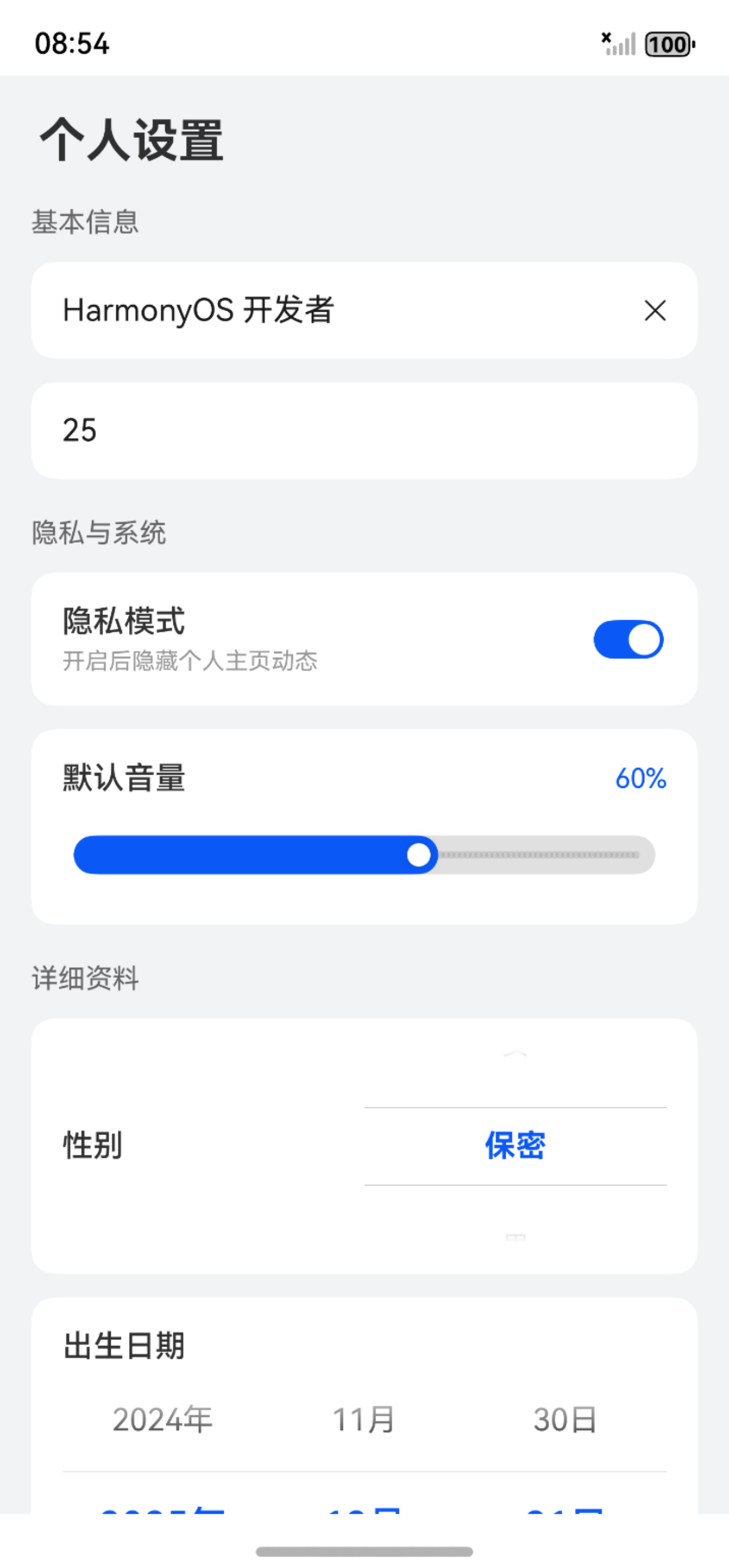
四、 综合实战:打造全功能的个人设置页
为了将上述知识点融会贯通,我们来构建一个功能完备的“个人设置”页面。这个页面将包含用户昵称修改(TextInput)、隐私开关(Toggle)、系统音量预设(Slider)以及出生日期选择(DatePicker)。我们将全程使用 $$ 双向绑定语法,让你亲眼见证代码可以精简到什么程度。
请注意观察代码中对于 $$ 的使用位置。你会发现,我们在整个逻辑代码中,几乎找不到一行手动赋值 this.x = val 的代码,所有的交互都是通过数据驱动自动完成的。这就是鸿蒙 HarmonyOS 6 声明式 UI 的魅力所在——数据即 UI,UI 即数据。
import { promptAction } from '@kit.ArkUI';

@Entry
@Component
export struct FormInteractionPage {
  // 定义表单的状态数据
  // 在实际开发中,这些数据可能来自 View Model 或接口
  @State userName: string = 'HarmonyOS 开发者';
  @State userAge: string = '25';
  @State isPrivateMode: boolean = true;
  @State systemVolume: number = 60;
  @State selectedDate: Date = new Date();

  // 性别选择的数据源
  private genderOptions: string[] = ['男', '女', '保密'];
  @State selectedGenderIndex: number = 0;

  build() {
    Column() {
      // 顶部标题
      Text('个人设置')
        .fontSize(24)
        .fontWeight(FontWeight.Bold)
        .width('100%')
        .padding(20)
        .backgroundColor('#F1F3F5')

      // 表单内容区域,使用 Scroll 包裹防止内容溢出
      Scroll() {
        Column({ space: 20 }) {

          // 1. 文本输入:双向绑定的魅力
          // 使用 Group 样式让表单更聚合
          Column({ space: 12 }) {
            Text('基本信息').fontSize(14).fontColor('#666666').width('100%')

            // 昵称输入框
            TextInput({ text: $$this.userName, placeholder: '请输入昵称' })
              .height(50)
              .backgroundColor(Color.White)
              .borderRadius(12)
              .padding({ left: 16 })
              .cancelButton({ style: CancelButtonStyle.INPUT }) // 输入时显示清除按钮

            // 年龄输入框 (限制数字)
            TextInput({ text: $$this.userAge, placeholder: '请输入年龄' })
              .type(InputType.Number) // 弹出数字键盘
              .height(50)
              .backgroundColor(Color.White)
              .borderRadius(12)
              .padding({ left: 16 })
          }
          .width('100%')

          // 2. 开关与滑块:布尔与数值交互
          Column({ space: 12 }) {
            Text('隐私与系统').fontSize(14).fontColor('#666666').width('100%')

            // 隐私模式开关
            Row() {
              Column() {
                Text('隐私模式')
                  .fontSize(16)
                  .fontWeight(FontWeight.Medium)
                Text('开启后隐藏个人主页动态')
                  .fontSize(12)
                  .fontColor('#999999')
                  .margin({ top: 4 })
              }
              .alignItems(HorizontalAlign.Start)

              // 核心:$$this.isPrivateMode 实现双向绑定
              // 无需 onClick,点击即自动更新 boolean 状态
              Toggle({ type: ToggleType.Switch, isOn: $$this.isPrivateMode })
                .selectedColor('#0A59F7')
                .switchPointColor(Color.White)
            }
            .width('100%')
            .justifyContent(FlexAlign.SpaceBetween)
            .padding(16)
            .backgroundColor(Color.White)
            .borderRadius(12)

            // 音量调节滑块
            Column() {
              Row() {
                Text('默认音量')
                  .fontSize(16)
                  .fontWeight(FontWeight.Medium)
                Text(`${this.systemVolume.toFixed(0)}%`)
                  .fontSize(14)
                  .fontColor('#0A59F7')
              }
              .width('100%')
              .justifyContent(FlexAlign.SpaceBetween)
              .margin({ bottom: 10 })

              // Slider 组件
              // value 绑定状态,min/max 设置范围
              Slider({
                value: $$this.systemVolume,
                min: 0,
                max: 100,
                step: 1,
                style: SliderStyle.InSet
              })
                .trackColor('#E0E0E0')
                .selectedColor('#0A59F7')
                .showSteps(true) // 显示步长点
            }
            .padding(16)
            .backgroundColor(Color.White)
            .borderRadius(12)
          }

          // 3. 选择器实战:TextPicker 与 DatePicker
          Column({ space: 12 }) {
            Text('详细资料').fontSize(14).fontColor('#666666').width('100%')

            // 性别选择 (TextPicker)
            // 这里我们模拟一个内嵌的选择效果
            Row() {
              Text('性别')
                .fontSize(16)
                .fontWeight(FontWeight.Medium)

              // 使用 TextPicker 选择文本
              // value: 绑定选中的文本值,selected: 绑定选中的索引
              TextPicker({ range: this.genderOptions, selected: $$this.selectedGenderIndex })
                .defaultPickerItemHeight(40)
                .height(100)
                .width('50%')
                .disappearTextStyle({ color: Color.Gray, font: { size: 12 } })
                .textStyle({ color: '#333', font: { size: 14 } })
                .selectedTextStyle({ color: '#0A59F7', font: { size: 16, weight: FontWeight.Bold } })
            }
            .width('100%')
            .padding(16)
            .backgroundColor(Color.White)
            .borderRadius(12)
            .justifyContent(FlexAlign.SpaceBetween)

            // 出生日期 (DatePicker)
            Column() {
              Text('出生日期')
                .fontSize(16)
                .fontWeight(FontWeight.Medium)
                .width('100%')
                .margin({ bottom: 8 })

              // 日期选择器
              DatePicker({
                start: new Date('1900-01-01'),
                end: new Date('2025-12-31'),
                selected: this.selectedDate
              })
                .height(150)
                .onDateChange((value: Date) => {
                  // DatePicker 目前主要通过回调更新,部分版本支持 $$ 但回调更稳健
                  this.selectedDate = value;
                })
            }
            .padding(16)
            .backgroundColor(Color.White)
            .borderRadius(12)
          }

          // 提交按钮
          Button('保存修改')
            .width('100%')
            .height(50)
            .fontSize(18)
            .backgroundColor('#0A59F7')
            .margin({ top: 20, bottom: 40 })
            .onClick(() => {
              // 验证双向绑定结果
              const result = `
                昵称: ${this.userName}
                年龄: ${this.userAge}
                隐私: ${this.isPrivateMode ? '开启' : '关闭'}
                音量: ${this.systemVolume}
                性别: ${this.genderOptions[this.selectedGenderIndex]}
                日期: ${this.selectedDate.toLocaleDateString()}
              `;
              promptAction.showDialog({
                title: '数据提交',
                message: result,
                buttons: [{ text: '确定', color: '#0A59F7' }]
              });
            })

        }
        .padding({ left: 16, right: 16 })
      }
      .scrollBar(BarState.Off)
      .layoutWeight(1)
    }
    .width('100%')
    .height('100%')
    .backgroundColor('#F1F3F5')
  }
}
总结
通过这个实战案例,我们可以清晰地看到,ArkUI 的表单开发体验是极其流畅的。$$ 双向绑定语法的引入,让我们从繁琐的事件监听中解脱出来,能够把更多的精力投入到业务逻辑和界面美学的设计上。
从基础的 TextInput 到交互丰富的 Toggle 和 Slider,再到功能强大的 Picker 家族,这套组件全家桶足以支撑起绝大多数的表单业务场景。
在鸿蒙 HarmonyOS 6 的开发中,善用这些工具,不仅能提升代码的可维护性,更能为用户带来一致且流畅的操作体验。

作为“人工智能6S店”的官方数字引擎,为AI开发者与企业提供一个覆盖软硬件全栈、一站式门户。
更多推荐


 6
6 0
0- 0


 已为社区贡献4条内容

所有评论(0)