
CMP for OpenHarmony 按钮组件开发实战
本文介绍了使用Compose Multiplatform开发鸿蒙系统按钮组件库的全过程。文章首先设计了统一的颜色配置和数据模型,包括按钮颜色、尺寸和形状枚举。然后详细讲解了四种基础按钮的实现:填充按钮(视觉权重最高)、描边按钮(中等权重)、文字按钮(最低权重)和浮起按钮(带阴影效果)。每种按钮都支持多种状态(正常、禁用)、尺寸(小、中、大)和形状(圆角、胶囊、直角),并提供了完整的参数配置和交互处
项目开源地址:https://atomgit.com/nutpi/cmp_openharmony
前言
按钮是用户界面中最基础也是最重要的交互元素。一个设计良好的按钮系统不仅能提升用户体验,还能让开发者更高效地构建界面。本文将详细介绍如何使用 Compose Multiplatform(CMP)适配鸿蒙系统,开发一套功能完善、样式丰富的按钮组件库。
通过本教程,你将学会:
- 创建多种样式的基础按钮(填充、描边、文字、浮起)
- 实现不同尺寸和形状的按钮变体
- 开发特殊功能按钮(图标、渐变、加载、徽章)
- 构建实用的按钮组合(分段、计数、评分、社交登录)
- 掌握按钮组件的最佳实践
环境准备
确保你的开发环境已正确配置 CMP for OpenHarmony:
- DevEco Studio 4.0 或更高版本
- OpenHarmony SDK
- Kotlin 1.9.0+
- Compose Multiplatform 1.5.0+
一、按钮颜色与数据模型设计
在开始编写组件之前,我们首先定义统一的颜色配置和数据模型。
1.1 颜色配置
package com.tencent.compose.sample.buttons

import androidx.compose.ui.graphics.Color
import androidx.compose.ui.unit.Dp
import androidx.compose.ui.unit.dp

/**
 * 按钮颜色配置
 * 统一管理所有按钮相关的颜色值
 */
object ButtonColors {
    val Primary = Color(0xFF6200EE)       // 主要按钮颜色
    val PrimaryVariant = Color(0xFF3700B3) // 主要按钮变体
    val Secondary = Color(0xFF03DAC5)     // 次要按钮颜色
    val SecondaryVariant = Color(0xFF018786)
    val Success = Color(0xFF4CAF50)       // 成功状态
    val Warning = Color(0xFFFF9800)       // 警告状态
    val Error = Color(0xFFB00020)         // 错误状态
    val Info = Color(0xFF2196F3)          // 信息状态
    val Light = Color(0xFFF5F5F5)         // 浅色背景
    val Dark = Color(0xFF333333)          // 深色背景
    val White = Color.White
    val TextPrimary = Color(0xFF333333)   // 主要文字
    val TextSecondary = Color(0xFF666666) // 次要文字
    val TextHint = Color(0xFF999999)      // 提示文字
    val Disabled = Color(0xFFBDBDBD)      // 禁用状态
    val DisabledText = Color(0xFF9E9E9E)  // 禁用文字
}
颜色配置采用语义化命名,Primary 和 Secondary 用于主次按钮,Success、Warning、Error、Info 用于不同状态的反馈按钮。Disabled 和 DisabledText 专门用于禁用状态,确保禁用按钮有明确的视觉区分。这种设计让开发者能够快速选择合适的颜色,同时保持整个应用的视觉一致性。
在实际项目中,建议将这些颜色值与设计团队对齐,确保代码中的颜色与设计稿保持一致。如果项目需要支持深色模式,可以考虑将 ButtonColors 改为接口或抽象类,然后提供 LightButtonColors 和 DarkButtonColors 两套实现。另外,颜色值使用十六进制格式(如 0xFF6200EE)而非 RGB 格式,这样更便于与设计工具中的颜色值进行对照。
1.2 按钮尺寸与形状
/**
 * 按钮尺寸枚举
 */
enum class ButtonSize {
    SMALL,      // 小尺寸 - 适合紧凑布局
    MEDIUM,     // 中等尺寸 - 默认选择
    LARGE       // 大尺寸 - 适合主要操作
}

/**
 * 按钮形状枚举
 */
enum class ButtonShape {
    ROUNDED,    // 圆角 - 现代风格
    PILL,       // 胶囊形 - 柔和风格
    SQUARE      // 直角 - 严肃风格
}

/**
 * 获取按钮高度
 */
fun ButtonSize.toHeight(): Dp = when (this) {
    ButtonSize.SMALL -> 32.dp
    ButtonSize.MEDIUM -> 44.dp
    ButtonSize.LARGE -> 56.dp
}

/**
 * 获取按钮圆角
 */
fun ButtonShape.toCornerRadius(height: Dp): Dp = when (this) {
    ButtonShape.ROUNDED -> 12.dp
    ButtonShape.PILL -> height / 2
    ButtonShape.SQUARE -> 4.dp
}
按钮尺寸分为三档:SMALL(32dp)适合工具栏或紧凑列表中的操作按钮;MEDIUM(44dp)是默认尺寸,符合人体工程学的最小触摸目标;LARGE(56dp)用于页面主要操作,如提交表单、确认购买等。按钮形状的设计考虑了不同的视觉风格需求,ROUNDED 是最通用的选择,PILL 形状更加柔和友好,SQUARE 则适合需要严肃感的场景。
toHeight() 和 toCornerRadius() 这两个扩展函数的设计非常巧妙,它们将枚举值转换为具体的尺寸数值,使得按钮组件的代码更加简洁。特别是 toCornerRadius() 函数,PILL 形状的圆角半径设置为按钮高度的一半,这样无论按钮多高,都能保证两端是完美的半圆形。这种设计模式可以复用到其他需要尺寸变体的组件中。
二、基础按钮组件
基础按钮是最常用的组件,包括填充按钮、描边按钮、文字按钮和浮起按钮。
2.1 填充按钮(主要按钮)
import androidx.compose.foundation.background
import androidx.compose.foundation.clickable
import androidx.compose.foundation.interaction.MutableInteractionSource
import androidx.compose.foundation.layout.*
import androidx.compose.foundation.shape.RoundedCornerShape
import androidx.compose.material.Text
import androidx.compose.runtime.Composable
import androidx.compose.runtime.remember
import androidx.compose.ui.Alignment
import androidx.compose.ui.Modifier
import androidx.compose.ui.draw.clip
import androidx.compose.ui.graphics.Color
import androidx.compose.ui.text.font.FontWeight
import androidx.compose.ui.unit.sp

/**
 * 填充按钮(主要按钮)
 * 用于页面中最重要的操作,视觉权重最高
 *
 * @param text 按钮文字
 * @param modifier 修饰符
 * @param icon 可选的前置图标
 * @param color 按钮背景颜色
 * @param size 按钮尺寸
 * @param shape 按钮形状
 * @param enabled 是否启用
 * @param onClick 点击回调
 */
@Composable
fun FilledButton(
    text: String,
    modifier: Modifier = Modifier,
    icon: String = "",
    color: Color = ButtonColors.Primary,
    size: ButtonSize = ButtonSize.MEDIUM,
    shape: ButtonShape = ButtonShape.ROUNDED,
    enabled: Boolean = true,
    onClick: () -> Unit
) {
    val height = size.toHeight()
    val cornerRadius = shape.toCornerRadius(height)
    val backgroundColor = if (enabled) color else ButtonColors.Disabled
    val textColor = if (enabled) ButtonColors.White else ButtonColors.DisabledText

    Box(
        modifier = modifier
            .height(height)
            .clip(RoundedCornerShape(cornerRadius))
            .background(backgroundColor)
            .then(
                if (enabled) {
                    Modifier.clickable(
                        indication = null,
                        interactionSource = remember { MutableInteractionSource() }
                    ) { onClick() }
                } else Modifier
            )
            .padding(horizontal = 24.dp),
        contentAlignment = Alignment.Center
    ) {
        Row(
            verticalAlignment = Alignment.CenterVertically,
            horizontalArrangement = Arrangement.Center
        ) {
            if (icon.isNotEmpty()) {
                Text(text = icon, fontSize = 16.sp)
                Spacer(modifier = Modifier.width(8.dp))
            }
            Text(
                text = text,
                color = textColor,
                fontSize = when (size) {
                    ButtonSize.SMALL -> 13.sp
                    ButtonSize.MEDIUM -> 15.sp
                    ButtonSize.LARGE -> 17.sp
                },
                fontWeight = FontWeight.Medium
            )
        }
    }
}
填充按钮是视觉权重最高的按钮类型,适合用于页面的主要操作。实现中使用 Box 作为容器,通过 clip 和 background 修饰符创建圆角背景。enabled 参数控制按钮的可用状态,禁用时自动切换为灰色背景和文字。文字大小根据按钮尺寸自动调整,确保在不同尺寸下都有良好的可读性。icon 参数支持在文字前添加图标,增强按钮的表意能力。
值得注意的是,这里使用了 Modifier.then() 来条件性地添加点击事件,而不是在 clickable 内部判断 enabled 状态。这种写法的好处是,禁用状态下按钮完全不响应点击,连点击的涟漪效果都不会出现。另外,MutableInteractionSource 配合 indication = null 可以移除默认的点击涟漪效果,如果你希望保留涟漪效果,可以移除这两个参数。水平内边距设置为 24dp,这个值经过反复测试,能够在大多数文字长度下保持良好的视觉平衡。
2.2 描边按钮(次要按钮)
import androidx.compose.foundation.border

/**
 * 描边按钮(次要按钮)
 * 用于次要操作,视觉权重低于填充按钮
 *
 * @param text 按钮文字
 * @param modifier 修饰符
 * @param icon 可选的前置图标
 * @param color 边框和文字颜色
 * @param size 按钮尺寸
 * @param shape 按钮形状
 * @param enabled 是否启用
 * @param onClick 点击回调
 */
@Composable
fun OutlinedButton(
    text: String,
    modifier: Modifier = Modifier,
    icon: String = "",
    color: Color = ButtonColors.Primary,
    size: ButtonSize = ButtonSize.MEDIUM,
    shape: ButtonShape = ButtonShape.ROUNDED,
    enabled: Boolean = true,
    onClick: () -> Unit
) {
    val height = size.toHeight()
    val cornerRadius = shape.toCornerRadius(height)
    val borderColor = if (enabled) color else ButtonColors.Disabled
    val textColor = if (enabled) color else ButtonColors.DisabledText

    Box(
        modifier = modifier
            .height(height)
            .clip(RoundedCornerShape(cornerRadius))
            .border(
                width = 1.5.dp,
                color = borderColor,
                shape = RoundedCornerShape(cornerRadius)
            )
            .then(
                if (enabled) {
                    Modifier.clickable(
                        indication = null,
                        interactionSource = remember { MutableInteractionSource() }
                    ) { onClick() }
                } else Modifier
            )
            .padding(horizontal = 24.dp),
        contentAlignment = Alignment.Center
    ) {
        Row(
            verticalAlignment = Alignment.CenterVertically,
            horizontalArrangement = Arrangement.Center
        ) {
            if (icon.isNotEmpty()) {
                Text(text = icon, fontSize = 16.sp, color = textColor)
                Spacer(modifier = Modifier.width(8.dp))
            }
            Text(
                text = text,
                color = textColor,
                fontSize = when (size) {
                    ButtonSize.SMALL -> 13.sp
                    ButtonSize.MEDIUM -> 15.sp
                    ButtonSize.LARGE -> 17.sp
                },
                fontWeight = FontWeight.Medium
            )
        }
    }
}
描边按钮使用边框而非填充背景,视觉权重低于填充按钮,适合用于次要操作或与填充按钮配合使用。边框宽度设置为 1.5dp,既能清晰可见又不会过于突兀。文字和边框使用相同的颜色,保持视觉统一。这种按钮在"取消"、“返回"等场景中非常常用,与"确认”、"提交"等主要操作形成对比。
描边按钮的实现与填充按钮非常相似,主要区别在于使用 border 修饰符替代 background。需要注意的是,border 修饰符需要单独指定 shape 参数,不能复用 clip 的形状,所以这里 RoundedCornerShape(cornerRadius) 出现了两次。在实际使用中,描边按钮通常与填充按钮成对出现,比如弹窗底部的"取消"和"确认"按钮,这时候两个按钮应该使用相同的尺寸和形状,只是样式不同。
2.3 文字按钮
/**
 * 文字按钮
 * 最轻量的按钮形式,适合不需要强调的操作
 *
 * @param text 按钮文字
 * @param modifier 修饰符
 * @param icon 可选的前置图标
 * @param color 文字颜色
 * @param size 按钮尺寸
 * @param enabled 是否启用
 * @param onClick 点击回调
 */
@Composable
fun TextButton(
    text: String,
    modifier: Modifier = Modifier,
    icon: String = "",
    color: Color = ButtonColors.Primary,
    size: ButtonSize = ButtonSize.MEDIUM,
    enabled: Boolean = true,
    onClick: () -> Unit
) {
    val height = size.toHeight()
    val textColor = if (enabled) color else ButtonColors.DisabledText

    Box(
        modifier = modifier
            .height(height)
            .then(
                if (enabled) {
                    Modifier.clickable(
                        indication = null,
                        interactionSource = remember { MutableInteractionSource() }
                    ) { onClick() }
                } else Modifier
            )
            .padding(horizontal = 16.dp),
        contentAlignment = Alignment.Center
    ) {
        Row(
            verticalAlignment = Alignment.CenterVertically,
            horizontalArrangement = Arrangement.Center
        ) {
            if (icon.isNotEmpty()) {
                Text(text = icon, fontSize = 16.sp, color = textColor)
                Spacer(modifier = Modifier.width(6.dp))
            }
            Text(
                text = text,
                color = textColor,
                fontSize = when (size) {
                    ButtonSize.SMALL -> 13.sp
                    ButtonSize.MEDIUM -> 15.sp
                    ButtonSize.LARGE -> 17.sp
                },
                fontWeight = FontWeight.Medium
            )
        }
    }
}
文字按钮是最轻量的按钮形式,没有背景和边框,只有文字。适合用于不需要强调的辅助操作,如"了解更多"、“跳过”、"稍后再说"等。文字按钮的水平内边距较小(16dp),使其在视觉上更加紧凑。虽然视觉权重最低,但仍然保持了足够的点击区域(通过 height 控制),确保良好的可操作性。
文字按钮虽然看起来简单,但在界面设计中扮演着重要角色。它可以在不增加视觉负担的情况下提供额外的操作入口。在使用文字按钮时,要注意文字颜色的选择,通常使用主题色(Primary)来表示可点击,使用灰色来表示次要操作。文字按钮也支持添加图标,但图标与文字的间距稍小(6dp),以保持紧凑感。在某些场景下,文字按钮可以不设置固定高度,让其自适应内容高度,但这样做会牺牲点击区域的一致性。
2.4 浮起按钮
import androidx.compose.ui.draw.shadow

/**
 * 浮起按钮(带阴影)
 * 通过阴影效果增加层次感,适合需要突出的操作
 *
 * @param text 按钮文字
 * @param modifier 修饰符
 * @param icon 可选的前置图标
 * @param color 按钮背景颜色
 * @param size 按钮尺寸
 * @param shape 按钮形状
 * @param enabled 是否启用
 * @param onClick 点击回调
 */
@Composable
fun ElevatedButton(
    text: String,
    modifier: Modifier = Modifier,
    icon: String = "",
    color: Color = ButtonColors.Primary,
    size: ButtonSize = ButtonSize.MEDIUM,
    shape: ButtonShape = ButtonShape.ROUNDED,
    enabled: Boolean = true,
    onClick: () -> Unit
) {
    val height = size.toHeight()
    val cornerRadius = shape.toCornerRadius(height)
    val backgroundColor = if (enabled) color else ButtonColors.Disabled
    val textColor = if (enabled) ButtonColors.White else ButtonColors.DisabledText

    Box(
        modifier = modifier
            .height(height)
            .shadow(
                elevation = if (enabled) 6.dp else 0.dp,
                shape = RoundedCornerShape(cornerRadius)
            )
            .clip(RoundedCornerShape(cornerRadius))
            .background(backgroundColor)
            .then(
                if (enabled) {
                    Modifier.clickable(
                        indication = null,
                        interactionSource = remember { MutableInteractionSource() }
                    ) { onClick() }
                } else Modifier
            )
            .padding(horizontal = 24.dp),
        contentAlignment = Alignment.Center
    ) {
        Row(
            verticalAlignment = Alignment.CenterVertically,
            horizontalArrangement = Arrangement.Center
        ) {
            if (icon.isNotEmpty()) {
                Text(text = icon, fontSize = 16.sp)
                Spacer(modifier = Modifier.width(8.dp))
            }
            Text(
                text = text,
                color = textColor,
                fontSize = when (size) {
                    ButtonSize.SMALL -> 13.sp
                    ButtonSize.MEDIUM -> 15.sp
                    ButtonSize.LARGE -> 17.sp
                },
                fontWeight = FontWeight.Medium
            )
        }
    }
}
浮起按钮在填充按钮的基础上添加了阴影效果,使按钮看起来像是"浮"在界面上。6dp 的阴影高度提供了明显但不过分的立体感。禁用状态下阴影会消失,进一步强化禁用的视觉反馈。这种按钮适合用于需要特别突出的操作,或者在视觉层次较为复杂的界面中使用。
shadow 修饰符的位置很重要,它必须放在 clip 之前,否则阴影会被裁剪掉。阴影的颜色默认是半透明黑色,在浅色背景上效果很好,但在深色背景上可能不够明显。如果需要在深色背景上使用浮起按钮,可以考虑使用更浅的按钮颜色或增加阴影的不透明度。浮起按钮不宜过多使用,一个页面上有一两个就足够了,否则会削弱其突出效果。
三、特殊功能按钮
除了基础按钮,我们还需要一些具有特殊功能的按钮来满足更复杂的交互需求。
3.1 图标按钮
import androidx.compose.foundation.shape.CircleShape

/**
 * 图标按钮
 * 只显示图标的圆形按钮,适合工具栏等场景
 *
 * @param icon 图标内容
 * @param modifier 修饰符
 * @param size 按钮尺寸
 * @param backgroundColor 背景颜色
 * @param iconColor 图标颜色
 * @param enabled 是否启用
 * @param onClick 点击回调
 */
@Composable
fun IconButton(
    icon: String,
    modifier: Modifier = Modifier,
    size: Dp = 44.dp,
    backgroundColor: Color = ButtonColors.Primary,
    iconColor: Color = ButtonColors.White,
    enabled: Boolean = true,
    onClick: () -> Unit
) {
    val bgColor = if (enabled) backgroundColor else ButtonColors.Disabled

    Box(
        modifier = modifier
            .size(size)
            .clip(CircleShape)
            .background(bgColor)
            .then(
                if (enabled) {
                    Modifier.clickable(
                        indication = null,
                        interactionSource = remember { MutableInteractionSource() }
                    ) { onClick() }
                } else Modifier
            ),
        contentAlignment = Alignment.Center
    ) {
        Text(
            text = icon,
            fontSize = (size.value * 0.45f).sp,
            color = if (enabled) iconColor else ButtonColors.DisabledText
        )
    }
}
图标按钮是一个圆形的纯图标按钮,没有文字。图标大小自动根据按钮尺寸计算(按钮尺寸的 45%),确保在不同大小下都有良好的视觉比例。这种按钮非常适合工具栏、操作栏等需要紧凑布局的场景。使用 CircleShape 创建完美的圆形,配合 emoji 图标可以快速实现各种功能按钮。
图标按钮的尺寸默认为 44dp,这是 iOS 和 Android 都推荐的最小触摸目标尺寸。在工具栏中,可以适当减小到 36dp 或 40dp 以节省空间,但不建议小于 32dp。图标按钮通常成组出现,比如编辑器的工具栏、播放器的控制栏等,这时候要注意按钮之间的间距,通常 8-12dp 的间距比较合适。如果图标按钮需要表示选中状态,可以通过改变背景色或图标颜色来实现。
3.2 浮动操作按钮(FAB)
/**
 * 浮动操作按钮 (FAB)
 * Material Design 风格的浮动按钮,支持扩展模式
 *
 * @param icon 图标内容
 * @param modifier 修饰符
 * @param size 按钮尺寸
 * @param backgroundColor 背景颜色
 * @param extended 是否为扩展模式(显示文字)
 * @param text 扩展模式下的文字
 * @param onClick 点击回调
 */
@Composable
fun FloatingActionButton(
    icon: String,
    modifier: Modifier = Modifier,
    size: Dp = 56.dp,
    backgroundColor: Color = ButtonColors.Primary,
    extended: Boolean = false,
    text: String = "",
    onClick: () -> Unit
) {
    Box(
        modifier = modifier
            .then(
                if (extended) {
                    Modifier.height(size).wrapContentWidth()
                } else {
                    Modifier.size(size)
                }
            )
            .shadow(8.dp, if (extended) RoundedCornerShape(size / 2) else CircleShape)
            .clip(if (extended) RoundedCornerShape(size / 2) else CircleShape)
            .background(backgroundColor)
            .clickable(
                indication = null,
                interactionSource = remember { MutableInteractionSource() }
            ) { onClick() }
            .padding(horizontal = if (extended) 20.dp else 0.dp),
        contentAlignment = Alignment.Center
    ) {
        Row(
            verticalAlignment = Alignment.CenterVertically,
            horizontalArrangement = Arrangement.Center
        ) {
            Text(
                text = icon,
                fontSize = (size.value * 0.45f).sp,
                color = ButtonColors.White
            )
            if (extended && text.isNotEmpty()) {
                Spacer(modifier = Modifier.width(12.dp))
                Text(
                    text = text,
                    fontSize = 15.sp,
                    fontWeight = FontWeight.Medium,
                    color = ButtonColors.White
                )
            }
        }
    }
}
浮动操作按钮(FAB)是 Material Design 中的经典组件,通常固定在屏幕右下角,用于页面的主要操作。默认尺寸为 56dp,配合 8dp 的阴影创造出明显的浮动效果。extended 参数支持扩展模式,在图标旁边显示文字,适合需要更明确表意的场景。扩展模式下按钮变为胶囊形状,宽度自适应内容。
FAB 的使用有一些最佳实践需要注意。首先,一个页面通常只应该有一个 FAB,用于最重要、最常用的操作。其次,FAB 应该固定在屏幕的某个位置(通常是右下角),不随页面滚动而移动。在列表页面中,当用户向下滚动时可以隐藏 FAB,向上滚动时再显示,以避免遮挡内容。扩展模式的 FAB 适合在用户首次进入页面时使用,帮助用户理解按钮的功能,之后可以收缩为普通模式以节省空间。
3.3 渐变按钮
import androidx.compose.ui.graphics.Brush

/**
 * 渐变按钮
 * 使用渐变背景的按钮,视觉效果更加丰富
 *
 * @param text 按钮文字
 * @param modifier 修饰符
 * @param icon 可选的前置图标
 * @param startColor 渐变起始颜色
 * @param endColor 渐变结束颜色
 * @param size 按钮尺寸
 * @param shape 按钮形状
 * @param onClick 点击回调
 */
@Composable
fun GradientButton(
    text: String,
    modifier: Modifier = Modifier,
    icon: String = "",
    startColor: Color = ButtonColors.Primary,
    endColor: Color = ButtonColors.Secondary,
    size: ButtonSize = ButtonSize.MEDIUM,
    shape: ButtonShape = ButtonShape.ROUNDED,
    onClick: () -> Unit
) {
    val height = size.toHeight()
    val cornerRadius = shape.toCornerRadius(height)

    Box(
        modifier = modifier
            .height(height)
            .clip(RoundedCornerShape(cornerRadius))
            .background(
                brush = Brush.horizontalGradient(
                    colors = listOf(startColor, endColor)
                )
            )
            .clickable(
                indication = null,
                interactionSource = remember { MutableInteractionSource() }
            ) { onClick() }
            .padding(horizontal = 24.dp),
        contentAlignment = Alignment.Center
    ) {
        Row(
            verticalAlignment = Alignment.CenterVertically,
            horizontalArrangement = Arrangement.Center
        ) {
            if (icon.isNotEmpty()) {
                Text(text = icon, fontSize = 16.sp)
                Spacer(modifier = Modifier.width(8.dp))
            }
            Text(
                text = text,
                color = ButtonColors.White,
                fontSize = when (size) {
                    ButtonSize.SMALL -> 13.sp
                    ButtonSize.MEDIUM -> 15.sp
                    ButtonSize.LARGE -> 17.sp
                },
                fontWeight = FontWeight.Medium
            )
        }
    }
}
渐变按钮使用 Brush.horizontalGradient 创建水平方向的颜色渐变,比纯色按钮更具视觉吸引力。通过自定义 startColor 和 endColor,可以创建各种风格的渐变效果,如紫青渐变、橙红渐变、蓝绿渐变等。渐变按钮适合用于需要吸引用户注意的重要操作,如"立即购买"、"开始体验"等。
渐变的方向选择也很重要,水平渐变(horizontalGradient)是最常用的,因为按钮通常是横向的。如果按钮比较高或者是正方形,也可以考虑使用垂直渐变(verticalGradient)或对角渐变。渐变的两个颜色不宜差异过大,否则会显得突兀,建议选择色相相近或互补的颜色。在深色模式下,渐变按钮可能需要调整颜色的明度和饱和度,以保持良好的可读性和视觉效果。
3.4 加载按钮
/**
 * 加载按钮
 * 支持加载状态的按钮,适合异步操作场景
 *
 * @param text 按钮文字
 * @param isLoading 是否处于加载状态
 * @param modifier 修饰符
 * @param lo


### 3.4 加载按钮

```kotlin
/**
 * 加载按钮
 * 支持加载状态的按钮,适合异步操作场景
 *
 * @param text 按钮文字
 * @param isLoading 是否处于加载状态
 * @param modifier 修饰符
 * @param loadingText 加载时显示的文字
 * @param color 按钮颜色
 * @param size 按钮尺寸
 * @param shape 按钮形状
 * @param onClick 点击回调
 */
@Composable
fun LoadingButton(
    text: String,
    isLoading: Boolean,
    modifier: Modifier = Modifier,
    loadingText: String = "加载中...",
    color: Color = ButtonColors.Primary,
    size: ButtonSize = ButtonSize.MEDIUM,
    shape: ButtonShape = ButtonShape.ROUNDED,
    onClick: () -> Unit
) {
    val height = size.toHeight()
    val cornerRadius = shape.toCornerRadius(height)

    Box(
        modifier = modifier
            .height(height)
            .clip(RoundedCornerShape(cornerRadius))
            .background(if (isLoading) color.copy(alpha = 0.7f) else color)
            .then(
                if (!isLoading) {
                    Modifier.clickable(
                        indication = null,
                        interactionSource = remember { MutableInteractionSource() }
                    ) { onClick() }
                } else Modifier
            )
            .padding(horizontal = 24.dp),
        contentAlignment = Alignment.Center
    ) {
        Row(
            verticalAlignment = Alignment.CenterVertically,
            horizontalArrangement = Arrangement.Center
        ) {
            if (isLoading) {
                Text(text = "⏳", fontSize = 16.sp)
                Spacer(modifier = Modifier.width(8.dp))
            }
            Text(
                text = if (isLoading) loadingText else text,
                color = ButtonColors.White,
                fontSize = when (size) {
                    ButtonSize.SMALL -> 13.sp
                    ButtonSize.MEDIUM -> 15.sp
                    ButtonSize.LARGE -> 17.sp
                },
                fontWeight = FontWeight.Medium
            )
        }
    }
}
加载按钮在提交表单、发送请求等异步操作场景中非常实用。当 isLoading 为 true 时,按钮会显示加载图标和加载文字,同时背景色变为半透明,并禁用点击事件,防止用户重复操作。这种设计给用户明确的反馈,让他们知道操作正在进行中。加载文字可以自定义,如"提交中…"、"保存中…"等。
加载状态的视觉反馈非常重要,它能有效减少用户的焦虑感。背景色使用 copy(alpha = 0.7f) 变为半透明,既保持了按钮的可识别性,又明确表示当前不可点击。加载图标使用 emoji(⏳)是一个简单的实现方式,在实际项目中可以替换为旋转的加载动画以获得更好的效果。另外,建议在加载状态下保持按钮的宽度不变,避免因为文字长度变化导致按钮大小跳动,这可以通过设置固定宽度或使用 fillMaxWidth() 来实现。
3.5 带徽章按钮
/**
 * 带徽章的按钮
 * 在按钮右上角显示数字徽章,适合消息、通知等场景
 *
 * @param text 按钮文字
 * @param badge 徽章数字
 * @param modifier 修饰符
 * @param icon 可选的前置图标
 * @param color 按钮颜色
 * @param badgeColor 徽章颜色
 * @param size 按钮尺寸
 * @param shape 按钮形状
 * @param onClick 点击回调
 */
@Composable
fun BadgeButton(
    text: String,
    badge: Int,
    modifier: Modifier = Modifier,
    icon: String = "",
    color: Color = ButtonColors.Primary,
    badgeColor: Color = ButtonColors.Error,
    size: ButtonSize = ButtonSize.MEDIUM,
    shape: ButtonShape = ButtonShape.ROUNDED,
    onClick: () -> Unit
) {
    val height = size.toHeight()
    val cornerRadius = shape.toCornerRadius(height)

    Box(modifier = modifier) {
        // 主按钮
        Box(
            modifier = Modifier
                .height(height)
                .clip(RoundedCornerShape(cornerRadius))
                .background(color)
                .clickable(
                    indication = null,
                    interactionSource = remember { MutableInteractionSource() }
                ) { onClick() }
                .padding(horizontal = 24.dp),
            contentAlignment = Alignment.Center
        ) {
            Row(
                verticalAlignment = Alignment.CenterVertically,
                horizontalArrangement = Arrangement.Center
            ) {
                if (icon.isNotEmpty()) {
                    Text(text = icon, fontSize = 16.sp)
                    Spacer(modifier = Modifier.width(8.dp))
                }
                Text(
                    text = text,
                    color = ButtonColors.White,
                    fontSize = when (size) {
                        ButtonSize.SMALL -> 13.sp
                        ButtonSize.MEDIUM -> 15.sp
                        ButtonSize.LARGE -> 17.sp
                    },
                    fontWeight = FontWeight.Medium
                )
            }
        }

        // 徽章
        if (badge > 0) {
            Box(
                modifier = Modifier
                    .align(Alignment.TopEnd)
                    .offset(x = 8.dp, y = (-6).dp)
                    .clip(CircleShape)
                    .background(badgeColor)
                    .padding(horizontal = 6.dp, vertical = 2.dp),
                contentAlignment = Alignment.Center
            ) {
                Text(
                    text = if (badge > 99) "99+" else badge.toString(),
                    fontSize = 10.sp,
                    fontWeight = FontWeight.Bold,
                    color = ButtonColors.White
                )
            }
        }
    }
}
带徽章按钮在右上角显示一个数字徽章,非常适合消息、通知、购物车等需要显示数量的场景。徽章使用红色背景(Error 颜色)以吸引用户注意。当数字超过 99 时,显示"99+“以避免徽章过宽。徽章通过 offset 定位到按钮右上角外侧,形成悬浮效果。只有当 badge 大于 0 时才显示徽章,避免显示无意义的"0”。
徽章的实现使用了 Box 的 align 和 offset 修饰符,这是一种常见的定位技巧。offset 的值(x = 8.dp, y = -6.dp)经过调整,使徽章刚好悬浮在按钮右上角外侧,既不会完全脱离按钮,也不会遮挡按钮内容。徽章的内边距(horizontal = 6.dp, vertical = 2.dp)保证了数字周围有足够的空白,使其更易读。在某些设计中,徽章可能需要显示小红点而非数字,这时可以简化为一个固定大小的圆形,不显示任何文字。
四、按钮组合组件
在实际应用中,我们经常需要将多个按钮组合使用,形成特定的交互模式。
4.1 分段按钮
/**
 * 分段按钮
 * 多个选项组成的按钮组,同时只能选中一个
 *
 * @param options 选项列表
 * @param selectedIndex 当前选中的索引
 * @param modifier 修饰符
 * @param color 主题颜色
 * @param onSelect 选择回调
 */
@Composable
fun SegmentedButton(
    options: List<String>,
    selectedIndex: Int,
    modifier: Modifier = Modifier,
    color: Color = ButtonColors.Primary,
    onSelect: (Int) -> Unit
) {
    Row(
        modifier = modifier
            .height(40.dp)
            .clip(RoundedCornerShape(8.dp))
            .border(1.5.dp, color, RoundedCornerShape(8.dp))
    ) {
        options.forEachIndexed { index, option ->
            val isSelected = index == selectedIndex
            Box(
                modifier = Modifier
                    .weight(1f)
                    .fillMaxHeight()
                    .background(if (isSelected) color else Color.Transparent)
                    .clickable(
                        indication = null,
                        interactionSource = remember { MutableInteractionSource() }
                    ) { onSelect(index) },
                contentAlignment = Alignment.Center
            ) {
                Text(
                    text = option,
                    fontSize = 14.sp,
                    fontWeight = if (isSelected) FontWeight.Medium else FontWeight.Normal,
                    color = if (isSelected) ButtonColors.White else color
                )
            }

            // 分隔线
            if (index < options.size - 1) {
                Box(
                    modifier = Modifier
                        .width(1.dp)
                        .fillMaxHeight()
                        .background(color)
                )
            }
        }
    }
}
分段按钮将多个互斥的选项组合在一起,用户只能选择其中一个。选中的选项使用填充背景,未选中的选项保持透明背景。各选项之间用分隔线隔开,整体用边框包围,形成一个视觉整体。这种组件非常适合用于筛选条件、视图切换、时间范围选择等场景,如"日/周/月"、"全部/待付款/已完成"等。
分段按钮的实现使用了 forEachIndexed 遍历选项列表,每个选项占据相等的宽度(weight(1f))。分隔线的绘制需要注意只在选项之间添加,最后一个选项后面不需要分隔线,这通过 index < options.size - 1 条件判断实现。选中状态的切换通过比较 index 和 selectedIndex 来确定,选中时背景变为主题色,文字变为白色。这种组件的选项数量不宜过多,3-4 个是比较理想的,超过 5 个建议使用下拉选择或标签页。
4.2 计数按钮
/**
 * 计数按钮
 * 带加减功能的数量选择器
 *
 * @param count 当前数量
 * @param modifier 修饰符
 * @param minValue 最小值
 * @param maxValue 最大值
 * @param color 主题颜色
 * @param onCountChange 数量变化回调
 */
@Composable
fun CounterButton(
    count: Int,
    modifier: Modifier = Modifier,
    minValue: Int = 0,
    maxValue: Int = 99,
    color: Color = ButtonColors.Primary,
    onCountChange: (Int) -> Unit
) {
    Row(
        modifier = modifier
            .height(36.dp)
            .clip(RoundedCornerShape(8.dp))
            .border(1.dp, color, RoundedCornerShape(8.dp)),
        verticalAlignment = Alignment.CenterVertically
    ) {
        // 减少按钮
        Box(
            modifier = Modifier
                .size(36.dp)
                .background(if (count > minValue) color else ButtonColors.Disabled)
                .clickable(
                    indication = null,
                    interactionSource = remember { MutableInteractionSource() }
                ) {
                    if (count > minValue) onCountChange(count - 1)
                },
            contentAlignment = Alignment.Center
        ) {
            Text(
                text = "−",
                fontSize = 18.sp,
                fontWeight = FontWeight.Bold,
                color = ButtonColors.White
            )
        }

        // 数量显示
        Box(
            modifier = Modifier
                .width(50.dp)
                .fillMaxHeight()
                .background(Color.White),
            contentAlignment = Alignment.Center
        ) {
            Text(
                text = count.toString(),
                fontSize = 16.sp,
                fontWeight = FontWeight.Medium,
                color = ButtonColors.TextPrimary
            )
        }

        // 增加按钮
        Box(
            modifier = Modifier
                .size(36.dp)
                .background(if (count < maxValue) color else ButtonColors.Disabled)
                .clickable(
                    indication = null,
                    interactionSource = remember { MutableInteractionSource() }
                ) {
                    if (count < maxValue) onCountChange(count + 1)
                },
            contentAlignment = Alignment.Center
        ) {
            Text(
                text = "+",
                fontSize = 18.sp,
                fontWeight = FontWeight.Bold,
                color = ButtonColors.White
            )
        }
    }
}
计数按钮是电商应用中常见的组件,用于选择商品数量。左右两侧分别是减少和增加按钮,中间显示当前数量。当数量达到最小值或最大值时,对应的按钮会变为禁用状态(灰色),防止用户进行无效操作。minValue 和 maxValue 参数允许开发者自定义数量范围,适应不同的业务需求。
计数按钮的交互设计需要考虑边界情况。当 count 等于 minValue 时,减少按钮应该禁用;当 count 等于 maxValue 时,增加按钮应该禁用。这里通过条件判断背景色和点击事件来实现禁用效果。中间的数量显示区域使用白色背景,与两侧的彩色按钮形成对比,使数字更加醒目。在实际应用中,可能还需要支持长按连续增减、直接输入数字等功能,这些可以在此基础上扩展实现。
4.3 评分按钮
/**
 * 评分按钮
 * 星级评分选择器
 *
 * @param rating 当前评分
 * @param modifier 修饰符
 * @param maxRating 最大评分
 * @param activeColor 激活状态颜色
 * @param inactiveColor 未激活状态颜色
 * @param onRatingChange 评分变化回调
 */
@Composable
fun RatingButton(
    rating: Int,
    modifier: Modifier = Modifier,
    maxRating: Int = 5,
    activeColor: Color = Color(0xFFFFD700),
    inactiveColor: Color = ButtonColors.Disabled,
    onRatingChange: (Int) -> Unit
) {
    Row(
        modifier = modifier,
        horizontalArrangement = Arrangement.spacedBy(4.dp)
    ) {
        repeat(maxRating) { index ->
            val isActive = index < rating
            Text(
                text = if (isActive) "★" else "☆",
                fontSize = 28.sp,
                color = if (isActive) activeColor else inactiveColor,
                modifier = Modifier.clickable(
                    indication = null,
                    interactionSource = remember { MutableInteractionSource() }
                ) { onRatingChange(index + 1) }
            )
        }
    }
}
评分按钮使用星星图标实现经典的五星评分功能。已选中的星星显示为实心(★)和金色,未选中的显示为空心(☆)和灰色。点击任意星星会将评分设置为该星星的位置。maxRating 参数允许自定义最大评分数,虽然五星是最常见的,但有些场景可能需要十分制或其他评分标准。
评分按钮的实现非常简洁,使用 repeat 函数生成指定数量的星星。每个星星都是可点击的,点击后会调用 onRatingChange 回调,传入当前星星的位置(index + 1,因为评分从 1 开始)。星星之间的间距设置为 4dp,既不会太拥挤也不会太分散。金色(0xFFFFD700)是评分星星的经典颜色,在各种背景上都有良好的可见性。如果需要支持半星评分,可以将每个星星拆分为左右两半,分别处理点击事件。
4.4 社交登录按钮
/**
 * 社交登录按钮
 * 用于第三方登录的按钮样式
 *
 * @param icon 社交平台图标
 * @param text 按钮文字
 * @param modifier 修饰符
 * @param backgroundColor 背景颜色
 * @param textColor 文字颜色
 * @param onClick 点击回调
 */
@Composable
fun SocialButton(
    icon: String,
    text: String,
    modifier: Modifier = Modifier,
    backgroundColor: Color = ButtonColors.Light,
    textColor: Color = ButtonColors.TextPrimary,
    onClick: () -> Unit
) {
    Box(
        modifier = modifier
            .height(48.dp)
            .clip(RoundedCornerShape(12.dp))
            .background(backgroundColor)
            .clickable(
                indication = null,
                interactionSource = remember { MutableInteractionSource() }
            ) { onClick() }
            .padding(horizontal = 20.dp),
        contentAlignment = Alignment.Center
    ) {
        Row(
            verticalAlignment = Alignment.CenterVertically,
            horizontalArrangement = Arrangement.Center
        ) {
            Text(text = icon, fontSize = 20.sp)
            Spacer(modifier = Modifier.width(12.dp))
            Text(
                text = text,
                fontSize = 15.sp,
                fontWeight = FontWeight.Medium,
                color = textColor
            )
        }
    }
}
社交登录按钮专门用于第三方登录场景,如微信登录、QQ登录、手机号登录等。按钮左侧显示社交平台的图标,右侧显示登录文字。通过自定义 backgroundColor 和 textColor,可以匹配不同社交平台的品牌色,如微信的绿色、QQ的蓝色等。这种设计让用户能够快速识别登录方式,提升登录体验。
社交登录按钮的设计需要遵循各平台的品牌规范。例如,微信登录按钮通常使用绿色背景(#07C160)和白色文字,QQ登录使用蓝色背景(#12B7F5)。在实际项目中,建议使用各平台官方提供的图标资源,而不是 emoji,以确保品牌一致性。按钮的高度设置为 48dp,比普通按钮稍高,这是因为登录按钮通常是页面的主要操作,需要更大的点击区域和视觉权重。多个社交登录按钮垂直排列时,建议保持 12-16dp 的间距。
4.5 操作按钮组
/**
 * 操作按钮组(确认/取消)
 * 常用的确认取消按钮组合
 *
 * @param confirmText 确认按钮文字
 * @param cancelText 取消按钮文字
 * @param modifier 修饰符
 * @param confirmColor 确认按钮颜色
 * @param onConfirm 确认回调
 * @param onCancel 取消回调
 */
@Composable
fun ActionButtonGroup(
    confirmText: String = "确认",
    cancelText: String = "取消",
    modifier: Modifier = Modifier,
    confirmColor: Color = ButtonColors.Primary,
    onConfirm: () -> Unit,
    onCancel: () -> Unit
) {
    Row(
        modifier = modifier.fillMaxWidth(),
        horizontalArrangement = Arrangement.spacedBy(12.dp)
    ) {
        OutlinedButton(
            text = cancelText,
            modifier = Modifier.weight(1f),
            color = ButtonColors.TextSecondary,
            onClick = onCancel
        )
        FilledButton(
            text = confirmText,
            modifier = Modifier.weight(1f),
            color = confirmColor,
            onClick = onConfirm
        )
    }
}
操作按钮组是弹窗、表单底部最常用的按钮组合。取消按钮使用描边样式,确认按钮使用填充样式,通过视觉权重的差异引导用户关注主要操作。两个按钮使用 weight(1f) 平分宽度,保持对称美观。这种封装让开发者可以一行代码就添加标准的确认取消按钮,提高开发效率。
操作按钮组的设计遵循了"主次分明"的原则。确认按钮作为主要操作,使用填充样式和主题色,视觉上更加突出;取消按钮作为次要操作,使用描边样式和灰色,视觉上相对低调。按钮的排列顺序也有讲究,在大多数设计规范中,确认按钮放在右侧,取消按钮放在左侧,这符合用户从左到右的阅读习惯,让用户最后看到的是主要操作。两个按钮之间的间距设置为 12dp,既有明确的分隔又不会显得过于分散。
4.6 分享按钮组
/**
 * 分享按钮组
 * 常见的分享渠道按钮组合
 */
@Composable
fun ShareButtonGroup(
    modifier: Modifier = Modifier,
    onWechat: () -> Unit = {},
    onWeibo: () -> Unit = {},
    onQQ: () -> Unit = {},
    onLink: () -> Unit = {}
) {
    Row(
        modifier = modifier,
        horizontalArrangement = Arrangement.spacedBy(20.dp)
    ) {
        ShareIconButton(icon = "💬", label = "微信", onClick = onWechat)
        ShareIconButton(icon = "📱", label = "微博", onClick = onWeibo)
        ShareIconButton(icon = "🐧", label = "QQ", onClick = onQQ)
        ShareIconButton(icon = "🔗", label = "链接", onClick = onLink)
    }
}

@Composable
private fun ShareIconButton(
    icon: String,
    label: String,
    onClick: () -> Unit
) {
    Column(
        horizontalAlignment = Alignment.CenterHorizontally,
        modifier = Modifier.clickable(
            indication = null,
            interactionSource = remember { MutableInteractionSource() }
        ) { onClick() }
    ) {
        Box(
            modifier = Modifier
                .size(48.dp)
                .clip(CircleShape)
                .background(ButtonColors.Light),
            contentAlignment = Alignment.Center
        ) {
            Text(text = icon, fontSize = 22.sp)
        }
        Spacer(modifier = Modifier.height(6.dp))
        Text(
            text = label,
            fontSize = 12.sp,
            color = ButtonColors.TextSecondary
        )
    }
}
分享按钮组将常见的分享渠道(微信、微博、QQ、复制链接)组合在一起,每个按钮由圆形图标和下方文字标签组成。这种设计在分享弹窗中非常常见,用户可以快速识别并选择分享渠道。按钮之间保持 20dp 的间距,既不会太拥挤也不会太分散。
分享按钮组的布局采用了水平排列的方式,每个分享按钮是一个垂直的 Column,包含圆形图标和文字标签。这种"图标+文字"的组合方式在移动应用中非常常见,用户可以通过图标快速识别,同时文字标签提供了明确的说明。圆形图标的背景使用浅灰色(Light),与白色的分享弹窗背景形成柔和的对比。在实际项目中,分享渠道的数量和类型可能需要根据业务需求动态配置,可以将 ShareButtonGroup 改为接收一个分享渠道列表,而不是硬编码四个固定的渠道。
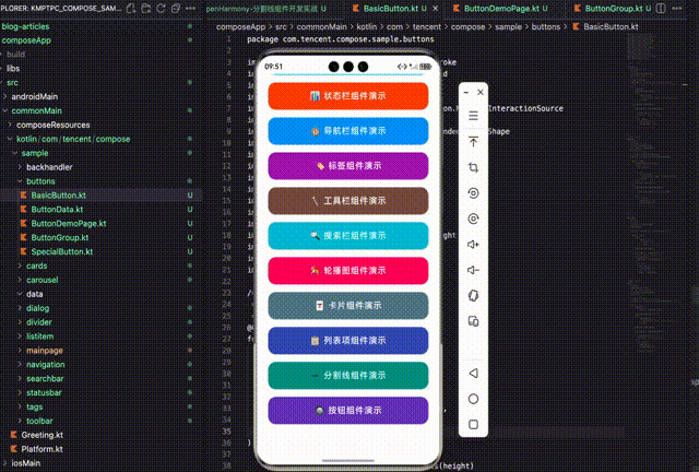
五、演示页面实现
创建一个演示页面来展示所有按钮组件的效果:
@Composable
fun ButtonDemoPage() {
    val scrollState = rememberScrollState()

    // 状态管理
    var isLoading by remember { mutableStateOf(false) }
    var selectedSegment by remember { mutableStateOf(0) }
    var count by remember { mutableStateOf(1) }
    var rating by remember { mutableStateOf(3) }

    Column(
        modifier = Modifier
            .fillMaxSize()
            .background(Color(0xFFF5F5F5))
    ) {
        // 页面标题
        Box(
            modifier = Modifier
                .fillMaxWidth()
                .background(Color.White)
                .padding(16.dp)
        ) {
            Column {
                Text(
                    text = "🔘 按钮组件演示",
                    fontSize = 24.sp,
                    fontWeight = FontWeight.Bold,
                    color = Color(0xFF333333)
                )
                Text(
                    text = "展示多种按钮样式和交互效果",
                    fontSize = 14.sp,
                    color = Color.Gray
                )
            }
        }

        Column(
            modifier = Modifier
                .fillMaxSize()
                .verticalScroll(scrollState)
                .padding(16.dp)
        ) {
            // 基础按钮样式
            SectionTitle("基础按钮样式")
            ButtonCard {
                Row(horizontalArrangement = Arrangement.spacedBy(12.dp)) {
                    FilledButton(text = "填充按钮", modifier = Modifier.weight(1f)) {}
                    OutlinedButton(text = "描边按钮", modifier = Modifier.weight(1f)) {}
                }
            }

            // 更多示例...
        }
    }
}
演示页面使用卡片式布局,将不同类型的按钮分组展示。通过 remember 管理各种交互状态,让用户可以实际体验按钮的功能。页面支持垂直滚动,可以容纳大量的示例内容。
演示页面的设计采用了"标题+卡片"的结构,每个卡片展示一类按钮。页面顶部是固定的标题区域,使用白色背景与下方的灰色内容区域形成对比。内容区域使用 verticalScroll 支持滚动,这样即使按钮示例很多也能完整展示。状态管理使用 remember 和 mutableStateOf,确保用户的交互操作能够得到即时反馈。在实际开发中,这种演示页面不仅可以用于开发调试,还可以作为组件文档的一部分,帮助其他开发者了解组件的使用方法和效果。
7.1 按钮选择指南
| 场景 | 推荐按钮 | 说明 |
|---|---|---|
| 主要操作 | FilledButton | 提交、确认、购买等 |
| 次要操作 | OutlinedButton | 取消、返回、跳过等 |
| 辅助操作 | TextButton | 了解更多、查看详情等 |
| 强调操作 | ElevatedButton / GradientButton | 需要特别突出的操作 |
| 工具栏 | IconButton | 紧凑布局中的操作 |
| 页面主操作 | FloatingActionButton | 新建、添加等 |
| 异步操作 | LoadingButton | 提交表单、发送请求等 |
| 消息入口 | BadgeButton | 消息、通知、购物车等 |
| 选项切换 | SegmentedButton | 筛选、视图切换等 |
| 数量选择 | CounterButton | 商品数量、人数等 |
| 评价反馈 | RatingButton | 评分、满意度等 |
| 第三方登录 | SocialButton | 微信、QQ、微博登录等 |
7.2 设计规范建议
-
视觉层次:一个页面通常只有一个主要操作(FilledButton),其他使用次要样式。
-
尺寸一致:同一区域的按钮应使用相同尺寸,保持视觉统一。
-
颜色语义:
- Primary:主要操作
- Success:成功、完成
- Warning:警告、注意
- Error:删除、危险操作
- Info:信息、帮助
-
触摸目标:按钮高度不应小于 44dp,确保良好的可点击性。
-
状态反馈:始终提供禁用状态和加载状态的视觉反馈。
7.3 性能优化建议
-
避免过度重组:使用 remember 缓存 MutableInteractionSource。
-
合理使用 Modifier:对于相同样式的按钮,可以预定义 Modifier 进行复用。
-
图标选择:优先使用 emoji 图标,避免加载额外的图标资源。
总结
本文详细介绍了如何使用 CMP 适配鸿蒙系统开发各种按钮组件,包括:
- 基础按钮:FilledButton、OutlinedButton、TextButton、ElevatedButton
- 特殊按钮:IconButton、FloatingActionButton、GradientButton、LoadingButton、BadgeButton
- 组合按钮:SegmentedButton、CounterButton、RatingButton、SocialButton、ActionButtonGroup、ShareButtonGroup
这套按钮组件库覆盖了移动应用开发中的绑大多数场景,开发者可以根据实际需求选择合适的组件。通过统一的颜色配置和尺寸系统,可以轻松保持整个应用的视觉一致性。
按钮作为用户界面中最基础的交互元素,其设计质量直接影响用户体验。希望本文能够帮助你在鸿蒙应用开发中构建出优秀的按钮系统。
欢迎加入开源鸿蒙跨平台社区:https://openharmonycrossplatform.csdn.net

作为“人工智能6S店”的官方数字引擎,为AI开发者与企业提供一个覆盖软硬件全栈、一站式门户。
更多推荐

 11
11 0
0- 0


 已为社区贡献1条内容

所有评论(0)