
鸿蒙常用组件
常用组件
文本组件(Text)
Text是显示文本的基础组件之一
Text定义介绍
interface TextInterface{
    (content?: string | Resource):TextAttributes;
}
content:要显示的文本内容,一个简单的例子如下:
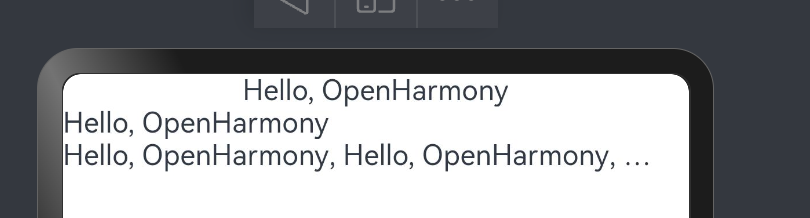
Text('Hello,OpenHarmony')
Text('Hello,OpenHarmony')
 .width("100%)
 .textAlign(TextAlign.Start)

Text('Hello,OpenHarmony,Hello,OpenHarmony,Hello,OpenHarmony',Hello,OpenHarmony)
 .maxLines(1)
 .textOverflow({overflow: TextOverflow.Ellipsis})
Text属性介绍
textAlign:设置文本的对其方式,对齐参考系是 Text 组件本身,只有 Text 组件本身的宽度大于文本内容长度, textAlign 属性才起作用, TextAlign 定义了以下 3 种类型:
Start:根据文字书写相同的方向对齐,比如中文从左往右排版,那么文本则靠左对齐。
Center(默认值):文本居中对齐。
End:根据文字书写相反的方向对齐,比如中文从左往右排版,那么文本则靠右对齐。
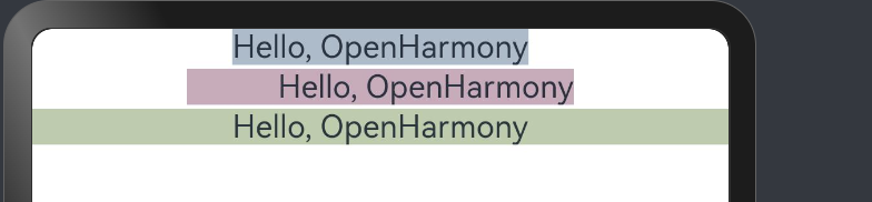
简单样例如下所示:
Text("Hello, OpenHarmony")
 .backgroundColor('#aabbcc')
 .textAlign(TextAlign.Center) // 宽度等于文本内容长度,textAlign不起作用
Text('Hello, OpenHarmony')
 .backgroundColor('#ccaabb')
 .margin({top: 2})
 .width(200)                  // 宽度大于文本内容长度,textAlign起作用
 .textAlign(TextAlign.End)
Text('Hello, OpenHarmony')
 .backgroundColor('#bbccaa')
 .margin({top: 2})
 .width('100%')               // 宽度大于文本内容长度,textAlign起作用
 .textAlign(TextAlign.Center)
样例运行结果如下图所示:
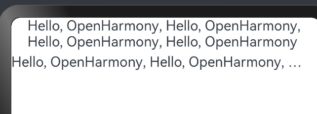
maxLines、textOverflow:设置文本显示的最大行数和截取方式,默认折行显示不截取,如果设置了此参数,则文本最多显示到指定的行,如果有多余的文本,可以通过 textOverflow 来指定截取方式,本样例的截断方式是 Ellipsis ,它将截断后的文本用 “…” 表示。
Text('Hello, OpenHarmony, Hello, OpenHarmony, Hello, OpenHarmony, Hello, OpenHarmony')
Text('Hello, OpenHarmony, Hello, OpenHarmony, Hello, OpenHarmony, Hello, OpenHarmony')
 .margin({top: 5})
 .maxLines(1)
 .textOverflow({overflow: TextOverflow.Ellipsis})
样例运行结果如下图所示:
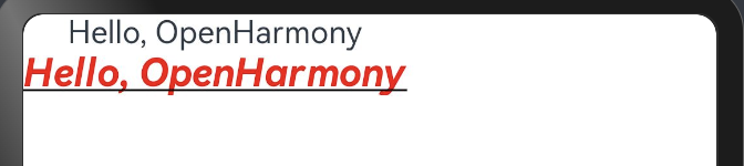
fontSize、fontColor、fontStyle、 fontWeight:分别表示设置文字的大小,颜色,样式以及粗细,我们可以组合起来设置文本的富样式,先看一个样例:
Text('Hello, OpenHarmony')
Text('Hello, OpenHarmony')
 .fontSize(20)
 .fontColor('#ff0000')
 .fontWeight(FontWeight.Bold)
 .fontStyle(FontStyle.Italic)
 .decoration({type: TextDecorationType.Underline, color: Color.Black}) // 文本装饰线
样例运行结果如下图所示:
官方更多全面的案例如下:
案例1
textAlign,textOverflow,maxLines,lineHeight使用示例。
https://developer.huawei.com/consumer/cn/doc/harmonyos-references/ts-basic-components-text#示例2设置文本样式
案例2
decoration,baselineOffset,letterSpacing,textCase使用示例:
https://developer.huawei.com/consumer/cn/doc/harmonyos-references/ts-basic-components-text#示例2设置文本样式
按钮组件(Button)
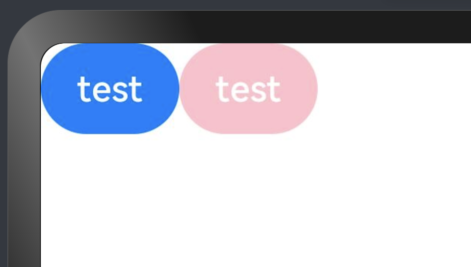
Button 组件也是基础组件之一,和其它基础组件不同的是 Button 组件允许添加一个子组件来实现不同的展示样式。
Button('test')
Button('test')
.backgroundColor(Color.Pink)
样例运行结果如下图所示:
type:设置 Button 按钮的显示样式, ButtonType 定义了以下3种样式:
Capsule(默认值):胶囊类型,圆角值为 Button 高度的一半并且不允许修改,此时通过设置 borderRadius() 的方式设置圆角则无效。简单样例如下所示:
Button('test')
 .height(40)
 .width(90)
 .backgroundColor('#aabbcc')
Button('test', {type: ButtonType.Capsule})
 .height(40)
 .width(90)
 .borderRadius(20)          // 设置圆角,但是没有效果
 .borderWidth(3)            // 设置边框宽度
 .borderColor(Color.Red)    // 设置边框颜色
 .backgroundColor('#bbaacc')// 设置背景色
样例运行结果如下图所示:
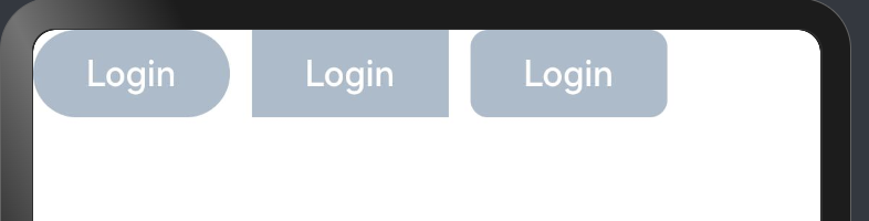
Normal:矩形按钮,无圆角,可以通过 borderRadius() 设置圆角大小,不支持通过 border() 的方式设置圆角,
简单样例如下所示:
Button('Login')                            // 默认胶囊类型
 .height(40)
 .width(90)
 .backgroundColor('#aabbcc')
Button('Login', {type: ButtonType.Normal}) // 没有圆角
 .height(40)
 .width(90)
 .backgroundColor('#aabbcc')
Button('Login', {type: ButtonType.Normal}) // 设置圆角
 .height(40)
 .width(90)
 .backgroundColor('#aabbcc')
 .borderRadius(8)
样例运行结果如下图所示:
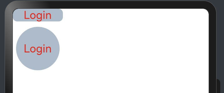
Circle:圆形按钮,设置该样式时,简单样例如下所示:
Button('Login')
 .height(40)
 .width(90)
 .backgroundColor('#aabbcc')

Button('Harmony')
 .type(ButtonType.Circle)
 .backgroundColor('#aabbcc')

Button('OpenHarmony', {type: ButtonType.Circle})
 .height(50)
 .width(90)
 .backgroundColor('#aabbcc')
样例运行结果如下图所示:
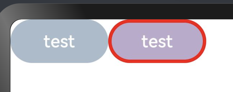
stateEffect:设置是否开启点击效果,默认开启,简单样例如下所示:
Button('effect: on')
 .fontSize(20)
Button('effect: off', {stateEffect: false})
 .fontSize(20)
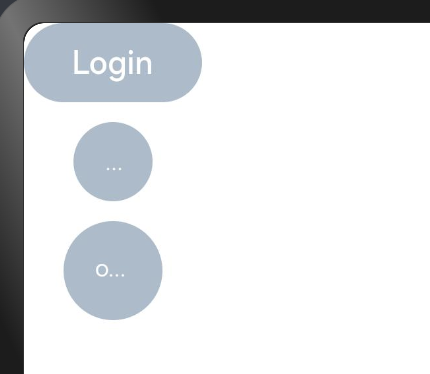
Button自定义样式
包含 Text 组件
Column(){
  Button({type:ButtonType.Normal}){
    Text("Login")
      .fontSize(20)
      .fontColor(Color.Red)
      .padding({left:20, right:20})
  }
  .borderRadius(8)
  .backgroundColor("#aabbcc")

  Button({type:ButtonType.Circle}){
    Text("Login")
      .fontColor(Color.Red)
      .fontSize(20)
  }
  .width(80)
  .height(80)
  .backgroundColor("#aabbcc")
}
样例运行结果如下图所示:
样例给 Button 添加了一个 Text 子组件,通过设置 Text 的文本样式达到修改 Button 文字的效果。
包含Image组件
Button({type: ButtonType.Circle}) {
Image($r("app.media.more"))
.width(30)
.height(30)
}
.width(70)
.height(70)
Button({type: ButtonType.Circle}) {
Image($r("app.media.delete"))
.width(40)
.height(40)
}
.width(70)
.height(70)
.backgroundColor('#ff0000')
样例运行结果如下图所示:
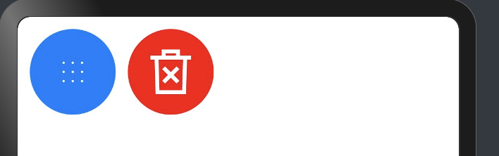
样例中使用了 Image 组件,该组件是后续章节要讲解的基础组件
包含复杂组件
Button({type: ButtonType.Normal}) {
Row() {
Image($r("app.media.loading"))
.width(30)
.height(30)
.margin({left: 12})
Text('loading')
.fontSize(20)
.fontColor('#ffffff')
.margin({left: 5, right: 12})
    }
}
.borderRadius(8)
.backgroundColor(0x317aff)
样例运行结果如下图所示:
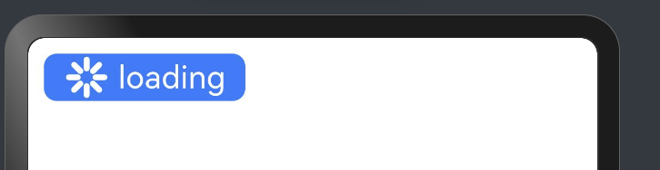
样例中使用 Row 作为子组件, Row 组件属于线性容器组件,它可以添加多个子组件
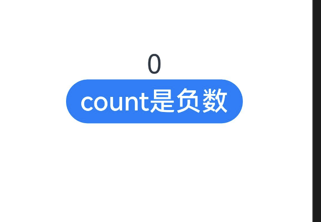
案例
Column() {
  Text(`${this.count}`)
    .fontSize(30)
    .onClick(() => {
      this.count++
    })
  if (this.count <= 0) {
    Button('count是负数').fontSize(30).height(50)
  } else if (this.count % 2 === 0) {
    Button('count是偶数').fontSize(30).height(50)
  } else {
    Button('count是奇数').fontSize(30).height(50)
  }
}.height('100%').width('100%').justifyContent(FlexAlign.Center)
有动态的按钮会变化:
图片组件(Image)
Image为图片组件,常用于在应用中显示图片。Image支持加载string、PixeMap和Resoure类型的数据源,支持png、jpg、bmp、svg和gif类型的图片格式
declare class ImageAttribute extends CommonMethod<ImageAttribute> {
  alt(value: string | Resource): ImageAttribute;
  matchTextDirection(value: boolean): ImageAttribute;
  fitOriginalSize(value: boolean): ImageAttribute;
  fillColor(value: ResourceColor): ImageAttribute;
  objectFit(value: ImageFit): ImageAttribute;
  objectRepeat(value: ImageRepeat): ImageAttribute;
  autoResize(value: boolean): ImageAttribute;
  renderMode(value: ImageRenderMode): ImageAttribute;
  interpolation(value: ImageInterpolation): ImageAttribute;
  sourceSize(value: { width: number; height: number }): ImageAttribute;
  syncLoad(value: boolean): ImageAttribute;
  onComplete(
    callback: (event?: {
      width: number;
      height: number;
      componentWidth: number;
      componentHeight: number;
      loadingStatus: number;
    }) => void,
  ): ImageAttribute;
  onError(callback: (event?: { componentWidth: number; componentHeight: number }) => void): ImageAttribute;
  onFinish(event: () => void): ImageAttribute;
}
Image加载方式
- 从本地加载
- 拷贝 test.png 图片到工程的 resources/main/base/media 目录下
- 加载图片,直接使用系统提供的资源访问符 $() 或者本地文件加载
加载网络图片
加载网络图片时,默认网络超时是5分钟,建议使用alt配置加载时的占位图。如果需要更灵活的网络配置,可以使用SDKHTTP工具包发送网络请求,接着将返回的数据解码为Image组件中的PixelMap
需要权限
使用网络图片时,需要申请权限ohos.permission.INTERNET。具体申请方式请参考权限申请声明。https://developer.huawei.com/consumer/cn/doc/harmonyos-guides-V2/accesstoken-guidelines-0000001493744016-V2#ZH-CN_TOPIC_0000001574088333__场景介绍
使用Stage模型的应用,需要在module.json5配置文件中声明权限。
"requestPermissions":[
      {
        "name" : "ohos.permission.INTERNET",//必填
        "reason": "$string:reason",
        "usedScene": {
          "abilities": [
            "FormAbility"
          ],
          "when":"inuse"
        }
      }
    ]
网络图片获取代码:
Image('https://ts1.cn.mm.bing.net/th/id/R-C.987f582c510be58755c4933cda68d525?rik=C0D21hJDYvXosw&riu=http%3a%2f%2fimg.pconline.com.cn%2fimages%2fupload%2fupc%2ftx%2fwallpaper%2f1305%2f16%2fc4%2f20990657_1368686545122.jpg&ehk=netN2qzcCVS4ALUQfDOwxAwFcy41oxC%2b0xTFvOYy5ds%3d&risl=&pid=ImgRaw&r=0')// 直接加载网络地址,请填写一个具体的网络图片地址
  .alt($r('app.media.icon'))// 使用alt,在网络图片加载成功前使用占位图
  .width('100%')
  .height(100)
alt:设置占位图,图片显示之前先显示占位图,比如在加载网络图片或者图片加载失败时的场景。
-
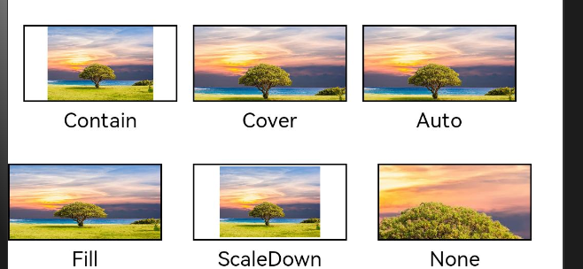
objectFit:设置图片的缩放类型,当Image组件大小和图片大小不同时指定图片的缩放类型,ImageFit提供了以下5种匹配模式:
- Cover(默认值):保持图片宽高比进行缩放显示,使得图片完全显示在显示边界外。
- Contain:保持图片宽高比进行缩放显示,使得图片完全显示在显示边界内。
- Fill:不保持图片宽高比显示,使得图片完全覆盖显示边界。
- None:不进行缩放,保持图片原始大小,通常配合objectFit属性一起使用。
- ScaleDown:保持图片宽高比进行缩放显示,使得图片完全显示在显示边界内,如果图片本身大小小于显示边界,则保持图片原始大小。
- Auto:根据图片的宽高比和显示边界自动选择合适的缩放类型。(自动)
以上6种匹配模式运行结果如下图所示:
@Entry
@Component
struct MyComponent {
  build() {
    Column({space: 40}) {
      Row({space: 10}) {
        Image($r('app.media.image_icon'))
          .width(100)
          .height(50)
          .border({ width: 1 })
            // 保持宽高比进行缩小或者放大,使得图片完全显示在显示边界内。
          .objectFit(ImageFit.Contain)
          //文字
          .overlay('Contain', { align: Alignment.Bottom, offset: { x: 0, y: 20 } })
        Image($r('app.media.image_icon'))
          .width(100)
          .height(50)
          .border({ width: 1 })
            // 保持宽高比进行缩小或者放大,使得图片两边都大于或等于显示边界。
          .objectFit(ImageFit.Cover)
          .overlay('Cover', { align: Alignment.Bottom, offset: { x: 0, y: 20 } })
        Image($r('app.media.image_icon'))
          .width(100)
          .height(50)
          .border({ width: 1 })
            // 自适应显示。
          .objectFit(ImageFit.Auto)
          .overlay('Auto', { align: Alignment.Bottom, offset: { x: 0, y: 20 } })
      }

      Row({space: 20}) {
        Image($r('app.media.image_icon'))
          .width(100)
          .height(50)
          .border({ width: 1 })
            // 不保持宽高比进行放大缩小,使得图片充满显示边界。
          .objectFit(ImageFit.Fill)
          .overlay('Fill', { align: Alignment.Bottom, offset: { x: 0, y: 20 } })
        Image($r('app.media.image_icon'))
          .width(100)
          .height(50)
          .border({ width: 1 })
            // 保持宽高比显示,图片缩小或者保持不变。
          .objectFit(ImageFit.ScaleDown)
          .overlay('ScaleDown', { align: Alignment.Bottom, offset: { x: 0, y: 20 } })
        Image($r('app.media.image_icon'))
          .width(100)
          .height(50)
          .border({ width: 1 })
            // 保持原有尺寸显示。
          .objectFit(ImageFit.None)

          .overlay('None', { align: Alignment.Bottom, offset: { x: 0, y: 20 } })
      }
    }
    //内边距
    .padding({
      top: 30
    })
  }
}
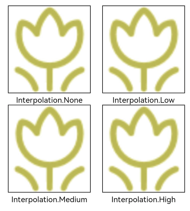
图片插值
当原图分辨率较低并且放大显示时,图片会模糊出现锯齿,这时可以使用interpolation属性对图片进行插值,使图片显示得更清晰。
@Entry
@Component
struct ImageTest {
  build() {
    Column() {
      Row() {
        Image($r('app.media.flowers_icon'))
          .width('40%')
          .interpolation(ImageInterpolation.None)
          .borderWidth(1)
          .overlay("Interpolation.None", { align: Alignment.Bottom, offset: { x: 0, y: 20 } })
          .margin(10)
        Image($r('app.media.flowers_icon'))
          .width('40%')
          .interpolation(ImageInterpolation.Low)
          .borderWidth(1)
          .overlay("Interpolation.Low", { align: Alignment.Bottom, offset: { x: 0, y: 20 } })
          .margin(10)
      }.width('100%')
      .justifyContent(FlexAlign.Center)

      Row() {
        Image($r('app.media.flowers_icon'))
          .width('40%')
          .interpolation(ImageInterpolation.Medium)
          .borderWidth(1)
          .overlay("Interpolation.Medium", { align: Alignment.Bottom, offset: { x: 0, y: 20 } })
          .margin(10)
        Image($r('app.media.flowers_icon'))
          .width('40%')
          .interpolation(ImageInterpolation.High)
          .borderWidth(1)
          .overlay("Interpolation.High", { align: Alignment.Bottom, offset: { x: 0, y: 20 } })
          .margin(10)
      }.width('100%')
      .justifyContent(FlexAlign.Center)
    }
    .height('100%')
  }
}
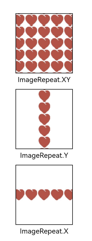
设置图片重复样式
通过objectRepeat属性设置图片的重复样式方式,重复样式请参考ImageRepeat枚举说明。
@Entry
@Component
struct ImageTest {
  build() {
    Column({ space: 30 }) {
      Image($r('app.media.heart_icon'))
        .width(110)
        .height(115)
        .border({ width: 1 })
          // 在水平轴和竖直轴上同时重复绘制图片
        .objectRepeat(ImageRepeat.XY)
          // 保持宽高比显示,图片缩小或者保持不变。
        .objectFit(ImageFit.ScaleDown)
        .overlay('ImageRepeat.XY', { align: Alignment.Bottom, offset: { x: 0, y: 20 } })
      Image($r('app.media.heart_icon'))
        .width(110)
        .height(115)
        .border({ width: 1 })
        .objectRepeat(ImageRepeat.Y)
        .objectFit(ImageFit.ScaleDown)
          // 只在竖直轴上重复绘制图片
        .overlay('ImageRepeat.Y', { align: Alignment.Bottom, offset: { x: 0, y: 20 } })
      Image($r('app.media.heart_icon'))
        .width(110)
        .height(115)
        .border({ width: 1 })
        .objectRepeat(ImageRepeat.X)
        .objectFit(ImageFit.ScaleDown)
          // 只在水平轴上重复绘制图片
        .overlay('ImageRepeat.X', { align: Alignment.Bottom, offset: { x: 0, y: 20 } })

    }.height(150).width('100%').padding(30)
  }
}
renderMode: 设置图片的渲染模式, ImageRenderMode 定义了以下2种渲染模式:
-
Original(默认值):按照原图进行渲染
-
Template:将图像渲染为模板图像,忽略图片的颜色信息。
    Image($r("app.media.xiaoxi"))
      .width(90)
      .height(90)
      .renderMode(ImageRenderMode.Original) // 原图渲染

    Image($r("app.media.xiaoxi"))
      .width(90)
      .height(90)
      .renderMode(ImageRenderMode.Template) // 模板渲染
效果图如下:
sourceSize:对原始图片做部分解码,样例如下:
Image($r("app.media.xiaoxi"))
    .width(90)
    .height(90)
    .sourceSize({width: 10, height: 10}) // 设置解码的宽高
Image事件介绍
declare class ImageAttribute extends CommonMethod<ImageAttribute> {
  onComplete(
    callback: (event?: {
      width: number;
      height: number;
      componentWidth: number;
      componentHeight: number;
      loadingStatus: number;
    }) => void,
  ): ImageAttribute;
  onError(callback: (event?: { componentWidth: number; componentHeight: number }) => void): ImageAttribute;
  onFinish(event: () => void): ImageAttribute;
}
- onComplete:图片成功加载时触发该回调,返回图片原始尺寸信息。
- onError:图片加载出现异常时触发该回调。
- onFinish:当加载的源文件为带动效的 svg 图片时,当 svg 动效播放完成时会触发这个回调,如果动效为无限循环动效,则不会触发这个回调。
通过在Image组件上绑定onComplete事件,图片加载成功后可以获取图片的必要信息。如果图片加载失败,也可以通过绑定onError回调来获得结果。
@Entry
@Component
struct ImageTest {
    //图片原本的宽高
  @State widthValue: number = 0
  @State heightValue: number = 0
  //组件的宽高
  @State componentWidth: number = 0
  @State componentHeight: number = 0

  build() {
    Column() {
      Row() {
        Image($r('app.media.image_icon'))
          .width(200)
          .height(150)
          .margin(15)
          .onComplete(msg => {
            if(msg){
              this.widthValue = msg.width
              this.heightValue = msg.height
              this.componentWidth = msg.componentWidth
              this.componentHeight = msg.componentHeight
            }
          })
            // 图片获取失败,打印结果
          .onError(() => {
            console.info('load image fail')
          })
            //成功打印
          .overlay('width: ' + this.widthValue + ', height: ' + this.heightValue + '\ncomponentWidth: ' + this.componentWidth + '\ncomponentHeight: ' + this.componentHeight, {
            align: Alignment.Bottom,
            offset: { x: 0, y: 60 }
          })
      }
    }
  }
}
文本输入(TextInput/TextArea)
TextInput/TextArea是输入框组件,通常用于响应用户的输入操作,比如评论区的输入、聊天框的输入、表格的输入等,也可以结合其他组件构建功能页面,例如登录注册页面。具体用法参考
TextInput
https://developer.huawei.com/consumer/cn/doc/harmonyos-references-V2/ts-basic-components-textinput-0000001427584864-V2
TextArea:
https://developer.huawei.com/consumer/cn/doc/harmonyos-references-V2/ts-basic-components-textarea-0000001427902464-V2
创建输入框
TextInput为单行输入框、TextArea为多行输入框。通过以下接口来创建
TextArea(value?:{placeholder?: ResourceStr, text?: ResourceStr, controller?: TextAreaController})

TextInput(value?:{placeholder?: ResourceStr, text?: ResourceStr, controller?: TextInputController})
-
单行输入框:
TextInput() -
多行输入框:
TextArea()
多行输入框文字超出一行时会自动折行。
TextArea({text:"我是TextArea我是TextArea我是TextArea我是TextArea"})
.width(300)
设置输入框类型
TextInput有5种可选择类型,分别为Normal基本输入模式、Password密码输入模式、Number纯数字输入模式、Email邮箱地址输入模式、PhoneNumber电话号码输入模式。通过type属性进行设置:
-
基本输入模式(默认类型)
TextInput().type(InputType.Normal)
-
密码输入模式
TextInput().type(InputType.Password)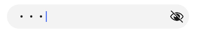
自定义样式
-
设置无输入时的提示文本。
TextInput({placeholder:'我是提示文本'})
-
添加backgroundColor改变输入框的背景颜色。

添加事件
文本框主要用于获取用户输入的信息,把信息处理成数据进行上传,绑定onChange事件可以获取输入框内改变的内容。用户也可以使用通用事件来进行相应的交互操作。
TextInput()
.onChange((value: string) => {
console.info(value);
})
//获取焦点
.onFocus(() => {
    console.info('获取焦点');
    })
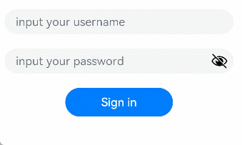
场景示例
用于表单的提交,在用户登录/注册页面,用户的登录或注册的输入操作。
@Entry
@Component
struct TextInputSample {
  build() {
    Column() {
      TextInput({ placeholder: 'input your username' }).margin({ top: 20 })
        .onSubmit((EnterKeyType)=>{
          console.info(EnterKeyType+'输入法回车键的类型值')
        })
      TextInput({ placeholder: 'input your password' }).type(InputType.Password).margin({ top: 20 })
        .onSubmit((E nterKeyType)=>{
          console.info(EnterKeyType+'输入法回车键的类型值')
        })
      Button('Sign in').width(150).margin({ top: 20 })
    }.padding(20)
  }
}
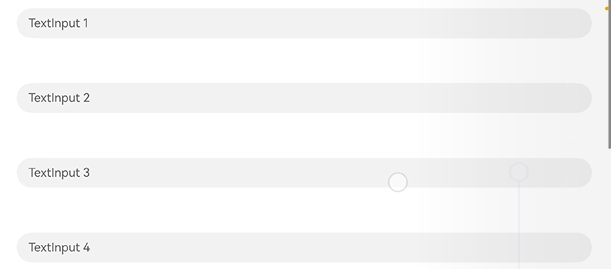
键盘避让
键盘避让
键盘抬起后,具有滚动能力的容器组件在横竖屏切换时,才会生效键盘避让,若希望无滚动能力的容器组件也生效键盘避让,建议在组件外嵌套一层具有滚动能力的容器组件,比如Scroll、List、Grid。
@Entry
@Component
struct Index {
  placeHolderArr: string[] = ['1', '2', '3', '4', '5', '6', '7']

  build() {
    Scroll() {
      Column() {
        ForEach(this.placeHolderArr, (placeholder: string) => {
          TextInput({ placeholder: 'TextInput ' + placeholder })
            .margin(30)
        })
      }
    }
    .height('100%')
    .width('100%')
  }
}
search组件
提供搜索框组件,用于提供用户搜索内容的输入区域
Search(options?: { value?: string, placeholder?: ResourceStr, icon?: string, controller?: SearchController })
SearchController
Search组件的控制器,目前通过它可控制Search组件的光标位置。
事件:
@Entry
@Component
struct SearchPage {
  @State changeValue: string = ''
  @State submitValue: string = ''
  //控制器,设置光标位置
  controller: SearchController = new SearchController()

  build() {
    Column() {
      Text('onSubmit:' + this.submitValue)
        .fontSize(18)
        .margin(15)
      Text('onChange:' + this.changeValue)
        .fontSize(18)
        .margin(15)
      //搜索组件
      Search({ value: this.changeValue, placeholder: 'Type to search...', controller: this.controller })
        //搜索按钮
        .searchButton('SEARCH')
        .width('95%')
        .height(40)
        .backgroundColor('#F5F5F5')
        //提示文本颜色
        .placeholderColor(Color.Grey)
        //提示文本大小
        .placeholderFont({ size: 14, weight: 400 })
        //输入的文本大小
        .textFont({ size: 14, weight: 400 })
        //提交,点击搜索按钮
        .onSubmit((value: string) => {
          this.submitValue = value
        })
        //文本改变触发
        .onChange((value: string) => {
          this.changeValue = value
        })
        .margin(20)
      Button('Set caretPosition 1')
        .onClick(() => {
          // 设置光标位置到输入的第一个字符后
          this.controller.caretPosition(1)
        })
    }.width('100%')
  }
}
切换按钮(Toggle)
Toggle组件提供状态按钮样式,勾选框样式及开关样式,一般用于两种状态之间的切换。
接口调用形式:
Toggle(options: { type: ToggleType, isOn?: boolean })
用于创建切换按钮,其中ToggleType为开关类型,包括Button、Checkbox和Switch,isOn为切换按钮的状态,接口调用有以下两种形式:
创建不包含子组件的Toggle。
当ToggleType为Checkbox或者Switch时,用于创建不包含子组件的Toggle:
Toggle({ type: ToggleType.Checkbox, isOn: false })
Toggle({ type: ToggleType.Checkbox, isOn: true })
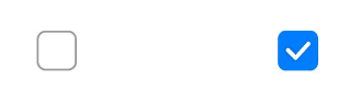
Toggle({ type: ToggleType.Switch, isOn: false })
Toggle({ type: ToggleType.Switch, isOn: true })

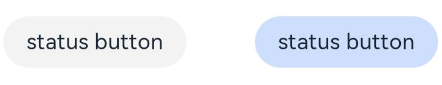
创建包含子组件的Toggle。
当ToggleType为Button时,只能包含一个子组件,如果子组件有文本设置,则相应的文本内容会显示在按钮内部。
Toggle({ type: ToggleType.Button, isOn: false }) {
Text('status button')
  .fontColor('#182431')
  .fontSize(12)
  }
.width(100)
  Toggle({ type: ToggleType.Button, isOn: true }) {
    Text('status button')
      .fontColor('#182431')
      .fontSize(12)
      }
  .width(100)
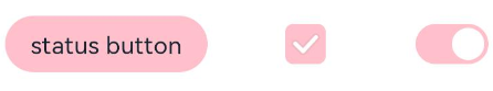
自定义样式
通过selectedColor属性设置Toggle打开选中后的背景颜色。
Toggle( { type: ToggleType.Button, isOn: true } ) {
  Text('status button')
    .fontColor('#182431')
    .fontSize(12)
}
.width(100)
.selectedColor(Color.Pink)

Toggle({ type: ToggleType.Checkbox, isOn: true })
 .selectedColor(Color.Pink)

Toggle({ type: ToggleType.Switch, isOn: true })
 .selectedColor(Color.Pink)
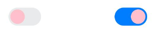
通过switchPointColor属性设置Switch类型的圆形滑块颜色,仅对type为ToggleType.Switch生效。
Toggle({ type: ToggleType.Switch, isOn: false })
  .switchPointColor(Color.Pink)
Toggle({ type: ToggleType.Switch, isOn: true })
  .switchPointColor(Color.Pink)
添加事件
除支持通用事件外,Toggle通常用于选中和取消选中后触发某些操作,可以绑定onChange事件来响应操作后的自定义行为。
Toggle({ type: ToggleType.Switch, isOn: false })
  .onChange((isOn: boolean) => {
      if(isOn) {
        // 需要执行的操作
      }
  })
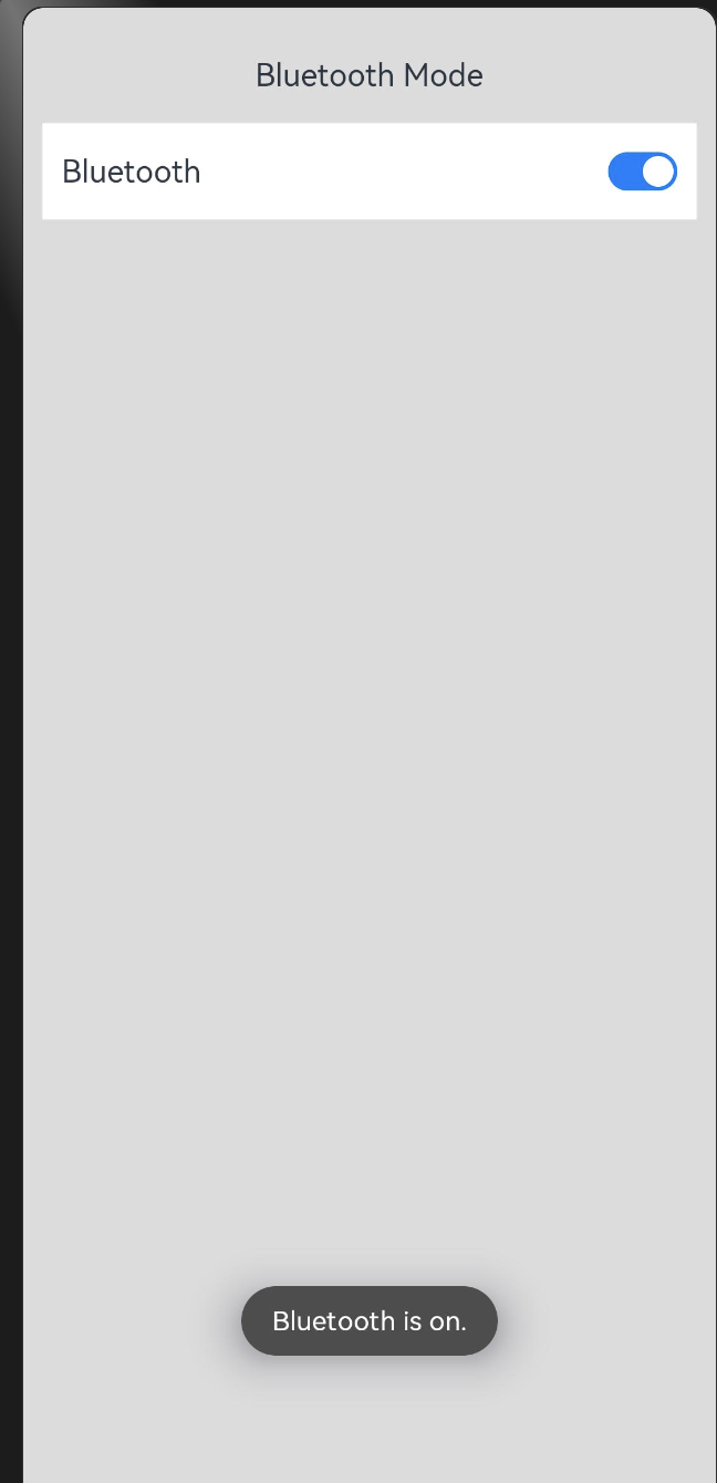
案例
import promptAction from '@ohos.promptAction';
@Entry
@Component
struct ToggleExample {
  build() {
    Column() {
      Row() {
        Text("Bluetooth Mode")
        .height(50)
        .fontSize(16)
      }
      Row() {
        Text("Bluetooth")
          .height(50)
          .padding({left: 10})
          .fontSize(16)
          .textAlign(TextAlign.Start)
          .backgroundColor(0xFFFFFF)
        //自动充满
        Blank()
        Toggle({ type: ToggleType.Switch })
          .margin({ right: 10})
          //设置点击事件
          .onChange((isOn: boolean) => {
            if(isOn) {
              promptAction.showToast({ message: 'Bluetooth is on.' })
            } else {
              promptAction.showToast({ message: 'Bluetooth is off.' })
            }
          })
      }
      .width('100%')
      .backgroundColor(0xFFFFFF)
    }
    .padding(10)
    .backgroundColor(0xDCDCDC)
    .width('100%')
    .height('100%')
  }
}
Progress(进度条)
Progress是进度条显示组件,显示内容通常为某次目标操作的当前进度。
Progress(options: {value: number, total?: number, type?: ProgressType})
参数
| 参数名 | 参数类型 | 必填 | 参数描述 |
|---|---|---|---|
| value | number | 是 | 指定当前进度值。设置小于0的数值时置为0,设置大于total的数值时置为total。从API version 9开始,该接口支持在ArkTS卡片中使用。 |
| total | number | 否 | 指定进度总长。默认值:100从API version 9开始,该接口支持在ArkTS卡片中使用。 |
| type | ProgressType | 否 | 指定进度条类型。默认值:ProgressType.Linear从API version 9开始,该接口支持在ArkTS卡片中使用。 |
| styledeprecated | ProgressStyle | 否 | 指定进度条样式。该参数从API version8开始废弃,建议使用type替代。默认值:ProgressStyle.Linear |
ProgressType枚举说明
从API version 9开始,该接口支持在ArkTS卡片中使用。
| 枚举值 | 枚举说明 |
|---|---|
| Linear | 线性样式。从API version9开始,高度大于宽度的时候自适应垂直显示。 |
| Ring8+ | 环形无刻度样式,环形圆环逐渐显示至完全填充效果。 |
| Eclipse8+ | 圆形样式,显示类似月圆月缺的进度展示效果,从月牙逐渐变化至满月。 |
| ScaleRing8+ | 环形有刻度样式,显示类似时钟刻度形式的进度展示效果。从API version9开始,刻度外圈出现重叠的时候自动转换为环形无刻度进度条。 |
| Capsule8+ | 胶囊样式,头尾两端圆弧处的进度展示效果与Eclipse相同;中段处的进度展示效果与Linear相同。高度大于宽度的时候自适应垂直显示。 |
ProgressStyle枚举说明
从API version 9开始,该接口支持在ArkTS卡片中使用。
| 枚举值 | 枚举说明 |
|---|---|
| Linear | 线性样式。 |
| Ring | 环形无刻度样式,环形圆环逐渐显示至完全填充效果。 |
| Eclipse | 圆形样式,显示类似月圆月缺的进度展示效果,从月牙逐渐变化至满月。 |
| ScaleRing | 环形有刻度样式,显示类似时钟刻度形式的进度展示效果。 |
| Capsule | 胶囊样式,头尾两端圆弧处的进度展示效果与Eclipse相同;中段处的进度展示效果与Linear相同。高度大于宽度的时候自适应垂直显示。 |
属性
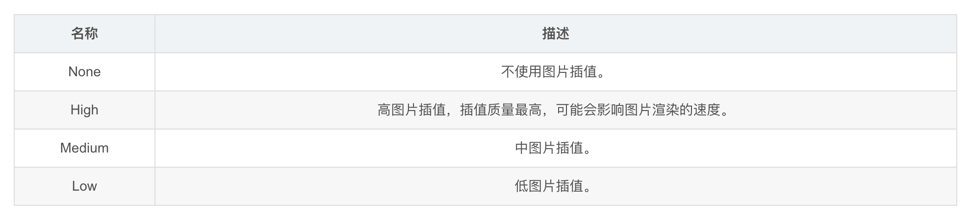
| 名称 | 参数类型 | 描述 |
|---|---|---|
| value | number | 设置当前进度值。设置小于0的数值时置为0,设置大于total的数值时置为total。非法数值不生效。从API version 9开始,该接口支持在ArkTS卡片中使用。 |
| color | ResourceColor | 设置进度条前景色。默认值:'#ff007dff’从API version 9开始,该接口支持在ArkTS卡片中使用。 |
| backgroundColor | ResourceColor | 设置进度条底色。默认值:'#19182431’从API version 9开始,该接口支持在ArkTS卡片中使用。 |
| style8+ | {strokeWidth?: Length,scaleCount?: number,scaleWidth?: Length} | 定义组件的样式。- strokeWidth: 设置进度条宽度(不支持百分比设置)。从API version9开始,环形进度条设置宽度大于等于半径时,默认修改宽度至半径值的二分之一。默认值:4.0Vp- scaleCount: 设置环形进度条总刻度数。默认值:120- scaleWidth: 设置环形进度条刻度粗细(不支持百分比设置),刻度粗细大于进度条宽度时,为系统默认粗细。默认值:2.0Vp从API version 9开始,该接口支持在ArkTS卡片中使用。 |
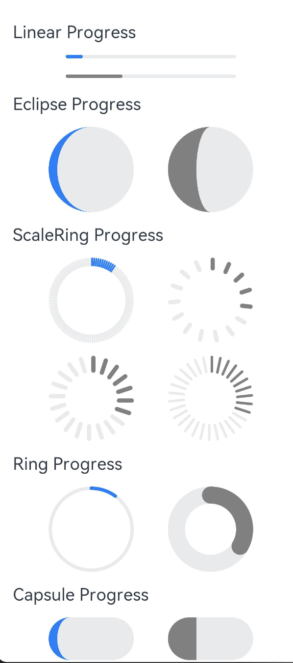
@Entry
@Component
struct ProgressExample {
  build() {
    Column({ space: 15 }) {
      //线性进度条
      Text('Linear Progress')
        .fontSize(20)
        .width('90%')
      //type设置类型,value,默认值
      Progress({ value: 10, type: ProgressType.Linear })
        .width(200)
      Progress({ value: 30, total: 150, type: ProgressType.Linear })
        .color(Color.Grey)//进度条颜色
        .value(50)//设置进度条进度
        .width(200)
      //月牙到满月
      Text('Eclipse Progress')
        .fontSize(20)
        .width('90%')
      Row({ space: 40 }) {
        Progress({ value: 10, type: ProgressType.Eclipse })
          .width(100)
        Progress({ value: 20, total: 150, type: ProgressType.Eclipse })
          .color(Color.Grey)
          .value(50)
          .width(100)
      }
      //刻度样式
      Text('ScaleRing Progress')
        .fontSize(20)
        .width('90%')
      Row({ space: 40 }) {
        Progress({ value: 10, type: ProgressType.ScaleRing })
          .width(100)
        Progress({ value: 20, total: 150, type: ProgressType.ScaleRing })
          .color(Color.Grey)
          .value(50)
          .width(100)
          //strokeWidth进度条宽度,scaleCount进度条总刻度,scaleWidth进度条粗细
          .style({ strokeWidth: 15, scaleCount: 15, scaleWidth: 5 })
      }
      // scaleCount和scaleWidth效果对比
      Row({ space: 40 }) {
        Progress({ value: 20, total: 150, type: ProgressType.ScaleRing })
          .color(Color.Grey).value(50).width(100)
          .style({ strokeWidth: 20, scaleCount: 20, scaleWidth: 5 })
        Progress({ value: 20, total: 150, type: ProgressType.ScaleRing })
          .color(Color.Grey).value(50).width(100)
          .style({ strokeWidth: 20, scaleCount: 30, scaleWidth: 3 })
      }
      //环形无刻度样式,环形圆环逐渐显示至完全填充效果
      Text('Ring Progress')
        .fontSize(20)
        .width('90%')
      Row({ space: 40 }) {
        Progress({ value: 10, type: ProgressType.Ring })
          .width(100)
        Progress({ value: 20, total: 150, type: ProgressType.Ring })
          .color(Color.Grey)
          .value(50)
          .width(100)
            //strokeWidth进度条宽度,scaleCount进度条总刻度,scaleWidth进度条粗细
          .style({ strokeWidth: 20, scaleCount: 30, scaleWidth: 20 })
      }
      //胶囊型
      Text('Capsule Progress')
        .fontSize(20)
        .width('90%')
      Row({ space: 40 }) {
        Progress({ value: 10, type: ProgressType.Capsule })
          .width(100)
          .height(50)
        Progress({ value: 20, total: 150, type: ProgressType.Capsule })
          .color(Color.Grey)
          .value(50)
          .width(100)
          .height(50)
          .backgroundColor(Color.Pink)
      }
    }
    .width('100%')
    .margin({ top: 30 })
  }
}
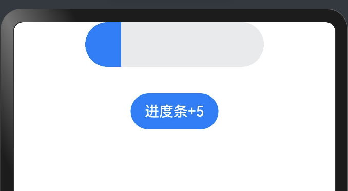
案例
@Entry
@Component
struct ForEachPage {
  @State progressValue: number = 0    // 设置进度条初始值为0
  build() {
    Column() {
      Column() {
        Progress({value:0, total:100, type:ProgressType.Capsule})
        .width(200)
        .height(50)
        .style({strokeWidth:50})
        .value(this.progressValue)
        Button("进度条+5")
          .margin({top: 30})
          .onClick(()=>{
            this.progressValue += 5
            if (this.progressValue > 100){
              this.progressValue = 0
            }
          })
      }
    }.width('100%').height('100%')
  }
}
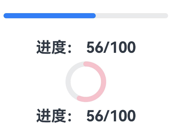
@Entry
@Component
struct ProgressPage {
  @State value: number = 0;

  @State private intervalID: number = -1;
  build() {
    Column({space: 10}) {
      Progress({
        value: this.value,           // 设置当前进度
        total: 100,                  // 设置进度总量
        type: ProgressType.Linear
      })
        .style({strokeWidth: 10})      // 设置进度条线宽
        .size({width: '90%', height: 40})
      Text(`进度: ${this.value}/100`)
        .fontSize(30)
        .fontWeight(FontWeight.Bold)

      Progress({
        value: this.value,           // 设置当前进度
        total: 100,                  // 设置进度总量
        type: ProgressType.Ring
      })
        .style({strokeWidth: 10})
        .color(Color.Pink)
        .size({width: 80, height: 80})
      Text(`进度: ${this.value}/100`)
        .fontSize(30)
        .fontWeight(FontWeight.Bold)
    }
    .width('100%')
    .height('100%')
    .justifyContent(FlexAlign.Center)
  }
//组件生命周期:aboutToAppear组件即将出现时回调该接口,具体时机为在创建自定义组件的新实例后,在执行其build()函数之前执行
  aboutToAppear() {
    //设置时间间隔
    this.intervalID = setInterval(() => {
      this.value ++
      if (this.value >= 100) {
        clearInterval(this.intervalID)
      }
    },100)
  }
}
LoadingProgress
LoadingProgress 和 Progress 的区别是不能精确指定进度条的进度,它是一个一直加载的动画,主要是向用户提示任务正在运行中。没有任何参数
interface LoadingProgressInterface {
  (): LoadingProgressAttribute;
}
简单使用:
LoadingProgress()
  .width(120)
  .height(40)
属性介绍:
declare class LoadingProgressAttribute extends CommonMethod<LoadingProgressAttribute> {
  color(value: ResourceColor): LoadingProgressAttribute;
}
- color:设置进度条的前景色。
轮播图(Swiper)
Swiper是什么
Swiper是一个容器类组件,它提供了切换页面显示的能力,Swiper内部包含的每一个子组件都表示一个页面,简单来说就是如果Swiper中包含了3个子组件,那么Swiper中就有3个页面。
布局与约束
Swiper作为一个容器组件,在自身尺寸属性未被设置时,会自动根据子组件的大小设置自身的尺寸。如果开发者对Swiper组件设置了固定的尺寸,则在轮播显示过程中均以该尺寸生效;否则,在轮播过程中,会根据子组件的大小自动调整自身的尺寸。
Swiper组件的常用属性
index:默认显示显示第几页,默认值为 0。
autoPlay:是否自动播放,默认值为 false
interval:设置自动播放时,播放的时间间隔,单位毫秒,默认是 3000。
indicator:是否显示导航点指示器,默认显示。
loop:是否开启循环显示,也就是说当翻页到最后一页再往下翻页是否会回到第一页,默认开启。
然后再来说一下SwiperController,SwiperController是Swiper的页面控制器,Swiper组件可以绑定一个SwiperController,通过它来实现控制翻页,并且提供了两个方法:
showNext:显示下一页。
showPrevious:显示上一页。
关于Swiper组件的更多介绍及API的使用,欢迎参考官方文档:
文档中心
【Swiper】
接下来我们就通过代码来快速实现一个自动轮播图,我们先通过Swiper来实现,直接调用系统提供的API简单快捷。
Swiper(){
  Image($r('app.media.icon_swiper_one'))
  Image($r('app.media.icon_swiper_two'))
}
循环播放
通过loop属性控制是否循环播放,该属性默认值为true。
当loop为true时,在显示第一页或最后一页时,可以继续往前切换到前一页或者往后切换到后一页。如果loop为false,则在第一页或最后一页时,无法继续向前或者向后切换页面。
-
loop为true
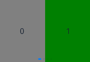
Swiper() {
  Text('0')
    .width('90%')
    .height('100%')
    .backgroundColor(Color.Gray)
    .textAlign(TextAlign.Center)
    .fontSize(30)

  Text('1')
    .width('90%')
    .height('100%')
    .backgroundColor(Color.Green)
    .textAlign(TextAlign.Center)
    .fontSize(30)

  Text('2')
    .width('90%')
    .height('100%')
    .backgroundColor(Color.Pink)
    .textAlign(TextAlign.Center)
    .fontSize(30)
}
.loop(true)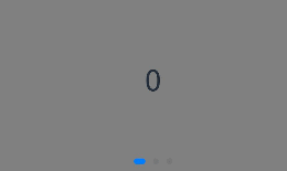
-
loop为false
Swiper() {  // ...}
.loop(false)
自动轮播
Swiper通过设置autoPlay属性,控制是否自动轮播子组件。该属性默认值为false。
autoPlay为true时,会自动切换播放子组件,子组件与子组件之间的播放间隔通过interval属性设置。interval属性默认值为3000,单位毫秒。
Swiper() {  // ...}
.loop(true)
.autoPlay(true)
.interval(1000)

导航点样式
Swiper提供了默认的导航点样式和导航点箭头样式,导航点默认显示在Swiper下方居中位置,开发者也可以通过indicator属性自定义导航点的位置和样式,导航点箭头默认不显示。
通过indicator属性,开发者可以设置导航点相对于Swiper组件上下左右四个方位的位置,同时也可以设置每个导航点的尺寸、颜色、蒙层和被选中导航点的颜色。
- 导航点使用默认样式
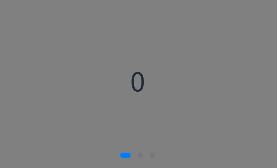
导航点直径设为30vp,左边距为0,导航点颜色设为红色。
Swiper() {
  // ...
}
.indicator(
  Indicator.dot()
    .left(0)
    .itemWidth(15)
    .itemHeight(15)
    .selectedItemWidth(30)
    .selectedItemHeight(15)
    .color(Color.Red)
    .selectedColor(Color.Blue)
)
- Indicator.dot():导航点样式为圆形,默认样式。
- Indicator.digit():导航点样式为数字,从1开始计数。
Swiper通过设置displayArrow属性,可以控制导航点箭头的大小、位置、颜色,底板的大小及颜色,以及鼠标悬停时是否显示箭头。
-
箭头使用默认样式
Swiper() {  // ...}
.displayArrow(true, false)
/*showBackground: 是否显示背景,默认为 true。
isSidebarMiddle: 箭头是否居中显示,默认为 true。
backgroundSize: 背景的大小,默认为 24。
backgroundColor: 背景颜色,默认为 Color.White。
arrowSize: 箭头的大小,默认为 18。
arrowColor: 箭头的颜色,默认为 Color.Blue*/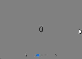
页面切换方式
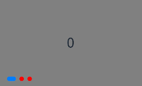
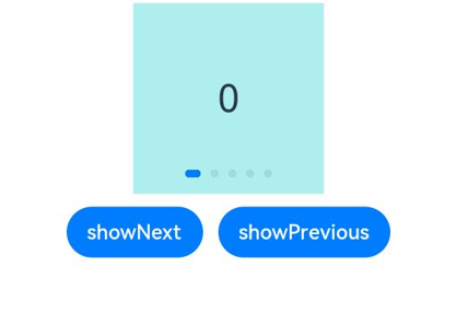
Swiper支持手指滑动、点击导航点和通过控制器三种方式切换页面,以下示例展示通过控制器切换页面的方法。
@Entry
@Component
struct TestPage {
  private swiperController:SwiperController = new SwiperController()
  build() {
    Column({space:10}) {
      Swiper(this.swiperController) {
        Text("0")
          .backgroundColor(Color.Gray)
          .width(250)
          .height(250)
          .textAlign(TextAlign.Center)
          .fontSize(20)
        Text("1")
          .backgroundColor(Color.Pink)
          .width(250)
          .height(250)
          .textAlign(TextAlign.Center)
          .fontSize(20)
        Text('2')
          .backgroundColor(Color.Red)
          .width(250)
          .height(250)
          .textAlign(TextAlign.Center)
          .fontSize(20)
      }
      .indicator(true)

      Row({space:12}){
        Button('showNext').onClick((event: ClickEvent) => {
          this.swiperController.showNext()// 通过controller切换到下一页
        })

        Button('showPrevious').onClick((event: ClickEvent) => {
          this.swiperController.showPrevious()// 通过controller切换到上一页
        })
      }
    }.height('100%').width('100%')
  }
}
轮播方向
Swiper支持水平和垂直方向上进行轮播,主要通过vertical属性控制。
当vertical为ture时,表示在垂直方向上进行轮播:为false时:表示在水平方向上进行轮播。vertical默认值为false
-
设置水平方向上轮播
Swiper(){// ...}
  .vertical(false)
  .indicator(true)
-
设置垂直方向轮播。
Swiper() {  // ...}
.indicator(true)
.vertical(true)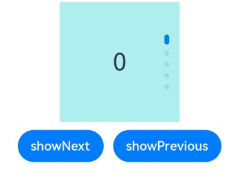
每页显示多个子页面
Swiper支持在一个页面内同时显示多个子组件,通过displayCount属性设置。
Swiper(){
    ForEach(this.data, (item:ResourceColor, index:number) =>{
        Column(){
          Text(`${index}`)
            .fontSize("20fp")
            .fontColor(FontWeight.Bold)
            .fontColor(Color.Black)
        }
        .width("100%")
        .height("200vp")
        .backgroundColor(item)
        .alignItems(HorizontalAlign.Center)
        .justifyContent(FlexAlign.Center)
      })
    }
    .displayCount(2)

作为“人工智能6S店”的官方数字引擎,为AI开发者与企业提供一个覆盖软硬件全栈、一站式门户。
更多推荐
 21
21 0
0- 0


 已为社区贡献2条内容

所有评论(0)