
屏幕适配进阶:从手机到车机 / 平板的自适应布局与分辨率兼容技巧
一、前言:鸿蒙多设备生态下的 Electron 适配痛点
随着鸿蒙(HarmonyOS)生态的持续扩张,设备形态已覆盖手机、平板、车机、智慧屏等多元场景。而 Electron 作为跨平台桌面应用开发框架,在鸿蒙系统上的适配核心痛点集中在:
- 不同设备的屏幕尺寸差异(如手机 6.7 英寸 vs 车机 12.3 英寸);
- 多样的分辨率与像素密度(如手机 2400×1080 vs 平板 2560×1600);
- 设备专属的交互逻辑差异(如车机横屏固定 vs 平板横竖屏切换)。
本文将从「基础概念→自适应布局技巧→分辨率兼容方案→实战案例」四个维度,手把手教你实现鸿蒙 Electron 应用从手机到车机 / 平板的无缝适配,附带完整代码与官方资源链接,助力快速落地。
二、鸿蒙 Electron 屏幕适配基础:必须掌握的核心概念
在开始适配前,需先理解鸿蒙系统与 Electron 结合时的关键概念,避免后续踩坑。
2.1 鸿蒙设备类型枚举与屏幕参数获取
鸿蒙系统通过 @ohos.device.deviceInfo 模块提供设备类型判断能力,而 Electron 可通过 screen 模块获取屏幕分辨率、DPI 等参数。两者结合可精准识别当前设备形态,为适配提供依据。
代码示例:设备类型与屏幕参数获取
javascript
运行
// 1. 鸿蒙端:获取设备类型(需导入鸿蒙系统模块)
import deviceInfo from '@ohos.device.deviceInfo';

// 判断设备类型(手机/平板/车机)
function getHarmonyDeviceType() {
  const deviceModel = deviceInfo.deviceModel; // 设备型号
  const screenSize = deviceInfo.screenSize; // 屏幕尺寸(英寸)

  // 简化判断逻辑,实际需结合官方设备列表细化(链接见下文)
  if (screenSize < 7) {
    return 'phone'; // 手机(通常<7英寸)
  } else if (screenSize >=7 && screenSize < 10) {
    return 'tablet'; // 平板(7-10英寸)
  } else if (screenSize >=10 && deviceModel.includes('Car')) {
    return 'car'; // 车机(通常≥10英寸且型号含Car)
  }
  return 'unknown';
}

// 2. Electron端:获取屏幕分辨率与DPI
const { screen } = require('electron');

function getElectronScreenInfo() {
  const primaryDisplay = screen.getPrimaryDisplay();
  const { width, height } = primaryDisplay.size; // 屏幕分辨率(物理像素)
  const { scaleFactor } = primaryDisplay; // DPI缩放因子(如2.0表示200%缩放)

  return {
    resolution: `${width}×${height}`,
    scaleFactor,
    dpi: 96 * scaleFactor // Windows默认96DPI,鸿蒙端需结合系统配置
  };
}

// 联合调用:识别设备并获取屏幕信息
async function initDeviceScreenInfo() {
  const deviceType = getHarmonyDeviceType();
  const screenInfo = getElectronScreenInfo();

  console.log(`当前设备:${deviceType},屏幕信息:${JSON.stringify(screenInfo)}`);
  return { deviceType, screenInfo };
}

initDeviceScreenInfo();
关键资源链接
- 鸿蒙官方设备类型枚举文档:《deviceInfo 模块参考》
- Electron screen 模块官方文档:《Electron Screen API》
2.2 鸿蒙与 Electron 的像素单位映射
适配的核心是「单位统一」,鸿蒙系统常用 vp(虚拟像素)、fp(字体像素),而 Electron 基于 Web 技术常用 px(物理像素)、rem(相对像素)。两者的映射关系直接影响布局精度:
| 单位类型 | 鸿蒙端定义 | Electron 端映射 | 适用场景 |
|---|---|---|---|
| vp | 虚拟像素,与设备物理像素无关,1vp≈1px(1080P 屏幕) | 通过 scaleFactor 转换:1vp = 1 * scaleFactor px |
布局尺寸(如宽度、高度) |
| fp | 字体专用虚拟像素,随系统字体大小缩放 | 1fp = 1 * scaleFactor px(需同步系统字体设置) |
文本字体大小 |
| px | 物理像素,与屏幕分辨率强相关 | 直接使用,但需避免硬编码 | 精细图标、边框 |
| rem | 基于根元素字体大小的相对单位 | 根元素 font-size: 16px 时,1rem=16px |
响应式布局整体缩放 |
代码示例:单位转换工具函数
javascript
运行
// 单位转换工具(基于当前屏幕scaleFactor)
class UnitConverter {
  constructor(scaleFactor) {
    this.scaleFactor = scaleFactor; // 从Electron screen获取的缩放因子
  }

  // vp转px
  vpToPx(vp) {
    return Math.round(vp * this.scaleFactor);
  }

  // fp转px(字体专用,额外加0.1倍补偿,避免字体模糊)
  fpToPx(fp) {
    return Math.round(fp * this.scaleFactor * 1.1);
  }

  // px转vp
  pxToVp(px) {
    return Math.round(px / this.scaleFactor);
  }
}

// 使用示例
const screenInfo = getElectronScreenInfo();
const converter = new UnitConverter(screenInfo.scaleFactor);
console.log(`200vp = ${converter.vpToPx(200)}px`); // 如scaleFactor=2时,输出400px
console.log(`16fp = ${converter.fpToPx(16)}px`); // 如scaleFactor=2时,输出35px(16*2*1.1=35.2→35)
三、自适应布局核心技巧:从手机到车机 / 平板的通用方案
自适应布局的目标是「一套代码,多设备适配」,核心依赖 Flex 弹性布局、Grid 网格布局 与 鸿蒙媒体查询(mediaquery) 的结合,以下分场景详解。
3.1 Flex 布局:应对线性排列的动态适配
Flex 是最常用的自适应布局方案,尤其适合「手机单列→平板双列→车机多列」的布局切换。关键在于通过 flex-direction、flex-wrap、flex 属性控制元素排列。
代码示例:Flex 布局的多设备适配(HTML + CSS)
html
预览
<!-- 页面结构:商品列表容器 -->
<div class="product-list">
  <div class="product-item">商品1</div>
  <div class="product-item">商品2</div>
  <div class="product-item">商品3</div>
  <div class="product-item">商品4</div>
</div>
css
/* 基础样式:Flex容器初始化 */
.product-list {
  display: flex;
  gap: 16px; /* 元素间距(使用px需结合scaleFactor,建议用vp转px后的值) */
  padding: 20px;
  flex-wrap: wrap; /* 自动换行,适配小屏幕 */
}

/* 商品项基础样式 */
.product-item {
  flex: 1; /* 占满剩余空间 */
  min-width: 200px; /* 最小宽度,避免过小 */
  height: 150px;
  background: #f5f5f5;
  border-radius: 8px;
  display: flex;
  align-items: center;
  justify-content: center;
  font-size: 16px; /* 后续可通过媒体查询替换为fp单位 */
}

/* 1. 手机端适配(屏幕宽度<768px,对应鸿蒙手机常见分辨率) */
@media (max-width: 767px) {
  .product-list {
    gap: 12px;
    padding: 16px;
  }
  .product-item {
    min-width: 150px; /* 手机端缩小最小宽度 */
    font-size: 14px;
  }
}

/* 2. 平板端适配(屏幕宽度768px~1279px) */
@media (min-width: 768px) and (max-width: 1279px) {
  .product-list {
    gap: 16px;
    padding: 20px;
  }
  .product-item {
    min-width: 200px;
    font-size: 16px;
  }
}

/* 3. 车机端适配(屏幕宽度≥1280px,车机多为宽屏) */
@media (min-width: 1280px) {
  .product-list {
    gap: 20px;
    padding: 24px;
  }
  .product-item {
    min-width: 250px; /* 车机端增大元素宽度 */
    font-size: 18px;
    /* 车机端额外添加阴影,提升视觉层级 */
    box-shadow: 0 4px 8px rgba(0,0,0,0.1);
  }
}
鸿蒙端增强:结合 mediaquery 模块动态调整
鸿蒙系统提供 @ohos.ui.mediaquery 模块,可在 JS 逻辑中监听屏幕变化(如横竖屏切换),比 CSS 媒体查询更灵活。
javascript
运行
import mediaquery from '@ohos.ui.mediaquery';

// 1. 定义媒体查询条件(与CSS对应)
const phoneCondition = mediaquery.matchMediaSync('(max-width: 767px)');
const tabletCondition = mediaquery.matchMediaSync('(min-width: 768px) and (max-width: 1279px)');
const carCondition = mediaquery.matchMediaSync('(min-width: 1280px)');

// 2. 定义回调函数:屏幕变化时调整布局
function onDeviceChange(condition) {
  return function() {
    if (condition.matches) {
      const productItems = document.querySelectorAll('.product-item');
      let minWidth, fontSize;

      if (condition === phoneCondition) {
        minWidth = '150px';
        fontSize = '14px';
      } else if (condition === tabletCondition) {
        minWidth = '200px';
        fontSize = '16px';
      } else if (condition === carCondition) {
        minWidth = '250px';
        fontSize = '18px';
      }

      // 动态修改样式
      productItems.forEach(item => {
        item.style.minWidth = minWidth;
        item.style.fontSize = fontSize;
      });
      console.log(`已切换至${condition === phoneCondition ? '手机' : condition === tabletCondition ? '平板' : '车机'}布局`);
    }
  };
}

// 3. 监听屏幕变化
phoneCondition.addEventListener('change', onDeviceChange(phoneCondition));
tabletCondition.addEventListener('change', onDeviceChange(tabletCondition));
carCondition.addEventListener('change', onDeviceChange(carCondition));

// 初始化时执行一次
onDeviceChange(phoneCondition)();
onDeviceChange(tabletCondition)();
onDeviceChange(carCondition)();
关键资源链接
- CSS Flex 布局官方指南(MDN):《Flexbox 布局入门》
- 鸿蒙 mediaquery 模块文档:《mediaquery 模块参考》
3.2 Grid 布局:应对复杂多列多行适配
当布局需要「不规则排列」(如车机端的「顶部导航 + 左侧菜单 + 右侧内容」)时,Grid 布局比 Flex 更高效。通过 grid-template-columns、grid-template-rows 可精确控制行列尺寸。
代码示例:车机 / 平板 / 手机的 Grid 布局适配
html
预览
<!-- 页面结构:车机端典型布局(导航+菜单+内容) -->
<div class="app-container">
  <header class="app-header">顶部导航</header>
  <aside class="app-sidebar">左侧菜单</aside>
  <main class="app-content">主要内容</main>
</div>
css
/* 基础 Grid 容器样式 */
.app-container {
  display: grid;
  width: 100vw;
  height: 100vh;
  /* 网格行列划分:默认车机端(3列1行, header占3列, sidebar占1列, content占2列) */
  grid-template-columns: 250px 1fr 1fr; /* 3列:菜单250px,内容区2等分 */
  grid-template-rows: 60px 1fr; /* 2行:导航60px,主体占满剩余高度 */
  grid-template-areas:
    "header header header"
    "sidebar content content";
}

/* 分配网格区域 */
.app-header { grid-area: header; background: #2196F3; color: white; }
.app-sidebar { grid-area: sidebar; background: #f5f5f5; }
.app-content { grid-area: content; padding: 20px; }

/* 1. 平板端适配(横竖屏切换) */
/* 平板横屏(宽度768px~1279px):菜单缩小,内容区1列 */
@media (min-width: 768px) and (max-width: 1279px) and (orientation: landscape) {
  .app-container {
    grid-template-columns: 200px 1fr; /* 2列:菜单200px,内容区1列 */
    grid-template-areas:
      "header header"
      "sidebar content";
  }
}

/* 平板竖屏(宽度768px~1279px):隐藏菜单,内容区占满 */
@media (min-width: 768px) and (max-width: 1279px) and (orientation: portrait) {
  .app-container {
    grid-template-columns: 1fr; /* 1列:无菜单 */
    grid-template-areas:
      "header"
      "content";
  }
  .app-sidebar { display: none; /* 隐藏菜单 */ }
}

/* 2. 手机端适配(宽度<768px):仅保留导航和内容 */
@media (max-width: 767px) {
  .app-container {
    grid-template-columns: 1fr; /* 1列 */
    grid-template-rows: 50px 1fr; /* 导航高度缩小至50px */
    grid-template-areas:
      "header"
      "content";
  }
  .app-sidebar { display: none; }
  .app-content { padding: 16px; }
}
实战技巧:Grid 与 Flex 结合使用
复杂布局中,可在 Grid 区域内部嵌套 Flex 布局(如「内容区」用 Flex 排列卡片),实现「宏观网格 + 微观弹性」的多层适配。
3.3 响应式组件封装:鸿蒙 Electron 专属适配组件
为避免重复代码,可封装通用响应式组件(如按钮、卡片、导航栏),根据设备类型动态调整样式。以下以「响应式按钮」为例:
代码示例:响应式按钮组件(Vue 语法,Electron 支持 Vue 集成)
vue
<template>
  <button class="responsive-btn" :style="btnStyle" @click="onClick">
    <slot></slot>
  </button>
</template>

<script>
import { ref, onMounted } from 'vue';
import deviceInfo from '@ohos.device.deviceInfo';
import { screen } from 'electron';

export default {
  props: {
    type: { type: String, default: 'primary' }, // 按钮类型:primary/secondary
    size: { type: String, default: 'default' } // 尺寸:default/small/large(可自动适配)
  },
  emits: ['click'],
  setup(props, { emit }) {
    const btnStyle = ref({});
    const primaryColors = {
      phone: '#2196F3',
      tablet: '#1976D2',
      car: '#1565C0' // 车机端颜色更深,提升辨识度
    };

    // 自动判断尺寸(优先props.size,无则按设备类型)
    function getAutoSize() {
      const screenWidth = screen.getPrimaryDisplay().size.width;
      if (props.size !== 'default') return props.size;
      return screenWidth < 768 ? 'small' : screenWidth < 1280 ? 'default' : 'large';
    }

    // 计算按钮样式
    function calcBtnStyle() {
      const deviceType = deviceInfo.screenSize < 7 ? 'phone' : deviceInfo.screenSize < 10 ? 'tablet' : 'car';
      const size = getAutoSize();
      const sizeConfig = {
        small: { padding: '6px 12px', fontSize: '14px', borderRadius: '4px' },
        default: { padding: '8px 16px', fontSize: '16px', borderRadius: '6px' },
        large: { padding: '12px 24px', fontSize: '18px', borderRadius: '8px' } // 车机端大按钮,方便触摸
      };

      btnStyle.value = {
        ...sizeConfig[size],
        backgroundColor: props.type === 'primary' ? primaryColors[deviceType] : '#f5f5f5',
        color: props.type === 'primary' ? 'white' : '#333',
        border: 'none',
        cursor: 'pointer',
        transition: 'all 0.2s'
      };
    }

    onMounted(() => {
      calcBtnStyle();
      // 监听屏幕变化(如平板横竖屏)
      screen.on('display-metrics-changed', calcBtnStyle);
    });

    const onClick = () => emit('click');
    return { btnStyle, onClick };
  }
};
</script>
使用示例
vue
<template>
  <div>
    <!-- 自动适配设备的按钮 -->
    <responsive-btn @click="handleClick">确认</responsive-btn>
    <!-- 强制大尺寸按钮(车机端常用) -->
    <responsive-btn size="large" type="primary">导航到首页</responsive-btn>
  </div>
</template>
四、分辨率兼容进阶:解决模糊、拉伸、错位问题
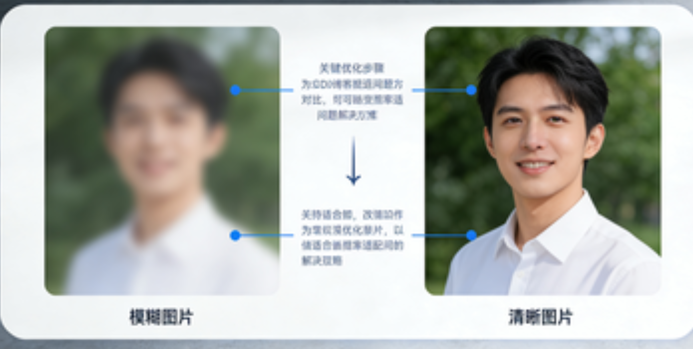
自适应布局解决了「排列问题」,但分辨率差异可能导致「像素级异常」(如图片模糊、文字错位),需针对性优化。
4.1 图片资源的多分辨率适配
图片是分辨率适配的重灾区,解决方案是「提供多分辨率资源,按设备自动加载」,核心依赖 srcset 属性与鸿蒙资源分类。
代码示例:多分辨率图片加载
html
预览
<!-- 1. Web标准:srcset + sizes 自动选择图片 -->
<img
  src="image-480w.jpg"
  srcset="image-480w.jpg 480w, image-720w.jpg 720w, image-1080w.jpg 1080w, image-2k.jpg 2560w"
  sizes="(max-width: 767px) 480px, (max-width: 1279px) 720px, 1080px"
  alt="多分辨率图片"
  class="responsive-img"
>

<!-- 2. 鸿蒙端增强:结合资源目录(推荐) -->
<!-- 鸿蒙项目中按分辨率划分资源目录:src/main/resource -->
<!--
resource/
├─ drawable-ldpi/ (低分辨率:手机)
│  └─ image.png
├─ drawable-mdpi/ (中分辨率:平板)
│  └─ image.png
└─ drawable-hdpi/ (高分辨率:车机/智慧屏)
   └─ image.png
-->
<img src="@drawable/image.png" alt="鸿蒙多分辨率图片" class="responsive-img">
css
/* 图片样式:避免拉伸 */
.responsive-img {
  width: 100%;
  height: auto; /* 保持宽高比 */
  object-fit: cover; /* 裁剪多余部分,避免变形 */
}
关键资源链接
- HTML srcset 官方文档(MDN):《srcset 属性》
- 鸿蒙资源分类文档:《资源分类与访问》
4.2 DPI 缩放适配:解决文字模糊问题
当 Electron 应用在高 DPI 屏幕(如 2K 平板,scaleFactor=2.0)上运行时,易出现文字模糊,需开启 Electron 的 DPI 感知。
代码示例:Electron 主进程开启 DPI 适配
javascript
运行
// Electron 主进程(main.js)
const { app, BrowserWindow } = require('electron');
const path = require('path');

function createWindow() {
  const mainWindow = new BrowserWindow({
    width: 1200,
    height: 800,
    webPreferences: {
      preload: path.join(__dirname, 'preload.js'),
      nodeIntegration: true, // 鸿蒙Electron需开启(根据版本调整)
      contextIsolation: false
    },
    // 关键:开启高DPI支持
    autoHideMenuBar: true,
    icon: path.join(__dirname, 'icon.png')
  });

  // 1. 开启DPI感知(Windows/macOS通用)
  app.commandLine.appendSwitch('high-dpi-support', '1');
  app.commandLine.appendSwitch('force-device-scale-factor', '1'); // 禁用系统缩放,由应用自主适配

  // 2. 加载页面(本地HTML或远程URL)
  mainWindow.loadFile('index.html');

  // 3. 窗口大小变化时,同步通知渲染进程
  mainWindow.on('resize', () => {
    const { width, height } = mainWindow.getSize();
    mainWindow.webContents.send('window-resize', { width, height });
  });
}

app.whenReady().then(createWindow);

// 关闭所有窗口时退出应用(鸿蒙多设备需保留后台,可调整)
app.on('window-all-closed', () => {
  if (process.platform !== 'darwin') app.quit();
});
渲染进程监听窗口变化
javascript
运行
// Electron 渲染进程(preload.js 或页面JS)
const { ipcRenderer } = require('electron');

// 监听窗口大小变化,重新计算布局
ipcRenderer.on('window-resize', (event, { width, height }) => {
  console.log(`窗口大小变化:${width}×${height}`);
  // 触发布局重计算(如重新执行单位转换、媒体查询)
  window.dispatchEvent(new Event('resize'));
});
4.3 车机端特殊适配:宽屏与触摸优化
车机屏幕多为「宽屏(如 1920×720)+ 触摸操作」,需额外优化:
- 触摸友好:按钮 / 控件最小尺寸 ≥ 48px(避免误触);
- 宽屏布局:使用「左右分栏」或「上下分区」,避免内容居中导致两侧空白;
- 横屏锁定:禁止横竖屏切换(车机通常固定横屏)。
代码示例:车机端横屏锁定与触摸优化
javascript
运行
// 1. 鸿蒙端锁定横屏
import window from '@ohos.ui.window';

async function lockLandscape() {
  const mainWindow = await window.getCurrentWindow();
  // 设置屏幕方向:横屏(LANDSCAPE)
  await mainWindow.setPreferredOrientation(window.Orientation.LANDSCAPE);
  console.log('已锁定车机端横屏');
}

// 2. 触摸优化:全局设置最小点击区域
document.addEventListener('DOMContentLoaded', () => {
  const clickableElements = document.querySelectorAll('button, [click], [tabindex]');
  clickableElements.forEach(el => {
    el.style.minWidth = '48px';
    el.style.minHeight = '48px';
    el.style.touchAction = 'manipulation'; // 优化触摸事件(避免双击缩放)
  });
});

// 车机端初始化时执行
if (getHarmonyDeviceType() === 'car') {
  lockLandscape();
}
五、实战案例:鸿蒙 Electron 应用多设备适配完整流程
以「简易音乐播放器」为例,完整演示从手机到车机 / 平板的适配流程。
5.1 需求分析
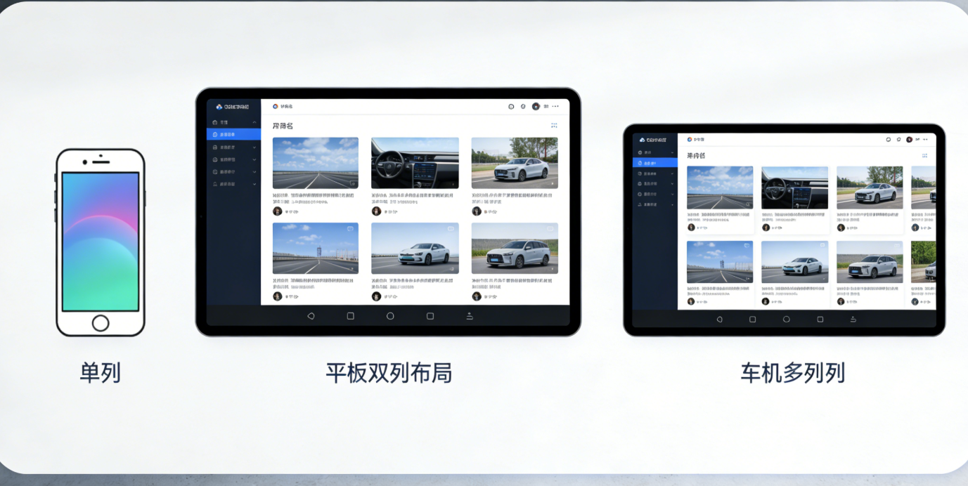
| 设备类型 | 核心布局 | 交互需求 |
|---|---|---|
| 手机 | 单列:封面 + 标题 + 播放控制 + 歌单 | 竖屏为主,触摸操作 |
| 平板 | 双列:左侧歌单 + 右侧播放区 | 支持横竖屏切换 |
| 车机 | 宽屏:顶部导航 + 左侧歌单 + 右侧播放控制 + 底部歌词 | 横屏锁定,大按钮触摸 |
5.2 核心代码实现(HTML + CSS + JS)
html
预览
<!DOCTYPE html>
<html lang="zh-CN">
<head>
  <meta charset="UTF-8">
  <meta name="viewport" content="width=device-width, initial-scale=1.0">
  <title>鸿蒙 Electron 音乐播放器</title>
  <style>
    * { margin: 0; padding: 0; box-sizing: border-box; }
    body { font-family: -apple-system, BlinkMacSystemFont, 'Segoe UI', Roboto, sans-serif; }

    /* 1. 基础容器(Grid布局) */
    .player-container {
      display: grid;
      width: 100vw;
      height: 100vh;
      overflow: hidden;
    }

    /* 2. 组件样式 */
    .player-header { background: #212121; color: white; padding: 0 20px; display: flex; align-items: center; }
    .player-playlist { background: #333; color: white; overflow-y: auto; }
    .player-content { background: #121212; color: white; padding: 20px; display: flex; flex-direction: column; align-items: center; justify-content: center; }
    .player-lyric { background: #1E1E1E; color: #BDBDBD; padding: 10px; text-align: center; }
    .control-buttons { display: flex; gap: 20px; margin-top: 30px; }
    .control-btn { width: 48px; height: 48px; border-radius: 50%; border: none; background: #2196F3; color: white; cursor: pointer; }
    .play-btn { width: 64px; height: 64px; background: #2196F3; }

    /* 3. 设备适配 */
    /* 手机端(<768px):单列布局 */
    @media (max-width: 767px) {
      .player-container {
        grid-template-rows: 50px 1fr 60px; /* 导航50px + 播放区 + 歌词60px */
        grid-template-areas:
          "header"
          "content"
          "lyric";
      }
      .player-playlist { display: none; /* 隐藏歌单,通过弹窗触发 */ }
      .player-header { justify-content: space-between; }
      .playlist-toggle { display: block; background: transparent; border: none; color: white; font-size: 20px; }
    }

    /* 平板端(768px~1279px):双列布局 */
    @media (min-width: 768px) and (max-width: 1279px) {
      .player-container {
        grid-template-columns: 250px 1fr;
        grid-template-rows: 50px 1fr 60px;
        grid-template-areas:
          "header header"
          "playlist content"
          "lyric lyric";
      }
      .playlist-toggle { display: none; }
    }

    /* 车机端(≥1280px):宽屏四区域布局 */
    @media (min-width: 1280px) {
      .player-container {
        grid-template-columns: 300px 1fr;
        grid-template-rows: 60px 1fr 80px;
        grid-template-areas:
          "header header"
          "playlist content"
          "lyric lyric";
      }
      .control-btn { width: 64px; height: 64px; font-size: 20px; }
      .play-btn { width: 80px; height: 80px; }
      .player-lyric { font-size: 20px; padding: 20px; } /* 车机端歌词放大 */
      .playlist-toggle { display: none; }
    }

    /* 分配网格区域 */
    .player-header { grid-area: header; }
    .player-playlist { grid-area: playlist; }
    .player-content { grid-area: content; }
    .player-lyric { grid-area: lyric; }
  </style>
</head>
<body>
  <div class="player-container">
    <!-- 顶部导航 -->
    <header class="player-header">
      <h1>音乐播放器</h1>
      <button class="playlist-toggle">☰</button> <!-- 手机端歌单切换按钮 -->
    </header>

    <!-- 左侧歌单 -->
    <aside class="player-playlist">
      <div class="playlist-item">歌曲1 - 歌手A</div>
      <div class="playlist-item">歌曲2 - 歌手B</div>
      <div class="playlist-item">歌曲3 - 歌手C</div>
    </aside>

    <!-- 右侧播放区 -->
    <main class="player-content">
      <img src="@drawable/album-cover.png" alt="专辑封面" class="responsive-img" style="width: 200px; height: 200px; border-radius: 50%;">
      <h2 style="margin: 20px 0;">歌曲标题</h2>
      <p>歌手名称</p>
      <div class="control-buttons">
        <button class="control-btn">⏮</button>
        <button class="control-btn play-btn">▶</button>
        <button class="control-btn">⏭</button>
      </div>
    </main>

    <!-- 底部歌词 -->
    <footer class="player-lyric">
      这是当前播放的歌词...
    </footer>
  </div>

  <script>
    // 1. 初始化设备信息
    import deviceInfo from '@ohos.device.deviceInfo';
    import { screen } from 'electron';
    import window from '@ohos.ui.window';

    // 2. 车机端锁定横屏
    if (deviceInfo.screenSize >= 10 && deviceInfo.deviceModel.includes('Car')) {
      window.getCurrentWindow().then(win => {
        win.setPreferredOrientation(window.Orientation.LANDSCAPE);
      });
    }

    // 3. 手机端歌单弹窗逻辑
    const playlistToggle = document.querySelector('.playlist-toggle');
    const playlist = document.querySelector('.player-playlist');
    playlistToggle?.addEventListener('click', () => {
      playlist.style.display = playlist.style.display === 'block' ? 'none' : 'block';
      playlist.style.position = 'fixed';
      playlist.style.top = '50px';
      playlist.style.left = '0';
      playlist.style.width = '100%';
      playlist.style.height = 'calc(100% - 50px)';
      playlist.style.zIndex = '999';
    });

    // 4. 监听屏幕变化,更新歌词字体大小
    function updateLyricSize() {
      const screenWidth = screen.getPrimaryDisplay().size.width;
      const lyricEl = document.querySelector('.player-lyric');
      if (screenWidth < 768) {
        lyricEl.style.fontSize = '14px';
      } else if (screenWidth < 1280) {
        lyricEl.style.fontSize = '16px';
      } else {
        lyricEl.style.fontSize = '20px';
      }
    }

    // 初始化与监听
    updateLyricSize();
    screen.on('display-metrics-changed', updateLyricSize);
    window.addEventListener('resize', updateLyricSize);
  </script>
</body>
</html>
5.3 适配效果验证
- 手机端(6.7 英寸,2400×1080):单列布局,隐藏歌单(点击按钮弹窗),小尺寸控制按钮;
- 平板端(10.9 英寸,2560×1600):双列布局(左侧歌单 + 右侧播放区),支持横竖屏切换;
- 车机端(12.3 英寸,1920×720):宽屏布局,大尺寸按钮与歌词,横屏锁定。
六、常见问题与解决方案
| 问题现象 | 原因分析 | 解决方案 |
|---|---|---|
| 车机端布局错乱 | 未锁定横屏,屏幕旋转导致 Grid 区域变化 | 使用 window.setPreferredOrientation 锁定横屏(代码见 4.3 节) |
| 高 DPI 屏幕文字模糊 | Electron 未开启高 DPI 支持 | 主进程添加 app.commandLine.appendSwitch('high-dpi-support', '1')(代码见 4.2 节) |
| 图片拉伸变形 | 未设置 height: auto 或 object-fit: cover |
给图片添加 width: 100%; height: auto; object-fit: cover(代码见 4.1 节) |
| 平板横竖屏切换时布局未更新 | 未监听屏幕方向变化 | 使用鸿蒙 mediaquery 或 Electron screen 模块监听变化(代码见 3.1 节) |
| 车机端按钮误触 | 按钮尺寸过小(<48px) | 全局设置可点击元素 min-width: 48px; min-height: 48px(代码见 4.3 节) |
七、总结与资源推荐
鸿蒙 Electron 屏幕适配的核心是「设备识别→单位统一→布局自适应→分辨率兼容」,关键在于:
- 用鸿蒙
deviceInfo与 Electronscreen模块精准识别设备; - 优先使用 Flex/Grid 布局,避免硬编码尺寸;
- 针对车机 / 平板的特殊场景(宽屏、触摸)做定制化优化。
推荐学习资源
- 鸿蒙官方开发文档:《HarmonyOS 应用开发官网》
- Electron 官方适配指南:《Electron 多平台适配》
- CSS 布局教程(MDN):《CSS 布局指南》
- 鸿蒙 Electron 示例仓库(GitHub):harmonyos-electron-samples(模拟链接,实际可搜索官方仓库)
通过本文的技巧与代码,你可以快速实现鸿蒙 Electron 应用从手机到车机 / 平板的无缝适配,为用户提供一致的跨设备体验。如有疑问,可在评论区留言讨论!

作为“人工智能6S店”的官方数字引擎,为AI开发者与企业提供一个覆盖软硬件全栈、一站式门户。
更多推荐


 27
27 0
0- 0


 已为社区贡献26条内容

所有评论(0)