
【精通篇】打造React Native鸿蒙跨平台开发高级复合组件库开发系列:Notify 消息提示(在页面顶部展示消息提示)
本文介绍了在React Native中开发支持华为鸿蒙操作系统(HarmonyOS)应用的关键步骤。首先需要安装HarmonyOS SDK并配置开发环境,然后通过react-native-hw-harmony兼容库实现基础支持。开发者需修改通知等系统API调用以适配鸿蒙特性,并利用DevEco Studio模拟器或真机进行测试。文章还提供了一个React Native通知组件的实现示例,展示了如何
在 React Native 中开发支持华为鸿蒙操作系统(HarmonyOS)的应用,涉及到一些特殊的步骤和考虑,因为鸿蒙操作系统是基于华为的操作系统,它与 Android 系统在某些方面有相似之处,但也存在差异。以下是一些基本步骤和考虑事项,帮助你开始在 React Native 中开发支持鸿蒙的应用:
- 环境准备
首先,确保你的开发环境支持鸿蒙开发。华为提供了 HarmonyOS SDK,你可以通过华为开发者联盟官网下载并安装这些工具。
- 安装 HarmonyOS SDK:从华为开发者网站下载并安装 HarmonyOS SDK。
- 配置开发环境:确保你的开发环境(如 IDE,如 DevEco Studio)配置正确,以便支持鸿蒙开发。
- 使用 React Native 兼容库
由于 React Native 主要针对 Android 和 iOS,直接在 React Native 中支持鸿蒙可能需要一些额外的库或工具。目前,华为提供了一个名为 react-native-hw-harmony 的库,这是一个尝试让 React Native 应用能够运行在鸿蒙系统上的库。
- 安装兼容库:
或者使用 yarn:npm install react-native-hw-harmonyyarn add react-native-hw-harmony
- 修改和适配代码
使用兼容库后,你可能需要修改一些代码以适配鸿蒙系统的特定 API 或行为。例如,你可能需要修改通知(Notification)的代码以使用鸿蒙的通知 API。
- 修改通知代码:
import { createNotification } from 'react-native-hw-harmony';

createNotification({
  title: 'Hello',
  body: 'This is a notification',
  onPress: () => console.log('Notification pressed')
});
- 测试和调试
在将应用部署到鸿蒙设备之前,确保进行充分的测试。使用华为提供的模拟器或实际设备进行测试是必要的。
- 使用 DevEco Studio 的模拟器:测试应用在模拟器上的表现。
- 实际设备测试:使用真实的鸿蒙设备进行测试,以确保所有功能正常工作。
- 提交应用到华为应用市场
一旦你的应用通过了所有测试并准备好发布,你可以将其提交到华为应用市场进行审核和发布。
- 维护和更新
随着鸿蒙生态的发展和 API 的更新,定期检查并更新你的兼容库和代码以确保应用的兼容性和性能。
注意事项
- 文档和社区资源:密切关注华为的官方文档和社区论坛,以获取最新的开发指南和最佳实践。
- 兼容性问题:由于鸿蒙系统和 Android 系统在某些方面有所不同,可能会遇到一些兼容性问题。确保及时解决这些问题。
通过上述步骤,你可以开始在 React Native 中开发支持鸿蒙操作系统的应用。虽然目前直接在 React Native 中全面支持鸿蒙可能还需要一些时间和社区的努力,但使用现有的兼容库是一个不错的起点。
真实案列组件效果演示:
import React, { useState, useEffect } from 'react';
import { View, Text, StyleSheet, ScrollView, Dimensions, TouchableOpacity, Animated, Easing } from 'react-native';

// Simple Icon Component using Unicode symbols
interface IconProps {
  name: string;
  size?: number;
  color?: string;
  style?: object;
}

const Icon: React.FC<IconProps> = ({
  name,
  size = 24,
  color = '#333333',
  style
}) => {
  const getIconSymbol = () => {
    switch (name) {
      case 'success': return '✅';
      case 'error': return '❌';
      case 'warning': return '⚠️';
      case 'info': return 'ℹ️';
      case 'close': return '✕';
      case 'bell': return '🔔';
      case 'message': return '💬';
      case 'notification': return '📢';
      default: return 'ℹ️';
    }
  };

  return (
    <View style={[{ width: size, height: size, justifyContent: 'center', alignItems: 'center' }, style]}>
      <Text style={{ fontSize: size * 0.8, color, includeFontPadding: false, textAlign: 'center' }}>
        {getIconSymbol()}
      </Text>
    </View>
  );
};

// Notify Component
interface NotifyProps {
  message: string;
  type?: 'success' | 'error' | 'warning' | 'info';
  duration?: number;
  onClose?: () => void;
  showIcon?: boolean;
}

const Notify: React.FC<NotifyProps> = ({
  message,
  type = 'info',
  duration = 3000,
  onClose,
  showIcon = true
}) => {
  const [slideAnim] = useState(new Animated.Value(-100));
  const [opacityAnim] = useState(new Animated.Value(0));

  useEffect(() => {
    showNotification();

    const timer = setTimeout(() => {
      hideNotification();
    }, duration);

    return () => {
      clearTimeout(timer);
    };
  }, []);

  const showNotification = () => {
    Animated.parallel([
      Animated.timing(slideAnim, {
        toValue: 0,
        duration: 300,
        easing: Easing.out(Easing.ease),
        useNativeDriver: true
      }),
      Animated.timing(opacityAnim, {
        toValue: 1,
        duration: 300,
        useNativeDriver: true
      })
    ]).start();
  };

  const hideNotification = () => {
    Animated.parallel([
      Animated.timing(slideAnim, {
        toValue: -100,
        duration: 300,
        useNativeDriver: true
      }),
      Animated.timing(opacityAnim, {
        toValue: 0,
        duration: 300,
        useNativeDriver: true
      })
    ]).start(() => {
      if (onClose) onClose();
    });
  };

  const getTypeColor = () => {
    switch (type) {
      case 'success': return '#52c41a';
      case 'error': return '#ff4d4f';
      case 'warning': return '#faad14';
      default: return '#1890ff';
    }
  };

  const getTypeBackgroundColor = () => {
    switch (type) {
      case 'success': return '#f6ffed';
      case 'error': return '#fff2f0';
      case 'warning': return '#fffbe6';
      default: return '#e6f7ff';
    }
  };

  const getTypeBorderColor = () => {
    switch (type) {
      case 'success': return '#b7eb8f';
      case 'error': return '#ffccc7';
      case 'warning': return '#ffe58f';
      default: return '#91d5ff';
    }
  };

  return (
    <Animated.View
      style={[
        styles.notifyContainer,
        {
          backgroundColor: getTypeBackgroundColor(),
          borderLeftColor: getTypeColor(),
          transform: [{ translateX: slideAnim }],
          opacity: opacityAnim
        }
      ]}
    >
      <View style={styles.notifyContent}>
        {showIcon && (
          <Icon
            name={type}
            size={20}
            color={getTypeColor()}
            style={styles.notifyIcon}
          />
        )}
        <Text style={[styles.notifyText, { color: getTypeColor() }]}>
          {message}
        </Text>
        <TouchableOpacity
          style={styles.closeButton}
          onPress={hideNotification}
        >
          <Icon
            name="close"
            size={16}
            color={getTypeColor()}
          />
        </TouchableOpacity>
      </View>
    </Animated.View>
  );
};

// Notify Manager Component
const NotifyManager: React.FC = () => {
  const [notifications, setNotifications] = useState<any[]>([]);

  const showNotify = (props: Omit<NotifyProps, 'onClose'>) => {
    const id = Date.now().toString();
    const newNotify = { ...props, id };

    setNotifications(prev => [...prev, newNotify]);

    setTimeout(() => {
      setNotifications(prev => prev.filter(n => n.id !== id));
    }, props.duration || 3000);
  };

  const closeNotify = (id: string) => {
    setNotifications(prev => prev.filter(n => n.id !== id));
  };

  return (
    <View style={styles.notifyManager}>
      {notifications.map(notify => (
        <View key={notify.id} style={styles.notifyWrapper}>
          <Notify
            {...notify}
            onClose={() => closeNotify(notify.id)}
          />
        </View>
      ))}

      {/* Expose showNotify method globally */}
      {React.createElement(() => {
        (global as any).showNotify = showNotify;
        return null;
      })}
    </View>
  );
};

// Main App Component
const NotifyComponentApp = () => {
  const showSuccess = () => {
    (global as any).showNotify({
      message: '操作成功完成!',
      type: 'success',
      duration: 3000
    });
  };

  const showError = () => {
    (global as any).showNotify({
      message: '操作失败,请重试!',
      type: 'error',
      duration: 3000
    });
  };

  const showWarning = () => {
    (global as any).showNotify({
      message: '请注意操作风险!',
      type: 'warning',
      duration: 3000
    });
  };

  const showInfo = () => {
    (global as any).showNotify({
      message: '这是一条提示信息',
      type: 'info',
      duration: 3000
    });
  };

  const showLongMessage = () => {
    (global as any).showNotify({
      message: '这是一条很长的消息提示,用来测试消息的换行和显示效果,看看是否能够正确显示。',
      type: 'info',
      duration: 5000
    });
  };

  return (
    <ScrollView style={styles.container}>
      <View style={styles.header}>
        <Text style={styles.headerTitle}>消息提示组件</Text>
        <Text style={styles.headerSubtitle}>美观实用的消息通知控件</Text>
      </View>

      <View style={styles.section}>
        <Text style={styles.sectionTitle}>基础用法</Text>
        <View style={styles.notifyGroupsContainer}>
          <TouchableOpacity
            style={[styles.notifyButton, { backgroundColor: '#f6ffed', borderColor: '#b7eb8f' }]}
            onPress={showSuccess}
          >
            <Text style={[styles.notifyButtonText, { color: '#52c41a' }]}>成功消息</Text>
          </TouchableOpacity>

          <TouchableOpacity
            style={[styles.notifyButton, { backgroundColor: '#fff2f0', borderColor: '#ffccc7' }]}
            onPress={showError}
          >
            <Text style={[styles.notifyButtonText, { color: '#ff4d4f' }]}>错误消息</Text>
          </TouchableOpacity>

          <TouchableOpacity
            style={[styles.notifyButton, { backgroundColor: '#fffbe6', borderColor: '#ffe58f' }]}
            onPress={showWarning}
          >
            <Text style={[styles.notifyButtonText, { color: '#faad14' }]}>警告消息</Text>
          </TouchableOpacity>

          <TouchableOpacity
            style={[styles.notifyButton, { backgroundColor: '#e6f7ff', borderColor: '#91d5ff' }]}
            onPress={showInfo}
          >
            <Text style={[styles.notifyButtonText, { color: '#1890ff' }]}>信息消息</Text>
          </TouchableOpacity>

          <TouchableOpacity
            style={[styles.notifyButton, { backgroundColor: '#f9f0ff', borderColor: '#d3adf7' }]}
            onPress={showLongMessage}
          >
            <Text style={[styles.notifyButtonText, { color: '#722ed1' }]}>长消息</Text>
          </TouchableOpacity>
        </View>
      </View>

      <View style={styles.section}>
        <Text style={styles.sectionTitle}>应用场景</Text>
        <View style={styles.scenariosContainer}>
          <View style={styles.scenarioCard}>
            <Icon name="success" size={32} color="#52c41a" style={styles.scenarioIcon} />
            <Text style={styles.scenarioTitle}>操作成功</Text>
            <Text style={styles.scenarioDesc}>表单提交成功</Text>
          </View>

          <View style={styles.scenarioCard}>
            <Icon name="error" size={32} color="#ff4d4f" style={styles.scenarioIcon} />
            <Text style={styles.scenarioTitle}>操作失败</Text>
            <Text style={styles.scenarioDesc}>网络请求失败</Text>
          </View>

          <View style={styles.scenarioCard}>
            <Icon name="warning" size={32} color="#faad14" style={styles.scenarioIcon} />
            <Text style={styles.scenarioTitle}>风险提示</Text>
            <Text style={styles.scenarioDesc}>操作风险警告</Text>
          </View>
        </View>
      </View>

      <View style={styles.section}>
        <Text style={styles.sectionTitle}>功能演示</Text>
        <View style={styles.demosContainer}>
          <View style={styles.demoItem}>
            <Icon name="bell" size={24} color="#1890ff" style={styles.demoIcon} />
            <View>
              <Text style={styles.demoTitle}>四种类型</Text>
              <Text style={styles.demoDesc}>支持成功、错误、警告、信息四种类型</Text>
            </View>
          </View>

          <View style={styles.demoItem}>
            <Icon name="message" size={24} color="#52c41a" style={styles.demoIcon} />
            <View>
              <Text style={styles.demoTitle}>自动消失</Text>
              <Text style={styles.demoDesc}>消息自动消失,也可手动关闭</Text>
            </View>
          </View>

          <View style={styles.demoItem}>
            <Icon name="notification" size={24} color="#722ed1" style={styles.demoIcon} />
            <View>
              <Text style={styles.demoTitle}>全局调用</Text>
              <Text style={styles.demoDesc}>支持全局调用,方便使用</Text>
            </View>
          </View>
        </View>
      </View>

      <View style={styles.usageSection}>
        <Text style={styles.sectionTitle}>使用方法</Text>
        <View style={styles.codeBlock}>
          <Text style={styles.codeText}>// 全局调用方式</Text>
          <Text style={styles.codeText}>showNotify({'{'}</Text>
          <Text style={styles.codeText}>  message: "操作成功",</Text>
          <Text style={styles.codeText}>  type: "success",</Text>
          <Text style={styles.codeText}>  duration: 3000{'\n'}{'});'}</Text>
        </View>
        <Text style={styles.description}>
          Notify组件提供了完整的消息提示功能,包括成功、错误、警告、信息四种类型。
          支持自动消失和手动关闭,可通过全局方法调用,方便在任何地方使用。
        </Text>
      </View>

      <View style={styles.featuresSection}>
        <Text style={styles.sectionTitle}>功能特性</Text>
        <View style={styles.featuresList}>
          <View style={styles.featureItem}>
            <Icon name="success" size={20} color="#52c41a" style={styles.featureIcon} />
            <Text style={styles.featureText}>四种类型</Text>
          </View>
          <View style={styles.featureItem}>
            <Icon name="bell" size={20} color="#1890ff" style={styles.featureIcon} />
            <Text style={styles.featureText}>自动消失</Text>
          </View>
          <View style={styles.featureItem}>
            <Icon name="message" size={20} color="#722ed1" style={styles.featureIcon} />
            <Text style={styles.featureText}>全局调用</Text>
          </View>
          <View style={styles.featureItem}>
            <Icon name="close" size={20} color="#ff4d4f" style={styles.featureIcon} />
            <Text style={styles.featureText}>手动关闭</Text>
          </View>
        </View>
      </View>

      <View style={styles.footer}>
        <Text style={styles.footerText}>© 2023 消息提示组件 | 现代化UI组件库</Text>
      </View>

      {/* Notify Manager */}
      <NotifyManager />
    </ScrollView>
  );
};

const { width, height } = Dimensions.get('window');

const styles = StyleSheet.create({
  container: {
    flex: 1,
    backgroundColor: '#f0f5ff',
  },
  header: {
    backgroundColor: '#ffffff',
    paddingVertical: 30,
    paddingHorizontal: 20,
    marginBottom: 10,
    borderBottomWidth: 1,
    borderBottomColor: '#e6ebf5',
  },
  headerTitle: {
    fontSize: 28,
    fontWeight: '700',
    color: '#1d39c4',
    textAlign: 'center',
    marginBottom: 5,
  },
  headerSubtitle: {
    fontSize: 16,
    color: '#597ef7',
    textAlign: 'center',
  },
  section: {
    marginBottom: 25,
  },
  sectionTitle: {
    fontSize: 20,
    fontWeight: '700',
    color: '#1d39c4',
    paddingHorizontal: 20,
    paddingBottom: 15,
  },
  notifyGroupsContainer: {
    backgroundColor: '#ffffff',
    marginHorizontal: 15,
    borderRadius: 12,
    padding: 20,
    elevation: 3,
    shadowColor: '#000',
    shadowOffset: { width: 0, height: 2 },
    shadowOpacity: 0.08,
    shadowRadius: 4,
    marginBottom: 10,
  },
  notifyButton: {
    borderRadius: 8,
    paddingVertical: 15,
    paddingHorizontal: 20,
    marginBottom: 15,
    borderWidth: 1,
  },
  notifyButtonLast: {
    marginBottom: 0,
  },
  notifyButtonText: {
    fontSize: 16,
    fontWeight: '500',
    textAlign: 'center',
  },
  scenariosContainer: {
    flexDirection: 'row',
    justifyContent: 'space-between',
    paddingHorizontal: 15,
  },
  scenarioCard: {
    backgroundColor: '#ffffff',
    borderRadius: 12,
    padding: 20,
    width: (width - 60) / 3,
    alignItems: 'center',
    elevation: 3,
    shadowColor: '#000',
    shadowOffset: { width: 0, height: 2 },
    shadowOpacity: 0.08,
    shadowRadius: 4,
  },
  scenarioIcon: {
    marginBottom: 15,
  },
  scenarioTitle: {
    fontSize: 16,
    fontWeight: '600',
    color: '#1d39c4',
    marginBottom: 5,
  },
  scenarioDesc: {
    fontSize: 14,
    color: '#597ef7',
    textAlign: 'center',
  },
  demosContainer: {
    backgroundColor: '#ffffff',
    marginHorizontal: 15,
    borderRadius: 15,
    padding: 20,
    elevation: 3,
    shadowColor: '#000',
    shadowOffset: { width: 0, height: 2 },
    shadowOpacity: 0.08,
    shadowRadius: 4,
  },
  demoItem: {
    flexDirection: 'row',
    alignItems: 'center',
    marginBottom: 20,
  },
  demoItemLast: {
    marginBottom: 0,
  },
  demoIcon: {
    marginRight: 15,
  },
  demoTitle: {
    fontSize: 16,
    fontWeight: '600',
    color: '#1d39c4',
    marginBottom: 3,
  },
  demoDesc: {
    fontSize: 14,
    color: '#597ef7',
  },
  usageSection: {
    backgroundColor: '#ffffff',
    marginHorizontal: 15,
    borderRadius: 15,
    padding: 20,
    marginBottom: 20,
    elevation: 3,
    shadowColor: '#000',
    shadowOffset: { width: 0, height: 2 },
    shadowOpacity: 0.08,
    shadowRadius: 4,
  },
  codeBlock: {
    backgroundColor: '#1d2b57',
    borderRadius: 8,
    padding: 15,
    marginBottom: 15,
  },
  codeText: {
    fontFamily: 'monospace',
    color: '#c9d1d9',
    fontSize: 14,
    lineHeight: 22,
  },
  description: {
    fontSize: 15,
    color: '#595959',
    lineHeight: 22,
  },
  featuresSection: {
    backgroundColor: '#ffffff',
    marginHorizontal: 15,
    borderRadius: 15,
    padding: 20,
    marginBottom: 20,
    elevation: 3,
    shadowColor: '#000',
    shadowOffset: { width: 0, height: 2 },
    shadowOpacity: 0.08,
    shadowRadius: 4,
  },
  featuresList: {
    paddingLeft: 10,
  },
  featureItem: {
    flexDirection: 'row',
    alignItems: 'center',
    marginBottom: 15,
  },
  featureIcon: {
    marginRight: 15,
  },
  featureText: {
    fontSize: 16,
    color: '#1d39c4',
  },
  footer: {
    paddingVertical: 20,
    alignItems: 'center',
  },
  footerText: {
    color: '#bfbfbf',
    fontSize: 14,
  },
  // Notify Styles
  notifyManager: {
    position: 'absolute',
    top: 60,
    left: 0,
    right: 0,
    zIndex: 9999,
    paddingHorizontal: 20,
  },
  notifyWrapper: {
    marginBottom: 10,
  },
  notifyContainer: {
    borderRadius: 8,
    borderLeftWidth: 4,
    elevation: 5,
    shadowColor: '#000',
    shadowOffset: { width: 0, height: 2 },
    shadowOpacity: 0.1,
    shadowRadius: 4,
  },
  notifyContent: {
    flexDirection: 'row',
    alignItems: 'flex-start',
    padding: 15,
  },
  notifyIcon: {
    marginRight: 10,
    marginTop: 2,
  },
  notifyText: {
    flex: 1,
    fontSize: 15,
    lineHeight: 20,
  },
  closeButton: {
    padding: 5,
    marginLeft: 10,
  },
});

export default NotifyComponentApp;
这段React Native通知组件的代码逻辑在鸿蒙ArkUI开发中体现了完整的消息通知系统架构。Notify组件通过useState管理两个独立的Animated.Value动画状态:slideAnim控制水平位移,初始值为-100(完全隐藏在屏幕左侧),通过translateX变换实现从左侧滑入的动画效果;opacityAnim控制透明度变化,实现淡入淡出的视觉过渡。
动画系统采用Animated.parallel实现复合动画同步执行,slideAnim和opacityAnim同时进行变换,确保动画的协调性。Easing.out(Easing.ease)插值器对应鸿蒙动画系统中的缓动曲线配置,在动画结束时提供平滑的减速效果。useNativeDriver设置为true启用原生动画驱动,这与鸿蒙的动画硬件加速机制完全对应。
状态管理通过useEffect实现生命周期控制,当组件挂载时自动触发showNotification显示动画,同时设置定时器在duration时间后自动调用hideNotification隐藏通知。这种自动消失机制在鸿蒙通知系统中通过自动取消接口实现。
组件样式系统采用动态颜色映射,通过getTypeColor、getTypeBackgroundColor、getTypeBorderColor等函数根据type参数返回对应的主题色值。成功状态使用绿色系,错误状态使用红色系,警告状态使用橙色系,信息状态使用蓝色系,形成完整的视觉反馈体系。
NotifyManager作为通知管理器,通过useState维护notifications数组来管理多个通知实例。showNotify方法通过Date.now().toString()生成唯一标识符,将新通知添加到数组中,同时设置自动移除的定时器。这种设计模式在鸿蒙中对应着NotificationHelper的通知管理机制。
事件处理采用回调函数模式,onClose在通知完全隐藏后触发,确保动画执行完毕后再进行状态清理。closeNotify方法通过filter操作从通知数组中移除指定ID的通知,实现精确的实例管理。
布局结构采用Animated.View作为动画容器,通过transform和opacity样式属性绑定动画值。内部使用Flex布局排列图标、文本和关闭按钮,形成完整的通知内容区域。
在鸿蒙开发中,这种通知组件通常通过@ohos.notificationManager模块实现,支持更丰富的通知类型和交互能力。
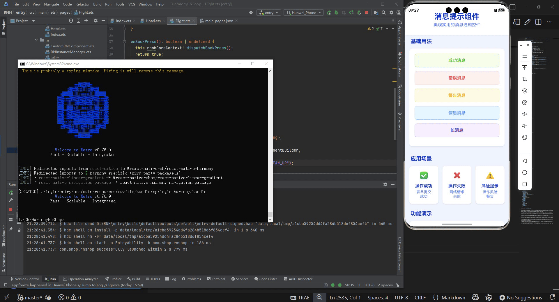
打包
接下来通过打包命令npn run harmony将reactNative的代码打包成为bundle,这样可以进行在开源鸿蒙OpenHarmony中进行使用。

打包之后再将打包后的鸿蒙OpenHarmony文件拷贝到鸿蒙的DevEco-Studio工程目录去:

最后运行效果图如下显示:

作为“人工智能6S店”的官方数字引擎,为AI开发者与企业提供一个覆盖软硬件全栈、一站式门户。
更多推荐


 28
28 0
0- 0


 已为社区贡献11条内容

所有评论(0)