
【精通篇】打造React Native鸿蒙跨平台开发高级复合组件库开发系列:Uploader 文件上传(将本地的图片或文件上传至服务器)
文章摘要:本文介绍了在华为鸿蒙系统上使用React Native实现文件上传功能的方法。提供了两种主要方案:1) 使用现成库如RNFS和react-native-fetch-blob处理文件操作和上传;2) 通过原生模块开发实现更深度的集成。文中包含详细的代码示例,演示了文件准备、上传请求构建等关键步骤。还展示了一个完整的文件上传UI组件实现,包含文件类型图标显示、上传状态指示和删除功能,支持图片
在华为鸿蒙(HarmonyOS)操作系统上进行React Native开发,涉及到文件上传功能,你可以通过使用一些现有的库或者自己封装一些原生模块来实现。鸿蒙系统是基于OpenHarmony开发的,所以大多数OpenHarmony的文件上传解决方案同样适用于鸿蒙。以下是一些步骤和技巧,帮助你在React Native项目中实现文件上传功能:
- 使用现有的React Native库
RNFS (React Native File System)
react-native-fs 是一个常用的库,可以用来处理文件系统操作,包括读取和写入文件。虽然它主要用于文件操作,但你可以用它来准备文件然后通过其他方式上传。
安装:
npm install react-native-fs
示例代码:
import RNFS from 'react-native-fs';

async function uploadFile() {
  const filePath = RNFS.DocumentDirectoryPath + '/myfile.txt';
  const fileData = 'Hello, world!';
  await RNFS.writeFile(filePath, fileData, 'utf8');

  // 然后可以使用其他库如 `react-native-fetch-blob` 或 `axios` 来上传文件
}
react-native-fetch-blob
react-native-fetch-blob 是一个强大的库,可以用来上传文件。
安装:
npm install --save react-native-fetch-blob
示例代码:
import RNFetchBlob from 'react-native-fetch-blob';

async function uploadFile() {
  const filePath = `${RNFS.DocumentDirectoryPath}/myfile.txt`;
  const fileData = 'Hello, world!';
  await RNFS.writeFile(filePath, fileData, 'utf8');

  const { dirs } = RNFetchBlob.fs;
  const uploadUrl = 'https://yourserver.com/upload'; // 你的上传URL
  RNFetchBlob.fetch('POST', uploadUrl, {
    // 'Content-Type' : 'multipart/form-data', // 可选,根据你的服务器需求设置
    'otherHeader' : 'foo', // 其他自定义头部信息
  }, [
    { name: 'myfile.txt', filename: 'myfile.txt', filepath: filePath }, // 文件信息
  ]).then((resp) => {
    console.log('Upload success', resp);
  }).catch((err) => {
    console.log('Upload error', err);
  });
}
- 使用原生模块(如果你需要更深入的集成)
如果你需要更深入的控制或者遇到库无法解决的问题,你可以创建一个原生模块。例如,你可以为OpenHarmony创建一个Java/Kotlin模块,然后在鸿蒙(HarmonyOS)上使用相同的代码。
OpenHarmony 原生模块示例:
Java/Kotlin 文件上传代码:
// 在你的 OpenHarmony 项目中,例如在某个服务或Activity中:
import okhttp3.*; // 需要添加 OkHttp 依赖到你的 build.gradle 文件中
import java.io.*; // 处理文件流等操作需要这个库
import okio.*; // OkHttp 使用的库来处理流等操作

public void uploadFile(String filePath) {
    OkHttpClient client = new OkHttpClient(); // 创建 OkHttp 客户端实例
    RequestBody requestBody = new MultipartBody.Builder() // 创建 MultipartBody 来构建请求体,用于文件上传
        .setType(MultipartBody.FORM) // 设置表单类型,你也可以使用其他类型如 MultipartBody.MIXED 等根据需要选择合适的类型。
        .addFormDataPart("file", "myfile.txt", RequestBody.create(MediaType.parse("text/plain"), new File(filePath))) // 添加文件数据部分到请求体中。这里 "file" 是后端期待的字段名,"myfile.txt" 是文件名,最后的 create 方法是用来创建 RequestBody 的实例。MediaType.parse("text/plain") 是文件的 MIME 类型,根据你的文件类型进行更改。例如图片可以是 "image/jpeg"。new File(filePath) 是文件的路径。
        .build(); // 构建请求体对象。
    Request request = new Request.Builder() // 创建请求对象。这里用的是 POST 方法。你也可以使用其他方法如 GET 等。具体取决于你的后端API设计。
        .url("https://yourserver.com/upload") // 设置请求的 URL。这里替换成你的服务器地址和上传接口。
        .post(requestBody) // 将请求体设置到请求对象中。这里用的是 POST 方法,所以用的是 post 方法。如果是 GET 方法
真实案列演示效果:
import React, { useState } from 'react';
import { View, Text, StyleSheet, ScrollView, Dimensions, TouchableOpacity, Alert, Image } from 'react-native';

// Simple Icon Component using Unicode symbols
interface IconProps {
  name: string;
  size?: number;
  color?: string;
  style?: object;
}

const Icon: React.FC<IconProps> = ({
  name,
  size = 24,
  color = '#333333',
  style
}) => {
  const getIconSymbol = () => {
    switch (name) {
      case 'upload': return '📤';
      case 'file': return '📄';
      case 'image': return '🖼️';
      case 'document': return '📑';
      case 'delete': return '🗑️';
      case 'success': return '✅';
      case 'error': return '❌';
      case 'camera': return '📷';
      case 'gallery': return '🖼️';
      case 'pdf': return '📕';
      case 'excel': return '📊';
      case 'word': return '📝';
      default: return '📎';
    }
  };

  return (
    <View style={[{ width: size, height: size, justifyContent: 'center', alignItems: 'center' }, style]}>
      <Text style={{ fontSize: size * 0.8, color, includeFontPadding: false, textAlign: 'center' }}>
        {getIconSymbol()}
      </Text>
    </View>
  );
};

// File Type Icon Component
const getFileTypeIcon = (type: string, size: number = 24) => {
  if (type.includes('image')) return <Icon name="image" size={size} color="#1890ff" />;
  if (type.includes('pdf')) return <Icon name="pdf" size={size} color="#ff4d4f" />;
  if (type.includes('sheet')) return <Icon name="excel" size={size} color="#52c41a" />;
  if (type.includes('document')) return <Icon name="word" size={size} color="#1890ff" />;
  return <Icon name="file" size={size} color="#999999" />;
};

// File Item Component
interface FileItemProps {
  file: {
    id: string;
    name: string;
    size: number;
    type: string;
    uri?: string;
    progress?: number;
    status: 'uploading' | 'success' | 'error';
  };
  onDelete: (id: string) => void;
}

const FileItem: React.FC<FileItemProps> = ({ file, onDelete }) => {
  const formatFileSize = (bytes: number) => {
    if (bytes < 1024) return bytes + ' B';
    if (bytes < 1048576) return (bytes / 1024).toFixed(1) + ' KB';
    return (bytes / 1048576).toFixed(1) + ' MB';
  };

  const getStatusColor = () => {
    switch (file.status) {
      case 'success': return '#52c41a';
      case 'error': return '#ff4d4f';
      default: return '#1890ff';
    }
  };

  const getStatusText = () => {
    switch (file.status) {
      case 'uploading': return '上传中...';
      case 'success': return '上传成功';
      case 'error': return '上传失败';
      default: return '';
    }
  };

  return (
    <View style={styles.fileItemContainer}>
      <View style={styles.fileIcon}>
        {file.uri && file.type.includes('image') ? (
          <Image source={{ uri: file.uri }} style={styles.fileThumbnail} />
        ) : (
          getFileTypeIcon(file.type, 32)
        )}
      </View>

      <View style={styles.fileInfo}>
        <Text style={styles.fileName} numberOfLines={1}>{file.name}</Text>
        <Text style={styles.fileMeta}>
          {formatFileSize(file.size)} • {file.type.split('/')[1]?.toUpperCase() || 'FILE'}
        </Text>
        <View style={styles.fileStatusContainer}>
          <Text style={[styles.fileStatus, { color: getStatusColor() }]}>
            {getStatusText()}
          </Text>
          {file.status === 'uploading' && (
            <View style={styles.progressBar}>
              <View
                style={[
                  styles.progressFill,
                  { width: `${file.progress || 0}%`, backgroundColor: getStatusColor() }
                ]}
              />
            </View>
          )}
        </View>
      </View>

      <TouchableOpacity
        style={styles.deleteButton}
        onPress={() => onDelete(file.id)}
      >
        <Icon name="delete" size={20} color="#ff4d4f" />
      </TouchableOpacity>
    </View>
  );
};

// Uploader Component
interface UploaderProps {
  onUpload: (files: any[]) => void;
  maxFiles?: number;
  accept?: string[];
  multiple?: boolean;
}

const Uploader: React.FC<UploaderProps> = ({
  onUpload,
  maxFiles = 5,
  accept = [],
  multiple = true
}) => {
  const [files, setFiles] = useState<any[]>([]);
  const [isUploading, setIsUploading] = useState(false);

  const selectFile = () => {
    if (files.length >= maxFiles) {
      Alert.alert('提示', `最多只能上传${maxFiles}个文件`);
      return;
    }

    Alert.alert(
      '选择文件',
      '请选择文件来源',
      [
        {
          text: '拍照',
          onPress: () => simulateCameraCapture()
        },
        {
          text: '从相册选择',
          onPress: () => simulateGallerySelection()
        },
        {
          text: '从文件管理器选择',
          onPress: () => simulateFileManagerSelection()
        },
        {
          text: '取消',
          style: 'cancel'
        }
      ]
    );
  };

  // Simulate file selection (in real app, you would use libraries like react-native-image-picker)
  const simulateCameraCapture = () => {
    const newFile = {
      id: Date.now().toString(),
      name: `photo_${Date.now()}.jpg`,
      size: Math.floor(Math.random() * 5000000) + 1000000,
      type: 'image/jpeg',
      uri: 'https://picsum.photos/200/200?random=' + Math.floor(Math.random() * 100),
      status: 'uploading' as const,
      progress: 0
    };

    setFiles(prev => [...prev, newFile]);
    simulateUpload(newFile.id);
  };

  const simulateGallerySelection = () => {
    const types = [
      { name: `image_${Date.now()}.png`, type: 'image/png' },
      { name: `document_${Date.now()}.pdf`, type: 'application/pdf' },
      { name: `spreadsheet_${Date.now()}.xlsx`, type: 'application/vnd.openxmlformats-officedocument.spreadsheetml.sheet' },
      { name: `report_${Date.now()}.docx`, type: 'application/vnd.openxmlformats-officedocument.wordprocessingml.document' }
    ];

    const randomType = types[Math.floor(Math.random() * types.length)];

    const newFile = {
      id: Date.now().toString(),
      name: randomType.name,
      size: Math.floor(Math.random() * 10000000) + 500000,
      type: randomType.type,
      uri: randomType.type.includes('image')
        ? 'https://picsum.photos/200/200?random=' + Math.floor(Math.random() * 100)
        : undefined,
      status: 'uploading' as const,
      progress: 0
    };

    setFiles(prev => [...prev, newFile]);
    simulateUpload(newFile.id);
  };

  const simulateFileManagerSelection = () => {
    simulateGallerySelection();
  };

  const simulateUpload = (fileId: string) => {
    const interval = setInterval(() => {
      setFiles(prev => prev.map(file => {
        if (file.id === fileId && file.status === 'uploading') {
          const newProgress = Math.min((file.progress || 0) + 10, 100);

          if (newProgress === 100) {
            clearInterval(interval);
            return { ...file, progress: 100, status: 'success' };
          }

          return { ...file, progress: newProgress };
        }
        return file;
      }));
    }, 300);
  };

  const deleteFile = (id: string) => {
    setFiles(prev => prev.filter(file => file.id !== id));
  };

  const retryUpload = (id: string) => {
    setFiles(prev => prev.map(file =>
      file.id === id ? { ...file, status: 'uploading', progress: 0 } : file
    ));
    simulateUpload(id);
  };

  return (
    <View style={styles.uploaderContainer}>
      <TouchableOpacity
        style={styles.uploadArea}
        onPress={selectFile}
        disabled={isUploading}
      >
        <Icon name="upload" size={48} color="#1890ff" />
        <Text style={styles.uploadText}>点击上传文件</Text>
        <Text style={styles.uploadHint}>
          支持 JPG、PNG、PDF、DOC 等格式
        </Text>
        <Text style={styles.uploadLimit}>
          最多可上传 {maxFiles} 个文件
        </Text>
      </TouchableOpacity>

      {files.length > 0 && (
        <View style={styles.filesContainer}>
          {files.map(file => (
            <FileItem
              key={file.id}
              file={file}
              onDelete={file.status === 'uploading' ? () => {} : deleteFile}
            />
          ))}
        </View>
      )}

      {files.some(f => f.status === 'error') && (
        <TouchableOpacity
          style={styles.retryButton}
          onPress={() => files.forEach(f => f.status === 'error' && retryUpload(f.id))}
        >
          <Text style={styles.retryButtonText}>重新上传失败文件</Text>
        </TouchableOpacity>
      )}
    </View>
  );
};

// Main App Component
const UploaderComponentApp = () => {
  const handleUpload = (files: any[]) => {
    console.log('Uploaded files:', files);
  };

  return (
    <ScrollView style={styles.container}>
      <View style={styles.header}>
        <Text style={styles.headerTitle}>文件上传组件</Text>
        <Text style={styles.headerSubtitle}>美观实用的文件上传控件</Text>
      </View>

      <View style={styles.section}>
        <Text style={styles.sectionTitle}>基础用法</Text>
        <View style={styles.uploaderSection}>
          <Uploader
            onUpload={handleUpload}
            maxFiles={5}
            multiple
          />
        </View>
      </View>

      <View style={styles.section}>
        <Text style={styles.sectionTitle}>上传说明</Text>
        <View style={styles.infoSection}>
          <View style={styles.infoItem}>
            <Icon name="file" size={20} color="#1890ff" style={styles.infoIcon} />
            <Text style={styles.infoText}>支持常见文件格式:图片、文档、表格等</Text>
          </View>

          <View style={styles.infoItem}>
            <Icon name="image" size={20} color="#52c41a" style={styles.infoIcon} />
            <Text style={styles.infoText}>图片文件支持预览显示</Text>
          </View>

          <View style={styles.infoItem}>
            <Icon name="success" size={20} color="#fa8c16" style={styles.infoIcon} />
            <Text style={styles.infoText}>上传进度实时显示</Text>
          </View>
        </View>
      </View>

      <View style={styles.section}>
        <Text style={styles.sectionTitle}>功能演示</Text>
        <View style={styles.demosContainer}>
          <View style={styles.demoItem}>
            <Icon name="upload" size={24} color="#1890ff" style={styles.demoIcon} />
            <View>
              <Text style={styles.demoTitle}>多文件上传</Text>
              <Text style={styles.demoDesc}>支持同时上传多个文件</Text>
            </View>
          </View>

          <View style={styles.demoItem}>
            <Icon name="image" size={24} color="#52c41a" style={styles.demoIcon} />
            <View>
              <Text style={styles.demoTitle}>图片预览</Text>
              <Text style={styles.demoDesc}>图片文件支持缩略图预览</Text>
            </View>
          </View>

          <View style={styles.demoItem}>
            <Icon name="success" size={24} color="#722ed1" style={styles.demoIcon} />
            <View>
              <Text style={styles.demoTitle}>状态反馈</Text>
              <Text style={styles.demoDesc}>上传进度和结果实时反馈</Text>
            </View>
          </View>
        </View>
      </View>

      <View style={styles.usageSection}>
        <Text style={styles.sectionTitle}>使用方法</Text>
        <View style={styles.codeBlock}>
          <Text style={styles.codeText}>{'<Uploader'}</Text>
          <Text style={styles.codeText}>  onUpload={'{handleUpload}'}</Text>
          <Text style={styles.codeText}>  maxFiles={'{5}'}</Text>
          <Text style={styles.codeText}>  multiple{'\n'}/></Text>
        </View>
        <Text style={styles.description}>
          Uploader组件提供了完整的文件上传功能,包括文件选择、上传进度、状态反馈等。
          通过onUpload处理上传完成事件,支持自定义文件数量限制和文件类型。
        </Text>
      </View>

      <View style={styles.featuresSection}>
        <Text style={styles.sectionTitle}>功能特性</Text>
        <View style={styles.featuresList}>
          <View style={styles.featureItem}>
            <Icon name="upload" size={20} color="#1890ff" style={styles.featureIcon} />
            <Text style={styles.featureText}>多文件上传</Text>
          </View>
          <View style={styles.featureItem}>
            <Icon name="image" size={20} color="#52c41a" style={styles.featureIcon} />
            <Text style={styles.featureText}>图片预览</Text>
          </View>
          <View style={styles.featureItem}>
            <Icon name="success" size={20} color="#722ed1" style={styles.featureIcon} />
            <Text style={styles.featureText}>进度反馈</Text>
          </View>
          <View style={styles.featureItem}>
            <Icon name="file" size={20} color="#fa8c16" style={styles.featureIcon} />
            <Text style={styles.featureText}>格式支持</Text>
          </View>
        </View>
      </View>

      <View style={styles.footer}>
        <Text style={styles.footerText}>© 2023 文件上传组件 | 现代化UI组件库</Text>
      </View>
    </ScrollView>
  );
};

const { width } = Dimensions.get('window');

const styles = StyleSheet.create({
  container: {
    flex: 1,
    backgroundColor: '#ffffff',
  },
  header: {
    backgroundColor: '#f0f5ff',
    paddingVertical: 30,
    paddingHorizontal: 20,
    marginBottom: 10,
    borderBottomWidth: 1,
    borderBottomColor: '#e1ebff',
  },
  headerTitle: {
    fontSize: 28,
    fontWeight: '700',
    color: '#1d39c4',
    textAlign: 'center',
    marginBottom: 5,
  },
  headerSubtitle: {
    fontSize: 16,
    color: '#597ef7',
    textAlign: 'center',
  },
  section: {
    marginBottom: 25,
  },
  sectionTitle: {
    fontSize: 20,
    fontWeight: '700',
    color: '#1d39c4',
    paddingHorizontal: 20,
    paddingBottom: 15,
  },
  uploaderSection: {
    backgroundColor: '#ffffff',
    marginHorizontal: 15,
    borderRadius: 12,
    padding: 20,
    elevation: 3,
    shadowColor: '#000',
    shadowOffset: { width: 0, height: 2 },
    shadowOpacity: 0.08,
    shadowRadius: 4,
  },
  infoSection: {
    backgroundColor: '#ffffff',
    marginHorizontal: 15,
    borderRadius: 12,
    padding: 20,
    elevation: 3,
    shadowColor: '#000',
    shadowOffset: { width: 0, height: 2 },
    shadowOpacity: 0.08,
    shadowRadius: 4,
  },
  infoItem: {
    flexDirection: 'row',
    alignItems: 'center',
    marginBottom: 15,
  },
  infoItemLast: {
    marginBottom: 0,
  },
  infoIcon: {
    marginRight: 15,
  },
  infoText: {
    fontSize: 15,
    color: '#595959',
    flex: 1,
  },
  demosContainer: {
    backgroundColor: '#ffffff',
    marginHorizontal: 15,
    borderRadius: 15,
    padding: 20,
    elevation: 3,
    shadowColor: '#000',
    shadowOffset: { width: 0, height: 2 },
    shadowOpacity: 0.08,
    shadowRadius: 4,
  },
  demoItem: {
    flexDirection: 'row',
    alignItems: 'center',
    marginBottom: 20,
  },
  demoItemLast: {
    marginBottom: 0,
  },
  demoIcon: {
    marginRight: 15,
  },
  demoTitle: {
    fontSize: 16,
    fontWeight: '600',
    color: '#262626',
    marginBottom: 3,
  },
  demoDesc: {
    fontSize: 14,
    color: '#8c8c8c',
  },
  usageSection: {
    backgroundColor: '#ffffff',
    marginHorizontal: 15,
    borderRadius: 15,
    padding: 20,
    marginBottom: 20,
    elevation: 3,
    shadowColor: '#000',
    shadowOffset: { width: 0, height: 2 },
    shadowOpacity: 0.08,
    shadowRadius: 4,
  },
  codeBlock: {
    backgroundColor: '#1d2b57',
    borderRadius: 8,
    padding: 15,
    marginBottom: 15,
  },
  codeText: {
    fontFamily: 'monospace',
    color: '#c9d1d9',
    fontSize: 14,
    lineHeight: 22,
  },
  description: {
    fontSize: 15,
    color: '#595959',
    lineHeight: 22,
  },
  featuresSection: {
    backgroundColor: '#ffffff',
    marginHorizontal: 15,
    borderRadius: 15,
    padding: 20,
    marginBottom: 20,
    elevation: 3,
    shadowColor: '#000',
    shadowOffset: { width: 0, height: 2 },
    shadowOpacity: 0.08,
    shadowRadius: 4,
  },
  featuresList: {
    paddingLeft: 10,
  },
  featureItem: {
    flexDirection: 'row',
    alignItems: 'center',
    marginBottom: 15,
  },
  featureIcon: {
    marginRight: 15,
  },
  featureText: {
    fontSize: 16,
    color: '#262626',
  },
  footer: {
    paddingVertical: 20,
    alignItems: 'center',
  },
  footerText: {
    color: '#bfbfbf',
    fontSize: 14,
  },
  // Uploader Styles
  uploaderContainer: {
    marginBottom: 15,
  },
  uploadArea: {
    borderWidth: 2,
    borderStyle: 'dashed',
    borderColor: '#91caff',
    borderRadius: 12,
    padding: 30,
    alignItems: 'center',
    backgroundColor: '#f0faff',
  },
  uploadText: {
    fontSize: 18,
    fontWeight: '600',
    color: '#1d39c4',
    marginTop: 15,
    marginBottom: 10,
  },
  uploadHint: {
    fontSize: 14,
    color: '#597ef7',
    marginBottom: 5,
  },
  uploadLimit: {
    fontSize: 13,
    color: '#8c8c8c',
  },
  filesContainer: {
    marginTop: 20,
  },
  fileItemContainer: {
    flexDirection: 'row',
    alignItems: 'center',
    padding: 15,
    backgroundColor: '#fafafa',
    borderRadius: 8,
    marginBottom: 10,
    borderWidth: 1,
    borderColor: '#f0f0f0',
  },
  fileIcon: {
    marginRight: 15,
  },
  fileThumbnail: {
    width: 40,
    height: 40,
    borderRadius: 4,
  },
  fileInfo: {
    flex: 1,
  },
  fileName: {
    fontSize: 16,
    fontWeight: '500',
    color: '#262626',
    marginBottom: 3,
  },
  fileMeta: {
    fontSize: 13,
    color: '#8c8c8c',
    marginBottom: 5,
  },
  fileStatusContainer: {
    flexDirection: 'column',
  },
  fileStatus: {
    fontSize: 13,
    fontWeight: '500',
  },
  progressBar: {
    height: 4,
    backgroundColor: '#f0f0f0',
    borderRadius: 2,
    marginTop: 5,
    overflow: 'hidden',
  },
  progressFill: {
    height: '100%',
    borderRadius: 2,
  },
  deleteButton: {
    padding: 5,
  },
  retryButton: {
    backgroundColor: '#1890ff',
    borderRadius: 6,
    paddingVertical: 12,
    alignItems: 'center',
    marginTop: 15,
  },
  retryButtonText: {
    color: '#ffffff',
    fontSize: 16,
    fontWeight: '500',
  },
});

export default UploaderComponentApp;
从鸿蒙ArkUI开发角度分析,这段React Native文件上传组件的逻辑体现了鸿蒙分布式文件管理系统的设计理念。Icon组件通过Unicode符号映射实现图标显示,这与鸿蒙的Symbol组件设计思路一致,但鸿蒙提供了更完善的图标资源管理机制,可以通过$r(‘app.media.icon_name’)直接引用资源文件。
FileItem组件在鸿蒙中对应着List组件的项渲染,通过@Builder装饰器构建每个文件项的UI布局。文件类型识别逻辑通过getFileTypeIcon函数实现,基于MIME类型匹配对应图标,这与鸿蒙的文件类型关联机制相似。鸿蒙通过FileExtension枚举定义文件类型,支持更精确的类型匹配。
状态管理方面,文件的上传状态(uploading/success/error)通过@State装饰器管理,当状态变更时自动触发UI更新。进度条显示逻辑对应鸿蒙的Progress组件,通过value属性绑定上传进度数值。图片缩略图展示使用鸿蒙的Image组件,支持本地和网络图片的异步加载和缓存。
Uploader组件的文件选择逻辑在鸿蒙中通过@ohos.file.picker模块实现,支持相机拍照、相册选择和文件管理器三种来源。这与代码中的Alert选择器功能对应,但鸿蒙提供了更完整的文件选择API。最大文件数限制通过maxFiles参数控制,这与鸿蒙Picker的maxSelectNumber配置一致。
文件删除操作在鸿蒙中通过@ohos.file.fs模块的删除接口实现,需要申请相应的文件访问权限。鸿蒙的安全机制要求在使用文件操作前必须通过requestPermissionsFromUser申请权限。
组件通信采用回调函数模式,onUpload和onDelete对应鸿蒙的自定义事件机制,通过CustomDialogController管理弹窗交互。文件大小格式化函数在鸿蒙中可以通过@ohos.i18n的国际化能力实现更友好的显示。
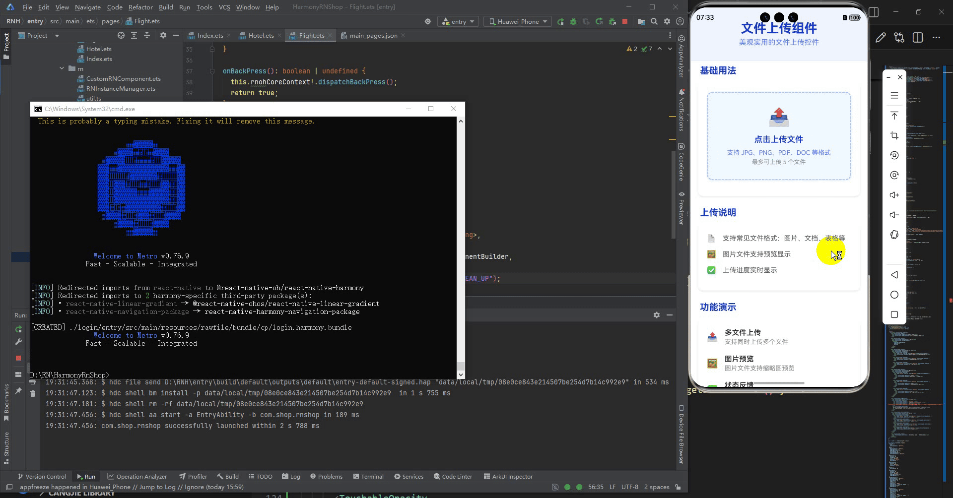
打包
接下来通过打包命令npn run harmony将reactNative的代码打包成为bundle,这样可以进行在开源鸿蒙OpenHarmony中进行使用。

打包之后再将打包后的鸿蒙OpenHarmony文件拷贝到鸿蒙的DevEco-Studio工程目录去:

最后运行效果图如下显示:

作为“人工智能6S店”的官方数字引擎,为AI开发者与企业提供一个覆盖软硬件全栈、一站式门户。
更多推荐


 15
15 0
0- 0


 已为社区贡献11条内容

所有评论(0)