
【精通篇】打造React Native鸿蒙跨平台开发高级复合组件库开发系列:Layout 布局(row 和 col 两个组件来进行行列布)
本文介绍了在React Native中实现类似鸿蒙系统布局的三种方法:1)使用原生Flexbox布局,通过flexDirection等属性控制行列排列;2)采用第三方库如react-native-flex-grid实现网格布局;3)自定义Grid组件进行精细化控制。文中提供了完整的代码示例,包括基础Flexbox实现、第三方库应用以及自定义网格组件的开发方法。此外,还演示了包含图标组件、行列组件的
在鸿蒙(HarmonyOS)的布局设计中,鸿蒙系统使用的是类似于Android Jetpack的CompositionLayout,这是一种基于XML的布局方式,类似于Flexbox的布局方式,但不完全兼容。如果你想在React Native中实现类似鸿蒙的布局方式,你可以使用一些第三方库或者自定义组件来实现。
方法1:使用Flexbox布局
React Native原生支持Flexbox布局,这是实现行列布局的一个非常强大的工具。你可以使用<View>组件和style属性中的flexDirection、justifyContent、alignItems等属性来控制布局。
示例代码:
import React from 'react';
import { View, Text, StyleSheet } from 'react-native';

const App = () => {
  return (
    <View style={styles.container}>
      <View style={styles.row}>
        <View style={styles.col}>
          <Text>Column 1</Text>
        </View>
        <View style={styles.col}>
          <Text>Column 2</Text>
        </View>
      </View>
      <View style={styles.row}>
        <View style={styles.col}>
          <Text>Column 3</Text>
        </View>
        <View style={styles.col}>
          <Text>Column 4</Text>
        </View>
      </View>
    </View>
  );
};

const styles = StyleSheet.create({
  container: {
    flex: 1,
  },
  row: {
    flexDirection: 'row', // 水平方向排列子元素
  },
  col: {
    flex: 1, // 每个列平分剩余空间
    justifyContent: 'center', // 垂直居中内容
    alignItems: 'center', // 水平居中内容
    margin: 10, // 外边距
  },
});

export default App;
方法2:使用第三方库如react-native-grid-component或react-native-flex-grid
这些库提供了更接近于鸿蒙的Grid布局方式,允许你更灵活地控制行列布局。例如,react-native-flex-grid库:
安装库:
npm install react-native-flex-grid --save
使用示例:
import React from 'react';
import { Container, Row, Col } from 'react-native-flex-grid';
import { Text } from 'react-native';

const App = () => {
  return (
    <Container>
      <Row>
        <Col>
          <Text>Column 1</Text>
        </Col>
        <Col>
          <Text>Column 2</Text>
        </Col>
      </Row>
      <Row>
        <Col>
          <Text>Column 3</Text>
        </Col>
        <Col>
          <Text>Column 4</Text>
        </Col>
      </Row>
    </Container>
  );
};

export default App;
方法3:自定义组件实现Grid布局
如果你需要完全自定义或者更精细的控制,你可以自己实现一个Grid布局组件。这通常涉及到计算每个单元格的宽度和高度,并动态地渲染它们。例如:
import React from 'react';
import { View, Text, StyleSheet } from 'react-native';
import { Dimensions } from 'react-native'; // 获取屏幕尺寸以计算列宽等。

const Grid = ({ children }) => {
  const numColumns = 2; // 假设有两列,可根据需要调整。
  const width = Dimensions.get('window').width / numColumns; // 计算每列宽度。
  return (
    <View style={styles.container}>
      {React.Children.map(children, (child, index) => (
        <View key={index} style={[styles.col, { width }]}>
          {child} // 渲染子元素。每个子元素都应该是一个Col组件。
        </View>
      ))}
    </View>
  );
};
```然后在你的应用中使用它:
```jsx
const App = () => {
  return (
    <Grid>
      <Text>Column 1</Text> // 这些将是Grid的子元素。每个都应该占据一列。如果有更多列则继续添加。
组件真实实际案例演示:
import React, { useState } from 'react';
import { View, Text, StyleSheet, TouchableOpacity, ScrollView, Dimensions } from 'react-native';

// Simple Icon Component using Unicode symbols
interface IconProps {
  name: string;
  size?: number;
  color?: string;
  style?: object;
}

const Icon: React.FC<IconProps> = ({
  name,
  size = 24,
  color = '#333333',
  style
}) => {
  const getIconSymbol = () => {
    switch (name) {
      case 'layout': return '⚏';
      case 'grid': return '⊞';
      case 'flex': return '⥊';
      case 'align': return '⇳';
      case 'justify': return '⇔';
      default: return '●';
    }
  };

  return (
    <View style={[{ width: size, height: size, justifyContent: 'center', alignItems: 'center' }, style]}>
      <Text style={{ fontSize: size * 0.8, color, includeFontPadding: false, textAlign: 'center' }}>
        {getIconSymbol()}
      </Text>
    </View>
  );
};

// Row Component
interface RowProps {
  children: React.ReactNode;
  gutter?: number;
  align?: 'flex-start' | 'center' | 'flex-end' | 'stretch';
  justify?: 'flex-start' | 'center' | 'flex-end' | 'space-between' | 'space-around';
  style?: object;
}

const Row: React.FC<RowProps> = ({
  children,
  gutter = 0,
  align = 'flex-start',
  justify = 'flex-start',
  style
}) => {
  return (
    <View
      style={[
        styles.row,
        {
          marginHorizontal: -gutter / 2,
          alignItems: align,
          justifyContent: justify,
        },
        style
      ]}
    >
      {React.Children.map(children, (child) => {
        if (React.isValidElement(child)) {
          return React.cloneElement(child, {
            style: [
              child.props.style,
              {
                marginHorizontal: gutter / 2
              }
            ]
          });
        }
        return child;
      })}
    </View>
  );
};

// Col Component
interface ColProps {
  children: React.ReactNode;
  span?: number;
  offset?: number;
  style?: object;
}

const Col: React.FC<ColProps> = ({
  children,
  span = 24,
  offset = 0,
  style
}) => {
  const percentage = (span / 24) * 100;
  const offsetPercentage = (offset / 24) * 100;

  return (
    <View
      style={[
        styles.col,
        {
          width: `${percentage}%`,
          marginLeft: `${offsetPercentage}%`,
        },
        style
      ]}
    >
      {children}
    </View>
  );
};

// Layout Example Data
const layoutExamples = [
  { id: 1, title: '基础栅格', description: '24栅格系统' },
  { id: 2, title: '间隔布局', description: '带间距的Row' },
  { id: 3, title: '对齐方式', description: '垂直居中对齐' },
  { id: 4, title: '偏移布局', description: '列偏移效果' },
];

// Layout Showcase Component
const LayoutExample: React.FC<{
  title: string;
  description: string;
  children: React.ReactNode;
}> = ({ title, description, children }) => {
  return (
    <View style={styles.exampleContainer}>
      <Text style={styles.exampleTitle}>{title}</Text>
      <Text style={styles.exampleDescription}>{description}</Text>
      <View style={styles.exampleContent}>
        {children}
      </View>
    </View>
  );
};

// Main App Component
const LayoutComponentApp = () => {
  const [selectedExample, setSelectedExample] = useState<number>(1);

  return (
    <ScrollView style={styles.container}>
      <View style={styles.header}>
        <Text style={styles.headerTitle}>栅格布局组件</Text>
        <Text style={styles.headerSubtitle}>基于Flexbox的响应式布局系统</Text>
      </View>

      <View style={styles.section}>
        <Text style={styles.sectionTitle}>组件介绍</Text>
        <View style={styles.componentsInfo}>
          <View style={styles.componentCard}>
            <View style={styles.iconWrapper}>
              <Icon name="layout" size={32} color="#4361ee" />
            </View>
            <Text style={styles.componentName}>Row</Text>
            <Text style={styles.componentDesc}>水平排列容器</Text>
          </View>

          <View style={styles.componentCard}>
            <View style={styles.iconWrapper}>
              <Icon name="grid" size={32} color="#4cc9f0" />
            </View>
            <Text style={styles.componentName}>Col</Text>
            <Text style={styles.componentDesc}>栅格列容器</Text>
          </View>
        </View>
      </View>

      <View style={styles.section}>
        <Text style={styles.sectionTitle}>布局示例</Text>
        <View style={styles.examplesContainer}>
          {layoutExamples.map((example) => (
            <TouchableOpacity
              key={example.id}
              style={[
                styles.exampleTab,
                selectedExample === example.id && styles.selectedExampleTab
              ]}
              onPress={() => setSelectedExample(example.id)}
            >
              <Text style={[
                styles.exampleTabText,
                selectedExample === example.id && styles.selectedExampleTabText
              ]}>
                {example.title}
              </Text>
            </TouchableOpacity>
          ))}
        </View>

        {selectedExample === 1 && (
          <LayoutExample
            title="基础栅格"
            description="使用24栅格系统的布局"
          >
            <Row gutter={10}>
              <Col span={8}>
                <View style={[styles.demoBox, { backgroundColor: '#4361ee' }]}>
                  <Text style={styles.boxText}>span=8</Text>
                </View>
              </Col>
              <Col span={8}>
                <View style={[styles.demoBox, { backgroundColor: '#3a0ca3' }]}>
                  <Text style={styles.boxText}>span=8</Text>
                </View>
              </Col>
              <Col span={8}>
                <View style={[styles.demoBox, { backgroundColor: '#7209b7' }]}>
                  <Text style={styles.boxText}>span=8</Text>
                </View>
              </Col>
            </Row>

            <Row gutter={10} style={{ marginTop: 10 }}>
              <Col span={12}>
                <View style={[styles.demoBox, { backgroundColor: '#f72585' }]}>
                  <Text style={styles.boxText}>span=12</Text>
                </View>
              </Col>
              <Col span={12}>
                <View style={[styles.demoBox, { backgroundColor: '#b5179e' }]}>
                  <Text style={styles.boxText}>span=12</Text>
                </View>
              </Col>
            </Row>
          </LayoutExample>
        )}

        {selectedExample === 2 && (
          <LayoutExample
            title="间隔布局"
            description="带有间距的栅格布局"
          >
            <Row gutter={15}>
              <Col span={6}>
                <View style={[styles.demoBox, { backgroundColor: '#4cc9f0' }]}>
                  <Text style={styles.boxText}>gutter=15</Text>
                </View>
              </Col>
              <Col span={6}>
                <View style={[styles.demoBox, { backgroundColor: '#4895ef' }]}>
                  <Text style={styles.boxText}>gutter=15</Text>
                </View>
              </Col>
              <Col span={6}>
                <View style={[styles.demoBox, { backgroundColor: '#4361ee' }]}>
                  <Text style={styles.boxText}>gutter=15</Text>
                </View>
              </Col>
              <Col span={6}>
                <View style={[styles.demoBox, { backgroundColor: '#3a0ca3' }]}>
                  <Text style={styles.boxText}>gutter=15</Text>
                </View>
              </Col>
            </Row>
          </LayoutExample>
        )}

        {selectedExample === 3 && (
          <LayoutExample
            title="对齐方式"
            description="不同的对齐选项"
          >
            <Row gutter={10} align="center">
              <Col span={6}>
                <View style={[styles.demoBox, { backgroundColor: '#f72585', height: 60 }]}>
                  <Text style={styles.boxText}>高60</Text>
                </View>
              </Col>
              <Col span={6}>
                <View style={[styles.demoBox, { backgroundColor: '#b5179e', height: 80 }]}>
                  <Text style={styles.boxText}>高80</Text>
                </View>
              </Col>
              <Col span={6}>
                <View style={[styles.demoBox, { backgroundColor: '#7209b7', height: 100 }]}>
                  <Text style={styles.boxText}>高100</Text>
                </View>
              </Col>
              <Col span={6}>
                <View style={[styles.demoBox, { backgroundColor: '#560bad', height: 70 }]}>
                  <Text style={styles.boxText}>高70</Text>
                </View>
              </Col>
            </Row>
          </LayoutExample>
        )}

        {selectedExample === 4 && (
          <LayoutExample
            title="偏移布局"
            description="列偏移效果"
          >
            <Row gutter={10}>
              <Col span={6}>
                <View style={[styles.demoBox, { backgroundColor: '#4cc9f0' }]}>
                  <Text style={styles.boxText}>span=6</Text>
                </View>
              </Col>
              <Col span={6} offset={6}>
                <View style={[styles.demoBox, { backgroundColor: '#4895ef' }]}>
                  <Text style={styles.boxText}>span=6 offset=6</Text>
                </View>
              </Col>
            </Row>

            <Row gutter={10} style={{ marginTop: 10 }}>
              <Col span={8} offset={4}>
                <View style={[styles.demoBox, { backgroundColor: '#4361ee' }]}>
                  <Text style={styles.boxText}>span=8 offset=4</Text>
                </View>
              </Col>
              <Col span={8} offset={4}>
                <View style={[styles.demoBox, { backgroundColor: '#3a0ca3' }]}>
                  <Text style={styles.boxText}>span=8 offset=4</Text>
                </View>
              </Col>
            </Row>
          </LayoutExample>
        )}
      </View>

      <View style={styles.usageSection}>
        <Text style={styles.sectionTitle}>使用方法</Text>
        <View style={styles.codeBlock}>
          <Text style={styles.codeText}>{'<Row gutter={10}>'}</Text>
          <Text style={styles.codeText}>  {'<Col span={12}>内容</Col>'}</Text>
          <Text style={styles.codeText}>  {'<Col span={12}>内容</Col>'}</Text>
          <Text style={styles.codeText}>{'</Row>'}</Text>
        </View>
        <Text style={styles.description}>
          Row组件用于创建水平布局容器,Col组件用于创建栅格列。通过gutter属性设置间距,
          通过span属性设置列宽度(总共24份),通过offset属性设置列偏移。
        </Text>
      </View>

      <View style={styles.featuresSection}>
        <Text style={styles.sectionTitle}>功能特性</Text>
        <View style={styles.featuresList}>
          <View style={styles.featureItem}>
            <Icon name="flex" size={20} color="#4361ee" style={styles.featureIcon} />
            <Text style={styles.featureText}>基于Flexbox布局</Text>
          </View>
          <View style={styles.featureItem}>
            <Icon name="align" size={20} color="#4cc9f0" style={styles.featureIcon} />
            <Text style={styles.featureText}>灵活的对齐选项</Text>
          </View>
          <View style={styles.featureItem}>
            <Icon name="justify" size={20} color="#f72585" style={styles.featureIcon} />
            <Text style={styles.featureText}>多种排列方式</Text>
          </View>
          <View style={styles.featureItem}>
            <Icon name="grid" size={20} color="#7209b7" style={styles.featureIcon} />
            <Text style={styles.featureText}>24栅格系统</Text>
          </View>
        </View>
      </View>

      <View style={styles.footer}>
        <Text style={styles.footerText}>© 2023 栅格布局组件 | 响应式布局解决方案</Text>
      </View>
    </ScrollView>
  );
};

const { width } = Dimensions.get('window');

const styles = StyleSheet.create({
  container: {
    flex: 1,
    backgroundColor: '#f8f9fa',
  },
  header: {
    backgroundColor: '#ffffff',
    paddingVertical: 30,
    paddingHorizontal: 20,
    marginBottom: 10,
    borderBottomWidth: 1,
    borderBottomColor: '#e9ecef',
  },
  headerTitle: {
    fontSize: 28,
    fontWeight: '700',
    color: '#212529',
    textAlign: 'center',
    marginBottom: 5,
  },
  headerSubtitle: {
    fontSize: 16,
    color: '#6c757d',
    textAlign: 'center',
  },
  section: {
    marginBottom: 20,
  },
  sectionTitle: {
    fontSize: 20,
    fontWeight: '700',
    color: '#212529',
    paddingHorizontal: 20,
    paddingBottom: 15,
  },
  componentsInfo: {
    flexDirection: 'row',
    justifyContent: 'space-around',
    paddingHorizontal: 15,
  },
  componentCard: {
    backgroundColor: '#ffffff',
    borderRadius: 15,
    padding: 20,
    width: (width - 60) / 2,
    alignItems: 'center',
    elevation: 3,
    shadowColor: '#000',
    shadowOffset: { width: 0, height: 2 },
    shadowOpacity: 0.08,
    shadowRadius: 4,
  },
  iconWrapper: {
    width: 60,
    height: 60,
    borderRadius: 30,
    backgroundColor: '#f1f3f5',
    justifyContent: 'center',
    alignItems: 'center',
    marginBottom: 15,
  },
  componentName: {
    fontSize: 18,
    fontWeight: '700',
    color: '#212529',
    marginBottom: 5,
  },
  componentDesc: {
    fontSize: 14,
    color: '#6c757d',
    textAlign: 'center',
  },
  examplesContainer: {
    flexDirection: 'row',
    paddingHorizontal: 15,
    marginBottom: 15,
  },
  exampleTab: {
    flex: 1,
    paddingVertical: 12,
    backgroundColor: '#e9ecef',
    marginHorizontal: 5,
    borderRadius: 10,
    alignItems: 'center',
  },
  selectedExampleTab: {
    backgroundColor: '#4361ee',
  },
  exampleTabText: {
    fontSize: 14,
    fontWeight: '600',
    color: '#495057',
  },
  selectedExampleTabText: {
    color: '#ffffff',
  },
  exampleContainer: {
    backgroundColor: '#ffffff',
    marginHorizontal: 15,
    borderRadius: 15,
    padding: 20,
    marginBottom: 20,
    elevation: 3,
    shadowColor: '#000',
    shadowOffset: { width: 0, height: 2 },
    shadowOpacity: 0.08,
    shadowRadius: 4,
  },
  exampleTitle: {
    fontSize: 18,
    fontWeight: '700',
    color: '#212529',
    marginBottom: 5,
  },
  exampleDescription: {
    fontSize: 14,
    color: '#6c757d',
    marginBottom: 15,
  },
  exampleContent: {
    padding: 10,
  },
  row: {
    flexDirection: 'row',
    flexWrap: 'wrap',
  },
  col: {
    flexDirection: 'column',
  },
  demoBox: {
    padding: 15,
    borderRadius: 8,
    minHeight: 50,
    justifyContent: 'center',
    alignItems: 'center',
  },
  boxText: {
    color: '#ffffff',
    fontWeight: '600',
    textAlign: 'center',
  },
  usageSection: {
    backgroundColor: '#ffffff',
    marginHorizontal: 15,
    borderRadius: 15,
    padding: 20,
    marginBottom: 20,
    elevation: 3,
    shadowColor: '#000',
    shadowOffset: { width: 0, height: 2 },
    shadowOpacity: 0.08,
    shadowRadius: 4,
  },
  codeBlock: {
    backgroundColor: '#2b3541',
    borderRadius: 8,
    padding: 15,
    marginBottom: 15,
  },
  codeText: {
    fontFamily: 'monospace',
    color: '#e9ecef',
    fontSize: 14,
    lineHeight: 22,
  },
  description: {
    fontSize: 15,
    color: '#495057',
    lineHeight: 22,
  },
  featuresSection: {
    backgroundColor: '#ffffff',
    marginHorizontal: 15,
    borderRadius: 15,
    padding: 20,
    marginBottom: 20,
    elevation: 3,
    shadowColor: '#000',
    shadowOffset: { width: 0, height: 2 },
    shadowOpacity: 0.08,
    shadowRadius: 4,
  },
  featuresList: {
    paddingLeft: 10,
  },
  featureItem: {
    flexDirection: 'row',
    alignItems: 'center',
    marginBottom: 15,
  },
  featureIcon: {
    marginRight: 15,
  },
  featureText: {
    fontSize: 16,
    color: '#212529',
  },
  footer: {
    paddingVertical: 20,
    alignItems: 'center',
  },
  footerText: {
    color: '#6c757d',
    fontSize: 14,
  },
});

export default LayoutComponentApp;
这段React Native代码实现了一个完整的栅格布局系统,其架构设计基于Flexbox布局模型,构建了一个响应式的24栅格布局解决方案。整个系统由多个高度专业化的组件构成,每个组件都承担着特定的布局职责。
图标组件设计原理
Icon组件采用了Unicode符号的渲染策略,这种设计避免了图片资源的依赖,提供了极致的性能优化。组件通过TypeScript接口定义了严格的属性约束,包括图标名称、尺寸、颜色和自定义样式。这种类型约束确保了组件使用的可靠性,防止了运行时错误的发生。
图标符号的映射机制通过getIconSymbol函数实现,该函数采用switch-case条件判断来匹配不同的图标名称。布局图标使用"⚏"符号,栅格图标使用"⊞"符号,弹性布局图标使用"⥊"符号,对齐图标使用"⇳"符号,两端对齐图标使用"⇔"符号,默认情况下使用"●"作为通用图标。这种符号选择体现了语义化设计原则,使得图标能够直观地传达其功能含义。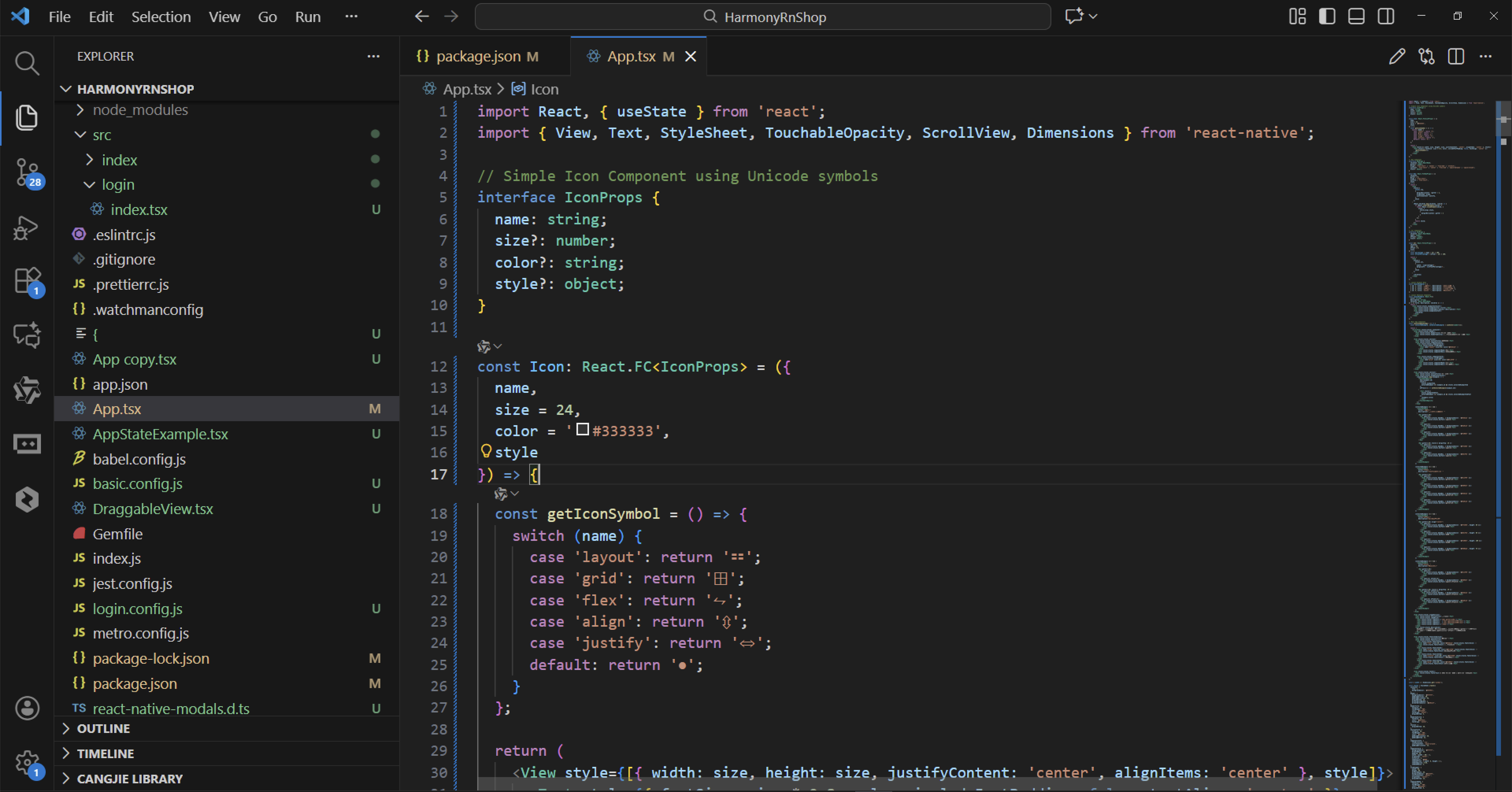
行容器组件架构
Row组件作为水平排列容器,其设计哲学建立在负边距补偿技术上。通过marginHorizontal: -gutter / 2的设置,抵消了列间距对整体布局的影响。这种设计确保了栅格系统的精确对齐和间距控制。
组件的对齐系统支持多种垂直对齐方式,包括flex-start、center、flex-end和stretch,这些选项覆盖了Flexbox布局中常见的对齐需求。水平方向的对齐支持包括flex-start、center、flex-end、space-between和space-around,这种全面的对齐支持使得布局系统具有极高的灵活性。
列容器组件实现
Col组件实现了经典的24栅格系统,这种设计源于Ant Design等成熟UI框架的布局理念。每个列都可以定义span属性来指定占据的栅格数量,offset属性用于实现列的偏移效果。这种栅格系统的设计使得布局可以实现精确的百分比控制。
布局示例数据模型
系统通过layoutExamples数组定义了四种核心布局场景。基础栅格示例展示了标准的24栅格系统的工作原理,间隔布局示例演示了带间距的Row容器的实现方式,对齐方式示例重点展示垂直居中对齐的效果,偏移布局示例则体现了列偏移的视觉效果。
示例展示组件结构
LayoutExample组件作为布局示例的展示容器,其设计采用了清晰的层次结构。标题使用突出的字体样式,描述文本提供详细的说明信息,内容区域承载具体的布局演示。
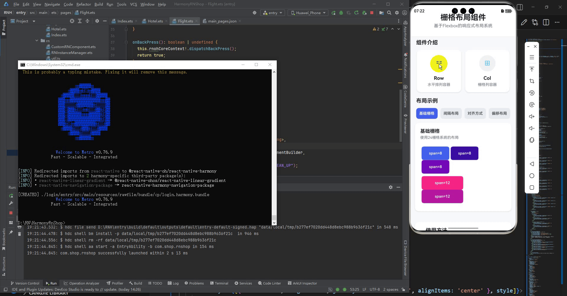
打包
接下来通过打包命令npn run harmony将reactNative的代码打包成为bundle,这样可以进行在开源鸿蒙OpenHarmony中进行使用。

打包之后再将打包后的鸿蒙OpenHarmony文件拷贝到鸿蒙的DevEco-Studio工程目录去:

最后运行效果图如下显示:

作为“人工智能6S店”的官方数字引擎,为AI开发者与企业提供一个覆盖软硬件全栈、一站式门户。
更多推荐


 14
14 0
0- 0


 已为社区贡献5条内容

所有评论(0)