
【精通篇】打造React Native鸿蒙跨平台开发高级复合组件库开发系列:Toast 轻提示(弹出黑色半透明提示)
摘要 本文介绍了在鸿蒙OS中使用React Native实现Toast提示的两种方法:一是通过react-native-root-toast第三方库快速实现跨平台Toast功能,支持自定义显示时长和位置;二是详细讲解了如何自主开发一个带动画效果的Toast组件,包含透明度渐变和位置动画,支持多种消息类型和自定义样式。文章提供了完整的组件代码示例,涵盖状态管理、动画效果和样式配置,特别针对鸿蒙OS与
在鸿蒙操作系统(HarmonyOS)中使用 React Native 开发应用时,如果你想实现类似于 Android 原生中的 Toast 轻提示功能,你可以通过使用第三方库或者自己封装一个组件来实现。鸿蒙 OS 基于 Android,因此在很多方面与 Android 兼容,但也有一些细微的差别。
方法 1:使用第三方库
一个常用的第三方库是 react-native-root-toast,这是一个可以跨平台的 Toast 提示库,支持 React Native 和其他一些平台。
-
安装库
在你的 React Native 项目中,通过 npm 或 yarn 安装
react-native-root-toast:npm install react-native-root-toast 或者 yarn add react-native-root-toast -
使用 Toast
在你的组件中引入并使用 Toast:
import Toast from 'react-native-root-toast';

const showToast = () => {
  Toast.show('这是一个 Toast 消息!', {
    duration: Toast.durations.SHORT, // 或者 Toast.durations.LONG
    position: Toast.positions.BOTTOM, // 底部弹出,还有其他位置如顶部等
  });
};
方法 2:自定义 Toast 组件
如果你希望更灵活地控制 Toast 的样式或功能,你可以自己实现一个 Toast 组件。以下是一个简单的自定义 Toast 组件示例:
-
创建 Toast 组件
在项目中创建一个新的文件,例如
Toast.js:import React from 'react'; import { View, Text, StyleSheet, Animated, Easing } from 'react-native'; class Toast extends React.Component { state = { fadeAnim: new Animated.Value(0), // 透明度动画值 }; componentDidMount() { this.fadeIn(); setTimeout(() => this.fadeOut(), this.props.duration || 3000); // 默认3秒后淡出 } fadeIn = () => { Animated.timing(this.state.fadeAnim, { toValue: 1, duration: 300, easing: Easing.linear, useNativeDriver: true, // 如果要使用原生动画驱动,需要设置为 true }).start(); }; fadeOut = () => { Animated.timing(this.state.fadeAnim, { toValue: 0, duration: 300, easing: Easing.linear, useNativeDriver: true, // 如果要使用原生动画驱动,需要设置为 true }).start(() => this.props.onClose && this.props.onClose()); // 动画结束时调用 onClose 回调函数(如果有的话) }; render() { const { textStyle, containerStyle } = this.props; return ( <Animated.View style={[styles.container, { opacity: this.state.fadeAnim }, containerStyle]}> <Text style={[styles.text, textStyle]}>{this.props.message}</Text> </Animated.View> ); } } const styles = StyleSheet.create({ container: { position: 'absolute', bottom: 50, // 可以根据需要调整位置和样式 left: 0, right: 0, alignItems: 'center', justifyContent: 'center', }, text: { backgroundColor: 'black', // 根据需要调整背景颜色和样式等 padding: 10, borderRadius: 5, color: 'white', // 文字颜色,可根据需要调整为白色或其他颜色以增加可读性 }, });使用这个组件时,你可以这样调用:
<Toast message="这是自定义的 Toast 消息" />。你可以通过传递containerStyle和textStyle来调整样式。
注意:在使用自定义组件时,你可能需要手动管理其显示和隐藏逻辑,比如在某个按钮点击事件中调用。这可以通过状态管理或通过回调函数来实现。例如,你可以在父组件中控制 Toast 的显示和隐藏状态。例如:<Toast message="消息" show={this.state.showToast} onClose={() => this.setState({ showToast: false })} />。然后通过 `this
组件真实案例演示:
import React, { useState, useEffect } from 'react';
import { View, Text, StyleSheet, TouchableOpacity, ScrollView, Dimensions, Animated, Easing } from 'react-native';

// Simple Icon Component using Unicode symbols
interface IconProps {
  name: string;
  size?: number;
  color?: string;
  style?: object;
}

const Icon: React.FC<IconProps> = ({
  name,
  size = 24,
  color = '#333333',
  style
}) => {
  const getIconSymbol = () => {
    switch (name) {
      case 'info': return 'ℹ';
      case 'success': return '✓';
      case 'warning': return '⚠';
      case 'error': return '✕';
      case 'loading': return '⏳';
      case 'check': return '✔';
      case 'alert': return '!';
      default: return '●';
    }
  };

  return (
    <View style={[{ width: size, height: size, justifyContent: 'center', alignItems: 'center' }, style]}>
      <Text style={{ fontSize: size * 0.8, color, includeFontPadding: false, textAlign: 'center' }}>
        {getIconSymbol()}
      </Text>
    </View>
  );
};

// Toast Component
interface ToastProps {
  visible: boolean;
  message: string;
  type?: 'default' | 'info' | 'success' | 'warning' | 'error' | 'loading';
  duration?: number;
  position?: 'top' | 'center' | 'bottom';
  onClose?: () => void;
}

const Toast: React.FC<ToastProps> = ({
  visible,
  message,
  type = 'default',
  duration = 3000,
  position = 'bottom',
  onClose
}) => {
  const [opacity] = useState(new Animated.Value(0));
  const [positionValue] = useState(new Animated.Value(position === 'top' ? -100 : position === 'center' ? 0 : 100));

  useEffect(() => {
    if (visible) {
      show();
      const timer = setTimeout(() => {
        hide();
      }, duration);
      return () => clearTimeout(timer);
    }
  }, [visible]);

  const show = () => {
    Animated.parallel([
      Animated.timing(opacity, {
        toValue: 1,
        duration: 300,
        easing: Easing.out(Easing.ease),
        useNativeDriver: true,
      }),
      Animated.spring(positionValue, {
        toValue: 0,
        speed: 10,
        bounciness: 5,
        useNativeDriver: true,
      })
    ]).start();
  };

  const hide = () => {
    Animated.parallel([
      Animated.timing(opacity, {
        toValue: 0,
        duration: 300,
        useNativeDriver: true,
      }),
      Animated.timing(positionValue, {
        toValue: position === 'top' ? -100 : position === 'center' ? 0 : 100,
        duration: 300,
        useNativeDriver: true,
      })
    ]).start(() => {
      if (onClose) onClose();
    });
  };

  const getTypeStyles = () => {
    switch (type) {
      case 'info':
        return {
          backgroundColor: '#e3f2fd',
          borderColor: '#2196f3',
          iconColor: '#2196f3',
          iconBg: '#bbdefb'
        };
      case 'success':
        return {
          backgroundColor: '#e8f5e9',
          borderColor: '#4caf50',
          iconColor: '#4caf50',
          iconBg: '#c8e6c9'
        };
      case 'warning':
        return {
          backgroundColor: '#fff8e1',
          borderColor: '#ffc107',
          iconColor: '#ffc107',
          iconBg: '#ffecb3'
        };
      case 'error':
        return {
          backgroundColor: '#ffebee',
          borderColor: '#f44336',
          iconColor: '#f44336',
          iconBg: '#ffcdd2'
        };
      case 'loading':
        return {
          backgroundColor: '#f5f5f5',
          borderColor: '#9e9e9e',
          iconColor: '#9e9e9e',
          iconBg: '#eeeeee'
        };
      default:
        return {
          backgroundColor: '#ffffff',
          borderColor: '#e0e0e0',
          iconColor: '#666666',
          iconBg: '#eeeeee'
        };
    }
  };

  const getPositionStyle = () => {
    switch (position) {
      case 'top':
        return { top: 50 };
      case 'center':
        return { top: '50%', marginTop: -30 };
      case 'bottom':
        return { bottom: 50 };
      default:
        return { bottom: 50 };
    }
  };

  const typeStyles = getTypeStyles();
  const positionStyle = getPositionStyle();

  if (!visible) return null;

  return (
    <Animated.View
      style={[
        styles.toastContainer,
        positionStyle,
        {
          opacity,
          transform: [{ translateY: positionValue }]
        }
      ]}
    >
      <View style={[styles.toastContent, { backgroundColor: typeStyles.backgroundColor, borderColor: typeStyles.borderColor }]}>
        <View style={[styles.toastIconContainer, { backgroundColor: typeStyles.iconBg }]}>
          <Icon
            name={type}
            size={18}
            color={typeStyles.iconColor}
          />
        </View>
        <Text style={styles.toastMessage}>{message}</Text>
      </View>
    </Animated.View>
  );
};

// Main App Component
const ToastComponentApp = () => {
  const [toastConfig, setToastConfig] = useState({
    visible: false,
    message: '',
    type: 'default' as 'default' | 'info' | 'success' | 'warning' | 'error' | 'loading',
    position: 'bottom' as 'top' | 'center' | 'bottom'
  });

  const showToast = (type: any, message: string, position: 'top' | 'center' | 'bottom' = 'bottom') => {
    setToastConfig({
      visible: true,
      message,
      type,
      position
    });
  };

  const toastTypes = [
    { id: 'info', name: '信息提示', color: '#2196f3' },
    { id: 'success', name: '成功提示', color: '#4caf50' },
    { id: 'warning', name: '警告提示', color: '#ffc107' },
    { id: 'error', name: '错误提示', color: '#f44336' },
    { id: 'loading', name: '加载提示', color: '#9e9e9e' },
  ];

  const positions = [
    { id: 'top', name: '顶部' },
    { id: 'center', name: '居中' },
    { id: 'bottom', name: '底部' },
  ];

  return (
    <ScrollView style={styles.container}>
      <View style={styles.header}>
        <Text style={styles.headerTitle}>轻提示组件</Text>
        <Text style={styles.headerSubtitle}>简洁美观的轻量级提示组件</Text>
      </View>

      <View style={styles.section}>
        <Text style={styles.sectionTitle}>提示类型</Text>
        <View style={styles.typesContainer}>
          {toastTypes.map((type) => (
            <TouchableOpacity
              key={type.id}
              style={[styles.typeCard, { borderLeftColor: type.color }]}
              onPress={() => showToast(type.id, `这是一个${type.name}示例`)}
            >
              <View style={[styles.typeIcon, { backgroundColor: `${type.color}20` }]}>
                <Icon name={type.id} size={20} color={type.color} />
              </View>
              <Text style={styles.typeName}>{type.name}</Text>
            </TouchableOpacity>
          ))}
        </View>
      </View>

      <View style={styles.section}>
        <Text style={styles.sectionTitle}>位置设置</Text>
        <View style={styles.positionsContainer}>
          {positions.map((position) => (
            <TouchableOpacity
              key={position.id}
              style={styles.positionButton}
              onPress={() => showToast('info', `提示出现在${position.name}`, position.id as any)}
            >
              <Text style={styles.positionText}>{position.name}</Text>
            </TouchableOpacity>
          ))}
        </View>
      </View>

      <View style={styles.section}>
        <Text style={styles.sectionTitle}>功能演示</Text>
        <View style={styles.demosContainer}>
          <TouchableOpacity
            style={styles.demoButton}
            onPress={() => showToast('success', '操作成功!')}
          >
            <Text style={styles.demoButtonText}>成功提示</Text>
          </TouchableOpacity>

          <TouchableOpacity
            style={[styles.demoButton, { backgroundColor: '#f44336' }]}
            onPress={() => showToast('error', '操作失败,请重试')}
          >
            <Text style={styles.demoButtonText}>错误提示</Text>
          </TouchableOpacity>

          <TouchableOpacity
            style={[styles.demoButton, { backgroundColor: '#ffc107' }]}
            onPress={() => showToast('warning', '请注意潜在风险')}
          >
            <Text style={styles.demoButtonText}>警告提示</Text>
          </TouchableOpacity>

          <TouchableOpacity
            style={[styles.demoButton, { backgroundColor: '#9e9e9e' }]}
            onPress={() => showToast('loading', '正在加载中...')}
          >
            <Text style={styles.demoButtonText}>加载提示</Text>
          </TouchableOpacity>
        </View>
      </View>

      <View style={styles.usageSection}>
        <Text style={styles.sectionTitle}>使用方法</Text>
        <View style={styles.codeBlock}>
          <Text style={styles.codeText}>{'showToast(\'success\', \'操作成功!\');'}</Text>
        </View>
        <Text style={styles.description}>
          Toast组件提供了多种提示类型和位置选项。通过调用showToast函数即可显示提示,
          支持自动消失,默认持续时间为3秒。
        </Text>
      </View>

      <View style={styles.featuresSection}>
        <Text style={styles.sectionTitle}>功能特性</Text>
        <View style={styles.featuresList}>
          <View style={styles.featureItem}>
            <Icon name="success" size={20} color="#4caf50" style={styles.featureIcon} />
            <Text style={styles.featureText}>多种提示类型</Text>
          </View>
          <View style={styles.featureItem}>
            <Icon name="info" size={20} color="#2196f3" style={styles.featureIcon} />
            <Text style={styles.featureText}>三个显示位置</Text>
          </View>
          <View style={styles.featureItem}>
            <Icon name="loading" size={20} color="#9e9e9e" style={styles.featureIcon} />
            <Text style={styles.featureText}>动画过渡效果</Text>
          </View>
          <View style={styles.featureItem}>
            <Icon name="check" size={20} color="#4caf50" style={styles.featureIcon} />
            <Text style={styles.featureText}>自动消失机制</Text>
          </View>
        </View>
      </View>

      <View style={styles.footer}>
        <Text style={styles.footerText}>© 2023 轻提示组件 | 现代化UI组件库</Text>
      </View>

      <Toast
        visible={toastConfig.visible}
        message={toastConfig.message}
        type={toastConfig.type}
        position={toastConfig.position}
        onClose={() => setToastConfig({...toastConfig, visible: false})}
      />
    </ScrollView>
  );
};

const { width } = Dimensions.get('window');

const styles = StyleSheet.create({
  container: {
    flex: 1,
    backgroundColor: '#f8f9fa',
  },
  header: {
    backgroundColor: '#ffffff',
    paddingVertical: 30,
    paddingHorizontal: 20,
    marginBottom: 10,
    borderBottomWidth: 1,
    borderBottomColor: '#e9ecef',
  },
  headerTitle: {
    fontSize: 28,
    fontWeight: '700',
    color: '#212529',
    textAlign: 'center',
    marginBottom: 5,
  },
  headerSubtitle: {
    fontSize: 16,
    color: '#6c757d',
    textAlign: 'center',
  },
  section: {
    marginBottom: 25,
  },
  sectionTitle: {
    fontSize: 20,
    fontWeight: '700',
    color: '#212529',
    paddingHorizontal: 20,
    paddingBottom: 15,
  },
  typesContainer: {
    paddingHorizontal: 15,
  },
  typeCard: {
    backgroundColor: '#ffffff',
    borderRadius: 12,
    padding: 18,
    marginBottom: 12,
    flexDirection: 'row',
    alignItems: 'center',
    borderLeftWidth: 4,
    elevation: 2,
    shadowColor: '#000',
    shadowOffset: { width: 0, height: 2 },
    shadowOpacity: 0.05,
    shadowRadius: 4,
  },
  typeIcon: {
    width: 36,
    height: 36,
    borderRadius: 18,
    justifyContent: 'center',
    alignItems: 'center',
    marginRight: 15,
  },
  typeName: {
    fontSize: 16,
    fontWeight: '600',
    color: '#212529',
  },
  positionsContainer: {
    flexDirection: 'row',
    justifyContent: 'space-around',
    paddingHorizontal: 20,
    marginBottom: 10,
  },
  positionButton: {
    backgroundColor: '#e9ecef',
    paddingVertical: 12,
    paddingHorizontal: 20,
    borderRadius: 20,
  },
  positionText: {
    fontSize: 16,
    fontWeight: '600',
    color: '#495057',
  },
  demosContainer: {
    paddingHorizontal: 20,
  },
  demoButton: {
    backgroundColor: '#4caf50',
    paddingVertical: 15,
    borderRadius: 10,
    alignItems: 'center',
    marginBottom: 15,
    elevation: 3,
    shadowColor: '#4caf50',
    shadowOffset: { width: 0, height: 2 },
    shadowOpacity: 0.2,
    shadowRadius: 4,
  },
  demoButtonText: {
    color: '#ffffff',
    fontSize: 16,
    fontWeight: '600',
  },
  usageSection: {
    backgroundColor: '#ffffff',
    marginHorizontal: 15,
    borderRadius: 15,
    padding: 20,
    marginBottom: 20,
    elevation: 3,
    shadowColor: '#000',
    shadowOffset: { width: 0, height: 2 },
    shadowOpacity: 0.08,
    shadowRadius: 4,
  },
  codeBlock: {
    backgroundColor: '#2b3541',
    borderRadius: 8,
    padding: 15,
    marginBottom: 15,
  },
  codeText: {
    fontFamily: 'monospace',
    color: '#e9ecef',
    fontSize: 14,
    lineHeight: 22,
  },
  description: {
    fontSize: 15,
    color: '#495057',
    lineHeight: 22,
  },
  featuresSection: {
    backgroundColor: '#ffffff',
    marginHorizontal: 15,
    borderRadius: 15,
    padding: 20,
    marginBottom: 20,
    elevation: 3,
    shadowColor: '#000',
    shadowOffset: { width: 0, height: 2 },
    shadowOpacity: 0.08,
    shadowRadius: 4,
  },
  featuresList: {
    paddingLeft: 10,
  },
  featureItem: {
    flexDirection: 'row',
    alignItems: 'center',
    marginBottom: 15,
  },
  featureIcon: {
    marginRight: 15,
  },
  featureText: {
    fontSize: 16,
    color: '#212529',
  },
  footer: {
    paddingVertical: 20,
    alignItems: 'center',
  },
  footerText: {
    color: '#6c757d',
    fontSize: 14,
  },
  // Toast Styles
  toastContainer: {
    position: 'absolute',
    left: 0,
    right: 0,
    alignItems: 'center',
    zIndex: 9999,
  },
  toastContent: {
    flexDirection: 'row',
    alignItems: 'center',
    paddingHorizontal: 20,
    paddingVertical: 12,
    borderRadius: 8,
    borderWidth: 1,
    maxWidth: width * 0.8,
    elevation: 5,
    shadowColor: '#000',
    shadowOffset: { width: 0, height: 2 },
    shadowOpacity: 0.2,
    shadowRadius: 4,
  },
  toastIconContainer: {
    width: 28,
    height: 28,
    borderRadius: 14,
    justifyContent: 'center',
    alignItems: 'center',
    marginRight: 12,
  },
  toastMessage: {
    fontSize: 15,
    color: '#212529',
    fontWeight: '500',
    flex: 1,
  },
});

export default ToastComponentApp;
这段React Native代码实现了一个高度模块化的Toast通知系统,其架构设计建立在现代前端开发的组件化、类型化和动画驱动原则之上。整个系统由两个核心组件构成:Icon图标组件和Toast通知组件,它们共同形成了一个完整的用户反馈解决方案。
图标组件架构设计
Icon组件采用了Unicode符号的渲染策略,这种设计避免了图片资源的依赖,提供了极致的性能优化。组件通过TypeScript接口定义了严格的属性约束,包括图标名称、尺寸、颜色和自定义样式。这种类型约束确保了组件使用的可靠性,防止了运行时错误的发生。
图标符号的映射机制通过getIconSymbol函数实现,该函数采用switch-case条件判断来匹配不同的图标名称。信息图标使用"ℹ"符号,成功图标使用"✓"符号,警告图标使用"⚠"符号,错误图标使用"✕"符号,加载图标使用"⏳"符号,确认图标使用"✔"符号,提醒图标使用"!"符号,默认情况下使用"●"作为通用图标。这种符号选择体现了语义化设计原则,使得图标能够直观地传达其功能含义。
Toast组件系统架构
Toast组件实现了一个功能完整的通知系统,其设计哲学建立在动画驱动的用户体验之上。组件通过React Hooks管理了两个核心的动画值:透明度动画值控制淡入淡出效果,位置动画值控制滑入滑出动画。这种动画系统设计确保了通知的平滑过渡和自然流畅的视觉效果。
类型样式管理系统
getTypeStyles函数定义了六种不同的通知类型,每种类型都有对应的颜色方案和视觉样式。信息类型采用蓝色系配色,成功类型采用绿色系配色,警告类型采用橙色系配色,错误类型采用红色系配色,加载类型采用中性灰色系配色,默认类型采用白色背景配合灰色边框。这种系统化的颜色编码使得用户能够快速理解每个通知的重要性级别。
位置布局控制系统
getPositionStyle函数实现了三种标准的位置布局:顶部、居中和底部。每种位置都有对应的定位样式,居中位置还特别考虑了垂直居中的计算逻辑。
打包
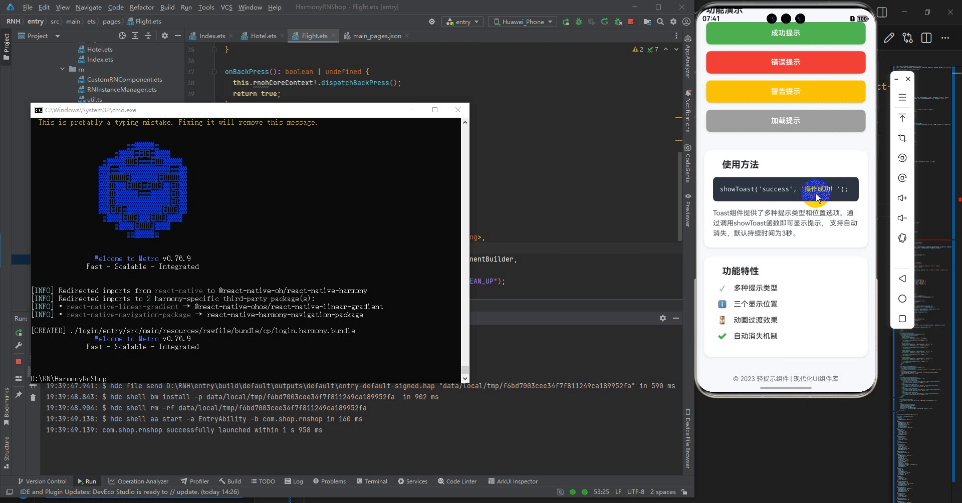
接下来通过打包命令npn run harmony将reactNative的代码打包成为bundle,这样可以进行在开源鸿蒙OpenHarmony中进行使用。

打包之后再将打包后的鸿蒙OpenHarmony文件拷贝到鸿蒙的DevEco-Studio工程目录去:

最后运行效果图如下显示:

作为“人工智能6S店”的官方数字引擎,为AI开发者与企业提供一个覆盖软硬件全栈、一站式门户。
更多推荐


 20
20 0
0- 0


 已为社区贡献5条内容

所有评论(0)