
【精通篇】打造React Native鸿蒙跨平台开发高级复合组件库开发系列:Cell 单元格 - 单元格为列表中的单个展示项
本文介绍了如何在React Native中创建鸿蒙风格(HarmonyOS)的Cell组件。主要内容包括:1) 创建基础Cell组件,设置样式和交互;2) 使用TouchableOpacity实现点击效果;3) 调整样式参数如padding、border等以匹配鸿蒙简洁设计风格;4) 提供高级组件示例,包含状态指示器、图标、描述文本和右侧箭头等元素;5) 演示组件调用方式并实现点击事件处理。通过自
在React Native中创建一个类似于鸿蒙(HarmonyOS)风格的Cell(单元格)通常涉及到自定义组件的设计,以达到鸿蒙系统的视觉和交互效果。鸿蒙系统以其简洁、扁平化的设计风格著称,因此在实现时,我们会尽量模仿这种设计风格。
以下是一些步骤和示例代码,帮助你使用React Native创建一个简单的鸿蒙风格的Cell组件:
- 创建Cell组件
首先,创建一个新的React Native组件,比如命名为HarmonyCell.js。
import React from 'react';
import { View, Text, StyleSheet, TouchableOpacity } from 'react-native';

const HarmonyCell = ({ title, onPress }) => {
  return (
    <TouchableOpacity style={styles.container} onPress={onPress}>
      <View style={styles.content}>
        <Text style={styles.title}>{title}</Text>
      </View>
    </TouchableOpacity>
  );
};

const styles = StyleSheet.create({
  container: {
    paddingHorizontal: 16,
    paddingVertical: 12,
    borderBottomWidth: StyleSheet.hairlineWidth,
    borderBottomColor: 'd9d9d9',
  },
  content: {
    flexDirection: 'row',
    justifyContent: 'space-between',
    alignItems: 'center',
  },
  title: {
    fontSize: 16,
    color: '333',
  },
});

export default HarmonyCell;
- 使用Cell组件
在你的主组件或者其他地方使用HarmonyCell组件。例如,在App.js中:
import React from 'react';
import { SafeAreaView, ScrollView, StatusBar } from 'react-native';
import HarmonyCell from './HarmonyCell'; // 确保路径正确

const App = () => {
  return (
    <>
      <StatusBar barStyle="dark-content" />
      <SafeAreaView style={{ flex: 1, backgroundColor: 'fff' }}>
        <ScrollView>
          <HarmonyCell title="选项一" onPress={() => alert('选项一被点击')} />
          <HarmonyCell title="选项二" onPress={() => alert('选项二被点击')} />
          <HarmonyCell title="选项三" onPress={() => alert('选项三被点击')} />
        </ScrollView>
      </SafeAreaView>
    </>
  );
};

export default App;
- 调整样式以符合鸿蒙风格
鸿蒙系统通常采用更简洁的UI设计,你可以通过调整颜色、字体大小和边距等来使HarmonyCell更贴近鸿蒙的风格。例如,可以增加更多的内边距,使用更柔和的色彩等。你可以调整styles中的属性来实现这一点。例如:
const styles = StyleSheet.create({
  container: {
    paddingHorizontal: 24, // 增加内边距以模仿鸿蒙的视觉效果
    paddingVertical: 16, // 增加内边距以模仿鸿蒙的视觉效果
    borderBottomWidth: StyleSheet.hairlineWidth, // 使用更细的边框线以保持简洁性
    borderBottomColor: 'e0e0e0', // 使用更淡的颜色以保持简洁性,同时增加可读性
  },
  content: { /* 不变 */ },
  title: {
    fontSize: 18, // 增加字体大小以增强可读性,同时保持简洁性
    color: '000', // 使用更深的颜色以增加对比度,使文字更清晰易读
  },
});
通过这些步骤,你可以创建一个具有鸿蒙风格的Cell组件。根据实际需求,你可以进一步自定义和优化样式和行为。
高级组件最终代码效果:
import React, { useState } from 'react';
import { View, Text, StyleSheet, TouchableOpacity, ScrollView, Image } from 'react-native';

// Define types for our cell data
interface CellData {
  id: string;
  title: string;
  description: string;
  icon?: string;
  value?: string;
  status?: 'active' | 'inactive' | 'warning';
}

// Sample data for our cells
const cellData: CellData[] = [
  {
    id: '1',
    title: '个人资料',
    description: '查看和编辑个人信息',
    icon: '👤',
    status: 'active'
  },
  {
    id: '2',
    title: '消息通知',
    description: '管理您的通知设置',
    icon: '🔔',
    value: '5',
    status: 'warning'
  },
  {
    id: '3',
    title: '隐私设置',
    description: '控制数据使用权限',
    icon: '🔒',
    status: 'active'
  },
  {
    id: '4',
    title: '支付方式',
    description: '管理付款和账单信息',
    icon: '💳',
    status: 'inactive'
  },
  {
    id: '5',
    title: '帮助中心',
    description: '获取支持和解答疑问',
    icon: '❓',
    status: 'active'
  },
  {
    id: '6',
    title: '关于我们',
    description: '了解我们的产品和服务',
    icon: 'ℹ️',
    status: 'active'
  }
];

// Cell Component
const Cell: React.FC<{
  data: CellData;
  onPress: (id: string) => void;
}> = ({ data, onPress }) => {
  const getStatusColor = () => {
    switch (data.status) {
      case 'active': return '#4CAF50';
      case 'warning': return '#FF9800';
      case 'inactive': return '#9E9E9E';
      default: return '#2196F3';
    }
  };

  return (
    <TouchableOpacity
      style={styles.cellContainer}
      onPress={() => onPress(data.id)}
      activeOpacity={0.7}
    >
      <View style={styles.cellContent}>
        <View style={[styles.statusIndicator, { backgroundColor: getStatusColor() }]} />

        <View style={styles.iconContainer}>
          <Text style={styles.iconText}>{data.icon}</Text>
        </View>

        <View style={styles.textContainer}>
          <Text style={styles.titleText}>{data.title}</Text>
          <Text style={styles.descriptionText}>{data.description}</Text>
        </View>

        <View style={styles.rightContainer}>
          {data.value && (
            <View style={styles.badge}>
              <Text style={styles.badgeText}>{data.value}</Text>
            </View>
          )}
          <Text style={styles.arrow}>›</Text>
        </View>
      </View>

      <View style={styles.separator} />
    </TouchableOpacity>
  );
};

// Main App Component
const CellComponentApp = () => {
  const [selectedCell, setSelectedCell] = useState<string | null>(null);

  const handleCellPress = (id: string) => {
    setSelectedCell(id);
    // In a real app, you would navigate to a detail screen here
  };

  return (
    <ScrollView style={styles.container}>
      <View style={styles.header}>
        <Text style={styles.headerTitle}>设置中心</Text>
        <Text style={styles.headerSubtitle}>管理您的应用偏好</Text>
      </View>

      <View style={styles.section}>
        <Text style={styles.sectionTitle}>账户设置</Text>
        <View style={styles.cellsContainer}>
          {cellData.slice(0, 3).map((cell) => (
            <Cell
              key={cell.id}
              data={cell}
              onPress={handleCellPress}
            />
          ))}
        </View>
      </View>

      <View style={styles.section}>
        <Text style={styles.sectionTitle}>应用设置</Text>
        <View style={styles.cellsContainer}>
          {cellData.slice(3).map((cell) => (
            <Cell
              key={cell.id}
              data={cell}
              onPress={handleCellPress}
            />
          ))}
        </View>
      </View>

      {selectedCell && (
        <View style={styles.selectionFeedback}>
          <Text style={styles.feedbackText}>
            已选择: {cellData.find(cell => cell.id === selectedCell)?.title}
          </Text>
          <TouchableOpacity
            style={styles.clearButton}
            onPress={() => setSelectedCell(null)}
          >
            <Text style={styles.clearButtonText}>清除选择</Text>
          </TouchableOpacity>
        </View>
      )}

      <View style={styles.footer}>
        <Text style={styles.footerText}>© 2023 应用名称. 保留所有权利.</Text>
      </View>
    </ScrollView>
  );
};

const styles = StyleSheet.create({
  container: {
    flex: 1,
    backgroundColor: '#F5F7FA',
  },
  header: {
    backgroundColor: '#FFFFFF',
    paddingVertical: 30,
    paddingHorizontal: 20,
    marginBottom: 10,
    borderBottomWidth: 1,
    borderBottomColor: '#E0E0E0',
  },
  headerTitle: {
    fontSize: 28,
    fontWeight: '700',
    color: '#263238',
    textAlign: 'center',
    marginBottom: 5,
  },
  headerSubtitle: {
    fontSize: 16,
    color: '#78909C',
    textAlign: 'center',
  },
  section: {
    marginBottom: 20,
  },
  sectionTitle: {
    fontSize: 18,
    fontWeight: '600',
    color: '#455A64',
    paddingHorizontal: 20,
    paddingBottom: 10,
  },
  cellsContainer: {
    backgroundColor: '#FFFFFF',
    marginHorizontal: 15,
    borderRadius: 15,
    overflow: 'hidden',
    elevation: 2,
    shadowColor: '#000',
    shadowOffset: { width: 0, height: 2 },
    shadowOpacity: 0.05,
    shadowRadius: 4,
  },
  cellContainer: {
    backgroundColor: '#FFFFFF',
  },
  cellContent: {
    flexDirection: 'row',
    alignItems: 'center',
    paddingVertical: 15,
    paddingHorizontal: 20,
  },
  statusIndicator: {
    width: 4,
    height: 40,
    borderRadius: 2,
    marginRight: 15,
  },
  iconContainer: {
    width: 40,
    height: 40,
    borderRadius: 20,
    backgroundColor: '#F1F8FF',
    justifyContent: 'center',
    alignItems: 'center',
    marginRight: 15,
  },
  iconText: {
    fontSize: 20,
  },
  textContainer: {
    flex: 1,
    justifyContent: 'center',
  },
  titleText: {
    fontSize: 17,
    fontWeight: '600',
    color: '#263238',
    marginBottom: 3,
  },
  descriptionText: {
    fontSize: 14,
    color: '#78909C',
  },
  rightContainer: {
    flexDirection: 'row',
    alignItems: 'center',
  },
  badge: {
    backgroundColor: '#FF4081',
    borderRadius: 10,
    paddingHorizontal: 8,
    paddingVertical: 2,
    marginRight: 10,
  },
  badgeText: {
    color: '#FFFFFF',
    fontSize: 12,
    fontWeight: '600',
  },
  arrow: {
    fontSize: 24,
    color: '#B0BEC5',
  },
  separator: {
    height: 0.5,
    backgroundColor: '#ECEFF1',
    marginLeft: 60,
  },
  selectionFeedback: {
    backgroundColor: '#E3F2FD',
    margin: 20,
    padding: 15,
    borderRadius: 12,
    flexDirection: 'row',
    justifyContent: 'space-between',
    alignItems: 'center',
  },
  feedbackText: {
    fontSize: 16,
    color: '#1976D2',
    fontWeight: '500',
  },
  clearButton: {
    backgroundColor: '#1976D2',
    paddingHorizontal: 15,
    paddingVertical: 8,
    borderRadius: 8,
  },
  clearButtonText: {
    color: '#FFFFFF',
    fontWeight: '600',
  },
  footer: {
    paddingVertical: 20,
    alignItems: 'center',
  },
  footerText: {
    color: '#90A4AE',
    fontSize: 14,
  },
});

export default CellComponentApp;
这段React Native代码实现了一个设置中心的界面组件,其架构设计体现了现代前端开发中组件化、类型化和状态管理的核心原则。从代码原理层面深入分析,整个组件的运作机制建立在React的声明式编程范式和TypeScript的类型系统之上。
首先从类型系统的设计来看,代码通过TypeScript接口定义了CellData的数据结构,这个接口不仅包含了基本的标识符和文本信息,还通过可选属性设计提供了良好的扩展性。id属性作为唯一标识符,title和description提供了核心的显示内容,而icon、value和status等可选属性则为不同的使用场景提供了灵活性。这种类型定义不仅为开发阶段提供了代码提示和类型检查,更重要的是为组件的使用者提供了明确的API契约。
在数据模型的设计上,cellData数组采用了静态数据初始化的方式,每个数据对象都严格遵循CellData接口的约束。这种设计使得数据与视图逻辑实现了清晰的分离,符合MVVM架构的设计思想。数据对象中的status属性通过联合类型定义了三种明确的状态值,这种设计避免了魔法字符串的使用,提高了代码的可靠性。
Cell组件的实现展现了高阶组件的设计模式。这个函数式组件通过React.FC泛型定义了明确的props类型,包括data和onPress两个属性。这种类型约束确保了组件使用的类型安全,防止了运行时错误的发生。组件的props设计体现了单一职责原则,data负责显示内容的传递,onPress负责交互行为的处理。
在组件的内部实现中,getStatusColor函数采用了策略模式的设计思想,根据不同的状态值返回对应的颜色代码。这种设计使得状态与视觉表现的映射关系更加清晰,也为后续的状态扩展提供了良好的基础。
状态指示器的设计通过动态样式应用实现了视觉反馈。statusIndicator视图的背景色根据当前数据的状态动态变化,这种设计使得用户能够快速识别每个设置项的状态情况。active状态使用绿色表示正常可用,warning状态使用橙色表示需要注意,inactive状态使用灰色表示不可用状态。这种颜色编码系统符合通用的设计规范,降低了用户的学习成本。
图标的渲染采用了文本符号的方式,这种设计避免了图片资源的依赖,提高了应用的性能。iconContainer为图标提供了统一的布局容器,iconText样式确保了图标符号的正确显示。
文本区域的布局采用了垂直堆叠的方式,titleText使用较大的字号和较重的字重来突出显示主要信息,而descriptionText则使用较小的字号和较浅的颜色来提供补充说明。这种层次分明的文本设计符合信息架构的基本原则。
右侧容器的设计包含了徽章和箭头两个元素。徽章通过badge样式实现了数字提示的视觉效果,badgeText确保了数字内容的清晰可读。箭头符号的使用符合移动端应用的导航惯例,向用户暗示了点击后会有进一步的页面跳转。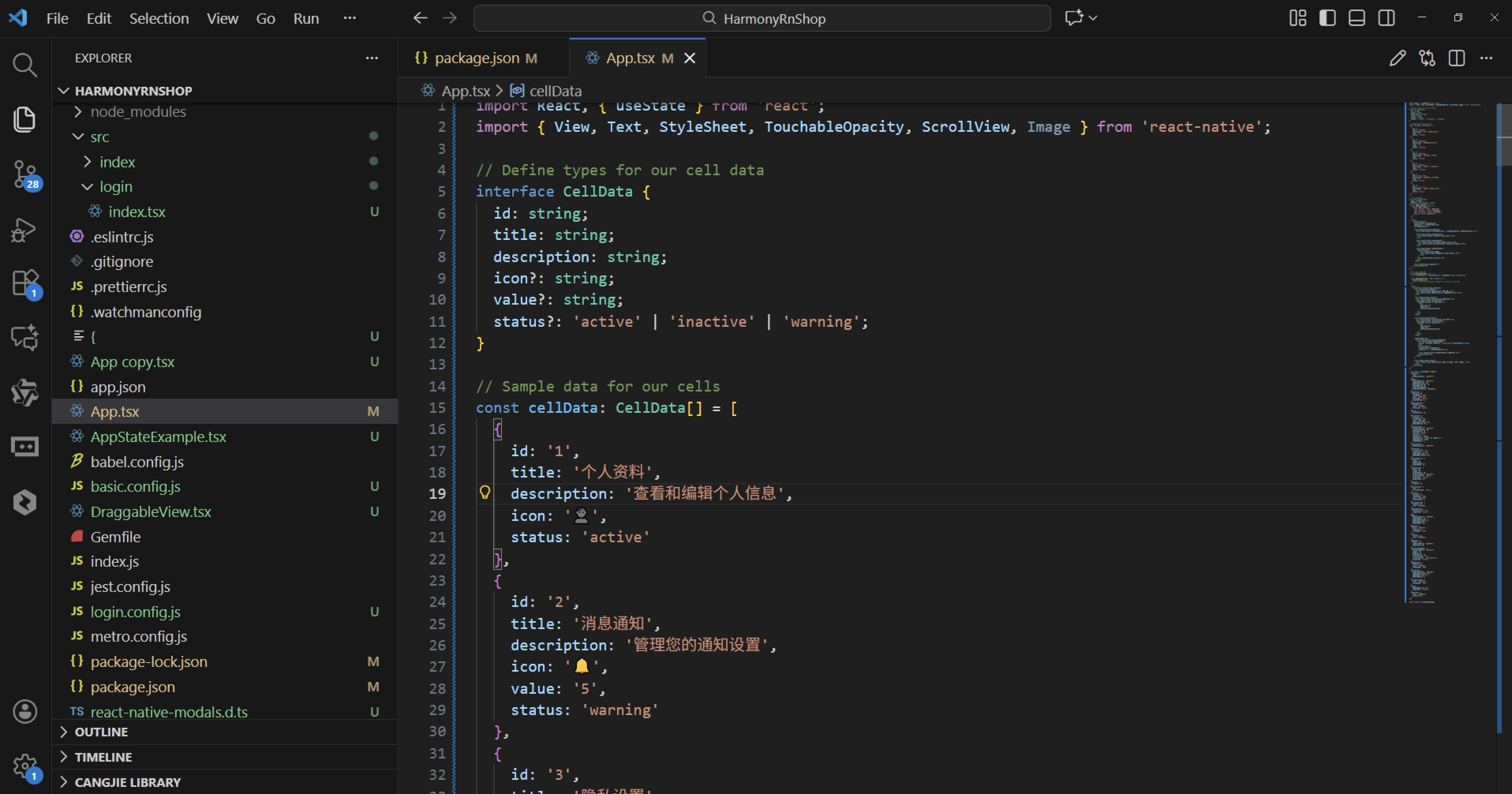
分隔线的设计通过separator视图实现了视觉上的分组效果。这种细微的视觉元素虽然简单,但在提升整体用户体验方面起着重要作用。
主组件CellComponentApp的状态管理采用了React Hooks的设计模式。selectedCell状态记录了用户当前选择的单元格标识符,这个状态的设计使得组件能够响应用户的交互行为。handleCellPress函数作为事件处理程序,不仅更新了状态值,还为后续的导航功能预留了扩展点。
界面布局的组织结构体现了模块化设计原则。容器、头部、分区、单元格容器等每个视觉元素都有对应的样式定义,这种系统化的样式组织方式大大提高了代码的可维护性。
滚动容器的设计确保了内容在超出屏幕时的可访问性。这种设计考虑到了不同屏幕尺寸的兼容性需求。
选择反馈区域的设计为用户操作提供了明确的确认信息。feedbackText显示了当前选择的项目名称,clearButton提供了撤销选择的便捷操作。这种即时反馈机制是现代交互设计中的重要组成部分。
页脚信息的设计虽然简单,但体现了应用的完整性。这种细节处理反映了开发者的专业素养。
组件的整体架构反映了关注点分离的软件工程原则。类型定义、数据模型、组件实现、状态管理和样式设计被清晰地分离到不同的代码区域。这种模块化的设计使得每个部分都可以独立地进行修改和优化,大大提高了代码的可维护性和可扩展性。
需要我将这个React Native设置中心组件转换为功能完整的Web应用版本吗?可以添加更多的设置选项和个性化配置功能。
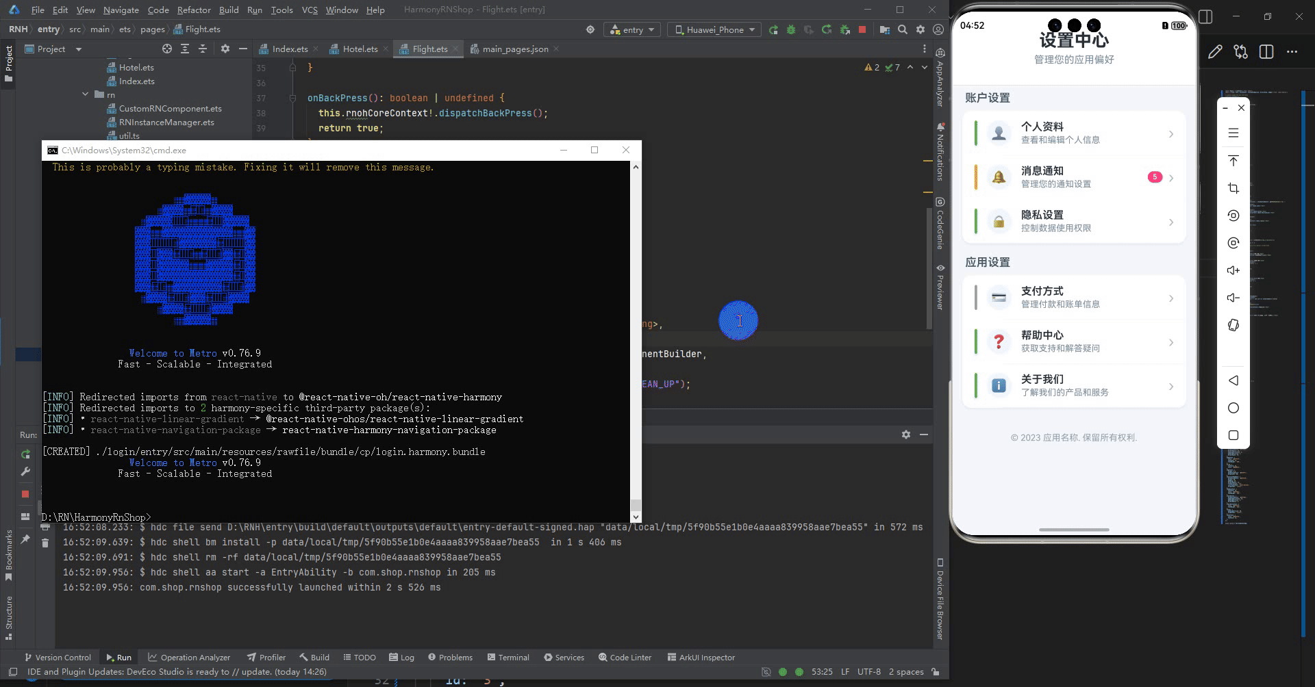
打包
接下来通过打包命令npn run harmony将reactNative的代码打包成为bundle,这样可以进行在开源鸿蒙OpenHarmony中进行使用。

打包之后再将打包后的鸿蒙OpenHarmony文件拷贝到鸿蒙的DevEco-Studio工程目录去:

最后运行效果图如下显示:

作为“人工智能6S店”的官方数字引擎,为AI开发者与企业提供一个覆盖软硬件全栈、一站式门户。
更多推荐


 24
24 0
0- 0


 已为社区贡献5条内容

所有评论(0)