
【开源鸿蒙跨平台开发学习笔记 】DAY10: Flutter开发之 ListView 与 下拉刷新与上拉加载更多
支持完全自定义 Header 和 Footer。
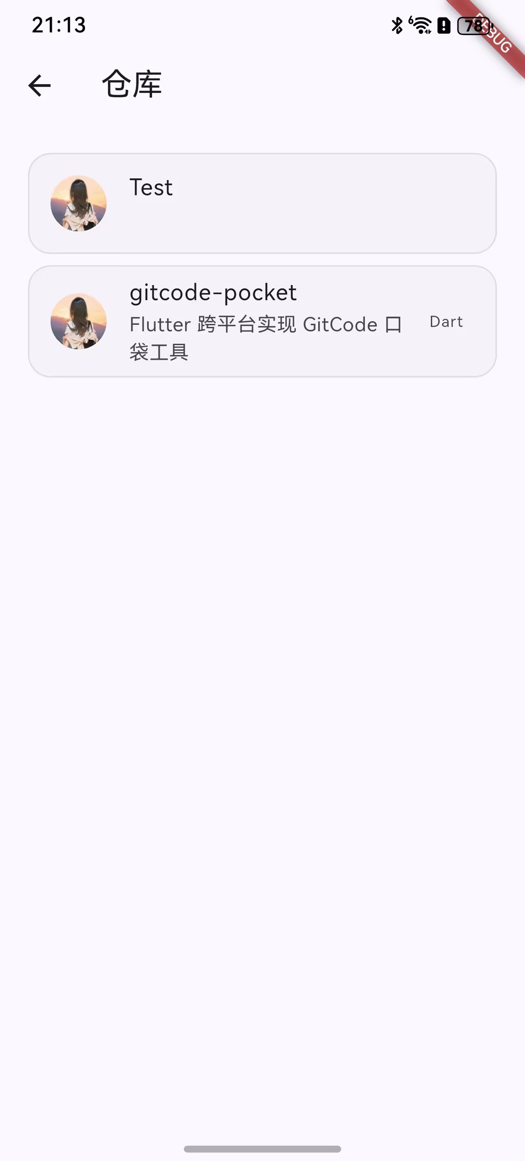
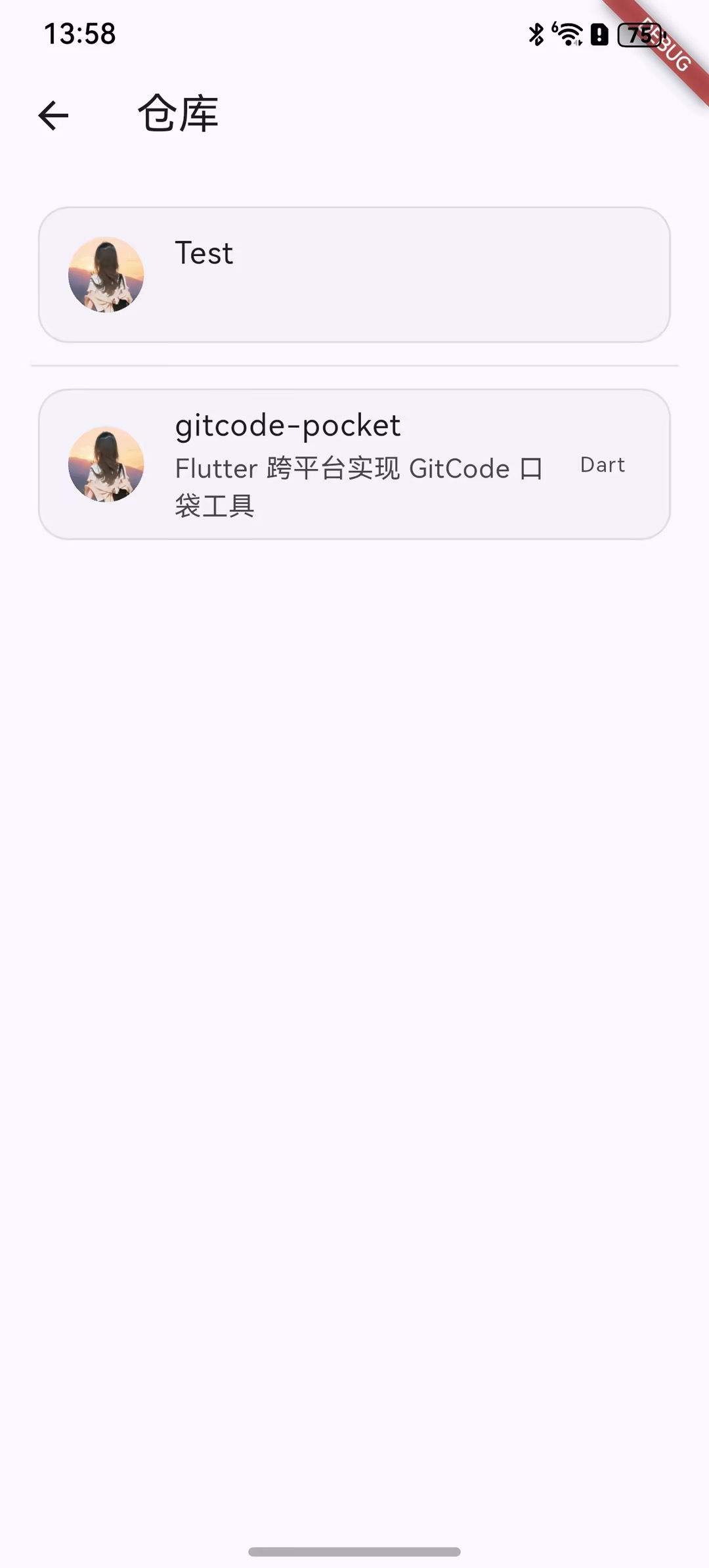
今天终于来到列表页面啦,用户的仓库列表,就学习一下列表的使用,以及列表的下拉刷新与上拉加载更多。
一、ListView
ListView是最常用的可滚动组件之一,它可以沿一个方向线性排布所有子组件,并且它也支持列表项懒加载
1、默认构造函数
ListView({
  super.key,
  super.scrollDirection,          // 滚动方向
  super.reverse,                  // 是否反向
  super.controller,               // 滚动控制器
  super.primary,                  // 是否为主滚动视图
  super.physics,                  // 滚动物理效果
  super.shrinkWrap,               // 是否包裹内容
  super.padding,                  // 内边距
  this.itemExtent,                // 固定子项高度
  this.itemExtentBuilder,         // 动态子项高度构建器
  this.prototypeItem,             // 原型子项
  bool addAutomaticKeepAlives = true,     // 自动保持子项状态
  bool addRepaintBoundaries = true,       // 添加重绘边界
  bool addSemanticIndexes = true,         // 添加语义索引
  super.cacheExtent,              // 预加载区域
  List<Widget> children = const <Widget>[], // 子组件列表
  int? semanticChildCount,        // 语义子项数量
  super.dragStartBehavior,        // 拖拽开始行为
  super.keyboardDismissBehavior,  // 键盘隐藏行为
  super.restorationId,            // 恢复ID
  super.clipBehavior,             // 裁剪行为
  super.hitTestBehavior,          // 点击测试行为
})
1)基础滚动属性
scrollDirection
scrollDirection: Axis.vertical,  // 默认,垂直滚动
scrollDirection: Axis.horizontal, // 水平滚动

// 示例
ListView(
  scrollDirection: Axis.horizontal,
  children: [...],
)
reverse
reverse: false,  // 默认,从顶部开始
reverse: true,   // 反向,从底部开始

// 示例 - 聊天应用
ListView(
  reverse: true,  // 最新消息在底部
  children: messages.map((msg) => MessageBubble(msg)).toList(),
)
controller
final ScrollController _controller = ScrollController();

// 示例 - 滚动到指定位置
ListView(
  controller: _controller,
  children: [...],
)

// 滚动到某个位置
_controller.animateTo(
  500.0,
  duration: Duration(seconds: 1),
  curve: Curves.easeInOut,
);2)布局控制属性
shrinkWrap
该属性表示是否根据子组件的总长度来设置ListView的长度,默认值为false 。默认情况下,ListView会在滚动方向尽可能多的占用空间。当ListView在一个无边界(滚动方向上)的容器中时,shrinkWrap必须为true。
shrinkWrap: false,  // 默认,占用尽可能多的空间
shrinkWrap: true,   // 只占用子项所需空间

// 示例 - 嵌套在Column中
Column(
  children: [
    Text('标题'),
    ListView(
      shrinkWrap: true,  // 重要:避免无限高度
      physics: NeverScrollableScrollPhysics(), // 禁止自身滚动
      children: [...],
    ),
  ],
)
padding
padding: EdgeInsets.all(16.0),
padding: EdgeInsets.symmetric(horizontal: 16.0),
padding: EdgeInsets.only(top: 8.0, bottom: 16.0),

// 示例
ListView(
  padding: EdgeInsets.all(16.0),
  children: [...],
)
3)性能优化属性
addAutomaticKeepAlives
addAutomaticKeepAlives: true,  // 默认,保持子项状态
addAutomaticKeepAlives: false, // 不保持状态

// 使用场景
ListView(
  addAutomaticKeepAlives: false,  // 子项不需要保持状态时
  children: List.generate(100, (index) => Text('Item $index')),
)
addRepaintBoundaries
addRepaintBoundaries: true,  // 默认,添加重绘边界
addRepaintBoundaries: false, // 不添加重绘边界

// 示例 - 简单列表可以关闭以提高性能
ListView(
  addRepaintBoundaries: false,
  children: [
    for (var i = 0; i < 10; i++)
      Container(
        height: 50,
        color: Colors.primaries[i % Colors.primaries.length],
      ),
  ],
)
addSemanticIndexes
addSemanticIndexes: true,  // 默认,为无障碍功能添加索引
addSemanticIndexes: false, // 不添加语义索引

// 对于动态变化或无需无障碍支持的列表可以关闭
cacheExtent
cacheExtent: 250.0,  // 预加载250逻辑像素的区域
cacheExtent: 0.0,    // 不预加载
cacheExtent: null,   // 使用默认值(约250.0)

// 示例 - 图片列表优化
ListView.builder(
  cacheExtent: 500.0,  // 预加载更多
  itemCount: images.length,
  itemBuilder: (context, index) => ImageItem(images[index]),
)4)尺寸相关属性
itemExtent (固定高度)
该参数如果不为null,则会强制children的“长度”为itemExtent的值;这里的“长度”是指滚动方向上子组件的长度,也就是说如果滚动方向是垂直方向,则itemExtent代表子组件的高度;如果滚动方向为水平方向,则itemExtent就代表子组件的宽度。在ListView中,指定itemExtent比让子组件自己决定自身长度会有更好的性能,这是因为指定itemExtent后,滚动系统可以提前知道列表的长度,而无需每次构建子组件时都去再计算一下,尤其是在滚动位置频繁变化时(滚动系统需要频繁去计算列表高度)。
itemExtent: 50.0,  // 所有子项固定高度50

// 示例 - 等高列表
ListView(
  itemExtent: 60.0,
  children: List.generate(
    20,
    (index) => ListTile(
      title: Text('Item $index'),
    ),
  ),
)
itemExtentBuilder (动态高度)
ListView.builder(
  itemExtentBuilder: (index, _) {
    // 根据索引返回不同高度
    if (index % 3 == 0) return 80.0;
    if (index % 3 == 1) return 100.0;
    return 60.0;
  },
  itemCount: 50,
  itemBuilder: (context, index) => ItemWidget(index),
)
prototypeItem (原型子项)
如果知道列表中的所有列表项长度都相同但不知道具体是多少,这时我们可以指定一个列表项,该列表项被称为 prototypeItem(列表项原型)。指定 prototypeItem 后,可滚动组件会在 layout 时计算一次它延主轴方向的长度,这样也就预先知道了所有列表项的延主轴方向的长度,所以和指定 itemExtent 一样,指定 prototypeItem 会有更好的性能。注意,itemExtent 和prototypeItem 互斥,不能同时指定它们。
ListView(
  prototypeItem: ListTile(
    title: Text('原型项'),
    subtitle: Text('用于测量高度'),
  ),
  children: [...],
)

// 更实用的示例
ListView(
  prototypeItem: Container(
    height: 80,
    child: Card(
      child: Padding(
        padding: EdgeInsets.all(16),
        child: Text('示例内容'),
      ),
    ),
  ),
  children: items.map((item) => ItemCard(item)).toList(),
)
5)滚动物理效果
// 常用物理效果
physics: AlwaysScrollableScrollPhysics(),  // 总是可滚动
physics: NeverScrollableScrollPhysics(),   // 禁止滚动
physics: BouncingScrollPhysics(),          // 弹性效果(iOS风格)
physics: ClampingScrollPhysics(),          // 夹紧效果(Android风格)
physics: FixedExtentScrollPhysics(),       // 固定范围滚动

// 示例
ListView(
  physics: BouncingScrollPhysics(),
  children: [...],
)

// 分页加载时
ListView(
  physics: AlwaysScrollableScrollPhysics(),
  controller: _controller,
  children: [...],
)
6) 行为控制属性
primary
primary: true,   // 主滚动视图
primary: false,  // 非主滚动视图

// 通常用于判断是否需要AppBar的滚动监听
ListView(
  primary: true,  // 可以响应PageUp/PageDown键
  children: [...],
)
dragStartBehavior
dragStartBehavior: DragStartBehavior.start,  // 立即开始拖拽
dragStartBehavior: DragStartBehavior.down,   // 按下时开始拖拽

// 示例
ListView(
  dragStartBehavior: DragStartBehavior.down,
  children: [...],
)
keyboardDismissBehavior
keyboardDismissBehavior: ScrollViewKeyboardDismissBehavior.manual,     // 手动
keyboardDismissBehavior: ScrollViewKeyboardDismissBehavior.onDrag,     // 拖拽时隐藏
keyboardDismissBehavior: ScrollViewKeyboardDismissBehavior.onTap,      // 点击时隐藏

// 示例 - 搜索页面
ListView(
  keyboardDismissBehavior: ScrollViewKeyboardDismissBehavior.onDrag,
  children: [...],
)
clipBehavior
clipBehavior: Clip.hardEdge,    // 硬边裁剪
clipBehavior: Clip.antiAlias,   // 抗锯齿裁剪(默认)
clipBehavior: Clip.none,        // 不裁剪

// 示例 - 需要阴影效果时不裁剪
ListView(
  clipBehavior: Clip.none,
  children: items.map((item) =>
    Card(
      elevation: 4,
      child: ListTile(title: Text(item)),
    )
  ).toList(),
)
hitTestBehavior
hitTestBehavior: HitTestBehavior.deferToChild,  // 传递给子项
hitTestBehavior: HitTestBehavior.opaque,        // 不透明区域
hitTestBehavior: HitTestBehavior.translucent,   // 透明区域

// 示例
ListView(
  hitTestBehavior: HitTestBehavior.opaque,
  children: [...],
)
8)恢复
// 保存和恢复滚动位置
ListView(
  restorationId: 'my_list_view',
  children: [...],
)

// 需要在MaterialApp中配置
MaterialApp(
  restorationScopeId: 'app',
  home: MyHomePage(),
)
2、ListView.builder
ListView.builder适合列表项比较多或者列表项不确定的情况使用
核心参数:
ListView.builder({
  // ListView公共参数已省略
  ...
  required IndexedWidgetBuilder itemBuilder,
  int itemCount,
  ...
})itemBuilder:它是列表项的构建器,类型为IndexedWidgetBuilder,返回值为一个widget。当列表滚动到具体的index位置时,会调用该构建器构建列表项。
itemCount:列表项的数量,如果为null,则为无限列表。
3、ListView.separated
ListView.separated可以在生成的列表项之间添加一个分割组件,它比ListView.builder多了一个separatorBuilder参数,该参数是一个分割组件生成器。
 Widget _buildSeparatedListview() {
    final theme = Theme.of(context);
    final borderColor = theme.colorScheme.outlineVariant.withValues(alpha: 0.5);
    return ListView.separated(
      padding: EdgeInsets.all(16),
      itemCount: _repositoryList.length,
      itemBuilder: (context, index) {
        final repo = _repositoryList[index];
        return _buildListItem(context: context, repo: repo);
      },

      separatorBuilder: (BuildContext context, int index) {
        return Divider(color: borderColor);
      },
    );
  }

  Widget _buildListview() {
    return ListView.builder(
      padding: EdgeInsets.all(16),
      itemCount: _repositoryList.length,
      itemBuilder: (context, index) {
        final repo = _repositoryList[index];
        return _buildListItem(context: context, repo: repo);
      },
    );
  }
4、固定高度列表
前面说过,给列表指定 itemExtent 或 prototypeItem 会有更高的性能,所以当我们知道列表项的高度都相同时,强烈建议指定 itemExtent 或 prototypeItem
class FixedExtentList extends StatelessWidget {
  const FixedExtentList({Key? key}) : super(key: key);

  @override
  Widget build(BuildContext context) {
    return Scaffold(
      appBar: AppBar(title: Text('FixedExtentList')),
      body: ListView.builder(
        padding: EdgeInsets.all(16),
        itemBuilder: (context, index) {
//LayoutLogPrint是一个自定义组件,在布局时可以打印当前上下文中父组件给子组件的约束信息
          return LayoutLogPrint(
            tag: index,
            child: ListTile(title: Text("$index")),
          );
        },
      ),
    );
  }
}
因为列表项都是一个 ListTile,高度相同,但是我们不知道 ListTile 的高度是多少,所以指定了prototypeItem ,运行后,控制台打印:
flutter settings log message: 0: Size(342.2, 56.0)
flutter settings log message: 1: Size(342.2, 56.0)
flutter settings log message: 2: Size(342.2, 56.0)
flutter settings log message: 3: Size(342.2, 56.0)
flutter settings log message: 4: Size(342.2, 56.0)
flutter settings log message: 5: Size(342.2, 56.0)
flutter settings log message: 6: Size(342.2, 56.0)
flutter settings log message: 7: Size(342.2, 56.0)
ListTitle 高度时56,指定 itemExtent 为 56也是可以的。但是建议优先指定原型,这样的话在列表项布局修改后,仍然可以正常工作(前提是每个列表项的高度相同)。
5、ListView 原理
ListView 内部组合了 Scrollable、Viewport 和 Sliver,需要注意:
1)ListView 中的列表项组件都是 RenderBox,并不是 Sliver, 这个一定要注意。
2)一个 ListView 中只有一个Sliver,对列表项进行按需加载的逻辑是 Sliver 中实现的。
3)ListView 的 Sliver 默认是 SliverList,如果指定了 itemExtent ,则会使用 SliverFixedExtentList;如果 prototypeItem 属性不为空,则会使用 SliverPrototypeExtentList,无论是是哪个,都实现了子组件的按需加载模型。
二、下拉刷新与上拉加载更多
关于下拉刷新以及加载更多这个功能小鱼选择了pull_to_refresh 插件,因为能满足大部分需求,其特点如下:
丰富的内置样式:经典、水滴、Material 等多种风格
灵活的自定义能力:支持完全自定义 Header 和 Footer
完善的状态管理:通过 RefreshController 管理所有状态
良好的性能:支持大量数据的流畅滚动
多种使用场景:支持普通列表、网格、Sliver 等
下面就一一介绍其安装使用,以及功能详解啦。
1、安装
dependencies:
  pull_to_refresh: ^2.0.0
2、基本使用
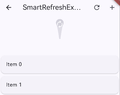
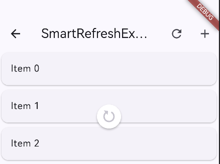
Widget _buildSmartListview() {
    return SmartRefresher(
      controller: _refreshController,
      enablePullDown: true,
      enablePullUp: true,
      header: ClassicHeader(),
      footer: ClassicFooter(),
      onRefresh: _refresh,
      onLoading: _loadMore,
      child: ListView.builder(
        padding: EdgeInsets.all(16),
        itemCount: _repositoryList.length,
        itemBuilder: (context, index) {
          final repo = _repositoryList[index];
          return _buildListItem(context: context, repo: repo);
        },
      ),
    );
  }


 Future<void> _refresh() async {
    _page = 1;
    _hasMore = true;
    await _loadData(_page);
    _refreshController.refreshCompleted();
  }

  Future<void> _loadMore() async {
    if (_isLoading || !_hasMore) return;

    await _loadData(_page);
    _refreshController.loadComplete();
  }
3、详解RefreshController
class RefreshController {
  // 刷新相关
  void refreshCompleted()          // 刷新完成
  void refreshFailed()            // 刷新失败
  void refreshToIdle()           // 恢复到空闲状态

  // 加载相关
  void loadComplete()            // 加载完成
  void loadFailed()              // 加载失败
  void loadNoData()              // 没有更多数据

  // 状态判断
  bool get isRefresh             // 是否正在刷新
  bool get isLoading             // 是否正在加载
  bool get isTwoLevel            // 是否在二级刷新

  // 手动触发
  Future<void> requestRefresh({Duration duration})  // 手动触发刷新
  Future<void> requestLoading({Duration duration})  // 手动触发加载

  // 重置
  void resetNoData()            // 重置无数据状态

  // 状态监听
  void addStatusListener(RefreshListener listener)
  void removeStatusListener(RefreshListener listener)
}
示例:
import 'dart:math';

import 'package:flutter/material.dart';
import 'package:pull_to_refresh/pull_to_refresh.dart';

class SmartRefreshExample extends StatefulWidget {
  const SmartRefreshExample({super.key});

  @override
  State<StatefulWidget> createState() {
    return _SmartRefreshExample();
  }
}

class _SmartRefreshExample extends State<SmartRefreshExample> {
  final RefreshController _controller = RefreshController();

  @override
  Widget build(BuildContext context) {
    return Scaffold(
      appBar: AppBar(
        title: Text('SmartRefreshExample'),
        actions: [
          IconButton(
            icon: Icon(Icons.refresh),
            onPressed: () {
              // 手动触发刷新
              _controller.requestRefresh();
            },
          ),
          IconButton(
            icon: Icon(Icons.add),
            onPressed: () {
              // 手动触发加载
              _controller.requestLoading();
            },
          ),
        ],
      ),
      body: SmartRefresher(
        // key: _refreshKey,
        controller: _controller,
        enablePullDown: true,
        enablePullUp: true,
        header: ClassicHeader(
          completeText: "刷新完成",
          failedText: "刷新失败",
          idleText: "下拉刷新",
          releaseText: "释放刷新",
          refreshingText: "正在刷新...",
        ),
        footer: CustomFooter(
          builder: (context, mode) {
            Widget body;
            if (mode == LoadStatus.idle) {
              body = Text("上拉加载");
            } else if (mode == LoadStatus.loading) {
              body = CircularProgressIndicator();
            } else if (mode == LoadStatus.failed) {
              body = Text("加载失败,点击重试");
            } else if (mode == LoadStatus.canLoading) {
              body = Text("释放加载更多");
            } else {
              body = Text("没有更多数据了");
            }
            return Container(
              height: 55.0,
              child: Center(child: body),
            );
          },
        ),
        onRefresh: () async {
          // 模拟网络延迟
          await Future.delayed(Duration(seconds: 3));

          // 模拟随机失败
          if (Random().nextBool()) {
            _controller.refreshFailed();
          } else {
            _controller.refreshCompleted();
          }
        },
        onLoading: () async {
          await Future.delayed(Duration(seconds: 2));

          // 模拟数据加载完毕
          if (Random().nextInt(20) > 10) {
            _controller.loadNoData();
          } else {
            _controller.loadComplete();
          }
        },
        child: ListView.builder(
          itemBuilder: (c, i) => Card(child: ListTile(title: Text("Item $i"))),
          itemCount: 20,
        ),
      ),
      floatingActionButton: FloatingActionButton(
        child: Icon(Icons.info),
        onPressed: () {
          // 获取当前状态
          print('刷新状态: ${_controller.isRefresh}');
          print('加载状态: ${_controller.isLoading}');
          print('无数据状态: ${_controller.footerStatus == LoadStatus.noMore}');
        },
      ),
    );
  }
}
4、详解Header
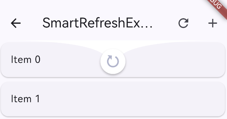
1)经典样式
ClassicHeader(
  height: 80.0,                    // 高度
  refreshStyle: RefreshStyle.Follow, // 刷新样式
  completeDuration: Duration(milliseconds: 500), // 完成停留时间
  textStyle: TextStyle(color: Colors.grey), // 文本样式
  failedIcon: Icon(Icons.error, color: Colors.red), // 失败图标
  completeIcon: Icon(Icons.done, color: Colors.green), // 完成图标
  idleIcon: Icon(Icons.arrow_downward, color: Colors.grey), // 空闲图标
  releaseIcon: Icon(Icons.arrow_upward, color: Colors.grey), // 释放图标
  refreshingIcon: SizedBox(
    width: 25.0,
    height: 25.0,
    child: CircularProgressIndicator(strokeWidth: 2.0),
  ), // 刷新中图标
  // 国际化文本
  idleText: "下拉刷新",
  releaseText: "释放刷新",
  refreshingText: "正在刷新...",
  completeText: "刷新完成",
  failedText: "刷新失败",
  // 其他配置
  spacing: 15.0, // 图标和文本间距
  outerBuilder: (child) => Container(  // 外部包装
    color: Colors.white,
    child: child,
  ),
)
2)水滴样式
WaterDropHeader(
  waterDropColor: Colors.blue,           // 水滴颜色
  idleIcon: Icon(Icons.autorenew, size: 25), // 空闲图标
  complete: Icon(Icons.done, size: 25),     // 完成图标
  refresh: CircularProgressIndicator(      // 刷新中图标
    strokeWidth: 2.0,
    valueColor: AlwaysStoppedAnimation(Colors.white),
  ),
)
3) MaterialClassicHeader(Material 风格)
MaterialClassicHeader(
  color: Colors.blue,                     // 颜色
  backgroundColor: Colors.white,          // 背景色
  distance: 40.0,                         // 触发距离
)
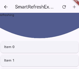
4) BezierHeader(贝塞尔曲线)
BezierHeader(
  bezierColor: Theme.of(context).primaryColor,  // 颜色
  child:  child: Text('refreshing'), // 自定义内容
)
5) WaterDropMaterialHeader(Material 水滴)
WaterDropMaterialHeader(
  backgroundColor: Colors.white,          // 背景色
  color: Theme.of(context).primaryColor,  // 颜色
)
5、详解Footer
1)ClassicFooter
ClassicFooter(
  height: 60.0,                          // 高度
  loadStyle: LoadStyle.ShowAlways,       // 显示方式
  textStyle: TextStyle(color: Colors.grey), // 文本样式
  failedIcon: Icon(Icons.error, color: Colors.red),
  noDataIcon: Icon(Icons.inbox, color: Colors.grey),
  canLoadingIcon: Icon(Icons.arrow_upward, color: Colors.grey),
  idleIcon: Icon(Icons.arrow_downward, color: Colors.grey),
  loadingIcon: SizedBox(
    width: 25.0,
    height: 25.0,
    child: CircularProgressIndicator(strokeWidth: 2.0),
  ),
  // 文本
  idleText: "上拉加载",
  canLoadingText: "释放加载更多",
  loadingText: "正在加载...",
  noDataText: "没有更多数据了",
  failedText: "加载失败,点击重试",
)
2)CustomFooter
CustomFooter(
  builder: (BuildContext context, LoadStatus? mode) {
    Widget body;

    if (mode == LoadStatus.idle) {
      body = Row(
        mainAxisAlignment: MainAxisAlignment.center,
        children: <Widget>[
          Icon(Icons.arrow_upward, color: Colors.grey),
          SizedBox(width: 10),
          Text("上拉加载", style: TextStyle(color: Colors.grey)),
        ],
      );
    } else if (mode == LoadStatus.loading) {
      body = Row(
        mainAxisAlignment: MainAxisAlignment.center,
        children: <Widget>[
          SizedBox(
            width: 20,
            height: 20,
            child: CircularProgressIndicator(strokeWidth: 2),
          ),
          SizedBox(width: 10),
          Text("正在加载...", style: TextStyle(color: Colors.grey)),
        ],
      );
    } else if (mode == LoadStatus.failed) {
      body = Row(
        mainAxisAlignment: MainAxisAlignment.center,
        children: <Widget>[
          Icon(Icons.error_outline, color: Colors.red),
          SizedBox(width: 10),
          Text("加载失败,点击重试", style: TextStyle(color: Colors.red)),
        ],
      );
    } else if (mode == LoadStatus.canLoading) {
      body = Text("释放加载更多");
    } else {
      body = Row(
        mainAxisAlignment: MainAxisAlignment.center,
        children: <Widget>[
          Icon(Icons.done_all, color: Colors.green),
          SizedBox(width: 10),
          Text("没有更多数据了", style: TextStyle(color: Colors.green)),
        ],
      );
    }

    return Container(
      height: 55.0,
      child: Center(child: body),
    );
  },
)
6、使用建议
- 对于简单需求,使用
ClassicHeader和ClassicFooter - 需要 Material 风格时,使用
MaterialClassicHeader - 需要高度定制时,使用
CustomHeader和CustomFooter - 注意处理空状态和错误状态
- 合理使用控制器管理状态

作为“人工智能6S店”的官方数字引擎,为AI开发者与企业提供一个覆盖软硬件全栈、一站式门户。
更多推荐


 14
14 0
0- 0


 已为社区贡献7条内容

所有评论(0)