
小白3天精通跨平台React Native鸿蒙开发:解决Button不能自定义样式的问题(使用TouchableOpacity组件)
本文分析了React Native中Button组件样式失效的问题,指出错误原因是传递了不支持的children属性。解决方案包括:1)移除children属性,改用title属性设置按钮文本;2)推荐使用TouchableOpacity组件实现自定义样式按钮。文章提供了两种正确写法的代码示例,并强调检查Button组件代码、删除children属性的重要性。同时展示了完整的React Nativ
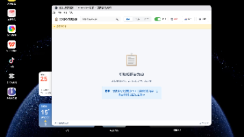
在以下图片中,我们需要添加一个按钮的点击操作,但是在使用的过程,我们定义的样式并没有生效。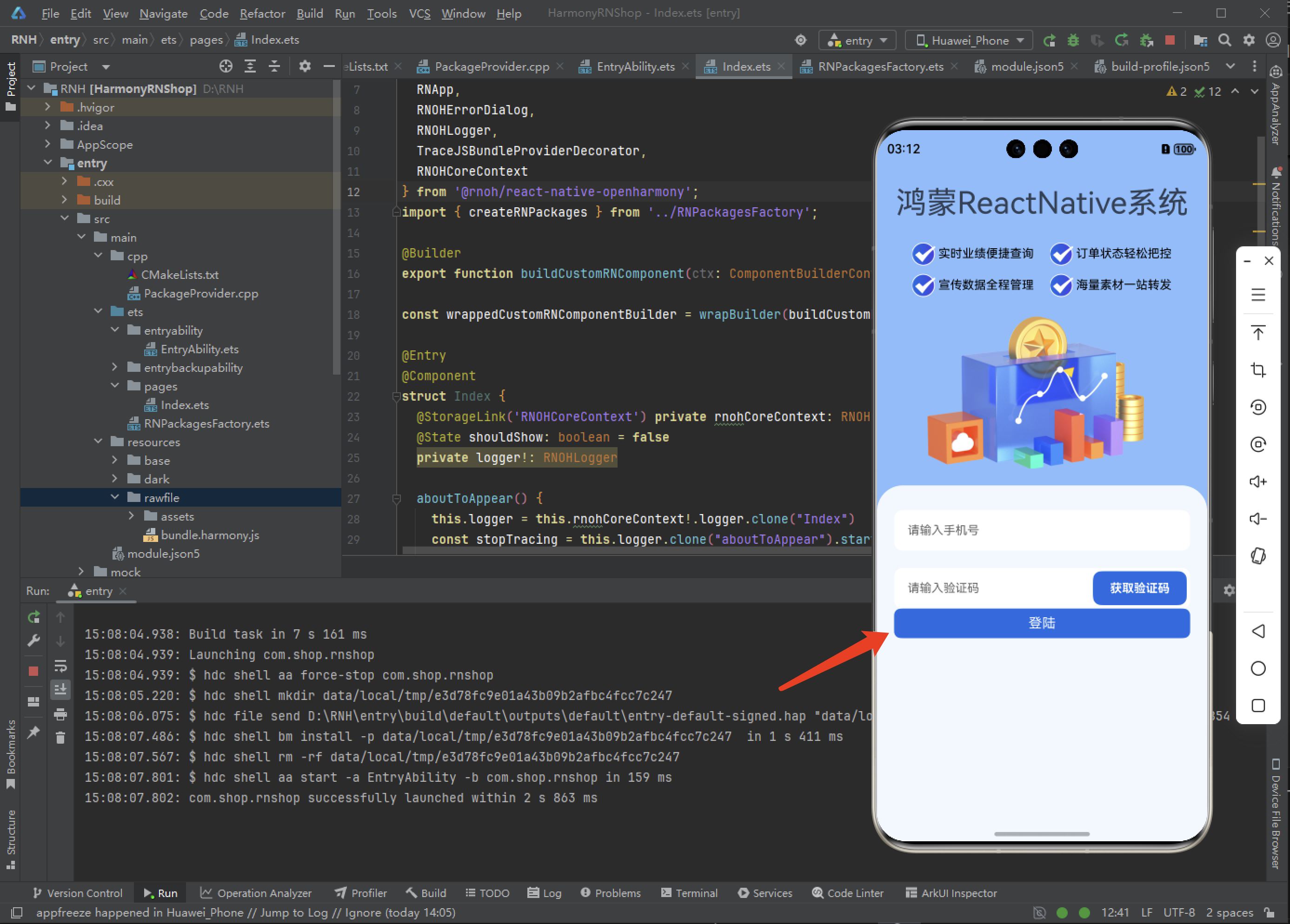
看代码提示是有报错的:
No overload matches this call.
  Overload 1 of 2, '(props: ButtonProps): Button', gave the following error.
    Type '{ children: string; title: string; color: string; style: { marginTop: number; width: "100%"; height: number; lineHeight: number; borderRadius: number; backgroundColor: string; textAlign: "center"; fontWeight: "bold"; fontSize: number; color: string; }; }' is not assignable to type 'IntrinsicAttributes & IntrinsicClassAttributes<Button> & Readonly<ButtonProps>'.
      Property 'children' does not exist on type 'IntrinsicAttributes & IntrinsicClassAttributes<Button> & Readonly<ButtonProps>'.
  Overload 2 of 2, '(props: ButtonProps, context: any): Button', gave the following error.
    Type '{ children: string; title: string; color: string; style: { marginTop: number; width: "100%"; height: number; lineHeight: number; borderRadius: number; backgroundColor: string; textAlign: "center"; fontWeight: "bold"; fontSize: number; color: string; }; }' is not assignable to type 'IntrinsicAttributes & IntrinsicClassAttributes<Button> & Readonly<ButtonProps>'.
      Property 'children' does not exist on type 'IntrinsicAttributes & IntrinsicClassAttributes<Button> & Readonly<ButtonProps>'.
这个错误是因为你在使用 React Native 的 Button 组件时传递了它不支持的 children 属性。这是一个 TypeScript 类型错误,问题出现在你给 React Native 的 Button 组件传递了它不支持的 children 属性。
问题核心:
React Native 的原生 Button 组件不支持 children 属性,它的内容应该通过 title 属性来设置,React Native 的 Button 组件不支持 children 属性,它使用 title 属性来设置按钮文本。
你的代码中同时使用了:
children: string ❌(Button 组件不支持)
title: string ✅(这是正确的用法)
解决方案:
- 移除 children 属性,将按钮文本内容放在 title 属性中
- 或者使用 TouchableOpacity 等支持 children 的可触摸组件
正确的 Button 用法:
<Button
  title="按钮文本"
  color="#007AFF"
  onPress={() => console.log('按钮点击')}
/>
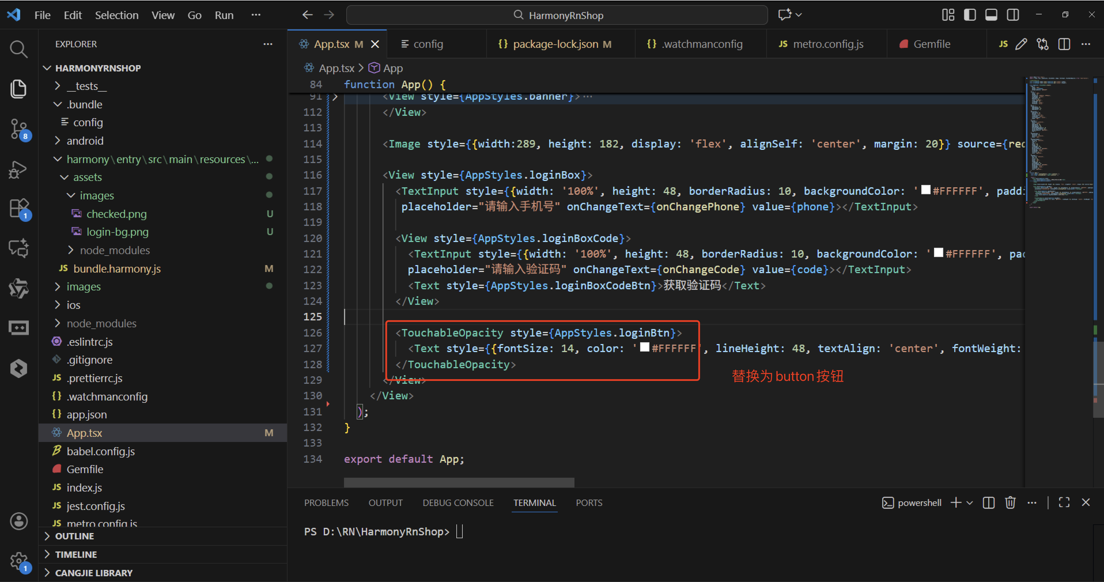
如果你需要自定义样式的按钮,建议使用 TouchableOpacity:
<TouchableOpacity
  style={{
    marginTop: 10,
    width: '100%',
    height: 50,
    borderRadius: 8,
    backgroundColor: '#007AFF',
    justifyContent: 'center',
    alignItems: 'center'
  }}
  onPress={() => console.log('按钮点击')}
>
  <Text style={{color: 'white', fontSize: 16, fontWeight: 'bold'}}>
    按钮文本
  </Text>
</TouchableOpacity>
建议:立即检查你的 Button 组件代码,删除 children 属性并将文本内容移至 title 属性中,这样就能解决这个类型错误。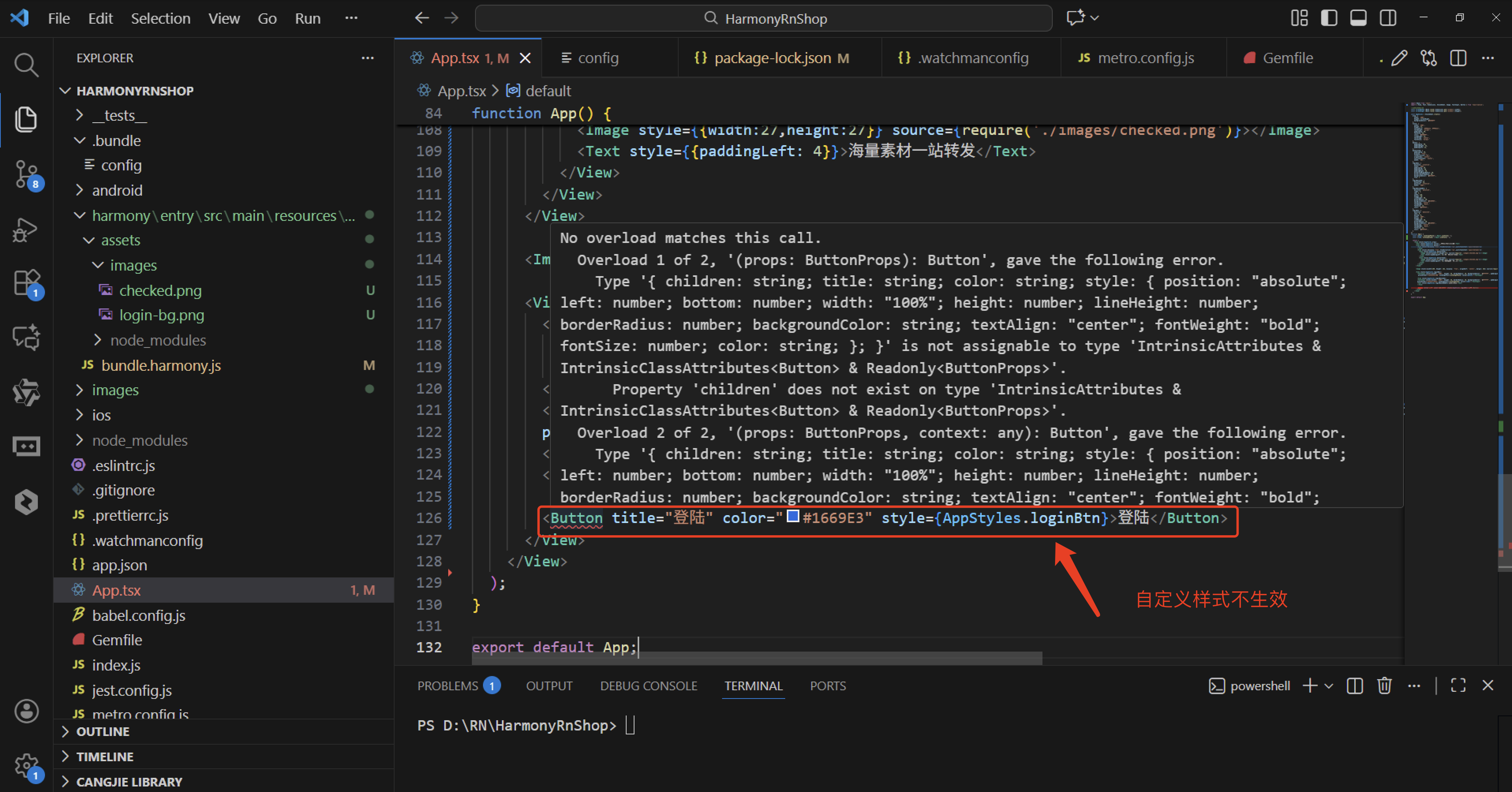
import React from 'react';
import { View, Text, Dimensions, StyleSheet, Image, TextInput, Button } from 'react-native';

//获取屏幕的宽高
const screenWidth =Math.round( Dimensions.get('window').width);
const screenHight =Math.round( Dimensions.get('window').height);

const AppStyles = StyleSheet.create({
  wrap: {
    width: '100%',
    height: screenHight,
    backgroundColor: '#85BDFF'
  },
  title: {
    width: '100%',
    height: 72,
    fontFamily: 'OPPOSans, OPPOSans',
    fontWeight: 'normal',
    paddingTop: 50,
    fontSize: 36,
    color: '#304057',
    lineHeight: 72,
    textAlign: 'center',
    fontStyle: 'normal'
  },
  banner: {
    paddingTop: 50,
    paddingRight: 32,
    paddingLeft: 32,
  },
  bannerItem: {
    paddingTop: 10,
    display: 'flex',
    flexDirection:'row',
    alignItems: 'center',
    justifyContent: 'center',
    width: '50%',
  },
  loginBox: {
    position: 'relative',
    width: '100%',
    paddingTop: 29,
    paddingLeft: 20,
    paddingRight: 20,
    borderTopRightRadius: 30,
    borderTopLeftRadius: 30,
    backgroundColor: '#F2F8FF',
    flex: 1
  },
  loginBoxCode: {
    marginTop: 20,
    position: 'relative',
    width: '100%',
  },
  loginBoxCodeBtn: {
    position: 'absolute',
    right: 4,
    top: 4,
    width: 110,
    height: 40,
    lineHeight: 40,
    borderRadius: 10,
    backgroundColor: '#1669E3',
    textAlign: 'center',
    fontWeight: 'bold',
    fontSize: 14,
    color: '#FFFFFF',
  },
  loginBtn: {
    position: 'absolute',
    left: 20,
    bottom: 30,
    width: '100%',
    height: 48,
    lineHeight: 48,
    borderRadius: 10,
    backgroundColor: '#1669E3',
    textAlign: 'center',
    fontWeight: 'bold',
    fontSize: 14,
    color: '#FFFFFF',
  }
})
function App() {
  const [phone, onChangePhone] = React.useState('');
  const [code, onChangeCode] = React.useState('');

  return (
    <View style={AppStyles.wrap}>
      <Text style={AppStyles.title}>鸿蒙ReactNative系统</Text>
      <View style={AppStyles.banner}>
        <View style={{display:'flex',flexDirection:'row',justifyContent:'space-between'}}>
          <View style={AppStyles.bannerItem}>
            <Image style={{width:27,height:27}} source={require('./images/checked.png')}></Image>
            <Text style={{paddingLeft: 4}}>实时业绩便捷查询</Text>
          </View>
          <View style={AppStyles.bannerItem}>
            <Image style={{width:27,height:27}} source={require('./images/checked.png')}></Image>
            <Text style={{paddingLeft: 4}}>订单状态轻松把控</Text>
          </View>
        </View>
        <View style={{display:'flex',flexDirection:'row',justifyContent:'space-between'}}>
          <View style={AppStyles.bannerItem}>
            <Image style={{width:27,height:27}} source={require('./images/checked.png')}></Image>
            <Text style={{paddingLeft: 4}}>宣传数据全程管理</Text>
          </View>
          <View style={AppStyles.bannerItem}>
            <Image style={{width:27,height:27}} source={require('./images/checked.png')}></Image>
            <Text style={{paddingLeft: 4}}>海量素材一站转发</Text>
          </View>
        </View>
      </View>

      <Image style={{width:289, height: 182, display: 'flex', alignSelf: 'center', margin: 20}} source={require('./images/login-bg.png')}></Image>

      <View style={AppStyles.loginBox}>
        <TextInput style={{width: '100%', height: 48, borderRadius: 10, backgroundColor: '#FFFFFF', paddingLeft: 16, paddingRight: 16, fontSize: 14, color: '#304057'}}
         placeholder="请输入手机号" onChangeText={onChangePhone} value={phone}></TextInput>

        <View style={AppStyles.loginBoxCode}>
          <TextInput style={{width: '100%', height: 48, borderRadius: 10, backgroundColor: '#FFFFFF', paddingLeft: 16, paddingRight: 16, fontSize: 14, color: '#304057'}}
          placeholder="请输入验证码" onChangeText={onChangeCode} value={code}></TextInput>
          <Text style={AppStyles.loginBoxCodeBtn}>获取验证码</Text>
        </View>

        <Button title="登录" onPress={() => {}}>登录</Button>
      </View>
    </View>
  );
}

export default App;
TouchableOpacity
TouchableOpacity 是 React Native 中一个专门用于处理触摸交互的组件。它通过封装其他视图元素(如 Text、Image 等),使其能够响应用户的点击等触摸操作。
当用户按下它时,被封装视图的不透明度会降低,产生一个视觉反馈,提示用户操作已被接收。这个透明度的变化是通过把子元素封装在一个 Animated.View 中来实现的。
核心特点
- 透明度反馈:按下时子组件透明度改变,提供清晰的视觉反馈
- 视图层级不变:透明度变化不会真正改变视图层级,对布局影响较小
- 跨平台兼容:在 iOS 和 Android 上表现一致
- 灵活封装:可以包裹任何视图组件,创建自定义按钮
基本使用示例
<TouchableOpacity style={styles.button} onPress={() => alert('点击了')}>
  <Text style={styles.text}>确定</Text>
</TouchableOpacity>
你可以通过 activeOpacity 属性自定义按下时的透明度值,范围从 0(完全透明)到 1(完全不透明)。
建议:在需要自定义样式按钮时,直接使用 TouchableOpacity 包裹你的视图组件,比使用默认的 Button 组件更加灵活。
实际案例:
TouchableOpacity是React Native框架提供的一个组件,用于为文本或其他可点击元素添加点击效果,通过降低透明度实现视觉反馈,提升用户交互体验。
核心功能
- 透明度变化:点击时元素透明度降低,提供直观的点击反馈 。
- 跨平台兼容:支持iOS和Android、鸿蒙,保持一致的交互效果 。
与其他组件的区别
- TouchableHighlight:按压时背景变暗 。
- TouchableNativeFeedback:仅限Android,显示水波纹效果 。
常用属性
- activeOpacity:控制按压时的透明度(默认0.2) 。
- onPress:点击事件处理函数 。
注意事项
需正确导入组件(import { TouchableOpacity } from ‘react-native’) 。 确保样式设置合理,避免因布局问题导致效果异常 。
import React from 'react';
import { View, Text, Dimensions, StyleSheet, Image, TextInput, TouchableOpacity } from 'react-native';

//获取屏幕的宽高
const screenWidth =Math.round( Dimensions.get('window').width);
const screenHight =Math.round( Dimensions.get('window').height);

const AppStyles = StyleSheet.create({
  wrap: {
    width: '100%',
    height: screenHight,
    backgroundColor: '#85BDFF'
  },
  title: {
    width: '100%',
    height: 72,
    fontFamily: 'OPPOSans, OPPOSans',
    fontWeight: 'normal',
    paddingTop: 50,
    fontSize: 36,
    color: '#304057',
    lineHeight: 72,
    textAlign: 'center',
    fontStyle: 'normal'
  },
  banner: {
    paddingTop: 50,
    paddingRight: 32,
    paddingLeft: 32,
  },
  bannerItem: {
    paddingTop: 10,
    display: 'flex',
    flexDirection:'row',
    alignItems: 'center',
    justifyContent: 'center',
    width: '50%',
  },
  loginBox: {
    position: 'relative',
    width: '100%',
    paddingTop: 29,
    paddingLeft: 20,
    paddingRight: 20,
    borderTopRightRadius: 30,
    borderTopLeftRadius: 30,
    backgroundColor: '#F2F8FF',
    flex: 1
  },
  loginBoxCode: {
    marginTop: 20,
    position: 'relative',
    width: '100%',
  },
  loginBoxCodeBtn: {
    position: 'absolute',
    right: 4,
    top: 4,
    width: 110,
    height: 40,
    lineHeight: 40,
    borderRadius: 10,
    backgroundColor: '#1669E3',
    textAlign: 'center',
    fontWeight: 'bold',
    fontSize: 14,
    color: '#FFFFFF',
  },
  loginBtn: {
    position: 'absolute',
    left: 20,
    bottom: 30,
    width: '100%',
    height: 48,
    lineHeight: 48,
    borderRadius: 10,
    backgroundColor: '#1669E3',
    textAlign: 'center',
    fontWeight: 'bold',
    fontSize: 14,
    color: '#FFFFFF',
  }
})
function App() {
  const [phone, onChangePhone] = React.useState('');
  const [code, onChangeCode] = React.useState('');

  return (
    <View style={AppStyles.wrap}>
      <Text style={AppStyles.title}>鸿蒙ReactNative系统</Text>
      <View style={AppStyles.banner}>
        <View style={{display:'flex',flexDirection:'row',justifyContent:'space-between'}}>
          <View style={AppStyles.bannerItem}>
            <Image style={{width:27,height:27}} source={require('./images/checked.png')}></Image>
            <Text style={{paddingLeft: 4}}>实时业绩便捷查询</Text>
          </View>
          <View style={AppStyles.bannerItem}>
            <Image style={{width:27,height:27}} source={require('./images/checked.png')}></Image>
            <Text style={{paddingLeft: 4}}>订单状态轻松把控</Text>
          </View>
        </View>
        <View style={{display:'flex',flexDirection:'row',justifyContent:'space-between'}}>
          <View style={AppStyles.bannerItem}>
            <Image style={{width:27,height:27}} source={require('./images/checked.png')}></Image>
            <Text style={{paddingLeft: 4}}>宣传数据全程管理</Text>
          </View>
          <View style={AppStyles.bannerItem}>
            <Image style={{width:27,height:27}} source={require('./images/checked.png')}></Image>
            <Text style={{paddingLeft: 4}}>海量素材一站转发</Text>
          </View>
        </View>
      </View>

      <Image style={{width:289, height: 182, display: 'flex', alignSelf: 'center', margin: 20}} source={require('./images/login-bg.png')}></Image>

      <View style={AppStyles.loginBox}>
        <TextInput style={{width: '100%', height: 48, borderRadius: 10, backgroundColor: '#FFFFFF', paddingLeft: 16, paddingRight: 16, fontSize: 14, color: '#304057'}}
         placeholder="请输入手机号" onChangeText={onChangePhone} value={phone}></TextInput>

        <View style={AppStyles.loginBoxCode}>
          <TextInput style={{width: '100%', height: 48, borderRadius: 10, backgroundColor: '#FFFFFF', paddingLeft: 16, paddingRight: 16, fontSize: 14, color: '#304057'}}
          placeholder="请输入验证码" onChangeText={onChangeCode} value={code}></TextInput>
          <Text style={AppStyles.loginBoxCodeBtn}>获取验证码</Text>
        </View>

        <TouchableOpacity style={AppStyles.loginBtn}>
          <Text style={{fontSize: 14, color: '#FFFFFF', lineHeight: 48, textAlign: 'center', fontWeight: 'bold'}}>登陆</Text>
        </TouchableOpacity>
      </View>
    </View>
  );
}

export default App;
touchableopacity是react native中鸿蒙的一个可点击的组件,它提供了在触摸时产生视觉反馈的能力.在expo react native开发中,touchableopacity应该是可以正常触发的,可以自定义样式,非常的方便。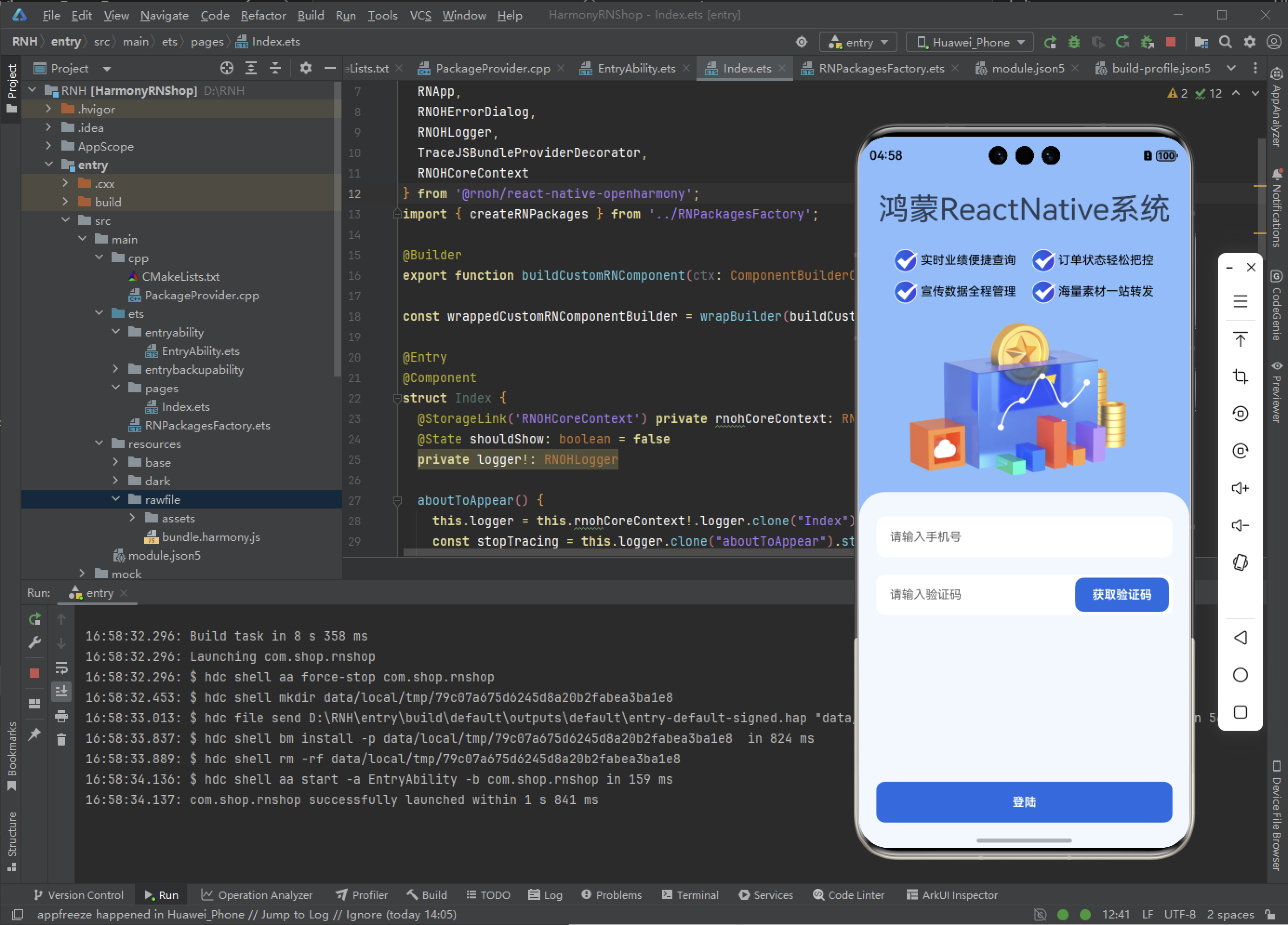

作为“人工智能6S店”的官方数字引擎,为AI开发者与企业提供一个覆盖软硬件全栈、一站式门户。
更多推荐

 11
11 0
0- 0


 已为社区贡献6条内容

所有评论(0)