
鸿蒙响应式主题设计实践指南
修改中的LightTheme和DarkThemeprimary: '#你的主色',background: '#你的背景色',// ... 修改其他颜色✅三种主题模式:亮色、暗色、跟随系统✅手动切换功能:通过按钮或图标快速切换✅系统主题跟随:自动响应系统主题变化✅响应式更新:所有UI元素自动适配主题✅状态持久化:主题设置自动保存✅防御性编程:完善的错误处理,避免崩溃。
本文档详细记录了如何在HarmonyOS应用中实现响应式多主题系统,包括手动切换主题和跟随系统主题变化的功能。
目录
项目结构
在开始之前,让我们了解一下项目的文件结构:
demo/
├── entry/
│   └── src/
│       └── main/
│           └── ets/
│               ├── entryability/
│               │   └── EntryAbility.ets      # Ability入口,监听系统配置变化
│               ├── pages/
│               │   └── Index.ets            # 演示页面
│               ├── models/
│               │   └── ThemeModel.ets       # 主题模型核心逻辑
│               ├── utils/
│               │   └── Logger.ets           # 日志工具类
│               └── components/
│                   └── icons/
│                       └── ThemeToggleIcon.ets  # 主题切换图标组件
核心概念
1. 主题类型
系统支持三种主题模式:
- light(亮色主题):固定使用亮色配色方案
- dark(暗色主题):固定使用暗色配色方案
- system(跟随系统):自动跟随系统主题变化
2. 状态管理
使用 AppStorage 进行全局状态管理:
app_theme_type:当前主题类型(light/dark/system)app_is_dark_mode:是否为暗色模式(boolean)app_theme_colors:当前主题颜色配置(JSON字符串)currentColorMode:系统颜色模式(从系统配置同步)
3. 响应式更新
通过以下机制实现响应式更新:
- EntryAbility.onConfigurationUpdate:监听系统配置变化
- @StorageProp:在组件中自动响应 AppStorage 变化
- ThemeModel:统一管理主题状态和切换逻辑
实施步骤
步骤1:创建工具类 Logger
文件路径:entry/src/main/ets/utils/Logger.ets
作用:提供统一的日志输出接口,方便调试和问题排查。
操作:
- 在
entry/src/main/ets/目录下创建utils文件夹 - 创建
Logger.ets文件 - 复制以下代码:
/*
 * 日志工具类
 */

enum LogLevel {
  DEBUG = 0,
  INFO = 1,
  WARN = 2,
  ERROR = 3
}

export class Logger {
  private static readonly LOG_LEVEL: LogLevel = LogLevel.INFO

  static info(tag: string, message: string): void {
    if (LogLevel.INFO >= Logger.LOG_LEVEL) {
      console.info(`[${tag}] ${message}`)
    }
  }

  static error(tag: string, message: string, error?: Error): void {
    if (LogLevel.ERROR >= Logger.LOG_LEVEL) {
      console.error(`[${tag}] ${message}`, error || '')
    }
  }
}
步骤2:创建主题模型 ThemeModel
文件路径:entry/src/main/ets/models/ThemeModel.ets
作用:核心主题管理类,负责主题切换、状态同步和系统主题监听。
关键代码片段:
import { Logger } from '../utils/Logger'
import { common, ConfigurationConstant } from '@kit.AbilityKit'

let uiContext: common.UIAbilityContext | null = null

export function setUIContext(context: common.UIAbilityContext): void {
  uiContext = context
}

export type ThemeType = 'light' | 'dark' | 'system'

export interface ThemeColors {
  primary: string
  background: string
  onBackground: string
  surface: string
  card: string
  // ... 更多颜色定义
}

// 亮色主题配色
export const LightTheme: ThemeColors = {
  primary: '#2E7D32',
  background: '#FFFFFF',
  onBackground: '#212121',
  surface: '#F5F5F5',
  card: '#FFFFFF',
  // ... 完整配色
}

// 暗色主题配色
export const DarkTheme: ThemeColors = {
  primary: '#4CAF50',
  background: '#121212',
  onBackground: '#FFFFFF',
  surface: '#1E1E1E',
  card: '#2C2C2C',
  // ... 完整配色
}

@Observed
export class ThemeModel {
  themeType: ThemeType = 'system'
  isDarkMode: boolean = false
  currentThemeColors: ThemeColors = LightTheme

  constructor() {
    console.log('[ThemeModel] 📦 构造函数开始');

    // 确保立即设置默认主题颜色,避免初始化异步导致 undefined
    this.currentThemeColors = LightTheme
    this.themeType = 'system'
    this.isDarkMode = false

    console.log('[ThemeModel] 📦 构造函数完成,currentThemeColors:', this.currentThemeColors);

    // 异步初始化主题
    this.initTheme()
  }

  // 初始化主题
  async initTheme(): Promise<void> {
    const storedThemeType = AppStorage.get<ThemeType>('app_theme_type')
    if (storedThemeType) {
      this.themeType = storedThemeType
    } else {
      Logger.info('ThemeModel', '首次启动,使用system模式跟随系统')
    }

    await this.applyTheme(this.themeType)
    this.syncToAppStorage()

    Logger.info('ThemeModel', `主题初始化完成: type=${this.themeType}, isDark=${this.isDarkMode}`)
  }

  // 切换主题
  async toggleTheme(): Promise<void> {
    const nextTheme: ThemeType = this.isDarkMode ? 'light' : 'dark'
    await this.setTheme(nextTheme)
  }

  // 设置主题
  async setTheme(theme: ThemeType): Promise<void> {
    this.themeType = theme
    await this.applyTheme(theme)
    this.syncToAppStorage()
  }

  // 应用主题
  private async applyTheme(theme: ThemeType): Promise<void> {
    Logger.info('ThemeModel', `应用主题: ${theme}`)

    switch (theme) {
      case 'light':
        this.isDarkMode = false
        this.currentThemeColors = LightTheme
        break
      case 'dark':
        this.isDarkMode = true
        this.currentThemeColors = DarkTheme
        break
      case 'system':
        await this.followSystemTheme()
        break
    }
  }

  // 跟随系统主题
  private async followSystemTheme(): Promise<void> {
    Logger.info('ThemeModel', '=== 开始跟随系统主题 ===')
    const colorMode = AppStorage.get<number>('currentColorMode')

    Logger.info('ThemeModel', `从AppStorage读取系统颜色模式: ${colorMode}`)

    if (colorMode === ConfigurationConstant.ColorMode.COLOR_MODE_DARK) {
      this.isDarkMode = true
      this.currentThemeColors = DarkTheme
      Logger.info('ThemeModel', '✓ 系统处于暗色模式')
    } else {
      this.isDarkMode = false
      this.currentThemeColors = LightTheme
      Logger.info('ThemeModel', '✓ 系统处于亮色模式')
    }

    Logger.info('ThemeModel', `✓ 跟随系统主题完成: ${this.isDarkMode ? '暗色' : '亮色'} (colorMode: ${colorMode})`)
  }

  // 同步到 AppStorage
  private syncToAppStorage(): void {
    AppStorage.setOrCreate('app_theme_type', this.themeType)
    AppStorage.setOrCreate('app_is_dark_mode', this.isDarkMode)
    AppStorage.setOrCreate('app_theme_colors', JSON.stringify(this.currentThemeColors))

    Logger.info('ThemeModel', `主题状态已同步到 AppStorage: ${this.themeType}, isDark: ${this.isDarkMode}`)
  }

  // 系统配置变化回调
  async onConfigurationChanged(): Promise<void> {
    if (this.themeType === 'system') {
      await this.followSystemTheme()
      this.syncToAppStorage()
    }
  }

  // 其他辅助方法...
}
关键说明:
- 构造函数中立即设置默认值:确保对象创建后立即可用,避免异步初始化导致的
undefined错误 @Observed装饰器使类可被观察followSystemTheme()从 AppStorage 读取系统颜色模式syncToAppStorage()确保所有页面都能响应主题变化
步骤3:创建主题切换图标组件
文件路径:entry/src/main/ets/components/icons/ThemeToggleIcon.ets
@Component
export struct ThemeToggleIcon {
  @Prop iconWidth: number = 24
  @Prop iconHeight: number = 24
  @Prop color: string = '#000000'
  @Prop isDarkMode: boolean = false

  build() {
    Stack() {
      if (this.isDarkMode) {
        // 太阳图标
        Path()
          .width(this.iconWidth)
          .height(this.iconHeight)
          .commands('M12 7c-2.76 0-5 2.24-5 5s2.24 5 5 5...')
          .fill(this.color)
      } else {
        // 月亮图标
        Path()
          .width(this.iconWidth)
          .height(this.iconHeight)
          .commands('M12 3c-4.97 0-9 4.03-9 9...')
          .fill(this.color)
      }
    }
  }
}
步骤4:更新 EntryAbility
文件路径:entry/src/main/ets/entryability/EntryAbility.ets
关键代码:
import { AbilityConstant, ConfigurationConstant, UIAbility, Want, Configuration } from '@kit.AbilityKit';
import { hilog } from '@kit.PerformanceAnalysisKit';
import { window } from '@kit.ArkUI';
import { Logger } from '../utils/Logger';
import { setUIContext } from '../models/ThemeModel';
import { ThemeModel } from '../models/ThemeModel';

export default class EntryAbility extends UIAbility {
  private themeModel: ThemeModel | null = null;

  onCreate(want: Want, launchParam: AbilityConstant.LaunchParam): void {
    hilog.info(0x0000, 'testTag', '%{public}s', 'Ability onCreate');
    setUIContext(this.context);

    const colorMode = this.context.config.colorMode;
    AppStorage.setOrCreate('currentColorMode', colorMode);
    Logger.info('EntryAbility', `当前系统颜色模式: ${colorMode}`);

    this.initializeTheme();
  }

  private async initializeTheme(): Promise<void> {
    try {
      this.themeModel = new ThemeModel();
      await this.themeModel.initTheme();
      Logger.info('EntryAbility', '主题模型初始化成功');
    } catch (error) {
      Logger.error('EntryAbility', '主题模型初始化失败:', error as Error);
    }
  }

  onConfigurationUpdate(newConfig: Configuration): void {
    hilog.info(0x0000, 'testTag', '%{public}s', 'Ability onConfigurationUpdate');
    try {
      if (newConfig.colorMode !== undefined) {
        Logger.info('EntryAbility', `系统颜色模式变化: ${newConfig.colorMode}`);
        AppStorage.setOrCreate('currentColorMode', newConfig.colorMode);
        Logger.info('EntryAbility', `已同步颜色模式到 AppStorage: ${newConfig.colorMode}`);
        if (this.themeModel) {
          this.themeModel.onConfigurationChanged();
        }
      }
    } catch (error) {
      Logger.error('EntryAbility', '处理配置变化失败:', error as Error);
    }
  }

  // ... 其他生命周期方法
}
关键说明:
setUIContext()将 UI 上下文传递给 ThemeModelonConfigurationUpdate是系统回调,响应系统配置变化- 必须将系统颜色模式同步到 AppStorage
步骤5:创建演示页面
文件路径:entry/src/main/ets/pages/Index.ets
⚠️ 重要:ArkTS 语法限制
ArkTS 不支持 ES6 的 get 关键字定义 getter!必须使用普通方法。
import { ThemeModel, ThemeColors, LightTheme } from '../models/ThemeModel';
import { ThemeToggleIcon } from '../components/icons/ThemeToggleIcon';

@Entry
@Component
struct Index {
  @State themeModel: ThemeModel = new ThemeModel();
  @StorageProp('app_is_dark_mode') isDarkMode: boolean = false;
  @StorageProp('app_theme_colors') themeColorsJson: string = '';

  // ✅ 正确:使用普通方法而不是 get getter(ArkTS 语法要求)
  getCurrentThemeColors(): ThemeColors {
    console.log('[Index] 🔍 getCurrentThemeColors - 开始');

    // 优先从 AppStorage 读取
    if (this.themeColorsJson && this.themeColorsJson.trim() !== '') {
      try {
        const colors = JSON.parse(this.themeColorsJson) as ThemeColors;
        if (colors && colors.background) {
          console.log('[Index] ✅ 从 AppStorage 返回颜色');
          return colors;
        }
      } catch (e) {
        console.log('[Index] ⚠️ JSON 解析失败:', e);
      }
    }

    // 如果 AppStorage 中没有,尝试使用 themeModel 的颜色
    if (this.themeModel &&
        this.themeModel.currentThemeColors &&
        this.themeModel.currentThemeColors.background) {
      console.log('[Index] ✅ 从 themeModel 返回颜色');
      return this.themeModel.currentThemeColors;
    }

    // 最后使用默认的亮色主题
    console.log('[Index] ✅ 返回默认 LightTheme');
    return LightTheme;
  }

  async aboutToAppear() {
    console.log('[Index] 📱 aboutToAppear 开始');
    try {
      await this.themeModel.loadThemeSettings();
      this.updateThemeFromStorage();
    } catch (error) {
      console.error('主题初始化失败,使用默认主题', error);
    }
  }

  updateThemeFromStorage(): void {
    const hasChanged = this.themeModel.updateFromAppStorage();
  }

  build() {
    Column() {
      // 顶部导航栏
      Row() {
        Text('主题演示')
          .fontSize(24)
          .fontWeight(FontWeight.Bold)
          // ✅ 调用方法获取颜色
          .fontColor(this.getCurrentThemeColors().onBackground)
          .layoutWeight(1)
          .textAlign(TextAlign.Center)

        // 主题切换按钮
        Button() {
          ThemeToggleIcon({
            iconWidth: 24,
            iconHeight: 24,
            color: this.getCurrentThemeColors().onBackground,
            isDarkMode: this.isDarkMode
          })
        }
        .type(ButtonType.Circle)
        .width(40)
        .height(40)
        .backgroundColor(Color.Transparent)
        .onClick(async () => {
          await this.themeModel.toggleTheme();
        })
      }
      .width('100%')
      .height(60)
      .padding({ left: 16, right: 16 })
      .backgroundColor(this.getCurrentThemeColors().surface)

      // 主内容区域
      Scroll() {
        Column({ space: 20 }) {
          this.buildThemeInfoCard()
          this.buildColorShowcaseCard()
          this.buildActionButtons()
        }
        .width('100%')
        .padding(16)
      }
      .layoutWeight(1)
      .width('100%')
    }
    .width('100%')
    .height('100%')
    .backgroundColor(this.getCurrentThemeColors().background)
  }

  @Builder
  buildThemeInfoCard() {
    Column({ space: 12 }) {
      Text('当前主题信息')
        .fontSize(18)
        .fontWeight(FontWeight.Bold)
        .fontColor(this.getCurrentThemeColors().onSurface)
        .width('100%')

      Row() {
        Text('主题类型:')
          .fontSize(14)
          .fontColor(this.getCurrentThemeColors().onSurfaceVariant)
        Text(this.themeModel.getThemeDescription())
          .fontSize(14)
          .fontWeight(FontWeight.Medium)
          .fontColor(this.getCurrentThemeColors().primary)
      }
      .width('100%')
      .justifyContent(FlexAlign.SpaceBetween)

      Row() {
        Text('当前模式:')
          .fontSize(14)
          .fontColor(this.getCurrentThemeColors().onSurfaceVariant)
        Text(this.isDarkMode ? '暗色模式' : '亮色模式')
          .fontSize(14)
          .fontWeight(FontWeight.Medium)
          .fontColor(this.getCurrentThemeColors().secondary)
      }
      .width('100%')
      .justifyContent(FlexAlign.SpaceBetween)
    }
    .width('100%')
    .padding(16)
    .backgroundColor(this.getCurrentThemeColors().card)
    .borderRadius(12)
    .shadow({
      radius: 8,
      color: this.getCurrentThemeColors().shadow,
      offsetX: 0,
      offsetY: 2
    })
  }

  @Builder
  buildColorShowcaseCard() {
    Column({ space: 12 }) {
      Text('主题颜色展示')
        .fontSize(18)
        .fontWeight(FontWeight.Bold)
        .fontColor(this.getCurrentThemeColors().onSurface)
        .width('100%')

      Row({ space: 12 }) {
        Column() {
          Text('主色')
            .fontSize(12)
            .fontColor('#FFFFFF')
        }
        .width('30%')
        .height(60)
        .backgroundColor(this.getCurrentThemeColors().primary)
        .borderRadius(8)
        .justifyContent(FlexAlign.Center)

        // 更多颜色展示...
      }
      .width('100%')
    }
    .width('100%')
    .padding(16)
    .backgroundColor(this.getCurrentThemeColors().card)
    .borderRadius(12)
  }

  @Builder
  buildActionButtons() {
    Column({ space: 12 }) {
      Text('主题切换操作')
        .fontSize(18)
        .fontWeight(FontWeight.Bold)
        .fontColor(this.getCurrentThemeColors().onSurface)
        .width('100%')

      Button('切换到亮色主题')
        .width('100%')
        .height(48)
        .fontSize(16)
        .fontColor(this.getCurrentThemeColors().onPrimary)
        .backgroundColor(this.getCurrentThemeColors().primary)
        .borderRadius(24)
        .onClick(async () => {
          await this.themeModel.setTheme('light');
        })

      Button('切换到暗色主题')
        .width('100%')
        .height(48)
        .fontSize(16)
        .fontColor(this.getCurrentThemeColors().onPrimary)
        .backgroundColor(this.getCurrentThemeColors().primary)
        .borderRadius(24)
        .onClick(async () => {
          await this.themeModel.setTheme('dark');
        })

      Button('跟随系统主题')
        .width('100%')
        .height(48)
        .fontSize(16)
        .fontColor(this.getCurrentThemeColors().onSecondary)
        .backgroundColor(this.getCurrentThemeColors().secondary)
        .borderRadius(24)
        .onClick(async () => {
          await this.themeModel.setTheme('system');
        })
    }
    .width('100%')
    .padding(16)
    .backgroundColor(this.getCurrentThemeColors().card)
    .borderRadius(12)
  }
}
关键说明:
- ⚠️ ArkTS 不支持
get currentThemeColors()getter 语法,必须使用普通方法getCurrentThemeColors() - 使用
@StorageProp监听 AppStorage 中的主题变化 - 所有地方都调用
this.getCurrentThemeColors()方法获取颜色 - 完善的错误处理确保永远不会返回
undefined
代码详解
1. 为什么要使用普通方法而不是 getter?
// ❌ 错误:ArkTS 不支持 get 关键字
@Component
struct Index {
  get currentThemeColors(): ThemeColors {
    return LightTheme;
  }

  build() {
    // 这会返回 undefined 导致崩溃!
    Text('hello').fontColor(this.currentThemeColors.onBackground)
  }
}

// ✅ 正确:使用普通方法
@Component
struct Index {
  getCurrentThemeColors(): ThemeColors {
    return LightTheme;
  }

  build() {
    // 正常工作
    Text('hello').fontColor(this.getCurrentThemeColors().onBackground)
  }
}
2. AppStorage 状态管理
// 设置或创建值
AppStorage.setOrCreate('key', value)

// 获取值
const value = AppStorage.get<Type>('key')

// 在组件中使用 @StorageProp 自动响应变化
@StorageProp('key') myValue: Type = defaultValue
3. 主题切换流程
用户点击切换按钮
    ↓
ThemeModel.toggleTheme()
    ↓
ThemeModel.setTheme(theme)
    ↓
ThemeModel.applyTheme(theme)
    ↓
更新 isDarkMode 和 currentThemeColors
    ↓
ThemeModel.syncToAppStorage()
    ↓
AppStorage 值变化
    ↓
所有使用 @StorageProp 的组件自动更新
4. 系统主题跟随原理
EntryAbility.onCreate和onConfigurationUpdate同步系统颜色模式到 AppStorageThemeModel.followSystemTheme()从 AppStorage 读取系统颜色模式- 根据系统颜色模式应用对应的主题配色
ThemeModel.syncToAppStorage()同步主题颜色到 AppStorage- 页面通过
@StorageProp('app_theme_colors')监听变化,调用getCurrentThemeColors()自动更新UI
运行项目
1. 编译项目
cd demo
hvigorw assembleHap --mode module -p module=entry@default
预期输出:
BUILD SUCCESSFUL in 8 s 530 ms
2. 在 DevEco Studio 中运行
- 使用 DevEco Studio 打开项目
- 连接设备或启动模拟器
- 点击运行按钮(或按 Shift+F10)
- 等待应用安装并启动
3. 查看日志
在 DevEco Studio 的 Log/HiLog 面板中,可以看到:
[ThemeModel] 📦 构造函数开始
[ThemeModel] 📦 LightTheme: [object Object]
[ThemeModel] 📦 构造函数完成,currentThemeColors: [object Object]
[ThemeModel] 📦 currentThemeColors.background: #FFFFFF
[EntryAbility] 当前系统颜色模式: 1
[EntryAbility] 主题模型初始化成功
[Index] 📱 aboutToAppear 开始
[Index] 🔍 getCurrentThemeColors - 开始
[Index] ✅ 从 themeModel 返回颜色
4. 测试功能
手动切换主题
- 方法1:点击右上角的主题切换图标
- 方法2:点击页面中的主题切换按钮
跟随系统主题
- 点击"跟随系统主题"按钮
- 在系统设置中切换主题(设置 > 显示和亮度 > 深色模式)
- 观察应用是否自动跟随系统主题变化
验证响应式更新
- 切换主题后,观察页面所有元素是否立即更新
- 检查主题信息卡片中的显示是否正确
常见问题
Q1: 应用启动时崩溃,错误 “Cannot read property background of undefined”?
原因:这是最常见的问题,有两个可能的原因:
- 使用了 ArkTS 不支持的
get关键字 ThemeModel异步初始化未完成时访问了currentThemeColors
解决方案:
- 确保使用普通方法而不是 getter:
// ❌ 错误
get currentThemeColors(): ThemeColors { ... }

// ✅ 正确
getCurrentThemeColors(): ThemeColors { ... }
- 在 ThemeModel 构造函数中立即设置默认值:
constructor() {
  // 立即设置默认值,确保对象创建后立即可用
  this.currentThemeColors = LightTheme
  this.themeType = 'system'
  this.isDarkMode = false

  // 异步初始化
  this.initTheme()
}
- 在 getCurrentThemeColors() 中添加完善的错误处理:
getCurrentThemeColors(): ThemeColors {
  // 1. 优先从 AppStorage 读取
  if (this.themeColorsJson && this.themeColorsJson.trim() !== '') {
    try {
      const colors = JSON.parse(this.themeColorsJson) as ThemeColors;
      if (colors && colors.background) {
        return colors;
      }
    } catch (e) {
      // 解析失败,继续下一步
    }
  }

  // 2. 尝试从 themeModel 读取
  if (this.themeModel?.currentThemeColors?.background) {
    return this.themeModel.currentThemeColors;
  }

  // 3. 返回默认值
  return LightTheme;
}
- 在 aboutToAppear 中添加错误处理:
async aboutToAppear() {
  try {
    await this.themeModel.loadThemeSettings();
    this.updateThemeFromStorage();
  } catch (error) {
    console.error('主题初始化失败,使用默认主题', error);
  }
}
Q2: 跟随系统主题不生效?
解决方案:
- 确保
EntryAbility实现了onConfigurationUpdate方法 - 确保同步了
currentColorMode到 AppStorage - 确保
ThemeModel.themeType设置为'system' - 确保页面使用了
@StorageProp('app_theme_colors') - 确保页面调用
getCurrentThemeColors()方法
Q3: 编译错误 “ArkTS Compiler Error”?
可能原因:
- 使用了
get关键字定义 getter build()方法中有 console.log 等语句- 语法不符合 ArkTS 规范
解决方案:
- 将
get currentThemeColors()改为getCurrentThemeColors() - 将
build()中的调试代码移到aboutToAppear()中 - 参考本文档的正确代码示例
Q4: 如何清除缓存重新编译?
如果遇到奇怪的问题,可能是缓存导致,请清除缓存:
方法1:手动删除缓存文件夹
cd demo
Remove-Item -Recurse -Force .hvigor\cache
Remove-Item -Recurse -Force entry\build
Remove-Item -Recurse -Force build
方法2:在 DevEco Studio 中
- 点击菜单:Build → Clean Project
- 点击菜单:Build → Rebuild Project
Q5: 如何自定义主题颜色?
修改 ThemeModel.ets 中的 LightTheme 和 DarkTheme 常量:
export const LightTheme: ThemeColors = {
  primary: '#你的主色',
  background: '#你的背景色',
  // ... 修改其他颜色
}
Q6: 如何在其他页面使用主题?
参考以下代码模板:
import { ThemeModel, ThemeColors, LightTheme } from '../models/ThemeModel';

@Component
struct MyPage {
  @State themeModel: ThemeModel = new ThemeModel();
  @StorageProp('app_is_dark_mode') isDarkMode: boolean = false;
  @StorageProp('app_theme_colors') themeColorsJson: string = '';

  // 使用普通方法获取主题颜色
  getCurrentThemeColors(): ThemeColors {
    if (this.themeColorsJson && this.themeColorsJson.trim() !== '') {
      try {
        const colors = JSON.parse(this.themeColorsJson) as ThemeColors;
        if (colors && colors.background) {
          return colors;
        }
      } catch (e) {}
    }

    if (this.themeModel?.currentThemeColors?.background) {
      return this.themeModel.currentThemeColors;
    }

    return LightTheme;
  }

  async aboutToAppear() {
    await this.themeModel.loadThemeSettings();
    this.themeModel.updateFromAppStorage();
  }

  build() {
    Column() {
      Text('我的页面')
        .fontColor(this.getCurrentThemeColors().onBackground)
    }
    .backgroundColor(this.getCurrentThemeColors().background)
  }
}
Q7: 主题设置会持久化吗?
是的,ThemeModel 使用 AppStorage 保存主题设置,应用重启后会恢复上次的主题选择。
ArkTS 语法注意事项
1. 不支持 ES6 Getter/Setter
// ❌ 错误 - ArkTS 不支持
get currentThemeColors(): ThemeColors {
  return LightTheme;
}

// ✅ 正确 - 使用普通方法
getCurrentThemeColors(): ThemeColors {
  return LightTheme;
}
2. build() 方法限制
build() 方法只能包含一个根组件,不能有其他语句:
// ❌ 错误
build() {
  console.log('debug')  // 不能有 console.log
  const colors = this.getCurrentThemeColors()  // 不能有变量声明

  Column() { ... }
}

// ✅ 正确
build() {
  Column() { ... }
}
3. 组件装饰器限制
- 只能使用官方提供的装饰器:
@Component、@Entry、@State、@Prop、@StorageProp等 - 不能使用自定义装饰器
4. 其他限制
| 特性 | ES6/TypeScript | ArkTS | 说明 |
|---|---|---|---|
get/set |
✅ 支持 | ❌ 不支持 | 使用普通方法 |
私有字段 #field |
✅ 支持 | ❌ 不支持 | 使用 private field |
可选链 ?. |
✅ 支持 | ✅ 支持 | 推荐使用 |
空值合并 ?? |
✅ 支持 | ✅ 支持 | 推荐使用 |
总结
通过本实践指南,我们实现了:
- ✅ 三种主题模式:亮色、暗色、跟随系统
- ✅ 手动切换功能:通过按钮或图标快速切换
- ✅ 系统主题跟随:自动响应系统主题变化
- ✅ 响应式更新:所有UI元素自动适配主题
- ✅ 状态持久化:主题设置自动保存
- ✅ 防御性编程:完善的错误处理,避免崩溃
核心要点回顾
- ArkTS 语法:不支持
get关键字,必须使用普通方法 - 防御性初始化:构造函数中立即设置默认值
- 多层错误处理:AppStorage → themeModel → 默认值
- AppStorage 同步:EntryAbility → AppStorage → ThemeModel → UI
- 响应式更新:使用
@StorageProp监听变化
希望这个实践指南能帮助你理解和实现鸿蒙应用的响应式主题设计!
如有问题,请参考:
demo/核心问题修复说明.md- 详细的崩溃问题解决方案- 项目源码中的注释和日志
源代码
效果图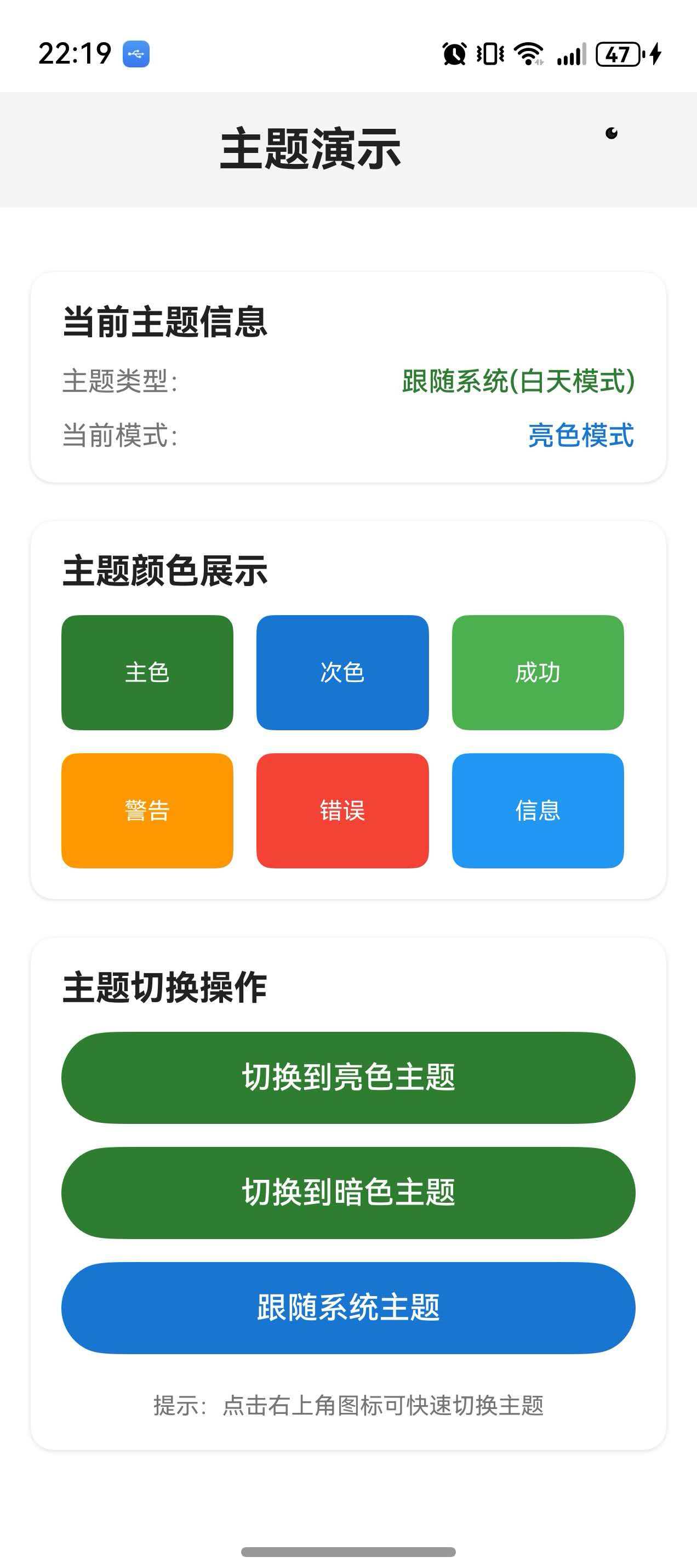
https://developer.huawei.com/consumer/cn/training/classDetail/fd34ff9286174e848d34cde7f512ce22?type=1%3Fha_source%3Dhmosclass&ha_sourceId=89000248

作为“人工智能6S店”的官方数字引擎,为AI开发者与企业提供一个覆盖软硬件全栈、一站式门户。
更多推荐


 2
2 0
0- 0


 已为社区贡献1条内容

所有评论(0)