
《鸿蒙 TextInput/TextArea/Checkbox 组件:属性、样式与登录页应用》
主要内容包括:1) 单行输入框TextInput的基本属性设置,如placeholder、文本样式、边框、密码输入模式等;2) 多行输入框TextArea的使用方法,包括字数统计、最大长度限制等特性;3) 复选框Checkbox的选中状态控制、样式设置和形状选择;4) 通过一个完整的登录页面Demo展示了这些组件的综合应用,包括输入验证、协议勾选判断等交互逻辑。文档还特别说明了CheckboxGr
·
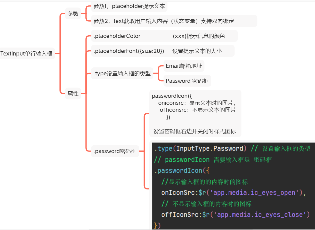
TextInput 单输入框
基本属性:
@Entry
@Component
struct Index {
@State value:string = ''
build() {
Column({space:50}){
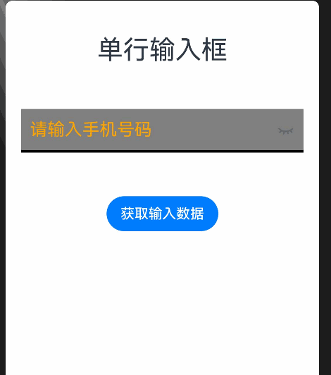
Text('单行输入框')
.fontSize(30)
// placeholder 提示文本
// text 获取用户输入的内容
TextInput({placeholder:'请输入手机号码', text:$$this.value})
.width('90%')
.height(50)
.borderRadius(0)
.border({width:{bottom:3}})
.padding({left:10})
.backgroundColor(Color.Gray)
.placeholderColor(Color.Orange) // 设置提示文本的颜色
.placeholderFont({size:20}) // 设置提示文本的大小
.type(InputType.Password) // 设置输入框的类型
// passwordIcon 需要输入框是 密码框
.passwordIcon({
onIconSrc:$r('app.media.ic_eyes_open'),
offIconSrc:$r('app.media.ic_eyes_close')
})
Button('获取输入数据')
.onClick(()=>{
AlertDialog.show({
message:this.value,
})
// console.log(``,this.value)
this.value = ''
})
}
.width('100%')
.height('100%')
}
}@Entry
@Component
struct Index {
@State value:string = ''
build() {
Column({space:30}){
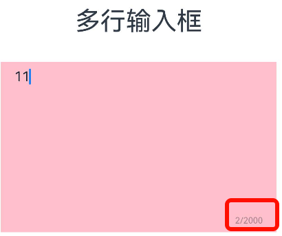
Text('多行输入框')
.fontSize(30)
// 参数1,提示文本 参数2,value值,支持双向绑定
TextArea({placeholder:'请发表你的评论....',text:$$this.value})
.width('90%')
.height(200)
.backgroundColor(Color.Pink)
.borderRadius(0)
.placeholderColor(Color.Orange)
.showCounter(true) // 显示右下角统计数据 取值 布尔值 true显示 默认false隐藏
.maxLength(2000) // 限制用户输入的内容数量
}
.width('100%')
.height('100%')
}
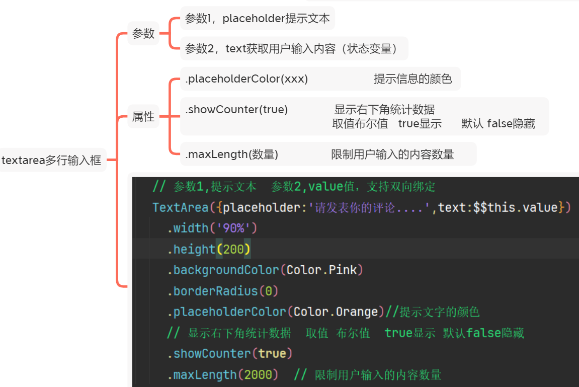
}textarea 多行输入框(文本域)
基本属性:
@Entry
@Component
struct Index {
  @State value:string = ''
  build() {
    Column({space:30}){
      Text('多行输入框')
        .fontSize(30)
      // 参数1,提示文本  参数2,value值,支持双向绑定
      TextArea({placeholder:'请发表你的评论....',text:$$this.value})
        .width('90%')
        .height(200)
        .backgroundColor(Color.Pink)
        .borderRadius(0)
        .placeholderColor(Color.Orange)//提示文字的颜色
        // 显示右下角统计数据  取值 布尔值  true显示 默认false隐藏
        .showCounter(true)
        .maxLength(2000)  // 限制用户输入的内容数量
    }
    .width('100%')
    .height('100%')
  }
}
例 :demo 清空或者用户输入内容
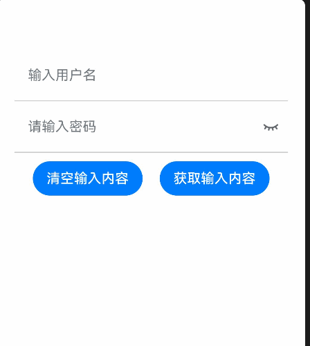
@Entry
@Component
struct Page01_TextInput {
  @State userName:string = ''
  @State password:string = ''
  build() {
    Column() {
      TextInput({ placeholder: '输入用户名',text: $$this.userName})
        .type(InputType.Normal)
        .backgroundColor(Color.Transparent)
        .borderRadius(0)
        .height(60)
        .border({
          width: { bottom: 1 }
        , color: '#ccc'
        })
      TextInput({ placeholder: '请输入密码' , text:$$this.password})
        .type(InputType.Password)
        .height(60)
        .backgroundColor(Color.Transparent)
        .borderRadius(0)
        .border({
          width: { bottom: 1 }
        , color: '#ccc'
        })
        .passwordIcon({
          onIconSrc: $r('app.media.ic_eyes_open'),
          offIconSrc: $r('app.media.ic_eyes_close')
        })
      Row({ space: 20 }) {
        Button('清空输入内容')
          .onClick(()=>{
            // 清空
            this.userName = ''
            this.password = ''
          })
        Button('获取输入内容')
          .onClick(()=>{
            AlertDialog.show({
              message: this.userName +'-'+this.password
            })
          })
      }
      .margin({ top: 10 })
    }
    .padding(20)
  }
}
Checkbox 多选框
基本属性:
@Entry
@Component
struct Index {
  @State  selected:boolean = false
  @State Selected:boolean=false
  build() {
    Column({space:30}){
      Text('多选框')
        .fontSize(30)

      Checkbox()
        .select($$this.selected)  // 控制选中状态
        .selectedColor(Color.Orange)  // 选中之后的颜色
        .unselectedColor(Color.Black) // 非选中的边框颜色
        // ROUNDED_SQUARE方形  原型
        .shape(CheckBoxShape.ROUNDED_SQUARE) // 设置多选框的形状
      Checkbox()
        .select($$this.Selected)
        .selectedColor(Color.Red)
        .unselectedColor(Color.Black)
        .shape(CheckBoxShape.CIRCLE)

      Button('切换第一个多选框选中状态')
        .onClick(()=>{
          this.selected = !this.selected
        })
    }
    .width('100%')
    .height('100%')
  }
}
例 demo: 登录判断是否勾选和有值
需求:
- 点击登录,判断:(onClick)
- 是否勾选用户协议($$双向绑定选中状态)
- 用户名、密码是否为空($$双向绑定输入的内容,结合trim去空格)
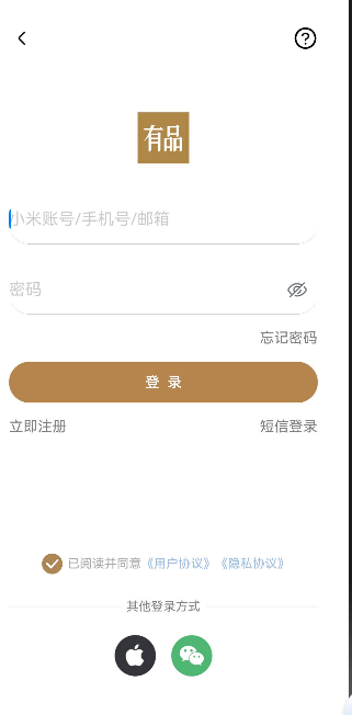
import { promptAction } from '@kit.ArkUI'

@Entry
@Component
struct Page04_Demo_Xiaomi {
  @State  username:string = ''
  @State  password:string = ''
  @State  selected:boolean = false
  build() {
    Column() {
      // 1. 顶部
      this.TopSectionBuilder()

      // 2. 登录区域
      Column() {
        Image($r('app.media.ic_xiaomi_logo'))
          .width(50)
        Stack() {
          // 登录信息+密码登录
          Column({ space: 20 }) {
            // 账号输入框
            TextInput({ placeholder: '小米账号/手机号/邮箱', text: $$this.username})
              .placeholderColor('#ccc')
              .backgroundColor(Color.Transparent)
              .border({ width: { bottom: .5 }, color: '#ccc' })
              .padding(0)
              .height(48)

            TextInput({ placeholder: '密码', text:$$this.password })
              .placeholderColor('#ccc')
              .backgroundColor(Color.Transparent)
              .border({ width: { bottom: .5 }, color: '#ccc' })
              .padding(0)
              .height(48)

              .type(InputType.Password)
              .passwordIcon({
                offIconSrc: $r('app.media.ic_eyes_open'),
                onIconSrc: $r('app.media.ic_eyes_close'),
              })

          }

        }
        .margin({ top: 30 })

        // 底部区域
        Column({ space: 15 }) {
          Row() {
            Text('忘记密码')
              .LinkTextExtends()
          }
          .width('100%')
          .justifyContent(FlexAlign.End)

          Button('登  录')
            .width('100%')
            .backgroundColor('#b6854e')
            .fontSize(14)
            .fontWeight(600)
            .onClick(()=>{
              // 判断用户名是否为空, 如果为空提示
              if(this.username.trim() == ''){
                 promptAction.showToast({
                    message: `用户名不能为空~~`,
                    bottom: 200
                  })
                return
              }
              // 判断密码是否为空, 如果为空提示
              if(this.password.trim() == ''){
                promptAction.showToast({
                  message: `密码不能为空~~`,
                  bottom: 200
                })
                return
              }

              // 判断用户协议是否勾选
              // console.log(``,this.selected)
              if(!this.selected){
                 promptAction.showToast({
                    message: `请勾选用户协议~~`,
                    bottom: 200
                  })
                return
              }

              // 提示 登录成功
                AlertDialog.show({
                    message: '登录成功'
                  })
            })

          Row() {
            Text('立即注册')
              .LinkTextExtends()
            Text('短信登录')
              .LinkTextExtends()

          }
          .width('100%')
          .justifyContent(FlexAlign.SpaceBetween)
        }
        .margin({ top: 15 })

      }
      .margin({ top: 60 })

      Blank()

      // 3. 底部登录区域
      Column({ space: 20 }) {
        Row() {
          Checkbox()
            .shape(CheckBoxShape.CIRCLE)
            .selectedColor('#af8756')
            .select($$this.selected)

          Text() {
            Span('已阅读并同意')
            Span('《用户协议》')
              .fontColor('#9cbce8')
            Span('《隐私协议》')
              .fontColor('#9cbce8')
              .translate({ x: -10 })
          }
          .fontSize(12)
          .fontColor('#acacac')
        }

        Stack() {
          Divider()
            .strokeWidth(.5)
          Text('其他登录方式')
            .fontSize(12)
            .fontColor(Color.Gray)
            .backgroundColor(Color.White)
            .padding({ left: 5, right: 5 })
        }
        .width('100%')

        // 微信 和 苹果的登录
        Row({ space: 15 }) {
          Image($r('app.media.ic_applelogo'))
            .width(40)
          Image($r('app.media.ic_wechat'))
            .width(40)
        }

      }
    }
    .padding({ top: 30, left: 30, right: 30, bottom: 50 })
    .height('100%')
  }

  @Builder
  TopSectionBuilder() {
    // 1. 顶部
    Row() {
      Image($r('app.media.ic_public_arrow_left'))
        .width(24)
      Image($r('app.media.ic_public_question'))
        .width(24)
    }
    .width('100%')
    .justifyContent(FlexAlign.SpaceBetween)
  }
}

@Extend(Text)
function LinkTextExtends() {
  .fontColor(Color.Gray)
  .fontSize(14)
}
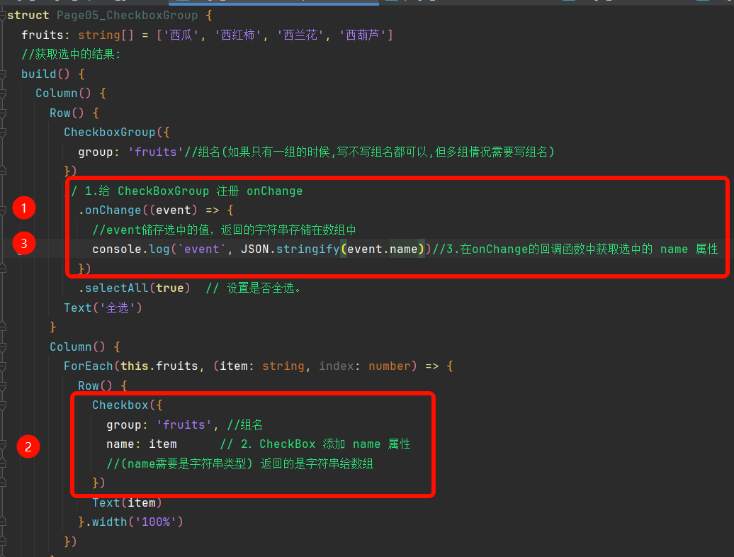
CheckboxGroup
作用:控制多个 Checkbox 的选中状态
获取选中结果
// 核心步骤
// 1.给 CheckBoxGroup 注册 onChange
// 2.CheckBox 添加 name 属性
// 3.在onChange的回调函数中获取选中的 name 属性

作为“人工智能6S店”的官方数字引擎,为AI开发者与企业提供一个覆盖软硬件全栈、一站式门户。
更多推荐
 4
4 0
0- 0


 已为社区贡献3条内容

所有评论(0)